
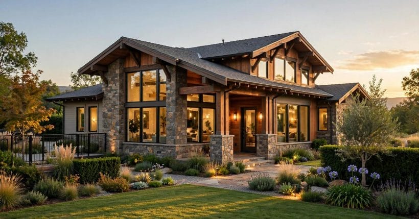
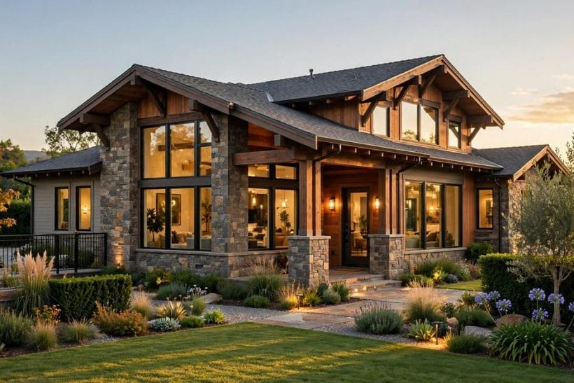
A beautiful house is rarely an accident of decoration. It is a layout that works: an entry that lands you somewhere welcoming, living rooms that gather light, bedrooms set apart from the noise, and a kitchen placed where the day actually happens.
This post reads house layouts the way an architect does, then turns that reading into seventy-five layout ideas you can test against any plan: your own sketch, a builder’s brochure or the floor plan of a house you already own.
1. House Layouts at a Glance
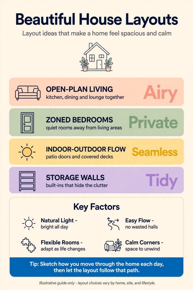
Every plan answers the same handful of questions. Where do you arrive, and what do you see first? Where does the household gather, and where does it retreat? How do people, shopping, laundry and mud move through the rooms without crossing each other’s quiet?
Read any layout in this order: orientation first, because sun and wind are fixed; then zoning, the split between sociable and private rooms; then circulation, the paths between them; then the wet rooms, whose plumbing likes to stack and cluster; and finally storage, the layer most plans under-provide and most households feel every day.
| Question | Short answer |
|---|---|
| What makes a layout feel beautiful? | Light in the living rooms, a calm entry, private rooms set apart, and few wasted corridors — proportion and placement, not size |
| What should I check first on a plan? | Which way it faces: living rooms and gardens toward the sun’s useful side, service rooms buffering the harsh side |
| What do most plans get wrong? | Storage and circulation — too little of the first, too much of the second, and bedrooms opening straight off living space |
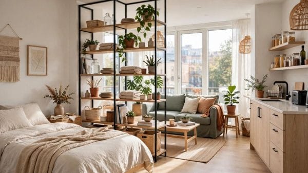
| Can a small plan live large? | Yes — borrowed light, an open core, built-in storage and one flexible room beat spare square metres every time |
2. The Entry Sequence: Arriving Well
1. A door you can find
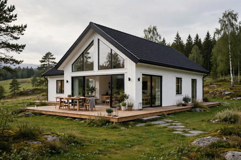
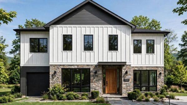
The front door should be legible from the street or path — visible, lit and reached by an obvious route.
2. A pause at the threshold
Even a small hall, alcove or change of floor gives arrivals somewhere to land: coats off, shoes away, eyes adjusting. Plans that open the door straight into the living room feel exposed; a modest buffer — a screen wall, a bookcase, a step — restores the pause.
3. A view with a destination
From the door, the eye should find something worth looking at: a window at the corridor’s end, the garden beyond the living room, a fireplace or a piece of art.
4. Coats and clutter at the door
Storage belongs where the mess arrives. A cupboard, bench or hooks near the entry keeps the hall clear and the living rooms calm. On compact plans this can be a single deep alcove; what matters is that it exists before the first sofa is placed.
5. The guest route that spares the bedrooms
Guests should reach a cloakroom and the living spaces without passing bedroom doors. Trace the route on the plan: if it threads the private wing, the zoning needs another look. This single test exposes more weak layouts than any other.
6. A porch or covered step
Weather protection at the door — a porch, canopy or recessed entry — is a layout decision, not an ornament. It keeps rain off arrivals and post, gives parcels a dry landing, and deepens the facade in a way applied decoration never quite manages.
7. The second door for daily life
Most households live through a side or back door near the kitchen and parking. Good plans honour that: a practical second entry with somewhere for boots, bags and the dog, so the formal front stays for guests and the house works on weekdays.
8. Stairs that do not block the hall
In two-storey plans the stair wants a position that serves both floors without swallowing the entry. A stair rising from a corner of the hall, or turning against an outside wall, keeps the arrival open and leaves the upper landing room to breathe.
3. Open-Plan Living: The Sociable Core
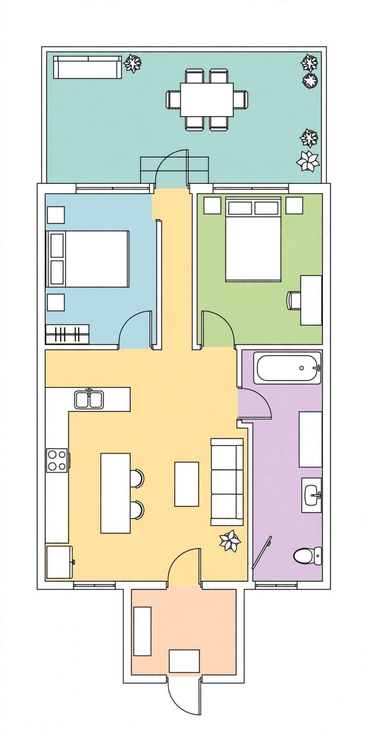
9. One great room, three territories
The strongest open plans still read as kitchen, dining and sitting territories, arranged so each has its own light and outlook. Furniture and level changes mark the borders; the plan’s job is to give each territory a wall, window or corner to belong to.
10. The broken-plan middle path
Half-walls, wide cased openings, screens and changes of ceiling height divide without isolating. Broken-plan layouts keep the light and sociability of open plan while giving the cook, the reader and the television different acoustic worlds — a pattern worth drawing before defaulting to one big box.
11. A quiet corner inside the open core
Every open plan needs one seat that is out of the traffic: a window bay, an alcove, the far end of the sitting area. Without it, nobody can read, nap or take a call. Mark the quiet corner on the plan and defend it against later furniture creep.
12. Dining where the light is
Dining tables collect everything from breakfast to homework, so their position deserves the best dual-aspect light the plan can offer — near the kitchen for serving, near a window for living. A dining space stranded in the plan’s dark middle becomes a corridor with chairs.
13. The kitchen at the social edge
Kitchens work socially when the cook faces the room, not the wall. Islands and peninsulas turn the work zone toward the gathering, and a plan that puts the sink or hob on the island makes conversation the default. Keep the working run compact behind it.
14. Television without tyranny
A plan that gives the sitting area one obvious screen wall — away from window glare and not the room’s only focal point — ends the daily negotiation.
15. Ceiling height where people gather
Volume is a layout luxury that costs no floor area. A raised, vaulted or double-height ceiling over the living core — and standard heights over bedrooms — concentrates the grandeur where the household actually spends its waking hours.
16. A snug for the evenings
Many families add one small closed sitting room beside the open core: winter evenings, films, music practice, guests. On the plan it can begin life as a study or spare room; the point is a door that closes somewhere in the sociable half of the house.
4. Kitchen Placement: The Working Heart
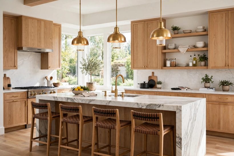
17. Close to the door the shopping uses
Groceries travel from car to counter several times a week. A plan that shortens that route — kitchen near the daily entry, no stairs, no living-room crossing — saves more steps than any appliance. Trace the bag route on paper; it should be short and boring.
18. The work triangle kept compact
Sink, cooker and fridge form the classic triangle, and its virtue is compactness, not geometry for its own sake. In general terms, the three should sit within a few unobstructed steps of each other, with no through-traffic crossing the working side of the room.
19. A window over the sink
The oldest layout pleasure in the house: washing up with a view and daylight.
20. The pantry within arm’s reach
A walk-in pantry, larder cupboard or deep store beside the kitchen changes how the room works — bulk goods out of the worktops’ way, small appliances off the counter. On the plan it wants to sit on the kitchen’s cool, internal edge rather than stealing window wall.
21. Dining adjacency without collision
Serving should be a short, clear path from hob to table that does not pass the fridge doors or the dishwasher’s open door. Draw the serving route as you drew the shopping route; collisions visible on paper are collisions avoided in life.
22. A place for the morning
Kettle, cups, toaster and a perch: most households run a small morning station inside the kitchen. Plans that allow one stretch of counter near a seat and a socket cluster keep breakfast out of the cook’s working triangle at the busiest hour.
23. Bins, recycling and the unglamorous metre
Waste sorting needs floor space near the door it leaves by. A plan that reserves an honest nook for bins — ventilated, washable, near the back entry — prevents the slow colonisation of the kitchen’s best corner by recycling bags.
24. Laundry out of the kitchen’s ear
In compact plans the washer often lands in the kitchen, and the layout should then buffer it: a cupboard, a utility alcove or at least a position away from the dining seat. Better still is the small separate utility the next sections argue for.
5. Bedroom Zoning: Quiet by Design
25. The split-bedroom plan
Placing the main bedroom apart from the children’s or guest rooms — opposite ends of a single-storey plan, or separated by living space — gives adults and children different evenings. It is the zoning move households praise most once they live with it.
26. A door buffer, not a door on the lounge
Bedrooms that open directly off living rooms lose privacy every day. A short corridor stub, a lobby or even a well-placed wardrobe wall between the bedroom door and the sociable rooms restores it for the cost of a few square feet of plan.
27. Bathrooms between bedrooms, not through them
Shared bathrooms should be reachable without entering another bedroom. En-suite for the main room is a luxury; a family bathroom that serves the children’s rooms from the corridor is a necessity of civilised mornings. Check the plan at the morning rush hour, in your head.
28. Morning light in bedrooms, evening in living rooms
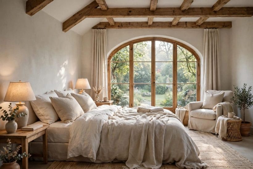
Orientation applies room by room: bedrooms that catch early light help households wake; living rooms benefit from afternoon and evening sun where the family gathers after work. A plan that states its compass and assigns rooms accordingly is already half designed.
29. The main bedroom’s small extras
A dressing niche, a window seat, a door to the garden or a bath reached without crossing the room: the main bedroom earns these because it is used every day of the year. On the plan they cost little; added later, they cost a remodel.
30. Guest sleeping that does not evict the family
A guest room that doubles as a study, with its own reachable bathroom, hosts kindly. Plans that rely on converting the living room host rarely and resentfully. Even a small dedicated room — the flexible room argued for later — outperforms a large sofa bed.
31. Children’s rooms that can grow
A child’s room must fit, across its life, a cot, then a bed and desk, then a teenager’s whole world. Rectangular rooms with one unbroken wall and a window that leaves the corners free adapt; odd shapes with sloped ceilings charm once and constrain for years.
32. Sound through the walls
On paper, avoid backing a bedroom onto the television wall, the laundry or the bathroom’s plumbing run where you can. Wardrobes make excellent sound buffers: a plan that lines the shared wall with the bedroom’s own storage quiets both rooms at once.
6. Bathrooms and Utility: The Wet Rooms
33. Stack and cluster the plumbing
Bathrooms above kitchens, utility rooms beside bathrooms, en-suites back-to-back with the family bath: clustering wet rooms shortens pipe runs, simplifies maintenance and keeps the wet trades in one neighbourhood of the build. Your plumber will approve; so will your budget.
34. A bathroom for the morning peak
The family bathroom serves everyone at once on school mornings. A plan that separates the bath or shower from the basin and WC — or adds a small second WC — ends the queue. Even splitting the vanity into two basins changes the room’s politics.
35. The downstairs cloakroom
Guests, children in from the garden and anyone mid-cooking all need a WC that does not require a trip through the bedrooms. A small cloakroom near the entry or living zone is among the highest-value rooms per square metre in any plan.
36. A utility room with a door
Laundry, machines, mops, the boiler’s company: a small separate utility room — ventilated, with a sink if the plan allows — takes noise and clutter out of the kitchen entirely. In the wider home design ideas survey this is the room owners of open-plan homes say they miss most.
37. The mudroom bench
Where climate and lifestyle demand it, a mudroom zone at the daily entry — bench, hooks, boot tray, a floor that forgives — absorbs the outdoors before it reaches the house. It can share space with the utility room; the functions are cousins.
38. En-suite without the corridor tax
En-suites should open from the bedroom they serve, through or beside the dressing area — never as a door visible from the bed’s pillow if it can be helped, and never stealing the bedroom’s only window wall. Draw the door swing before you fall for the suite.
39. A bath with a window
Bathrooms with natural light and ventilation feel larger, dry faster and need their mirrors lit less often. Where an outside wall is impossible, a borrowed-light transom or a rooflight over the bath keeps the room from feeling like a cupboard.
40. Storage inside the wet rooms
Towels, bottles and cleaning gear live in bathrooms whether the plan provides for them or not. Niches in the shower wall, a deep cupboard over the WC cistern and a vanity with drawers are plan decisions; surface clutter is what happens when they are skipped.
41. Doors that do not collide
Small wet rooms suffer door swings: the door that hits the vanity, the shower screen that meets the towel rail. Sliding and pocket doors solve some of it; mostly it is solved by swinging doors against walls and checking every swing on the drawing, in ink.
7. Indoor-Outdoor Flow: Rooms That Reach the Garden
42. Living rooms that open to the terrace
Wide doors from the main living space to a terrace at the same level multiply the room in fine weather. The plan detail that matters is threshold: flush or near-flush, sheltered from driving rain, and aligned so the view through is the garden’s best.
43. The kitchen garden door
A door from kitchen or utility to the herb bed, bins and washing line shortens a dozen daily journeys. Plans often give the living room the only garden access; the working door matters more, and it wants a small paved apron outside it.
44. A courtyard at the plan’s heart
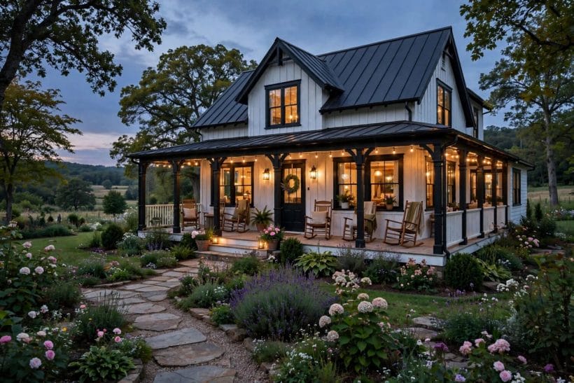
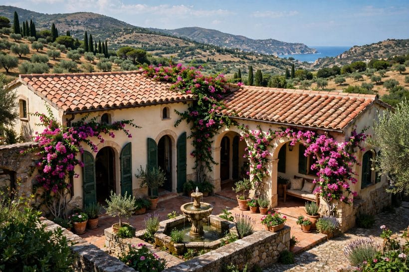
On tight or overlooked plots, an internal courtyard brings light and air to the middle of the plan and gives every surrounding room a private outlook. The Mediterranean houses in these photographs are built on the idea; it adapts to any climate with a covered edge.
45. Covered outdoor sitting
A veranda, loggia or deep porch roof extends outdoor living across seasons and shades the glass behind it. As a layout move it belongs on the sun side, attached to the rooms the household uses at the day’s ends.
46. Windows placed for the view you own
Every plot has one best view and several to avoid. Plans should be drawn on the site plan, not in the abstract: living-room glass aimed at the garden’s depth or the hills, bathroom and stair windows aimed at sky, neighbours’ windows answered with high or screened glass.
47. The garden room sequence
House, terrace, lawn, planted depth: a sequence of outdoor rooms gives even a small plot a journey. The plan contributes by placing its garden doors at the start of that sequence and its quiet rooms facing the planted end rather than the parking.
48. Outdoor utility within reach
Taps, stores and the shed belong in the plan’s thinking: an outside tap near the kitchen door, storage for garden furniture on the terrace’s edge, a shed position that does not consume the view. Layouts that ignore them sprout clutter against the house’s best wall.
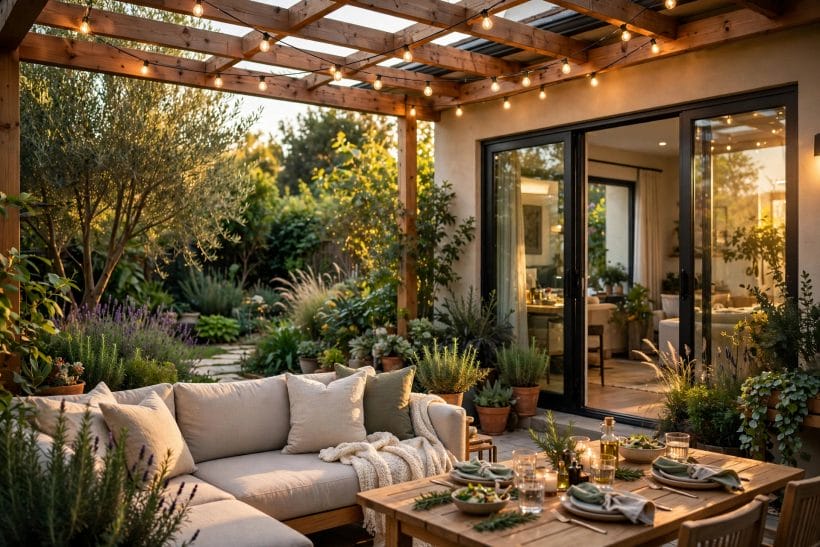
49. Evening sun for the sitting terrace
Where the household eats and sits outside is an evening activity in most lives, so the main terrace wants the day’s later light where the climate allows. Check the plan against the compass at the hour you actually use a garden, not at noon on the drawing.
8. Storage Built Into the Plan
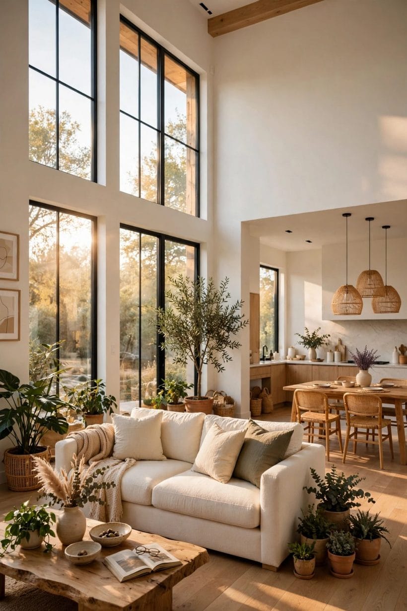
50. A wardrobe wall in every bedroom
Bedrooms planned with one full wall free for wardrobes — no window, no door swing, no radiator — never need freestanding furniture wars. The plan stage is when that wall is protected; everything later is compromise.
51. The linen cupboard near the bedrooms
Sheets and towels travel between laundry, bathroom and bed. A linen store in the bedroom zone, ventilated and honestly sized, ends the airing-cupboard archaeology. Small houses feel this most: one deep cupboard outperforms three shallow ones.
52. Under-stair honesty
The space under a stair can be drawers, a cloakroom, a study nook or simple deep storage — but only if the plan decides. Left undecided, it becomes the house’s Bermuda triangle. Draw its door and its use before the stair is finalised.
53. A broom cupboard where floors are washed
Vacuum, mop and cleaning kit need a tall, skinny home near the middle of the plan. It is the least glamorous cupboard in the house and the one whose absence is felt weekly, usually as a vacuum living permanently in a bedroom corner.
54. Kitchen storage counted, not assumed
Plans should count kitchen storage the way they count bedrooms: the everyday set, the bulky appliances, the celebration ware. A pantry, a run of tall units or a larder wall designed in from the start beats the later garage exile of the good pans.
55. The hallway that earns its keep
Corridors wide enough for a bookcase, a bench or shallow cupboards stop being wasted area. In compact plans like those in our tiny house floor plans collection, circulation that doubles as storage is the difference between tight and clever.
56. Loft and garage realism
Storage outside the heated envelope — loft, garage, shed — should be planned for the bulky and the seasonal, with access that does not require moving a car or a wardrobe. If the plan’s only loft hatch is over a bed, the loft will not be used.
57. A place for the hobby
Instruments, sewing, tools, the bicycle fleet: every household has one bulky enthusiasm. Naming its home on the plan — a garage corner, a deep cupboard, a garden room — prevents the slow takeover of the dining table that nobody voted for.
9. Flexible Rooms and Future Change
58. The room with three lives
One room near the entry — nursery, then study, then guest room or a ground-floor bedroom — is the classic flexible space. It wants a door that closes, a window that cheers it and dimensions that honestly fit a bed, not merely a desk.
59. Ground-floor sleeping potential
A plan that can put a bed and a shower room on the ground floor — even if they begin as a study and cloakroom — future-proofs the house for injury, age and guests who cannot climb. The plumbing cluster argued for earlier makes the conversion simple.
60. Work-from-home without the kitchen table
A work corner succeeds when it is out of the bedroom and out of the main traffic: a landing alcove, the flexible room, a deep nook off the hall. In tiny house loft ideas the same discipline appears at small scale — a defined edge, a door or screen, a view that is not the bed.
61. Walls that could move
Where a plan might one day join two small rooms or split a large one, non-structural internal walls make the change cheap.
62. Children arriving, children leaving
A nursery near the main bedroom that later becomes a teenager’s room at the house’s far end sounds impossible in one plan — unless two rooms are sized to swap roles.
63. Space for care and company
A live-in grandparent, an adult child returning, a carer for a season: households host long stays more often than plans admit. The flexible room plus a reachable bathroom covers most of it; a separate entrance, where the plot allows, covers the rest with grace.
64. The rental or studio seed
Some plans quietly allow a self-contained corner — a room, small bathroom and exterior door that could serve as a studio for family or, where local rules allow, a let. Even unused, the arrangement hosts guests superbly; it is flexibility designed in, not carved out later.
65. Services that can be reached
Boilers, manifolds and stopcocks placed in accessible cupboards rather than buried behind baths make every future repair cheaper. Layout is also maintenance: a plan that shows where its machinery lives, and how a person reaches it, ages far more kindly.
66. Furniture drawn at full size
The oldest professional habit: draw the actual furniture — beds, sofas, the table with its chairs pulled out — on the plan before approving it.
10. Light, Views and the Shape of the Plot
67. Living rooms toward the sun
Within the limits of the plot, the main living rooms and the garden they open to belong on the sun’s generous side, with bedrooms and service rooms as buffers elsewhere. The wider room-by-room treatment in our interior design ideas survey assumes this orientation is settled first.
68. Borrowed light for the middle
Deep plans have dark middles. Borrowed light — glazed internal doors, transoms, open stairs that let light fall through, a lightwell or courtyard — rescues the centre rooms. Draw the sun’s path room by room and give every inhabited room a claim on it.
69. Windows sized to their rooms
Glass should follow use: wide and low-silled where you sit and look, high where you need privacy, small where heat loss hurts. A plan with every window the same size is a plan that has not yet thought about its rooms.
70. The stair as a light shaft
An open-riser or well-placed stair under a rooflight pours daylight into both floors and gives the house a vertical heart.
71. Privacy without curtains drawn all day
Angled windows, offset openings, screens and planting on the plan keep neighbouring eyes out while the glass stays open. Layout solves privacy better than frosting: check sightlines from the street and the adjoining gardens as carefully as the view you are framing.
72. The plan that fits its plot’s shape
Long plots want long plans; corner plots can turn a face to each street; slopes invite split levels like those in our split level homes post, where the section does the work. Forcing a standard plan onto an irregular plot wastes garden and light in equal measure.
73. Arrival for cars that does not eat the garden
Parking placed to the plot’s edge, with the walk to the door short and planted, keeps vehicles from owning the outlook. The plan should show the car, the bins and the bikes as honestly as the sofa — they are part of the composition the street sees.
74. Rooms that frame one good view each
Rather than glazing everything toward everything, give each main room one composed view: the garden’s depth from the sofa, the hills from the bath, the tree from the desk.
75. The plan read at night
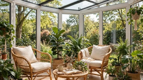
Finally, read the plan as the house will be used after dark: lamps where people sit, a lit route from bedrooms to bathroom, the entry welcoming and the garden doors secure. A layout that works at midnight as well as midday is the real definition of a beautiful house plan — and if you are sketching your own, the sunroom ideas in this series show how one hard-working glass room can be planned in from the start.
Final Considerations
A house plan is a promise about daily life, and it should be read like one: orientation, zoning, circulation, wet rooms, storage, flexibility. The seventy-five ideas above are that reading, made checkable.
Start with a plan you admire — the home design ideas pillar surveys the whole house room by room — and mark it against these sections in pencil. Where the marks cluster, the layout will fight you every day; where the plan passes quietly, build with confidence.

0 Comments