
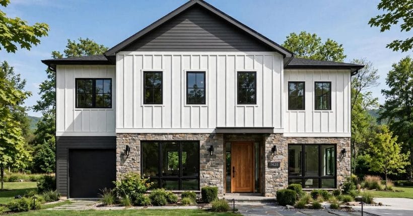
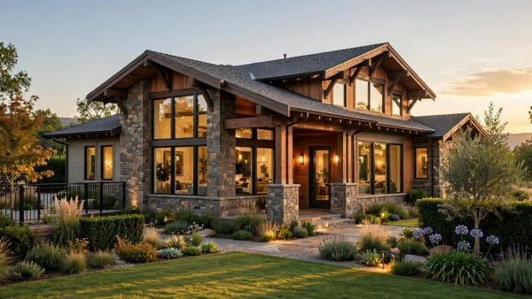
One material stretched over a whole house can look flat no matter how good the material is. The houses that stop you on the street almost always mix: stone where the building meets the ground, something quieter across the main walls, and a third texture reserved for the gable or the entry, so the eye reads the architecture instead of a single surface.
These seventy-five mixed siding ideas work through the combinations in the order a facade gets designed: the classic pairings first, then stone and brick bases, direction changes, shingle accents, colour discipline, placement rules, feature spots and the junctions where mixes succeed or fail. The wider exterior survey lives in our exterior home ideas pillar; this post owns one subject only — siding combinations — and it stays separate from the whole-house form covered in split level homes.
1. Mixed Siding at a Glance
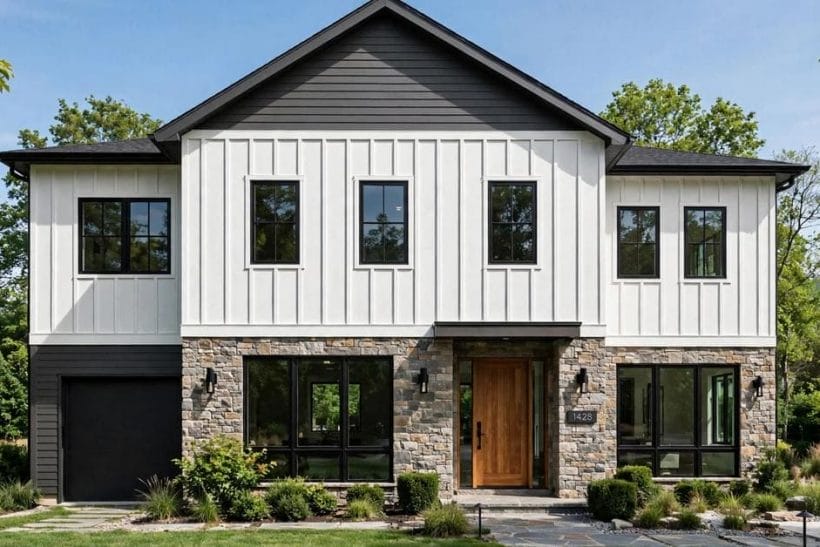
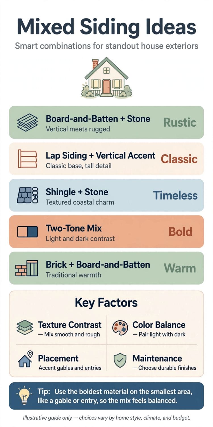
A good mix is a hierarchy, not a collection. One material leads and covers most of the wall, a second supports it at the base or on secondary volumes, and a third — if there is one — appears once, in the smallest area, where the house wants emphasis. Break that order and the facade reads as indecision; keep it and even humble materials look deliberate. Every material is described in general terms below: profiles, textures and behaviour differ by maker and climate, so treat each pairing as a design pattern to price and specify locally, never as a product promise.
| Question | Short answer |
|---|---|
| How many materials can one house carry? | Two comfortably, three with discipline — a lead, a support and one accent; a fourth almost always muddles the facade |
| Where does the second material usually go? | The base, a gable, a bump-out or the entry — places where the architecture itself changes plane, volume or level |
| What holds a mix together? | One trim colour, aligned junctions and a shared undertone across materials, even when the textures contrast hard |
| Where does the money go? | The accent material and the junction details; the lead material is the bulk cost, the transitions are the craft cost |
2. Start With Two: The Classic Pairings
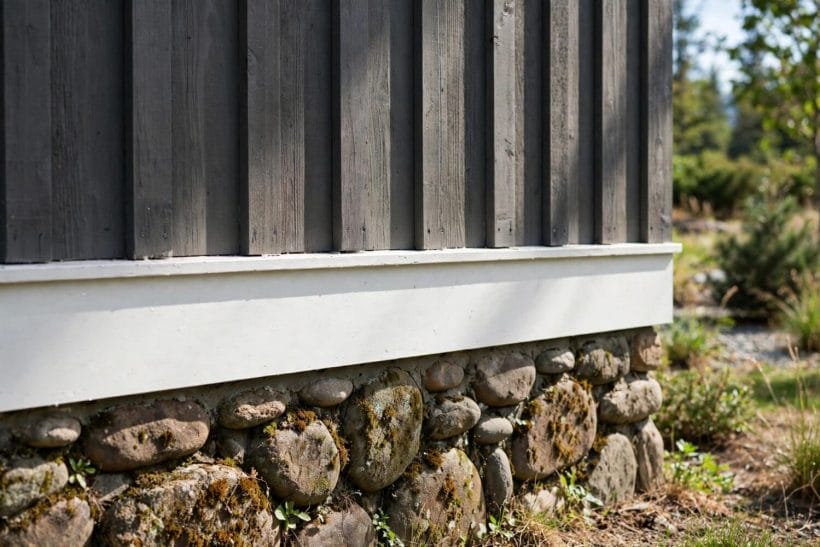
Two materials are the mix most houses need. The pairings in this section have survived every style cycle because each material does the job it is visibly suited to: weight at the bottom, lightness above, texture where the hand and eye come close.
1. Lap siding over a stone base
The oldest pairing in the book: horizontal boards across the walls, stone carrying the ground floor or the foundation line. The stone reads as the house’s footing and the boards as its shelter, a division any eye accepts without thinking.
2. Board-and-batten over brick
Vertical boards above a brick base give a farmhouse elevation its height and its anchor at once. Keep the brick in its natural range and let the boards take the painted colour, so the mix reads as structure below and skin above.
3. Shingles in the gable, lap on the walls
The classic coastal and craftsman move. Shingles fill the triangular gable where their scale suits a small field, while long lap boards keep the big wall planes calm. A trim board between the two fields makes the change look designed.
4. Vertical siding on the addition
When a house grows, letting the new volume wear a different direction of the same family — vertical boards against horizontal lap — tells the building’s story honestly and saves the impossible job of matching weathered material.
5. Stucco with a timber or board accent
Smooth render needs one rougher companion to keep it from monotony. A board-clad entry volume or a timber-screened section gives the eye a place to rest and the stucco a foil.
6. Metal panels against warm boards
A cool, flat panel material against warm timber boards is the modern pairing: the metal takes the tall, plain volumes and the wood warms the entry and the lived-in faces. Keep the metal’s area disciplined or the house turns industrial.
7. Two profiles, one material
The gentlest mix changes only the profile: wide lap below, narrow lap or shingles above, all in one material and one colour. The facade gains shadow and scale without any clash of character — ideal on traditional streets.
8. The dark base, light top
Reversing the usual instinct — dark material at the ground floor, pale above — grounds a tall house and hides splash-back dirt where it lands. It works best when the dark base is also the tougher texture.
3. Stone and Solid Bases
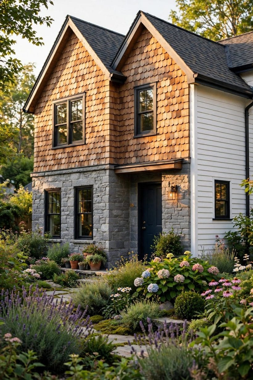
Stone, brick and masonry bases do more than decorate: they put the most weather-beaten material where the weather beats hardest, at the splash zone and the soil line. This section covers the base as the second material in the mix.
9. The full ground-floor wrap
Carrying stone around the whole ground floor gives tall houses a plinth and lets the upper storeys wear something lighter. The horizontal trim line where stone stops becomes the facade’s main event, so it must run level and unbroken.
10. Stone only at the entry
A smaller budget buys the same idea in miniature: stone framing the front door and the porch, boards everywhere else. The entry gains ceremony and the mix stays affordable because the premium material covers the smallest area.
11. The foundation skirt
Where only the foundation shows, cladding it in stone or brick slips turns a concrete strip into the base course of the design. Every other material on the house then sits on something that looks intentional.
12. Brick base with painted boards
Brick below and painted boards above is the mix that suits almost any era of house. The brick’s colour becomes the anchor for the whole palette: pull the board colour from its mortar or its softest tone.
13. Stone piers, board infill
On porches and carports, stone piers carrying the roof with board-clad walls between them mix the materials structurally rather than decoratively — the stone is visibly doing work, which is why it convinces.
14. A rendered plinth
Smooth render at the base, boards above: the cheapest solid base and the easiest to keep crisp. Render takes paint well, so the plinth can carry the facade’s darkest tone and be refreshed without touching the boards.
15. Stone returning around the corner
A base material that stops dead at the front corner looks pasted on. Returning it a short way down the side wall — or all the way around — is the detail that separates a designed mix from a front-only treatment.
16. Matching the landscape stone
When the garden already has stone walls, steps or edging, echoing that stone in the house base ties building and plot into one composition. The mix then starts at the boundary wall, not at the front door.
4. Vertical Meets Horizontal
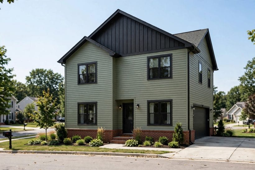
Changing direction is the cheapest mix of all: the same board family, turned ninety degrees, reads as a different material from the street. Direction changes belong where the building itself changes — gables, bays, towers and storeys.
17. Vertical gables over horizontal walls
Board-and-batten in the gable above lap siding on the walls emphasises the roof’s sheltering shape. The verticals draw the eye up, so this mix flatters low, wide houses that need height.
18. The vertical tower
A stair tower, entry block or chimney breast clad vertically against horizontal walls becomes the house’s exclamation mark. Give the tower one material and no further decoration; the direction change is the decoration.
19. Horizontal bands on a vertical house
Tall, narrow houses calm down when one storey band runs horizontal against vertical cladding elsewhere. The band works like a belt line, dividing the height into readable parts.
20. Vertical boards on the garage
Garage doors break up any wall. Cladding the garage volume vertically separates it politely from the house’s horizontal main walls and stops the largest door on the facade from dominating the design.
21. Direction change at the floor line
Running the ground floor horizontal and the upper floor vertical marks the storeys the way older houses were marked by a trim board. It suits additions and dormers, where a subtle announcement of the new layer is honest.
22. The corner-board rule
Direction changes need a referee: a trim or corner board where the two fields meet, wide enough to read from the street. Without it, vertical and horizontal boards collide in a scribble of joints.
23. Vertical inside the porch
Porch walls and ceilings take vertical boards well because the scale is intimate. Against the house’s horizontal exterior, the porch becomes a room-like pause before the door.
24. Mixed directions in one colour
When both directions share one colour, the mix is all shadow and rhythm — the safest way to experiment. It is also the easiest mix to live with long-term, because repainting never reopens the design argument.
5. Shingles and Shakes as the Accent
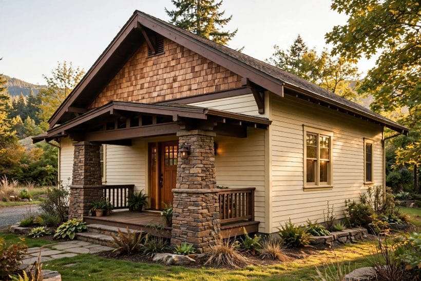
Shingle siding has a small scale and a busy shadow line, which makes it a natural accent material: wonderful in a gable or a bay, exhausting across a whole elevation. This section places it where its texture earns its keep.
25. The shingled gable
The textbook use. Shingles fill the gable triangle, a trim flare or straight course marks the change, and the main walls stay in lap or board. From the street, the roof seems to be wearing a cap.
26. Shingled bays and bows
Curved and angled bays take shingles gracefully because the small units turn corners without fuss. Cladding just the bay separates the room it serves — often the best room — from the plainer walls around it.
27. The shingle skirt
A band of shingles at the base, flared slightly at the bottom course, gives cottages their storybook stance. Pair it with plain boards above and keep the flare gentle; it is a skirt, not a tutu.
28. Shingles with stone
Two rugged textures can coexist when their scales differ: big irregular stone below, small regular shingles above. The contrast is of size, not of character, so the facade stays rustic and calm.
29. Painted shingles, natural boards
Reversing expectations — painting the shingle field and leaving the board field in a natural timber tone — suits modern rustic houses. The painted texture reads as pattern; the wood reads as warmth.
30. The dormer treatment
Dormers clad in shingles against a board or lap main wall look woven into the roof rather than stuck onto it. Match their colour to the roof or the wall trim, never to a third tone.
31. Shingle returns on the chimney
A chimney breast in shingles ties the stack to the gables and softens its bulk. It also weathers at the same pace as the gable fields, keeping the house’s ageing even.
32. Alternating courses as pattern
Within a shingle field, shaped or alternating courses can draw a quiet pattern — a diamond, a wave, a band. Keep it to one field per facade; pattern is an accent, not a wallpaper.
6. Brick in the Mix
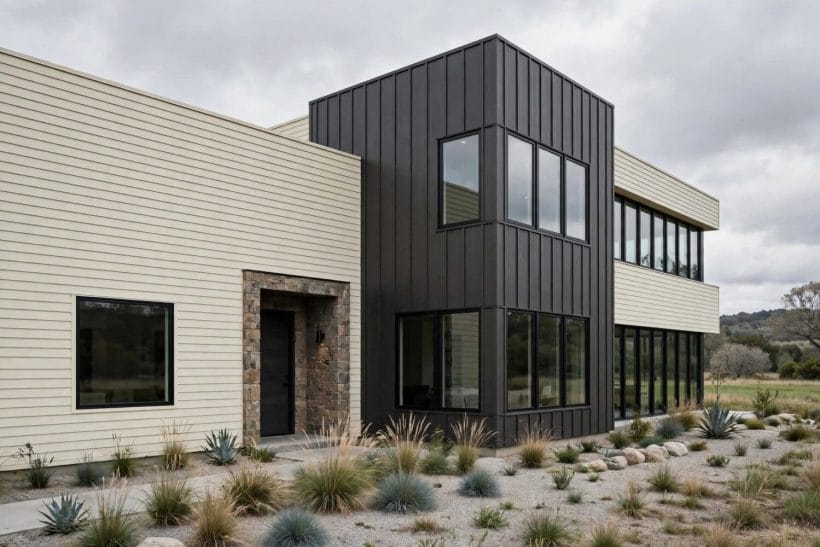
Brick brings permanence and a colour that cannot be repainted away, so in a mix it usually takes the supporting role — base, chimney, one wall — while painted materials carry the changeable colour above and around it.
33. Brick below, boards above
The two-storey classic: brick ground floor, board-clad upper floor. The upper boards can be repainted through several colour eras while the brick keeps the house rooted in its street.
34. The brick chimney as the mix’s anchor
Sometimes the only brick a facade needs is already standing: the chimney. Echo its tone in a brick base course or entry surround and a lone stack becomes the keystone of the whole mix.
35. Brick with stucco
Smooth render against brick’s small-scale texture is a pairing with centuries behind it. Let the brick take the base, the corners or the entry block, and the stucco the broad quiet fields between.
36. Painted brick, natural boards
Painting tired brick in a soft tone while leaving boards natural reverses the usual contrast and can rescue a house whose brick colour fights everything. It is a commitment — painted brick stays painted — so test it on the least-seen wall first.
37. Brick piers with panel infill
Brick piers at corners and openings, with board or panel siding between, give a house a framed, deliberate structure. The piers read as the skeleton; the infill can change with fashion.
38. Thin brick slips as the accent
Where full brick is too heavy or costly, brick slips give the same face at a fraction of the depth — useful for a gable panel or an entry surround over an existing wall. The junction detailing matters more, not less, for being thin.
39. Matching mortar to trim
Mortar is half of brick’s visible surface. Choosing a mortar tone that matches the house’s trim colour quietly knits brick into any mix; a clashing mortar will fight every other material on the facade.
40. Brick only on the front
Budget honesty: brick across the street elevation, boards on the sides and back. Done with a clean corner return, it reads as a brick house from everywhere the public sees, and no one sensible minds the economy.
7. Colour: Two-Tone and Tonal Mixes
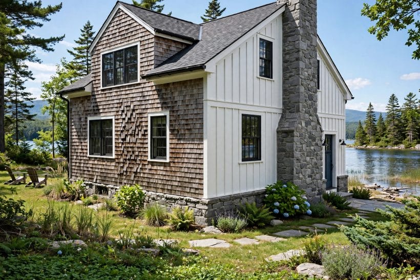
Colour can do the mixing on its own. Two tones of one material, or several materials held inside one colour family, give a facade its layers without a single texture argument — the approach that links this post to the wider colour thinking in our coastal exterior home ideas and blue exterior home ideas.
41. Light walls, dark gable
A darker tone in the gable seats the roof on the house and shortens tall elevations. The gable colour usually comes from the roof or the trim family, so the top of the house reads as one composed piece.
42. The tonal mix
Different materials in near-identical tones — stone, boards and render all within one warm grey family — mix by texture alone. It is the quietest, most forgiving mix, and the one that photographs as calm rather than busy.
43. Dark base, light top
Already met as a material move, it works as pure colour too: the ground floor a tone or two deeper than the upper walls, whatever the materials. Tall houses gain a plinth; splash marks disappear into the darker tone.
44. The accent colour on one volume
One block of the house — the entry volume, the garage, a side wing — in the facade’s single strong colour, everything else neutral. The accent volume should be a real architectural piece, not an arbitrary patch of wall.
45. White boards, black accents
Pale board walls with the gable, garage block or base in near-black is the modern farmhouse signature. The contrast is graphic, so the shapes must be simple; fussy architecture in this palette turns harsh.
46. Earth-tone mixing
Stone, timber and render in the colours of the site itself — ochre, umber, sage, clay — root a house in its landscape. This mix suits rural plots, where the facade’s job is to belong rather than to stand out.
47. Grey scales
Several greys, warm and cool kept apart, can mix across stone, board and metal with real sophistication. The discipline is undertone: one grey family per house, tested in daylight, as our gray exterior home ideas set out.
48. The trim as the third colour
In a two-material mix, the trim is already a design decision: matching one material unifies, contrasting both adds a graphic edge. Corner boards, junction battens and window surrounds should all share the trim decision, or the mix frays.
49. Colour echoing the roof
Pulling one siding tone from the roof — the slate’s blue-grey, the tile’s clay, the shingle’s weathered brown — ties the largest surface of the house into the mix. The roof stops being a lid and becomes the palette’s source.
8. Where Each Material Goes: Placement Rules
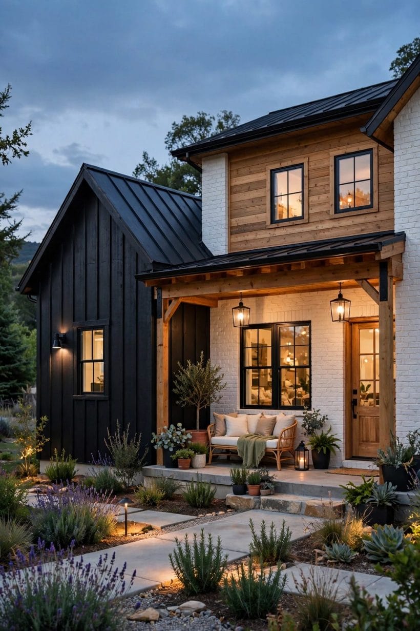
Materials fail in mixes less often than placements do. These rules govern where changes happen: at real architectural breaks, in proportions the eye accepts, and never mid-wall without a reason.
50. Change at corners, not mid-wall
A material change that stops in the middle of a flat wall always looks like running out of stock. End materials at inside or outside corners, at a bay, or behind a trim board that gives the stop a reason.
51. The two-thirds rule
Lead material on roughly two-thirds of the facade, support on the rest. Mixes near fifty-fifty read as two houses arguing; a clear majority gives the facade a subject and a supporting act.
52. Heaviest at the bottom
Stone below boards, brick below render, boards below shingles: the eye expects weight to decrease with height. Breaking the rule can work in crisp modern design — but it must look engineered, not accidental.
53. Follow the storeys
Where a floor line exists, it is the natural seam for a material change, ideally marked by a trim or string course. Seams that ignore the building’s levels fight the windows and lose.
54. Wrap the change around
An accent that exists only on the front teaches visitors the house has a costume. Return accent materials around corners — even a short return — so the mix reads as the building’s construction, not its stage set.
55. One mix per elevation
The side walls can be quieter than the front, but they should speak the same language: same lead material, same trim, accents fading out. Changing the whole scheme between elevations makes four small houses instead of one.
56. Respect the neighbours
On streets with a strong material tradition — brick terraces, stone villages, shingled coasts — a mix that quotes the local material as its base will sit comfortably even when its second material is new. Context is a design material too.
57. Small houses, fewer mixes
Compact facades saturate quickly. A small house usually wants two materials and one of them quiet; save the three-material composition for elevations with the area to hold it. The same restraint governs the compact exteriors in our ground level deck ideas cluster’s neighbourhood of small-footprint designs.
58. Plan the mix from the street
Judge every placement from where the house is actually seen: the pavement, the gate, the bend in the drive. Mixes are composed for those viewpoints, and a change that only makes sense on the drawing rarely survives the walk up the path.
9. Gables, Entries and Feature Walls
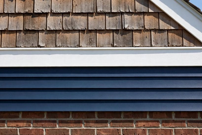
The accent material needs a stage, and houses provide three natural ones: the gable, the entry and the occasional feature wall. This section works those stages — the places where a bolder texture earns its concentration.
59. The gable as the canvas
Already the classic accent field, the gable rewards the mix’s most characterful material because its area is small and its shape is given by the roof. Shingles, vertical boards and stone all take the gable well.
60. The entry surround
Cladding the wall around the front door in the accent — stone, brick, timber — builds a porch’s worth of ceremony without a porch. Add a light and a number in the same spirit and the entry becomes the facade’s signature.
61. The chimney breast
An external chimney is a ready-made feature wall running the full height of the house. Cladding it in the mix’s heaviest material gives the facade a vertical spine the other materials can arrange themselves around.
62. The bay window block
A projecting bay is a separate little building attached to the house, and cladding it separately — shingles, vertical boards, render — celebrates that. Keep its roof and trim in the main house’s language so it stays a relation, not a stranger.
63. The garage as the second volume
Garages are large, plain and close to the street: ideal carriers for the mix’s second material. A stone or vertical-board garage lets the house proper stay calm, and the pairing reads as house-plus-outbuilding, a farmyard logic everyone understands.
64. The garden-facing wall
The back of the house can carry a warmer, more relaxed mix than the street face — timber where the front wears board, stone where the terrace meets the wall. Visitors read the front; the household lives against the back.
65. Feature walls on modern houses
Flat-roofed and cubic houses mix by whole planes: one wall in ribbed metal, one in render, one in timber screen. The rule is one material per plane and ruthless alignment of the junctions with windows and corners.
66. The porch and carport ceiling
A small, often-forgotten field: lining a porch ceiling or carport soffit in timber boards adds the mix’s warm material exactly where people stand closest to the house. It costs little and is felt every day.
10. Junctions, Trim and Upkeep
The mix is only ever as good as its junctions. Every change of material is a place where water, movement and workmanship meet, so this final section covers the seams — and the maintenance thinking that keeps a mixed facade ageing as one house, with detailing specified by the installer for the products and climate in question.
67. Trim boards at every change
A trim board or batten over the seam gives two materials a clean meeting, hides their edge conditions and draws the tidy line the eye follows. Size it generously; a mean trim makes a confident mix look apologetic.
68. Flashing where planes change
Where a base material projects beyond the wall above, its top edge is a ledge for water. Flashing and a slight slope at that ledge are not decoration — they are the detail that decides whether the mix lasts. This is installer territory, specified per material.
69. Movement between materials
Different materials expand, shrink and age at different rates. Junctions need room for that movement, detailed by whoever installs them; a mix forced tight at every seam will announce the strain within a few seasons.
70. Back-painting and end grain
Timber in a mix fails first at cut ends and hidden faces. Sealing end grain and the backs of boards near junctions is invisible work that decides whether the timber sections age with the masonry or ahead of it.
71. Repaint cycles in a mix
Painted materials will need recoating while stone and brick stand pat. Choose the mix knowing which parts are on a painting cycle, and detail junctions so scaffolding and masking stay simple when that day comes.
72. Cleaning mixed facades
Different materials wash differently, and runoff from one can stain another — metal and timber are common culprits above pale render. Agree the cleaning approach with the installer at design stage, not after the first streak.
73. Replacing one material later
Design junctions so a single material can be renewed without dismantling its neighbours. A mix whose accent can be re-clad independently will survive fashion changes and local damage with far less surgery.
74. Sample the junction, not just the materials
Swatches lie by omission: they never show the seam. Before committing, mock up or photograph the actual junction — trim size, shadow gap, colour against colour — because that small square is where the mix will be judged.
75. Keep a record of the mix
Note the materials, profiles, colours and makers somewhere durable. A mixed facade outlives its paperwork quickly, and the next repair — or the next owner — will bless the household that can say exactly what each layer is. For the compact-house version of the same care, our tiny house siding options guide keeps the same records discipline at small scale.
Final Considerations
A mixed facade succeeds when the hierarchy is clear: one lead material, one support, at most one accent, placed where the architecture changes and joined with trim that looks meant. Everything else — colour echoes, direction changes, stone at the splash zone — is in service of that order. Choose materials in general families first, walk the design from the street, and let local installers specify the junction details for the products and weather your house actually faces.
For the wider canvas, the exterior home ideas pillar covers the whole outside of the house; this post stays with siding combinations, just as split level homes stays with the house form itself. Start with two materials, place them with discipline, and most houses need nothing more.

0 Comments