

Chartreuse is the colour that walks into a room like spring walking into February: impossible to ignore, faintly alarming, and — handled properly — the making of everything calmer around it. Handled carelessly, it is the colour a room apologises for. The difference is never the colour. It is the company, the quantity and the light.
This colour guide works chartreuse the way it deserves: what it actually is, its two families, the proportions it demands, the pairings that steady it and the rooms that can carry it — a complete guide to working with the boldest colour in the box, within the wider home design ideas collection.
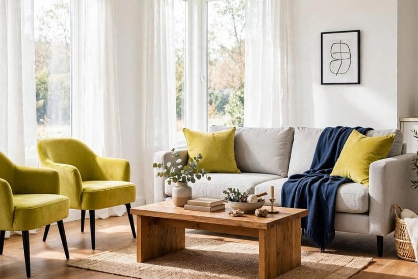
1. Chartreuse at a Glance
Chartreuse is a yellow-green — a colour sitting between yellow and green on the spectrum, named for its resemblance to the colour of the French liqueur of the same name. Its character comes from that in-between position: it carries yellow’s cheer and advancing warmth with green’s organic freshness, at a brightness few other colours attempt. In decorating terms it behaves as a high-energy accent first and a field colour only in brave, well-lit rooms. Its attributes are choices: the lean (toward yellow or toward green), the depth (vivid, mid or muted with grey and brown), the proportion (a colour of teaspoons, not buckets, in most rooms), and its partners — the neutrals, darks and complementary notes that decide whether it reads as springlike or as a warning. This guide keeps its advice at that general, checkable level: behaviour and pairing, not named products or promised effects.
| Question | Short answer |
|---|---|
| Is chartreuse yellow or green? | Deliberately both — it is the colour between them, and individual shades lean one way or the other. Yellow-leaning chartreuse reads sunny, sharp and citrus; green-leaning chartreuse reads leafy, cooler and calmer. Naming the lean of the shade in front of you is the guide’s first skill, because the two families want different partners and different rooms. |
| Why does chartreuse so often look wrong in shops and right in magazines? | Light and company. Under retail lighting the colour is judged alone and at full shout; in a composed room it is a small, deliberate note inside a calm scheme, lit by daylight. Chartreuse should never be chosen from a card in isolation — only in a sample, in the room, surrounded by the colours it will actually live with. |
| What is the safest way to use it? | As an accent against a composed neutral ground — cushions, a single chair, ceramics, art, a lampshade — in a room whose bones are calm. The accent route gives the colour its full springlike effect at a reversible price, and it is how most of the successful rooms in this guide are built. |
| Can chartreuse cover a whole wall or a kitchen? | Yes, in the right room: large, well-lit, and furnished with the darks and neutrals that steady it — navy, charcoal, timber, white in quantity. A small or dim room under a full chartreuse scheme is the combination that gives the colour its frightening reputation. Scale and light grant the permission; the colour cannot grant it itself. |
2. What Chartreuse Actually Is: The Colour Between

Stand between a yellow wall and a green one and the colour in the middle is chartreuse: brighter than most greens dare, greener than any yellow admits. That brightness is its gift and its difficulty. The eye goes to it before anything else in a room — it is among the most visible colours the human eye registers — which makes it a natural focal point and a natural tyrant. Every successful chartreuse scheme in this guide is built on accepting that hierarchy in advance: the colour will be noticed first, so the scheme decides, deliberately, what it is noticed on.
Brightness is a budget, and chartreuse spends it fast
A room can afford only so much visual energy before it tires its occupants. Chartreuse spends that budget faster than any other common colour — a single chair can use a whole room’s allowance. Schemes that also ask for patterned walls, bright art and colourful rugs alongside it are overdrawn before they begin, which is why this guide pairs the colour with calm at every step.
Muted chartreuse is a different, easier colour
Add grey or a touch of brown and chartreuse settles into the olive-citron family — still unmistakably itself, but at a volume a whole room can hold. The muted branch of the family is the one that suits walls, cabinetry and the households who love the colour’s character but live at lower volume. Much of this guide’s advice splits here: vivid for accents, muted for areas.
3. The Two Families: Yellow-Leaning and Green-Leaning
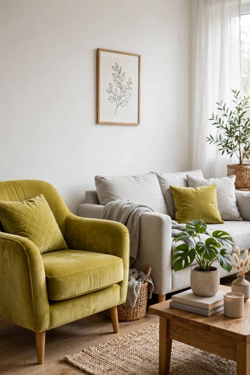
Yellow-leaning chartreuse — citron, lime-zest, the colour of new leaves in hard sun — is the extrovert: warm, sharp, modern in feeling, happiest with white, grey, navy and black in tailored rooms. Green-leaning chartreuse — moss-citron, young-leaf, the colour of a shaded garden in spring — is the introvert of the pair: cooler, more organic, happiest with timber, cream, stone and the earthier neutrals. Confusing the two is the commonest buying error: a cushion chosen as the first arrives home as the second, because the lean shifts with light and with neighbouring colours.
Choose the lean from the room, not from preference alone
A cool, north-facing room usually takes the yellow-leaning family better, borrowing its warmth; a sun-drenched room can afford the green-leaning family, which sunlight will warm for free. The living room ideas discipline applies to colour as to layout: the room’s own conditions choose first, taste chooses second, and the schemes that last obey both.
Keep one lean per room
The two families are cousins, not twins, and side by side they quarrel — each makes the other look like a mistake. One lean per room, repeated in its accents, reads as intention. The other family can live in another room, where the light and its partners suit it.
4. Proportions: A Colour of Teaspoons

The guide’s central law is quantity. In its vivid form, chartreuse succeeds in small, deliberate doses against a larger calm field: the cushions on a grey sofa, one chair in a navy room, a row of ceramics on a timber shelf, the inside of a lampshade, a single door. Its failures are almost all failures of area — the colour asked to cover what its brightness cannot sustain. Treat vivid chartreuse as the scheme’s exclamation mark: a sentence needs one, a paragraph of them is unreadable, and a room obeys the same grammar.
The accent ladder: objects, textiles, furniture, surfaces
Climb the ladder of commitment in order. Objects first — vases, books, a bowl — to test the lean and the light. Textiles next, then a single upholstered piece, and only then, if the room still asks for more, a painted surface. Each rung is reversible until the last, and most rooms find their correct dose two rungs below the one enthusiasm first proposed.
Repeat the accent at least three times, in different materials
One chartreuse object is an accident; three, in ceramic, fabric and glass or paint, are a scheme. Repetition is what turns the colour from a stray note into the room’s signature, and it costs little — the repetitions should be small, spread across the room’s sightlines, and never identical in scale.
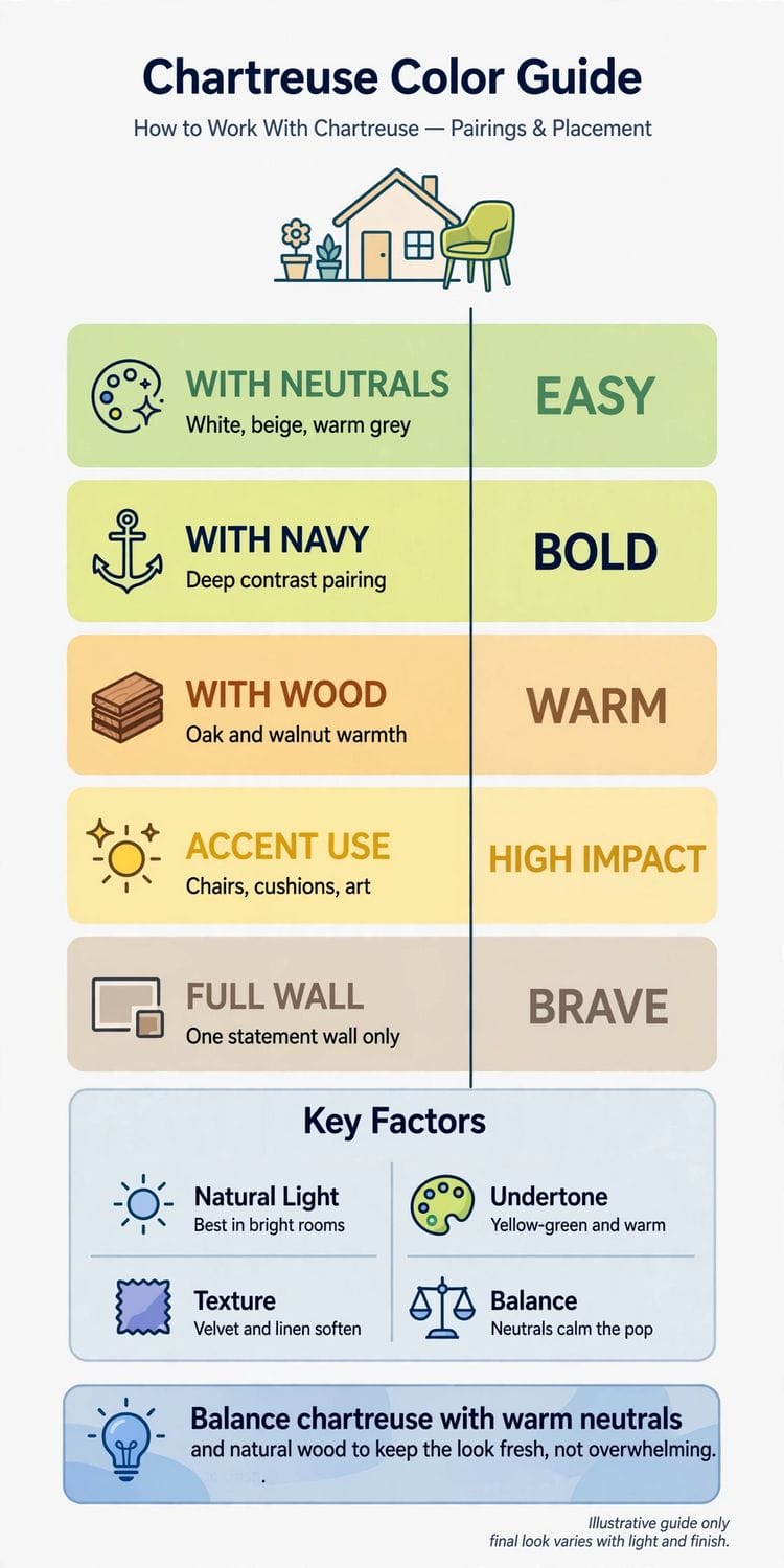
5. Pairings That Steady It: Neutrals, Darks and Timber
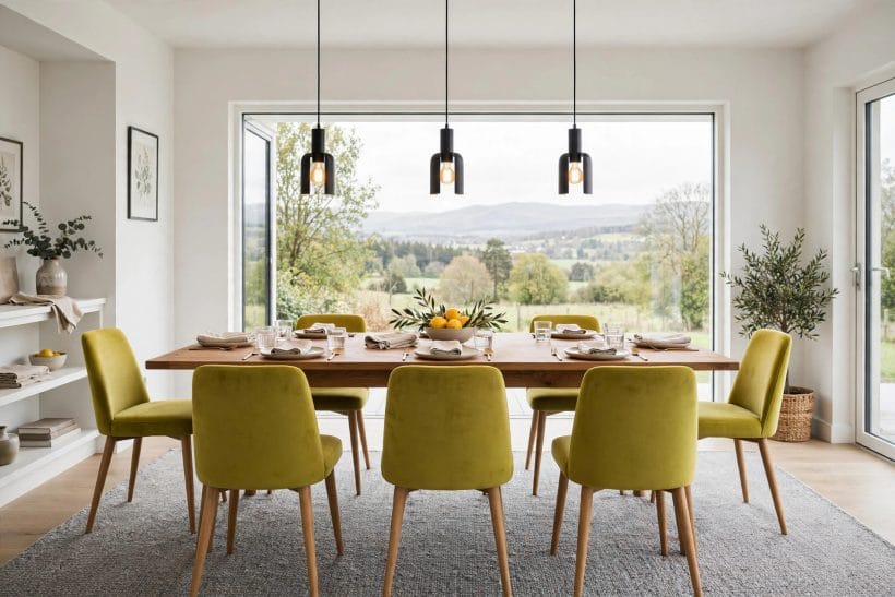
Chartreuse is only ever as good as its partners. White sharpens it into freshness; warm grey and greige calm it into tailoring; charcoal and black give it a gallery’s drama and are its most forgiving ground after dark. Navy is its classic dark partner — the deep blue absorbs the colour’s energy and returns elegance — while plum and aubergine, its near-complements, make it glow in schemes that want richness rather than freshness. Natural timber, especially mid and warm tones, earths both families, and stone and linen keep the whole arrangement honest.
The green family’s own neighbours need care
Other greens can sit beside chartreuse when they are clearly deeper or greyer — forest, sage, olive — giving a layered, garden-like scheme. Equals are the danger: two greens of similar brightness and different lean fight continuously. In the planted version of the same lesson, the outdoors shows the colour at its most natural, which is why the green exterior home ideas survey’s layered plantings read so calmly beside it.
Metals set the colour’s temperature
Brass and gold warm chartreuse toward luxury and suit the green-leaning family in evening rooms; chrome and steel sharpen the yellow-leaning family toward the modern and graphic. Black metal in thin lines — frames, legs, edging — is the colour’s eyeliner, giving its brightness a tailored boundary in either temperature.
6. Pairings to Handle With Care
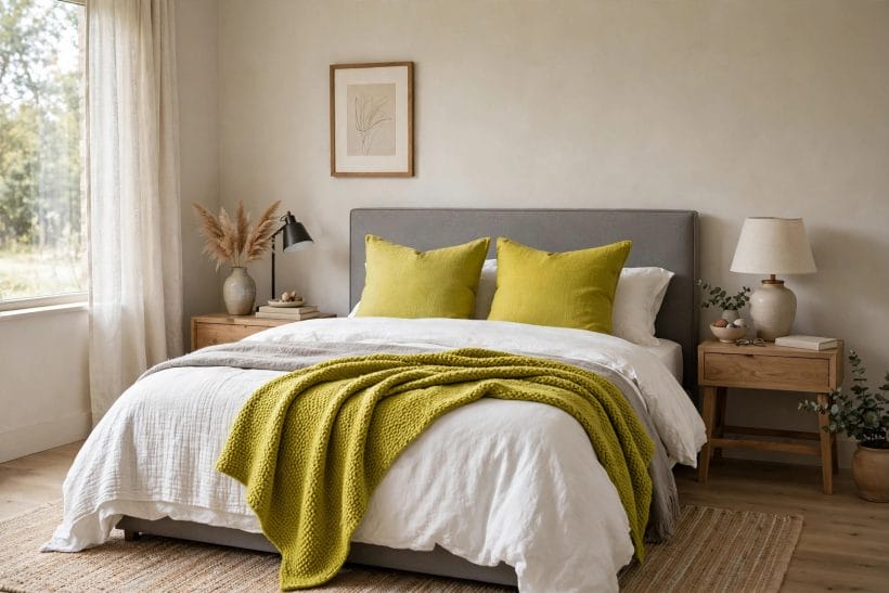
Candour is a colour guide’s duty, so the difficult partnerships deserve their own section. Pastels beside vivid chartreuse tend to look washed out and slightly ill, each exposing the other’s weakness; if a soft scheme is the aim, the muted family is the honest route. Bright red and orange compete at the same volume and the room becomes a shout in two languages — small, deep notes of rust or oxblood are a different, calmer matter. And large areas of chartreuse beside large areas of its fellow brights — turquoise, fuchsia, cobalt — belong to exhibition spaces and the very brave; a home that must be lived in daily should let one bright speak at a time.
Brown and beige can either save it or sink it
Deep browns — walnut, leather, dark timber — ground chartreuse beautifully. Pale beiges, chosen carelessly, can make it look grubby, as if the colour were a stain the room had acquired. The difference is contrast: the neutral must be clearly darker, clearly lighter or clearly greyer than the colour, never its near neighbour in tone.
Pattern with chartreuse in it should carry the scheme’s other colours too
A fabric or paper that holds chartreuse alongside the room’s navy, grey or timber proves the palette in a single piece and does the pairing’s diplomacy for you. A pattern of chartreuse alone, on white, is the bolder commitment and should be counted as the room’s one brave surface, with everything else plain.
7. Walls, Cabinetry and the Brave Surfaces
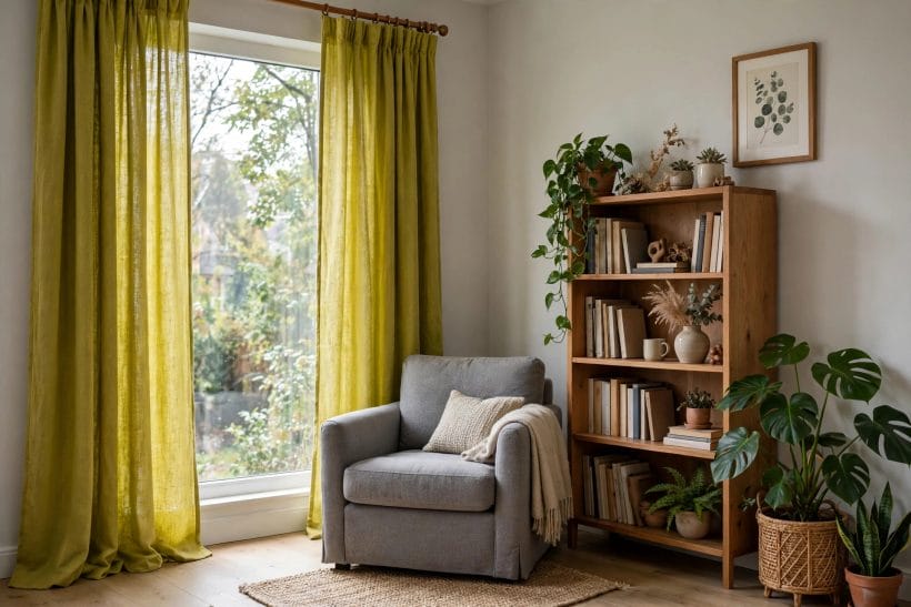
When chartreuse is promoted from accent to area, the muted family and the well-lit room are its conditions. A muted chartreuse wall behind timber, white and navy is springlike and liveable; the same wall in a small, dim room is a endurance test. Cabinetry is the colour’s most successful large role — kitchen units in a muted citron, steadied by stone or timber worktops and plenty of white, have the confidence of a colour that knows it is the room’s whole personality, an effect the kitchen ideas tradition reserves for its bravest schemes. A single door, a stair wall or the inside of an alcove or bookcase are the middle commitments: area enough to matter, bounded enough to forgive.
Paint the inside of things
The backs of shelves and cabinets, the inside of a wardrobe or a porch ceiling give chartreuse a framed, jewel-like role — discovered rather than announced — and they are the easiest brave surfaces to reverse. Rooms that love the colour often collect these interior flashes the way gardens collect spring bulbs: briefly seen, disproportionately cheering.
One brave surface per room is the working limit
Wall or cabinetry or a large patterned paper — choose one. Two brave surfaces turn the colour from the room’s personality into its climate, and climates are what the muted family, generous light and dark steadying partners are for. The limit is not timidity; it is how the colour keeps its power to delight.
8. Room by Room: Where the Colour Earns Its Keep
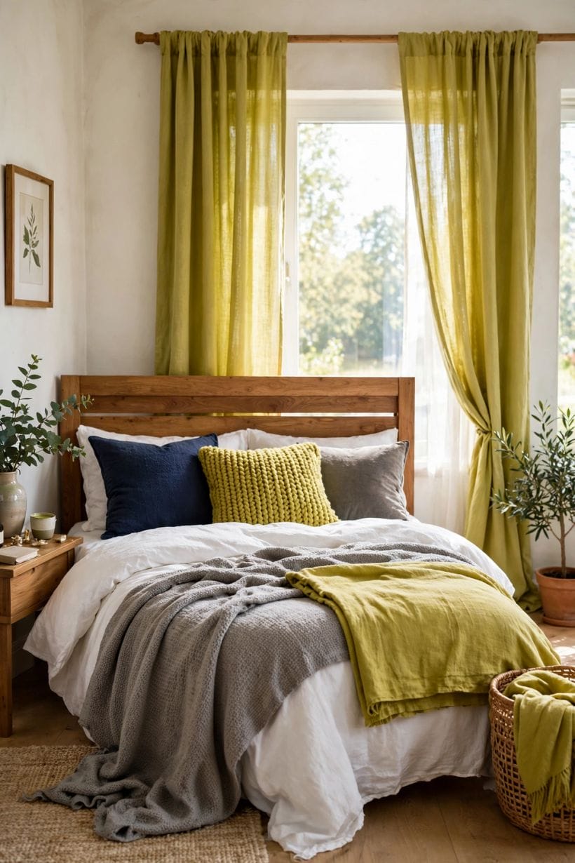
Kitchens take chartreuse best among the hardworking rooms — it is a food colour, a herb-and-citrus colour, and cabinetry or a tiled splashback in its muted family sits naturally among timber, steel and white. Living rooms take it best as upholstery and art against calm bones, after the pattern of the bedroom ideas discipline of dressing before rebuilding. Bedrooms ask for its softest handling: the colour’s energy is a morning gift and an evening argument, so bedrooms usually take it in small, removable doses — a throw, cushions, a single chair — unless the household genuinely rises with the lark and wants the room to rise too.
Bathrooms and cloakrooms are its natural theatre
Small, briefly occupied, mirror-lit rooms flatter bold colour, and chartreuse in a cloakroom — walls or a vanity in the muted family, brass and white beside it — is the pairing’s most reliable drama. The bathroom ideas principle that small rooms forgive bravery applies with full force: the colour’s risk shrinks with the room.
Children’s and working rooms can spend its energy honestly
A study, studio or playroom, where alertness is the room’s job, can take chartreuse at a volume a bedroom should refuse — a wall in the muted family, vivid accents in the working zone. The colour’s wakefulness, aimed at work, is a tool; aimed at rest, it is a disturbance. Room purpose, as always in this guide, grants or withholds the permission.
9. Light, Testing and Living With the Colour

Chartreuse is the most light-dependent colour in the common palette, and its testing rules are therefore this guide’s strictest. Samples must be large, placed where the colour will live, and judged at morning, noon and lamplight, beside the partners it will keep. Daylight from a cool direction can push the yellow family green and the green family murky; warm lamplight can push both toward a glow that flatters the scheme or a harshness that ends it. No chartreuse decision made from a small card, in a shop, has any authority at all.
Live with the accent before buying the area
A fortnight with the cushions and ceramics will tell a household what no sample can: whether the colour’s energy is a pleasure at breakfast, whether it tires by evening, whether guests’ compliments sound convinced. Chartreuse schemes fail by enthusiasm outrunning acquaintance; the accent ladder in the proportions section exists to make acquaintance cheap.
Seasonal adjustment is the colour’s kindness
Because its best roles are accents and single surfaces, a chartreuse scheme can be tuned with the year — fuller in spring, when the colour outside the window agrees with it, quieter in winter, when a household may swap a cushion cover and let the navy and timber lead. A colour that can be seasonally rested never has to be ripped out in a fit of February.
10. Costs and Pulling It Together
The costs of working with chartreuse divide sharply by rung. At the accent rungs — objects, textiles, a chair — the colour is inexpensive and wholly reversible, and its guidance can be followed for the price of a few cushions. At the surface rungs — paint, tile, cabinetry — it costs what any quality finish costs, with the added premium that mistakes are conspicuous: a wrongly leaned wall is repainted at the usual rates and an unusual depth of regret. The guide’s economics therefore mirror its aesthetics — test cheap, commit late, and let the permanent money follow a fortnight of evidence. This article attaches no figures; the honest quotation is always the one for your own room, your own surfaces and your own chosen rung.
Pull the colour together in order: name its lean, yellow or green; choose its family, vivid for accents or muted for areas; appoint its partners — a calm neutral field, a dark anchor, timber for earth; climb the accent ladder slowly, repeating the note three times in different materials; grant it one brave surface at most; and judge every step in the room’s own light, at the room’s own hours. Worked that way, chartreuse stops being the colour people warn each other about and becomes what it is in the garden every spring: the freshest note in the composition, and the one the whole scheme is remembered by.
Final Considerations
Every palette needs a colour that is awake. Rooms composed entirely of the calm and the safe are pleasant the way a held breath is pleasant; chartreuse, in its teaspoon, is the breath released — the note that makes the greys look tailored rather than timid and the navies look deep rather than merely dark. Its reputation for difficulty is really a reputation for honesty: it refuses to be ignored, and schemes must therefore be decided rather than drifted into.
So buy the cushion first. Live with it through a fortnight of mornings and lamplight. If the room keeps smiling — and rooms do, visibly, when the colour is right — climb one rung more. That is how the bravest colour in the box becomes, of all things, a careful household’s favourite.



0 Comments