

Pink and blue should not work as equals — one is warmth, the other is cool; one advances, the other recedes — and yet set side by side, each makes the other look more itself. It is the prettiest argument in the colour box, and the easiest to lose by using too much of both.
This colour-combination article works the pink-and-blue pairing properly: which shades, in which proportions, on which surfaces, room by room — the pretty colour combo treated as a discipline rather than a mood, within the wider home design ideas collection.
1. Blue and Pink at a Glance
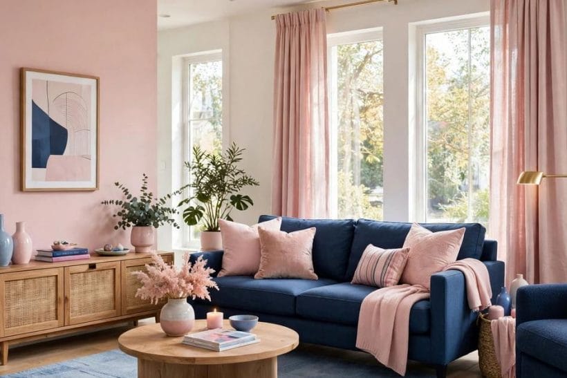
Pink and blue, as a colour combination, pairs a warm red-family colour with a cool one, and its whole behaviour follows from that tension. Pink — from palest blush through rose to deep raspberry — brings warmth, softness and a flattering, skin-friendly light; blue — from powder through denim to navy — brings calm, depth and recession, the sense of walls stepping back. Used together with a neutral mediator (white, cream, warm grey or natural timber), the pair can be nursery-gentle, tailored and grown-up, or dramatically theatrical, depending almost entirely on shade and proportion rather than on the colours themselves. Its attributes are therefore choices: the depth of each colour, the ratio between them, the temperature of the neutral that separates them, and the light the room actually receives. This article keeps its guidance at that general, checkable level — how the pair behaves, not which named paint to buy.
| Question | Short answer |
|---|---|
| Why do pink and blue so often end up looking childish? | Proportion and shade, not the colours. Equal areas of pastel pink and pastel blue, with no neutral and no depth anywhere, reproduce the nursery shorthand exactly. The grown-up version keeps one colour clearly in charge, lets the other answer in smaller areas, adds a deep or neutral anchor — navy, charcoal, timber, brass — and lets white or cream do the separating. |
| Which colour should lead? | The room’s light decides first. In a cool, north-facing room, pink leading warms the whole scheme and blue becomes the calming answer. In a bright, warm room, blue leading keeps the scheme fresh while pink supplies the warmth it would otherwise lack. Either way, lead clearly: an undecided room, split evenly, pleases nobody. |
| What neutral mediates the pair best? | White for freshness, cream for softness, warm grey for tailoring, and natural timber for earthiness — all four work, and each changes the pair’s character more than most shade changes do. The mediator is not a background extra; in most successful pink-and-blue rooms it covers the largest area of all. |
| Does the pair suit a bathroom? | Beautifully — blue’s long association with water and pink’s flattering light beside mirrors are both at home there. The dedicated survey of blue bathroom ideas works the blue-led version in depth; this article’s bathroom guidance stays at the pairing level: blue as the room’s cool ground, pink in towels, ceramics and the warm details. |
2. Why the Pair Works: Warmth Held Against Coolness
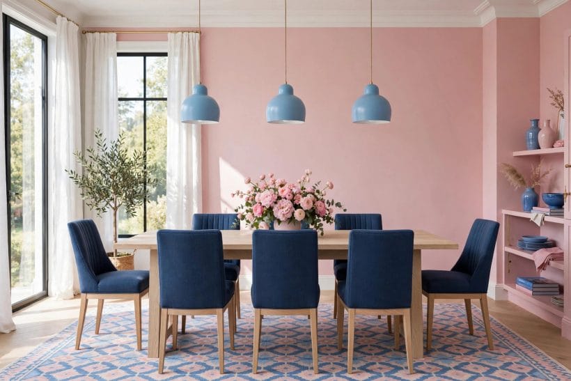
Colour theory gives the pairing its backbone. Pink is a tint of red, the warmest family in the box; blue is the coolest. Set together, they create the gentle vibration decorators call complementary tension without the shout of true complements like orange and blue. Pink advances — a pink chair seems nearer than it is — while blue recedes, making a room’s walls feel further away. A scheme that puts receding colour on the architecture and advancing colour on the objects people sit on, touch and gather around is working with the room’s own optics.
The pair flatters people, which most pairs do not
Pink near skin is famously kind — it is the colour of health in a cheek — and blue is the colour most people name as restful. A room that seats its occupants against blue and dresses them in pink light, rose textiles and warm wood is flattering its company in both directions at once. It is a large part of why the pairing survives every fashion cycle that tries to retire it.
Sweetness is a dosage problem
Everything the pairing is mocked for — sweetness, prettiness, the nursery — is a failure of dosage and depth, never of the colours themselves. Keep one shade deep, one surface tailored, one material grown-up — linen, wool, timber, brass, stone — and the same two colours turn composed. This article returns to dosage in every section, because it is the whole craft of the pair.
3. Choosing Your Pink: Blush, Rose and the Deep Reds
Pink is not one colour but a staircase. At the top, blush and shell — pinks so pale they behave almost as warm neutrals, changing with the light from cream to rose. In the middle, the true roses and corals, cheerful and unmistakable. At the bottom, raspberry, cerise and the dusty, brown-leaning pinks that read as near-relatives of terracotta and oxblood. The staircase matters because pink’s role changes with its depth: pale pink can cover walls, mid pink covers furniture, deep pink is best spent in accents and single brave pieces.
Dusty pinks are the grown-up shortcut
A pink with grey or brown in it — dusty, muted, plaster-toned — pairs with blue almost without effort, because the muting does the mediating work inside the colour itself. Such pinks suit walls and large upholstery in grown-up rooms, where a cleaner, sweeter pink would need more neutral around it to stay composed.
Test pink in the room’s own light, morning and evening
Pink is the most light-sensitive colour in the common palette: flattering at noon, it can turn sugary under warm evening lamps or grey and tired in cold northern light. Samples belong on the wall and beside the blue they will live with, judged at the hours the room is actually used. No pairing decision in this article repays testing more.
4. Choosing Your Blue: Powder, Denim and Navy
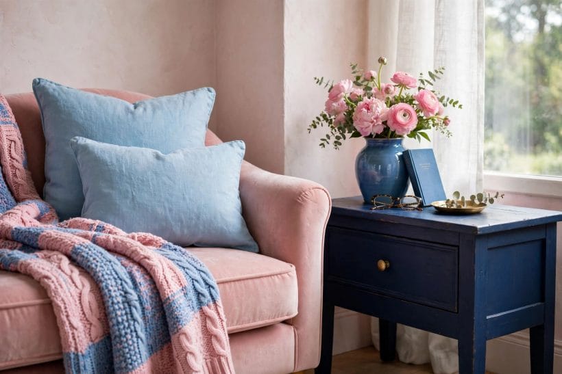
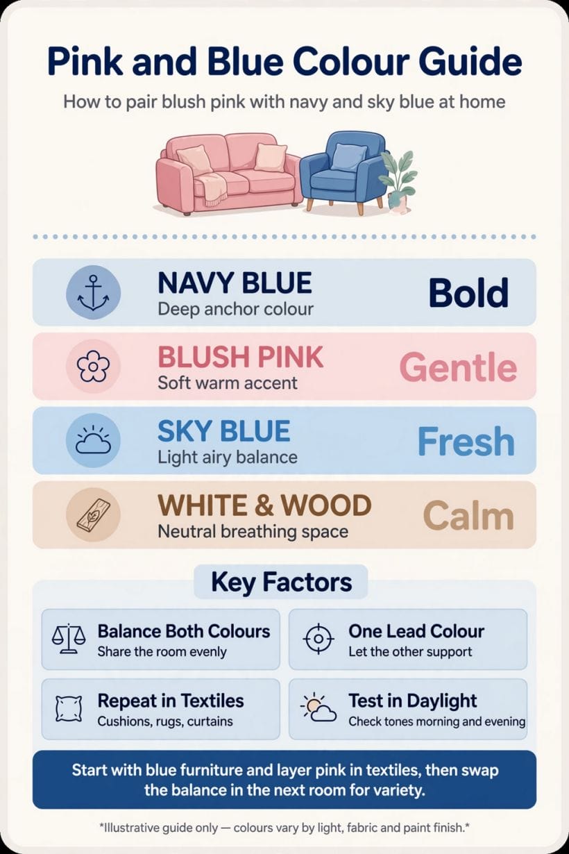
Blue’s staircase runs from powder and sky — pale, airy, receding furthest of all — through the mid blues of denim, cornflower and Wedgwood cheerfulness, down to navy and ink, which behave less like a colour than like a dark neutral with a soul. As with pink, depth assigns the job: pale blue is a wall and ceiling colour, mid blue a furniture and tile colour, navy an anchor — the sofa, the cabinetry, the one deep note that lets everything paler stay fresh without turning insipid.
Navy is the pair’s chaperone
When a pink-and-blue scheme threatens sweetness, navy is the correction that keeps both colours: a navy sofa, rug or cabinet run adds the depth the eye was asking for, and pink beside navy turns elegant rather than cute. Notice that the correction is more blue, deepened — the pairing heals itself from within its own family.
Green-leaning and grey-leaning blues behave differently
A blue with green in it — teal’s paler cousins, duck-egg — leans summery and pairs with pinks warmly and easily. A blue with grey in it leans tailored and northern, asking for warmer pinks and warmer neutrals to stay kind. Naming which way your blue leans, before choosing its pink, prevents the scheme’s commonest quiet failure: two colours that are individually lovely and mutually cold.
5. Proportions: The Ratios That Keep the Pair Grown-Up
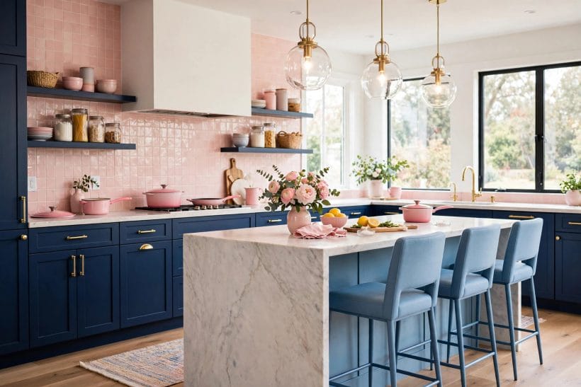
Proportion is where the pairing is won. The reliable pattern is a clear hierarchy: one colour leads across the room’s largest coloured areas, the second answers in clearly smaller areas, and a neutral — very often the largest area of all — separates and rests them. Equal shares are the nursery ratio and should be chosen only where the nursery is honestly the aim. Within the hierarchy, depth should also be unequal: if pink is pale, let blue go deep somewhere; two pastels at equal depth and equal area is the precise formula for the look this article exists to help you avoid.
Swap the lead to change the room, keep the pair to keep the home
Across a home, the pairing unifies best when its lead alternates: a blue-led living room, a pink-led bedroom, a bathroom where they meet over white — the family resemblance holds the house together while each room keeps its own temperature. The grey and blue living room article shows the neighbouring discipline, where grey takes the mediator’s role inside a single room.
Small rooms want the paler staircase, deep rooms can spend depth
In a small room, keep both colours in their paler halves and let depth appear in objects — a navy cushion, a raspberry throw — that can be changed with the seasons. A large, light room can spend depth on architecture: navy cabinetry, a deep pink wall. Depth on objects is rented; depth on walls is bought. Choose accordingly.
6. Walls, Floors and the Big Quiet Surfaces
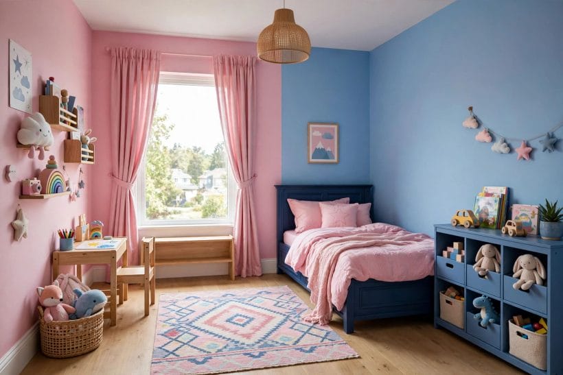
The big surfaces set the scheme’s temperature before any furniture arrives. Pink walls wrap a room in warmth and flatter everything in it, suiting bedrooms and living rooms that are lived in after dark — the territory of the bedroom ideas collection. Blue walls cool and expand a room, suiting bright spaces and rooms used by day. Floors should generally mediate rather than join the argument: pale timber, warm neutral carpet or stone lets either wall colour lead, while a strongly coloured floor commits the room before its furniture has had a vote.
Ceilings and woodwork are the pair’s quiet frame
White or the palest blush on a ceiling keeps a pink-walled room from closing in; the palest blue-grey on a ceiling over pink walls is the period-house trick that cools the scheme by a degree. Woodwork in a clean warm white frames both colours; woodwork painted in the deeper of the two is the tailored, dramatic option, best kept to rooms with the light to carry it.
Tile is the pair’s most permanent playground
In kitchens and bathrooms, tile fixes the pairing for years, so its proportions deserve the most care: blue tile with pink kept to towels, ceramics and paint, or pink tile softened by blue’s smaller answering notes and a great deal of white. The bathroom ideas collection shows how much of a room tile can carry; in this pairing, let it carry one colour and lend the other to everything changeable.
7. Furniture, Textiles and Pattern
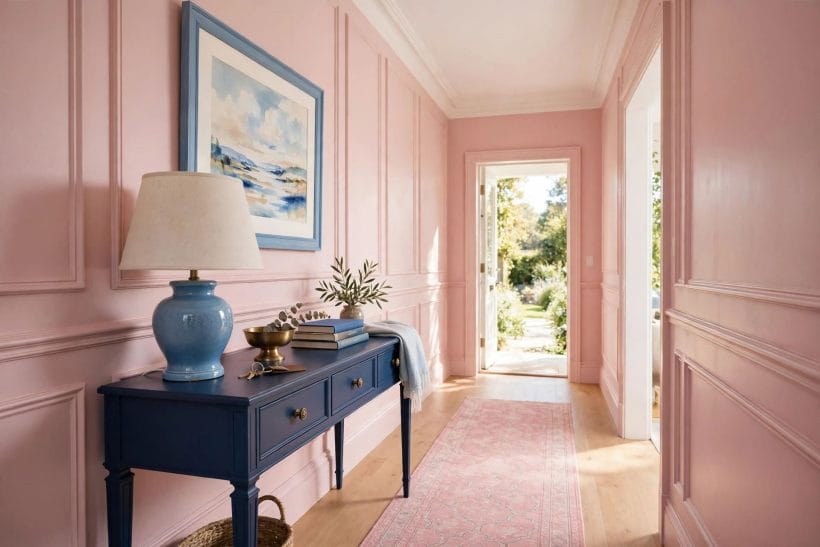
Furniture is where the answering colour usually lives. A blue room takes a pink sofa or pair of chairs as its warmth; a pink room takes blue upholstery as its calm. Timber furniture mediates between them, upholstered pieces carry the colours, and textiles — cushions, throws, curtains, rugs — fine-tune the ratio season by season, which is the pairing’s great practical kindness: its proportions can be rebalanced for the price of a cushion cover. In the living room ideas tradition, this is the layer where a scheme becomes a home.
Pattern can marry the pair inside a single fabric
A floral, stripe or check that carries both colours does the scheme’s diplomatic work in one move, proving the shades belong together and giving the eye a pattern-sized portion of each. Choose the pattern first and pull both room colours from it, and the pairing’s hardest decision — which pink, which blue — has been made by a fabric designer who already solved it.
Keep one textile story per room
The pairing is busy enough without competing patterns. One patterned fabric, its colours repeated in plain textiles around the room, is the composed formula; two patterns are welcome only when one is a quiet stripe or check acting as a neutral. Prettiness curdles fastest at the textile layer, and restraint there lets the colours themselves stay generous.
8. Room by Room: Living, Sleeping, Bathing and Children
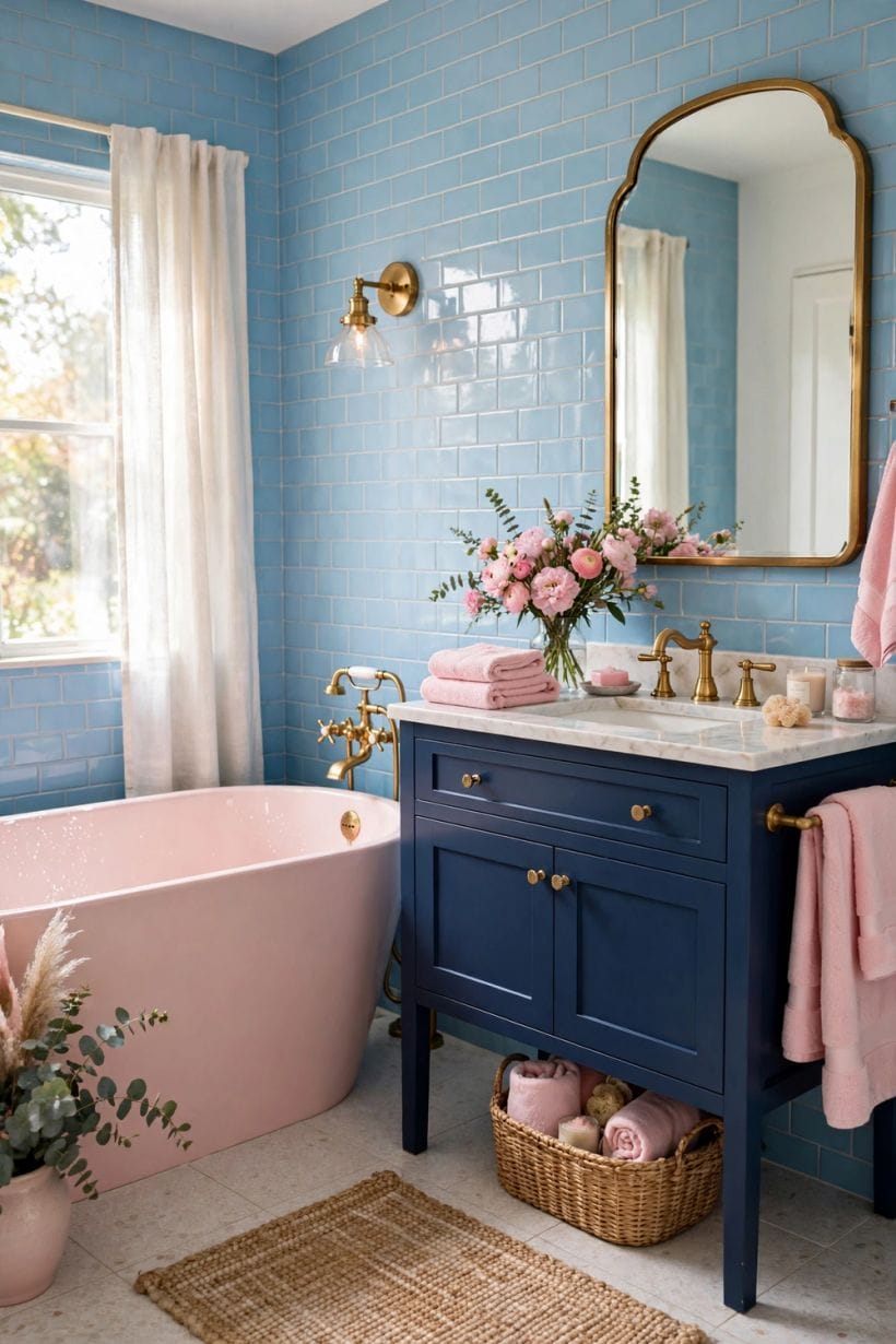
In living rooms, let the seating carry one colour and the walls the other, with the mediator on floor and ceiling; the scheme’s social flattery works hardest here. In bedrooms, pink usually deserves the lead — its warmth and skin-kindness belong where faces are unmade-up and mornings are early — with blue in bedding, curtains or a single calm piece supplying the cool note that sleep prefers. Children’s rooms may honestly use the equal, pastel version the rest of this article edits: it is a short-lived room, and its sweetness is seasonally appropriate — but even here, one deep or timber anchor keeps the room pleasant for the adults who also live in it.
Bathrooms: blue leads, pink attends
The bathroom is blue’s home ground — water, tile, cleanliness — and the pairing’s most reliable room: blue in tile, cabinetry or paint, pink in towels, a stool, ceramics and the warm side of the lighting. The result flatters the mirror’s subject daily, which no other room in the house can promise so directly.
Hallways and small rooms are the pair’s testing ground
A hall, cloakroom or box room is where to rehearse a braver version — deeper pink, bolder blue, the dramatic woodwork option — because small rooms forgive drama and are lived in briefly. A household unsure of the pairing should start where the commitment is smallest and the lesson quickest.
9. Light, Metals and the Finishing Touches
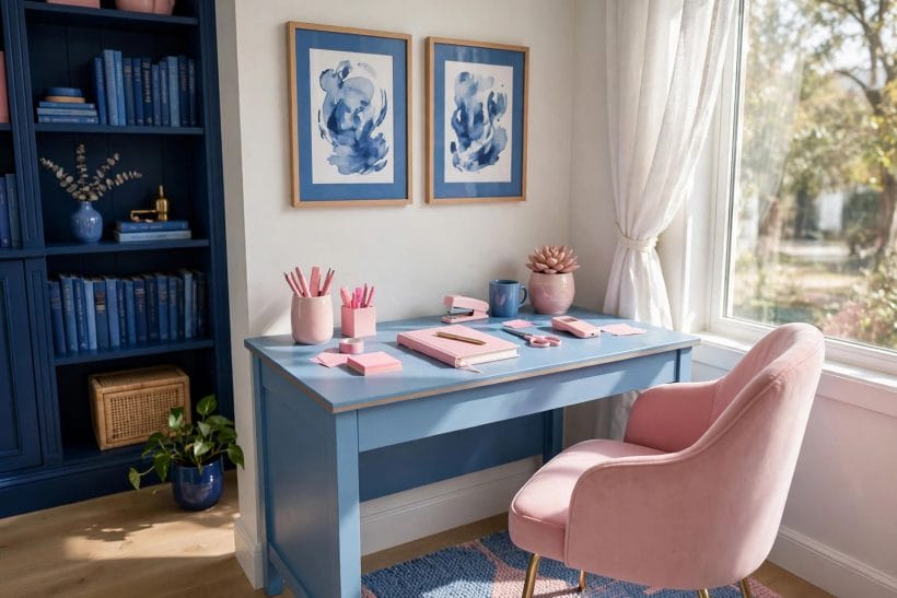
Light rewrites both colours hourly. Daylight from a cool direction greys pink and deepens blue; warm evening light melts pink toward coral and can turn a mid blue greenish. The scheme should therefore be judged, and its lamps chosen, for the hours of real use: warm-toned bulbs restore pink’s kindness after dark, while blue in a lamplit room benefits from the warmer pinks and brass around it. Metals are the scheme’s jewellery and its thermostat — brass and gold warm the pair toward elegance, chrome and nickel cool it toward freshness, and black in thin lines gives either version its tailored edge.
Art and objects are the final ratio adjustment
A painting, a vase, a stack of books in the answering colour, placed where the scheme feels unbalanced, corrects a room more cheaply than any repaint. Finish the room, live in it, and let these small ambassadors of the second colour be posted one at a time until the room settles — the pairing’s last proportion decision should be made by the eye in the finished room, not by the chart in the empty one.
When the pair is not working, change depth before changing colours
Schemes that fail are usually repaired fastest by deepening or lightening one side — navy introduced, or pink paled toward blush — rather than by abandoning the pairing. The colours were chosen because they pleased you together; it is their dosage, almost always, that is asking to be corrected.
10. Costs and Pulling It Together
The costs of the pairing are the costs of colour itself, which is to say mostly paint, textile and tile money, spent in the usual order of permanence: cheapest and most changeable in cushions and towels, dearest in tile, cabinetry and upholstery. The pairing’s economic virtue is its reversibility — because its proportions can be rebalanced at the textile layer, a scheme can be corrected, deepened or lightened season by season without rebuilding the room. Spend the permanent money on the colour you are surest of, at the depth the room’s light supports, and rent the rest of the argument in fabric until the room has told you its mind. This article attaches no figures, because the honest cost is the one quoted for your own surfaces.
Pull the pairing together in order: choose which colour leads, from the room’s light; set both colours’ depths, unequal on purpose; appoint the neutral mediator and give it the largest share; place the lead on the architecture and the answer on the furniture; marry them once in a patterned fabric; add navy or timber as the anchor; and finish with metals and objects posted one at a time. A pink-and-blue room assembled in that order is not a nursery that grew up by accident. It is one of the oldest and kindest schemes in the house, composed on purpose.
Final Considerations
Fashions will keep announcing that pink and blue are over, or back, or over again, and the pairing will keep outliving the announcements, because it rests on something sturdier than fashion: the way warm and cool colours behave in each other’s company, and the way people look and feel inside that behaviour. Schemes built on optics do not expire.
So choose your depths, appoint your mediator, and let the two colours argue gently in your rooms for years. Heard at the right volume, it is the prettiest argument in the house — and the only one in which both sides make the other look better.

0 Comments