

Light grey is the most chosen colour in modern homes and the most quietly misunderstood: half the rooms painted with it were aiming at a different grey entirely.
This guide teaches the one skill the colour demands — reading the undertone — and then pairs, warms and places light grey room by room, in British spelling and plain terms.

1. Light Grey at a Glance
Light grey is a pale neutral with an undertone — a lean towards blue, green, violet, pink or warm stone — inherited from the pigments that made it. Its attributes are that lean, the light it lives in, the whites and woods it is paired with, and the textures that decide whether it reads warm or cold. This guide owns the colour itself: grey as a finished living-room scheme belongs to gray living room ideas, grey walls as a single-room decision to gray living room walls, and neither is re-taught here.
| Question | Short answer |
|---|---|
| Why does my light grey look blue (or pink)? | Because of its undertone: the lean was in the tin all along, magnified by your light. Blue leans show in cool light, pink and violet leans under warm bulbs. The fix is choosing by undertone first and paint name second — the method this whole guide teaches. |
| Which light grey suits a north-facing room? | A warm-leaning or green-leaning one. North light is cool and indirect, and it doubles a blue grey’s chill; warm leans cancel it. Judge the test patch on an overcast day, when the room’s light is at its coldest and most honest. |
| What white goes with light grey walls? | The white must be chosen against the actual grey, on the same wall: bright whites make grey read warmer, warm whites make it read cooler. There is no universal pairing — only the pair tested together in the room’s own light. |
| How do I stop a grey room feeling cold? | Texture and temperature, not more grey: natural timber, one warm metal, matte fibrous textiles and a single warm accent colour. Cold grey rooms are almost always smooth grey rooms — the paint is rarely the culprit. |

2. What Light Grey Actually Is: A Family, Not a Colour

Grey is made by taking a colour’s strength away, and what remains is never perfectly empty. Every light grey leans — towards blue, towards green, towards violet or pink, or towards the warm, stony middle — and that lean, the undertone, is the whole subject of this guide. Two tins both honestly labelled light grey can sit a room apart from each other, one crisp and coastal, the other soft and almost greige, and neither tin is lying. The work is learning to see the lean before the walls do.
The blue-leaning greys
Blue-based light greys read cool, clean and slightly formal. They flatter bright, sunlit rooms and modern furniture, and they are the greys that can turn icy in a dim north-facing room. Against them, whites look brighter and woods look more orange — a pairing effect this guide returns to in every section.
The green-leaning greys
Green-based greys are the landscape greys: softer, earthier, kinder to plants, linen and old timber. They sit happily beside gardens and in rooms that face one, and they warm more gracefully under evening lamplight than their blue cousins do.
The violet and pink-leaning greys
A whisper of red in the mix gives the romantic greys — lavender-grey, blush-grey — which flatter skin, candlelight and bedrooms. They are the easiest greys to live with and the easiest to misjudge in the tin, where the pink can hide until a whole wall is wearing it.
The true and warm neutrals
The balanced greys lean almost nowhere, and the warm greys — greige’s paler end — lean towards stone and sand. These are the diplomats of the family: they pair with nearly everything, which is precisely why they can also drift towards dullness if a room gives them nothing to answer.
3. Reading Your Light: The Room Decides the Grey

A grey is a mirror for the light it lives in. The same paint reads blue at a north window, warm at a south one, and greener beside a garden. Choosing light grey is therefore choosing it in situ — on the room’s own walls, at the room’s own hours — and any method that skips the room and trusts the colour card is gambling.
North light and the cold-room problem
North-facing rooms receive cool, indirect light all day, and blue-leaning greys double its chill. In these rooms the warm and green-leaning greys earn their keep, and the test patch must be judged on the greyest day, not the sunniest.
South light and the washed-out problem
Strong southern sun bleaches pale colours towards white and can make a careful light grey disappear by noon. Here the cooler and slightly deeper greys hold their identity, and a shade that looks stern on the card often proves exactly right on the wall.
Bulbs, lamps and the evening test
Artificial light rewrites grey nightly: warm bulbs soften and yellow it, cool bulbs sharpen and blue it. Judge every test patch twice — once in daylight, once under the lamps the room actually uses after dark — because a sitting room lives most of its life in the second light.
The test-patch discipline
Paint generous patches on more than one wall, live with them through a full day and a full evening, and hold the room’s real fabrics and woods against them. Grey is the colour most betrayed by small samples; the patch is not a delay but the decision itself, made honestly.
4. Keeping It Warm: Texture, Timber and the Anti-Cold Toolkit

The one complaint light grey ever earns is coldness — and coldness is almost never the paint’s fault. It is the fault of everything smooth, shiny and grey arranged together: grey walls, grey sofa, grey rug, glass and chrome. Warmth comes from contrast of texture and temperature, and this section is the toolkit.
Timber as grey’s oldest partner
Natural wood — oak pale or mid-toned, walnut for depth, pine for the cottage register — supplies the warmth grey withholds. A single timber floor or table can carry a whole grey room; this is why grey schemes in timber-floored houses so rarely feel cold.
The warm metals
Brass, bronze and copper light grey the way candlelight lights a face; chrome and polished steel sharpen it towards the clinical. Choosing the metal family is choosing the room’s temperature, and mixing one warm metal through lamps, handles and frames knits the scheme together.
Linen, wool and the matte rule
Grey rooms live or die on touch: washed linen, nubby wool, matte ceramics, limewashed and chalky finishes. Every matte, fibrous surface subtracts cold; every glossy one adds it. When a grey room feels wrong, the fix is usually a throw and a rug, not a repaint.
One warm colour, used once or twice
A single warm accent — rust, ochre, a faded red, a bowl of oranges — gives grey something to be cool against, and the room reads balanced rather than chilly. The accent must be warm in fact, not merely bright: a cold pink will not do this work.
5. Pairings: White, Blue, Colour and the Sibling Lanes

Light grey is the great partner colour, and its partnerships are this guide’s core. The full grey living-room treatment — grey as a room’s whole scheme — is carried by the gray living room ideas lane, and grey walls as a single decision by gray living room walls; here the pairings are drawn tightly so neither lane is re-taught.
Grey with white: the trim question
White against grey is never neutral: a bright blue-white makes grey look warm and creamy, a warm white makes it look cooler and cleaner. Choose the white after the grey, on the same wall, in the same light — trim chosen from a different shop’s card is the commonest pairing failure.
Grey with blue: the classic pair
Blue is grey’s home pairing, from mist-blue cushions on a grey sofa to a fully blue-and-grey scheme. That full pairing has its own post — grey and blue living room — and this guide simply records the principle: keep the blues greyed too, or they will shout over the walls.
Grey with strong colour: the foil effect
Grey exists to make other colours look expensive. Mustard, emerald, aubergine and the boldest guest in this colour-guide series — the subject of the chartreuse colour guide — all sit forward against light grey and look richer for the quiet behind them. The rule is proportion: grey in the large, colour in the deliberate.
Grey with grey: the tonal room
Layering greys — pale walls, mid-grey sofa, charcoal cushion — is the connoisseur’s scheme and the beginner’s trap. It works only when the layers differ in texture as much as in tone; five smooth greys of five depths are still one cold room wearing stripes.
6. Room by Room: Where Each Lean Belongs

Undertone advice turns practical room by room, because each room’s light, hours and purpose differ. The living room is surveyed as the worked example, through the site’s living room ideas pillar and its grey lanes; the other rooms take the same method in miniature.
Living rooms
The sitting room carries grey longest and judges it hardest, in both day and lamplight. Warm and green leans suit most; the scheme is finished by timber, warm metal and layered textiles rather than by the paint alone.
Bedrooms
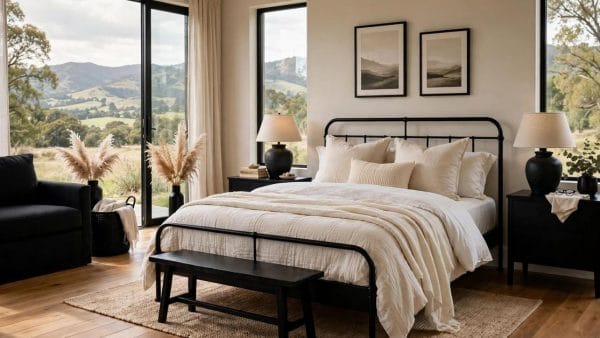
Sleep argues for the soft leans — violet, pink and warm neutral greys — which flatter lamplight and bedding whites. Blue greys can feel wonderfully crisp in a bright bedroom and faintly institutional in a dark one; the evening test decides.
Kitchens and bathrooms
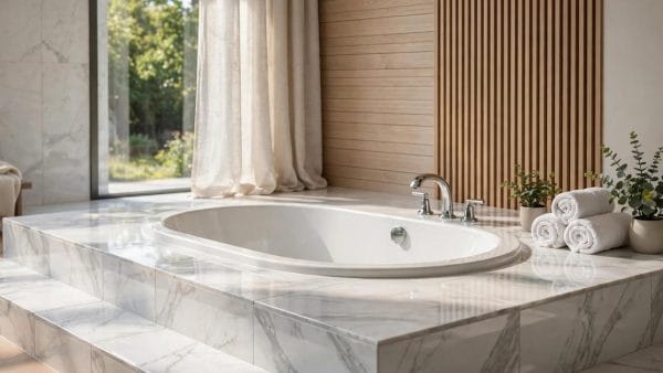
Stone, steel and tile are already grey’s family, so kitchens and bathrooms take cooler leans gracefully. The warmth must then be imported deliberately: timber boards, brass taps, a woven basket — small doses, faithfully repeated.
Halls and small rooms
A pale grey hall is light borrowed all day, and in small rooms light grey’s gift is that it steps back: walls recede, objects advance. Keep the lean warm where the hall has no window of its own, and let doors and trim carry the contrast instead.
7. Paint, Fabric and Finish: The Same Grey in Every Material

A scheme is not one grey but a family of them, repeated across paint, upholstery, curtain, rug and stone — and each material translates the colour differently. Velvet deepens it, linen pales it, glossy paint sharpens it, and a wool rug warms whatever grey it is dyed.
Paint finishes change the colour
Matte and eggshell paints soften light grey and forgive walls; satin and gloss deepen it, sharpen its lean and show every imperfection. The same tin in two finishes can read as two greys, so test in the finish you will live with.
Fabrics first, or paint first?
Either order works if the other is tested against it: hold the sofa fabric against the test patch, not against the colour card. Fabric dyes lean as surely as paints do, and the quarrels between a grey sofa and a grey wall are always undertone quarrels.
Grey in stone, tile and flooring
Stone and tile greys are fixed in a way paint is not — choose them early and let paint follow. A grey floor, whether stone, timber-washed or carpet, sets the room’s base note, and walls a clear step lighter than the floor keep the room feeling lifted rather than sunk.
Curtains and the view between rooms
Window fabric is where a grey scheme meets the weather: curtains in a deeper or warmer grey than the walls frame the light without blocking it, and from the room next door the doorway view should still read as one family. Walk the house’s sightlines with your test fabrics in hand — a scheme that only works inside one room, seen from no other, is a scheme half finished.
8. Mistakes, Checks and the Honest Limits of Grey

Light grey’s failures are famous because they are repeatable. The blue room that was meant to be soft; the scheme that reads as a photograph of a room rather than a room; the rental-white walls repainted a grey that argues with the floor. Each is an undertone or texture failure, and each was visible in the test patch to anyone who waited a day.
The five checks
Name the lean before buying. Test big, on two walls, through day and lamplight. Choose the white after the grey. Count the room’s textures — if they are all smooth, import warmth before repainting anything. And set one warm material or colour deliberately, rather than hoping the room warms itself.
When not to choose light grey
A room with little natural light, cold flooring and north glass may be happier in a warm off-white or a pale stone colour than in any grey, however warm its lean. Grey is a servant colour, not a duty; this guide’s loyalty is to the room, and the honest answer is sometimes a different pale colour entirely.
9. Grey in Small Spaces and Tiny Houses

Small homes are light grey’s natural constituency: the colour’s recession enlarges, its neutrality unifies, and one pale grey carried through a small home’s rooms makes the whole dwelling read as one calm volume rather than a set of interruptions. This is the tiny-house lesson the big houses keep borrowing.
One grey, whole home
In a small dwelling, changing wall colour room by room chops the space; one light grey throughout, varied by textile and timber, stitches it together. Doors and trim in the same family keep the envelope unbroken.
Grey as the background of small-room colour
Small rooms cannot carry colour on every wall, so grey becomes the quiet field against which the one coloured thing — a door, a chair, a curtain — performs. It is the economy of the small home: colour by the object, not by the acre.
The discipline transfers upward without change: the small home simply makes a large home’s grey mistakes impossible to hide, because every wall is always in sight of every other. Choose the lean once, prove it once, and carry it through — in a flat of four rooms as in a house of fourteen, light grey’s whole promise is a calm that does not stop at the doorway.
10. Costs and Pulling It Together
Costs need no figures here, because grey’s economics are simple: the paint itself costs what paint costs, and the expensive mistakes are all repaints — walls redone when the undertone declares itself a week too late. The test patch, the two-wall trial and the evening check are this guide’s entire budget discipline, and they cost a sample pot and a day’s patience. Fabrics and finishes chosen against the tested grey, rather than against a card, complete the saving.
Pull the guide together as one sentence: choose light grey by its lean, prove it in the room’s own light, warm it with texture and timber, and pair it deliberately — and the most forgiving colour in the house will also be the most elegant. The wider colour and room context gathers under home design ideas, where the sibling colour guides and the grey lanes all sit in one map.
Final Considerations
Light grey rewards the patient and betrays the hurried with perfect fairness — it tells you its undertone in the tin’s depths, in the test patch, in the first morning’s light, to anyone willing to look before the whole room is painted.
So begin with three patches, not one colour: a warm lean, a green lean and a blue lean, side by side on the wall that gets the room’s truest light. By tomorrow evening the wall itself will have told you which grey your home has been waiting for, and everything after that is simply painting.


0 Comments