

Blue and grey are the two colours living rooms reach for when they want calm — and the two that most often disappoint, because a cool grey beside the wrong blue does not read as calm at all. It reads as a waiting room. The difference is never the colours. It is whether their undertones were introduced to each other before they were asked to live together.
This article works the pairing only — undertones, proportions, walls, textiles, the warm bridge of wood and metal, and the room’s own light — as the colour-pairing spoke of the living-room cluster whose hub is the living room ideas pillar. It does not tour other living-room styles; it teaches one partnership until you can judge it in any room.
1. Blue and Grey in the Living Room at a Glance
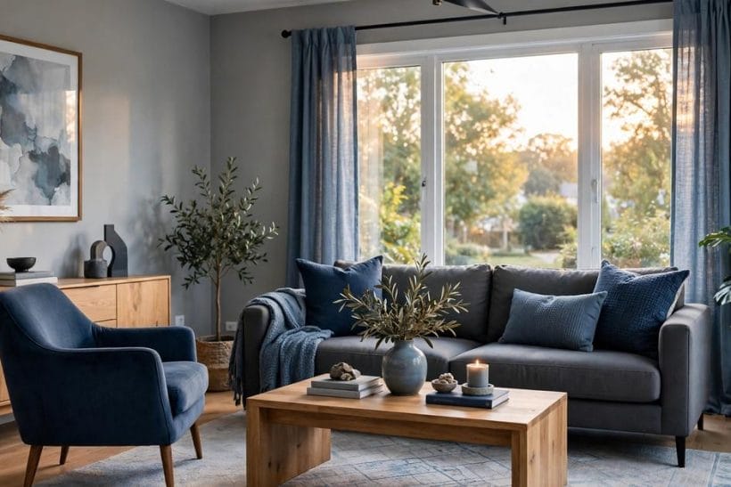
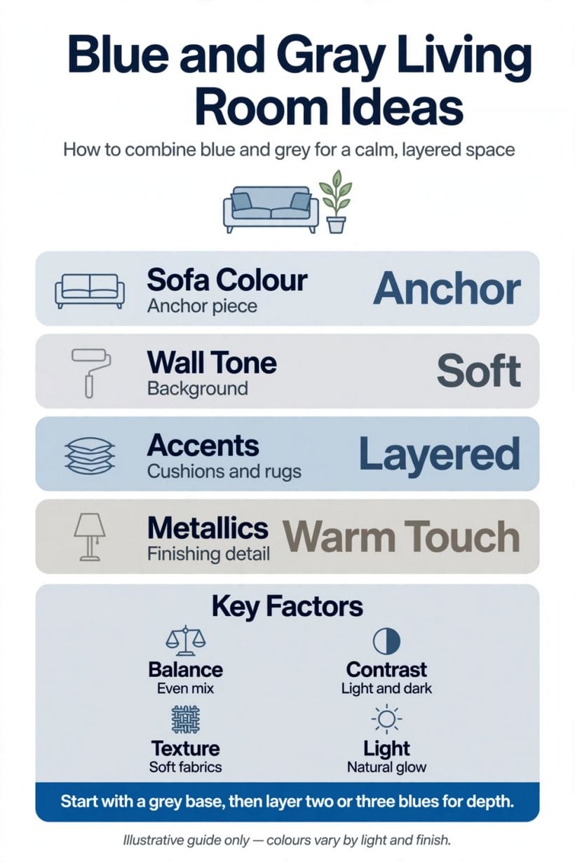
A blue-and-grey living room is a two-colour scheme built from a family of greys — each carrying a warm or cool undertone — and a family of blues, from pale air tints to deep navy, arranged so that one colour leads, the other supports, and warm materials mediate between them. Its success rests on four decisions: matching undertones before matching shades; settling the proportions between the two colours; giving the walls and the largest furniture to the scheme’s quieter register; and testing everything in the room’s actual light, because both blue and grey change character between morning and evening more than almost any other pairing.
| Question | Short answer |
|---|---|
| Why do blue and grey so often look cold together? | Because both are cool colours, and two cools with mismatched undertones — a blue-based grey beside a warm, green-leaning blue, say — fight quietly while the room feels chilly without anyone knowing why. The pairing works when the grey’s undertone leans the same way as the blue’s, and when warm materials are deliberately invited in to mediate. |
| Which colour should lead, blue or grey? | Grey, in most rooms: it is the better field — walls, the largest sofa, the floor’s register — while blue does the expressive work in chairs, cushions, art and one or two chosen depths. Rooms where blue leads can be magnificent, but they are designed rooms, committed on every surface; the grey-led room forgives, and forgiving schemes are the ones households live happily inside. |
| What is the warm bridge, and why does the pairing need one? | The natural materials — mid and warm woods, leather, brass and bronze tones, warm-white textiles, a fire’s glow where there is one — that stand between the two cool colours and the people. Blue and grey describe the room’s weather; the bridge decides whether that weather feels like a bright morning or a corridor. Almost every admired blue-and-grey room is, on inspection, a wood-and-leather room wearing blue and grey. |
| How do I test the pairing before committing? | In the room, at its worst hour. Paint and fabric samples of both colours, together, against the wall that gets least light, judged in the evening under the lamps you actually use. |
2. Read the Undertones First: The Pairing’s One Law
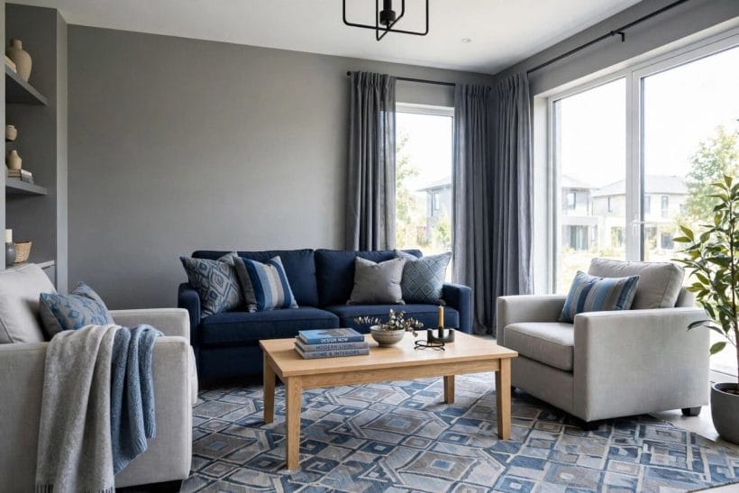
Grey is not a colour but a direction. Every grey leans — toward blue, toward green, toward violet, or toward the warm browns that make a greige — and the lean, invisible on a colour card in isolation, becomes the loudest fact in the room once a true blue stands beside it. A blue-leaning grey beside a clear blue is a chord; the same grey beside a teal-leaning blue is an argument conducted in whispers, felt as unease and blamed on the furniture.
So the pairing is chosen undertone-first. Decide the blue family’s lean — clean and coastal, greyed and misty, deep and inky, or green-touched like the sea-glass shades — then choose greys that lean the same way: blue-greys for the clean blues, soft grey-greens’ neighbours for the sea-glass family, and the deep charcoals whose own blue base lets navy read as richness rather than clash. The grey living room walls lane works the grey family’s range on walls in depth; here the point is narrower — your grey and your blue must be able to stand in the same light.
Test with the largest samples you can get, together, in the room. Undertone is a relationship, not a property — it exists only between the two colours and the light — and the household that tests the relationship rather than the individuals will not be surprised by its own living room.
3. Proportions: Which Colour Leads, and by How Much
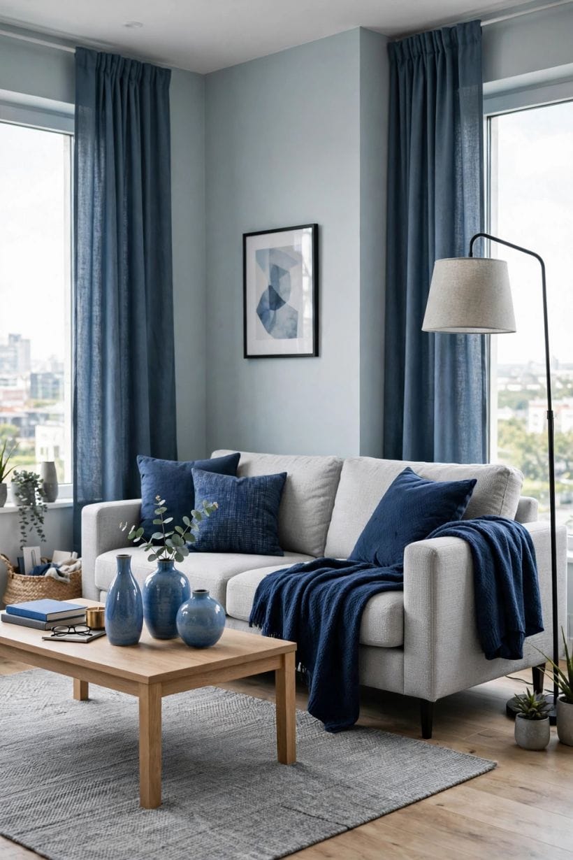
Two-colour rooms fail by equality more often than by choice. When blue and grey hold the room in near-equal shares, every object becomes a vote in an election that never closes, and the eye keeps campaigning. Settle the hierarchy: one colour is the room’s field — the majority of its surfaces — the other is its voice, arriving in fewer, stronger statements. The old decorator’s instinct for a dominant, a secondary and an accent is unfashionable to quote and remains how rooms actually compose.
The grey-led scheme is the forgiving default: grey walls or a grey-cast wall treatment, the large sofa in a grey or grey-leaning textile, the floor neutral beneath — and blue placed where the room wants its emphasis: the pair of chairs, the cushions’ main note, the art’s deepest passage, perhaps a single blue wall where the room’s architecture offers one. The grey living room ideas survey shows the grey field at full stretch; this article’s scheme borrows its calm and spends it on blue.
The blue-led scheme is the committed one: blue walls — most successfully the deep, greyed blues that behave almost as neutrals — with grey demoted to upholstery, stone and metal. It produces rooms of real drama and real mood, and it punishes hesitation: a blue-led room decorated timidly is merely dark. Choose it for rooms with generous light or a deliberate evening character, and let the bridge materials carry more warmth than usual to keep the mood companionable.
Whichever leads, vary the depth within each family. A room of one grey and one blue, flatly repeated, reads as a showroom scheme; the living version layers each colour from pale to deep — mist to slate in the greys, air to navy in the blues — so the pairing feels gathered rather than installed. Depth variety is what lets two colours furnish a whole room without monotony.
4. Walls and Large Surfaces: Setting the Room’s Register
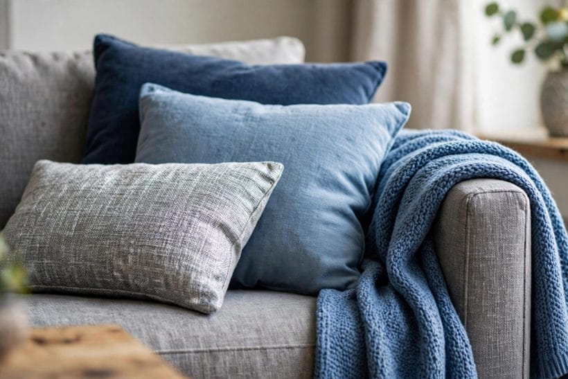
The walls decide whether the pairing whispers or declares. Pale grey walls with blue held in the furniture give the airy, northern register — the scheme at its most liveable and its most dependent on the bridge for warmth. Mid-grey walls deepen the register and demand the light be audited first. Blue walls are treated in the proportions section; the wall question here is the grey family’s, and its rule is that wall grey should be the quietest version of the scheme’s undertone — the colour the rest of the room can stand against.
The floor is the scheme’s silent third surface. Cool grey floors — stone-look, pale washed timber, grey carpet — extend the pairing and can tip a north-facing room from calm to cold; warm timber floors are the bridge built into the architecture, and rooms that have them can afford cooler walls and bolder blues everywhere else. Read the floor before the colour cards: it is the surface you will not be changing, and the pairing must be married to it, not merely introduced.
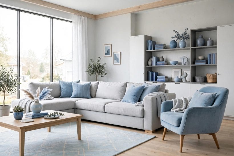
Large textiles set the register at body height: the sofa above all. A grey sofa in a textured weave — bouclé, linen-look, a wool with visible fibre — is the scheme’s anchor and repays buying the best cloth the budget has, because texture is what stops a grey expanse reading as upholstery foam. A blue sofa is the bolder anchor, most successful in the deep, greyed blues, with the greys then carried by chairs, rug and walls around it. Either way, the rug is where the two colours can be woven together literally — a patterned rug in the pair, with the bridge’s warm notes threaded through, does the scheme’s diplomacy in a single object.
The white living room ideas lane is this scheme’s useful neighbour: its warm whites — on ceilings, woodwork and the lightest textiles — are the pairing’s pressure valve, the near-neutral that lets blue and grey rest. A blue-and-grey room with no warm white in it is a room holding its breath.
5. Sofas, Chairs and the Textile Layer
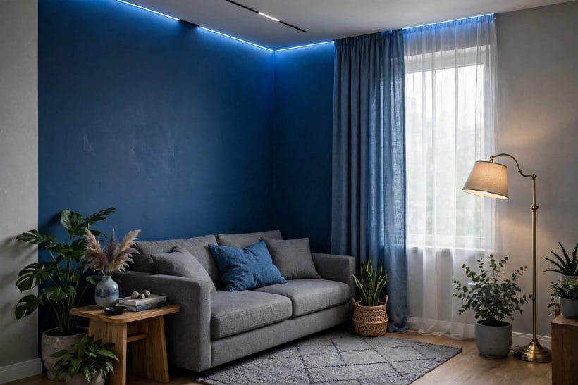
Textiles are where the pairing is tuned, because they can be changed, layered and auditioned in a way walls cannot. Work them as a ladder: the largest textile (sofa) in the leading colour’s middle register; the chairs either echoing it or carrying the second colour’s strongest statement; cushions and throws as the mixing chamber, where the two colours meet pattern, stripe and each other; curtains as the frame, usually quieter than everything they surround.
Pattern is the pairing’s peace treaty. A cushion or rug that contains both colours — a stripe, a plaid, a faded oriental pattern in blues and greys with warm threads in its ground — proves the two belong together more persuasively than any colour card, because it shows them already married in an object the eye accepts as one thing. Where a scheme feels unresolved, the answer is very often not another solid colour but one patterned piece that contains the whole argument.
Texture does the pairing’s warmth work inside the textiles themselves. The same grey in flat cotton, in nubby wool and in washed linen are three temperatures of grey; the same blue in velvet is midnight and in linen is noon. A blue-and-grey room dressed entirely in smooth fabrics will feel cool however warm its bridge, while a room that mixes velvet, wool, linen and a knitted throw can run its colours quite cool and still feel held. Buy the pairing in cloth with your hands, not only your eyes.
Keep one textile heresy available: the warm accent that is neither blue nor grey — the ochre cushion, the rust throw, the leather pouffe. Used singly and deliberately, it is not a third colour scheme but the bridge arriving in soft form, and rooms that allow themselves exactly one are usually the ones in the photographs.
6. Wood, Metal and Stone: The Warm Bridge
Stand back from any blue-and-grey room that feels welcoming and you will find the bridge: warm material carrying the room’s middle register. Timber is its chief engineer — mid-toned and honeyed woods against blue and grey read as sunlight stored in furniture — while the very pale, grey-washed woods extend the cool scheme and the very dark, ebonised woods sharpen it into formality. Choose the timber’s temperature as deliberately as the paint’s: it is a colour decision wearing a material’s clothes.
Metals divide by temperature too. Brass, bronze and warm copper are the bridge in metallic form, and a little goes far — the lamp bases, the picture frames, the handles, the fire tools. Chrome, nickel and blackened steel belong to the cool scheme and will sharpen it; they suit the blue-led, deliberate rooms and chill the reluctant ones. Mixing one warm metal family consistently is the amateur-proof route; the room reads it as jewellery, chosen once and worn throughout.
Leather and stone complete the bridge’s ends. A single leather chair or ottoman in a warm tan is the classic mediator — it touches both colours and flatters both — while stone in the warm register (a travertine-look table, a limestone hearth) bridges where a cool marble would extend the chill. The traditional living room lane shows these materials carrying whole schemes; here they are conscripts in a two-colour peace, and their orders are simply to be warm, natural and few.
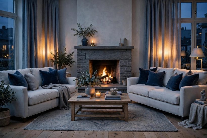
And where the room has a fire, the bridge builds itself nightly — one more reason the family room ideas schemes, hearth-centred, wear blue and grey so comfortably. A living flame in a cool-coloured room is not an accent; it is the sun the scheme revolves around, and hearth rooms can push their blues deeper and their greys cooler than any other room in the house.
7. Light: The Pairing’s Third Author
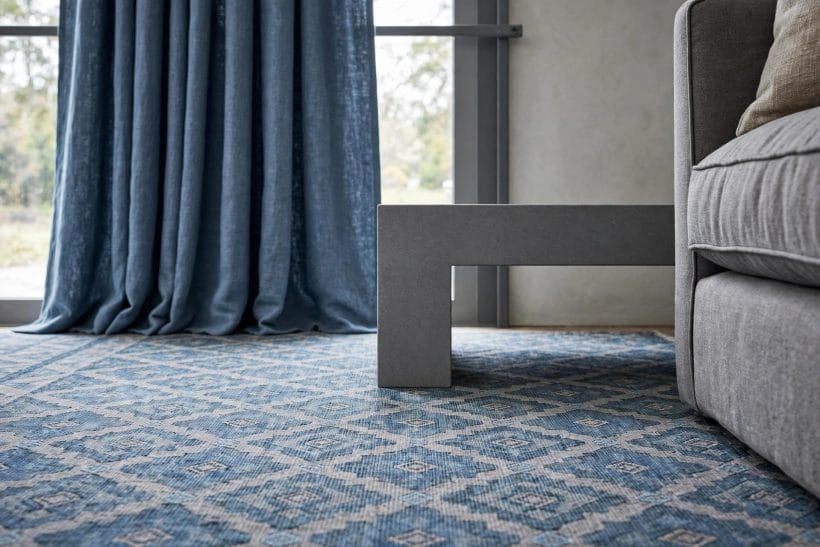
Blue and grey are the most light-dependent colours in the house. A grey that is serene at noon can turn lavender by lamplight; a blue chosen in morning sun can go funereal at four on a winter afternoon. The pairing therefore has three authors — you, the colours, and the room’s light — and the third author always gets the last edit. North-facing rooms receive cool, blue-grey light all day and will amplify the scheme’s coolness; they ask for the warmest greys in the family and a generous bridge. South-facing rooms forgive almost everything.
Artificial light is a choice the scheme must survive. Warm lamp light is the pairing’s friend — it is the bridge arriving by switch — and a blue-and-grey room lit warm will feel intimate where the same room lit cool feels institutional. Layer the lighting as the scheme’s textiles are layered: low lamps for the evening register, not a single ceiling source, so the colours are seen in pools and gradients as they are in daylight.
Judge the scheme at the room’s worst hour, not its best. Every room has one — the grey mid-afternoon, the hour before the lamps feel justified — and a pairing that survives its worst hour will delight at all the others. The sample ritual of the glance table exists for this: both colours, large, together, in the least-lit corner, at dusk. Fifteen honest minutes there are worth a month of returns.
Sheers, blinds and curtains mediate the light itself and belong to the scheme, not after it: a warm-white sheer softens a cool room’s daylight measurably, and the household that treats its window dressing as part of the colour plan — as the coastal living room ideas lane does with its sea-light — is designing with the third author instead of being edited by it.
8. Small Rooms, Dark Rooms and Rental Rooms: The Pairing Under Pressure
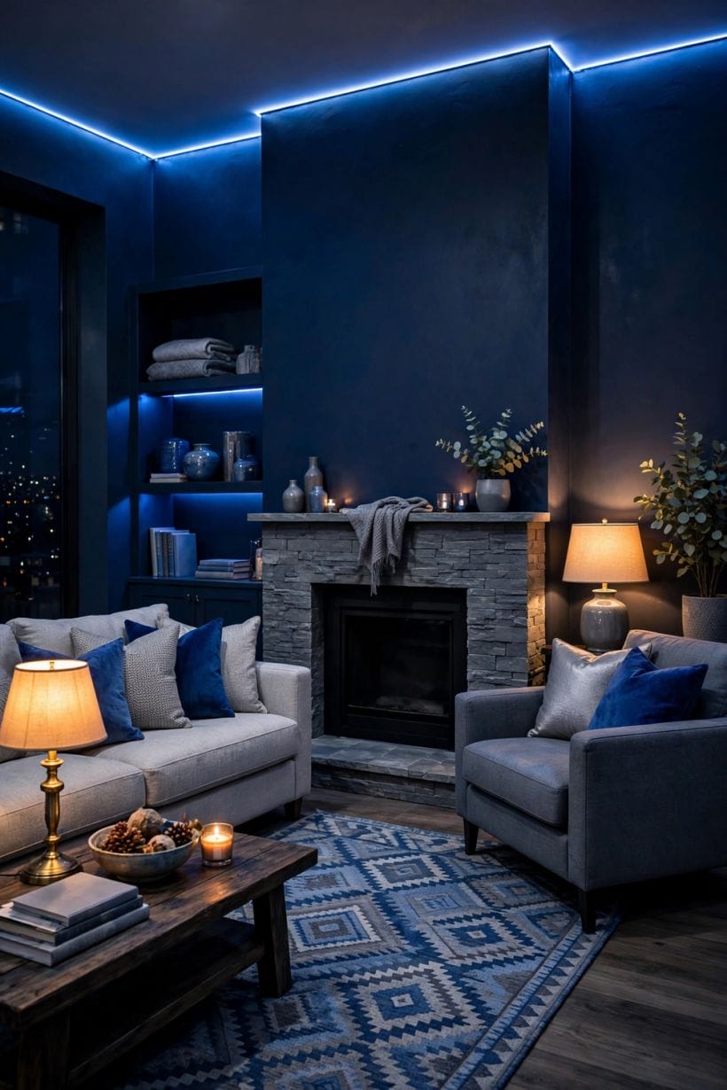
The small room is told to avoid cool colours, and the advice is half wrong. A small room in pale, blue-leaning greys with its blue held in depth — one chair, the cushions, the art — reads airy and calm, because pale cool colours recede. What shrinks small rooms is not coolness but contrast chopped small: many strong statements in a tiny field. Keep the small room’s pairing pale, layered and few-handed, and it will feel like a held breath in the good way.
The dark room asks for the opposite commitment: go deep deliberately or not at all. A genuinely dark living room decorated in the deep register — greyed navy walls, charcoal textiles, brass and warm timber doing heavy bridge duty, lamps in pools — is one of the great domestic atmospheres, while the same room decorated apologetically in mid-greys is a waiting room for the sun. Darkness is a scheme, and the pairing serves it superbly when the household stops apologising.
The rental room, where walls are not yours, runs the pairing in reverse: the landlord’s white or magnolia becomes the field — treat it as the scheme’s warm white — and blue and grey arrive entirely in textiles, rug, art and furniture. The pairing is unusually rental-friendly precisely because it is textile-led in its best versions; nothing in this article’s method requires a paintbrush until the proportions section’s walls, and those can wait for a house that allows them.
In every pressured case the discipline is the same: fewer, larger statements; undertones matched before shades are admired; the bridge present even when — especially when — the palette cannot be. Pressure does not change the pairing’s laws. It raises the fine for breaking them.
9. Pulling the Pair Together: A Worked Sequence
Decorate the pairing in this order and it will assemble itself. First, read the room: its light’s direction, its floor’s temperature, its worst hour. Second, choose the blue family’s lean and match the greys’ undertone to it, on the largest samples, in the room, at dusk. Third, settle who leads — grey for the forgiving room, blue for the committed one — and write the hierarchy down; schemes drift when their hierarchy is only remembered.
Fourth, place the field: walls and the sofa in the leading colour’s quiet register. Fifth, place the voice: the second colour in its chosen few statements, at full intended strength, not apologised into paleness. Sixth, build the bridge — one warm timber presence, one warm metal family, leather or warm stone where the room offers it — and stand back at the doorway, which is where rooms are actually judged, by their owners, every day of their lives.
Seventh, marry them with pattern: one textile or rug containing both colours and the bridge’s warmth, placed where the eye lands. Eighth, light it warm and layered, and live in it for a week before the final cushions are bought — the last ten per cent of any pairing is adjustment, and adjustment cannot be hurried past the living. The transitional living room ideas lane is a natural next read: its whole style is this kind of negotiated peace between registers, practised across a room rather than a pair of colours.
10. Costs and Pulling It Together
Costs, honestly framed for a colour scheme: the pairing itself is among the cheapest transformations a living room can undergo, because its expensive surfaces — sofa, rug, curtains — are bought once and its tuning surfaces — paint, cushions, throws, art — are the room’s most affordable layer. Spend where the hand and eye rest daily: the sofa’s cloth, the rug’s quality, the lamps. Save without shame on the replaceable notes. And price the samples as part of the project, not a preliminary to it — with this pairing, the testing is the design work, and it is cheaper than one wrong wall.
Pulling it together: match the undertones, settle who leads, give the field to the quiet register, place the voice at full strength, build the warm bridge, marry the pair in one patterned piece, and judge everything at the room’s worst hour. Blue and grey do not need luck. They need introductions — and now the introduction is yours to make.
Final Considerations
A blue-and-grey living room is a climate, chosen. Get its undertones agreeing and its bridge built, and the climate is the one the photographs promised: calm with a pulse, cool with a hearth-side. Get them wrong and no quantity of cushions will warm it — which is why this article spent its length on two decisions, undertone and proportion, and treated everything else as their consequences.
Start with the samples at dusk. The pairing will tell you, in the room’s own light, whether it intends to be friends.

0 Comments