

Tiny houses are where interior design experiments graduate or die. A layout, material or gadget that survives life at 300 square feet has earned its place anywhere — and the current crop is strong: split-level plans, fluted walls, invisible tech and colour that finally feels warm. This guide collects what is genuinely new, and applies the only filter that matters: new must also work.
1. Interior Design Ideas for Tiny Houses at a Glance
Interior design ideas for tiny houses have a stricter editor than those for any other home: the floor plan itself. Every novelty is measured against the same unforgiving questions — does it save space, add a function, or improve the light? — and the ideas gathered here are the ones currently passing. They arrive from three sources: builder innovations, designer experiments and owner hacks, each tested where square footage is scarcest. The table below gathers the whole landscape in one place; the sections after it take each family apart in turn.
| Attribute | Detail |
|---|---|
| The “New” Filter | New to tiny houses and gaining real traction — and it must still pass the tiny-house practicality test |
| Layouts | Split-level half-lofts, central-core pods, interior glass partitions and flexible sliding walls |
| Materials | Fluted panels, limewash, cork, recycled composites and thin real-stone veneer |
| Tech | Hidden integration, switchable smart glass, one-app control and monitored air quality |
| Colour | Warm minimalism in cream, earth pigments, tonal rooms and the deliberate dark tiny |
| Storage | Stair systems, ceiling storage, toe-kick drawers, magnetic walls and under-floor trapdoors |
| Kitchens | The upgraded single wall: panel-ready hidden appliances, induction as standard, the filtered tap |
| Bathrooms | The wet room, floating vanities, large-format tile and backlit mirrors |
| The Retrofit Math | Finishes retrofit in a weekend, systems in a week; opening finished walls costs 3–5× the in-build price |
| The Adoption Rule | Wait 2 years on structural trends; ask “will I love this in 5 years?” before adopting anything |
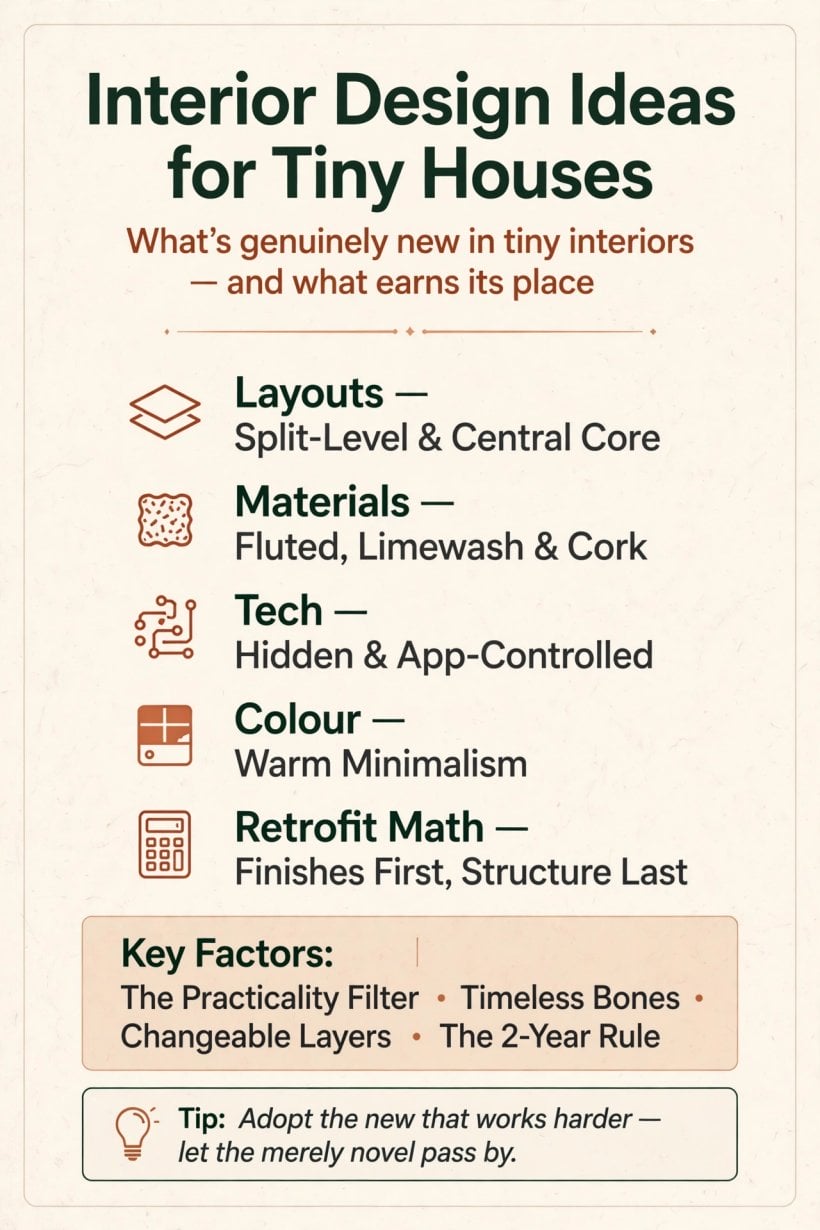
Split-level layouts, fluted and limewash walls, hidden tech and cream-over-grey warmth — the new tiny interior on one card.
Read the table as a filter, not a shopping list. The families build on each other — a layout decision enables a storage system, a material choice sets the colour palette, and the tech disappears behind both — while the retrofit and adoption sections at the end exist because most readers are not starting from an empty shell. They are improving a finished home, where the order in which new ideas are adopted matters as much as the ideas themselves. Deeper dives into single directions, such as modern tiny house interior design with clean lines, sit alongside this survey; this guide’s job is the map of what is new and what deserves to stay.
2. Layouts That Reconfigure the Day: Split-Levels, Central Cores and Flexible Walls
The newest thinking starts with the plan, because the plan decides everything the finishes can only decorate. The split-level tiny replaces the full loft with half-levels — a few steps up to the bed platform, a few down to the lounge — so the vertical play continues without forcing anyone to crawl or crouch. Headroom stays human at every level, and the house gains the one thing a flat floor cannot offer: rooms defined by height rather than by walls. It borrows the section of a much larger home and compresses it honestly.
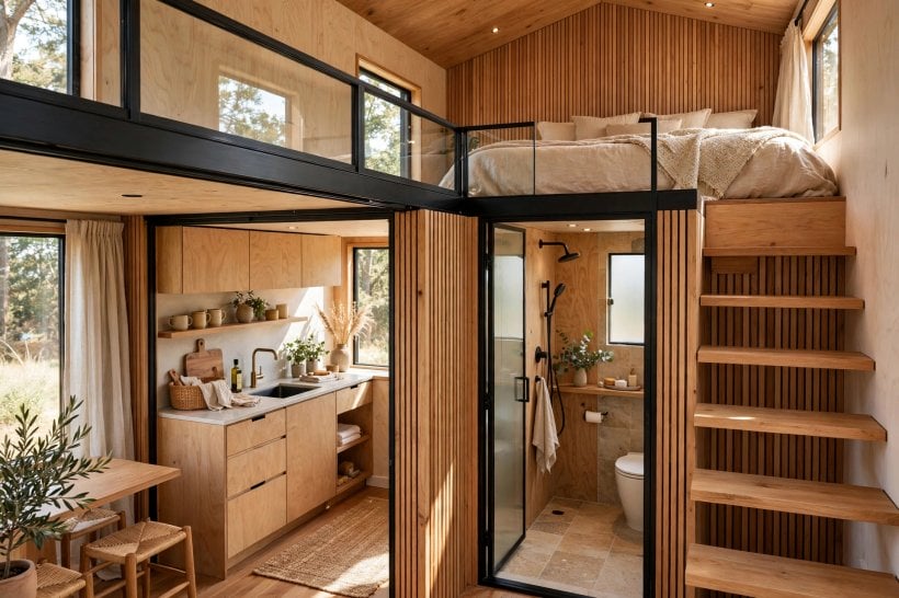
The central core puts the bathroom and kitchen into a single pod mid-plan, living and sleeping flowing around it — plumbing stacked in one place, rooms freed at the windowed perimeter. And the flexible wall — sliding and pivoting partitions — lets one volume reconfigure daily: open for the morning, divided for the work call, closed for guests. Between them sits the glass wall — separation without darkness, borrowing light from the room beside it. The plan families extend outdoors and upward, too: the dormered 1.5-storey, the courtyard L-shape, the expandable slide-out, and above all the outdoor room — a deck designed as a true room, and the cheapest new square footage there is because it needs no foundation at all. Layouts at this level are drawn before they are built, and the options in the tiny house designer plans, layouts and 3D ideas show how these plan logics look before a single wall goes up.
3. Materials With Texture: Fluted Panels, Limewash, Cork and Thin Stone
If layouts are the skeleton, the new materials are the skin — and the direction is unmistakably tactile. Fluted panels bring the textured wall: shallow vertical ribs that catch light and shadow across the day, giving a flat surface the dimension paint alone cannot. Limewash is the soft-movement wall, a finish with visible brushwork and gentle tonal drift that makes a small room feel handmade, not manufactured. Cork is the warm, quiet, sustainable surface — soft underfoot, kind to acoustics in a house where every sound travels. Recycled composites turn beautiful waste into worktops and cladding, and thin stone — a real-stone veneer at a fraction of slab weight — delivers the new luxury without the structural penalty a tiny frame cannot carry.

The rule governing all of them is the standing one: new materials must earn their place. In a conventional house a disappointing finish is a room you avoid; in a tiny house it is a percentage of your entire home, touched and seen every day. That is why the bio-materials belong in the same conversation — mushroom, hemp and mycelium products are the new natural, grown rather than manufactured, and they are arriving first in small spaces because a tiny house needs so little material that experimenting is cheap. Texture, warmth and a defensible origin story: a material that offers all three will outlast any that offers only a photograph.
4. Tech That Disappears: Hidden Integration, Smart Glass and the App Home
The newest technology in a tiny house is the technology you cannot see. Hidden tech is the invisible integration: speakers built into ceilings, screens that vanish behind panels or into cabinetry, charging buried in the furniture itself. The room reads as wood, textile and light — and behaves like a gadget. Smart glass is the switchable window, frosting at a touch for privacy and clearing for the view, solving the oldest tiny-house dilemma — the best seat sits beside glass everyone can see through. Above both sits the app home — one app for climate, light and security — because a small house run from five remotes and three thermostats has misunderstood its own scale.
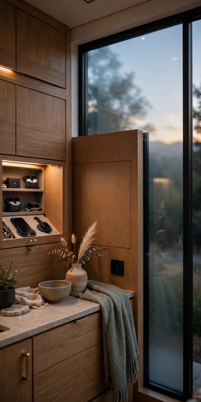
The compact appliances are the quieter half: a new generation smaller, smarter and better, designed for galley footprints rather than shrunk from family-size machines. And air quality is the monitored home’s health layer — sensors watching the air of a small, tightly sealed volume where cooking, breathing and building materials share the same few cubic metres, making the invisible visible before it becomes a headache. The test for every piece is the same as for materials: tech earns its place by disappearing into the room’s calm, not by demanding attention.
5. Colour Turns Warm: Cream Neutrals, Earth Pigments and the Dark Tiny
The grey decade is over. Warm minimalism is the new neutral — cream, not grey — keeping the calm while trading the chill for something closer to candlelight. Earth pigments supply the depth: clay and ochre, colours that look dug rather than mixed, sitting comfortably beside the wood and cork the material story is already telling. The single bold is the disciplined accent — one saturated moment in an otherwise quiet room, a door or a cabinet run carrying the whole colour argument so the rest can rest.
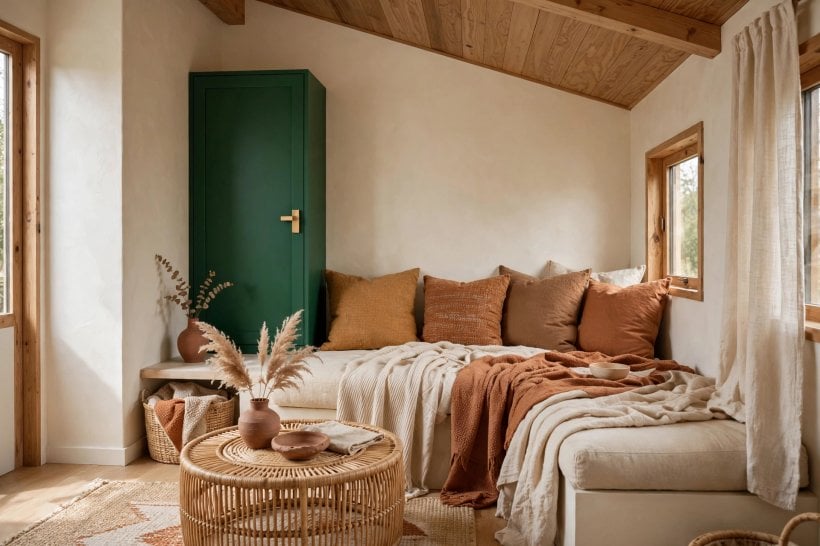
Two ideas complete the family. Tonal rooms work one colour in many shades, building depth from layering rather than contrast — in a small space, where the eye takes in the whole room at once, tonal layering reads as richness without visual noise. And the dark tiny is the new brave: the moody small space, deliberately deep walls balanced with light, texture and good lighting. Done with intention it feels cocooning and sophisticated rather than cramped — darkness at this scale reads as enclosure chosen, not space denied. The through-line is warmth with control: the palette of the 2026 look, assembled one deliberate layer at a time.
6. Storage in Every Inch: Stair Carpentry, Ceilings and Toe-Kick Drawers
Storage is where new thinking gets measured in inches, and the stair is the headline: the stair reimagined — the whole storage system designed as a staircase, every tread a box, every riser a cupboard, the climb itself doing the work of a wardrobe. The ceiling is the overhead frontier, the newfound space above head height in rooms whose floor plan was exhausted long ago: shallow, latched, reserved for the seasonal and seldom-used. The toe-kick drawer claims the hidden inches at the base of every cabinet run, the dead plinth space converted into flat storage for trays, documents and everything thin.
Magnetic walls turn vertical surfaces into utility — tools, knives, jars and notes held on the wall itself, visible and reachable, the new organisation. And the under-floor is the trapdoor storage, the new secret: compartments beneath the boards for the valuables, the archives and the off-season bulk. Together they express the storage family’s single principle — in a tiny house there is no leftover volume, only volume not yet assigned. The wider family of tricks that work at this scale is collected in the guide to small space interior design ideas and space-saving tricks — the new storage ideas here are its frontier: inches nobody had thought to use, now working.
7. Kitchens and Bathrooms: Single-Wall Efficiency and the Wet Room
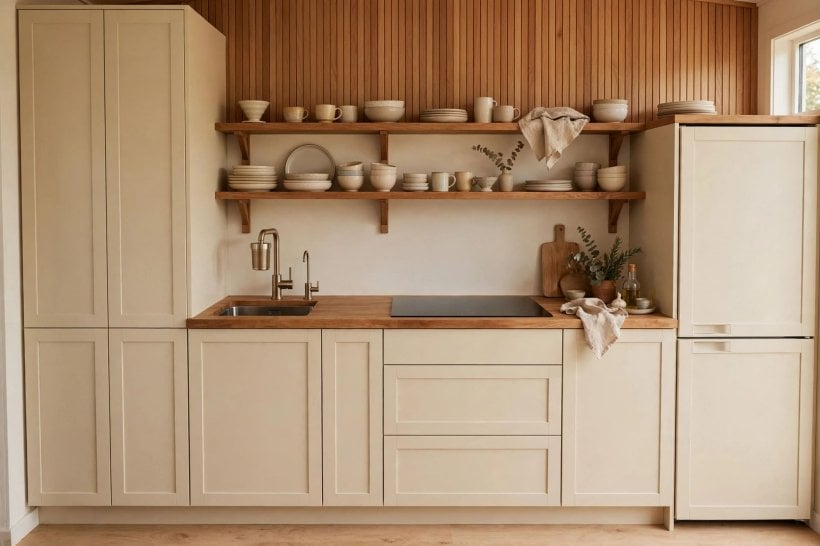
The kitchen’s new standard is the single wall, upgraded: everything in reach along one run, the new efficiency, because a galley at tiny scale wastes steps and corners the plan cannot afford. Hidden appliances complete the run — the panel-ready tiny, where the fridge and dishwasher wear the cabinetry’s face and the kitchen reads as furniture rather than machinery. The induction shift is the new standard on the hob: safer, faster, cleaner, and kinder to the air the monitored home is watching. Open shelving, edited, is the curated display — the new honest, dishes and jars on show because there is nowhere to hide them, chosen accordingly. Above it all sits compact luxury, the small-but-superb appliance tier, and at the sink the filtered tap, the new essential.
The bathroom answers with the wet room: the whole-bathroom shower, the new spacious, where the entire room is the shower enclosure and no cubicle steals a corner. The floating vanity keeps the floor visible — the new airy — because visible floor makes the room feel larger than its tape measure. Large-format tile means fewer grout lines, the new clean, and the backlit mirror supplies the glow, the new flattering, while natural materials — the stone, the wood — deliver the new spa. Both rooms reward plan-first thinking, as the layouts in the guide to design your own tiny house with plans and layouts show: a wet room drawn late is a waterproofing problem, while a wet room drawn early is the best room in the house.
8. Bedrooms, Lofts and Light: Main-Floor Sleep and the Curtain Comeback
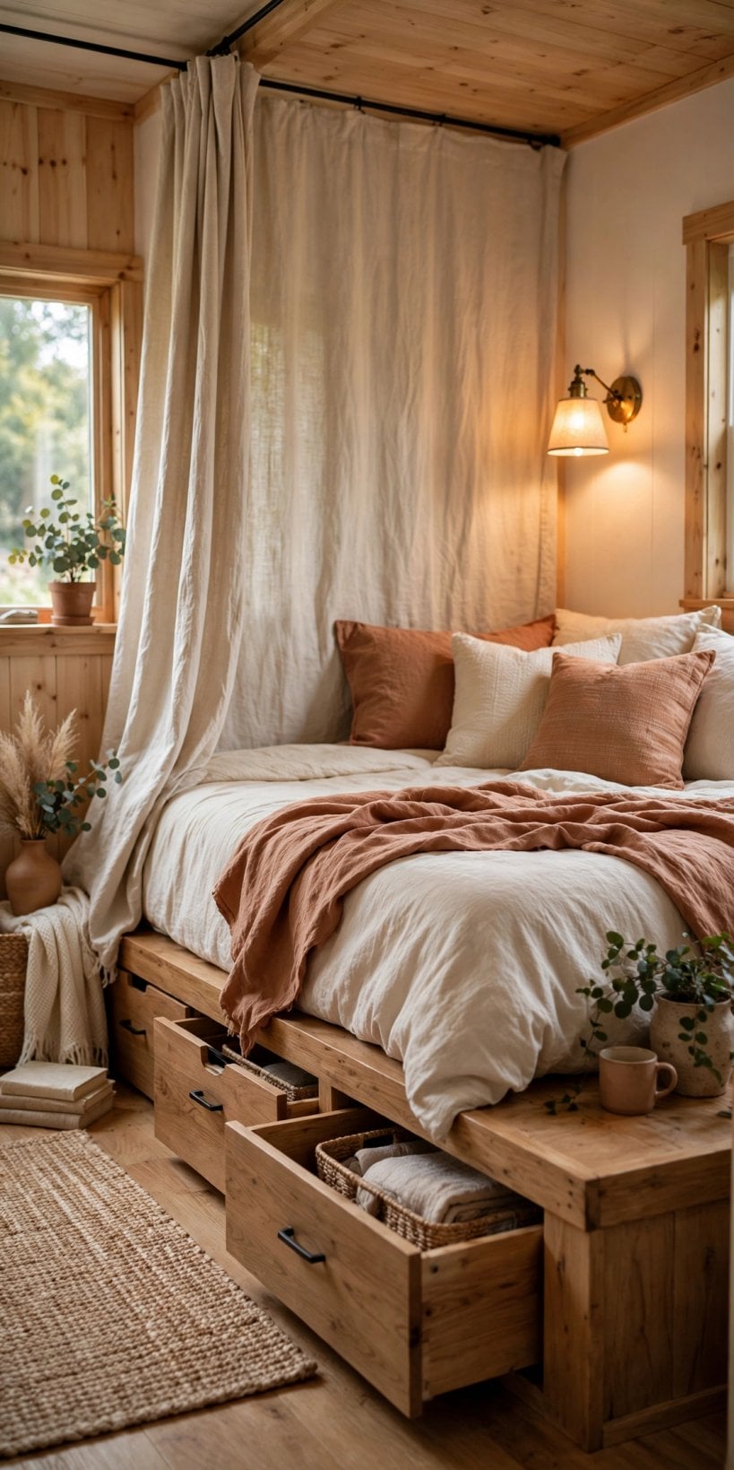
The bedroom’s new priority reverses a decade of assumption: the main-floor bedroom, no-loft living, claimed by owners who did the ladder maths at 3 a.m. and chose the floor. Where lofts remain, they are changing character — the glass loft shares light between levels, the new airy, replacing the solid balustrade that turned the upper level into a cave. The curtain, upgraded, is the beautiful textile division, the new soft: a heavy, lovely fabric doing the partition’s job with none of its permanence, drawn for sleep and opened for the day. Under the bed, maximised, is the drawer revolution — the new storage, the bed’s footprint finally paying rent.
Light is the layer that decides whether all of it works after dark. The linear light is the new architectural: a slim LED line tracing a ceiling edge or shelf, drawing the room’s geometry in brightness. The paper lantern, evolved, is sculptural paper — the new soft — a glow with a silhouette. Integrated shelving light puts the glow within the display, and the portable lamp is the cordless everywhere — the new flexibility, carried to the deck or the reading chair as needed. Circadian lighting is the auto-adjusting wellness layer, warming and dimming with the day. The family’s rule: invisible by day, magical by night. And at the bedside, the reading light — the perfect bedside, the new essential — is where the system proves itself nightly, because a bedroom that cannot be read in has failed its smallest test.
9. The Retrofit Question: Adding New Ideas to a Finished Tiny House
New-idea guides are written for people building fresh — but most readers already live in a finished tiny house, and the retrofit question is the one that matters: which innovations can actually be added to an existing build, and which require starting over? The honest sort has three tiers. Finishes and fixtures — new lighting, hardware, textiles, paint — retrofit in a weekend. Systems — mini-split upgrades, composting toilet swaps, solar additions — retrofit in a week with planning. Structure — layout changes, loft additions, envelope improvements — is where the maths turns brutal: opening walls in a finished tiny house costs 3–5x what the same work cost during the build, because every change cascades through finished surfaces. Set against the baseline of how much a tiny house costs to build, that multiplier is the number that should govern every retrofit ambition.
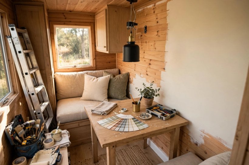
The hierarchy that respects the budget: start with what you touch daily — the faucet, the lighting, the bedding, the chair you sit in for eight hours. Then what you see constantly: paint, one statement fixture, the entry. Then the invisible systems that change how the house feels — ventilation, water filtration, sound dampening. Skip, for now, anything requiring structural surgery unless it is fixing an actual problem; a tiny house is a system, and random upgrades without a plan create a patchwork, not an improvement. Timing is the other half of the craft: the best moment for any upgrade is when something adjacent is already open — a countertop when the plumber is under the sink anyway, an insulation top-up during a roof reseal, flooring when the furniture is already out. Keep a running “someday” list, plan the sequence with tiny house design software before opening anything, and the opening, when it appears, has a job waiting for it. The patient retrofitter ends up with a better house than the impulsive one, for half the money.
10. Adopting Wisely: The 2-Year Rule, the Skip List and the 2026 Look
The final discipline is knowing what to refuse. The skip list, for now: the gimmick gadget, tomorrow’s drawer clutter; the extreme trend, the 6-month aesthetic that becomes the regret; the unproven material, the no-track-record risk a tiny house cannot afford; and the high-maintenance piece, the beautiful burden, the tiny-house trap. The rule beneath the list is absolute — new must prove itself, and the tiny house is no place for beta-testing. Against that, the 2026 look worth adopting is clear: warm in cream, wood and texture; curved in the arch and the round; honest in visible craft and handmade value; integrated in hidden tech; and personal — collected, not decorated. Sustainability is judged by the same standard: the circular tiny designed for disassembly, the passive tiny’s super-insulated efficiency, greywater as the new normal, and the carbon count as the measured footprint — accountability over gesture.
The adoption method is a curator’s rhythm: collect, filter, wait, adopt. Keep the file — the ongoing idea collection, the inspiration archive. Apply the filter — the tiny-house test, the practical screen. Observe the wait — the 2-year rule on structural trends, the proven filter, with the rental test and the small start as the low-risk trials: try the idea in a rental first, pilot it in the powder room, prefer the reversible, the undoable. Innovate in the layers, not the structure — timeless bones below, seasonal change above, which is also why the bones themselves repay the slow thinking in the comparison of steel or wood for a tiny house. The cadence that follows is simple: the bones rarely change, on a 10-year horizon; the layers change seasonally, in textiles and styling; the tech changes as it proves itself. The ideas themselves keep arriving from the builders’ R&D, the owners’ hacks, the small-space cities — Tokyo, Paris, New York — the festivals and the feed, and above all from living small itself. Test layouts digitally — design a tiny house online — and ask the only trend question that matters: will I love this in 5 years?
Final Considerations
The newest ideas earn their place in a tiny house by working harder than the ones they replace: the split-level that adds headroom, the fluted wall that adds texture, the outdoor room that adds living. Filter every novelty through the practicality test, retrofit in the order the house allows — finishes first, structure last — and let the 2-year rule keep the beta tests out. Adopt the new that is genuinely better, and let the merely novel pass by.

0 Comments