

The 1950s room was a promise made visible: after years of making do, the home filled with colour, curves, new materials and machines — and arranged them all with a confidence that still reads as optimism today. No decade since has believed quite so cheerfully in the future of the living room.
This article works through the 1950s home interior as a complete design language — its rooms, colours, furniture and patterns — and translates it honestly for modern houses, as one chapter of design through the decades within the wider home design ideas collection.
1. 1950s Home Interiors at a Glance
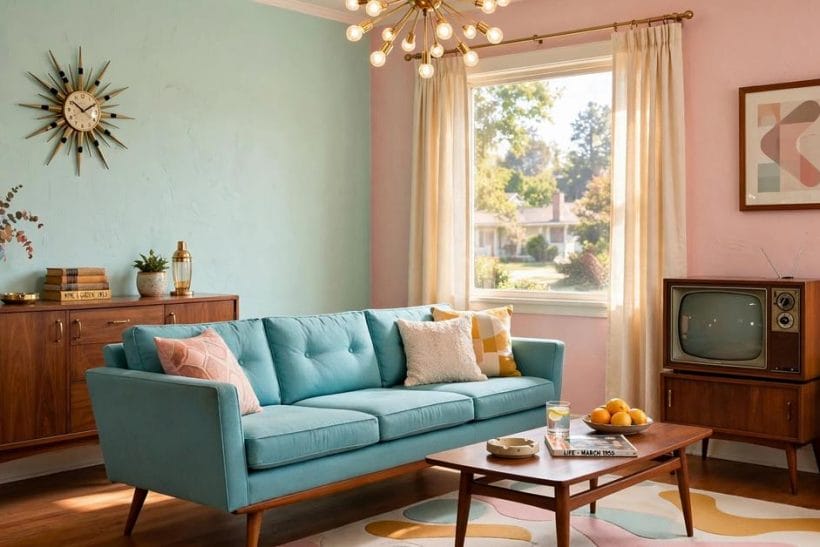
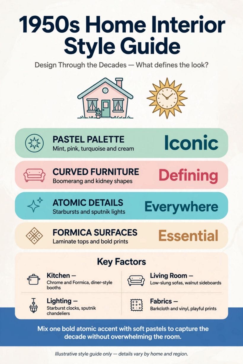
The 1950s home interior is the domestic style of the post-war decade, formed by returning prosperity, new materials and a faith in modern living. Its governing attributes are low, horizontal furniture raised on slim tapered legs; open, lighter room plans with picture windows and indoor-outdoor flow; a two-part colour story of soft pastels against warm timbers, brass and black accents; new fitted kitchens and labour-saving appliances displayed with pride; and pattern — atomic, geometric and botanical motifs — applied at domestic scale on curtains, cushions, laminates and wallpapers. It differs by country and by budget, and in humbler homes it arrived as one new chair, one patterned curtain, one gleaming appliance at a time. This article keeps its claims at that general, checkable level: the decade’s character, not a catalogue of dates, because the look is what a modern reader can actually use.
| Question | Short answer |
|---|---|
| What is the single most recognisable 1950s interior trait? | Furniture lifted off the floor on slim, splayed, tapered legs — sideboards, sofas and chairs all floating on little wooden pins. The floating effect made small post-war rooms feel larger, made cleaning easier, and gave the decade its unmistakable silhouette: low, long and light on its feet. |
| Were 1950s rooms really pastel? | Partly — pastels were the decade’s advertised kitchen and bathroom colours, in pink, mint, lemon and powder blue, usually set against white and warm wood. But the same decade also loved teak, walnut, brass, black and strong patterned textiles. Pastel was the sales story; timber and pattern were the lived one. An honest translation uses both. |
| How does 1950s differ from the mid-century modern label? | They overlap heavily, but mid-century modern names the designed, architectural end of the era — the famous chairs and houses. The 1950s interior, as this article uses it, is the whole domestic picture, including ordinary homes, fitted kitchens, ornaments and do-it-yourself improvements: the decade as it was lived in, not only as it was exhibited. |
| Can the look work in a small modern home? | Especially well — it was designed for one. Post-war homes were often modest, and the style’s answers were small-space answers: furniture that floats, storage built into walls, light colours, mirrors, and rooms asked to do double duty gracefully. A tiny home borrowing the decade’s discipline is borrowing from a kindred spirit. |
2. The Post-War Room: Open, Light and Horizontal
The decade’s rooms broke with the heavy, compartmented interiors that came before them. Partitions thinned, serving hatches and open plans joined kitchen to dining space, and the picture window — a broad sheet of glass, often filling a wall — pulled the garden into the room. Furniture followed the architecture’s lead: long and low, arranged along the room’s horizontal lines, with the television arriving as a new focal point the plan had to absorb, as the living room ideas of the era reorganised themselves around it.
Built-in storage was the decade’s quiet revolution
Wardrobes, shelving and cupboards fitted into alcoves and along whole walls replaced much freestanding furniture. The fitted wall made small rooms work harder without feeling fuller — a lesson any small modern home can take from the decade unchanged, and one the fitted kitchens below extended to the whole house.
Indoor-outdoor flow was a modern luxury
Patio doors, terraces and planting brought inside — the houseplant on the room divider, the planter by the window — expressed the decade’s health-and-sunshine optimism. In translation, the move costs little: treat the window wall as the room’s picture, and let greenery mediate between inside and out.
Rooms did double duty without embarrassment
The bed-sitting room, the dining table that became the homework and sewing table, the spare room that was a study until guests arrived — the decade planned for rooms with two lives and furnished them accordingly, with pieces that folded, nested, wheeled and stacked. Modern small homes asking the same of their rooms are not improvising; they are reviving the period’s most practical habit, and its furniture — light enough to move daily — was designed precisely for the choreography.
3. Colour: Pastels, Timber and the Warm Metal Accents
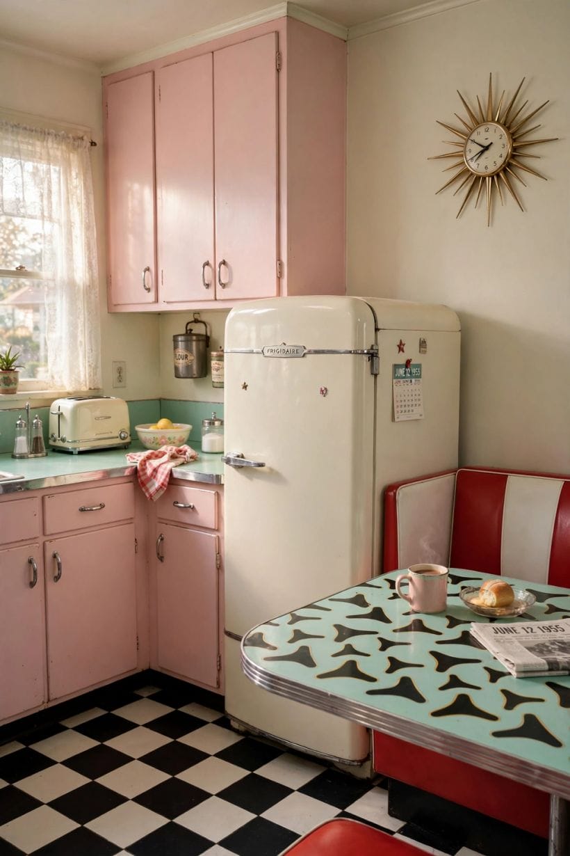
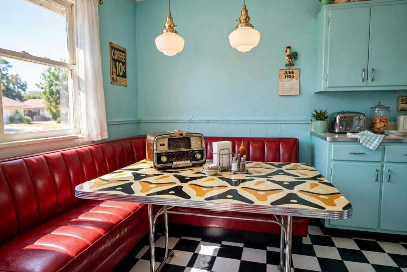
The 1950s palette ran on contrast between softness and warmth. Pastel enamels and laminates — pink, mint green, lemon, sky blue — coloured the kitchens and bathrooms; living rooms rested on warm timber tones, cream and beige grounds, and upholstery in teal, mustard, rust and olive. Brass and copper glowed against both, and black appeared in thin lines — legs, frames, edging — as the decade’s eyeliner. Colour was used in blocks and pairs rather than in today’s layered neutrals, which is why a single pastel appliance could redecorate a whole kitchen.
Use pastel as the decade did — on the hardworking surfaces
Pastel belonged to enamel, tile, laminate and paint: surfaces that could be chosen, fitted and one day replaced. Follow that logic and the colour stays brave but reversible — a pastel splashback, bathroom suite or painted cabinet run, with the room’s expensive bones kept in the timber-and-cream family that outlasts any single hue.
Warm wood is the translation’s safety net
Where a full pastel scheme feels risky, the decade offers its other half: teak-toned and walnut-toned furniture, cork and timber flooring, brass details. That warm, low, leggy scheme reads unmistakably of the period with no pastel in sight — proof the look is a structure, not a colour chart.
4. The Fitted Kitchen and the Proud Appliance
No room changed more. The fitted kitchen — continuous worktops, units in runs, the sink and cooker planned as one composition — replaced the freestanding pieces of earlier decades, and its surfaces were frankly modern: laminates in boomerang and crackle patterns, pastel enamel, chrome trim. Appliances were displayed, not hidden: the refrigerator, the washing machine and the new small electrics were the room’s trophies, evidence of a household ascending. The vintage kitchens survey shows this world at its most characterful.
Plan the run, then dress it
The translation for a modern kitchen is sequencing: the fitted run’s clean composition first — unbroken worktop, aligned units, one material story — and period character second, in handles, a laminate or pastel accent, open shelving with the decade’s cheerful crockery. Character applied to a sound run reads as style; applied to a muddle, as costume.
Let one appliance be the ornament
A single sculptural or coloured appliance — the kettle, the mixer, the refrigerator in a period tone — does the decade’s work in a modern kitchen without a theme-park conversion. The original rooms earned their machines one at a time; a translation that buys its character one piece at a time is historically accurate in spirit as well as budget.
5. Furniture: Low Lines, Tapered Legs and New Materials
The decade’s furniture floated. Sideboards stretched long and low on pin legs; chairs combined moulded shells, bent plywood and slender steel frames with upholstery; tables went kidney, surfboard and boomerang in outline. New materials — moulded plastics, foam upholstery, laminates, tubular metal — sat beside craft timber without apology, because the period’s real religion was not a material but lightness: nothing in the room should look as if it could not be moved by the people who lived with it.
The sideboard is the room’s anchor piece
If one purchase translates a modern room, it is the long low sideboard: storage, display surface and horizontal calm in a single piece, with the record player, the plant or the television upon it. Its height organises everything else — seating low beside it, art hung low above it — which is why rooms built around one cohere so quickly.
Mix the decade with what you own, at the level of line
Period fidelity is neither possible nor desirable in a lived-in home. The workable rule is kinship of line: modern pieces with slim profiles, visible legs and honest materials sit peacefully beside genuine or revival 1950s pieces, whatever their date. Bulk is the only real enemy — the decade had no use for the overstuffed, and neither should its translation.
6. Pattern and Textiles: Atomic, Botanical and Brave
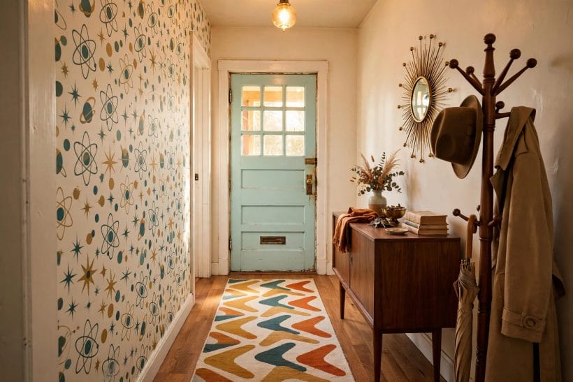
Pattern was the decade’s joy. Curtains, cushions, carpets and wallpapers carried its new visual language — abstract and atomic motifs, starbursts and scattered boomerangs, stylised botanicals and bold geometrics — in the palette’s teals, mustards, greys and pinks. Pattern lived on soft, changeable things, in the way pastel lived on replaceable surfaces: the architecture stayed calm while textiles supplied the exuberance, and a room could be redecorated by re-covering rather than rebuilding.
One bold pattern per room is the period’s own discipline
Period photographs show restraint as often as exuberance: a patterned curtain against plain walls, a plain sofa against one patterned paper. Follow that ratio and pattern stays the decade’s delight rather than its caricature. Two competing bold patterns in a small room is the mistake the translation most needs to avoid.
Textiles carry the smallest rooms furthest
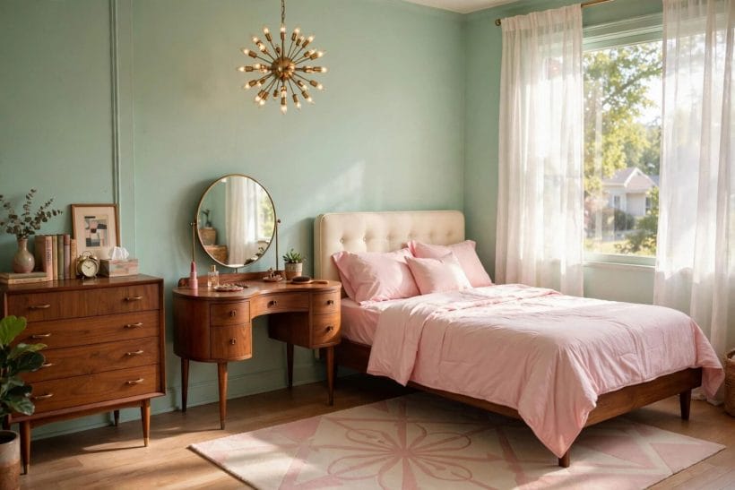
In a bedroom, the decade arrives by bedding, curtains and a cushion before it needs furniture — the approach the bedroom ideas collection would call dressing the room you have. It is also the cheapest translation to test: live with the pattern for a season before committing to paper or paint.
Ornament was small, sculptural and unembarrassed
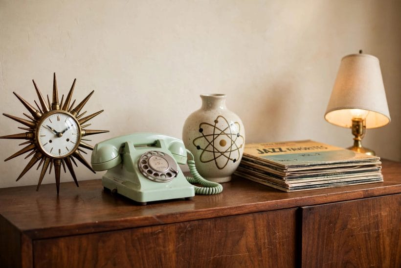
The decade’s shelves and sideboards carried their own little sculpture park: stylised ceramics, glass in the palette’s colours, abstract figures, a clock treated as a piece of art rather than an appliance. Ornament had shrunk from the mantelpiece crowd of earlier eras to a few chosen objects with air around them. The translation is a discipline of selection — three objects that earn their silhouette beat a shelf of souvenirs, and the sideboard’s long calm surface is exactly the stage they were made for.
7. Bathrooms and Bedrooms: The Decade’s Private Rooms
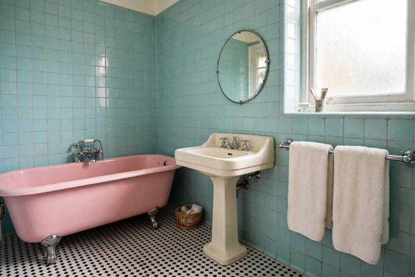
The bathroom was the pastel palace: coloured suites — pink, blue, green, yellow — with matching tiles, chrome fittings and the new pride in indoor plumbing properly finished. The bedroom paired the fitted wardrobe wall with a dressing table, twin or double bed with a shaped headboard, and textiles doing the decorative work. Both rooms were smaller than today’s, and both were finished with a completeness that treated smallness as no excuse — a stance the bathroom ideas of any era would endorse.
Translate the bathroom by colour, not by suite
Coloured sanitaryware is a commitment few modern households should make in the decade’s name. Its spirit translates better: a pastel or period-toned tile, chrome and mirror used generously, a shaped mirror or cabinet echoing the era’s curves. The room reads 1950s in its accents while its plumbing stays entirely of its own century.
The dressing table deserves its revival
Of all the decade’s furniture, the dressing table — mirror, drawers, a stool, a place for the rituals of getting ready — answers a modern need that fitted wardrobes alone never met. In a small bedroom it replaces a chest of drawers and a bathroom queue at once, which is exactly the double duty the period prized.
8. Translating the Decade Today: What to Keep, What to Leave
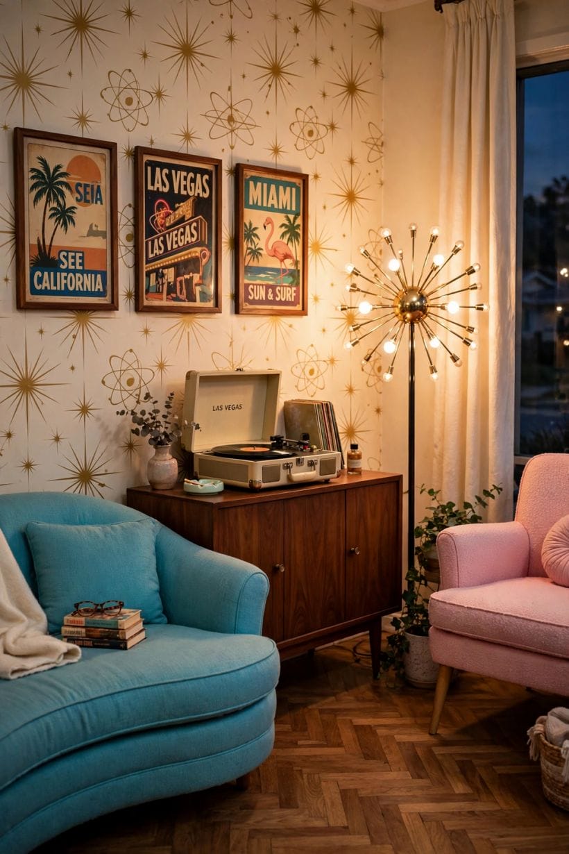
An honest translation keeps the decade’s structure and edits its inconveniences. Keep: the low horizontal lines, the floating furniture, the fitted storage, the warm timber and brass, pattern on changeable things, colour used bravely in blocks. Leave: the era’s fragile electrics and plumbing, its draughts and single glazing, any material now known to be hazardous, and the museum impulse itself — a 1950s room was a modern room in its day, and it would have wanted your heating, your lighting and your mattress to be as good as they can be.
Warm the light to period, not the wiring
Modern lighting in period shapes — opal glass, brass, starburst silhouettes — gives the look its evening glow on safe, efficient fittings installed to current rules by qualified hands. The decade’s atmosphere is a colour temperature and a silhouette, not a fuse box, and no translation should pretend otherwise.
Buy the real thing where it was built to last
Furniture is where originals earn their place: solidly built period sideboards, chairs and tables survive in quantity and were made to be repaired. Textiles, electrics and anything whose safety is material to its age are where the revival market should serve instead. The distinction keeps the translation both characterful and sane.
9. The 1950s in Small and Tiny Homes
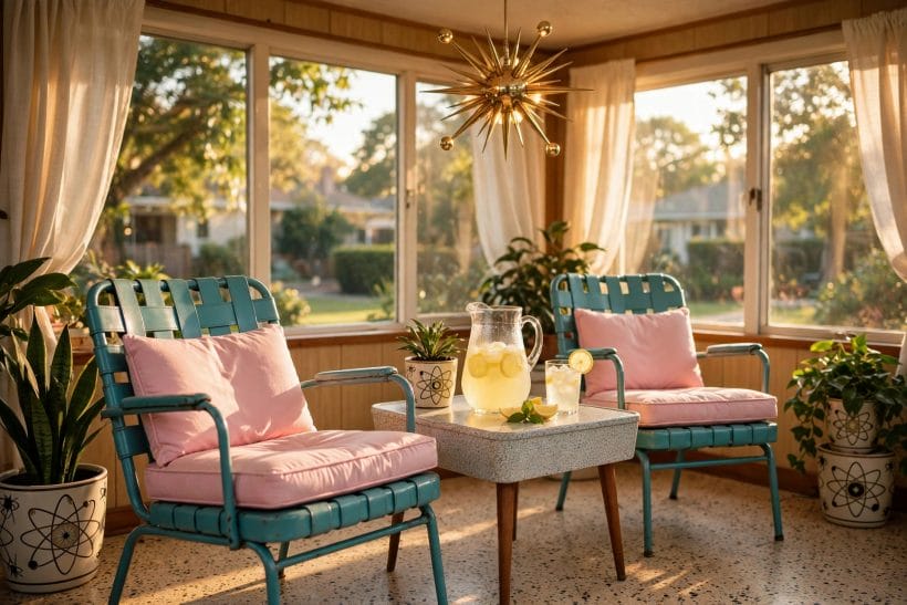
The decade deserves the last word in the small home, because it was the last era to design for smallness as the normal case. Its whole toolkit — floating furniture, fitted walls, double-duty rooms, light colour, mirrors, pattern instead of bulk — is a small-space toolkit, and its optimism suits homes that refuse to apologise for their size. The modern farmhouse lane may own today’s nostalgia, but the 1950s owns its engineering.
Start with one room and the leg rule
Raise the furniture, clear the floor, fit the storage to the wall, and let one pastel or pattern speak. A single room translated by those four moves will teach the whole method — and if the household tires of the decade, the room keeps its lightness and loses only its costume, which is the surest sign the translation was honest.
10. Costs and Pulling It Together
The costs of a 1950s translation spread as widely as its methods. Textiles, paint and one pastel surface ask little; a long sideboard, fitted storage and a kitchen run dressed in period materials ask more, with original period furniture priced by condition and fashion as all second-hand markets are. The reliable economy is the decade’s own: spend on the fitted and the built-to-last, let pattern and colour — the cheap, changeable layers — carry the period flavour, and let modern systems hide beneath. Local quotations price real rooms; this article prices none, because the honest figure is always the one measured in your own home.
Pull the decade together in order: set the room’s low horizontal lines; lift the furniture onto its legs; fit storage to the walls; lay the warm timber and cream ground; place pastel or pattern on the surfaces designed to change; add brass, black line and one proud appliance; and keep every system — heat, light, water — unapologetically modern. A room translated in that order does not imitate the 1950s. It continues it, which is what the decade itself would have insisted on.
Final Considerations
Design through the decades is not a tour of costumes; it is a stocktaking of tools. Every era solves the permanent problems of home — light, storage, comfort, beauty — with its own materials and its own mood, and leaves the solutions behind for anyone willing to translate rather than copy. The 1950s left unusually good tools, because it solved those problems for small rooms, modest budgets and high hopes all at once.
Take the legs, the light and the fitted walls. Take the pastel courage and the patterned joy. Leave the draughts. The decade that believed the future would be better would be delighted to know its rooms are still being learned from — and would expect yours to be better than its own.

0 Comments