

Every room has one surface that feels finished and three that feel abandoned, and the difference is rarely the furniture — it is the small arranged scene: a stack of books, a lamp, a bowl with opinions. That scene is a vignette, and arranging vignettes is the most learnable skill in the whole of decorating: a handful of principles, honestly applied, on surfaces you already own.
This is the evergreen ABC of the subject — what a vignette is, how its anatomy works, and how the same grammar serves a coffee table, a bookshelf and a mantel. It sits inside the wider craft covered by how to decorate a tiny living room and the hands-on spirit of DIY home decor hacks, and it borrows nothing from any magazine’s phrasing but the topic itself: small scenes, arranged on purpose.
1. Arranging Vignettes at a Glance
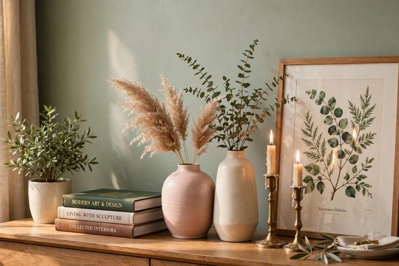
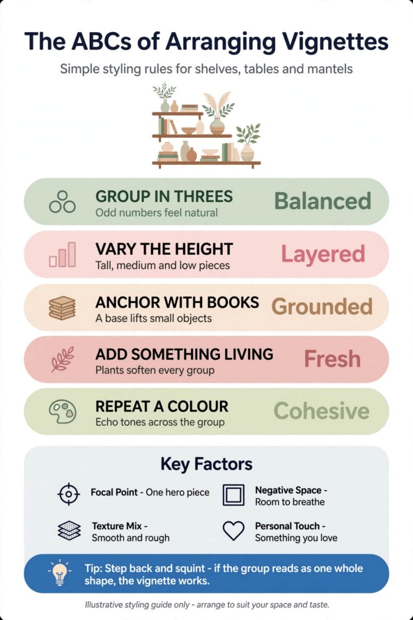
A vignette is a small, deliberate arrangement of objects on a surface — a table, shelf, mantel or sideboard — composed to be read as one scene rather than several things. Its working parts are an anchor (the largest or tallest piece), a supporting group in odd numbers, variation in height and texture, a shared colour or material thread, and the empty space that frames it. Vignettes are the finishing grammar of the living room and every room like it: they are how surfaces stop storing objects and start meaning something.
| Question | Short answer |
|---|---|
| How many objects make a vignette? | Usually three to seven, in odd numbers — enough to compose a scene, few enough to read at a glance. Beyond seven, a surface stops being a vignette and becomes storage with ambitions. |
| What is the commonest vignette mistake? | Objects of one height in a row, evenly spaced — the mantelpiece parade. A vignette needs a slope: something tall, something low, and air between the acts. |
| Do vignettes cost money? | Almost never new money. The art is rearrangement: the same books, bowls and candlesticks, composed. The classic vignette is assembled from the house’s own cupboards in an afternoon. |
| Where do vignettes matter most? | Wherever the eye lands and rests: the coffee table, the mantel, the hallway console, the shelf at the room’s entrance. Start with the surface you see first from the door. |
2. What a Vignette Is (and Is Not)
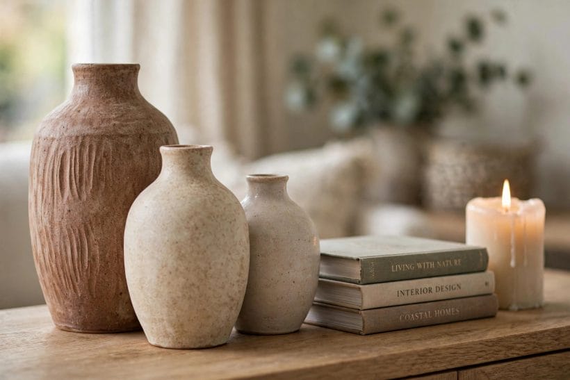
A vignette is a sentence, not a pile. Its objects are chosen to be read together — a lamp, a stack of two books and a small bowl say something about a room’s inhabitants that the same objects scattered across three surfaces never could. The scene has a subject (the anchor), supporting players, and a frame of empty space that tells the eye where the sentence ends.
It is not a display of everything owned, a shrine to one shopping trip, or a surface exempt from use. A working vignette lives on working surfaces — the coffee table still holds cups, the console still catches keys in its appointed bowl. The moment a vignette forbids the surface’s job, it has become a museum exhibit, and households rightly rebel against it within the week.
The vignette’s one rule of rank
Every scene has a single star. Two objects competing for the lead — the tall vase and the large picture both shouting — cancel each other into clutter. Decide the anchor first; everything else on the surface is cast in supporting roles and dressed accordingly.
Small is the whole point
A vignette’s power is concentration: one square foot composed beats a whole room gestured at. In small homes especially — the world of tiny house decorating — the vignette is how personality survives square-foot discipline, one surface at a time.
3. The Anatomy: Anchor, Height and the Odd Number
Begin with the anchor — the tallest, largest or most luminous object: a lamp, a leaning picture, a generous vase, a plant with presence. Set it first, usually off-centre, and let it fix the scene’s height and address. Everything else is measured against it.
Build the slope
From the anchor, step down: a medium group (the stack of books, the candlesticks), then a low finish (the bowl, the small box, the stone). The eye travels the slope like a hillside and reads it as composed. Flat arrangements — everything at one height — are the single most common reason a surface looks wrong despite containing lovely things.
Count in odd numbers
Groups of three and five read as intentional where pairs read as waiting. The odd-number rule is not mysticism: an odd group has a centre and a rhythm, an even group splits into two and argues. Use pairs only where architecture itself is symmetrical — and even there, let the group as a whole stay odd.
Vary texture as you vary height
A scene of all-gloss or all-matt objects reads flat however clever its heights. Mix the families: ceramic against timber, glass against linen, metal against the living green of a plant. Texture contrast is the vignette’s lighting at noon — it models everything it touches.
Leave air in the composition
The empty margin around and within the group is an ingredient, not an absence. Crowded scenes shout; spaced scenes converse. If in doubt, remove one object — the classic edit — and notice the survivors improve.
4. Coffee Tables, Consoles and Sideboards
The coffee table is the vignette’s home ground and its hardest brief: seen from above, used hourly, cleared for games and feet. Compose it in zones — a tray that gathers the scene into one liftable unit is the professional’s answer, letting the vignette be moved, cleaned around and restored in seconds.
The tray as stage
A tray under the group gives the arrangement a floor and a border, and the table its freedom back. Books, a candle, a small plant on the tray; remotes and cups negotiate their own territory off it.
Consoles: the hallway’s first sentence
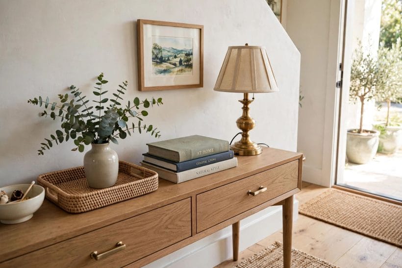
The entrance console is read at arrival speed: one anchor (a mirror or picture above does the height), a bowl with the honour of catching keys, a lamp if the hall is dark, and one personal object that says whose house this is. Nothing else earns the surface.
Sideboards: the long landscape
A sideboard’s length invites a landscape rather than a scene: a composition at one end, a serving emptiness along the rest, perhaps a second small group answering the first across the distance. Resist the parade of evenly spaced objects along its whole run — the buffet equivalent of the mantel mistake.
The dining table’s everyday scene
Between meals the dining table wants a centrepiece with the humility to be moved: a low bowl, a runner with two candlesticks, a plant that lifts away in one hand. Compose it long and low — the table’s own shape — and keep its footprint small enough that setting for six never begins with an excavation.
5. Shelves and Bookcases
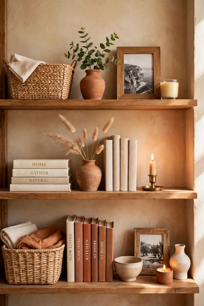
A bookshelf vignette works inside a rectangle the shelf itself provides: the frame is given, the composition is yours. Alternate the shelf’s grammar — a run of upright books, a horizontal stack, an object resting in the gap — so the eye reads rhythm rather than inventory.
Work shelf by shelf rather than across the whole bookcase at once: each shelf is a small room with its own anchor and air, and the bookcase succeeds as a street of good small rooms rather than one large argument. Stand back at the doorway between shelves — the bookcase is read from across the room more often than from the chair beside it.
The one-third rule for calm shelves
Shelves that breathe hold roughly two-thirds books and objects to one-third air. The ratio is a guide, not a law, but crowded shelves photographed in magazines cheat with stylists; lived shelves need the air to stay findable as well as beautiful.
Face one book outward
A single cover displayed — on a small stand or leaned at a stack’s end — gives the shelf a changing exhibit and the room a conversation. It is the library’s kindness to itself, rotated with the household’s reading.
Put the vignette where the eye lands
The shelf at seated eye height, nearest the door, carries the showcase scene; the high and low shelves can be honest storage. Not every shelf must perform — knowing which ones must is the whole allocation.
6. Mantels and Hearths
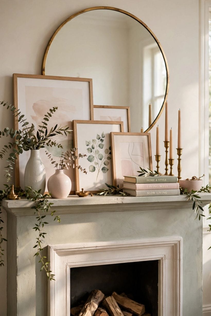
The mantel is the vignette’s ancestral home — the shelf above the fire has carried composed objects since there were shelves — and its deep treatment lives at fireplace mantel ideas. The ABC here is the same grammar with stricter discipline: the fire below is already a scene, so the mantel’s arrangement must harmonise rather than compete.
One slope across the shelf
Tall at one end, low at the other, the middle breathing — the asymmetric slope suits mantels because the firebox below is symmetrical and the eye wants the counterpoint. Matched pairs either end are the formal exception, best kept for genuinely formal rooms.
Mind the heat and the season
Candles unlit as sculpture, greenery that tolerates warmth, nothing precious where soot and heat conspire: the mantel’s vignette is chosen for the fireplace’s working life, and changed with the seasons — the summer mantel lighter, the winter one carrying the year’s ceremony.
The hearth’s own small scene
Below, the hearth takes the working vignette: the log basket as anchor, tools kept few, a plant in the unlit months. It is composition with a job — the test every vignette should pass somewhere in the house.
7. Colour, Texture and Material Echoes

A vignette coheres when its objects share a thread — a colour repeated twice, a material that rhymes with the room, a finish that echoes the furniture’s. The thread need not match; it must converse. The room’s existing palette is the first place to shop for it.
Pull the group’s colour from the room
Take the cushion’s ochre, the rug’s blue, the curtain’s green, and let one object in the group carry it. The vignette then belongs to the room rather than visiting it, and the whole composition settles without a single new purchase.
Repeat one material across two surfaces
Brass on the mantel answering brass on the coffee table; the same timber in frame and bowl: small material echoes stitch a room’s separate vignettes into one language. Two echoes are enough; three is a theme, and themes are for parties.
Let books be the colour library
Cloth bindings are the readiest palette in the house — madder, ochre, forest, ink. A stack chosen for its spines does colour work no ornament can, and it rotates free of charge with the household’s reading.
Borrow from the house before buying anything
Before any purchase, shop the house: the bowl in the wrong room, the candlesticks in a drawer, the print that never suited the landing. Most vignettes in most houses are one relocation away from existing. Buying enters only when the house genuinely lacks an anchor — and by then the shopper knows exactly what shape, height and temper the gap requires.
8. Light, Scent and the Living Layer
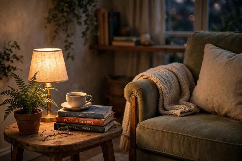
A vignette is finally judged by the room’s evening self, and light is its last ingredient. A lamp within or beside the group is the classic anchor precisely because it lights the scene it stars in; failing that, the arrangement should sit where the room’s lamplight finds it kindly rather than in the corner the light forgot.
Candlelight, used as punctuation
One candle — real, supervised, and set in a proper holder away from anything that drapes or dries — warms a vignette into ceremony. In the many houses that prefer it, a good electric candle does the same work with the vigilance removed; the punctuation matters more than the flame.
The living layer: one green or flowering thing
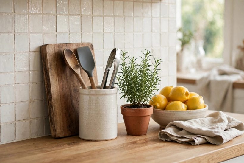
A small plant, a stem in a vase, a bowl of fruit in season: something alive or once-alive keeps the scene from reading as a shop window. It is also the vignette’s calendar — the stem changes, the scene breathes, the room notices the year turning.
Scent belongs to the room, not the arrangement
A vignette near the door carries the house’s welcome; keep its scents natural and faint — the plant, the timber, the book — rather than perfumed competition. The nose reads a room faster than the eye, and it cannot be argued with.
Refresh in minutes: the seasonal swap
The vignette’s living layer makes its cheapest transformation: the spring stem for the winter branch, the bowl of lemons for the bowl of pine cones, the light linen runner for the woollen one. A scene that changes four times a year is never furniture — it stays a sentence the house is still saying, and the swap takes less time than the kettle.
9. Editing: When to Stop, What to Remove
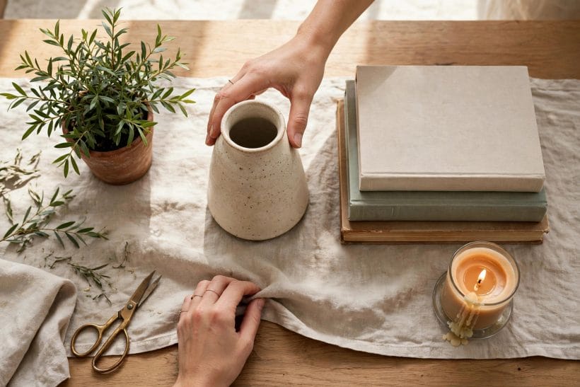
Every vignette is finished by subtraction. The method is the photograph test: take the picture, look at it as a stranger, and remove the object the eye trips on. Then live with the scene for a week before touching it again — arrangements, like gardens, look strange for a fortnight and then become the room’s memory of itself.
The one-in, one-out surface rule
A surface at its composition’s best has no spare capacity: the new object earns its place by replacing, not joining. The rule sounds austere and is in practice the kindest discipline a household owns — it keeps every surface at its photographable best without a single clear-out.
Rotate rather than accumulate
The cupboard of rested objects — last season’s bowl, the other candlesticks — is the vignette-keeper’s real collection. Rotation refreshes every surface in the house for free, and the rested things return like old friends instead of arriving like more clutter.
Let some surfaces stay empty
The final lesson of the ABC is restraint’s address: not every surface wants a scene. An empty side table beside a composed coffee table is not unfinished — it is the silence between the music’s phrases, and it is what makes the vignettes sing.
10. Costs and Pulling It Together
Vignettes are decorating’s honest economy: their cost is almost entirely attention. The objects are the house’s own, the tools are a tray and an afternoon, and the only purchases the craft ever truly demands are the occasional anchor — a lamp, a plant, a picture worth leaning. Spend the money there, when it is spent at all, and let the rest be rearrangement: the same rooms, saying better sentences.
Pulling it together: choose the surface the eye visits first; set one anchor; build the slope in odd numbers; mix heights and textures; thread the colour through the room; leave air; light it kindly; then edit once and stop. Repeat on the next surface when the season turns — the whole curriculum of arranging vignettes, filed under the same spirit as the reading nook, where small composed corners do the house’s largest kindnesses, and the wider home design ideas they both serve.
Final Considerations
A house full of vignettes is not a decorated house so much as a considered one: small evidences, on every third surface, that somebody arranged this on purpose and enjoys living inside the result. The skill is genuinely an ABC — anchor, balance, colour, edit — and it compounds: each surface composed makes the next one easier to see.
Start with the surface you see from the front door, one tray, and an hour. The rest of the house will ask for its turn soon enough.


0 Comments