

Paint is the fastest way to change a bathroom without moving a single fitting. The trick is choosing a colour that suits the light, the tiles you are keeping and the mood you want at 7 a.m. This tour of layouts, vanities and painted bathroom pictures shows how colour behaves in real rooms — small, large, bright and windowless — and what to check before your first coat goes on.
1. Bathroom Paint Colour at a Glance
| Question | Short answer |
|---|---|
| What finish suits a bathroom? | A bathroom-specific or scrubbable finish in a soft sheen copes best with steam and splashes; follow the paint maker’s guidance for humid rooms. |
| Which colours make a small room feel bigger? | Pale, light-reflective shades on walls and ceiling, with tonal trim, usually open a room up most. |
| Can dark colours work? | Yes — in a room with good lighting and pale sanitaryware, deep colour reads calm and cocooning rather than cramped. |
| What should I test first? | The colour beside your actual tiles, floor and vanity, in morning and evening light, on more than one wall. |
| Where else can paint go? | Vanity units, panelling, ceilings, doors and the outside of a freestanding bath can all carry colour, not just the walls. |
Start from what is staying. Tiles, flooring and sanitaryware are expensive to change and they set the undertone rules for everything else: a cool grey tile will fight a warm cream wall, while a warm stone floor can make a crisp white look blue. Collect those fixed colours first, in daylight, and let them narrow the paint chart for you — it is a far smaller and better decision than choosing from every shade in the shop.
Then decide the mood in one sentence. Calm and spa-like, fresh and bright, warm and traditional, or dark and dramatic are all workable bathrooms; the rooms that disappoint are the ones that never chose. That single sentence will arbitrate every later argument about vanities, mirrors, towels and trim far more quickly than taste alone.
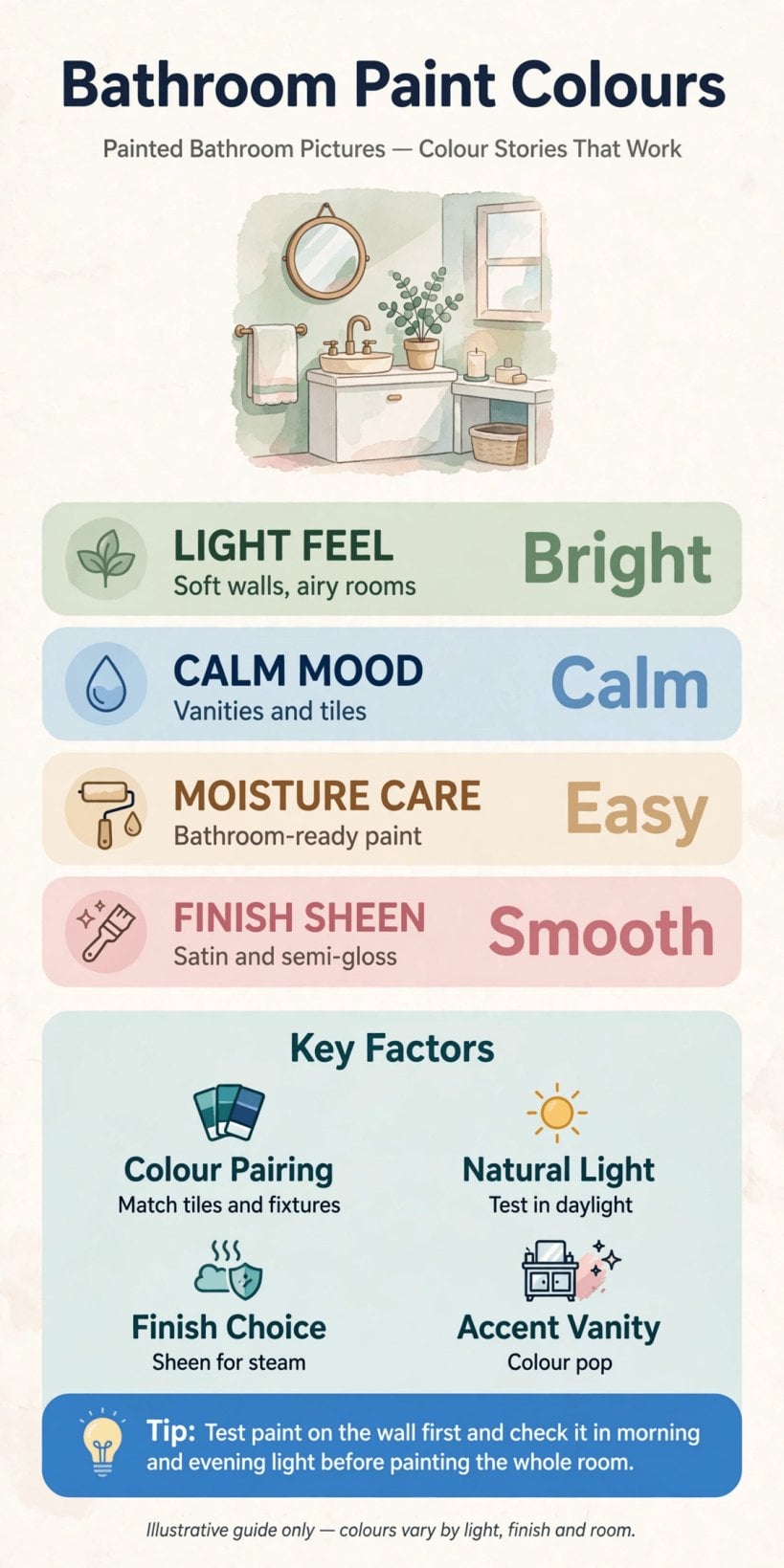
Colour families, finishes and testing steps at a glance — settle the fixed colours and the mood before opening a paint chart.
2. Read the Light Before You Read the Chart
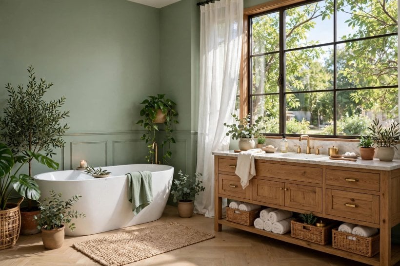
Light changes colour more in a bathroom than in any other room, because many bathrooms have one small window, no window at all, or light that arrives reflected off neighbouring buildings. A north-facing shade that looks elegant in a showroom can turn chilly at home, while a warm white can look creamy and kind under the same grey sky. Note which way your window faces and how much daylight actually arrives before shortlisting anything.
Artificial light matters just as much. Mirror lighting is where the colour will be judged every morning, at close range, so test your shortlist beside the mirror with the real bulbs fitted. Warm bulbs flatter warm colours and can dull cool blues; cooler bulbs do the opposite. If you are changing fittings anyway, choose the lighting first and the paint second — reversing that order is a common cause of a colour that never looks right.
Windowless rooms are not a problem to apologise for; they are a chance to be deliberate. With no daylight to fight, you can choose a gentle pale shade and light it warmly, or lean into a deep colour and make the room feel intentional and cocooning. The same freedom appears in compact homes generally — see how controlled palettes work in these tiny house bathroom ideas, where every colour is chosen because the room is small, not in spite of it.
3. Whites, Creams and the Softest Neutrals
White remains the default bathroom colour for good reasons: it signals cleanliness, reflects what light there is and lets tiles, taps and towels carry the personality. But whites are a family, not a colour. Blue-whites feel crisp beside chrome and grey tile; warm whites suit brass, wood and stone; and a white with a green undertone can look fresh in one room and faintly clinical in another. Line your candidates up against the whitest thing in the room — usually the basin — and the undertones will announce themselves.
Creams and warm off-whites soften a bathroom that risks feeling hard. They pair naturally with timber vanities, woven baskets and brushed metal finishes, and they forgive the slight colour differences between an older suite and newer fittings. Keep the ceiling in the same family so the room wraps rather than stripes, and use towels or a blind for any stronger colour you want to be able to change cheaply.
Soft neutrals — pale greige, stone and mushroom shades — offer middle ground: more atmosphere than white, less commitment than colour. They are especially good in family bathrooms that must please everyone and in rental properties being refreshed between tenancies. The layered, tonal approach in this colourful tiny house interior shows the opposite end of the same skill: whether you go bold or neutral, choosing a tight family of shades is what makes a small room feel designed.
4. Blues and Greens: The Bathroom Naturals
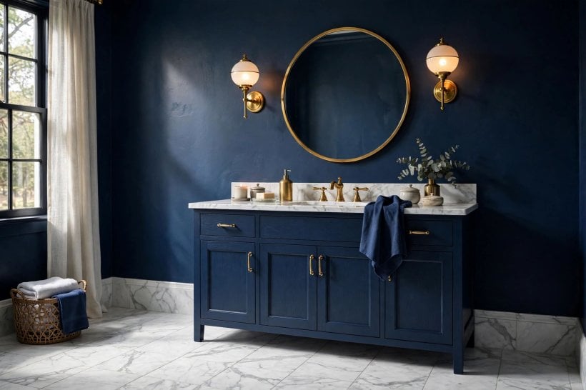
Blue belongs in bathrooms the way green belongs in gardens. Pale aqua and misty blue-grey shades feel clean and watery, mid blues add cheer without shouting, and deep navy turns an ordinary suite into something that feels considered and calm. Blue’s one trap is coldness: in a dim, north-facing room a grey-blue can feel chilly, so balance it with warm wood, warm metal or warm lighting.
Green has quietly become the other bathroom natural. Sage and eucalyptus shades sit comfortably with plants, stone and white sanitaryware and hide the visual noise of a busy family bathroom. Brighter greens energise a small cloakroom, while deep forest green behind a white freestanding bath is one of the most reliable dramatic looks there is — the white stays the star, the green does the atmosphere.
Both families pair well with natural materials, which is why they recur in so many painted bathroom pictures worth saving. If your tiles are plain white, blue or green walls give the room its identity; if your tiles are patterned or strongly coloured, let the paint be the quieter partner picked out from a tone inside the tile pattern itself.
5. Warm Shades: Blush, Terracotta, Ochre and Clay
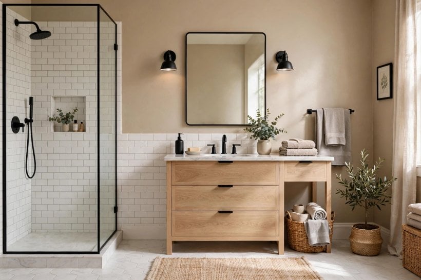
Warm colours solve the problem every cool bathroom has: it can feel like a place to hurry out of. Blush and dusty pink flatter skin at the mirror — a practical virtue no other colour family can claim — and they pair beautifully with white suites, marble-effect tiles and brass or black fittings. Keep blush dusty rather than sugary and it reads sophisticated, not sweet.
Terracotta, clay and ochre bring an earthy, sunbaked warmth that suits rustic, Mediterranean and modern organic schemes alike. They are strong colours, so they work well on one wall, below a dado line, or on a vanity and panelling with paler walls above. Natural textures — timber, rattan, linen, stone — calm these shades down and stop them feeling themed.
Test warm shades at night as carefully as by day. Under warm evening light they can intensify, which is lovely in a bath-by-candlelight room and overpowering in a bright family bathroom at dawn. If a full wall feels like too much commitment, a warm-painted ceiling over white walls gives the glow without the intensity, and it is a single weekend’s work to change if you tire of it.
6. Dark and Moody: Charcoal, Ink and Deep Tones
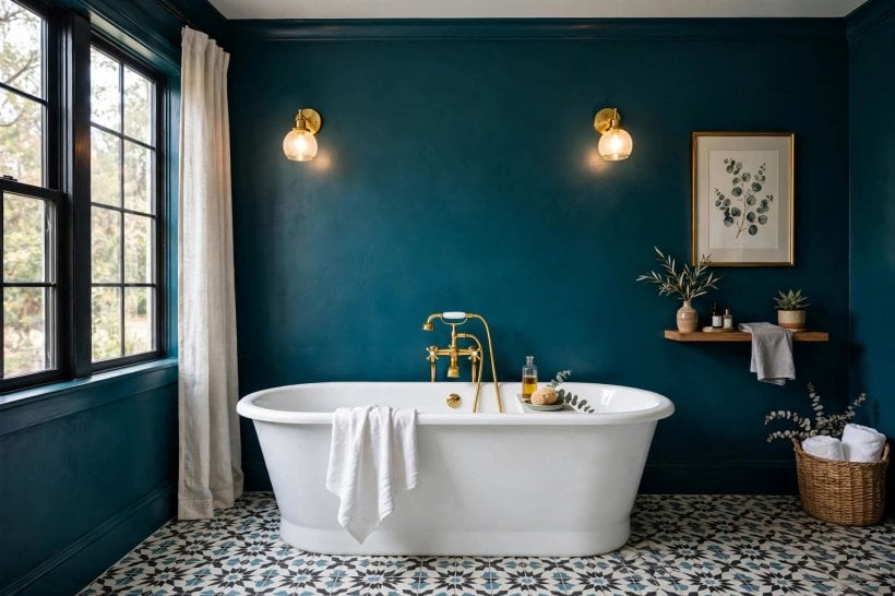
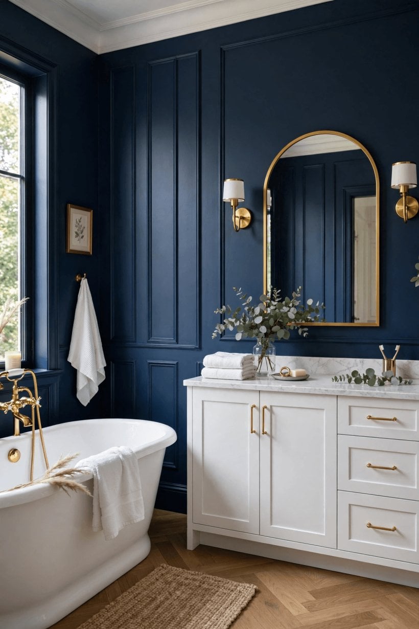
Dark bathrooms work because bathrooms are used in short visits, not lived in all day — drama that would tire in a living room delights here. Charcoal, ink blue, deep green and even near-black walls make white sanitaryware glow, metals gleam and mirrors become pools of light. The smaller and more windowless the room, the more convincing the effect often is, because there is no weak daylight arguing with the concept.
Success depends on lighting and contrast, not courage alone. Plan at least two light sources — a main light plus mirror lighting — so the room is atmospheric rather than murky, and keep something pale in the scheme: the suite, a floor, a ceiling or generous towels. Dark walls also show water marks and dust more readily, so choose a finish that wipes clean and keep a microfibre cloth in the room.
Commit in stages if you are unsure. Paint the wall behind the basin first, live with it for a week of real mornings, then decide about the remaining walls. That measured approach suits other compact rooms too; the restful schemes in these tiny house bedroom ideas use deep colour in the same disciplined way, as a backdrop that makes everything placed against it look better.
7. Half-Painted Walls, Colour Blocking and Ceilings
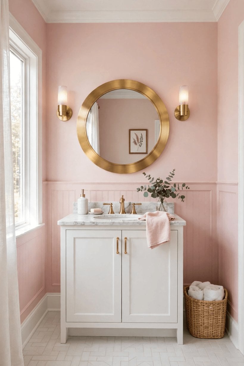
A half-painted wall — colour below, pale above, divided by a crisp line — is the hardest-working trick in the bathroom painter’s kit. The coloured lower half grounds the room, hides splash-zone scuffs and gives the effect of panelling without the joinery, while the pale upper half keeps the light. Set the line at a height that relates to something real: the top of the tiles, the basin splashback or a panelling rail, rather than an arbitrary midway point.
Colour blocking can also zone a larger bathroom. A soft shade behind the bath, a deeper tone in a shower zone or a painted arch or rectangle behind a mirror gives each area its own identity while the fittings stay the same. Keep edges sharp with good tape, patience and a steady hand, and limit the room to two paint colours plus trim so the zoning reads as design rather than indecision.
Do not forget the fifth wall. A ceiling painted in a gentle tint of the wall colour lowers a too-tall room pleasantly and makes a small room feel wrapped and intentional; a soft colour overhead over white walls gives a tent-like calm that suits a bath-led room. The same whole-room thinking shapes the schemes in this look at a tiny barn house interior, where ceilings and woodwork are part of the palette from the start, not an afterthought.
8. Painting the Vanity, Panelling and Woodwork
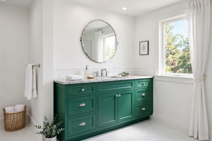
Sometimes the walls should stay quiet and the furniture should sing. A painted vanity unit — deep green, inky blue, warm clay or a classic grey — gives a bathroom its focal point for the price of a small tin of paint, and it can be repainted when taste changes in a way tiles cannot. Prepare properly: clean, sand, prime with a product suited to the unit’s surface and the humid room, and allow full curing time before the unit goes back into daily splash duty.
Panelling and tongue-and-groove, real or applied as moulding on a flat wall, take paint beautifully and add the texture plain bathrooms lack. Painted the same colour as the wall above, panelling reads subtle and architectural; painted in contrast, it becomes the room’s main event. Either way it protects the splash zone better than bare plaster and gives a half-tiled room a finished alternative.
Woodwork choices pull the scheme together. Matching skirting, architrave and door to the wall colour makes a small room feel larger and calmer; contrasting trim frames the room in a more traditional way. Even the outside of a freestanding bath can be painted to match or contrast. For more fitted-furniture inspiration, the joinery-led rooms in this bedroom interior design for tiny houses feature show how painted woodwork earns its place in a palette.
9. Pairing Paint With Tiles, Floors and Metals
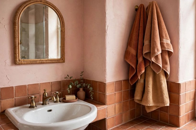
Paint never appears alone; it is always seen against tile, floor and metal. Work out the room’s existing undertone story first. Grey tiles and chrome like cool paint families. Stone-effect floors and brass like warm ones. Black fittings act as punctuation in almost any scheme and can rescue a palette that feels too soft, while brushed nickel and aged brass soften palettes that feel too stark.
Where tiles cover most of the wall, the paint colour’s job changes: it must flatter the tile from the small areas — above the tiling, the ceiling, a window wall — where it appears. Pick a tone from within the tile or grout rather than introducing a new colour, and let texture and accessories provide the interest. Patterned floors ask for the same discipline: a quiet wall in a shade drawn from the pattern will always beat a competing colour.
Use accessories as the adjustable layer. Towels, a bath mat, a blind and a plant can test a bolder accent colour for a few pounds before you commit it to a wall. If the accent delights you for a season, promote it to the vanity or the lower wall at the next repaint. This layered, reversible approach is the same one that makes the living spaces in these tiny house living room ideas feel personal without feeling permanent.
10. Testing, Prep and Finish: Making It Last
Testing is not a courtesy step; it is the project. Paint large swatches — at least a sheet of paper, painted and taped up — on two walls, and look at them wet and dry, morning and night, for at least a day. Colour dries darker and looks different across a whole wall than on a chart chip, and bathrooms add steam, mirrors and artificial light to further change the result. Move the swatch beside tiles, floor and vanity before deciding.
Prep decides how the finish looks in year three. Clean away bathroom residues, fill and sand, deal with any mould at its source, and use the primer and bathroom-suitable paint system the manufacturer recommends for humid rooms. Ventilation is part of the paint job too: an extractor that actually clears steam, or a window opened after showers, protects the finish you have just paid for in time and money.
Apply thin, patient coats and respect drying times between them, however tempting a same-day finish is. Keep leftover labelled paint for touch-ups, and note the colour name, finish and where it was used in your house records. A bathroom repaint is one of the cheapest refreshes in the home — comparable to the garden-side improvements in these tiny house landscaping ideas — and good records make the next one easier still.
Final Considerations
Choose bathroom colour in this order: fixed elements first, light second, mood third, shade last. Let tiles and floors set the undertone rules, test generously in real light, and use the room’s furniture — a vanity, panelling, even a bath exterior — as part of the palette rather than painting walls in isolation.
Whether you land on a warm white, a watery blue, a flattering blush or a confident charcoal, a bathroom painted with that discipline will feel deliberate every morning. And because paint is the most reversible decision in the room, you can afford to be a little braver than you think — the next colour is only ever a weekend away.

0 Comments