

Paint is the fastest way to change how a bedroom feels, and the easiest to get wrong under the wrong light.
A calmer room starts with testing, not with a tin. These ideas walk you through palettes, finishes and pairings, one honest step at a time.
1. Read Your Light Before You Choose a Colour
The same shade can look soft at breakfast and muddy by lamplight, so light comes before colour charts. Among all bedroom paint ideas, the ones that last are chosen in the room itself, as Tiny House Interior Paint Colors: Shades That Make Small Feel Big also shows for compact homes.
| At a Glance | What to Aim For |
|---|---|
| Best start | Test three shades on two walls, morning and evening |
| Calmest palettes | Warm whites, soft blues, sage greens and gentle greys |
| Finish | Matt or eggshell on walls, satin on woodwork |
| Accent rule | One deeper wall or none at all, never three competing features |
| Ceiling | Same colour or one step lighter than the walls |
| Budget note | Sample pots first; a wrong full tin costs far more |
| First check | Which way the windows face and when the sun arrives |
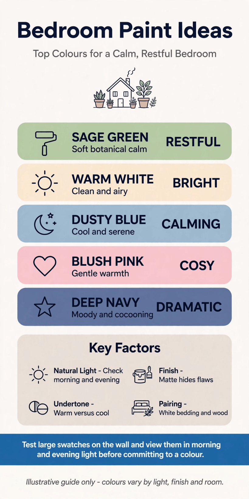
At a glance: light, palette, finish and testing, the four checks to make before any tin is opened.
1. Note which way your windows face. North-facing rooms make colours look cooler and greyer, while south-facing rooms warm everything up. Write it down before you shop, because a shade that sings in one room can sulk in another.
2. Paint big test patches, not tiny swatches. Brush two coats onto large pieces of lining paper and tape them up. Small chips lie about depth; a patch the size of a pillow tells the truth at every hour.
3. Live with the patches for two full days. Check them at breakfast, in flat afternoon light and under your bedside lamp. The right colour is the one you still like in the least flattering light of the day.
4. Move the patch behind the bed. The wall you actually see from the pillows matters most, and colours behave differently above bedding. Test where the headboard will sit, not just beside the door where you enter.
5. Hold fabric against the patch. Curtains, bedding and rugs all shift how a wall colour reads. A shade that fights your favourite quilt will annoy you daily, however beautiful it looked on the chart.
6. Check the colour against your skin tone in a mirror. Bedrooms are where faces rest, read and recover. If a shade makes everyone look exhausted in the mirror, pick the warmer neighbour on the chart instead.
7. Decide the mood in one sentence. Sleepy and cocooning, or fresh and bright? Write the sentence on the sample tin. Every later choice, from curtains to lamps, gets easier when the goal is written down.
8. Photograph the room at three times of day. Phone photos exaggerate contrast, but they reveal glare, dark corners and the wall that catches all the light. Use them to decide where a deeper colour can honestly live.
2. Soft Neutrals and Warm Whites
Neutrals are not the boring option; they are the flexible one, letting bedding, wood and art do the changing with the seasons. For room-by-room small-space thinking, Tiny House Bedroom Ideas pairs well with this palette.
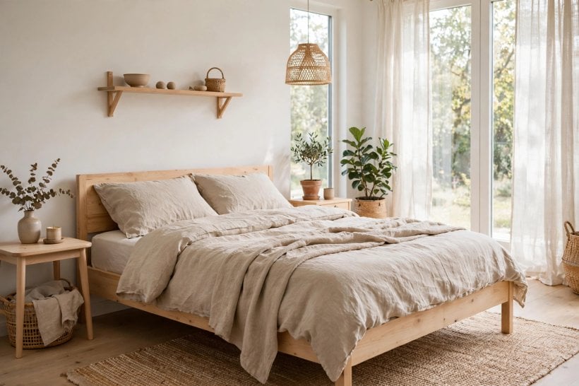
9. Choose a warm white for north-facing rooms. A white with a hint of cream or beige cancels the blue cast of cool daylight. Avoid icy whites there; they can make a restful room feel like a waiting room.
10. Layer two neutrals instead of chasing one perfect shade. Walls in a soft stone tone with bedding a step lighter feels designed, not plain. The gentle contrast gives depth without any strong colour to tire of.
11. Use putty and mushroom tones for instant calm. These in-between shades feel warm at night and clean by day. They hide minor wall imperfections kindly and suit both pale oak and darker vintage furniture.
12. Keep ceilings a cleaner white than the walls. A ceiling one step brighter lifts the whole room and makes coloured walls look deliberate. It also helps low rooms feel less like the lid is pressing down.
13. Add texture when the palette is quiet. Linen, wool, rattan and unglazed ceramics stop a neutral room feeling flat. If everything is smooth and shiny, even the loveliest shade will look a little sterile.
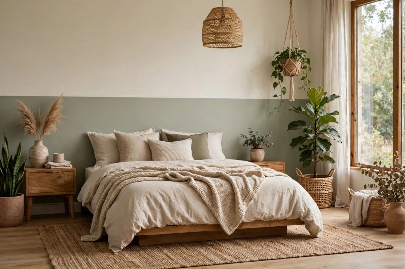
14. Pick a neutral with a green hint for leafy views. A soft green-grey echoes the garden outside the window and blurs the boundary in the nicest way. It is a classic trick for rooms that overlook trees or a courtyard.
15. Test whites beside your actual woodwork. Yellowed old gloss can make a fresh white look blue, and vice versa. If you are not repainting the trim, choose a wall shade that forgives its tone.
16. Use one neutral everywhere in a small suite. The same soft shade across bedroom, dressing nook and hall makes small spaces feel joined up and larger. Change the textiles, not the paint, to mark each zone.
3. Calm Blues and Blue-Greys
Blue is the colour most people ask for when they say they want to sleep better, and the softer, greyer end of the family rarely disappoints.
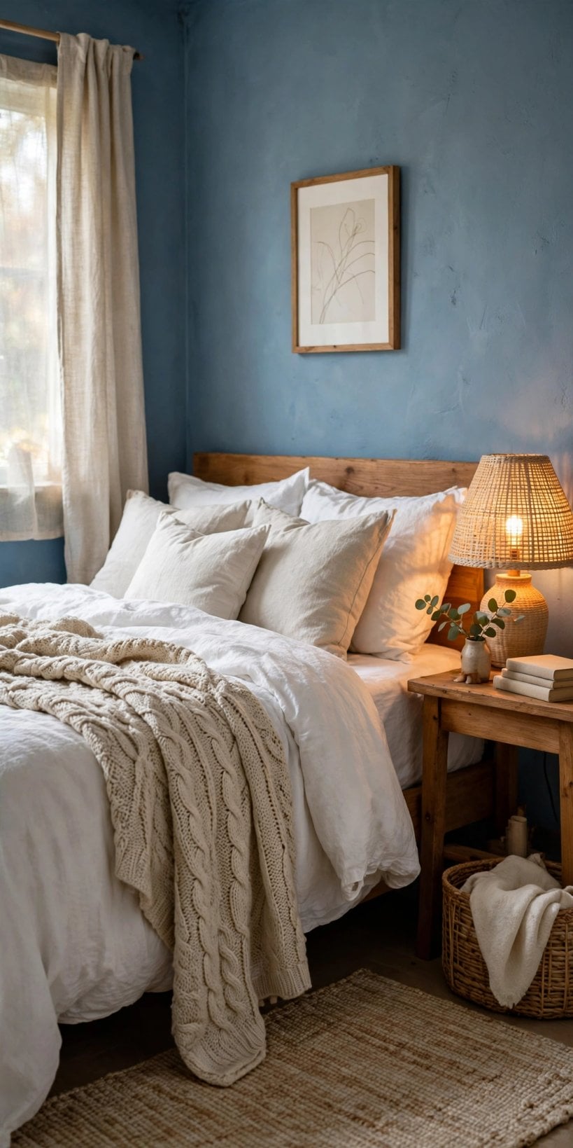
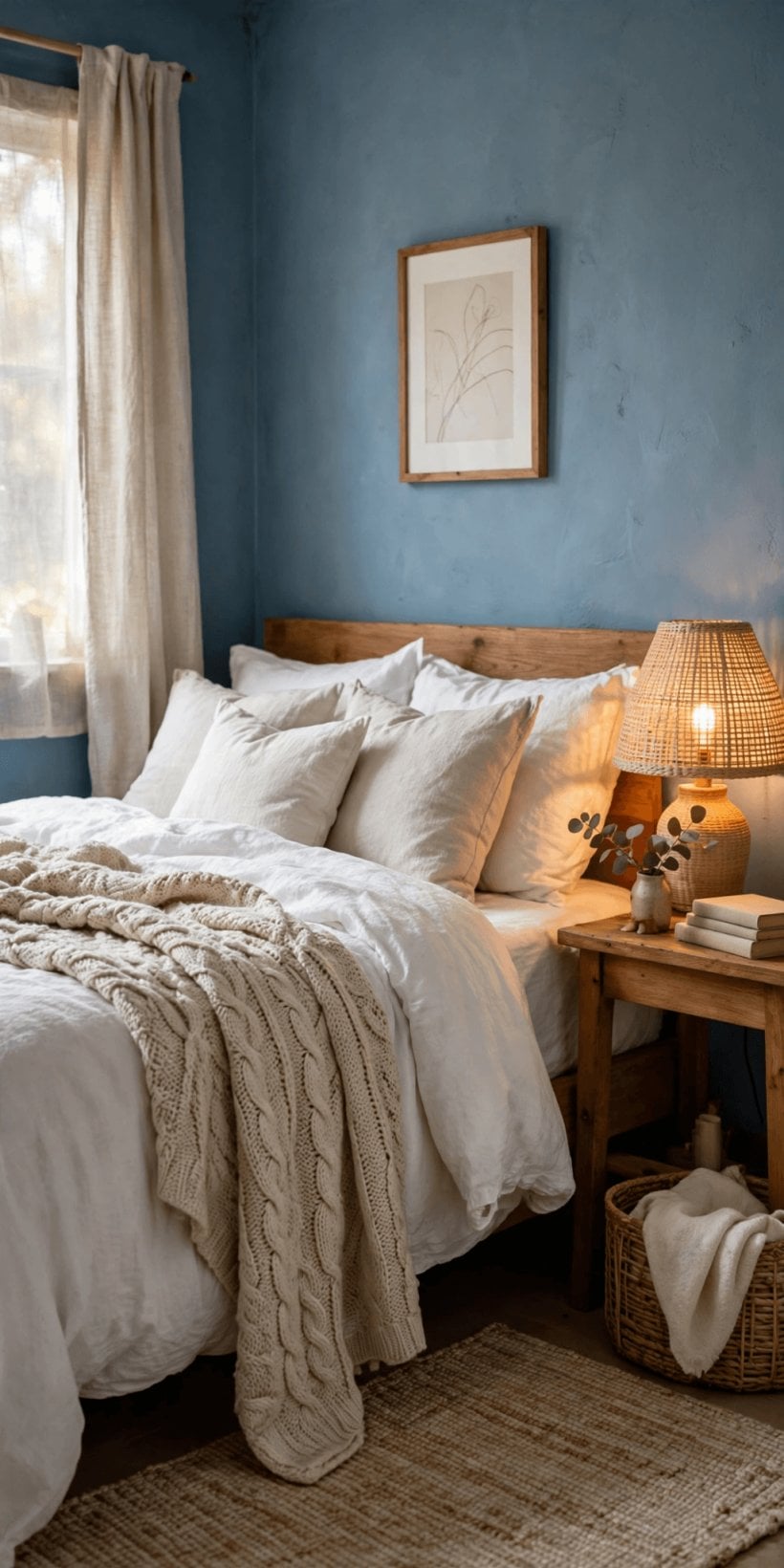
17. Try a misty blue-grey on all four walls. Wrapping a soft blue around the whole room feels like dusk settling, in a good way. Keep bedding pale so the walls stay the quiet background, not the main event.
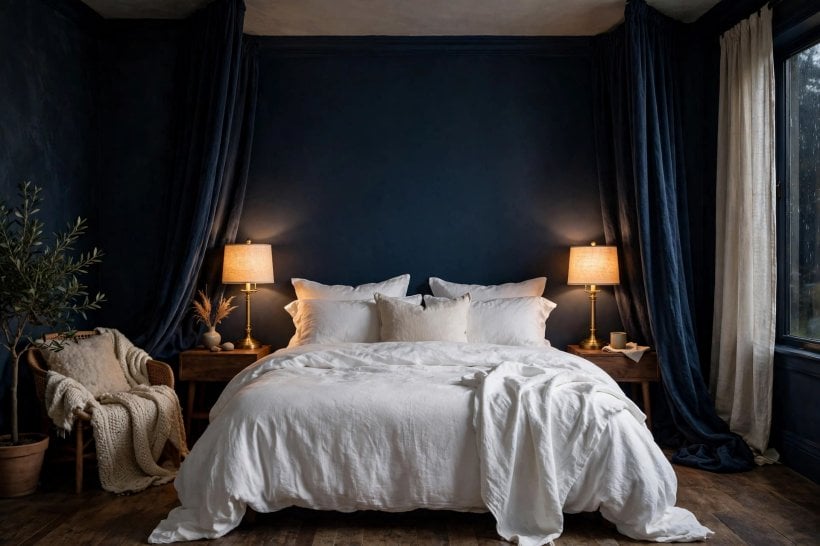
18. Put a deeper blue only behind the bed. A navy or slate headboard wall adds drama while the other walls stay light. From the pillows you face the calm walls; from the door you get the welcome.
19. Pair blue walls with warm wood to stop the chill. Blue plus white can feel coastal or cold; blue plus honey-toned wood feels like a library. Add brass or warm metal lamp bases for the same reason.
20. Use powder blue in a child’s room that must grow up. The palest blues work for a nursery and still suit a teenager with different bedding. It saves a full repaint when tastes change, which they reliably do.
21. Choose a grey-blue for rooms with strong sun. Bright southern light can wash pale colours out to nothing. A blue with real grey in it holds its depth at midday and turns cosy at night.
22. Repeat the blue in one small textile. A single cushion or throw in a similar tone joins the walls to the bed. Resist matching everything; one echo is elegant, five is a theme park.
23. Keep blue bedrooms’ lighting warm. Warm bulbs rescue blue paint from looking chilly after dark. Test your lamp bulbs against the sample patch before you commit to either one.
24. Try blue on the ceiling for a canopy feel. A soft blue ceiling above white walls feels like sky and lowers a too-tall room visually. Keep the shade pale; the effect is gentle, not theatrical.
4. Greens From Sage to Deep Forest
Green connects a bedroom to the outdoors and suits almost every skin tone and wood finish. Sleeker small-room schemes in Modern Tiny House Bedroom: 20 Sleek Design Ideas show how well green behaves in compact spaces.
25. Start with sage if you are nervous. Sage is the diplomat of greens: calm, forgiving and happy with white, wood or black accents. It is very hard to regret, which makes it a fine first colour.
26. Go deep green for a cocooning main bedroom. A forest or bottle green on all walls makes a large, bright room feel intimate. Balance it with pale bedding and one light-coloured piece of furniture.
27. Use olive tones with terracotta accents. Olive’s warmth loves clay, rust and natural leather. Together they make a bedroom feel earthy and settled, especially in autumn and winter light.
28. Paint a green half wall behind the bed. A horizontal colour block at headboard height gives the effect of a giant headboard for the price of a small tin. Finish the edge with a slim wooden batten for crispness.
29. Match green walls with plants sparingly. Two or three real plants echo the colour beautifully; a jungle competes with it. Let the paint do the green work and the plants add the life.
30. Test green carefully under lamplight. Some greens turn muddy or khaki under warm bulbs, others glow. Your two-day patch test matters more with green than with almost any other colour family.
31. Choose a blue-green for a fresher feel. Eucalyptus and sea-glass tones feel airy where yellow-greens feel earthy. Pick by the mood sentence you wrote earlier, not by which chip looked prettiest in the shop.
32. Use deep green in a guest room. Guests love a room that feels like a boutique stay, and deep green delivers that in one coat of confidence. Add crisp white bedding and the job is done.
5. Blush, Clay and Warm Earth Tones
Warm, dusty tones make bedrooms feel like evening light all day. They flatter skin, soften black furniture and welcome the vintage pieces discussed in Tiny House Decorating Ideas.
33. Pick a dusty blush, never a sugary pink. Greyed, grown-up blush reads as a warm neutral, not a theme. It pairs with charcoal, cream and aged brass for a bedroom that feels calm, not cute.
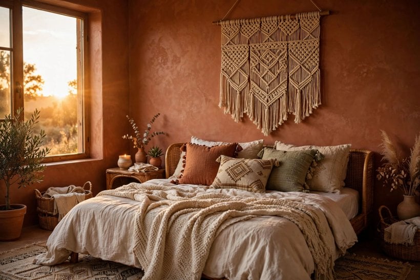
34. Try clay or terracotta on one wall. A single earthy wall brings sunset warmth behind pale bedding. Keep the other walls a warm off-white so the room stays light enough for dressing and reading.
35. Use warm taupe when blush feels brave. Taupe with a rosy undertone gives the same glow with less commitment. It is a kind bridge colour for couples who disagree about pink in any form.
36. Pair earth tones with natural fibres. Jute, linen, cane and raw cotton were made for this palette. Synthetic shiny fabrics fight it; if the bedding looks plasticky, the paint will get the blame.
37. Add a deep accent to ground the warmth. One charcoal, chocolate or black piece, a frame, a lamp, a bench, stops warm tones floating away into sweetness. Every soft scheme needs a firm full stop somewhere.
38. Test blush at night before deciding. Pink-family colours can turn peachy or orange under warm lamps. If the night version delights you, proceed; if it alarms you, choose the greyer chip beside it.
39. Carry a clay tone into an ensuite carefully. Repeating the colour in a connected bathroom joins the spaces, but use it on one wall or the vanity only. Echo, do not flood, and the link stays elegant.
6. Greys, Greige and Charcoal
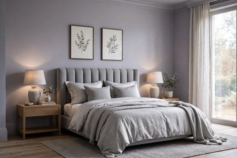
Grey done well is sophisticated and restful; grey done carelessly is a car park. The secret is undertone, warmth and contrast.
40. Choose greige for the best of both worlds. Grey-beige adapts to cool mornings and warm evenings better than true grey. It is the safest backdrop for mixed wood tones and inherited furniture.
41. Check grey’s undertone in daylight. Some greys flash blue, some violet, some green. Hold the chip beside a sheet of plain white paper in window light and the undertone will confess immediately.
42. Use charcoal as the accent, not the room. A charcoal headboard wall with pale bedding looks expensive and calm. Charcoal everywhere needs strong daylight and courage; test honestly before attempting it in a small room.
43. Warm a grey room with layered lighting. Two lamps at different heights rescue grey from flatness after dark. Paint cannot do it alone; light is half of every colour decision you will make.
44. Mix grey walls with white and one colour. Grey, white and a single accent, mustard, rust or deep teal, in small doses looks pulled together. Accent everywhere is just colour again, with grey as a bystander.
45. Take grey one shade deeper on the wardrobe wall. Built-in cupboards painted slightly deeper than the walls look bespoke and calm. It is a subtle move that makes flat-pack furniture look quietly expensive.
46. Avoid blue-grey in a cold, dark room. In north light with small windows, blue-grey can feel like a November morning. Choose the warm greige neighbour and keep the blue for cushions you can change.
47. Finish grey schemes with soft, matte textures. Boucle, wool and washed cotton keep grey restful. High-shine surfaces tip it towards office or showroom, which is rarely the feeling a bedroom needs.
7. Finishes, Ceilings and the Fifth Wall
Colour gets the attention, but finish decides how the room feels and how well it survives real life. Whole-room thinking from Tiny House Interior Design Ideas: 25 Timeless Styles and Trends applies just as much overhead.
48. Choose matt for walls that must forgive. Flat finishes hide bumps, old plaster and imperfect filling better than any sheen. Modern washable matts survive gentle wiping, so they are practical as well as pretty.
49. Use eggshell where walls get touched. Around doors, switches and children’s heights, a slight sheen shrugs off marks. The difference from matt is subtle in daylight and invisible by lamplight.
50. Paint woodwork in satin, not gloss, for a softer scheme. Satin trim looks calm beside matt walls and suits both period and new rooms. High gloss can feel harsh and shows every brush mark and dent honestly.
51. Try the ceiling in the wall colour, one step lighter. This softens the hard line where wall meets ceiling and makes the room feel wrapped. It works especially well with the deeper palettes in earlier sections.
52. Paint a low ceiling a pale, warm tone. Bright white can glare in a low room; a warm off-white feels higher and kinder. Keep the walls a touch deeper so the ceiling still reads as the lightest plane.
53. Consider a colour-drenched ceiling for drama in one room. Walls and ceiling in the same deep shade is bold, cocooning and unforgettable. Save it for a room with good height and bedding pale enough to lift it.
54. Use a washable paint behind the bed. Headboards, hair and hands all meet that wall nightly. A scrubbable finish there saves the whole scheme from looking tired within a year.
55. Keep one finish across a joined suite. Mixing sheen levels between bedroom and dressing area draws attention to the join. Same finish, changing colour if you like, keeps the flow quiet and deliberate.
8. Two-Tone Walls, Headboard Walls and Colour Drenching
When one colour feels too plain and a pattern feels too much, placement tricks give you design without wallpaper. Open-plan colour lessons from Tiny House Living Room Ideas translate surprisingly well to bedrooms.
56. Paint a headboard rectangle wider than the bed. A colour block extending a little beyond each side of the bed frames pillows like artwork. Measure from the mattress, not the frame, and tape the lines before painting.
57. Run a picture-rail split: deep below, pale above. The lower colour grounds the room while the pale top keeps it airy. It flatters period rooms with rails and works with a simple taped line in new ones.
58. Drench one small bedroom completely. Walls, woodwork and even the ceiling in one mid-tone shade makes a box room feel intentional and jewel-like. Small rooms often take drama better than big ones do.
59. Paint the wardrobe doors to disappear. Doors in the wall colour stop a run of cupboards shouting for attention. Change the handles to something you love; invisible doors deserve beautiful handles.
60. Frame the window wall in a deeper tone. A deeper colour around the window makes the view the picture and the wall its frame. It also hides the scuffs and marks that gather near handles and sills.
61. Use two tones of the same colour for safety. If mixing colours worries you, go one shade deeper on one wall instead. Monochrome schemes almost never clash, and the depth difference does all the work quietly.
62. Paint an arch or curve for a soft feature. A painted arch behind the bed or a reading chair adds shape without building anything. Draw it with string and a pencil, stand back, adjust, then paint once.
9. Pairing Paint With Bedding, Wood and Light
A wall colour never sits alone; it argues or agrees with everything touching it. If your bedroom doubles as a work corner, the calm palettes here also suit Home Office Design Ideas for Tiny Houses and Small Spaces.
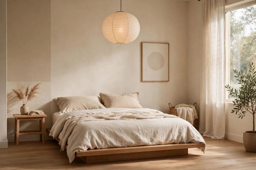
63. Choose the paint after the bedding, not before. There are thousands of paint shades and about six quilts you truly love. Match the abundant thing to the precious thing, in that order, every single time.
64. Lay swatches on the bed, not the table. Colour decisions made under kitchen lights fail in bedrooms. Spread chips across the duvet in the room’s own light and the wrong ones eliminate themselves quickly.
65. Match undertone to your wood. Orange-toned pine loves warm greys and creams; cool ash floors love blue-greys and clean whites. Fight the undertone and the room will never quite settle, whatever you buy.
66. Keep one metal finish repeated twice. Lamp bases and handles in the same finish tie a painted scheme together. Two appearances is enough; matching every object turns a bedroom into a showroom set.
67. Use white bedding as your safety net. Plain white or cream bedding forgives every wall colour and always looks fresh. With that anchor in place, you can afford to be braver on the walls.
68. Add pattern in textiles, not on walls. A patterned cushion or throw gives life that paint alone cannot, and it can be changed in minutes. Painted schemes stay calm longest when pattern is allowed to be temporary.
69. Stand at the door and squint. The squint test removes detail and shows only colour balance. If one element leaps out shouting, tone it down; a restful room should hum, not perform.
10. Testing, Prep and a Simple Painting Plan
Great results come from boring prep done properly and a simple order of work. None of this is glamorous, and all of it shows in the finish.
70. Buy sample pots in three neighbouring shades. The middle one is rarely right; light in real rooms pushes colour paler or deeper than the chart. Testing a trio gives you the true shade’s address.
71. Fill, sand and wipe before any colour goes on. Paint highlights every crack and nail hole you ignored. An hour of filling and a dust-free wall are the difference between fresh and merely recent.
72. Use the primer the paint maker recommends. Strong old colours, new plaster and stains all need the right base, and it differs by product. Check the tin and the maker’s guidance rather than guessing.
73. Paint in daylight order: ceiling, walls, woodwork. Drips fall downwards, so work downwards too. Mask the floor edges, keep a damp cloth for mistakes, and remove tape while the last coat is just tacky.
74. Plan two thin coats, not one thick one. Thin coats dry smoother, cover better and resist drips and brush marks. Rushing a single heavy coat is how a weekend job turns into a fortnight of regret.
75. Label the leftover tin and keep a painted stick. Write the room, brand, shade and date on the lid for touch-ups. A labelled dipping stick in the room’s drawer makes future colour matching a two-minute job.
Final Considerations
Test big, test in the room’s own light, and let the bedding you love lead the palette. The best bedroom paint ideas are not the boldest ones; they are the ones you still enjoy on a grey Tuesday morning. Choose the shade that helps you sleep, wake and breathe a little easier, and the room will do the rest.



0 Comments