
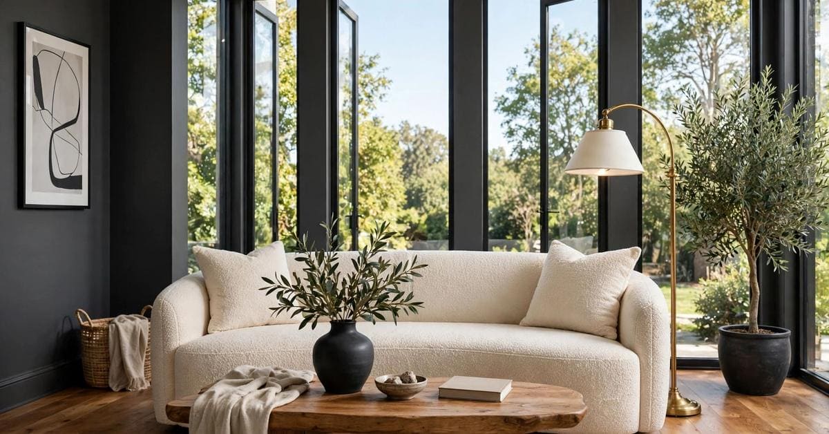
Charcoal does not decorate a room. It changes the room’s weather — walls go quiet, wood glows warmer, and every pale thing in the space suddenly looks deliberate.
This guide treats charcoal color as a whole-home decision: what charcoal actually is, how its undertones behave, and how to use it in living rooms, kitchens, small rooms and on exteriors — without a single invented paint code.
1. Charcoal Colour at a Glance
Charcoal is the deepest of the true greys — the colour of the burnt end of a stick of wood, dark enough to anchor a room but softened by grey so it never carries the hard edge of pure black. That softness is its whole talent: charcoal gives a space the depth and drama of a dark colour while staying a neutral, so furniture, timber, textiles and art all sit comfortably against it. This post belongs to the wider paint-colour family on this site and stays with charcoal alone: the colour itself, its undertones, its pairings and its care. Its nearest neighbours carry their own honest treatments — the grey-led exterior survey in gray exterior home ideas and the warm neutral guide in taupe color — and the broader exterior context sits in exterior home ideas, so nothing here needs to pretend charcoal is every dark colour at once.
| Question | Short answer |
|---|---|
| What colour is charcoal, exactly? | A very deep grey, softer than black, whose character is set by its undertone — blue, green, warm brown or near-neutral |
| Where does charcoal work best? | Living rooms, kitchen cabinets, bedrooms, studies and exteriors — anywhere depth, contrast or calm is wanted |
| What pairs with charcoal? | Warm whites, natural timber, brass and warm metals, and one clear accent colour used with restraint |
| Can small rooms wear charcoal? | Yes — evenly, on every wall, with good light; a single dark wall in a pale small room usually just looks unfinished |
| How is the right charcoal found? | By testing large samples in the room’s real light, in daylight and in evening light, before committing |
2. What Charcoal Is: The Deep End of Grey
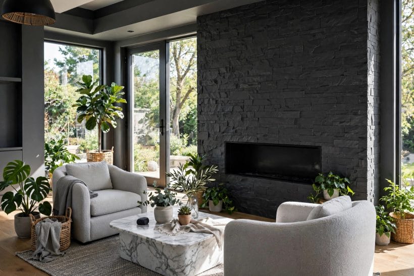
Every argument about charcoal is really an argument about undertones. Two paints can share a name and behave like different colours, because what sits underneath the grey decides everything the eye actually sees.
Blue-leaning charcoal: cool and architectural
A charcoal with a blue whisper reads crisp, formal and modern. It flatters chrome, marble, glass and pale woods, and it is the natural partner for white trim with a cool lean of its own. In a north-facing room it can turn austere, so it asks for warm textiles and timber somewhere in the scheme to keep its manners.
Green-leaning charcoal: earthy and calm
A green whisper makes charcoal feel botanical and settled — the version that sits happily beside plants, stone, linen and aged brass. It is forgiving in garden-facing rooms, where green light arrives all day, and it is often the easiest charcoal for a whole room because its darkness feels grown rather than painted on.
Warm charcoal: brown beneath the grey
Warm charcoals carry a brown or faintly violet warmth under the grey and read almost soft-black in evening light. They are the cosiest of the family, the kindest to warm woods and leather, and the safest choice where the room’s light is mostly lamplight. The reference habits in the colour reference guide — judging a colour by its undertone family first and its name second — were made for exactly this decision.
Why charcoal changes through the day
Charcoal borrows colour from its surroundings more obediently than any pale paint: morning light blues it, midday flattens it toward true grey, lamplight warms and deepens it, and a dark room at dusk can take it almost to black. That is not a flaw to engineer away; it is the colour’s life. It does mean a sample judged only at noon has not really been judged at all.
3. Choosing the Depth: Soft, Classic and Near-Black
Depth is the second decision after undertone. The same charcoal family at three depths makes three different rooms, and the right depth is set by the room’s light, its size and how much contrast the scheme is built to carry.
Soft charcoal: depth without drama
The palest charcoals — sometimes closer to a deep warm grey — give a room shadow and structure while staying gentle enough for every wall in an ordinary-lit home. They suit hallways, open-plan spaces and anyone making a first move away from pale neutrals, and they hide the scuffs of daily life far more kindly than white ever does.
Classic charcoal: the settled middle
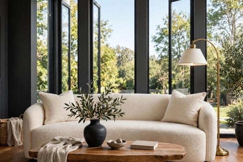
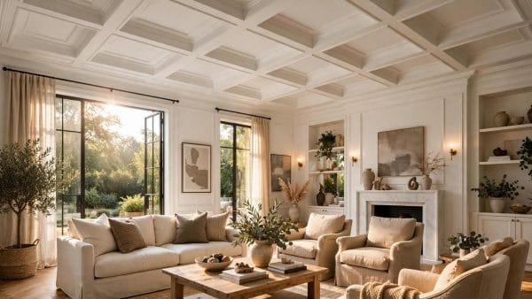
Mid-depth charcoal is the colour most people picture: unmistakably dark, still clearly grey, strong enough to make pale furniture glow against it. It is the depth the living room in this post’s feature photograph wears — composed behind tall windows, with a cream sofa and warm timber doing the brightening. For most rooms, this is the honest starting point.
Near-black charcoal: the full commitment
The deepest charcoals read as black with manners. They make superb cabinet colours, study walls, cinema-dark bedrooms and exterior schemes, and they reward texture — limewash effects, panelling, woven textiles — because at this depth the eye reads surface as much as colour. Their caution is light: a near-black room with weak lighting does not look moody, it just looks dim.
4. Charcoal in Living Rooms
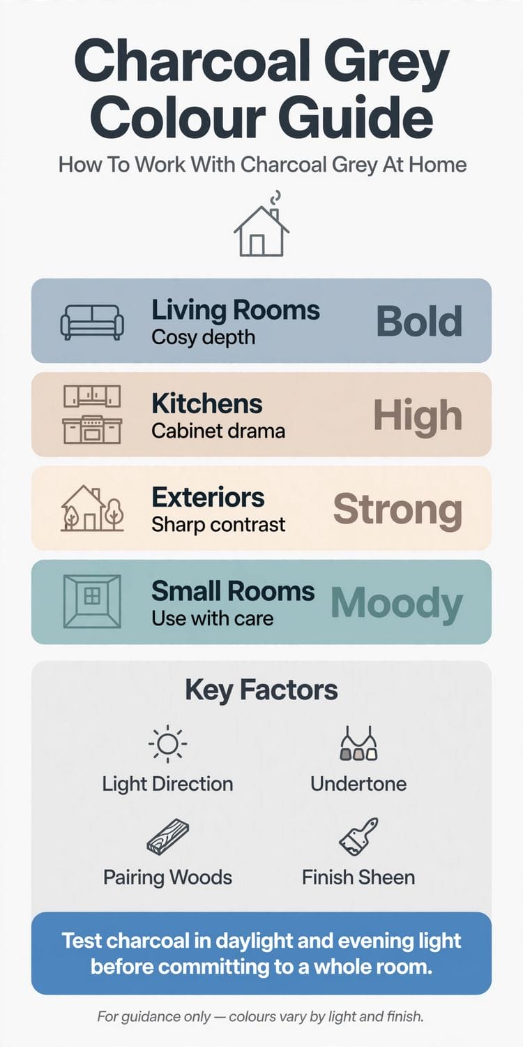
The living room is charcoal’s home ground — the infographic’s first row gives it the family’s boldest verdict for a reason. A charcoal living room feels gathered-in and evening-ready at any hour, and it flatters exactly the things living rooms are full of.
Every wall, or one wall done properly
Charcoal rewards commitment. Painted on every wall, it wraps the room and makes its edges recede, which can make a modest room feel larger rather than smaller. A single charcoal wall works when it is the room’s natural anchor — behind a fireplace, a bookcase wall or the sofa — and when the remaining walls are a warm white that shares charcoal’s undertone rather than fighting it. The small-space version of the same logic runs through small living room ideas: one strong decision, repeated calmly, beats several timid ones.
Furniture against charcoal
Pale sofas, cream boucle, natural linen and light timber all light up against charcoal — the contrast is the decoration. Dark furniture against dark walls needs texture to survive: velvet against matte paint, leather against limewash, a patterned rug underfoot. Glass, mirrors and warm metals earn their keep here, returning lamplight to the room in small bright notes.
Light the room in layers
A charcoal living room is lit, not merely illuminated. Ceiling light alone flattens it; table lamps, a floor lamp by the reading chair and a low glow near the floor give the walls the gradient that makes them feel deep instead of dark. Warm-toned bulbs suit every undertone of charcoal except the coolest blue-leaning family, which can take a neutral bulb honestly.
5. Charcoal in Kitchens: Cabinet Drama
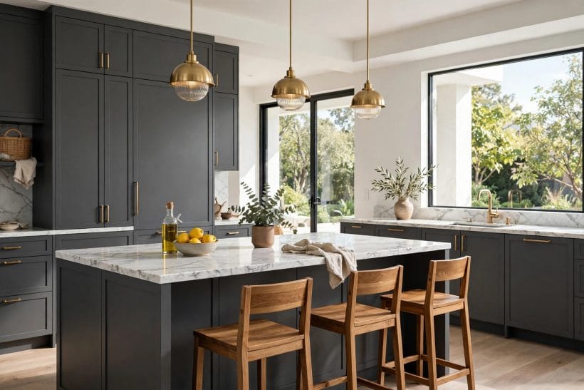
The infographic’s kitchen row promises cabinet drama, and charcoal cabinets deliver it more reliably than any other dark colour — deep enough to feel designed, grey enough to live with daily, and practical about the marks a working kitchen makes.
Cabinets below, lightness above
The most forgiving arrangement puts charcoal on the lower cabinets and island, with pale walls, open shelves or lighter uppers above. The room keeps its daylight manners while the working half wears the colour that shrugs off splashes, scuffs and the darkening that gathers around handles and hobs.
Worktops and metals that finish it
Pale stone or stone-look tops give charcoal cabinets their crisp edge; timber tops warm the scheme toward farmhouse; dark tops on dark cabinets make a single sculptural block that suits only genuinely bright kitchens. Warm metals — brass, bronze, copper in their quieter finishes — are charcoal’s natural hardware, while chrome pushes the scheme cooler and more formal. Choose one metal and repeat it at the tap, the handles and the lights.
Charcoal as the kitchen’s second colour
A kitchen that cannot take dark cabinets can still take charcoal: on an island only, on a pantry or dresser unit, on the wall behind open shelves, or in a deep charcoal floor that grounds pale cabinetry. The principle is placement, not quantity — one deliberate charcoal element reads as design, while scattered dark accessories read as clutter.
6. Charcoal in Bedrooms and Small Rooms
The infographic calls small rooms moody and advises care — not avoidance. Handled evenly, charcoal is one of the great small-room colours, because a small room’s problem is rarely darkness; it is usually a lack of intention.
Bedrooms: darkness as a feature
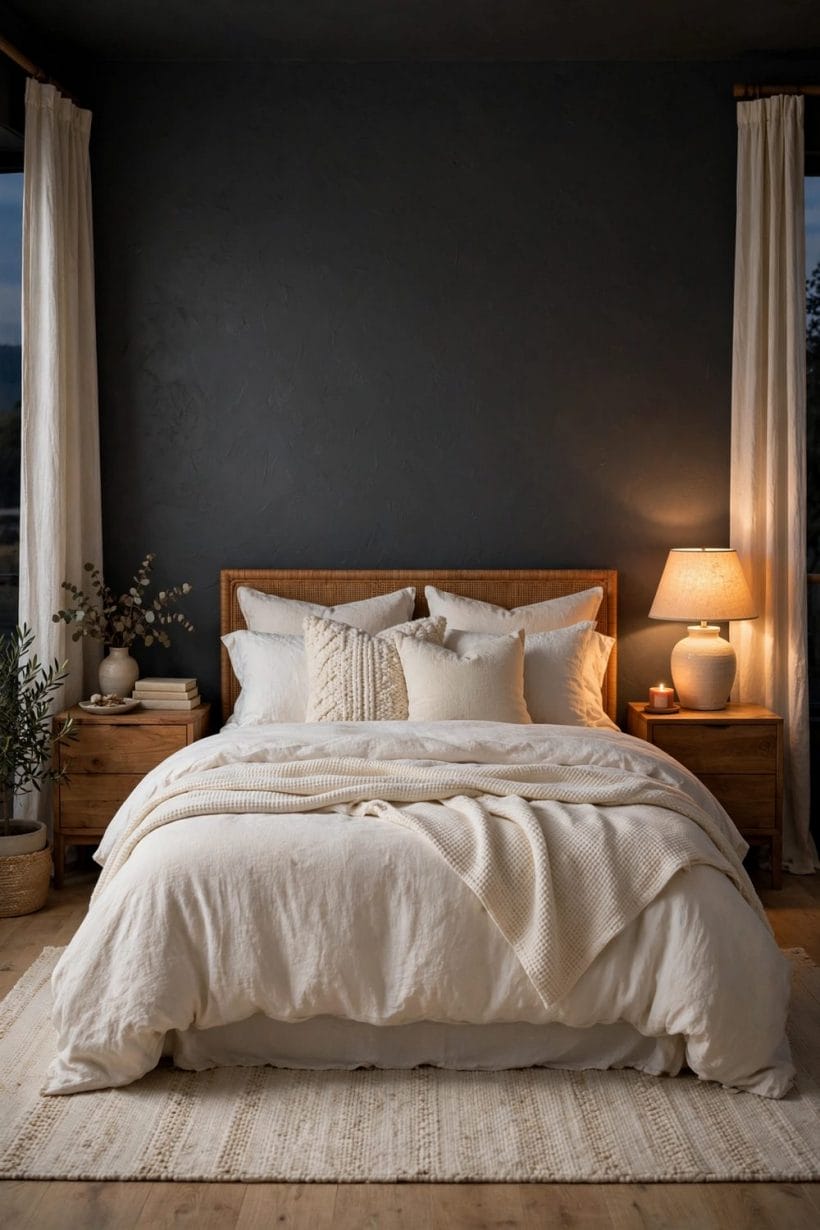
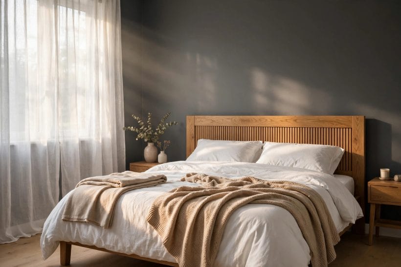
A bedroom exists to be slept in, and charcoal walls make it cocoon-dark in the kindest way, especially behind the bed where the colour becomes a giant, calm headboard. Pale bedding is the classic partner — white and cream linen glow against it — with one warm note, a timber bench, a woven throw or brass reading lights, to keep the room restful rather than stark.
Small rooms: every wall, one colour
In a small study, cloakroom or nursery-corner, charcoal on every wall — woodwork included — blurs the room’s corners and makes its smallness feel chosen. The mistakes are half-measures: one dark wall among pale ones shrinks the room visually, and dark walls with a bright white ceiling chop its height. Paint the ceiling the same colour or a breath paler, and the little room becomes a jewel box instead of a compromise.
En-suites, cloakrooms and hallways
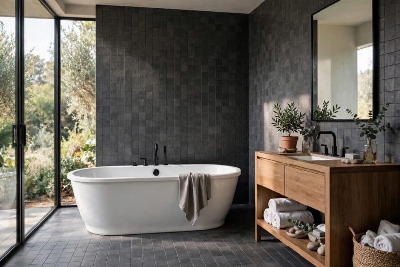
Rooms visited briefly can carry the deepest charcoal of the house. A charcoal cloakroom with a pale basin and a warm mirror light is a small daily pleasure, and a charcoal hallway makes every room opening off it look brighter by contrast. These connective spaces are also the safest place in the home to test the family’s deepest shades before trusting them to a main room.
7. Charcoal on Exteriors
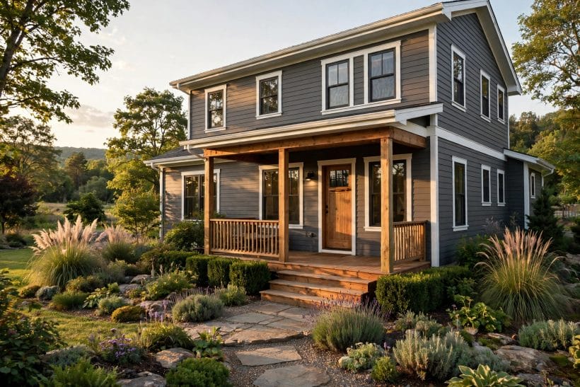
Outside, the infographic’s verdict is strong contrast — and charcoal exteriors earn it. A charcoal house reads tailored and modern against green planting, sits quietly in a landscape instead of shining out of it, and gives white trim and pale stone their sharpest possible frame.
Whole-house charcoal
Charcoal siding or render with warm white trim is the contemporary classic: architectural, calm and kind to houses whose shape is better than their materials. Dark walls absorb heat more than pale ones, which matters on sun-baked elevations and for whatever sits directly behind the cladding — a point to weigh honestly in hot climates, alongside the finish guidance in tiny house exterior ideas, where the same dark-scheme logic scales down to small homes.
Charcoal as the exterior accent
Where a whole dark house is too much, charcoal still works as the scheme’s punctuation: window frames and fascias, a garage door, fencing and gates, or the front door alone against pale walls. Repeated in two or three places, the accent reads as a system; used once, it reads as an afterthought.
Roofs, doors and planting against charcoal
Dark roofs continue a charcoal scheme seamlessly, while pale or terracotta roofs set up a deliberate two-tone house. Timber doors warm the entrance exactly where a welcome is wanted. And planting is charcoal’s best friend at every scale: green foliage, pale flowers and ornamental grasses all photograph — and live — beautifully against a dark wall, which is why charcoal fences have become the gardener’s favourite backdrop.
8. Pairing Charcoal: Woods, Whites and Accents
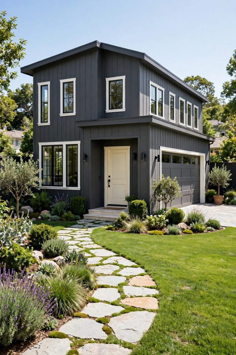
Charcoal is a background colour, which means its pairings are the scheme. The infographic’s key factors name the two that matter most — pairing woods and finish sheen — and both deserve a deliberate choice rather than a default.
Whites that sit well with charcoal
The trim white must share charcoal’s temperature: warm whites beside warm charcoals, cooler whites beside blue-leaning ones. A mismatched white is the commonest charcoal failure — the wall looks right, the trim looks right, and together they look faintly dirty. Test trim and wall samples side by side, in the room, before either is bought in quantity.
Timber: charcoal’s warming partner
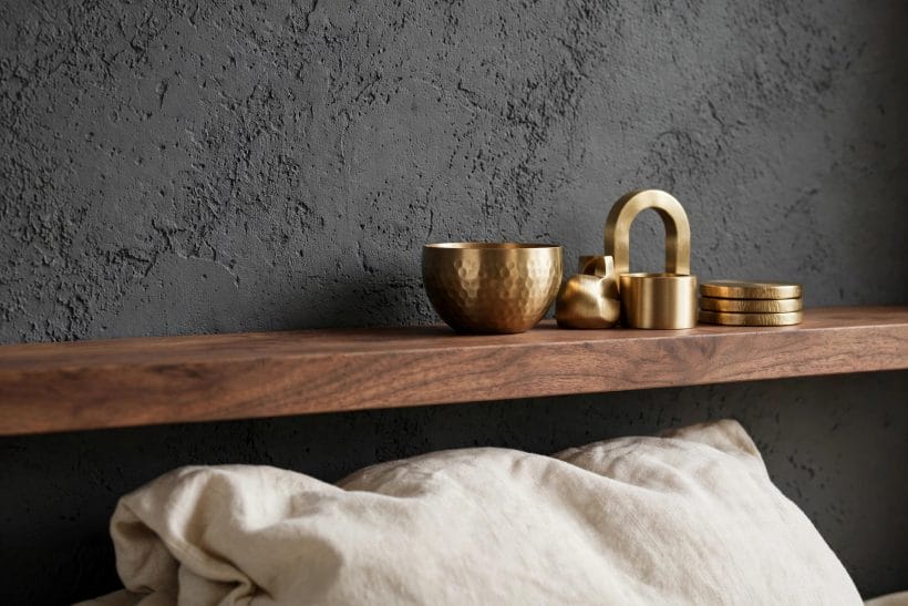
Wood is what stops charcoal feeling cold. Mid and warm timbers — oak, walnut, reclaimed pine — glow against it; very pale woods sharpen a modern scheme; dark woods on charcoal need texture and lamplight to stay distinct. Floors, one honest piece of furniture and a timber door or beam are usually enough; the colour does not ask for much wood, only for some.
One accent, used with restraint
Charcoal flatters nearly every accent — ochre and rust for warmth, deep green for calm, navy for formality, blush and clay for softness — precisely because it is neutral. The discipline is singleness: one accent family, repeated in textiles and small objects, reads as a palette. Three accents read as a shop. Choose the family from something already loved in the room — a rug, a painting, a chair — and let charcoal do the quiet work around it.
9. Testing Charcoal in Real Light
The infographic’s single tip is the whole secret of this colour: test charcoal in daylight and evening light before committing to a whole room. Charcoal changes more between noon and dusk than any pale colour does, and the test is where that change is discovered cheaply.
Paint large samples where the colour will live
Brush generous sample areas on two walls that catch different light, beside the window, the trim and the furniture the colour will sit with. Small swatches lie by omission with dark colours most of all: a chip that reads soft grey in the hand can read near-black across a whole wall, and only a large sample tells the truth at the room’s real scale.
Judge at morning, noon and lamplight
Look at the samples first thing, at midday, and after dark under the room’s own lamps. Note which sample stays pleasant in every light, not perfect in one. If the evening version is the one that matters — it usually is, in living rooms and bedrooms — weight the judgement toward dusk and forgive a slightly sterner noon.
Check sheen on the sample, not the tin
Sheen moves charcoal’s depth by what feels like a full shade: matte finishes deepen and soften it, satin adds a reflective lift that can grey it, and gloss turns it formal and mirror-dark. Paint the shortlisted colour in the intended finish on the sample wall, because the same paint in two sheens is, to the eye, two colours.
10. Applying Charcoal and Keeping It Looking Right
Charcoal is a calm colour that shows careless work and rewards honest work. The craft points below are general good practice for any dark scheme, and they matter doubly for a colour whose whole effect is composure.
Preparation and honest coats
Fill, sand and prime properly: dark paint shows ridges, old edges and brush marks that busy colours hide, and deep colours need their full coats to reach the tested depth — a single stretched coat dries paler, greyer and patchier than the sample promised. Keep a labelled pot of the exact paint for touch-ups; charcoal blends kindly, but only when the spare is truly the same paint in the same sheen.
Dust, marks and living with a dark wall
Honesty about upkeep: charcoal shows pale dust, chalky scuffs and pet hair more readily than mid-tone colours do, and hides cooking splashes, fingerprints and general grime better. A soft dry cloth lifts most dust; scuffs usually yield to a barely damp one. In high-traffic halls, a washable finish in the same colour is the practical choice, tested first, since washable finishes can shift the sheen.
When charcoal is the wrong answer
Rooms that must feel bright at noon in a dark plot, schemes built on crisp blue-white sparkle, and households who simply love a pale, airy home will be happier with another colour — charcoal’s gift is depth and calm, not brightness. Where depth is not the brief, the wider colour family linked through this post — taupes, greys and the colour-reference habits behind them — offers the lighter answers.
Final Considerations
Working with charcoal is mostly a matter of sequence: choose the undertone from the room’s own light and materials, set the depth by the room’s job, pair it with a white and a wood that share its temperature, and test it at full scale through a full day.
Do those things and charcoal repays them the way it repays them in every room of this post — with depth that feels calm rather than heavy, contrast that flatters everything placed against it, and a home that looks quietly, deliberately designed.



0 Comments