

A house is judged from the street long before it is judged from the sofa. The siding, the colour, the roofline and the door are the whole first conversation — and most houses mumble it, because their exterior was decided in pieces, years apart, by different people.
These 75 exterior home ideas rebuild that conversation in order: the shell first, colour and roofline second, windows, door and arrival after, and the small-house discipline last — so the face the street sees is one decision, not seventy-five accidents.
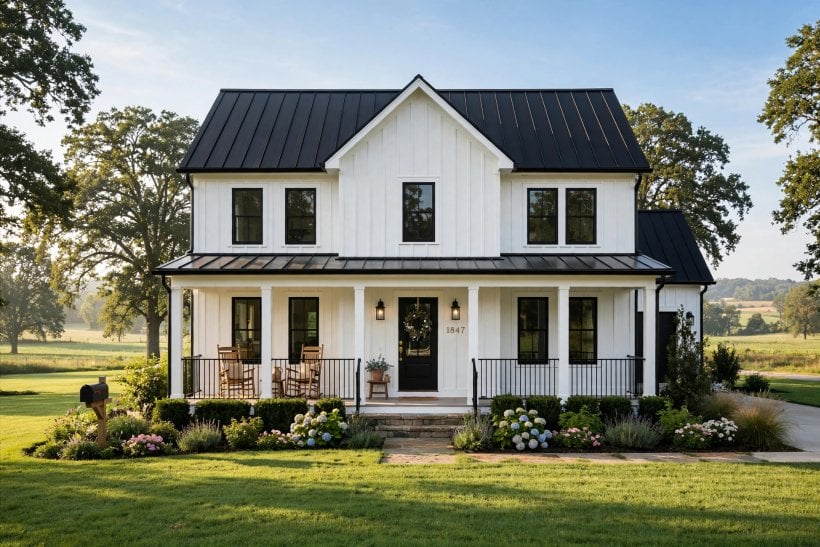
1. Exterior Home Ideas at a Glance
The central entity is the house exterior: the weather-facing system that presents the home to the street, built as a shell and defined by its attributes — the cladding, the colour, the roofline, the windows and trim, the front door, the porch and arrival, and the lighting that holds it together after dark. The first attribute governs the rest: an exterior succeeds or fails as a composition, and every material on it is only as good as the whole it belongs to.
| What should be decided first on an exterior? | The cladding and the colour, together. They cover the most area, cost the most to change, and set the terms every smaller element — trim, door, roof — has to answer to. |
| How many materials should one facade use? | Two, rarely three: a field material and an accent. Every added material divides the house’s visual budget; small houses feel the dilution fastest. |
| What makes a small house look right from the street? | Proportion, not decoration: a roof pitched to the span, windows sized to the walls, and details at honest scale. Small houses fail by borrowing big-house ornament. |
| Which exterior upgrade pays back fastest? | The arrival: door, lighting, house number and a tended path. It is the cheapest layer to change and the one every visitor actually experiences at close range. |
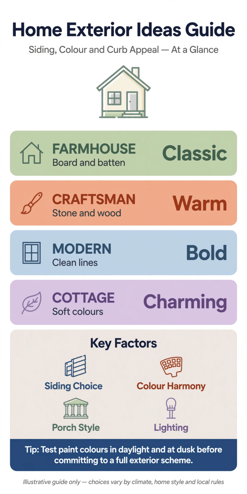
2. Start With the Shell: Siding and Cladding Choices
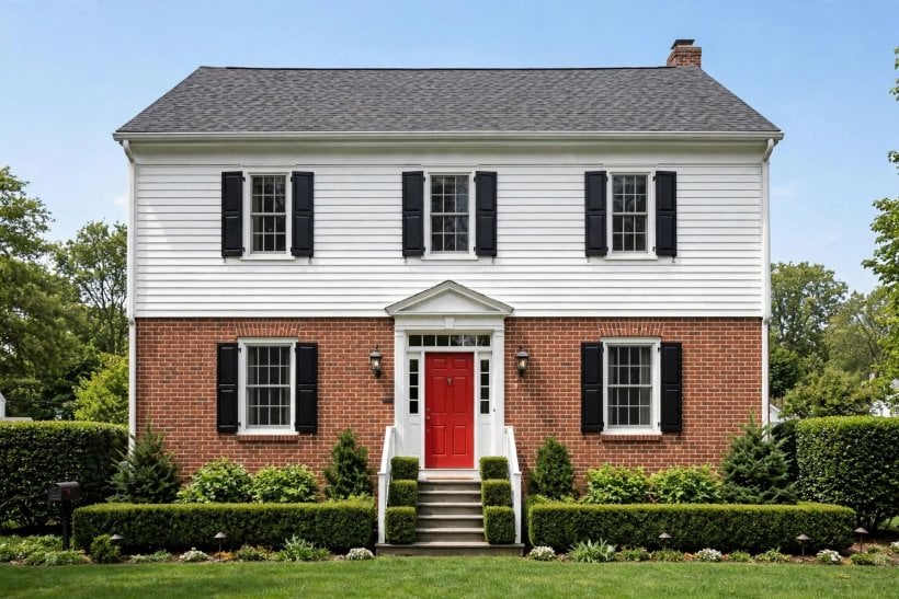
Cladding is the field everything else plays on, so this section stays at survey level — profiles, directions and pairings — while the full material-by-material comparison lives in the siding options guide for tiny houses. Choose the field first; the accents in later sections are only variations on it.
1. Let One Material Own the Field
Pick a single cladding to cover the majority of every wall, and let it run uninterrupted around corners. A house whose field keeps changing reads as several small buildings arguing, whatever the materials cost.
2. Run Boards Horizontally for Calm
Horizontal siding lengthens a house visually and settles it into its plot. It is the default direction for a reason: the long lines echo the ground, and the eye reads the house as resting rather than standing.
3. Go Vertical to Lift a Low House
Board-and-batten or vertical panels pull a squat house upward, adding apparent height where the roof cannot. Use it on the whole field or one full storey, never in nervous stripes between windows.
4. Break the Field at a Real Line
Where two claddings meet, end one at a genuine architectural line — a storey break, a gable, a porch roof. A material change floating mid-wall with no line to justify it always looks like a repair.
5. Use Shingles for the Gable Only
Cedar or fibre-cement shingles earn their keep as a gable accent over a plainer field below. The texture change marks the roof’s territory and gives a plain box its one moment of craft.
6. Let Brick or Stone Anchor the Base
A masonry skirt or a single masonry wall grounds a house, takes the splash-back weather at ground level, and gives lighter claddings something solid to stand on. Keep it low or keep it whole — never halfway.
7. Choose Fibre Cement for the Quiet Life
Fibre-cement boards imitate timber profiles, hold paint for years and shrug off rot and insects. For most households it is the cladding that asks the least and dates the slowest.
8. Keep Timber Where It Can Be Tended
Real wood cladding is beautiful and honest, but it wants a maintenance rhythm. Put it where a ladder reaches easily and the weather is kind — a sheltered elevation, a porch wall — rather than three storeys up.
9. Try Metal for the Modern Edge
Standing-seam and corrugated metal panels give a crisp, agricultural-modern field that suits simple roof forms. The profile does the decorating, so everything else on the facade can quieten down.
10. Match Cladding Scale to House Scale
Wide boards on a small house look coarse; narrow profiles on a large house look fussy. The board width should rhyme with the wall it covers — a detail the street reads instantly without naming it.
11. Flash and Vent the Field Properly
Every cladding is a rain screen over a structure that must dry. Keep the drainage plane, flashings and ventilation gaps behind the pretty face, or the best-looking wall in the street becomes the dampest.
3. Colour That Carries the Whole House
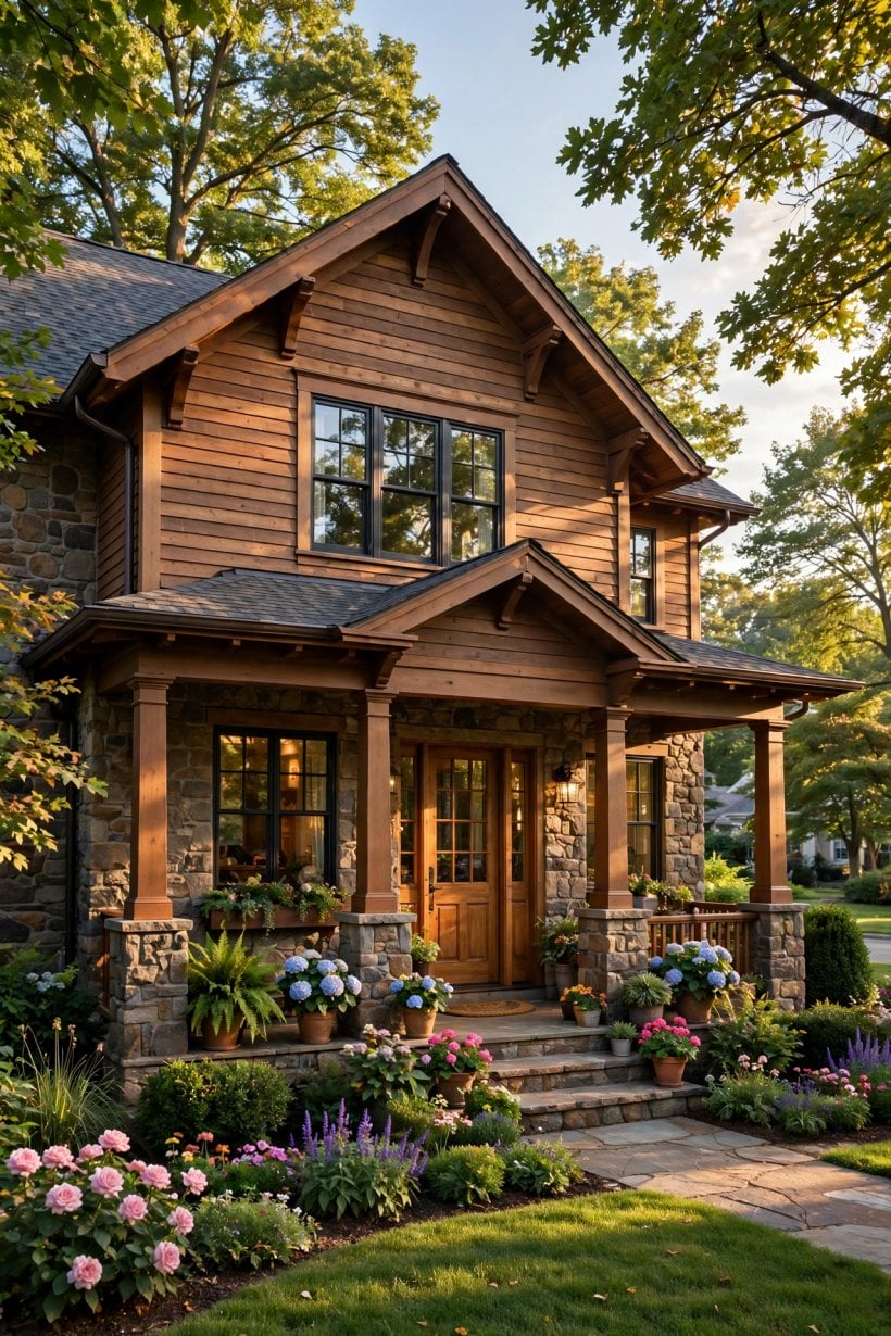
Colour is the cheapest attribute to change and the easiest to regret, because it multiplies across every wall. The discipline here is palette structure — field, trim, accent — and for timber the finish matters as much as the hue, as the paint-versus-stain guide works through.
12. Build the Palette in Three Roles
Assign every colour a job before it is bought: one field colour for the walls, one trim colour for the edges, one accent for the door and small moments. A palette with no roles becomes a crowd.
13. Take the Field Colour From the Roof
The roof is the largest fixed colour on the house and the hardest to change. Sample the wall colour against the actual shingles or tiles in daylight, and let the roof’s warm or cool bias lead.
14. Keep Trim One Step From the Field
Trim should draw the house’s lines without shouting: a shade lighter or darker than the field, or a clean white against a mid-tone wall. High-contrast trim on a busy house adds noise, not crispness.
15. Spend the Accent on the Door Alone
One strong colour, one place. When the accent spreads to shutters, garage and furniture at once, the door loses its job as the facade’s full stop — and the street stops knowing where to knock.
16. Test Colour on the Shadiest Wall
Exterior colour reads two shades lighter in full sun and duller in shade. Brush the shortlist on the north or shaded elevation and live with it for a day before committing the whole house.
17. Borrow From the Landscape, Quietly
The greens, stones and soils already on the plot are a palette that cannot clash with itself. A field colour drawn from them makes the house look planted rather than delivered.
18. Use Dark Colours on Simple Forms
Charcoal and near-black fields look superb on clean, modern volumes and merciless on fussy ones — dark paint shows every wobble in old siding. Match the drama of the colour to the calm of the form.
19. Let White Houses Earn It With Texture
An all-white exterior succeeds on shadow: board shadows, trim relief, a textured gable. On flat walls with flat light, white reads as unfinished. If the house has no relief, give the field a whisper of colour instead.
20. Repeat the Accent Once, at Ground Level
Echo the door colour in exactly one low place — a planter, a bench, the mailbox. The repetition ties the arrival together without starting the spread that idea 15 warns against.
21. Respect the Roof’s Second Life as a Wall
On steep-roofed houses the roof is half the visible exterior. Its colour and material deserve the same palette discipline as the walls, and its weathering will set the house’s apparent age.
22. Plan the Repaint Before the First Coat
Every painted exterior is a subscription. Choose systems whose recoat cycle the household will actually keep, and keep the palette notes — brand, colour, sheen — in the house file for the next round.
4. Roofs, Gables and the Top Line
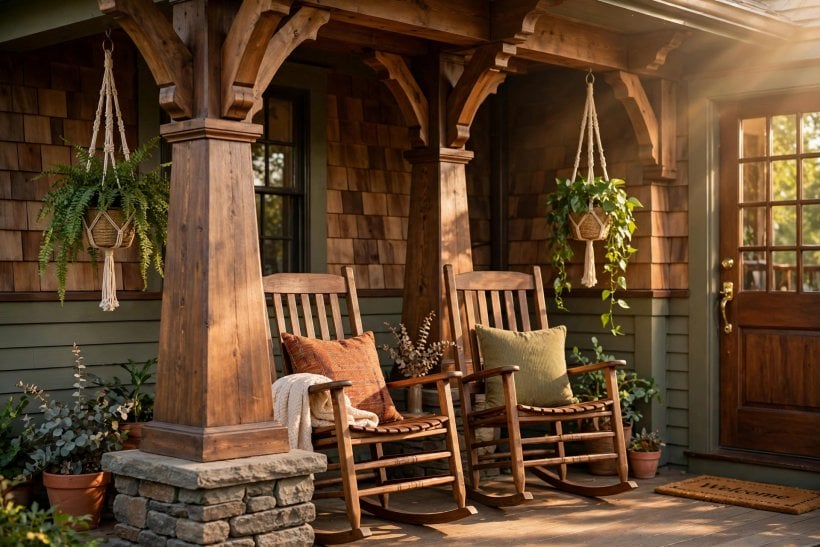
The top line is the house’s silhouette, the shape a neighbour recognises from a field away. Roof work is mostly decided when the house is built, but its visible details — edge, gable treatment, overhang — are exterior decisions any owner can still make well.
23. Keep the Roof Form Bored With Itself
One roof idea, repeated calmly, beats three competing pitches. Where additions have multiplied the forms, unify them with one material and one colour so the silhouette reads as a single sentence.
24. Dress the Gable as the House’s Forehead
The gable is the largest plain triangle on most houses and the natural place for the accent cladding or a louvred vent. Treated deliberately, it signs the facade; left blank, it stares.
25. Give Eaves a Visible Thickness
A roof edge with depth — boxed eaves, exposed rafter tails, a proper fascia — casts the shadow line that makes a house look built rather than wrapped. Thin, flush edges are the cheapest-looking line in architecture.
26. Match Overhang to Climate, Honestly
Deep overhangs shade walls and throw rain clear in wet or hot country; tight eaves suit sheltered, cold plots. The overhang is climate equipment first and style second, and it should look like both.
27. Choose Roof Colour for Heat as Well as Looks
Dark roofs gain heat; pale roofs shed it. In hot regions the roof colour is an energy decision wearing a style costume — weigh the attic’s summer first.
28. Let Chimneys Wear the House’s Masonry
A chimney repointed and capped in the house’s own brick or stone ties the top line to the base. A chimney in a foreign material reads as borrowed, however well it draws.
29. Hide the Working Roof Furniture
Vents, flues and aerials will exist; group them on the least-seen slope and paint small metalwork to disappear against the roof. The silhouette should be the house’s idea, not its plumbing’s.
30. Light the Top Line Only by Accident
The roof is best left dark at night. Wash the walls and the arrival with light and let the roofline emerge from the glow — a lit roof reads as a floodlit warehouse, not a home.
31. Treat Dormers as Rooms, Not Bumps
A dormer wants the house’s own cladding, trim and roof pitch in miniature. A dormer that matches the parent house looks inevitable; one that improvises looks apologetic.
32. Keep Gutters in the Palette
Gutters cross the facade at its most visible line. Choose their colour from the trim or the roof — whichever line they visually join — and never leave them as the street’s brightest object by accident.
33. Let a Steep Roof Take a Simple Wall
When the roof dominates, quieten everything beneath it: one cladding, restrained trim, a calm door. Two loud halves make a house that shouts at itself across the eaves.
5. Windows, Shutters and Trim

Windows are the facade’s punctuation, and trim is the frame that makes each opening a deliberate sentence. The material choices behind the trim boards are surveyed in the exterior trim materials comparison; here the subject is composition.
34. Align Windows on a Shared Line
Openings that share a head height across a facade make the wall look planned, whatever their sizes. Where old windows disagree, a continuous trim band can fake the line they missed.
35. Size Trim to the Opening, Not the Catalogue
Trim width should scale with the window and the wall: generous on tall openings, modest on small ones. Uniform skinny trim on every opening is the mark of a facade dressed from a single shelf.
36. Fit Shutters That Could Actually Close
A shutter should be half the window’s width, hung at its edge, sized as if it worked. Undersized shutters nailed flat to the wall are the exterior’s most recognisable lie.
37. Or Skip Shutters and Spend on the Frame
Many houses — modern ones especially — look better with a deep, well-painted window surround and no shutters at all. An honest frame beats a decorative apology beside every window.
38. Give Sills a Slope and a Shadow
A sill that sheds water and throws a shadow line makes each window sit into the wall. Flush, flat sills make openings look pasted on — a small detail the eye registers on every house in the street.
39. Keep Window Colour in One Family
Frames, sashes and screens should share the trim colour or the accent logic, not introduce a third scheme. Mixed frame colours belong to different decades; the facade should confess to only one.
40. Use Divided Lights Where the Style Asks
Grid patterns belong to the house’s period language: fine divisions on traditional forms, wide clear panes on modern ones. The wrong grid is fancy dress; the right one is invisible correctness.
41. Dress the Bay as the Facade’s Room
A bay window is a small building attached to a big one: give it the house’s cladding carried around, its own proper little roof, and trim that matches. It is the facade’s best seat — dress it like it matters.
42. Plant Against Windows With Restraint
Foundation planting should frame openings, not swallow them. A shrub that eats the bottom third of every window makes the house look like it is sinking into its own garden.
43. Match the Garage Door to the Architecture
Where the garage faces the street, its door is a second facade. Panels, windows and colour drawn from the house’s own vocabulary stop it reading as a warehouse shutter beside a home.
44. Let House Numbers and Hardware Agree
Numbers, letterbox, handle and hinges in one metal and one spirit are the facade’s jewellery. They cost little, sit at eye level, and are read by every visitor — the highest-value square foot on the house.
6. The Front Door and the Threshold
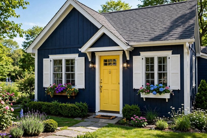
The door is where the exterior stops being scenery and starts being hospitality. It carries the accent colour, the house’s number and the visitor’s first touch — and it works inside the wider arrival that the new home exterior design guide treats as a whole composition.
45. Give the Door the Accent and Nothing Else
The strongest colour on the house belongs on the door because the door is the destination. Everything near it — frame, step, pots — should support the colour, not compete with it.
46. Frame the Door Like a Picture
A surround with real width and a small pediment, pilasters or a simple architrave tells the eye where the picture hangs. Doors without frames look like holes; doors with frames look like entrances.
47. Let Glass in the Door Borrow Light, Not Views
Glazed doors and sidelights brighten halls and signal welcome; choose frosting or placement that gives the hall light without giving the street a programme. The balance is the design, not the glass itself.
48. Make the Step a Place, Not a Trip Hazard
A step deep enough to stand on with a bag in each hand, lit, drained and grippy, is hospitality in masonry. Shallow, dark steps announce that arrivals were an afterthought.
49. Put a Roof, However Small, Over Arrivals
A porch roof, canopy or even a bold hood over the door keeps rain off guests and weather off the door’s finish. It also gives the facade its one piece of shelter sculpture.
50. Light the Door From Both Sides of the Story
A lantern by the door for faces, and low light on the path for feet. The pair makes arrivals feel expected rather than inspected — the full layout is covered in the security lighting guide linked in the final section.
51. Hang a Wreath Hook, Not a Nail
Small permanent fittings for the seasonal door — a proper hook, a knocker with presence — keep the entrance furnished between festivals. Improvised nails and tape are how thresholds quietly go shabby.
52. Keep the Door’s Furniture in One Metal
Handle, knocker, letterbox, numbers and hinges in a single finish read as a set chosen once, on purpose. Mixed metals at the door look like repairs.
53. Paint the Door’s Edge and Hinges Too
The door’s edge is visible every time it opens, and bare or clashing edges betray a weekend paint job. A considered threshold survives being looked at from the hall side as well.
54. Give the Bell or Knocker a Sound You Like
The door’s voice is part of the house’s welcome, heard a thousand times. Choose the chime or the knock the way you’d choose a voice for the house.
55. Keep the Threshold Tended Weekly
Swept step, empty of parcels and bins, a door wiped of dust: the tended threshold is the cheapest exterior idea in this collection and the one visitors believe most. Neglect photographs faster than paint fades.
7. Porches, Steps and the Arrival
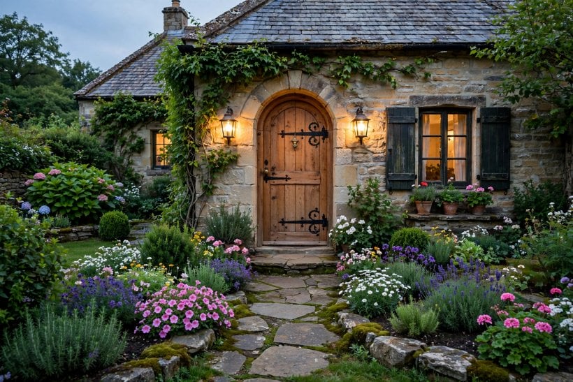
The arrival is the exterior’s narrative: gate, path, porch, door. The porch itself is a whole cluster on this site — the porch ideas pillar surveys the room itself, and front porch ideas takes the curb-appeal angle — so this section keeps to the porch’s role in the whole facade.
56. Let the Porch Belong to the House’s Style
Columns, brackets and railings should speak the house’s own language: turned posts for the traditional house, square timber for the farmhouse, steel for the modern box. Borrowed styles read as costumes.
57. Size the Porch to Its Furniture
A porch too narrow for a chair is a corridor with a roof. If the plot allows only a token porch, make it an honest canopy instead and spend the difference on the path and planting.
58. Run the Path on the Desire Line
People walk the shortest dry line from gate to door; the path should already be there. A path that argues with its own users gets shortcutted across the lawn, and the lawn keeps the evidence.
59. Edge the Path So It Reads at Night
A defined edge — brick soldier course, gravel boards, a planting line — keeps feet on the path in the dark and gives the front garden its structure in the day. Undefined paths dissolve visually.
60. Keep Steps Even, Lit and Few
Uneven risers are the arrival’s one unforgivable fault. Where the plot forces many steps, break them with a landing and plant the landing like a small terrace, so the climb becomes a stroll.
61. Put the Garden’s Best Moment at the Gate
The view from the street is the exterior’s public face: one composed moment — a small tree, a bench, the porch beyond — beats a whole garden of scattered effort. Compose for the passer-by first.
62. Fence and Gate in the House’s Vocabulary
The boundary is the facade’s first line. A fence and gate drawn from the house’s materials and heights frame the composition; a foreign fence spends the street’s attention before the house gets any.
63. Hide the Bins Behind the Arrival’s Edge
Bins, meters and deliveries are exterior facts, not exterior features. A screened bay on the arrival’s blind side keeps the necessary invisible without making collection day a fence-climbing exercise.
64. Give the Driveway a Finished Edge
Where a drive meets the facade, a border course, a planting strip or a change of surface keeps it from reading as spilled tarmac. The house should begin at a line, not at a smear.
65. Let the Porch Ceiling Finish the Room
A porch ceiling in beadboard, painted boards or the traditional pale blue turns a roof’s underside into a room’s ceiling. It is seen from every chair on the porch — finish it like it is watched, because it is.
8. Exteriors for Small Houses and Tiny Homes
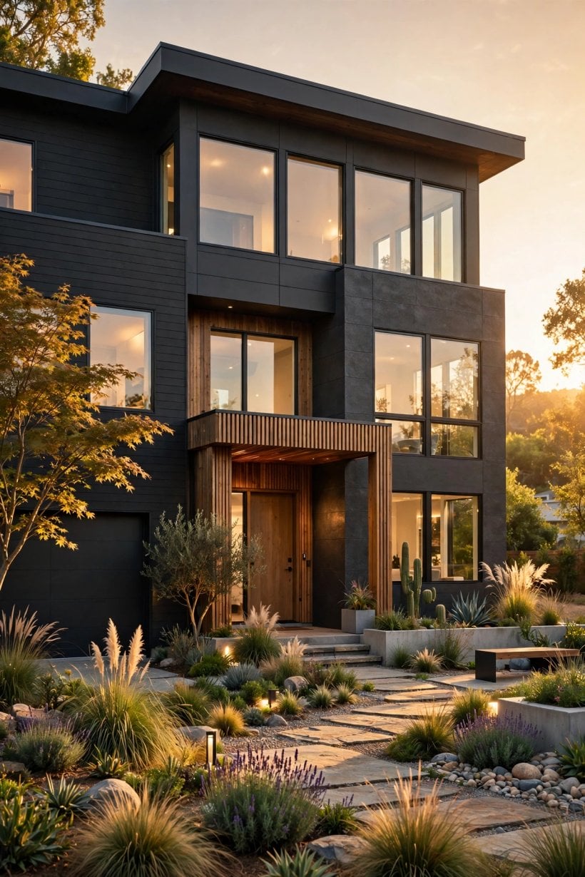
Small houses have no spare facade: every attribute is a large fraction of the whole, which makes composition easier to get right and mistakes impossible to hide. The tiny-house discipline below is the survey’s ideas at their most concentrated.
66. Use One Cladding and One Colour, Bravely
On a tiny house, a single material in a single colour reads as confidence. The small facade cannot afford the dilution of accents competing across a few metres of wall.
67. Let the Roof Be the Second Wall
A tiny house’s steep roof is half its exterior. Choose its material and colour with the same care as the siding, and consider carrying one material over both for a wrapped, deliberate silhouette.
68. Scale Details to the House, Not the Street
Small houses need small-scaled trim, slim porch posts and a door at honest size. Standard builders’ details at full size make a tiny house look like a toy wearing its parent’s shoes.
69. Spend the Accent Budget Once
One painted door, or one clad gable, or one window colour — a tiny house gets a single accent moment. Two accents on six metres of facade is not richness; it is noise at close range.
70. Put the Entrance on the Long Side
For trailer-based and narrow tiny homes, entering through the long elevation gives a real porch moment and a door that reads from the street, instead of a gable-end hatch between the windows.
71. Use a Skirt That Belongs
Where a tiny home sits on a chassis or piers, the skirt is part of the facade: board, panel or masonry that continues the wall’s language to the ground, so the house looks settled, not parked.
72. Let Windows Earn Their Wall
Every opening in a small wall costs insulation and privacy as well as buying light. Fewer, larger, well-placed windows compose better on a tiny facade than a scatter of small ones.
73. Keep a Tiny Porch, Deeply
A one-metre covered stoop with a bench and a hook does the arrival’s whole job at tiny scale. Depth matters more than width: enough to stand out of the rain while the door opens.
74. Match the Shed and the Fence to the House
On a small plot the outbuildings are in every photograph of the house. Paint and clad them from the same palette and the whole plot composes; ignore them and they heckle from the edge of every view.
75. Photograph It From the Street, Then Edit
The final tiny-house discipline: take the street photograph, look at it cold, and remove one thing. Small exteriors are edited, not accumulated — the last idea is always a subtraction.
9. Checks and Mistakes: Before the Paint Is Bought
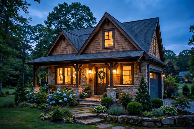
The common exterior mistakes are composition errors, not taste errors: three claddings competing on one wall, trim painted brighter than the accents, a shutter beside a window it could never cover, colour chosen from a screen and met for the first time on a whole gable. Each is cheapest to catch on paper.
Work the checks in order. First, count materials and colours on the main facade and make each justify its place. Second, view the house from the street’s actual distances, not from the garden. Third, check the weather side: the elevation that takes the rain deserves the hardiest materials and the first maintenance. Fourth, agree the maintenance rhythm the finishes demand before choosing them.
10. Costs and Pulling It Together
Exterior costs divide honestly into three tiers, and the tiers matter more than any figure. The first tier — door paint, hardware, numbers, path edges, lighting — is small money with street-sized effect, and where a tired facade should start. The second — repainting, trim renewal, porch repairs — is the maintenance heartland: real money, spent on rhythm. The third — re-cladding, re-roofing, new windows — is capital work, decided in decades, and deserves the composition discipline of the early sections most of all.
Sequencing protects the budget: shell before colour, colour before accents, arrival last and cheapest. A house re-clad in the wrong order pays for the same scaffold twice. And keep the file — every colour and finish recorded — because exterior costs are mostly future maintenance, and the file makes that maintenance cheap to buy correctly.
Final Considerations
An exterior is the house keeping a promise to its street: that someone inside cares how the shared world looks. The composition rules in this survey — one field, three colour roles, an arrival that reads as a welcome — are only that promise made systematic. After dark the promise is kept by light, and the exterior lighting guide works through that last attribute in full.
Start where the street starts: stand at the gate, name the one thing the house is trying to say, and remove everything that interrupts it. The best exteriors in any street are rarely the most expensive — they are the most decided.


0 Comments