

Every decorating project reaches the same moment: a colour exists in your head, on a cushion, in a photograph — and somehow it has to become a tin of paint with a name, a code and a finish. The bridge between the colour you mean and the colour you buy is a colour reference.
This guide explains how colour references work and how to use one properly: finding a colour’s identity, matching a colour you already have, translating between makers without fooling yourself, testing for light and undertone, and building a whole-house palette from references instead of guesses. No brand is needed for any of it — the method is the same whatever chart, deck or database you hold.
1. Colour References at a Glance
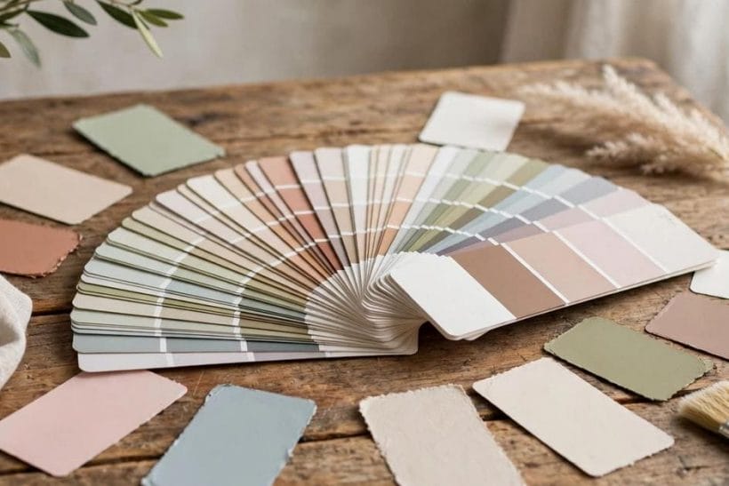
A colour reference is any organised system that gives colours stable identities — a name, a code, or both — so that a colour chosen in one place can be found, mixed or matched in another. Fan decks, swatch books, makers’ charts and online colour databases are all references; they differ in size and price, not in kind.
| Question | Short answer |
|---|---|
| What does a colour reference actually hold? | Colours arranged by family, each with a name and usually a code, sometimes with light and pairing notes |
| Why not just pick from the tin’s label? | Labels show one colour alone; a reference shows it among its relatives, which is how undertones and near-duplicates reveal themselves |
| Can a reference match a colour exactly? | It can identify and approximate honestly; an exact match to an existing surface is a job for a physical sample and a colour-matching scan at the counter |
| Do codes transfer between makers? | No — every maker’s codes are its own. A reference can find the nearest equivalent in another range, which is a match by eye, not by number |
| What is the classic failure? | Choosing from a phone screen or a tiny chip under shop light, then discovering the wall lives in a different light and the colour has moved |
2. What a Colour Reference Actually Is
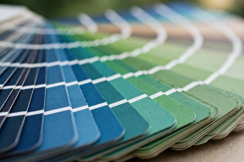
Think of a colour reference as a map of a maker’s entire range. The fan deck is the printed form: hundreds of swatches bound at one corner, arranged so that colours flow from light to deep and family to family. The swatch book and the wall chart in a paint shop are the same map at different scales. Online databases are the map made searchable — type a name or a code, and the colour appears with its relatives and, often, the colours its maker suggests beside it.
Three features make a reference useful rather than merely pretty. First, order: colours sit among their neighbours, so you can see that the grey you want leans blue by comparing it with the grey that leans green. Second, identity: each colour carries a name and usually a code, so the colour you chose on Tuesday can be re-ordered, matched or argued about precisely. Third, context notes: many references mark a colour’s depth or light-reflecting quality in general terms, which matters more to a room than the colour’s name ever will. Specialist references exist for heritage colours, for exterior colours that must weather gracefully, and for the standardised colour sets used across industries — the decorator’s everyday need is simply the full range of the paint being bought, in a form large enough to judge.
3. Finding a Colour’s Identity: Name, Code and Family
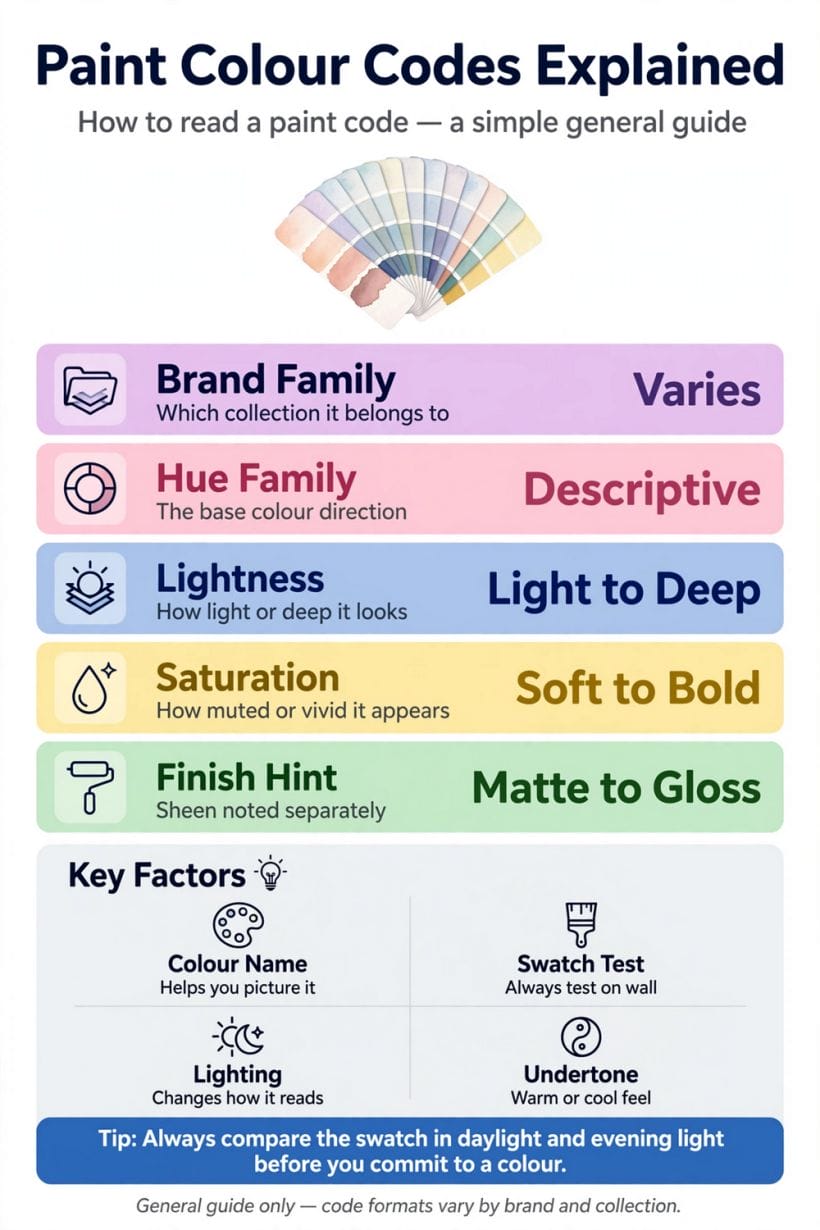
Every colour in a reference has three identities, and a good match uses all of them. The name is the human handle — memorable, searchable, and treacherous, because names are marketing as much as description: two makers may sell near-identical colours under unrelated names, and similar names across ranges may hide quite different colours. The code is the maker’s internal address for the colour — a string of letters, numbers or both that pins the colour inside that one range. Codes are exact and meaningless in equal measure: they will get you the identical colour from the same maker every time, and they tell you nothing at all about any other maker’s range. The third identity is the family — the colour’s hue group and its position from light to deep within it. Family is the identity that travels: when a code cannot cross between makers, the family description can, which is why this guide keeps returning to it.
In practice: when you find a colour you love, record all three. Photograph the swatch beside its name and code, note its family in your own words — “a mid sage green, greyer than the one above it in the deck” — and keep the physical chip if you can. Future-you, standing in a different shop in different light, will be grateful for every one of those anchors.
4. Matching a Colour You Already Have
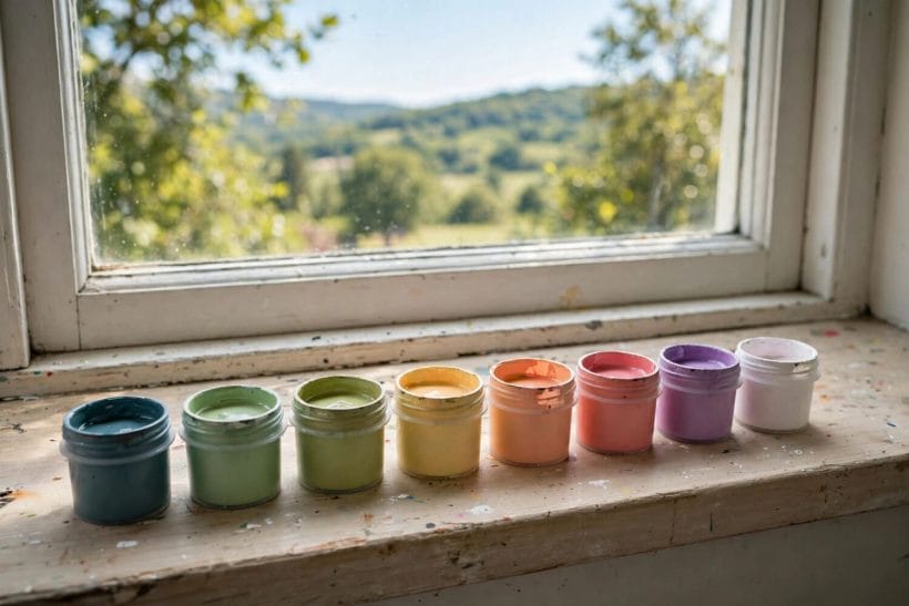
Most colour matching starts from a thing, not a chart: a cushion to live beside, a curtain to continue, a wall painted by a previous owner in a colour nobody recorded. The method is elimination. Begin in the reference at the family the object belongs to, then fan the neighbouring swatches across the object itself — never beside it in the air — and discard every swatch that is clearly lighter, deeper, warmer or cooler. Work in the room’s own daylight if you can, and repeat the survivors’ test under evening light, because a match that holds at noon and fails at seven is not a match. Narrow to two or three candidates, then buy the smallest tester of each and paint boards, not wall patches: a board can be carried from wall to wall and light to light, and it can lean against the original object for the final verdict.
Where the match must be exact — touching up a wall whose paint is unknown — a reference alone reaches its limit honestly. Paint counters can scan a physical sample, ideally a flake of the actual paint or an offcut from inside a cupboard door, and mix to the scan. Use the reference to understand what the scan found — which family, how deep — and the scan to do what eyes and charts cannot.
One more variable hides inside every match: the finish. The same colour in a flat matte, an eggshell and a gloss will read as three cousins rather than one colour, because sheen changes how much light the surface throws back and how deep the colour appears. A match is therefore never just a colour — it is a colour in a finish, on a surface. When you test candidates on boards, paint each board in the finish the wall will wear, or at least hold the board’s sheen difference in mind as a known margin of error. The reference records identity; the board, finished honestly, records the truth.
5. Translating Between Makers: Near Matches and Honest Limits
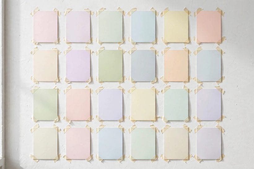
Sooner or later a colour must change ranges: the perfect shade is in a deck whose paint your decorator will not use, or whose finish your room cannot take. Translation is the reference’s most requested and most misunderstood service. There is no formula and no conversion table, because each maker’s colours are mixed from their own pigments; the same name in two ranges may be cousins, and the true equivalent of a colour may carry a completely different name in the other deck.
The honest method is the matching method of the previous section, run between two references: take the physical swatch of the colour you want into the other maker’s deck, find its family, and eliminate to the nearest two or three. Then test on boards, in the room, and accept what the test tells you — a near match that behaves identically in your light is a match for every purpose that matters, while a theoretically identical pairing that shifts green at dusk is not. Beware any tool or chart that promises exact cross-range equivalents: what it can honestly offer is the nearest neighbour, and the last judge is always your wall, your light and your eye.
6. Light Changes Everything: Testing in the Room
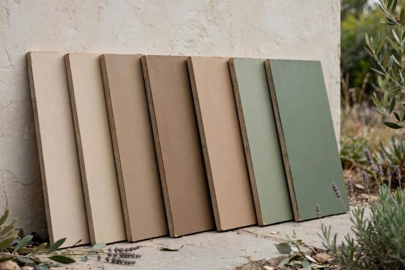
Two colours that are twins under the shop’s lights can be strangers at home, because light is an ingredient in every colour you see. Daylight itself changes through the day and by window direction; lamplight warms everything it touches; and some colour pairs match under one light and split under another — the effect colourists call metamerism, and the reason experienced decorators seem superstitious about testing.
The discipline is plain. Paint the candidates on boards large enough to judge, and live with them: prop them on the wall they will cover, look at them in the morning, at noon, at dusk and under the room’s own lamps. Check them against the room’s fixed points — floor, woodwork, the sofa that is not moving. Notice especially what the colour does in the room’s darkest corner and beside its brightest window; a wall colour is a compromise among all its lights, and the right choice is the one whose worst hour is still good. References help here too: many arrange families by depth, and choosing one step lighter than your first instinct is the oldest correction in decorating — walls wear colour larger and darker than chips suggest.
7. Undertones: The Colour Under the Colour
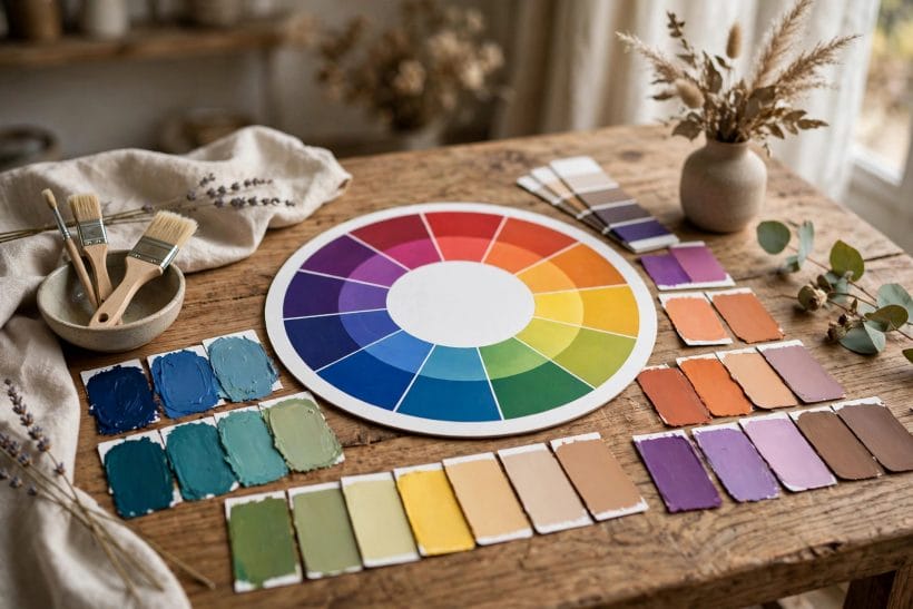
Ask a reference its most valuable question and it is not “what is this colour called” but “what is hiding inside it”. The undertone — the hue a neutral leans toward — decides whether a grey feels like stone or like fog, whether a white reads as cream or as linen, whether two “matching” neutrals fight all day in the same room. Undertones are why a colour can be exactly right in the deck and mysteriously wrong on the wall, where a warm floor or a cool window exposes the lean.
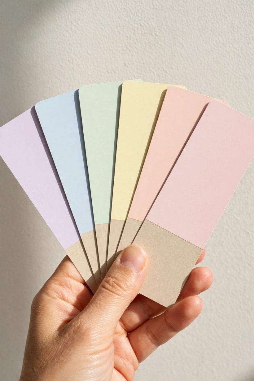
A reference makes undertones visible because it arranges relatives together. Fan the neutral family out and the leans declare themselves: this white is pinkish, that one is greenish, the third is the true neutral of the set. Hold a suspect swatch against a sheet of plain white paper and its lean sharpens; hold it against the room’s existing fixed colours and you will see whether the leans agree or quarrel. When a scheme feels inexplicably off, the undertone is the first suspect — and the reference, not another tin, is where the answer is found.
8. Building a Whole-House Palette from a Reference
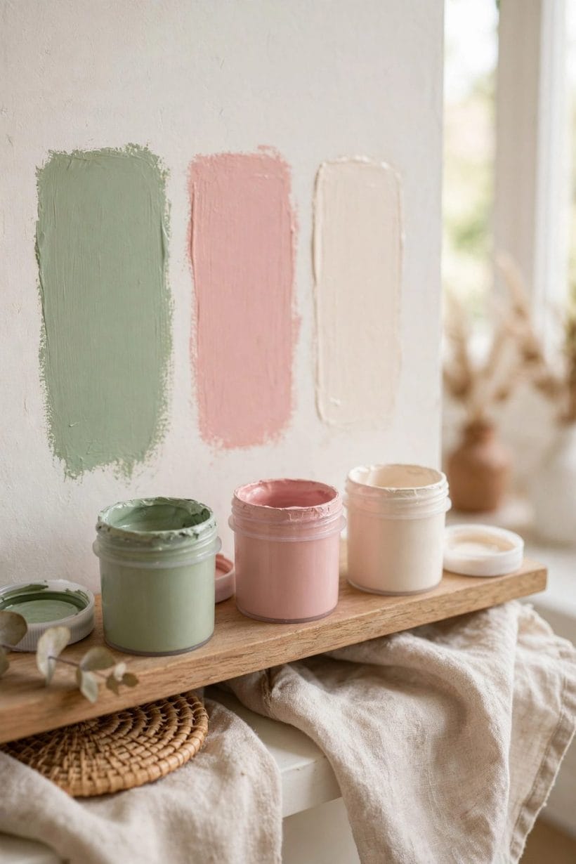
A reference earns its keep most completely when a whole house is being coloured, because a palette is really a set of relationships: the hall colour must greet the living room’s, the bedrooms must rest from the landing’s, and the whole set should feel like one household speaking in several voices. Working from one reference — or from the recorded identities of colours across several — keeps those relationships deliberate.
Begin with the anchor: the colour of the largest or most loved room, or the fixed colour nothing can change — a stone floor, a brick wall, a view of green. Choose its partners from neighbouring and complementary families within the reference, stepping depth up and down so rooms relate without repeating. The colour-led rooms elsewhere in this series show the palette at work in single hues — a whole room composed around brown and green, the single-note discipline of a chartreuse colour scheme, or the graduated calm of a light gray colour palette. Keep a written record of every choice — name, code, family, room, finish — in one place. That record becomes the house’s own private reference, and it will outlast every tin in the shed; small houses prove the same point at tighter scale, where a tiny house color palette must make three colours do the work of ten.
9. Common Mistakes: Screens, Chips and Wet Paint
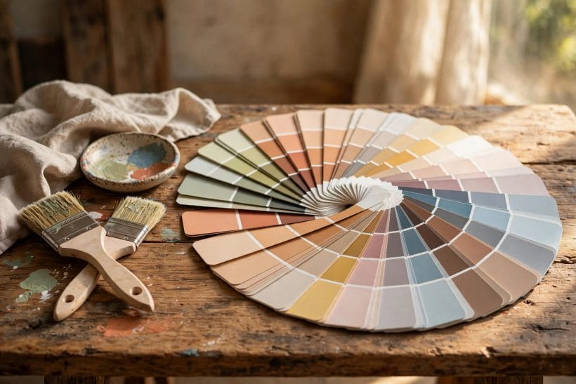
The mistakes are so consistent they can be listed like symptoms. Choosing from a screen: every display renders colour differently, and a photograph of a room has already been corrected by someone else’s camera — screens are for finding candidates, never for deciding. Choosing from the smallest chip: a colour’s character lives at scale, and the chip that looks gentle may be forceful across four walls. Judging wet paint: nearly every colour dries darker and flatter than it looks in the tin and on the first stroke, so verdicts wait for the second coat, fully dry. Skipping the neighbours: a colour chosen alone, without its family around it, hides its undertone until the wall reveals it. And the quietest mistake — recording nothing. The name unrecorded, the code lost, the empty tin thrown out: a year later the perfect colour is a rumour. The reference habit fixes all five: candidates from the deck, judgement from large samples in the room’s own light, patience for dry paint, and a written record kept with the house papers — the same discipline that governs choosing tiny house interior paint colors, where a small space forgives nothing.
10. Pulling It Together: A Working Method
The whole guide compresses into a sequence you can run for any room. Start from the thing that cannot change — floor, furniture, view, or a colour already loved. Find its family in a reference and gather the neighbouring candidates, chips in hand. Eliminate by comparison against the fixed things, in daylight, down to two or three. Check the undertones against plain white and against the room. Paint large boards, live with them through a full day and an evening, and let the room vote. Record the winner completely — name, code, family, finish, room — before the first full tin is opened, and keep a labelled sample board with the record.
Do this and the colour reference stops being a shop’s catalogue and becomes what it was always meant to be: your memory, externalised — the reason a colour chosen once can be found again, matched honestly, translated without superstition and built on, room by room, into a house whose colours feel inevitable. A room like the bedroom with gray walls looks effortless precisely because somebody ran this method before the roller ever got wet.
Final Considerations
Three questions follow every colour home, and a reference answers each. What is it — answered by name, code and family, recorded once and kept. What goes with it — answered by its neighbours in the deck, whose relationships were arranged by people whose whole trade is colour. And will it still be itself in my light — answered not by the reference but by the sample board, which is the reference’s appointed deputy in the room. Keep those three answers together, on paper, with the house documents, and no colour in the home is ever a mystery again.
A colour reference cannot choose for you, and it should not try. What it offers is steadiness: colours with identities, families in order, and a way to test every hope against the evidence of your own walls and light.
Use it as a map rather than an oracle, keep the record it helps you build, and the colours in your house will start agreeing with each other — which is most of what people mean by good taste in paint.




0 Comments