

Gray is the colour houses choose when they want to look deliberate — yet it is also the colour that surprises its owners most, turning blue at dusk, vanishing at noon, or arguing with a roof nobody thought to consult.
This collection chooses gray the way it must be chosen: by undertone and light first, then trim, material, roof and door, style by style, and finally the pairings and planting that finish a house from the street.
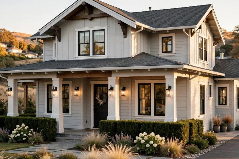
1. Gray Exterior Home Ideas at a Glance
The gray exterior is the gray colour lane of the exterior home ideas pillar in this collection: one gray family — warm or cool, pale or deep — carried across a house’s walls and resolved against its trim, materials, roof and door. The sheet keyword spells the topic “grey houses”; the post uses the same word in its image text and the American spelling in its prose, and the two spellings name one identical family of colours.
| Question | Short answer |
|---|---|
| Warm gray or cool gray — which first? | Warm if your roof, stone and light are warm; cool for crisp architecture and black accents. The fixed elements decide. |
| Why did my gray turn blue? | Many cool grays carry hidden blue, revealed at dusk. Step toward green-gray or greige, and test on the house. |
| What trim suits gray best? | White for classic, black for modern, a deeper shade of itself for calm — all three are right, on different houses. |
| Should the garage door match the walls? | Yes — painted the wall colour it recedes. Trim colour makes it the loudest thing on the facade. |
| What roof works with gray walls? | Charcoal, graphite metal or natural slate — one step deeper than the walls, in a temperature that agrees with them. |
| Can a small house wear dark gray? | Yes, with white trim and a welcoming door — or go pale and soft. The middle depths are the risky ones on small houses. |
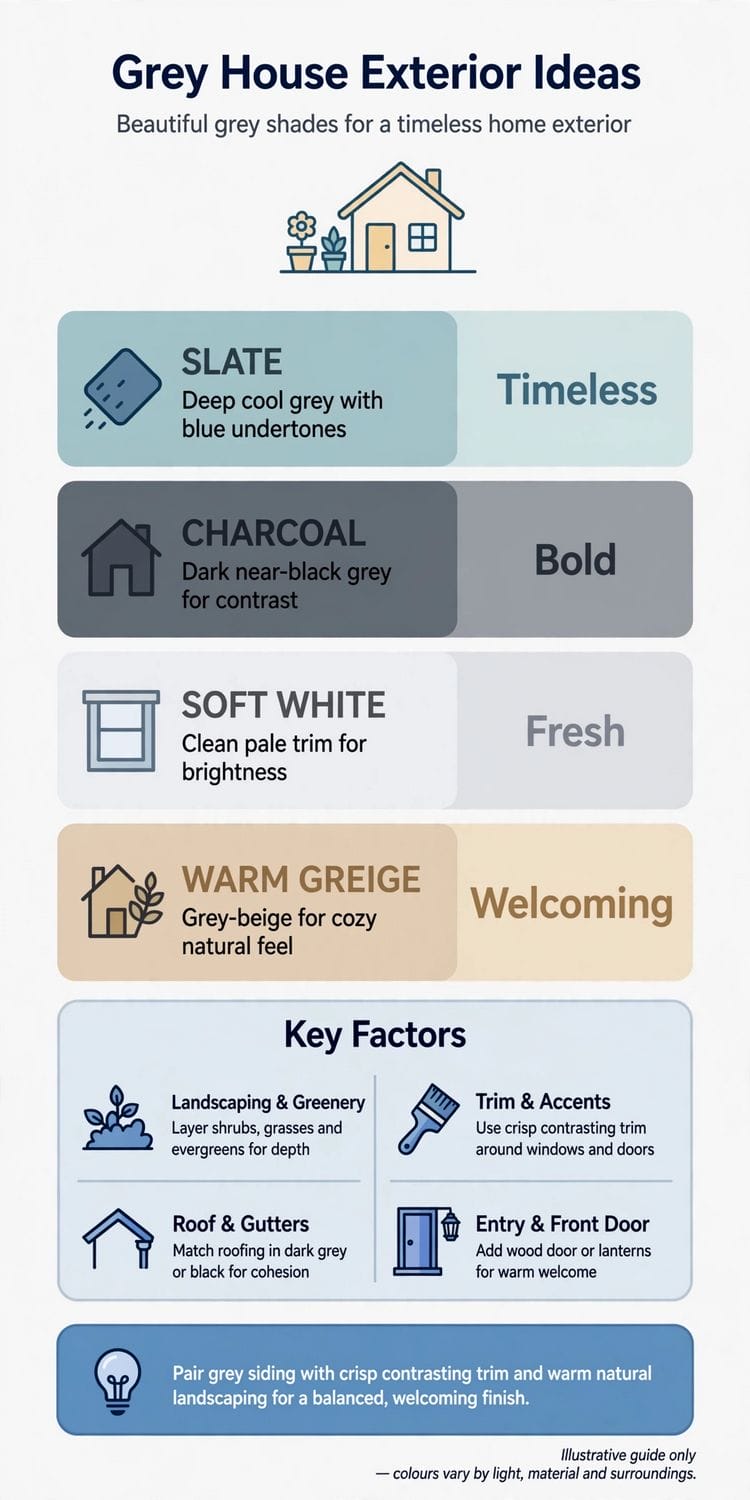
2. Choosing the Gray: Warm, Cool, Light and Deep
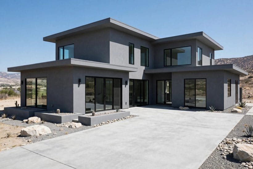
Gray is not a colour but a negotiation between blue, green, brown and black, held at a chosen depth. The whole risk of the scheme lives in this section: pick the gray whose undertone agrees with your light and your roof, and the rest of the house nearly paints itself.
1. Decide the undertone before the depth
Warm grays lean toward brown and green and feel like stone and weathered wood; cool grays lean blue and feel crisp and architectural.
2. Test on the house, in its own light
A gray that is serene on a south wall can turn cold and blue on a shaded north one.
3. Keep the depth one step braver than instinct
Exterior colours read lighter outdoors than on the chip — sun and sky bleach them. The depth that feels daring indoors is usually exactly right on a facade; the timid choice often dries to a apologetic wash.
4. Match gray to the roof you already have
Roofs are the expensive given. A warm brown-grey roof wants a warm gray wall; a charcoal or black roof opens the whole cool family. Fighting the roof’s temperature is the commonest reason gray houses disappoint.
5. Beware the blue surprise in cool light
Many cool grays are secretly blue, revealed at dusk and in photographs. If blue is not invited, step toward the green-grays and warm greiges, and check the test board on an overcast morning before committing.
6. Use greige where the street is traditional
Gray-beige — greige — is the diplomat of the family: gray at noon, warm at sunset, and inoffensive to every neighbour and era of architecture. On traditional streets it modernises without arguing.
7. Let the landscape cast its vote
A house among pines and lawn reads its gray against green all year; a house on pale gravel or by the sea reads it against sand and sky. The surroundings are half the colour scheme — sample with them in view.
8. Choose one gray for the whole house first
A single well-chosen gray, varied by trim and texture, beats three near-grays fighting across elevations. Complexity can be added with materials and accents; the base note should be one clear voice.
9. Record the exact colour everywhere it will be needed
Exterior paint is reordered for sheds, fences and touch-ups for decades. Keep the maker, range and code with the house documents, and paint a labelled board to store in the garage against the day the tin is discontinued.
10. Photograph the test before you commit
The camera is merciless about undertone: it will show the blue, the green or the purple hiding in a gray that the eye forgives in person. Judge the test boards in a phone photograph as well as in life.
11. Ask what the gray does to the windows
Deep grays make pale window frames glow and dark frames vanish; pale grays do the reverse. The windows are the house’s eyes — choose the gray that gives them the expression the house wants.
3. Gray With Trim: White, Black and Tone-on-Tone
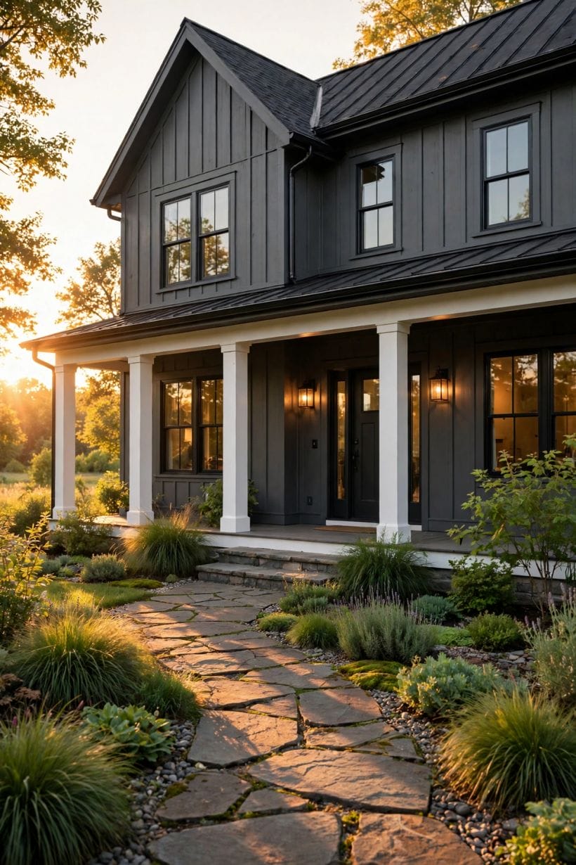
Trim is where a gray house declares its era and its manners. The same gray with bright white trim is a farmhouse; with black, a modern; with its own deeper shade, a quiet European cousin — the modern exterior home ideas in this collection push the dark version furthest.
12. Crisp white trim for the classic contract
White trim against mid gray is the most forgiving pairing in exterior design: it outlines every window and corner, suits any era, and refreshes with a single coat. It is the choice that never needs explaining.
13. Soft white when the gray is warm
A warm gray with a hard blue-white trim quarrels quietly all day. Creamy, soft whites sit with warm grays the way they sit with stone — the pairing traditional masonry has always used.
14. Black trim for the drawn-in-ink look
Black or near-black windows and trim turn a gray house into a line drawing: sharp, modern, deliberate. It asks for confidence in the architecture, because every misalignment is suddenly visible.
15. Tone-on-tone: trim a shade deeper than the walls
Trim painted two or three shades deeper in the same family gives a calm, tailored house that suits contemporary and Scandinavian-leaning streets. Nothing contrasts, yet everything is defined.
16. Reverse it: pale walls, gray as the trim
On a mostly white or pale house, mid-gray trim and doors supply the architecture’s shadow lines. It is the lightest way to join the gray family and the easiest to repaint out of.
17. Paint the garage door with the walls, not the trim
The garage door is the largest false note on many facades. Painted the wall colour it recedes; painted the trim colour it advances and shouts. Unless it is a beautiful door, let it disappear.
18. Let the front door carry the one accent
Gray’s gift is that it steps back, so the front door can be the single saturated note — deep red, ink navy, sage, ochre. One accent, chosen once, is the mark of a composed exterior.
19. Carry the trim colour to the fence and gate
A fence or gate painted the trim colour ties the plot to the house and makes the garden read as the house’s grounds. The cheapest curb-appeal move in this whole collection.
20. Mind the gutters and downpipes
Rain goods in the trim colour look intentional; in leftover white against every scheme they look forgotten. They are a small line item with an outsized effect on how finished the house appears.
21. Use the same trim logic at the back
The garden elevation deserves the same discipline as the street one — you will look at it more. A house finished on three sides and abandoned at the back feels exactly like what it is.
22. Sample the trim beside the gray, never alone
Trim colours are relationships, not absolutes: the white that is crisp beside one gray is chalky beside another. Judge the pair on the same board, in the same light, or do not judge at all.
4. Gray by Material: Siding, Brick, Stone and Stucco
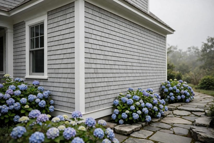
Gray behaves differently on every surface it touches — soaking into brick, sitting proudly on smooth stucco, shadowing the lines of siding — and the material sections of the stone exterior home collection make the same point from the quarry’s side. Choose the gray for the material you have, not the photograph you saved.
23. Horizontal siding: let the shadow lines work
Weatherboard and clapboard in gray gain their depth from the shadow under each board. Mid-tone grays show this best; very pale grays flatten it, very dark ones hide it in gloom.
24. Board and batten for the modern farmhouse note
Vertical battens over wide boards give gray a rhythm of stripes that suits barn-influenced and Scandinavian houses. The same gray feels entirely different stood upright — simpler, taller, quieter.
25. Painted brick: gray with a memory of clay
Paint or limewash on brick keeps the masonry texture under a gray veil, and the brick’s own colour ghosts through thin coats at the edges.
26. Natural stone in the gray family
Blue-grey and silver stones — granite, slate-hued rubble, weathered limestone — are gray houses built by geology. Match mortar slightly darker than the stone and the wall reads as one calm mass.
27. Stucco and render: the smooth modern field
A smooth render in gray is the contemporary blank canvas: crisp, shadowless, and dependent on proportion and openings for its interest. It shows every trowel sin, so the plasterer’s skill is part of the colour choice.
28. Shingle siding: gray that weathers itself
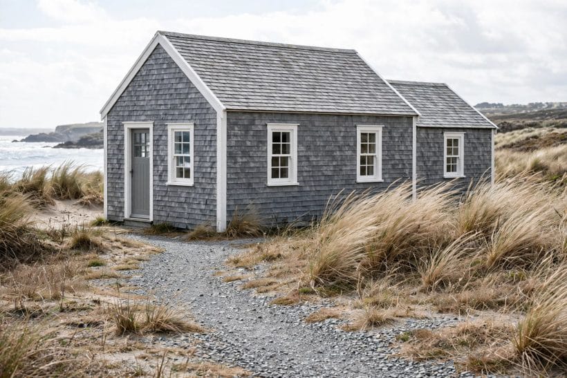
Timber shingles silver naturally toward gray, and a stain can hurry or even the process. The result is the coastal gray — varied, matte, alive to the light — that paint can imitate but never quite equal.
29. Fibre-cement and modern cladding panels
Factory-finished gray boards and panels bring an exact, repeatable colour and crisp joints. Their discipline suits contemporary houses; their flatness must be broken by shadow gaps, battens or changes of plane.
30. Mix two materials in one gray
Stone below and siding above, or brick beside render, united by a single gray family, gives a house both texture and calm. The materials vary; the colour holds the family together.
31. Let metal cladding bring the industrial note
Standing-seam metal and corrugated panels in graphite grays suit outbuildings, extensions and bold contemporary houses. Against a traditional main house, a gray metal extension is the classic respectful addition.
32. Test stains and paints on the real material
The same gray stain reads brown on cedar and blue on pine; the same paint reads warm on rough brick and cool on smooth render. The sample belongs on the house’s own surface or it proves nothing.
33. Keep one material unpainted as the accent
A natural cedar door, a stone plinth, a copper gutter left to weather: one honest material amid the gray keeps the scheme from sterility. Gray is the host; something living should still be at the table.
5. Roofs, Doors and the Dark Accents
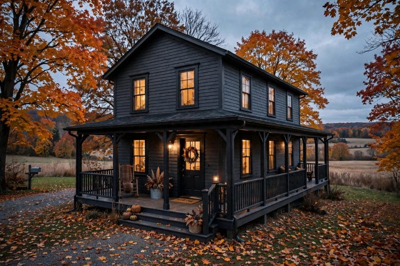
If the walls are the sentence, the roof is the full stop — and the door is the signature. This section spends the dark notes carefully, because on a gray house the roof, the door and the dark accents are most of what the street actually remembers.
34. Charcoal shingles: the default crown
A charcoal or weathered-black roof over gray walls is the combination the eye expects, and expectations satisfied read as quality. It also hides the streaks and moss shadows that pale roofs advertise.
35. Standing-seam metal in graphite
A metal roof in a graphite one step deeper than the walls gives the house a single tailored silhouette. It suits modern and farmhouse-modern houses and outlasts every other layer of the scheme.
36. Slate and slate-look for the traditional house
Real or imitation slate brings natural variation — blue-grey, green-grey, silver — that flatters gray walls of every temperature. It is the roof that makes a gray house look inherited rather than decorated.
37. Warm the roof if the walls run cool
A cool gray house under a cold black roof can feel severe in northern light. A weathered wood tone or a softer charcoal warms the composition without touching the walls.
38. The black front door: everyone’s answer, still right
Gloss or satin black on the front door of a gray house is classic because it is correct: maximum formality, minimum risk, and hardware in brass or chrome glows against it.
39. Deep green and ink navy doors for character
A very deep green reads almost black from the street and rewards the visitor at arm’s length; ink navy does the same for cool-gray houses. Both are accents with the volume turned to conversation level.
40. Let the door be red exactly once in the street’s story
A red door on a gray house is a landmark — delightful, and a commitment. If the street already has one, choose another jewel tone; two red doors cancel each other’s charm.
41. Match shutters to the door or the trim, never neither
Shutters painted the door colour make a considered pair; painted the trim, they join the architecture. A third colour for shutters alone is the start of a fairground.
42. Dark-framed windows as the modern accent
Where windows are being replaced anyway, dark frames against gray walls supply all the contrast a modern scheme needs — no shutters, no fuss, just drawn lines.
43. Carry the darkest note to the plinth and steps
A plinth and step edges painted or built in the scheme’s deepest tone ground the house visually and hide the splash zone’s honest dirt. Houses float without it; with it, they sit.
44. Light the door like a face
A lantern each side or one good fixture above, warm and welcoming: the door’s lighting finishes the accent. Gray houses at dusk live or die by this small kindness.
6. Gray by House Style: Farmhouse to Modern
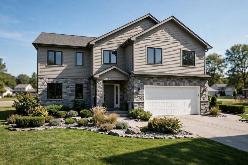
Gray is the most era-fluid of colours — it flatters a farmhouse and a glass box by different means — and it is the colour lane of the exterior home ideas pillar this post belongs to, distinct from the green exterior home ideas that own the garden-colour lane and from the craftsman exterior home ideas that own the timber-and-stone style.
45. Farmhouse gray: warm, soft and board-clad
The farmhouse takes a warm mid gray on vertical or horizontal boards, white trim, a porch with simple posts and a metal or charcoal roof. It should look weathered by Tuesday and settled by Sunday.
46. Craftsman gray: deep, earthy and grounded
Craftsman houses take the green-grays and deep warm tones, with stone piers, tapered columns and trim in a darker shade of the same family. Pale gray on a craftsman looks like the house is wearing someone else’s coat.
47. Colonial and traditional gray: the silvered classic
Symmetrical facades in a light-to-mid cool gray with white trim and black shutters are the eastern seaboard’s gift to the colour. Restraint is the whole design; the door supplies the single personality note.
48. Cottage gray: soft tones and soft edges
Small houses take soft, pale warm grays kindly, with white trim, a coloured door and flowers doing the styling. Dark gray on a tiny cottage can brood; if chosen, it needs the garden to embrace it.
49. Modern gray: one tone, many textures
Contemporary houses use gray as a field — render, panel and glass — varied by texture and plane rather than by colour changes. The discipline is absolute: any second hue must be a material, not a paint.
50. Scandinavian gray: pale walls, black windows
The Nordic formula — palest gray or off-white cladding, black window frames, no trim contrast — suits simple gabled forms and reads calm in flat northern light. It is the quietest scheme in this collection.
51. Coastal gray: weathered and salt-tolerant
Shingle and board houses by the sea take the silvered, driftwood grays, with white trim and roofs that can streak without shame. The palette accepts weather as a collaborator instead of an enemy.
52. Brick traditional in gray paint: the city refresh
Painting a red-brick terrace or townhouse gray with white trim is the urban update of the decade: the street keeps its rhythm, the house gains a decade of youth. Check local rules in conservation areas first.
53. Ranch and mid-century gray: long and low
Long single-storey houses take a mid gray happily, broken by a stone or brick pier section and a door in a period jewel tone. Keep the roof low-contrast; the horizontal line is the design.
54. Mountain and lodge gray: stone’s partner
Against heavy stone and timber, walls retreat to a deep warm gray that lets the masonry lead. The house should look grown from the slope, and gray is the colour of shadow and bark.
55. Tiny house gray: the small-house advantage
On a tiny house, one gray wraps walls, trim and skirting into a single jewel-box object, and a coloured door does all the talking. Small houses wear monochrome better than any other size.
7. Two-Tone Grays and Colour Pairings
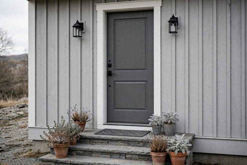
One gray is a decision; two are a composition. The trick of every successful pairing is hierarchy — one shade clearly leads, the other serves — and the same rule governs the colours gray keeps company with.
56. Darker below, lighter above: the grounded house
A deeper gray on the ground floor or plinth storey and a paler one above settles a tall house and echoes how buildings weather. The junction wants a trim line or a material change to sit on.
57. Lighter below, darker above: the deliberate inversion
Reversing the tradition gives a modern, top-weighted look that suits houses with a strong roof form. It is a fashion move; make it knowingly, with simple architecture underneath.
58. Two grays split by storey with a trim board
A painted trim board at the junction turns a colour change into architecture. Without that line, two-tone schemes can read as an unfinished repaint caught mid-job.
59. Gray with stone: the natural marriage
Where part of the house is stone, choose the wall gray from inside the stone’s own colours — pick its mid tone for the paint and the wall and the masonry become one argument.
60. Gray with warm wood: cedar, oak and teak accents
Warm timber against cool or neutral gray is the pairing of the decade — door, screen, soffit or gate in cedar against gray render. Each makes the other look more itself.
61. Gray with black: the monochrome discipline
Gray walls, black roof, black windows, white nowhere: the severe modern scheme. It succeeds on proportion and planting, and fails on fussy architecture — the simpler the house, the better it wears black company.
62. Gray with sage and soft greens
A gray house behind green planting is halfway there; bringing a sage door or shutters into the scheme completes the conversation between house and garden. The softest of the colour pairings.
63. Gray with navy: the coastal-classic pair
Navy accents — door, shutters, even a navy-gray main tone — give gray houses a maritime crispness that suits both coasts and traditional streets. Keep the navy deep, never bright.
64. Gray with clay and terracotta warmth
On Mediterranean-leaning and stucco houses, a warm gray with terracotta roof and door tones balances sun and shadow. It is the pairing for bright climates, where cool grays bleach to blue.
65. Test the pair in the proportions they will live in
A pairing judged on two equal chips lies: the accent colour must be tested as a door-sized board against a wall-sized one. Hierarchy is visible only at true scale.
8. Light, Landscape and Street Presence
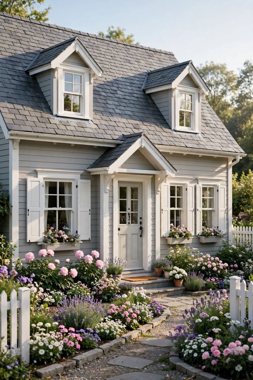
A gray house is finished by things that are not the house: the sun’s angle, the planting against the walls, the path, the fence and the view from the kerb. This closing section is the difference between a gray house and a gray photograph.
66. Watch the house at four times of day
Morning, noon, evening and the lit dusk: a gray house changes costume at each.
67. Plant green against gray for the classic contrast
Gray is foliage’s best friend: every green looks greener against it. A foundation planting of varied greens, with one flowering season planned, is the cheapest elevation upgrade available.
68. Use pale gravel and light paving carefully
Pale ground against a mid-gray house bounces light up and can wash the walls out; a darker path grounds the composition. Judge path and wall together, as one picture.
69. Let one tree be the house’s companion
A single well-placed tree — its shadow moving across the gray wall through the day — gives the facade a living ornament no paint can buy. Plant for the mature size, not the nursery pot.
70. Paint the fence to continue the house
A fence in the wall gray extends the architecture into the garden; in the trim colour it frames it. Either is composed; the leftover brown fence against a gray house is neither.
71. Number, mailbox and hardware in one metal
The small street furniture in a single finish — the same family as the door hardware — is the detail that makes a gray house look designed rather than merely painted. Consistency reads as care from thirty paces.
72. Keep the driveway’s tone in the family
A driveway resurfacing in a clashing warm tone can undo a gray scheme from the street. When the drive is renewed, its aggregate or paver tone joins the palette meeting.
73. Light the facade gently at night
One or two warm uplights on the best features — the door, a tree, the gable — give a gray house its evening face. Floodlit gray is a car park; grazed light is a portrait.
74. Refresh the scheme in seasons, not in repaint cycles
Planters by the door, a wreath, window boxes: the small seasonal colours change while the gray holds the composition. Gray’s restraint is what makes these touches legible.
75. Step across the street and be honest
The final check of every exterior scheme is the stranger’s view. Cross the road, look back, and if the house sits calm and deliberate among its neighbours — neither shouting nor apologising — the gray has done its work.
9. Checks and Mistakes: Before the First Purchase or the First Fitting
Sample at full scale or not at all: a door-sized board of the gray and a length of the actual trim, fixed to the house’s least forgiving elevation and lived with for a week of weather, is the only test whose verdict can be trusted.
Check the fixed elements one last time before ordering — roof, stone, brick returns, the neighbour’s wall where they touch. Every gray failure in this collection’s research was a fixed element nobody consulted until the paint was open.
Confirm local rules where they apply: conservation areas, listed buildings and some estates govern exterior colours, and a permission sought first is a formality while a repaint ordered afterwards is a feud.
10. Costs and Pulling It Together
An exterior repaint prices itself by access and preparation more than by paint: scaffolding, repairs, and the number of coats a colour change demands lead the bill, with trim and door work the slow, skilled portion. Two-tone schemes and material changes climb from the single-colour baseline, while the finishing touches — fence, numbers, lighting — stay in the realm of a weekend’s budget.
Against the cost, remember what the scheme returns daily: a house that sits calmly in its street and its landscape, photographed well by every visitor, and a palette recorded carefully enough that the shed, the gate and the inevitable touch-up all match in ten years’ time. The home design ideas hub carries the same discipline indoors.
Final Considerations
Gray rewards the patient: chosen by undertone, tested on the real walls, resolved against roof and trim and finished with planting, it gives a house the rarest quality on any street — the look of having been decided, not decorated.
Choose the family, hold the hierarchy, and let the door say the one personal thing. The rest of the street can argue in colours; yours will be the house that looks like it knows.

0 Comments