

Some colours shout from the street. Taupe waves — a warm, quiet neutral that makes the whole house look settled, expensive and at ease in its landscape.
This guide treats taupe color as an exterior decision end to end: what taupe actually is, how its undertones behave, and how to pair, test and look after it — the tasteful taupe approach, without a single invented paint code.
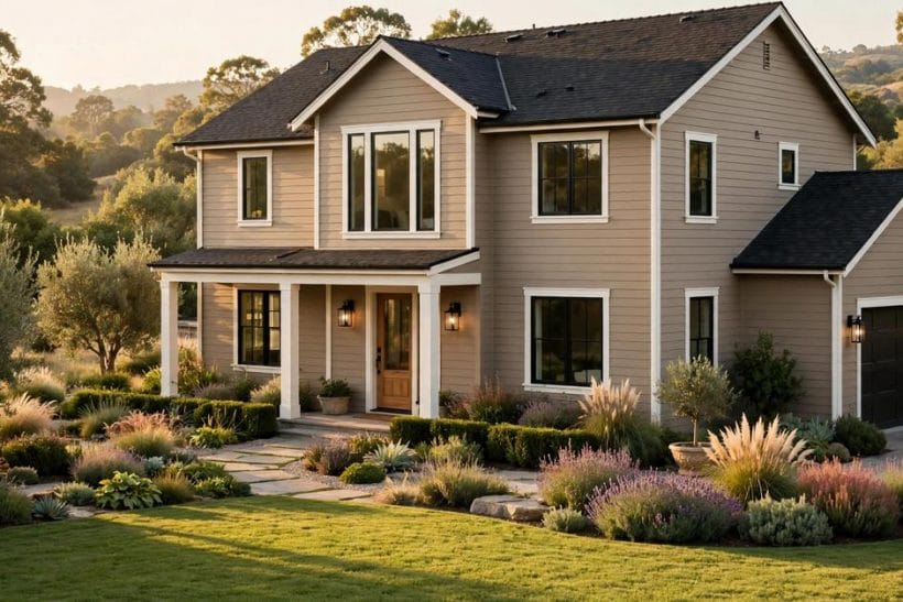
1. Taupe for House Exteriors at a Glance
Taupe sits between grey and brown, and that in-between position is its whole talent: it borrows grey’s calm and brown’s warmth, so a taupe house reads neutral without ever reading cold. On an exterior it does three jobs at once — it flatters natural materials, it forgives the dust and weathering that punish paler colours, and it lets the architecture, the roof line and the planting carry the interest while the walls provide the composed background. This post belongs to the wider exterior home ideas family, and it stays with taupe alone: the colour itself, its pairings and its care. Neighbouring colours get their own honest treatments elsewhere in the colour family — the grey-led survey in gray exterior home ideas and the seaside palettes in coastal exterior home ideas — so nothing here needs to pretend taupe is every colour at once.
| Question | Short answer |
|---|---|
| What colour is taupe, exactly? | A grey-brown neutral whose balance can lean warm, cool, pinkish or greenish — the undertone, not the name, decides its character |
| Which houses suit taupe best? | Almost any, but especially houses with stone, timber or brick in the mix, and houses sitting in green, planted settings |
| What trim works with taupe? | Crisp warm white for the classic look, charcoal or deep bronze for contrast, or a deeper taupe tone for a calm, layered scheme |
| How is the right taupe found? | By testing large samples on the actual walls, in the house’s real light, morning and evening — never from a small swatch indoors |
| What is taupe’s upkeep advantage? | Mid-tone colours hide dust, pollen and minor weathering kindly, and touch-ups blend more forgivingly than on stark whites |
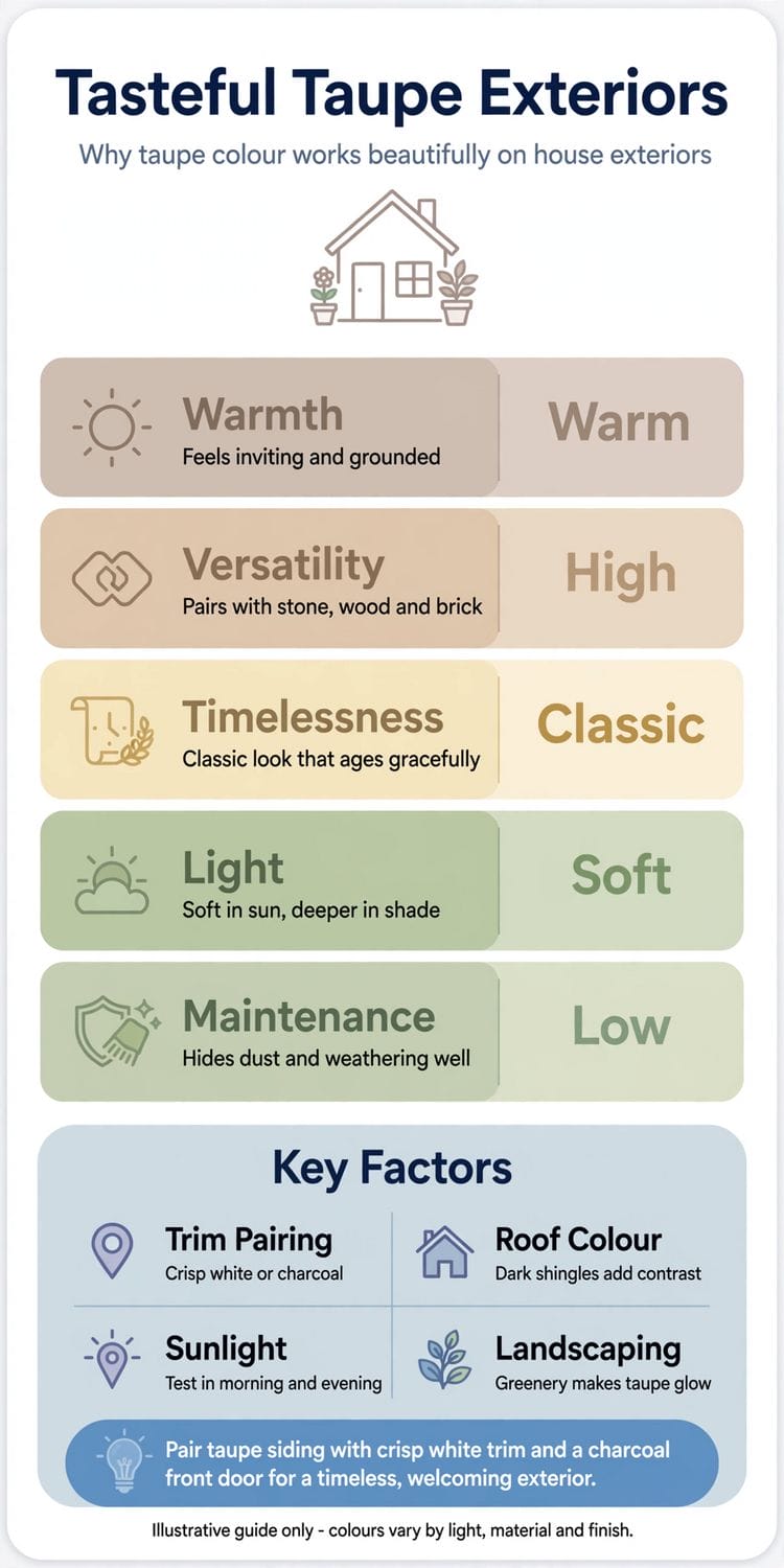
2. What Taupe Is: Between Grey and Brown
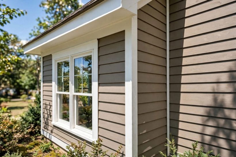
Every colour argument about taupe is really an argument about balance. Understanding where a particular taupe sits on the grey-to-brown line — and which way its undertone leans — is the skill the rest of this guide uses.
The grey-brown balance
A taupe that leans grey reads cooler, crisper and more architectural; one that leans brown reads warmer, softer and more traditional. Neither is better. The house’s materials and setting should cast the vote: stone and slate flatter the greyer taupes, while brick, timber and warm planting flatter the browner ones.
Undertones: warm, pinkish, greenish, violet-grey
Underneath every taupe sits a whisper of another colour. Warm taupes carry a golden or yellowish whisper and feel sunny; pinkish taupes — sometimes called mushroom — feel soft and traditional; greenish taupes feel earthy and sit beautifully among planting; violet-grey taupes feel cool and formal. The whisper is quiet indoors and loud on a whole sunlit wall, which is why testing outdoors is non-negotiable.
Why taupe changes through the day
Taupe is a chameleon because it borrows colour from its surroundings: morning light warms it, midday sun flattens it toward grey, evening light deepens it, and green planting reflects a soft green cast onto it. A taupe that looks perfect at noon may look muddy at dusk. Judge samples at several times of day before committing a whole house to them.
3. Choosing the Depth: Pale, Mid and Deep Taupe
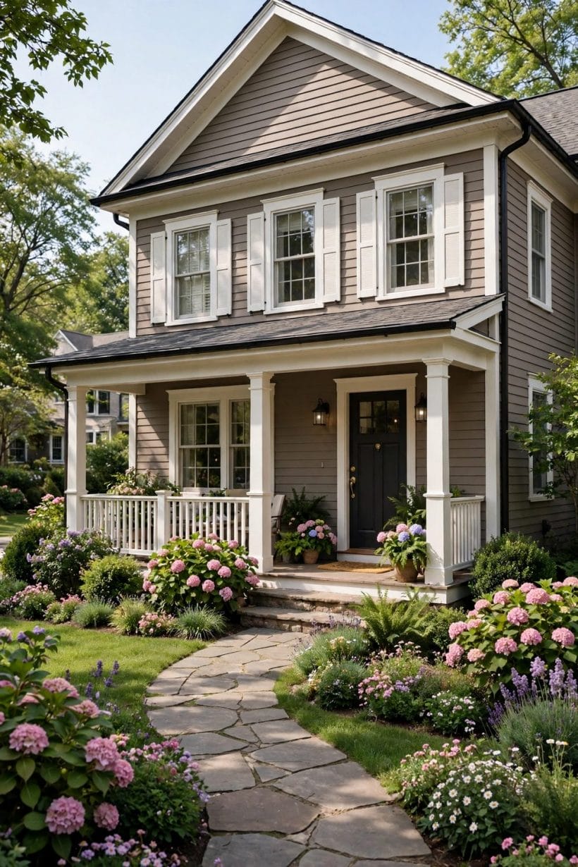
Depth is the second decision after undertone. The same taupe family at three depths produces three different houses, and the right depth depends on the house’s size, its setting and how much contrast the scheme needs.
Pale taupe: the soft, light-filled choice
Pale taupes read almost as warm off-whites from the street, with the neutrality doing quiet work in shadow and texture. They suit smaller houses, shaded plots and schemes where the trim is only slightly brighter than the walls. Their weakness is honesty: pale walls show dirt, splash marks and algae sooner, so they ask for a house whose owners wash walls down willingly.
Mid taupe: the classic middle
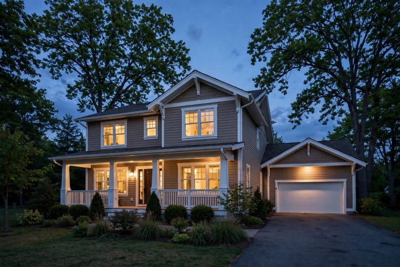
Mid-tone taupe is the colour most people picture — deep enough to hold its own against a dark roof and bright trim, light enough to keep a house friendly. It is the forgiving depth for upkeep, the safest depth for resale, and the depth the feature house in this post’s photographs wears: grounded, warm and composed.
Deep taupe: drama with manners
Deep taupe makes a house feel tailored and substantial, especially with pale trim cutting clean lines against it. It flatters modern and traditional houses alike, absorbs bright sun gracefully and hides weathering best of all. Its caution is heat and mood: very dark walls absorb more sun, and on a small house in a dark, treed setting a deep taupe can brood where a mid tone would glow.
4. Pairing Taupe With Trim, Doors and Roofs
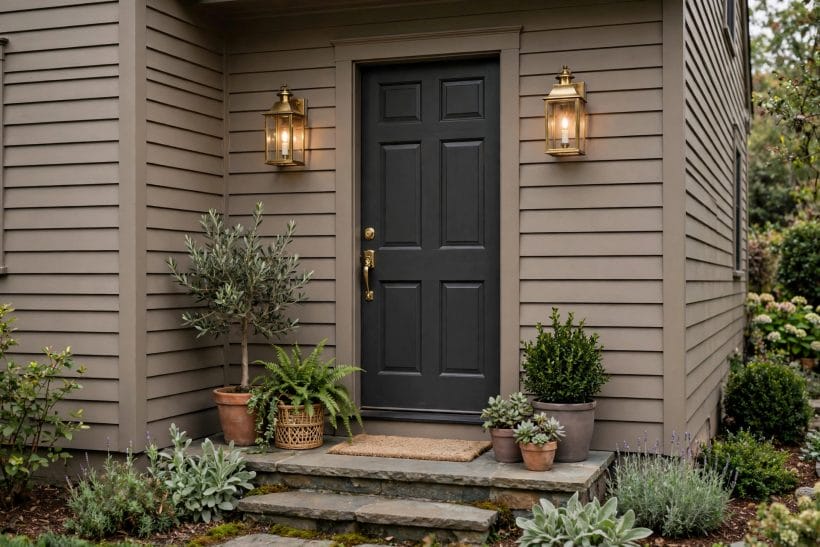
A taupe wall never appears alone. Trim, doors, roof and metalwork complete the scheme, and the pairings are where tasteful taupe is actually made or lost.
Warm white trim, the classic pairing
Crisp warm white on fascias, window frames and porch posts gives taupe its tailored edge and keeps the scheme bright without tipping into starkness. Choose a white with a warm lean of its own; a blue-cold white can make a warm taupe look dirty beside it, and the mismatch only shows at full scale.
Charcoal and deep bronze for contrast
Where white feels too expected, charcoal trim, bronze window frames or a near-black front door give taupe a modern, grounded contrast — the pairing the taupe infographic recommends, and the one dark roofs echo naturally. The contrast should be deliberate and repeated in at least two places, or it reads as an accident rather than a scheme.
Front doors that finish the sentence
A taupe house takes almost any door colour with grace: deep green for a planted, traditional welcome; navy for formality; a warm timber door where the house has wood elsewhere; or a saturated colour — oxblood, mustard, teal — as the single joyful note in an otherwise calm scheme. Taupe’s neutrality is precisely what lets one brave door work.
5. Taupe With Stone, Brick, Timber and Siding
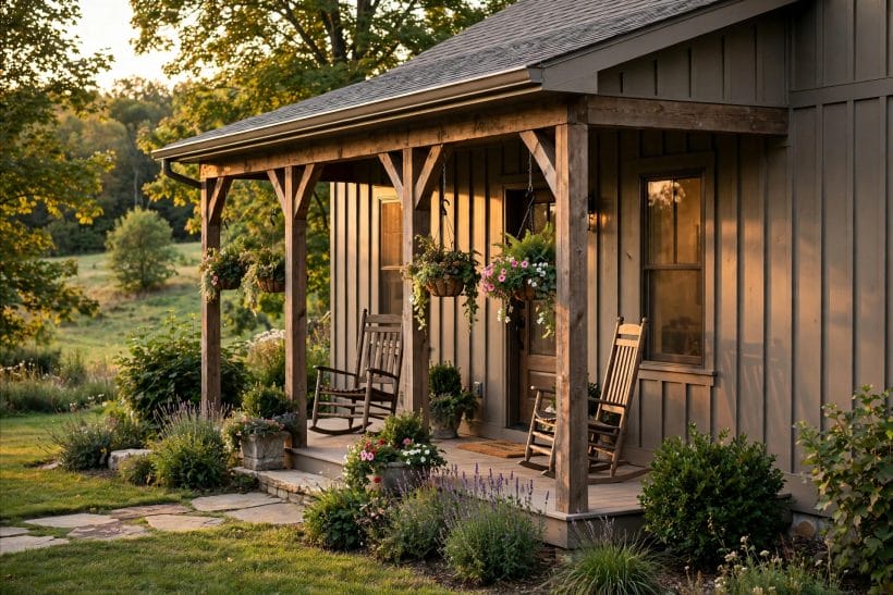
Materials carry their own colours into the scheme, and taupe’s reputation rests on how peacefully it sits beside all of them. The pairings below are the ones the colour was made for.
Stone: taupe’s oldest friend
Natural stone — in porch pillars, chimneys, plinths and garden walls — almost always contains grey and brown together, which is why taupe walls look inevitable beside it. Pick the taupe’s undertone from the stone’s own quieter tones and the wall and the stone read as one material decision. The stone-led planting in the craftsman garden survey later in this batch makes the same peace outdoors.
Brick and warm roof tiles
Red and orange brick can fight cool greys, but a warm-leaning taupe settles beside brick calmly, letting the brick be the colour and the painted walls be the frame. Terracotta and warm brown roof tiles ask for the same warm lean; a greenish taupe beside them can turn uneasy, which the test samples will reveal honestly.
Timber, shingles and fibre-cement siding
Stained timber and weathered shingles bring texture that flat colours flatten; taupe’s mid-tone depth keeps the texture visible without competing. On smooth siding, taupe rewards good preparation — its even, matte calm shows lumps and old paint edges plainly, so the painter’s sanding matters as much as the colour choice. The practical finish questions in tiny house exterior ideas apply at every house size.
6. Taupe in Different Lights and Landscapes
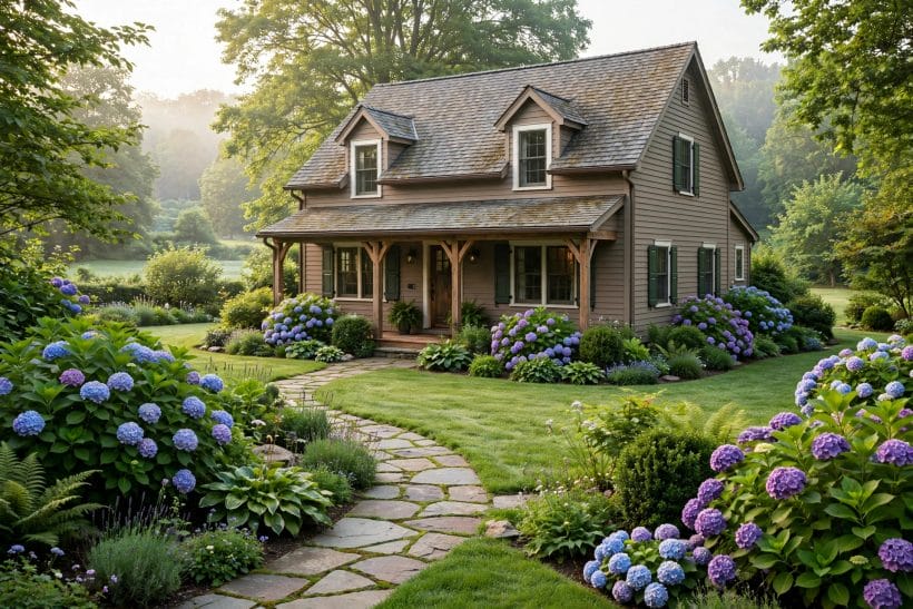
A colour is a relationship between paint, light and setting. Taupe’s relationships are mostly happy ones, but each setting asks for a small adjustment of undertone or depth.
Bright sun and open plots
Strong sun bleaches every colour toward pale, so houses in bright, open settings can carry a deeper taupe than the swatch suggests and still read mid-tone. Test at midday as well as evening; the sample that survives noon without washing out is the honest one.
Shade, trees and green surroundings
Under trees, light arrives filtered green, and taupes with a pinkish or warm lean stay balanced where a greenish taupe can disappear into the foliage entirely. Deep shade also darkens: a mid taupe in a wooded plot reads like a deep one, which may be exactly the cabin-like mood wanted — or a surprise, if it was not tested in place.
Coastal and desert settings
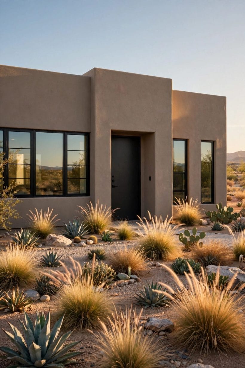
By the sea, taupe takes a supporting role to blues and whites in the classic shore palette surveyed in blue exterior home ideas; a warm taupe with white trim and a coloured door is the quieter coastal alternative. In dry, dusty country taupe is camouflage in the best sense — dust simply vanishes against it, and the house sits into its landscape instead of standing out of it.
7. Testing Taupe Properly Before You Commit
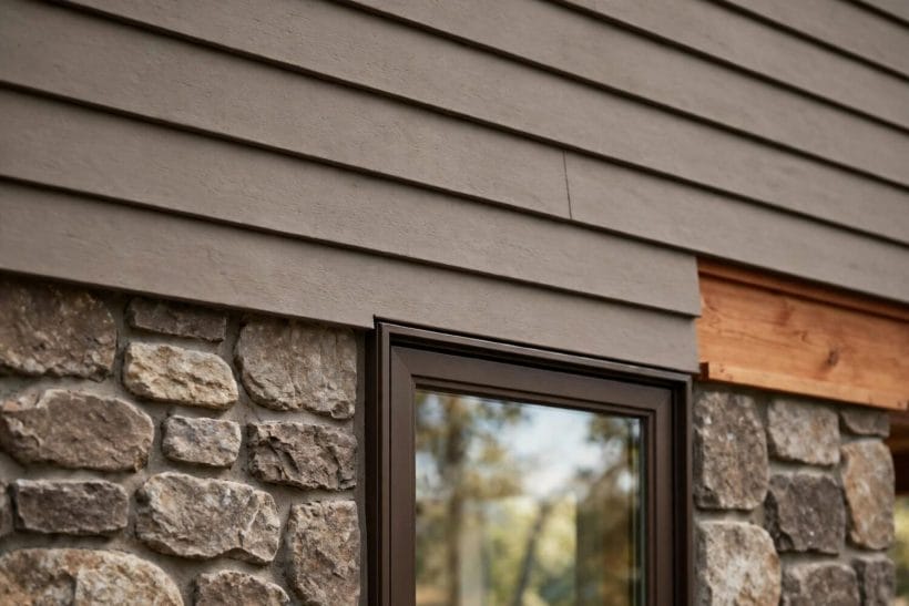
More taupe regret comes from skipped testing than from wrong choosing. The test is cheap, quick and entirely in the painter’s control — a weekend of samples against years of living with the wrong undertone.
Paint large samples on the real walls
Brush generous sample areas on at least two walls that face different directions, beside the trim, the stone and the door they will live with. Small swatches lie by omission: they cannot show how a colour behaves across a whole sunlit elevation, in shadow, and against the roof.
Live with the samples through a full day
Look in the morning, at noon, in the evening and on an overcast day if the week offers one. Note which sample stays pleasant in every light rather than perfect in one. Ask the household, too — the colour is a shared view, and the person who dislikes the dusk version will see it every evening.
Check the colour against what will not change
The roof, the stone, the brick, the neighbour’s house and the mature planting are fixed; the paint is the variable. Hold samples against the fixed elements, not against other paint swatches. And photograph the samples — phone pictures exaggerate some undertones, but a sample that photographs strangely pink usually is strangely pink.
8. Applying Taupe: Preparation and Finish
Taupe is a calm colour that shows careless work. The craft points below are general good practice for any exterior scheme, and they matter doubly for a mid-tone neutral whose whole effect is composure.
Preparation decides the finish
Wash the walls, scrape and sand failed paint, fill and prime repairs, and let everything dry honestly before colour coats begin. Taupe’s even surface shows ridges, drips and brush marks that a busier colour would hide. Sound preparation is also the durability decision: paint fails from beneath far more often than from above.
Sheen: matte walls, satin trim
A low-sheen or matte finish on walls gives taupe its soft, plastered calm and hides minor surface unevenness kindly. Trim usually takes a slightly higher sheen so the eye can read the architecture’s edges and so the most-handled parts of the scheme clean easily. Confirm the sheen on the test samples — sheen changes the perceived depth of the same colour.
Two honest coats, and a labelled spare pot
Mid-tone colours need their full coats to reach the tested colour; a single stretched coat dries paler and patchier than the sample promised. Keep a labelled pot of the exact paint for touch-ups, noting the wall and the date — taupe blends forgivingly, but only when the spare is truly the same paint.
9. Taupe Schemes for Different House Styles
The same colour family dresses very different houses. These scheme sketches are starting points — each is completed by the house’s own materials, roof and trim rather than copied whole.
Traditional and craftsman houses
Warm mid taupe with cream trim, a timber or deep-green door and stone at the base is practically the traditional scheme’s native dress. The craftsman family in this batch — the landscaping survey following this post — uses the same palette outdoors, where taupe walls and stone planting meet. Depth at the gables or a deeper taupe on shutters adds the Craftsman note of layered, earthy contrast.
Modern and minimalist houses
Greige-leaning taupe, charcoal frames, a flat or standing-seam dark roof and one timber accent make a scheme that feels designed rather than decorated. The discipline is restraint: fewer materials, repeated exactly, and planting kept architectural so the walls’ calm is never interrupted.
Cottages, farmhouses and tiny houses
Pale-to-mid taupe with white trim and a coloured door suits cottages and farmhouses because it lets gardens and porches supply the colour. On tiny houses the same logic scales down — one calm wall colour, bright trim, and the small house reads larger and calmer than a busy scheme would allow, a principle the design-led survey at new home exterior design ideas for tiny houses develops.
10. Keeping Taupe Looking Tasteful: Care and Refresh
Taupe asks less of its owners than most colours, but not nothing. A light rhythm of inspection and washing keeps the scheme composed for years between repaints.
Washing and the quiet enemies
An annual gentle wash removes the dust film, pollen and traffic grime that slowly grey a warm taupe. Watch the shaded walls for algae’s green bloom — taupe does not cause it, but its calm surface shows it — and treat it promptly with products made and labelled for exterior walls, following their directions exactly.
Touch-ups, fading and the repaint decision
Sun-facing walls fade first; a scheme is ready for repainting when the sunny and shaded elevations no longer match in ordinary light, or when the paint film itself chalks, cracks or peels. Because taupe blends kindly, localised touch-ups stay invisible longer than on whites or strong colours — one more reason the labelled spare pot earns its shelf space.
When taupe is the wrong answer
Honesty completes the guide: houses that need maximum brightness in a dark plot, schemes built on crisp blue-white contrast, and owners who simply love a bolder street presence will be happier with another colour. Taupe’s gift is composure. Where composure is not the brief, the wider colour family — grays, blues and coastal palettes linked through this post — offers the louder answers.
Final Considerations
Tasteful taupe is not a trend to ride but a decision to settle: choose the undertone from the house’s own stone, brick and light, set the depth by the setting, pair it with trim that knows its role, and test it at full scale through a full day.
Do those four things and taupe repays them the way it has repaid generations of house-painters — with a home that looks calm from the street, kind in every light, and quietly right for years.

0 Comments