
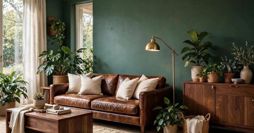
Soil and leaf. Trunk and canopy. Brown and green is the oldest colour pairing in the world — the one every landscape is built from, and the one a room can borrow whole.
This article takes the pairing apart properly: how its browns are chosen by depth, its greens by temperature, how it behaves room by room, which materials carry it, and the checks that stop its few real mistakes.
1. Brown and Green at a Glance
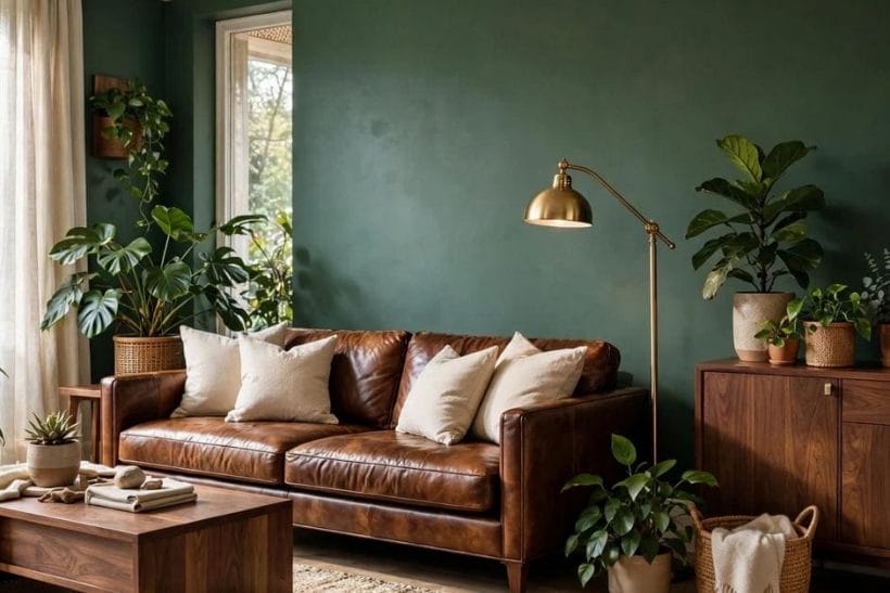
Brown and green is a two-colour scheme whose central entity is the pairing itself — warm, timber-borne browns against living greens — and whose attributes are depth, temperature, material, pattern and light. It belongs to the site’s colour family alongside the other combination and colour-guide posts gathered under the home design ideas hub, and it is the most forgiving of them all: both colours are mid-toned, both flatter natural materials, and both survive changes of fashion that strand brighter schemes.
| Question | Short answer |
|---|---|
| Why do brown and green work together? | Because they arrive together in nature: the eye reads timber, leather and earth tones against leaf greens as one system, not two colours. Indoors, the pairing borrows that instant rightness wholesale. |
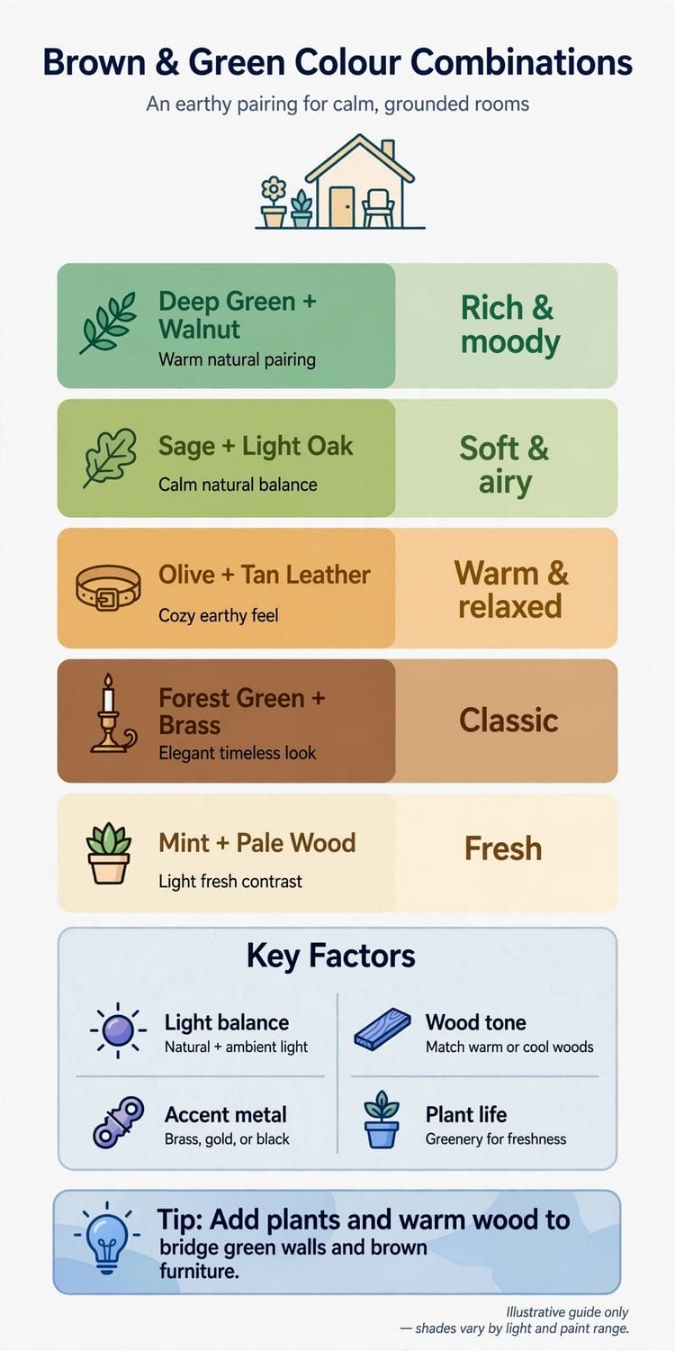
| Which browns should I choose? | By depth: pale oak and rattan for the bright modern version, teak and walnut for the classic, dark stained timber and leather for the enveloping one. Depth is a mood decision, not a correctness one. |
| Which greens should I choose? | By temperature: sage and olive forgive everything, mossy yellow-greens warm a room, blue-greens cool it, and chartreuse is a spark for small doses only. Match the green’s temperature to the brown’s. |
| What is the third colour? | Cream and warm white, as air — ceilings, rugs, bedding. Beyond them, one small spark such as ochre or rust may visit. Two sparks makes a different scheme entirely. |
| Does the pairing suit small or dark rooms? | Yes, in its pale register: light timber, sage, cream and plants. The deep register — forest green, dark leather — belongs to rooms with the light or the lamps to carry it. |
| What is the commonest mistake? | Browns that fight: several timbers of different temperatures in one room. Gather the real samples together in daylight before buying, and retire whichever one is not a relative of the others. |
2. Why the Pairing Works: Earth and Leaf
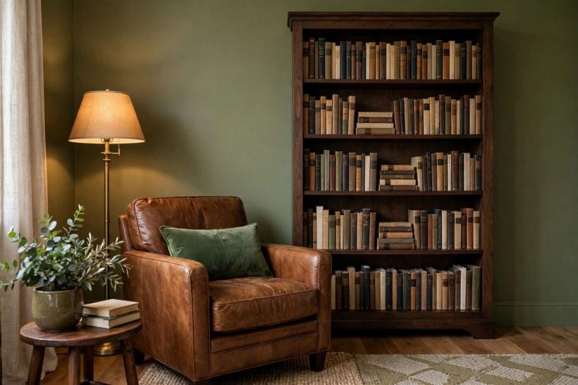
Brown and green is the colour pairing the natural world got to first: soil and leaf, trunk and canopy, bark and moss. Indoors it carries the same instant rightness, which is why the combination survives every fashion cycle that tries to replace it — the site’s other great pairing, pink and blue, charms by contrast, but brown and green persuades by recognition.
It flatters every light
Many pairings are hostage to a room’s aspect: they sing in south light and sulk in north. Brown and green is unusually forgiving, because both colours are mid-toned and warm-hearted — the browns hold their warmth in cool light, and the greens keep their life in dim corners where brighter colours simply give up.
It suits every age of house
Cottages, terraces, mid-century homes and new builds all contain timber somewhere, and timber is brown’s ambassador already in the room. Green joins what the building owns, which is why this pairing rarely looks applied — it looks discovered, as if the house had been waiting for it.
It ages without dating
Fashion colours date by their novelty; brown and green date by nothing, because neither has ever been out of the landscape. Rooms in this pairing may be refreshed by swapping textiles and shades, but the bones of the scheme are as safe as decorating decisions get.
It is built from things, not just colours
Most schemes live on walls; this one lives in objects — the timber table, the leather chair, the plant on the sill. That is why it survives redecoration and even moving house: the scheme is portable, because so much of it is furniture the owner already loves and keeps.
3. The Browns: Choosing Your Depth
Brown is not one colour but a staircase: pale oak and rattan at the top, through mid-toned teak and walnut, down to near-black stained timber and dark leather at the bottom. The pairing works at every step of that staircase — what changes is the mood, from airy woodland to panelled library — so the first decision is simply how deep your room wants to stand.
Pale browns for the light, modern version
Pale timber floors, oak furniture, woven cane and linen tones make the Scandinavian reading of the pairing: green appears as plants, a sage wall or cushions, and the whole stays bright. The reference point for building such palettes deliberately is the site’s tiny house colour palette work — small-space discipline, applied to a colour story.
Mid browns for the classic version
Teak, walnut and warm mid-oak with greens of medium depth give the pairing its most familiar, lived-in form: neither rustic nor minimal, simply comfortable. This is the version most homes already own in pieces — a table, a leather chair — waiting for the green to be invited in.
Dark browns for the enveloping version
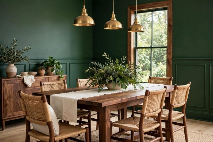
Dark-stained timber, chocolate leather and deep-toned floors under forest or emerald green make the library mood: enclosed, warm, lamp-lit. It asks for good lighting and a confident hand, and in return it delivers the most atmospheric rooms of the three depths.
4. The Greens: Choosing Your Temperature
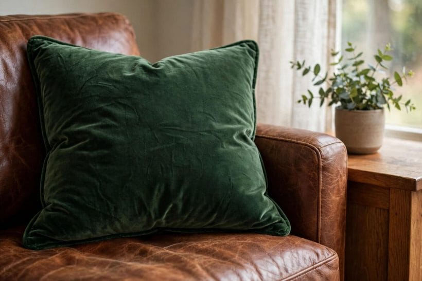
Green’s range matters as much as brown’s: yellow-leaning greens run warm and mossy, blue-leaning greens run cool and formal. The pairing succeeds when the green’s temperature agrees with the brown’s — warm timber with mossy green, cooler stained timber with the blue-greens — and it fails quietly when they argue, which is most of what people mean when they say a room feels almost right.
Sage and olive: the peacemakers
Greyed, soft greens sit calmly beside every brown on the staircase, which is why sage walls and olive textiles are the pairing’s safest instruments. They ask nothing of the light and flatter timber of any age — the place to start if the combination is new to you.
Chartreuse and acid green: use as a spark, not a surface
The bright yellow-greens are the pairing’s electricity and its danger in one. The dedicated treatment in the chartreuse colour guide gives the full method; in brown-and-green rooms, chartreuse belongs in a cushion, a lampshade, a single chair — a struck match of colour against the timber’s calm.
Forest and emerald: the deep end
Saturated dark greens against dark browns make the pairing’s most dramatic rooms, and they live or die by lighting: lamps at several heights, warm bulbs, and something pale — a ceiling, a rug — to keep the depth from becoming gloom. In a well-lit room, nothing in domestic colour is richer.
Undertones: the quiet test that settles arguments
Hold the green against the room’s actual timber in daylight. If the timber suddenly looks orange, the green is too blue; if the green turns khaki and tired, the pairing wants a cleaner or deeper green. The test takes a minute and explains most almost-right rooms: the colours were fine, their temperatures were strangers.
5. Room by Room: Living Room and Hall
The living room is where the pairing does its public work, and its recipe is stable: brown in the furniture’s bones — timber, leather, the floor — green in the surfaces that surround them, and plants to mediate between the two. It is the same room-splitting discipline the colour-lane post grey and blue living room applies to its own pair, with the warmth turned fully up.
The living room formula
Timber floor or mid-brown furniture below, green on the walls or in the sofa above, cushions and throws exchanging the two colours between them. Add brass or warm metal as the jewellery and a cream rug as the breathing space, and the room composes itself around any fireplace or window it owns.
The hall: the pairing as a welcome
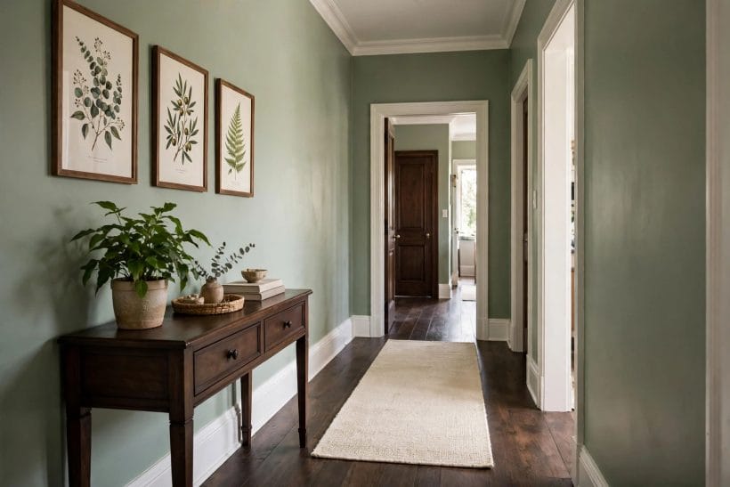
Halls are narrow, light-poor and hard-working — exactly the conditions the pairing forgives. A green below the dado or on the walls with timber in the bench, hooks and frames gives arriving guests the house’s thesis in one glance: natural, warm, unhurried.
Stairs and landings: carry the story upward
A runner that holds both colours, green paint rising with the stair wall, timber handrails and frames — the pairing on the stairs stitches the house’s floors into one scheme, so bedrooms in the same colours feel like chapters rather than new books.
6. Room by Room: Bedroom, Bathroom and Beyond
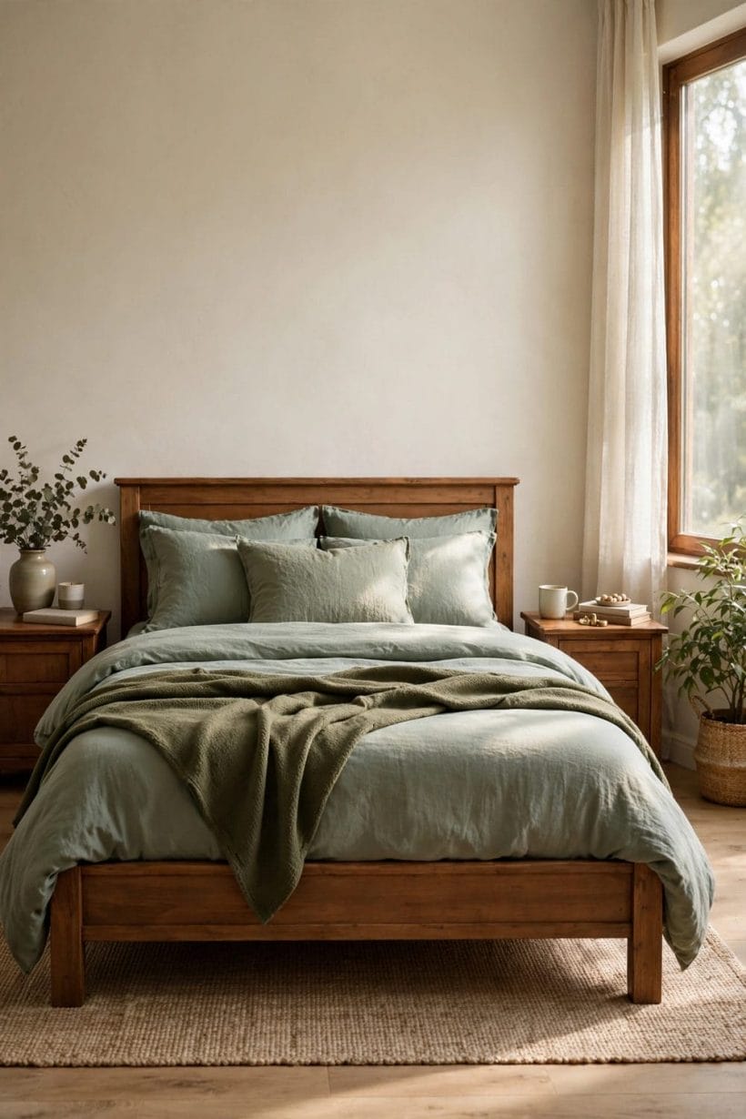
In the private rooms the pairing softens: greens get dustier, browns get more textile — linen, wool, rattan, timber — and the mood turns from composed to cocooning. The principles hold; only the temperature of intimacy changes.
The bedroom: green walls, brown bed
A sage or deep green wall behind a timber or rattan bed, bedding in cream and ochre, a plant on the dresser — the pairing’s bedroom is the easiest restful room in this whole survey. Keep screens and clutter out of the colour story and the room will do the rest.
The bathroom: timber tones against green tile
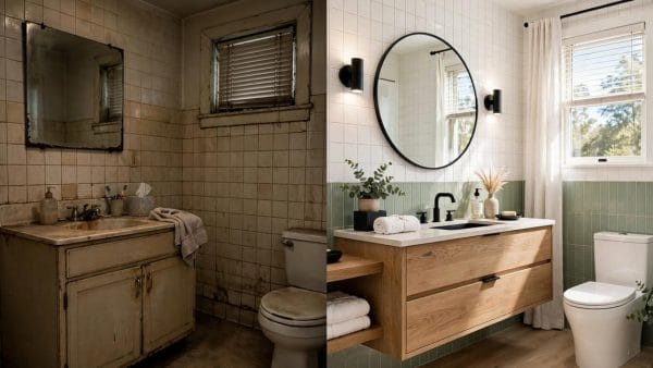
Green tile or paint with timber-toned vanity, shelves and stools gives the bathroom a spa-adjacent calm without a single beige compromise. Timber in bathrooms must be specified and ventilated for the damp — but its tones, real or faithfully imitated, are what the green is asking for.
Outside the back door: the pairing at full scale
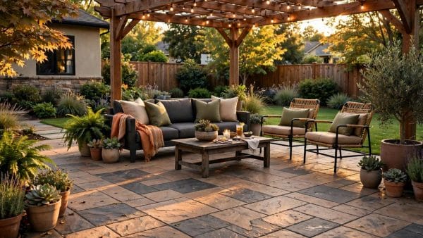
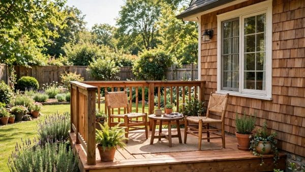
The scheme walks outdoors without translation: green planting against timber fencing, decking and furniture, the garden itself supplying both colours at full saturation. The exterior version of the discipline appears in green exterior home ideas — the house wearing the pairing before the visitor ever reaches the hall.
The kitchen and the workroom: where it earns its keep
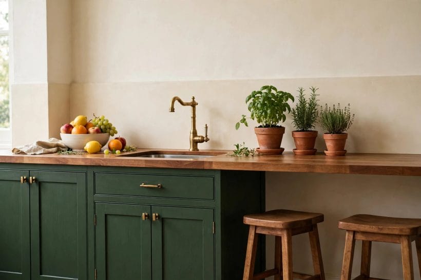
Green cabinetry or walls with timber worktops, shelves and stools make kitchens that feel gardened rather than engineered, and the same recipe steadies a studio or workroom — green is famously easy on working eyes, and timber warms rooms full of tools and tasks. In working rooms, keep the browns sealed and wipeable and let the greens live on the walls, where they ask nothing.
7. Materials That Marry Them: Wood, Leather and Living Green
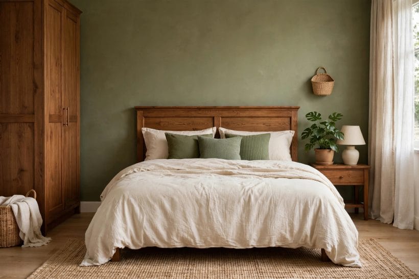
In this pairing, materials are not the backdrop to colour — they are the colour. Brown arrives mostly as stuff: timber grain, leather hide, woven fibre, clay and wool. Green arrives as paint and textile, yes, but supremely as living leaves, which is why brown-and-green rooms feel grown rather than decorated.
Timber does the brown’s heavy lifting
Floors, furniture and joinery in real or honestly-finished timber give brown its depth, because grain varies where paint cannot. One good timber surface per room is the pairing’s foundation; everything else brown — leather, textile, ceramic — is harmony around it.
Leather and woven fibre warm the middle register
A leather chair or footstool and woven baskets, blinds or lampshades occupy the tonal middle between floor and walls, softening the room’s transitions. These are also the pairing’s most forgiving materials: both improve with wear, in a scheme that never asks to look new.
Plants are not accessories here — they are a material
A room in brown and green with no living leaf is a portrait missing its sitter. One large plant, or a few in true scale, supplies the freshest green in the room and quietly justifies every other choice; silk substitutes should be the last resort of genuinely lightless corners.
8. Pattern, Texture and the Third Colour
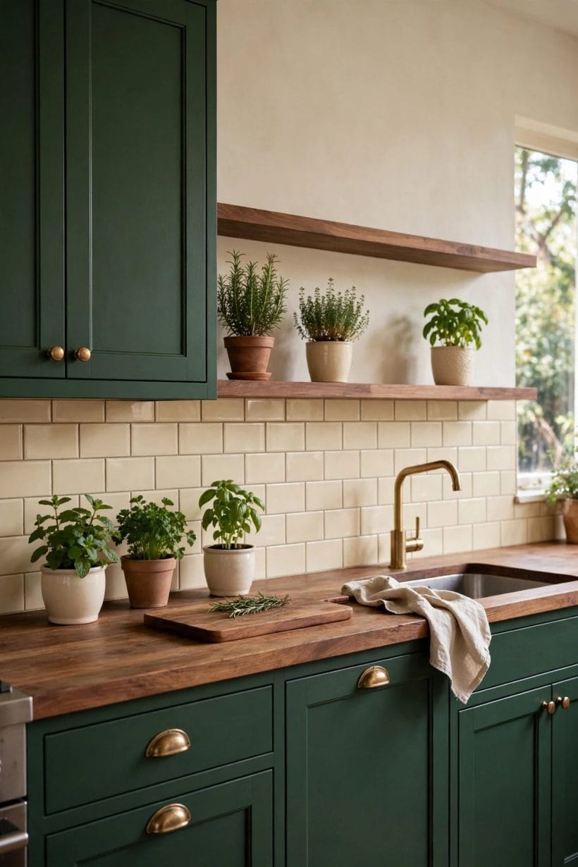
Two colours alone can read flat; the pairing stays interesting through pattern and texture, and through one guest colour kept on a short leash. This is the section where the scheme becomes a style rather than a formula.
Pattern belongs to the textiles
Checks, stripes, botanical prints and woven patterns in the two colours give the eye its exercise without new hues arriving. Cushions, throws, curtains and the rug are pattern’s proper home — surfaces that can be changed when the room wants a new verse of the same song.
Texture is the pairing’s third dimension
Rough timber against smooth leather, nubby wool against glazed ceramic, matte green paint against a polished brass rail: contrast of touch keeps a two-colour room rich. When a brown-and-green room feels dull, it is almost never the colours — it is that everything in it has the same finish.
The third colour: cream, always; then one spark
Cream and warm white are the pairing’s necessary air, on ceilings, rugs and bedding. Beyond them, a single spark — ochre, rust, or the neighbouring neutral treatment in the light gray colour guide — may visit in small doses. Two sparks is a different scheme; discipline is what makes this one recognisable.
9. Mistakes and Checks Before You Commit
The pairing is forgiving, not foolproof. Its failures are consistent enough to list, and each has a check that takes minutes before money moves.
Mistake: browns that fight each other
Three timbers in three temperatures — orange pine, pinkish oak, grey-washed board — make the room feel assembled from spares. Check by gathering the room’s actual timber samples together in daylight: they should read as relatives, and the ones that do not must be stained, painted or retired.
Mistake: green chosen from a screen or a swatch alone
Green is the colour screens lie about most, shifting blue or yellow without warning. Paint a board, live with it through a day and an evening, and judge it against the room’s real timber before any wall is committed.
Mistake: forgetting the light the room actually has
Deep green and dark brown in a north-facing cupboard of a room will read as a cave, whatever the photographs promised. Match the pairing’s depth to the room’s light honestly — pale versions exist precisely for the rooms that need them.
Check: the five-sample rule before ordering anything large
Timber, green paint, the main textile, the metal and the floor, gathered on one tray in the room itself. If the five agree, order with confidence; if one argues, it is far cheaper to discover it on the tray than on the wall.
None of these checks asks for equipment beyond samples, daylight and patience, which is fitting: a scheme drawn from the landscape rewards the same slow looking the landscape does. Rooms that pass the checks rarely need rescuing, and rooms that fail them announce exactly which decision to revisit — the brown’s depth, the green’s temperature, or the light both were judged in.
10. Costs and Pulling It Together
The pairing’s costs are mostly the costs of its materials, and they behave kindly: timber and leather are bought once and kept for decades, paint is paint, and the expensive mistakes are not objects but commitments — a floor or a wall of tiles in the wrong temperature of either colour. Stated generally, the scheme’s economy follows its ecology: invest in the browns, which arrive as furniture and floors, and let the greens, which arrive as paint, textile and plants, stay cheap enough to change with the seasons of your taste.
Pulling it together: choose the brown’s depth for the room’s mood, the green’s temperature to agree with it, build the scheme from materials before paint charts, give pattern to the textiles and air to the cream, and check the five real samples together in the room’s own light.
Rooms built that way have a particular quality visitors struggle to name: they feel inevitable, like a woodland edge or a garden wall — which is, of course, exactly where the pairing learned its manners.
Final Considerations
Brown and green will never be the fashion story of a single year, and that is its strength: it is the landscape’s own scheme, older than every interior ever painted, and it will be standing calmly when the year’s colours have been painted over.
Start with the timber you already own, invite the green that flatters it, and let living leaves finish the argument. The pairing does not need to be invented — only recognised, and allowed indoors.

0 Comments