
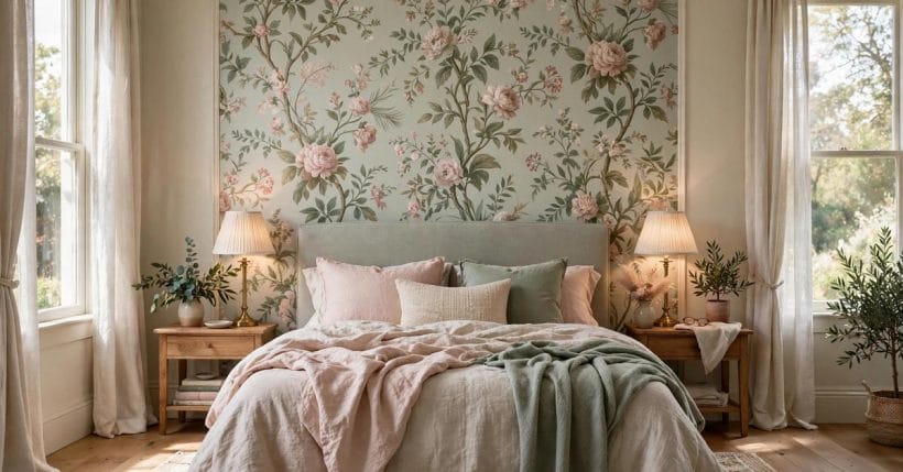
A bedroom has four walls and one job: rest. Wallpaper is the fastest way to give those walls a mood — pattern, colour and texture wrapped around the bed before a single cushion is chosen.
These seventy-five ideas treat the paper as the bedroom background it is: the setting every other choice answers to. One bold wall or four quiet ones, rented or owned, there is a paper here that turns sleeping quarters into a room with a point of view.
1. Wallpaper Bedroom Ideas at a Glance
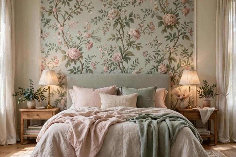
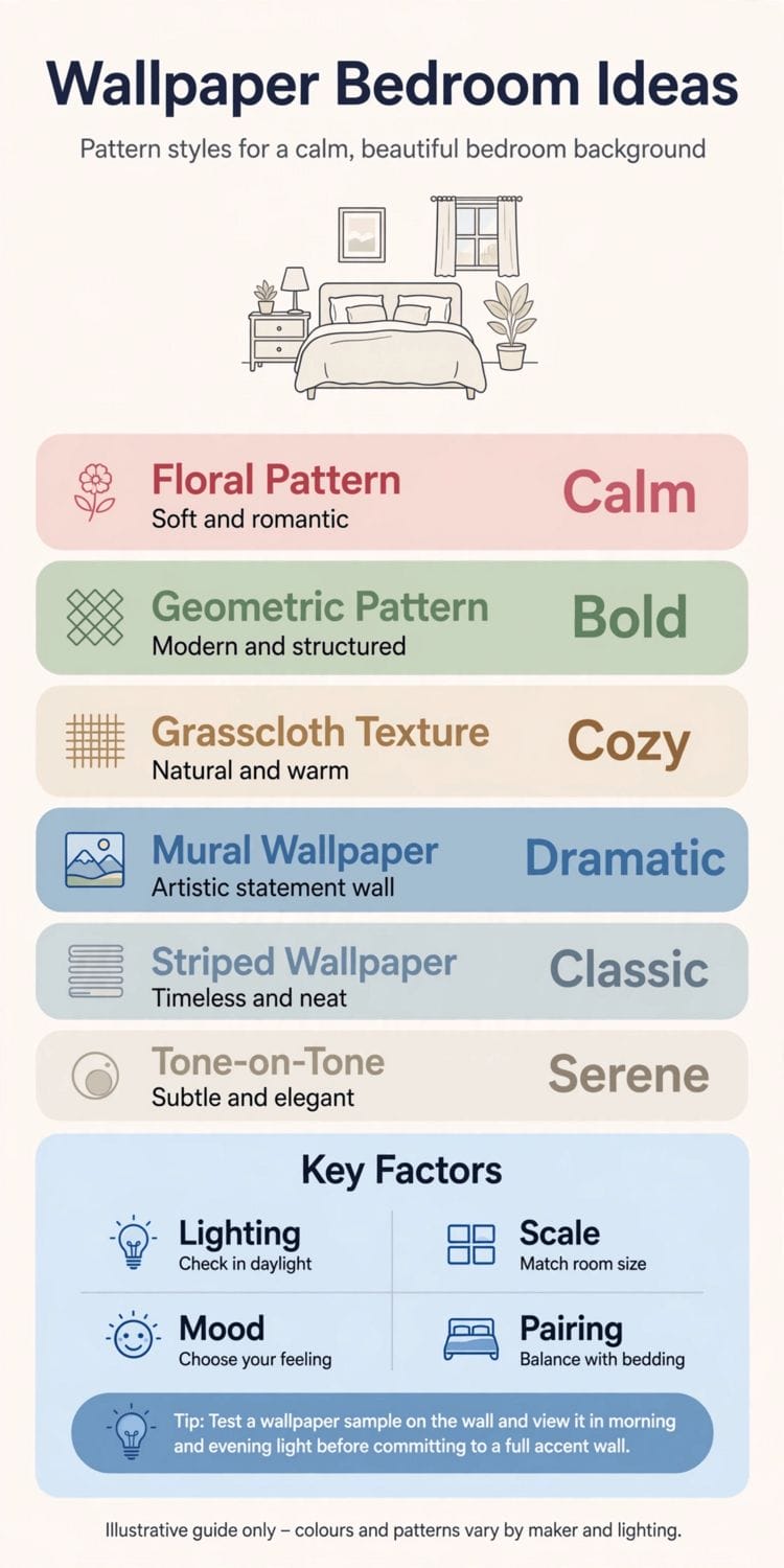
Bedroom wallpaper divides into two decisions: how much wall it covers, and how loudly it speaks. The feature wall behind the bed is the popular answer; the all-over wrap is the braver one; the half-wall and the ceiling are the connoisseur’s moves. Within the wider family of bedroom ideas, this post owns one angle only — paper on the walls — and leaves layout, furniture and the rest of the room to its sibling posts.
| Question | Short answer |
|---|---|
| Which wall gets the paper? | Usually the wall the bed stands against — it is the room’s backdrop and the one you face least while falling asleep |
| Feature wall or all four walls? | Bold, large-scale prints suit one wall; small, quiet patterns can wrap the whole room without crowding it |
| Can wallpaper suit a small bedroom? | Yes — pale grounds, fine patterns and one-wall restraint make small rooms feel considered rather than shrunk |
| What if the home is rented? | Peel-and-stick papers are made for exactly this — check the maker’s removal guidance and keep the original paint sound |
| What is the classic failure? | A loud pattern on every wall plus busy bedding — paper and textiles must agree on which of them is the soloist |
2. The Feature Wall Behind the Bed
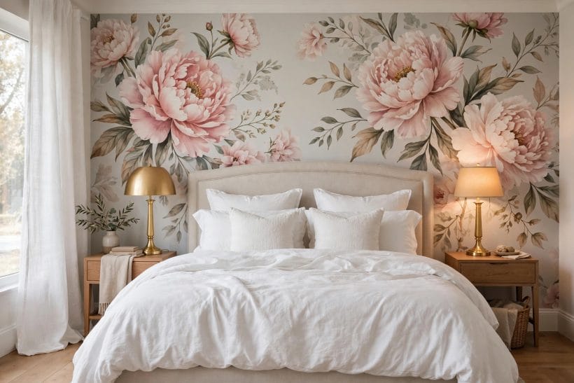
Start where most bedrooms start: the headboard wall. It is seen from the door, photographed by the eye on waking, and hidden behind you at night — the perfect stage for the room’s biggest pattern.
1. Paper the headboard wall, paint the rest
One patterned wall, three walls in a colour pulled from the print. The room gets its drama in a single dose and its calm everywhere else — the arrangement most bedrooms can live with longest.
2. Let the paper replace the headboard
A panel of strong pattern the width of the bed, framed by paint or trim, does the headboard’s visual work. Add a low padded board for leaning on and let the print be the furniture.
3. Centre a large-scale motif over the bed
Oversized florals, arcs or landscapes want a centre. Hang the first drop so the main motif sits over the pillows, and let the pattern fall symmetrically to both sides.
4. Wrap the feature wall into the ceiling’s edge
Carrying the paper a short way onto the ceiling — or to a picture rail and stopping cleanly — makes the wall feel designed rather than decorated, especially in rooms with high ceilings.
5. Back the bed with a mural panel
A single scenic panel behind the bed: misty hills, a forest, an abstract wash. Murals turn the headboard wall into a window the room never had, and they need no other art.
6. Frame wallpaper panels like artwork
Two or three framed panels of one paper, hung as a series over the bed. All the pattern, none of the commitment — and the panels move house when you do.
7. Choose a dark feature wall for a bright room
Deep green, ink or charcoal prints behind the bed ground a sunlit room and make white bedding glow. Darkness at the back wall reads as depth, not gloom.
8. Match the feature wall to the bed’s width only
Paper a section exactly the bed’s width, edge it with a timber strip or a painted border, and the wall gains architecture. The trick flatters plain rooms and small budgets alike.
9. Paper the wall the door opens onto
If the bed wall is awkward — windows, doors, a chimney breast — make the entrance wall the feature. The first sight of the room becomes its best one.
10. Keep bedside symmetry against the pattern
Matched lamps and tables in front of a busy print restore order. Symmetry is the frame that lets a bold background behave.
11. Use a quiet print where the bed is the statement
A carved, upholstered or four-poster bed needs a whisper behind it: tone-on-tone pattern, texture without contrast. The paper supports; the bed performs.
3. All-Over Pattern: Wrapping the Room
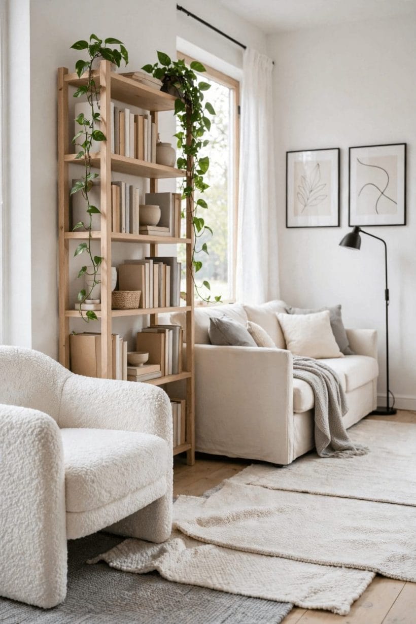
The full wrap is wallpaper’s oldest use and its most immersive. Done with a suitable pattern — small, regular, low-contrast — four papered walls make a bedroom feel like the inside of a jewel box or a garden at dusk.
The wrap has one more virtue nobody lists on the roll: it is honest about what a bedroom is. A bedroom is the one room nobody performs in — it is slept in, read in, recovered in — and a wrapped room behaves like a tent or a cabin, holding its occupant in a single sustained note rather than asking the eye to travel. That is why the traditional wrapped prints are nature at small scale: sprigs, leaves, tiny birds, the occasional hare. They give the waking eye something gentle to land on in every direction, which is precisely the feeling the feature-wall arrangement, for all its drama, cannot give the person lying in bed staring at the plain wall opposite. Choose between the two arrangements by deciding which view matters more — the one from the door or the one from the pillow — and the rest of this post’s decisions become much easier.
12. Wrap a small, regular print on every wall
Ditsy florals, tiny geometrics, fine sprigs: at room scale they read as texture, not noise. The wrap works when the pattern’s repeat is smaller than a hand.
13. Paper the ceiling too — the fifth wall
Continuing the print overhead is the boldest wrap of all, and in a low room it paradoxically lifts the lid by dissolving its edges. Keep the pattern pale and the bedding plain.
14. Take the paper over the doors
Papered doors vanish into the pattern, stretching the room and hiding its interruptions. It is a decorator’s trick with a real payoff in boxy modern bedrooms.
15. Wrap a patterned paper in a plain colourway
The same design in cream on cream, or grey on white, gives the wrap’s cocoon without colour commitment — pattern you discover as light moves across it.
16. Use the wrap to fix a room with no features
No cornice, no fireplace, no view? A full wrap supplies the character the architecture forgot, turning a developer’s box into a room with a memory.
17. Wrap the alcoves, paint the chimney breast
In period rooms, paper the recesses and leave the breast plain — or the reverse. The alternation gives the wrap rhythm and keeps one calm plane for art.
18. Choose a vertical stripe to lift the ceiling
Fine stripes run the eye upward and make low bedrooms feel taller. Keep the stripe’s contrast gentle; a barber-shop pole belongs in a different room.
19. Let a trellis print bring the garden in
Lattice and climbing-rose patterns turn four walls into a bower. In a town bedroom with a grey view, the paper supplies the garden.
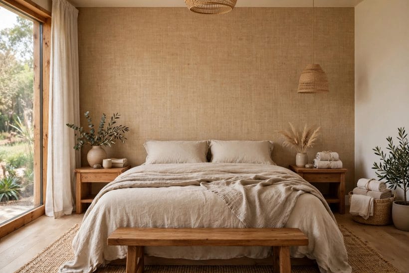
20. Wrap in grasscloth for texture without pattern
Woven grass and sisal papers give walls warmth, shadow-play and sound-softening with no motif at all — the wrap for people who say they dislike wallpaper.
21. Continue the paper inside the wardrobe recess
A glimpse of the same print inside an open closet or behind glass doors ties the room together like lining in a good coat.
22. Break the wrap with a dado line
Pattern above, plain paper or paint below a chair rail: the Victorian arrangement still earns its keep in tall rooms, halving the pattern’s dose without halving its effect.
4. Florals, Botanicals and Garden Prints
Flowers are wallpaper’s first language, and the bedroom is where they speak softest. Scale and ground colour decide whether a floral soothes or shouts — both have their beds to sleep in.
23. Blow the blooms up large
Oversized peonies and magnolias on one wall are modern, not chintzy — scale is what separates the boutique hotel from the spare-room cliché.
24. Pick a dark-ground floral for drama
Blossom on near-black or deep teal reads as evening garden: romantic, cocooning, and surprisingly restful once the lamps are low.
25. Go small and sprigged for cottage calm
Tiny scattered sprigs on white are the classic country bedroom — fresh at dawn, forgiving with mismatched furniture, and kind to low light.
26. Choose botanical drawings for a studied feel
Herbarium-style prints, ferns and seed heads suit bedrooms that double as reading rooms; their fine lines reward the close looking a bedroom gets.
27. Let one colour in the floral run the room
Pull the print’s secondary colour into cushions, a throw and the lampshades. The flower stays on the wall; its colour walks around the room.
28. Paper a canopy effect over the bed
A floral panel on the wall and a matching swoop overhead — or the print continued onto the ceiling section above the pillows — gives a four-poster feeling without the posts.
29. Mix floral paper with striped bedding
The classic decorator’s pairing: a stripe tames a floral and a floral softens a stripe. Keep one shared colour and the marriage holds.
30. Use trailing vines to soften corners
Climbing patterns blur the hard geometry of boxy rooms, leading the eye around corners instead of into them — especially kind in rooms with odd angles.
31. Choose monochrome florals for restraint
All the drawing, none of the colour: black-line blooms on white, or white on grey. Florals for minimalists, and a gift to rooms that change bedding colours seasonally.
32. Paper the nursery-to-teen room in a growable print
Botanicals outlast cartoon themes by a decade. A leaf or branch print chosen now will still suit the room’s occupant at every age between.
33. Set florals against painted panelling
Paper above a panelled half-wall, in the manner of old country houses, gives pattern a plinth — and the panelling takes the knocks the paper cannot.
5. Geometrics, Stripes and Texture-Look Papers
Where florals soften, geometrics organise. For sleepers who want pattern with a pulse — and rooms that lean modern — geometry, stripe and texture-look papers are the working set. They also sit happily in the colour-led lanes of this cluster, the way grey walls behave in the bedroom with gray walls — background first, furniture second.
34. Run a fine stripe for tailored calm
Pinstripes and ticking patterns give the bedroom a shirt-maker’s neatness — crisp with white linen, kind to small rooms, immune to fashion’s swings.
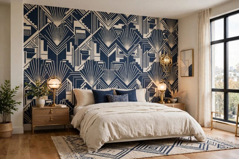
35. Choose an art-deco fan or scallop
Repeating fans bring rhythm and a little glamour. In metallic ink on a matte ground they catch lamplight beautifully at bedtime.
36. Go large with an arch or rainbow repeat
Big soft arches are the contemporary nursery’s and the playful main bedroom’s favourite — mural energy with a repeat’s economy.
37. Paper a chevron or herringbone for movement
Angled repeats energise a plain box of a room. Keep the contrast low in a bedroom; the zigzag should hum, not shout.
38. Fake the limewash with a plaster-look paper
Cloudy, tonal, depth without pattern — plaster and concrete-look papers give the Mediterranean wall finish without the trowel, and renters can take them away.
39. Use a linen or hessian texture print
The woven look warms white-box bedrooms the way grasscloth does, at friendlier cost and with washable manners in family homes.
40. Choose a small diamond or trellis for structure
Lattice repeats give eyes a grid to rest on — the patterned equivalent of a deep breath — and they flatter traditional furniture.
41. Paper in ombre or gradient
Colour that deepens toward the floor or fades toward the ceiling changes how tall and grounded a room feels. Ombre behind the bed is a sunset built in.
42. Set geometrics in the teen and guest rooms
Bold geometry reads young and guest-ready, and it ages better than novelty prints. One wall, strong repeat, bedding in a single colour from the print.
43. Combine two papers in one room
Pattern behind the bed, its plain companion — sold as a pair by many makers — on the other walls. Coordinated sets remove the guesswork from mixing.
44. Let texture papers carry dark colours bravely
Charcoal and navy are easier to live with as woven, matte textures than as flat paint; the surface breaks the darkness into light and shadow.
6. Murals and Scenic Papers
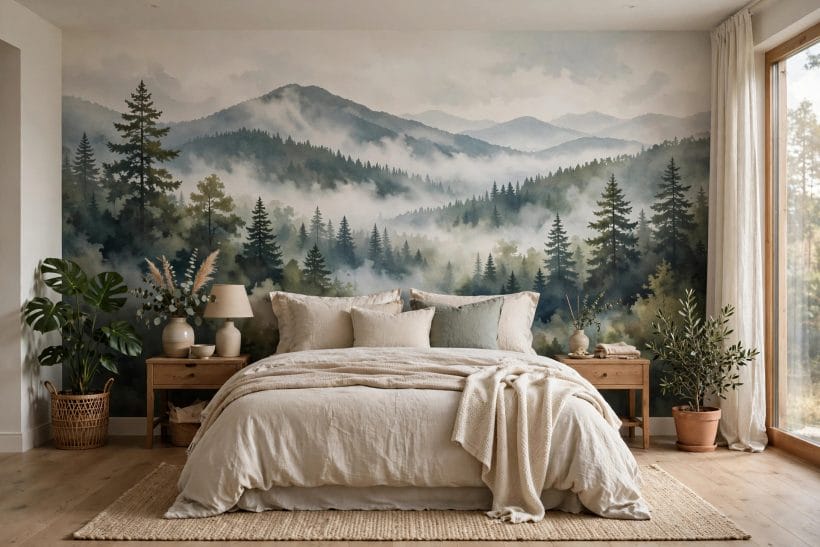
A mural is wallpaper behaving like a window. Misty forests, coastlines, skies and abstract washes give the bed a prospect — especially valuable in bedrooms whose real windows face brick.
45. Hang a misty forest behind the bed
Layered treelines fading into fog are the mural era’s signature for a reason: depth without detail, calm without blankness. Greens and greys suit nearly every bedding colour.
46. Choose a coastal scene for a light room
Dunes, shore and pale sky open a small bedroom like a held breath. Keep the rest of the room in sand, white and driftwood tones and the illusion holds.
47. Use a vintage map as the mural
Old charts and city plans reward the bedroom’s close looking and suit studies, teen rooms and travellers of every age.
48. Pick an abstract wash for a modern room
Ink-bleed and watercolour gradients give movement without imagery — the mural for people who find pictures distracting and blank walls dull.
49. Set a chinoiserie scene on panels
Branches, birds and blossom in the classical manner turn the bed wall into a screen painting. Pair with plain silk-look bedding and very little else.
50. Mural the short wall of a long room
A scene on the end wall shortens a corridor-like bedroom by giving the eye a destination; the long walls stay plain and the proportions heal.
51. Choose a night sky for a child’s room
Constellations and moon phases are a ceiling’s natural subject and a wall’s gentle one — a mural that teaches while it decorates.
52. Frame a landscape mural within panelling
A mural set inside moulding frames becomes a great landscape painting the size of a wall — the grandest version of the panelled-panel trick.
53. Commission the view you wish you had
Many mural makers print from photographs at wall size. The valley, coast or city you love, hung behind the bed, is the most personal wallpaper there is.
54. Keep murals matte
Scenes die under shine — a glossy mural looks like a poster. Matte finishes keep the illusion deep and the bedroom restful.
55. Let a mural stand in for a window in a basement room
In a windowless or near-windowless bedroom, a bright landscape mural plus layered lighting is the closest thing to daylight a wall can give.
7. Small Bedrooms, Awkward Rooms and Rental-Friendly Papers
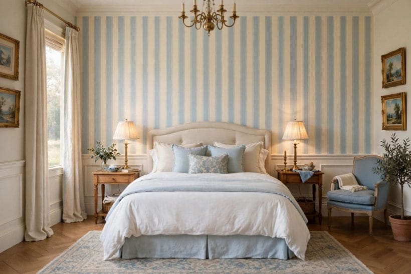
Constraints are where wallpaper earns its fee. Small footprints, sloped ceilings, landlords and odd corners all have papers designed for them — and the attic room shows the extreme case in the attic bedroom, where the walls themselves lean in.
56. Choose peel-and-stick for rented rooms
Removable papers have matured into real design — full florals, geometrics and murals that come away cleanly when the tenancy ends. Test a corner first and keep the backing sheets.
57. Paper the slope in an attic bedroom
A sloped ceiling papered in a small print becomes a canopy; painted white it is just a ceiling leaning. The print turns the room’s awkwardness into its charm.
58. Use pale, low-contrast prints in small rooms
Pattern at whisper volume adds interest without advancing the walls. The small bedroom’s rule: the lighter the ground, the larger the room feels.
59. Paper one short wall to widen a narrow room
Pattern on the far short wall pulls it closer and squares the room’s proportions; long walls in a plain colour from the print complete the correction.
60. Take paper around a corner for flow
Wrapping a print around one corner dissolves the box and makes a small room feel composed rather than partitioned — particularly good with stripes and small geometrics.
61. Paper inside the alcove or wardrobe nook
A shot of pattern in a recess — behind open shelves, in a dressing nook — gives small rooms a jewel moment without spending the whole budget.
62. Use washable papers in children’s rooms
Scrubbable and extra-washable finishes exist for a reason. Choose them, choose a forgiving mid-tone print, and sticky fingers become a cleaning event, not a decorating disaster.
63. Paper the ceiling of a tiny room
When every wall is spoken for by doors and windows, the ceiling is free. A soft print overhead makes the smallest bedroom feel like a tent in the best sense.
64. Match pattern scale to room scale — mostly
Small rooms take small prints kindly, but one large motif on one wall can work like art. The forbidden zone is medium-busy everywhere, which is where small rooms go to feel smaller.
65. Keep spare rolls and the batch number
Rooms get damaged; prints get discontinued. A spare roll and a note of the batch number, kept with the house papers, is the cheapest insurance in decorating.
8. Colour Stories: Calm, Dark and Bright Backgrounds
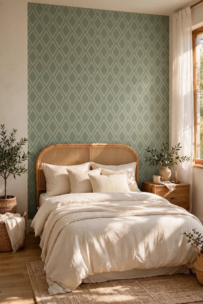
Pattern chosen, colour decides the feeling. The bedroom’s palette lanes — the deep mood of the black bedroom, the bloom of the purple bedroom — all translate into paper, with pattern doing the softening work paint cannot.
66. Sleep in blue-greens and eucalyptus tones
The colours of deep water and leaves are the bedroom’s proven calm. As wallpaper they hold pattern gently and flatter both warm woods and white linen.
67. Wrap in blush and plaster pink
Soft pink grounds warm north-facing bedrooms and make skin look rested in the mirror. Pair with brass or aged wood to keep the sweetness grown-up.
68. Go charcoal or ink for the cocoon
Dark papers make walls recede at night and lamps glow by day. In a bright room a dark print is not a risk; it is a dimmer switch for the architecture.
69. Choose warm neutrals with a pattern’s shadow
Oat, stone and putty prints give interest that never asks for attention — the background singer of backgrounds, ideal where art and textiles change often.
70. Use yellow sparingly and softly
Butter and primrose prints bring morning into rooms that lack it. Keep the saturation low; bedrooms want dawn, not noon.
71. Pair sage paper with oak and cream
The combination flatters almost every skin tone and wood finish, which is why it tops so many calm-bedroom lists — in paper it gains texture paint cannot give.
72. Let red appear only in a print’s detail
A berry in a floral, a thread in a check: red at accent scale warms a bedroom scheme without raising its pulse. Walls of it are for braver rooms than bedrooms.
73. Choose grey prints for changeable schemes
Grey grounds host any bedding colour, which suits guest rooms and indecisive decorators alike — the paper stays, the textiles rotate with the seasons.
74. Match the paper’s ground to the trim
When the print’s background colour equals the woodwork colour, the room reads tailored and larger. It is the quietest trick in this whole list and one of the best.
75. Decide the room’s hour
Every bedroom palette favours a time of day — dawn-fresh, noon-bright or dusk-deep. Choose the hour you love the room at, and let the paper’s colour keep that appointment daily.
9. Checks and Mistakes: Hanging It Right
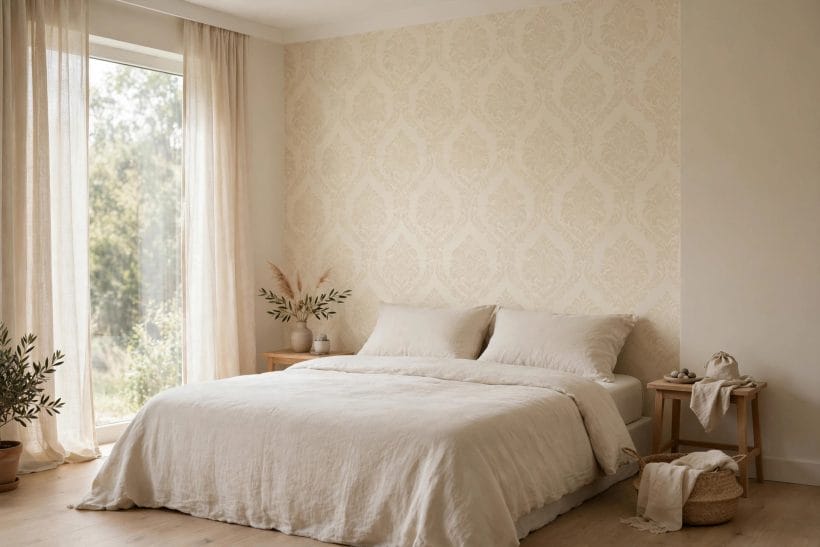
The failures here are practical, and all avoidable. Walls: paper magnifies bad preparation — fill, sand and line poor walls, or choose a heavy or textured paper that forgives them, because a thin shiny print will publish every bump. Light: always view the sample on the wall for a full day, because north light cools prints and evening lamps warm them, and the colour you bought at noon may not be the colour you sleep in. Pattern matching: order by the room’s measurements with the repeat allowed for, keep the same batch number across all rolls, and hang the feature wall’s first drop centred, not started from the corner. Paste and type must match the paper — peel-and-stick, paste-the-wall and traditional are different crafts — and heavy papers on ceilings or slopes want the maker’s recommended adhesive and honest curing time. Finally, the design mistake: pattern on pattern on pattern. If the paper sings, the bedding whispers; if the bedding sings, choose a paper that hums. Checking the small print — quite literally, with a full-size sample taped up for a day — is the whole secret, and compact bedrooms like the tiny bedroom punish guesswork fastest of all.
10. Costs and Pulling It Together
One more consideration belongs in the budget because it decides all the others: the room’s light, assessed before a single roll is ordered. Wallpaper is the only major bedroom surface that is patterned, and pattern behaves differently in every light the day offers — a print that glows at breakfast can turn muddy by lamplight, and a metallic ink that looks flat at noon performs at night. This is why the sample ritual in the checks section is not caution but method: two large samples, taped where the paper will live, watched across a full day and one full evening. Rooms that face the morning want their warmth checked at dusk; rooms used mostly at night should be judged by lamplight alone. Ten minutes of looking at the shop wall has started more disappointing bedrooms than any other single step in decorating.
The money ladder runs from paint-tester humility to mural grandeur. A single feature wall in a mid-range print is the modest end — a few rolls and a weekend. Standard prints on four walls sit in the middle, with lining and preparation quietly deciding whether the finish looks expensive. Murals, grasscloth and hand-finished papers are the top, where the paper itself is only part of the bill and skilled hanging is the rest; in period rooms, budget for the wall repairs the paper will otherwise announce. Peel-and-stick costs more per roll than its rental manners suggest and less than the deposit it protects. Across the ladder, samples are the cheapest line of all: two large samples, lived with for a day each, will save more money than any sale.
Pull the design together by choosing the room’s dose first — panel, wall, wrap or ceiling — then the pattern family, then the colour story, and only then the bedding that will live against it. The paper is the background; let everything else audition in front of it.
Final Considerations
Wallpaper is the bedroom’s fastest transformation and its most reversible one. It can cocoon, brighten, widen and quiet a room, and it asks only a sample’s worth of commitment before the first roll is cut.
Choose the print you want to wake inside, hang it with patience, and let the walls do the resting with you.


0 Comments