
Walk into a decorated model home and every room feels calm, balanced and quietly expensive — and none of it is an accident. Show homes are styled to teach: every cushion, lamp and centrepiece is placed to show you how the room could live.
These model home photos collect the lessons room by room. Treat them as a stylist’s notebook — what to copy, what each trick does, and how the same moves work in a home that is actually lived in.
1. Model Home Styling at a Glance
A model home is a house with the living edited out and the possibilities edited in. Designers stage them with a consistent formula: a coordinated colour palette that runs through every room, furniture scaled slightly generously, layered lighting at several heights, and one styled moment — a set table, a made bench, a tray on a tub — in every single space. Photographs of decorated model homes are worth studying precisely because the formula is so consistent: once you see it, you can apply it anywhere, including the small interiors in the wider interior design ideas collection.
One honest note before the tour: model homes are styled for the camera and the visit, not for Tuesday evenings. Copy their proportions, palettes and layering — then add back the storage, the charging cables and the life they edited out. Where this post’s photographs end and floor plans begin also matters: this is the styling companion to the beautiful house plan ideas collection, which covers the layouts these rooms sit inside.
| Room | The signature styling move |
|---|---|
| Living room | Symmetrical seating, layered cushions, one styled coffee table |
| Kitchen | Clear counters, a single fruit bowl or board, stools in a row |
| Primary bedroom | Layered bedding, matching lamps, a bench at the foot |
| Bathroom | Rolled towels, a plant, a tray — the spa formula |
| Dining room | A set table with a low centrepiece, never an empty surface |
| Entry | A console, a mirror and somewhere to sit |

2. Living Rooms: Layered and Balanced

1. Symmetry around the fireplace
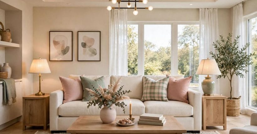
The first gallery’s living room is built on a mirror line: fireplace at centre, armchairs paired, the sofa facing across a shared coffee table. Symmetry is the show home’s fastest route to “designed” — it costs nothing but placement, and it photographs beautifully from the doorway.
2. Cushions in odd numbers
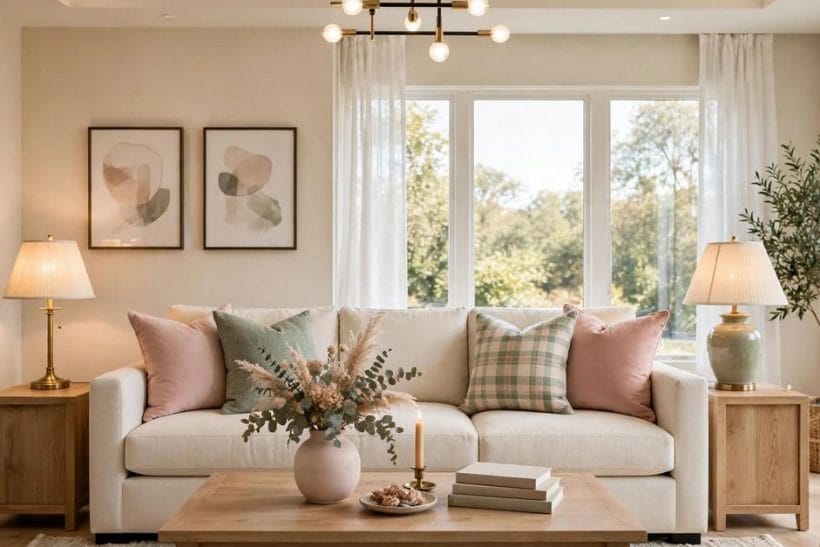
Model sofas wear cushions in threes and fives, mixed by size and pattern but held in one palette — the feature room’s blush, sage and checked mix is the textbook version. Odd groupings look arranged rather than matched, which is the difference between styled and showroom-stiff.
3. The styled coffee table formula
Every show-home coffee table carries the same three things: a stack of books, something natural (a vase, a bowl of texture), and something small and personal. The triangle of heights — tall vase, flat books, low bowl — is copied in every room of the house with different objects.
4. A rug that anchors, not floats
Show homes size rugs generously, with the front legs of every seat standing on them. A rug that reaches under the furniture pulls a loose group into one conversation; the too-small rug is the most common real-room mistake these photographs quietly correct.
5. Curtains hung high and wide
In model rooms the curtains start near the ceiling and fall past the window’s edges, making the glass — and the room — feel taller. Sheers keep the light soft for photographs. It is the cheapest grandeur in the stylist’s kit and it works in any house.
6. Two lamps, never one
Table lamps come in pairs in show homes, flanking sofas and consoles to balance the light and the composition. A single lamp reads as an appliance; a pair reads as a decision. The matched pair is also the easiest styling habit to steal outright.
7. One living thing per room
An olive tree in a basket, eucalyptus in a vase, a fern on the hearth — every photographed room in this set contains exactly one confident piece of greenery. It softens the newness, adds a height nothing else supplies, and signals “home” faster than any furniture.
8. Art in pairs, hung low
The feature room’s twin abstract prints hang lower than most people expect — centred on the seated eye line, not the standing one. Pairs give rhythm without the cost of one large piece, and abstract art in the room’s own colours can never clash with the scheme.
3. Colour and Light Across the Whole Home
9. One palette, every room
The deepest show-home secret is restraint: the same warm neutrals and one or two accent colours recur from hall to bedroom, so the house feels like one thought. Choose your palette at the front door and let every later room quote it.
10. Warm whites instead of bright whites
Model homes rarely use a stark white; warm, creamy whites photograph softer, flatter skin tones in mirrors of opinion, and make wood and brass glow. In north-facing rooms the difference between a warm and a blue white is the difference between calm and cold.
11. Accent colours in textiles only
Notice where the colour lives in these photographs: cushions, throws, a bench cushion, a runner — never in the expensive bones. Styling colour into textiles means the scheme can change with the season for the price of cushion covers, and the house never dates by its walls.
12. Layered lighting at three heights
Ceiling lights for general glow, table and floor lamps for the middle zone, candles or low accents for the floor of the composition: show homes light in layers so no corner falls flat. Photograph your own rooms at dusk to test whether your layers agree.
13. Brass repeated as a motif
A brass lamp base, brass cabinet pulls, a brass frame in the hall — small metal repeats stitch rooms together without matching anything else. Pick one metal for the accents you repeat and let other metals appear only once, as guests rather than residents.
14. Mirrors opposite the light
Show stylists hang mirrors to catch windows, doubling the daylight in the photograph and the room. The entry in the last gallery uses a round mirror over the console for exactly this. A mirror that reflects a wall reflects nothing; aim it at the light.
15. Texture where colour rests
When the palette is quiet, texture does the talking: boucle chairs, a woven rug, linen curtains, a stone hearth. Model rooms layer at least three textures per space, which is why their neutrals never read flat — a lesson the tiny house interior design ideas apply in miniature.
16. The dusk photograph test
Every room in this set was clearly checked at lamp-lighting time: lamps on, candles lit, no overhead glare. Shooting your own rooms at dusk, as the stylists do, reveals instantly which corners are dead and which lamps the room is asking for.
4. Kitchens Styled to Sell the Dream
17. Counters cleared to three objects
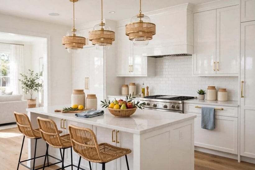
The second gallery’s kitchen holds its counters to a discipline: canisters grouped, a board, a bowl of fruit. Everything else — the appliances, the post, the clutter of real cooking — is edited away. At home, the lesson translates to one clear run of counter kept permanently empty.
18. The island as a stage
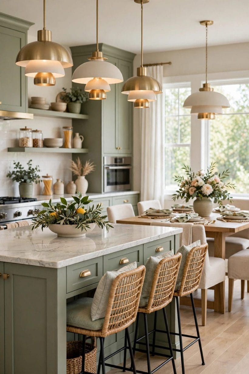
An island in a model kitchen is dressed like a table: stools tucked in a row, one centrepiece, pendants above marking the spot. Rattan stools warm the white scheme, and their even spacing is deliberate — push yours in straight and the room instantly looks styled.
19. Pendants in odd numbers
Three pendants over the island, spaced evenly, give rhythm and a ceiling-level layer of design. Show kitchens choose pendants with texture — woven, fluted, seeded glass — because against plain cabinetry the lights become the jewellery of the room.
20. A bowl of fruit, always
It is a cliché because it works: a generous bowl of one kind of fruit gives colour, life and scale to a kitchen photograph. Lemons and green apples are the stylists’ favourites — they last, they match everything, and they imply the cooking life the room promises.
21. Cookbooks and a board at the range
Beside the hob, model kitchens place a leaning board and one open cookbook: the suggestion of cooking without a single pan. It is theatre, but honest theatre — it shows the working zone and softens the run of cabinetry at its most clinical point.
22. Matching canisters on show
Decanted jars for flour, pasta and grains replace branded packets in every show kitchen. The uniform containers calm the visual noise and let the room’s palette rule. At home this is a twenty-minute change with an outsized effect on open shelves.
23. A towel over the oven rail
One folded linen towel, in a colour from the house palette, hangs on the oven handle in almost every model kitchen photograph. It is the smallest styling move in this post and the easiest to copy before guests arrive — softness introduced exactly where the steel is hardest.
24. Herbs on the sill
A small pot of something green at the kitchen window repeats the one-living-thing rule in the room that needs it most. Herbs are the natural choice — useful, fragrant, and the right scale for a sill — and they photograph as pure lifestyle shorthand.
5. Primary Bedrooms: Soft Layers
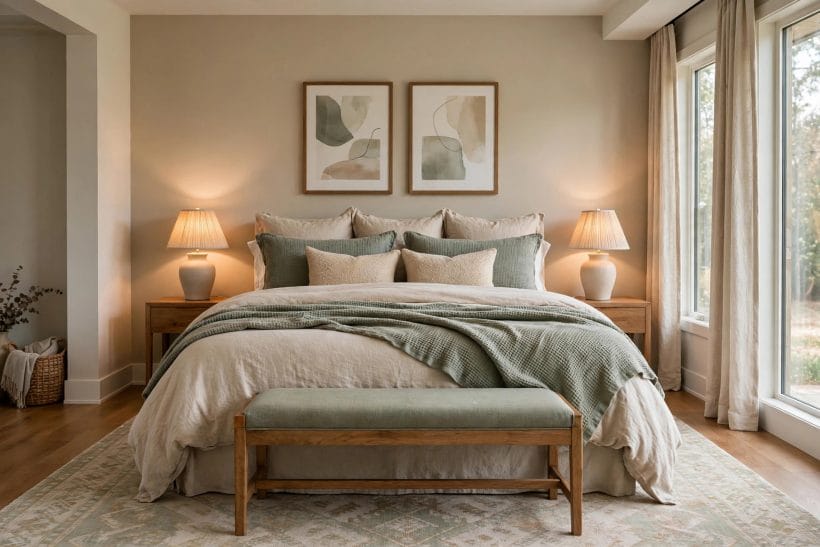
25. The layered bed formula
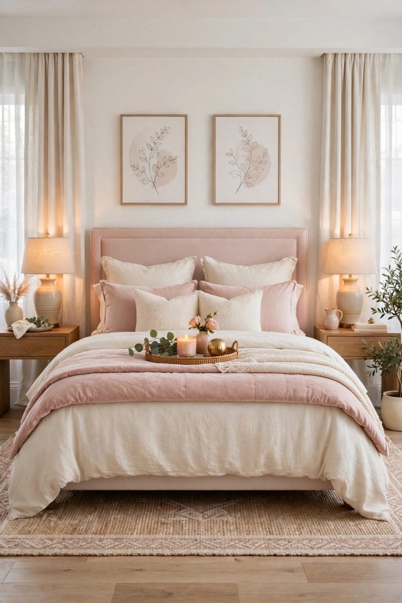
The third gallery’s bed shows the full show-home stack: crisp base bedding, a folded throw across the foot, sleeping pillows standing, decorative cushions in front. Layers signal luxury because they imply time and care — and every layer is removable when real sleep arrives.
26. A bench at the foot of the bed
Nearly every model primary bedroom ends its bed with a bench or a pair of stools. It completes the composition, gives the throw somewhere to land, and in a real home becomes the most useful seat in the room — for shoes, bags and tomorrow’s clothes.
27. Matching bedside lamps
The bedroom repeats the living room’s pair rule at the bedside: identical lamps, identical tables where the room allows. Symmetry at the bed creates the hotel calm everyone wants from a primary bedroom, and it needs no other decoration to succeed.
28. Art above the bed, in pairs
Two framed abstracts over the headboard, hung as one composition, fill the wall without competing with the bed’s softness. Show stylists keep bedroom art quiet — tonal, abstract, unframed-looking — because the room’s job is rest, and the walls should not be having conversations.
29. A tray on the bed
The oldest trick in the book still works: a small tray with a book and a cup or a tiny vase, placed on the turned-down corner of a model bed. It tells the story of a slow morning in one glance — the whole point of the room’s styling.
30. Curtains framing the bed wall
Where the bed faces windows, model rooms dress them in full-length curtains that frame the view like a picture. Sheers behind keep the privacy and the glow; the bedroom in the third gallery uses the treatment to make its garden wall feel intentional rather than exposed.
31. A rug under the bed, extending beyond
Bedroom rugs in show homes run under the bed and out on both sides, so the first step of the morning lands softly and the bed looks anchored in the room. Size up: a rug that only peeks out reads as an apology.
32. The reading chair corner
A single armchair, a small table and a lamp in the bedroom corner promise a life of reading in peace. Even if your own corner holds laundry by Friday, styling one quiet corner changes how the whole room feels — and it photographs as pure aspiration.
33. Bedding in the house palette
The bedroom’s sage throw and blush cushions are the living room’s colours, rested. Carrying the palette into the primary bedroom is what makes a house feel designed as one piece — the same discipline the interiors in the bungalow interior ideas collection use across their smaller footprints.
6. Bathrooms: The Spa Formula

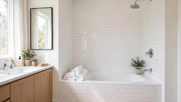
34. Rolled white towels
The fourth gallery’s bathroom performs the classic spa signal: white towels, rolled, stacked on the vanity and draped on the tub. Rolling reads as “prepared for you” in a way folding never does, and white keeps the promise of cleanliness the room is selling.
35. A plant where you least expect it
A substantial green plant on the vanity or beside the tub is the model bathroom’s signature surprise. Bathrooms are hard and cold by nature; one soft, living shape changes the register of the whole room and photographs beautifully against tile and stone.
36. A tray across or beside the tub
The bath tray — candle, book, small bottle — stages the soak the room exists for. In a show bathroom it sits ready; at home it corrals the real bottles into one tidy line. Either way, the tub becomes a destination rather than a fixture.
37. A big mirror with light at face height
The gallery’s wide mirror, flanked by sconces, flatters faces and doubles the room’s light. Show bathrooms avoid the single overhead light that makes everyone look tired; light at face height is both kinder and more useful for the mirror’s real work.
38. Wood warmth against the tile
A timber vanity under a stone top warms a bathroom the way it warms a kitchen. In model bathrooms the wood tone usually echoes the floors or the bedroom furniture, quietly tying the ensuite into the home’s one-palette discipline.
39. Decanted bottles, matching sets
Shampoo and lotion appear in model bathrooms only as matching, unbranded vessels on a tray. The rule translates directly: decant the daily products, hide the spares, and the vanity of a real bathroom gains the spa calm the photograph promises.
40. A stool or small bench
A little stool beside the tub holds the towel, the book, the glass of water — and signals unhurried bathing. It is also the stylist’s scale trick: one low piece of furniture makes a tall, tiled room feel human-sized and composed.
41. Nothing on the floor but a mat
Show bathrooms keep floors bare but for a soft mat: no scales on display, no baskets of clutter, no spare rolls in view. The discipline is storage, again — everything has a cabinet, so the room’s clean lines survive contact with real life.
7. Dining Rooms Set for Guests

42. The table always set
The fifth gallery’s dining table is laid for a dinner that will never happen — placemats, napkins, glasses, candles — because an empty dining table photographs as a corridor, and a set one photographs as a life. At home, even a simple runner and centrepiece hold the room together between meals.
43. A low, long centrepiece
Centrepieces in model dining rooms run long and low: a garland, a line of candles, a row of small vases. Low keeps sightlines open across the table — guests should see each other over the styling — and long matches the table’s own proportions.
44. Candles at the centre
Candlelight is the dining room’s evening layer, and show stylists cluster candles where a chandelier’s light pools. Unscented at the table, varied in height, always in holders that suit the scheme — the glow does more for the photograph than any single object.
45. Chairs with cushions or covers
Dining chairs in model rooms wear seat cushions in the house palette, softening the table’s hard lines and tying the room to the living spaces. It is also a comfort promise: these chairs expect you to stay for the long conversation after dinner.
46. A styled sideboard
The sideboard against the wall carries the room’s second composition: stacked books, a pair of vases, art leaning rather than hung. Leaning art is a show-home signature — casual, changeable, and safe for walls that may soon belong to someone else.
47. A statement light over the table
The dining chandelier is where model homes spend their drama: a branching, sculptural fixture centred on the table, hung low enough to feel intimate. It marks the room’s purpose from the doorway and gives the set table its pool of light.
48. Place settings in the palette
Napkins, placemats and ceramics in show dining rooms are chosen from the house palette, so the table reads as part of the home rather than a separate event. Copy the discipline with what you own: one colour family for linen, and the table always looks deliberate.
49. The room beyond the room
Notice how the dining photograph includes a glimpse of the living room beyond, styled and lit. Model homes are composed as views through doorways, each room borrowing depth from the next — a reminder to style the sightlines of your own home, not just its rooms.
8. Small Spaces and Second Bedrooms
50. The guest room as a boutique stay
Second bedrooms in model homes are styled as small hotels: made bed, folded throw, a carafe or a small stack of books at the bedside. The message to buyers — and to your own guests — is that no room in the house is an afterthought.
51. A child’s room, kept calm
Model children’s rooms use the house palette with one playful accent, rather than a separate cartoon scheme. Calm styling photographs better, ages with the child, and quietly demonstrates that the room works at every stage — the practical point beneath the prettiness.
52. The study that reads as a library
A desk, a chair, shelves with books arranged in short stacks and breathing room between them: the model study sells a working life without a single visible cable. Book styling — some vertical, some horizontal, one object as a bookend — is a transferable skill for every shelf at home.
53. Small rooms, full-size furniture
Counter-intuitively, model small bedrooms use a proper bed and real bedside tables rather than shrunken pieces. Full-size furniture makes a small room feel generous; dollhouse furniture makes it feel small. The photographs prove it room after room.
54. Studio corners staged as rooms
In compact homes, stylists carve one open space into implied rooms with rugs and lighting — the technique the studio apartment ideas collection develops fully. A rug under the sofa zone, a pendant over the table zone, and one open room becomes three.
55. Nursery neutrals
The model nursery wears the home’s warm neutrals with texture doing the softening — a woven mobile, a knitted throw, a plush rug. It photographs as calm rather than cute, and it lets the room become a bedroom later without a full redecoration.
56. The landing dressed as a place
Wide landings in show homes gain a chair, a small bookcase or a console and become reading landings rather than corridors. Even a narrow hall can take the lesson in miniature: one picture, one light, one piece of furniture with a purpose.
57. Utility spaces styled too
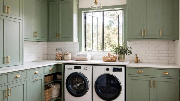
Model laundries and boot rooms get the same care as the bedrooms — jars, labels, a plant, folded towels. Styling the working rooms is what makes the whole house feel finished, and it is the cheapest impression to create because the spaces are small.
58. Storage shown, not hidden
Open a model home’s wardrobe and the styling continues: matching hangers, folded stacks, empty space between. The photographs sell storage by showing it calm. At home, one edited wardrobe shelf photographed well is the standard to copy first.
9. Entries, Halls and Staircases

59. The console-and-mirror greeting
The last gallery’s entry is the formula complete: a console with a seat beneath, a round mirror above, a plant and a stack of books as the welcome. It gives arrivals a place to land and gives the house its first, deliberate impression.
60. A runner that leads the eye
The striped stair runner draws the eye upward and promises that the design continues upstairs. Runners also soften the staircase’s sound and its hardness — in the photograph they read as texture, pattern and direction all at once.
61. Wall lights in the hall
Sconces at intervals turn a hall from a lit corridor into a styled passage, and their rhythm carries the eye through the house. Model homes light halls warmly and low, the opposite of the single bright ceiling light most halls endure.
62. A bench for the everyday ritual
The entry bench — for shoes, bags and the pause before leaving — is styled with two cushions in the palette. It is the hardest-working seat in the house disguised as decor, and its presence in the photograph tells buyers the entry has been thought about.
63. Art on the stair wall
A single large piece or a climbing gallery gives the staircase a story. Show homes keep stair art in the palette and generously sized — small frames scattered up a stair wall read as clutter in photographs, while one confident arrangement reads as design.
64. The front door dressed inside
Inside the front door, model homes add a wreath or a hanging plant on the door itself and a mat that suits the scheme. The door is the room’s fourth wall; styling it completes the entry instead of leaving a blank slab at its centre.
65. Baskets as the entry’s storage
Woven baskets under the console or beside the bench hold the shoes, gloves and leads that real entries accumulate. In the photographs they read as texture; in life they are the difference between a styled entry and a pile by the door.
66. Sightline styling from the door
Stand in a model home’s doorway and the view is composed: a lit lamp, a piece of art, a plant, all placed on the axis of the door. Stylists design the first view deliberately. Test your own entry from outside the front door and adjust what the frame contains.
67. The staircase as architecture
Dark handrails, pale spindles, a runner with a border — model staircases are finished like furniture, not left as structure. Where the budget allows one upgrade in a hall, the staircase finish is the one the photographs reward most.
10. Reading a Model Home Like a Designer
68. Photograph your own rooms
The stylist’s final tool is the camera: rooms reveal their faults in photographs — the crowded corner, the dead wall, the rug adrift. Photograph your rooms from their doorways, compare them honestly with this set, and fix the three things the lens complains about first.
69. Copy proportions before objects
The transferable lessons are proportional: rug sizes, lamp heights, curtain drops, the amount of empty counter. The specific vases and cushions matter far less. Measure what the photographs show and your own furniture will suddenly look styled in place.
70. Edit to seventy percent
Model rooms hold roughly two-thirds of the objects a lived room holds. You need not live at show-home emptiness, but editing any room down by a third — into cupboards, onto other shelves — is the single fastest route to the look in these photographs.
71. One palette decision, kept
If you take one lesson, take the palette: choose two neutrals and one or two accents, and let every new purchase answer to them. The homes in this set feel expensive largely because nothing in them argues with anything else.
72. Light the room you photograph
Lamps on, curtains open, candles lit for the evening shot: the mood in these photographs is lighting before it is furniture. Before buying anything new for a room, spend an evening with its lamps rearranged — the model-home glow is often already in the house.
73. Style the corners, not the centres
Centres look after themselves; corners are where rooms die. Every photograph in this set gives its corners a job — a chair, a plant, a lamp, a basket. Walk your own home corner by corner and give each one an assignment.
74. Know what not to copy
Skip the parts that exist only for the visit: the bed tray you would move nightly, the bowl of fruit nobody eats, the bathroom with no toothbrush. Model styling is a language for showing how rooms can feel — translate it, do not transcribe it, and keep the life the stylists edited out.
75. When the photos send you to the plans
Sometimes a photograph reveals that the room itself — its shape, its windows, its flow — is what you are really longing for. That is the moment to move from styling to layout, whether through the apartment refreshes in the modern apartment ideas collection or a longer look at the plans behind these rooms.
Final Considerations
Decorated model homes are best read as lessons, not as standards to live up to: one palette held through every room, furniture in balanced pairs and generous sizes, lighting layered at three heights, and one styled moment in every space, however small. Photograph your own rooms, edit them toward seventy percent, light them kindly, and the show-home calm in these pictures becomes something a real household can actually keep.

0 Comments