
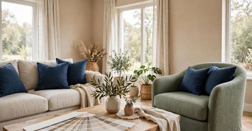
Every year brings a fresh list of colours said to be about to take over the nation’s walls, and every year the houses that actually look right are painted in a much shorter, older list. The colours that endure are not secrets and they are not new: they are families — warm whites, greiges, soft greys, earthy greens, deep blues — that survive every trend cycle because they flatter daylight, timber and ordinary furniture.
This article walks through nine timeless paint colour families, what each one does to a room, and how to test them honestly in your own light before committing. It names no shades and quotes no forecasts: colour families are the level at which paint decisions actually last, and the specific tint within a family should always be chosen from a sample on your own wall.
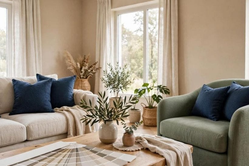
1. Paint Colours That Last at a Glance
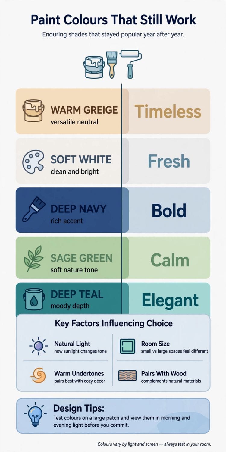
Trends move in seasons; walls stay for years. The families below recur in well-painted houses decade after decade because each solves a permanent problem — north light, low ceilings, dark timber, a room that must feel calm at night and fresh at noon. Choosing by family first and tint second is the discipline that keeps a repaint from dating: the family endures even as the fashionable tint within it drifts a shade warmer or cooler.
One distinction runs through everything that follows, so it is worth making plainly: a colour family is a temperature, an undertone and a depth — warm white, sage, deep blue — while a tint is a single manufacturer’s recipe within it. Tints are renamed, reformulated and discontinued constantly; families are simply the colours that earth pigments and daylight have always produced. Advice that names tints expires with the catalogue. Advice that teaches families cannot expire, because it is about light and material rather than about stock. That is the level this article works at, and it is why nothing in it needs a year attached.
| Question | Short answer |
|---|---|
| Which colours never really leave? | Warm whites, greiges and taupes, soft greys, sage greens, deep blues, charcoal accents, clay tones, pale blue-greys and buttery yellows |
| Why do they last? | Each is built from earth pigments and balanced undertones, so they sit comfortably with wood, stone, fabric and changing daylight |
| Should I copy a named shade from a list? | No — choose the family, then test several tints of it on your own walls; light changes everything |
| Where do fashionable colours belong? | In cushions, art and one painted door if you must — the cheap, changeable layers, not the whole envelope |
2. Family One: Warm Whites and Creams
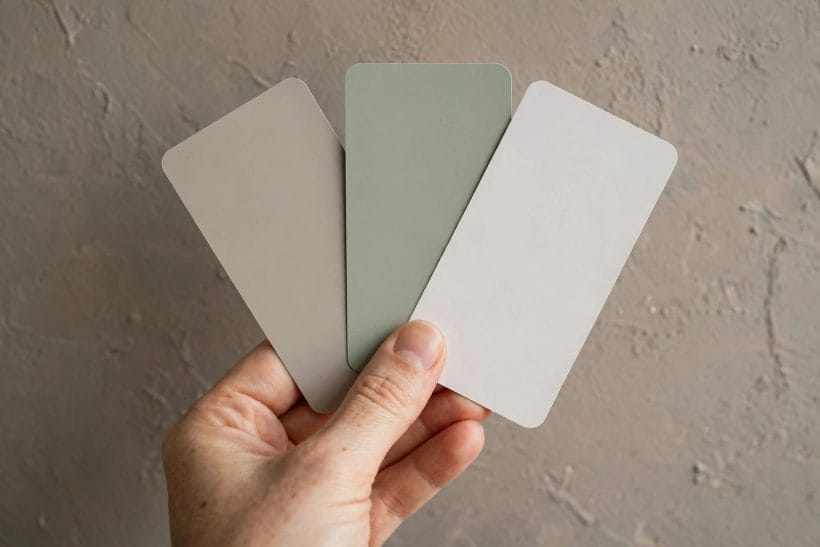
The default that never defaults: a white with a warm, slightly creamy undertone is the background of more good rooms than every fashion colour combined. Warm white forgives north light that turns blue-whites corpse-grey, flatters skin and timber, and lets furniture carry the colour story. Its one trap is company — beside a cooler white trim it can read yellow — so whites must always be chosen as a set: wall, trim and ceiling sampled together, in the room’s own light, before a single tin is opened.
Warm white is also the great unifier of the other eight families: it is the trim colour that lets greige walls, sage kitchens and charcoal doors coexist in one house without a palette meeting. When a home’s scheme feels scattered, the cheapest restoration is rarely a new colour — it is one warm white, used consistently on every ceiling, cornice and door, until the rooms agree again. That quiet consistency is why this family tops the list in every era, including the ones that claimed to have moved beyond it.
3. Family Two: Greige and True Taupe
Between grey and beige sits the family modern houses are quietly built on. Greige and taupe give a room the composure of grey without its chill, and they pair with both warm timber and cool stone — which is why they bridge old houses and new extensions so gracefully. Our dedicated greige undertones guide unpacks how to read their undertones, and the taupe colour article takes the deeper, browner end of the family. The discipline is the same: an undertone you have identified beats a tint you have merely liked.
Greige’s second gift is diplomacy between materials. A room can hold warm oak, cool marble, black metal and linen upholstery simultaneously if the walls carry a colour that shares a little of each temperature — and that is precisely greige’s composition. It is the family most often chosen for open-plan spaces for the same reason: one greige can run through kitchen, hall and living area while each zone changes its accent, giving a whole floor the coherence that trend colours, chosen room by room, rarely achieve.
4. Family Three: Soft Mid Greys
Below the greiges in warmth and above charcoal in lightness, soft mid greys are the tailored suit of paint colours: calm, architectural, and permanently in service for hallways, studies and bedrooms that need to feel composed. Their undertone decides their temperament — a green-leaning grey feels restful, a violet-leaning one can turn slyly cold — so the family’s samples must be judged at dusk as well as noon. Grey is also the great mediator of mixed materials, which is why it anchors so many of the exteriors in our wider colour coverage.
Soft grey’s working secret is that it recedes. Art, books, plants and people all look more themselves against it, which makes it the professional’s background for rooms whose contents change often — rental homes, growing families, collectors. Its endurance is therefore practical as much as aesthetic: a soft grey room rarely needs repainting for fashion reasons, because the room was never really about the grey. Choose the undertone for the light you have, keep the trim a clean warm white, and the family will serve through several complete changes of furniture.
5. Family Four: Sage and Earthy Greens
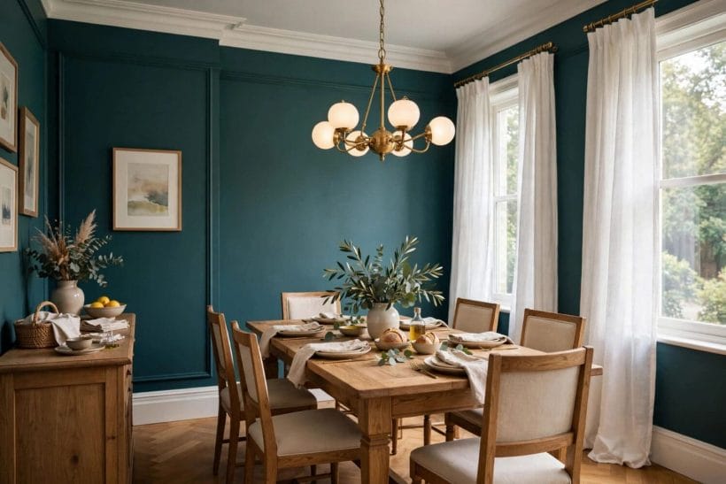
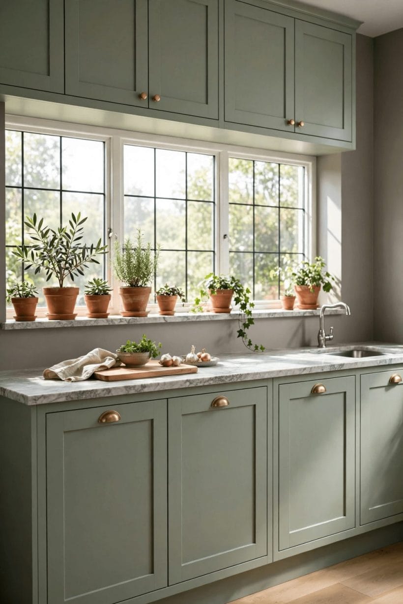
Green is the colour rooms borrowed from the garden, and its muted, greyed forms — sage, olive-leaning and eucalyptus tones — have never left the repertoire for long. Earthy greens calm kitchens, studies and bedrooms, partner naturally with timber and brass, and hold their dignity in both bright and gloomy light. They are the strongest colour most rooms can wear on all four walls, and the family to reach for when a house needs colour that still behaves like a neutral.
Sage also has the longest memory of any family here: it was the parlour colour of one century, the kitchen colour of another, and the quiet answer in this one, because it flatters both faces and food. In kitchens it sits happily with timber worktops, stone and unlacquered metal; in bedrooms it lowers the pulse a room needs at night. If a household wants one coloured room that will not embarrass it in a decade, the evidence of several centuries points here.
6. Family Five: Deep Blues
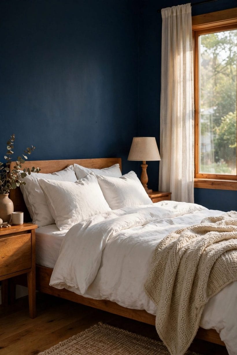
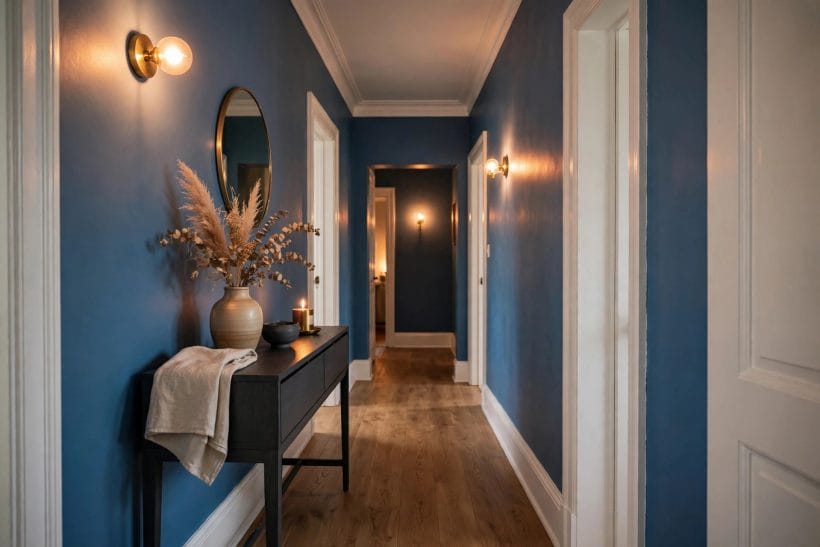
Every era rediscovers the deep blue room: library, snug, bedroom or dining room wrapped in an inky, green- or grey-leaning blue that lamplight turns to velvet. Deep blues endure because they do the opposite of fashion — they make a room feel enclosed and intentional, and they flatter books, leather, timber and faces in the evening. The family asks for commitment in small rooms and gives atmosphere in return; on a single wall or in a small room entire, it is the classic dramatic choice that has never needed a forecast to justify it.
Deep blue also solves a modern problem elegantly: the room that must be a cinema, a games room or a work den after dark. Dark walls swallow screen glare and lamplight pools where it is wanted, so the media room stops looking like a compromise and starts looking like the most deliberate room in the house. Pair it with warm metals and one pale textile to keep it sumptuous rather than submarine, and judge the sample at night — this is the one family whose daytime face matters least.
7. Family Six: Charcoal and Near-Black
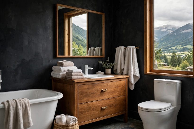
Charcoal is the accent that became a wall colour: doors, joinery, a chimney breast, or a whole small room in near-black with the edges picked out in pale upholstery and art. It endures because contrast is a permanent design need, and charcoal supplies it more softly than true black. Our charcoal colour guide covers how to work with it; the short version is to keep its surfaces few, its lighting warm and its neighbouring whites clean, and it will look deliberate in any decade.
Charcoal’s endurance also owes something to joinery. Built-in cupboards, bookcases and panelled doors painted near-black give a room the gravity of old libraries at the cost of a tin of paint, and they hide the scuffs of family life better than any pale colour can. On the outside of the house it plays the same role on doors, windows and fences — the dark punctuation that makes pale walls and planting look composed. Few colours work this hard in this many places, which is why it survives every cycle that tries to replace it with something softer.
8. Family Seven: Clay, Terracotta and Muted Reds
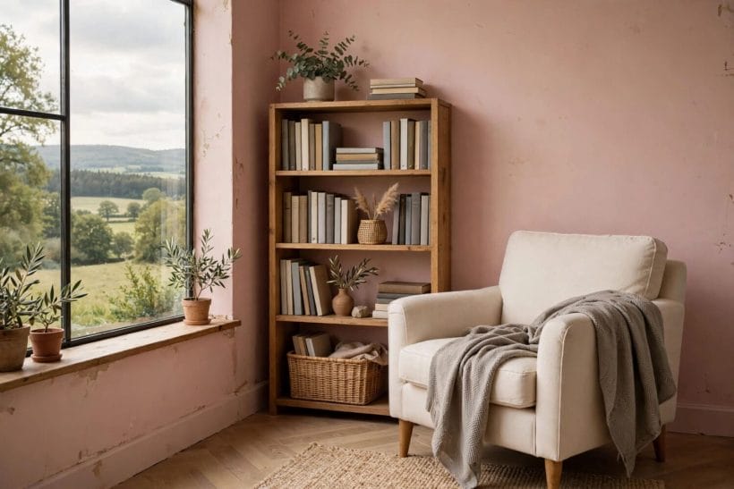
The earthiest family: clay pinks, muted terracottas and dusty brick reds, greyed down from their Mediterranean brightness into colours a northern room can live with. These tones warm dining rooms and hallways, love limewash and natural plaster, and sit beautifully against sage green and warm white — two other families on this list, which is exactly how enduring palettes are built. Used on the lower walls, in an alcove or through a whole small room, clay colours give heat without glare.
The family also carries the hand of the maker better than any other: limewash, clay paint and ordinary emulsion all sit naturally in these tones, because the colours themselves began as earth and water. A clay-toned room forgives uneven old plaster and rewards texture, which makes it the restorer’s friend in period houses — and its warmth is the reason dining rooms, where faces gather around food and lamplight, return to it in every generation.
9. Families Eight and Nine: Pale Blue-Greys and Buttery Yellows
The two quiet specialists complete the nine. Pale blue-greys are the cool family’s peacemakers: fresh in bathrooms and bedrooms, clean beside white tiles and chrome, and softened by their grey content from nursery blue into something permanently grown-up. Buttery yellows — never lemon, never gold — are the sunlight substitute: a warm, creamy yellow in a dark hall or north-facing kitchen does the work of a window, and has done since long before open-plan living. Both families are easy to get wrong by a single step too bright; sampled properly, they are the list’s most cheerful survivors.
Between them they also cover the two rooms fashion forgets: the windowless bathroom, where pale blue-grey reads as clean daylight, and the dark hallway, where buttery yellow manufactures a welcome. A colour family that can rescue the least promising spaces in the house has earned its permanence the practical way.
10. Why These Colours Endure — and How to Test Honestly
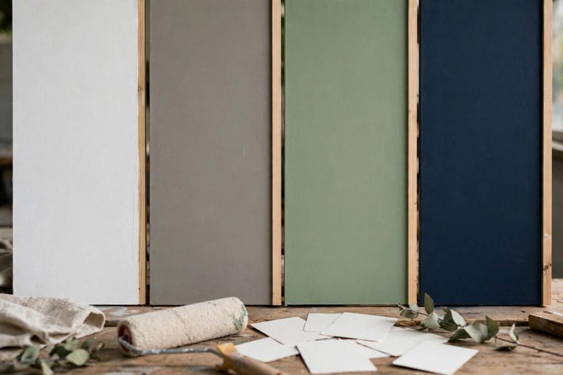
Look at the nine families together and the pattern shows: every one is a muted, pigment-rich, undertone-balanced colour of the kind that existed before synthetic fashion cycles, and every one cooperates with the permanent materials of a house — timber, stone, linen, leather, brass. Testing is where endurance is won or lost. Paint large sample boards, not wrist-sized patches; move them around the room; live with them through a full day of changing light; and check them against the floor and the biggest piece of furniture, because a wall colour is only ever seen in company.
Two further checks separate the lasting choices from the regretted ones. The first is undertone honesty: every family here can lean warm or cool, and the lean must agree with the room’s fixed elements — the floor’s timber tone, the stone, the direction the windows face — because those cannot be repainted when the wall starts a quarrel. The second is finish: the same colour in a flat matt absorbs light and reads deeper and calmer, while a slight sheen sharpens it and suits kitchens, bathrooms and busy halls. Neither choice is a trend; both are physics, and physics does not go out of fashion. Choose the family by the room’s light and job, choose the tint by the sample board, and the result will still look right when the next forecast arrives.
For a whole-room application of the warm end of this palette, our beige living room ideas show greige and cream families doing everyday work.
Final Considerations
Forecasts are entertainment; families are strategy. Warm whites, greiges, soft greys, sages, deep blues, charcoals, clays, pale blue-greys and buttery yellows have outlasted every list that ever announced them, because they answer permanent conditions of light, material and mood. Pick your family with the room in mind, test tints on boards in real light, and let cushions and art carry whatever the season is shouting about. The walls will still be right when the shouting moves on — which, in the end, is the only definition of a good paint colour that has ever held.
The colour cluster continues in our taupe colour and charcoal colour guides and the greige undertones guide; for the rooms these colours most often serve, the living room ideas pillar shows them in place, and our tiny house interior paint colors notes apply the same family-first thinking at small scale.


0 Comments