
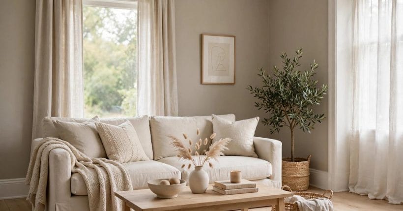
No paint family generates more puzzled reviews than warm greige. One buyer calls it the perfect warm grey; the next complains it turned green; a third swears it went pink in the hall. They are usually all describing the same colour honestly — because greige’s identity lives in its undertone, and undertones answer to light, flooring and neighbouring colours more than they answer to the name on the tin.
This guide explains greige undertones in plain colour terms: what greige is, the three directions its undertone leans, how light and company expose or hide the lean, why reviews of one colour contradict each other, and how to test properly before committing a wall. No brand and no specific colour name is needed for any of it — the reading skill transfers to every warm grey you will ever hold a swatch of. The wider colour family sits in the colour reference guide; this post is the greige chapter.
1. Greige Undertones at a Glance
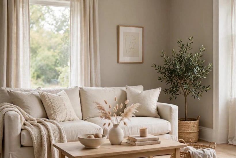
Greige is the family between grey and beige: grey’s calm with beige’s warmth, in proportions that vary from nearly-grey to nearly-beige. Its undertone — the secondary hue you glimpse in certain lights — is what separates one greige from another, and it leans in one of three directions: green, pink, or golden. The famous warm greiges of the paint charts, the ones that fill review pages, mostly sit mid-depth with a golden or green lean; their reputations rise and fall on rooms, not on formulas. Read the undertone correctly, in your own light, and greige becomes the most versatile neutral in the house. Its cousins are covered nearby: the taupe colour guide takes the browner relative, and the charcoal colour guide takes the deep end of the grey family.
| Question | Short answer |
|---|---|
| What is an undertone? | The secondary hue inside a neutral — the green, pink or golden lean that surfaces under some lights and hides under others |
| Which lean is warmest? | Golden-leaning greiges read warmest; green leans read cooler and earthier; pink leans read soft and can turn rosy beside cool light |
| Why does the same greige look different in every house? | Light direction, bulb warmth, floor colour and neighbouring whites all push the undertone around — the colour is constant, its company is not |
| Can reviews tell me the undertone? | Only loosely: a review reports one room’s light and company. Your own tested board, in your room, is the only reliable witness |
2. What Greige Is: Between Grey and Beige
1. A family, not a colour
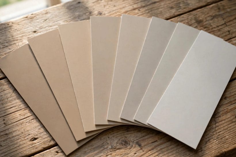
Greige names a territory, not a point. At one edge it is a grey that has merely been warmed; at the other, a beige that has been cooled and quieted. Every greige you meet sits somewhere on that line, and placing a swatch on the line is the first skill — ask of any greige not “is it greige?” but “which way does it tip?”
2. Mass tone and undertone are different readings
The mass tone is what you see at a glance on the swatch: a warm mid grey, say. The undertone is what the colour reveals at its edges, in thin light, against white — the lean. Buying on mass tone alone is how a room ends up greener, pinker or yellower than its owner ever intended.
3. The Undertone Families: Green, Pink and Golden Leans
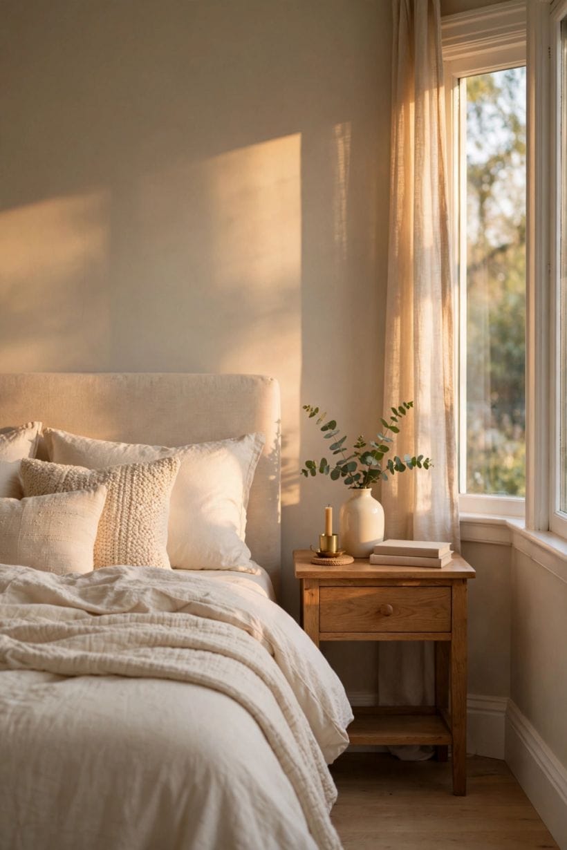
3. The green lean
Green-leaning greiges feel earthy, calm and slightly cool. They sit happily beside plants, sage accents and natural timber, and they are the greiges most likely to be accused of “turning green” — usually in cool, north-facing light that feeds the lean, or beside warm orange wood that makes green shout by contrast.
4. The pink lean
Pink-leaning greiges — the lilac-taupe direction — feel soft and traditional and flatter warm evening light beautifully. Their risk is the opposite room: beside crisp blue-white light or grey-blue furnishings they can blush unexpectedly, reading rosier than anyone planned.
5. The golden lean
Golden-leaning greiges are the warm camp: beige-forward, sunny, the classic “warm grey” of the review pages. They flatter south-facing rooms and warm woods, and their failure mode is sallow — in already-yellow light, on a large wall, golden can tip from warm to merely dingy.
Most real greiges are not pure examples of one family: a golden greige may carry a whisper of green, a green one a breath of warmth, and the secondary lean is often what surfaces in the room’s difficult corner or its evening light. Depth matters too — the deeper the tint, the more pigment the undertone has to speak with, so a colour that behaves as a quiet golden in its pale version may declare its green much more loudly two shades down. This is why family language is a starting point rather than a verdict: it tells you what to look for, and the board test in your own room tells you what you have.
4. Light: The Undertone Amplifier
6. North light cools and exposes
Light from the north is indirect and blue-grey, and it strengthens every cool note in a colour: green leans emerge, pink leans sharpen, golden leans retreat. A greige chosen in a bright south-facing shop can arrive home to a north room as a visibly different colour.
7. South light warms and forgives
Direct warm sunlight pushes greige toward its beige side and flatters golden leans. South-facing rooms are where warm greiges earn their devoted reviews — which is precisely why those reviews mislead the north-facing reader.
8. Bulbs finish the argument
After dark, the bulbs own the colour. Warm bulbs feed golden leans and mute green ones; cool daylight bulbs do the reverse and can make a soft greige look stark. Any greige test that ends at sunset is only half a test.
East and west rooms live between the two famous cases and change their minds through the day: an east-facing bedroom is cool at breakfast and warm by evening, a west-facing sitting room the reverse. Greige in these rooms will show both its faces daily, which is not a failure — a colour that moves gently between warm and cool across the hours is often the most alive neutral in the house. The test is whether both faces please you; a board watched across one full day answers it honestly, and no single-hour viewing can.
5. The Company It Keeps: Floors, Woods, Whites and Metals
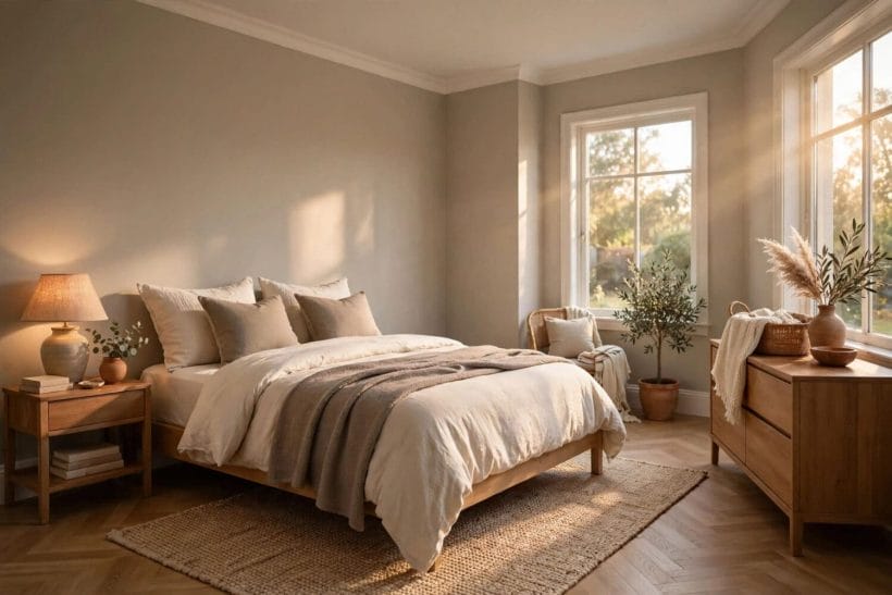
9. Warm floors pull the lean out
Orange-toned oak and warm laminate are undertone amplifiers: they push greige’s green lean forward by contrast and cosy its golden lean by agreement. Read every greige board on the actual floor it will live above, never in the hand alone.
10. The white beside it is a judge
Trim white is the strictest test a greige faces. A crisp, slightly blue white makes greige look deeper and can expose a pink lean; a creamy white softens everything and lets golden leans glow. Choose the trim as part of the colour decision, not after it.
11. Grey furnishings cool the room’s reading
Cool grey sofas, chrome and blue-grey fabrics all vote for the grey in greige, leaving its warmth looking stranded — often read, unfairly, as dirtiness. Warm metals, leather and timber vote the other way and complete the colour.
12. Stone and tile are permanent company
Kitchen and bathroom greiges live beside stone, tile and grout whose own undertones never change their minds. A worktop with a pink lean will find the pink in your greige every day; test boards against the fixed surfaces first.
6. Why Reviews of the Same Colour Disagree
13. Every review is a room report
“Turned green on me” means: in that reviewer’s light, over that floor, beside those whites, the green lean won. “Perfect warm grey” means the golden lean won elsewhere. Both reports are data about rooms, not verdicts on the colour — and neither room is yours.
14. Photographs lie politely
Phone cameras rebalance colour automatically, screens render differently, and a wall photographed at noon is not the wall at seven. Review photos are useful for depth and mood — how light or deep a greige sits — and nearly useless for undertone. Trust them for the first, never the second.
15. Depth changes the lean’s volume
The same formula reads gentler in a pale tint and stronger as it deepens, because the undertone has more pigment to speak with. A greige praised in a light version of itself may behave quite differently two shades down, which settles many an argument between reviewers of “the same” colour.
There is one more reason reviews mislead, and it is the oldest in decorating: the chip is not the wall. A colour read on a small card, surrounded by the whites of a shade chart, is being judged in the most flattering isolation it will ever enjoy; on a full wall, in a real room’s light, against real flooring, its undertone has room and company to amplify it. Reviewers who loved the chip and quarrelled with the wall are not careless — they are reporting the gap between the two tests. The board test exists to close that gap before the paint is bought, which is why the next section treats it as the guide’s one non-negotiable.
7. Testing Properly: Boards, Corners and Two Lights
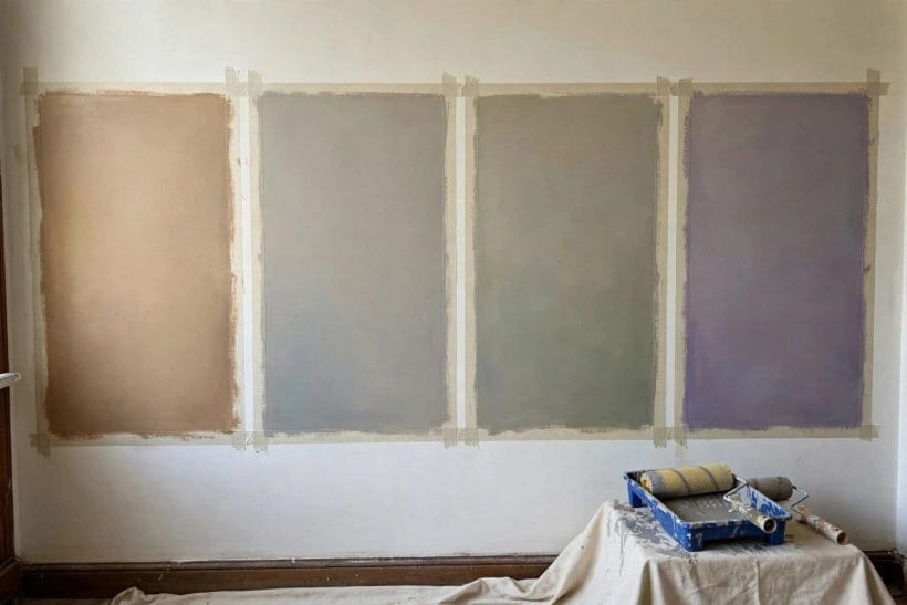
16. Paint boards, not wall patches
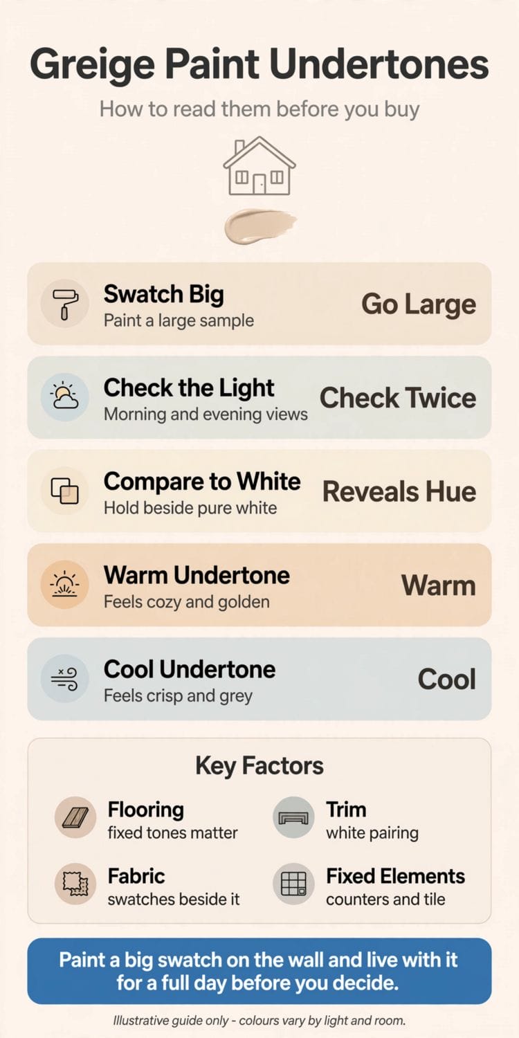
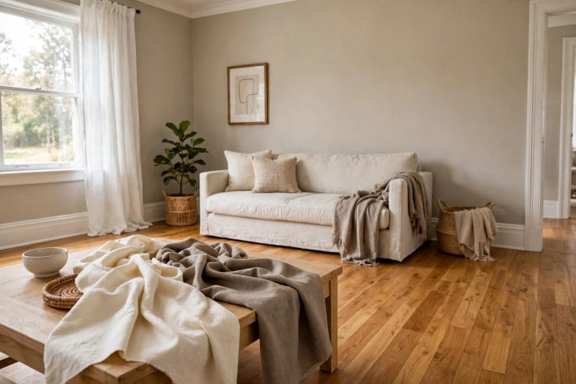
Two coats on a large board, movable from wall to wall and room to room. A patch tests one spot in one light; a board tests the colour’s whole character — and it can stand beside flooring, trim and furniture for the company checks.
17. Use the white-card isolation test
Hold the swatch or board against plain white card, away from other colours. Isolation strips away contrast effects and shows the lean naked: green, pink or golden announces itself within seconds once the eye stops comparing it to neighbours.
18. Test in the corner and at two times
Corners double a colour’s apparent depth, and every room has two lights — day and evening. A greige that pleases at the window at noon and beside the lamp at night has passed; any other result is the colour telling you its lean does not suit the room.
19. Compare candidates side by side
Undertones are relative, so test relatively: two or three greiges fanned together reveal their leans instantly, where each alone looked simply “warm grey”. This is the fan-deck lesson the colour reference guide teaches, applied to a single family.
Then give the winner time. Live with the board for a few days, moving it between the room’s walls, before the tins are ordered — first impressions of neutrals are notoriously unstable, and the greige that seemed merely safe on day one often turns out to be the one whose lean suits the room at every hour. Paint is the cheapest big change a room can have and the most laborious to undo; a slow test is not indecision, it is the whole method.
8. Greige Room by Room
20. Living rooms: the natural home
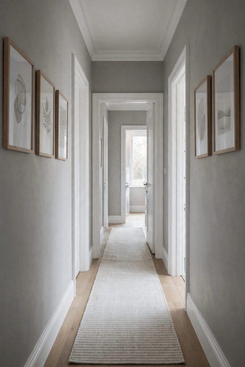
Greige’s versatility peaks where light and company are mixed — timber, textiles, plants, lamplight. In the brown bedroom the same warm-neutral logic runs deeper and cosier; in living rooms keep greige mid-depth and let the furnishings supply the contrast.
21. Bedrooms: choose the lean for the mood
Golden leans make bedrooms feel lamplit and restful; pink leans feel soft and traditional; green leans feel cool and garden-calm. Beside the near-black drama of the bedroom with black walls, greige is the gentle alternative — same sophistication, opposite volume.
22. Kitchens and halls: the traffic test
In kitchens, judge greige against the fixed stone and steel, and prefer the lean that flatters both. In halls — little daylight, much bulb light — test at night first; a hall greige lives its whole life under bulbs and should be chosen under them.
9. Pairing: Trim, Ceilings and Accent Colours
23. Trim: creamy for warmth, crisp for definition
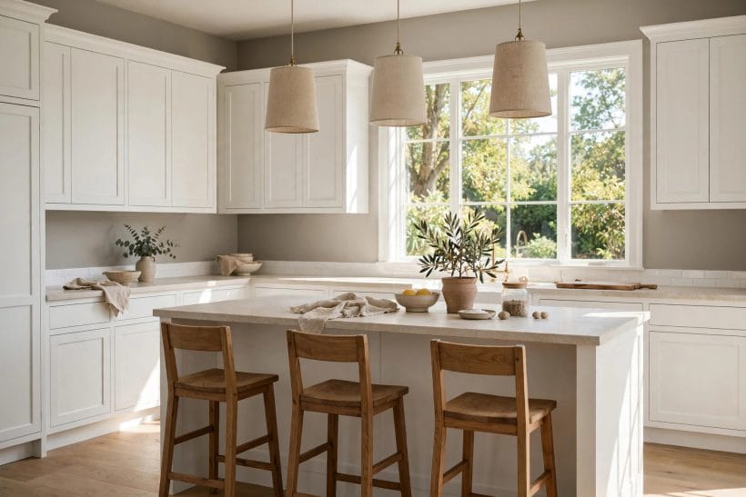
Match the trim’s temperature to the effect wanted: creamy whites merge with golden greiges into one warm envelope; crisper whites draw a line around the colour and make it read richer and deeper. Neither is wrong; indecision between them on the same wall is.
24. Ceilings a step lighter in the same family
The reliable ceiling for a greige room is a paler tint of the wall’s own direction — the lean continues overhead at lower volume, and the room feels taller and calmer than under a foreign white.
25. Accents that agree with the lean
Accent colours work hardest when they second the undertone: sage and olive for green leans, clay and muted berry for pink leans, ochre and warm brass for golden leans — a harmony the yellow bedroom achieves from the other direction. Contradicting the lean is possible but should always be a decision, never a discovery.
One pairing discipline covers most rooms: let the largest textile in the room — the sofa, the rug, the curtains — be the accent decision, and let everything smaller take its cue from that. A greige wall is a background by design; it asks only that the foreground colours be chosen in its company rather than against it. Rooms decorated that way rarely produce the puzzled reviews this guide began with, because the colour was never asked to perform alone.
10. Common Mistakes and Honest Limits
The recurring greige mistakes are all failures of testing rather than of taste: choosing from a small chip under shop light; reading reviews as verdicts instead of room reports; testing one wall at one hour; forgetting that the floor and the trim are part of the colour. And one honest limit deserves stating plainly — undertone language describes tendencies, not guarantees. Two colours sold under different names may share a lean; one colour may lean two ways in two lights on the same day. That is not the system failing; that is how pigment and light behave, and the board test exists precisely because no description, this one included, can replace your room’s own evidence.
Final Considerations
Greige rewards readers. Learn its three leans — green for earthy calm, pink for softness, golden for warmth — read any candidate against white card to name its lean, then test a painted board in your light, beside your floor and your trim, by day and by bulb. Do that and the contradictory reviews resolve themselves: everyone was right about their own room, and now you know about yours. Keep the colour family’s splits in mind as you browse: taupe takes the browner neutrals, charcoal takes the deep greys, the colour reference guide teaches the matching method, and this post owns the warm greige territory between them.



0 Comments