
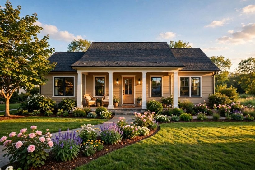
A single-storey home has nowhere to hide, which is exactly its charm. This roundup of one story house exterior ideas covers roof lines, colours, materials, porches and the practical details that make a low, wide facade look designed rather than stretched.
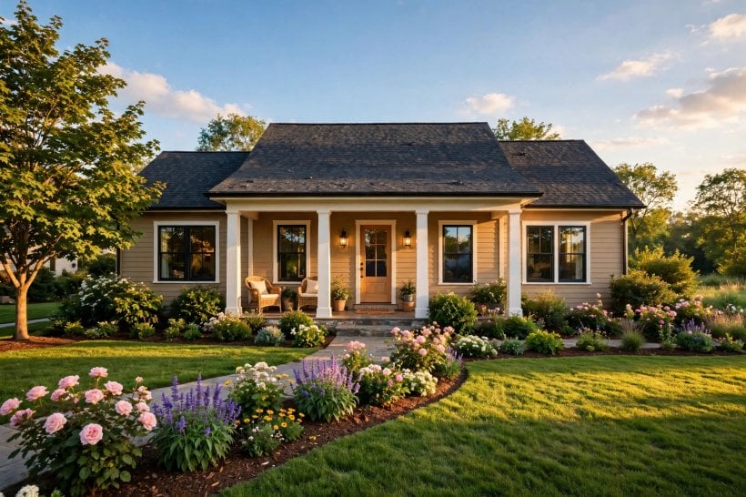
1. At a Glance
Exterior design for a one-storey home is a game of length, not height. The eye travels along the facade, taking in the roof edge, the rhythm of the windows, the front door and the planting in one long glance, so every interruption matters. The good news is that single-storey homes are forgiving projects: most changes are reachable from a modest ladder, repainting is straightforward, and the roof, being so visible, does much of the design work for you. The table below sums up the priorities that the following sections explore in detail.
| Question | Short Answer |
|---|---|
| What shapes the look most? | The roof line and the proportions of the facade; colour comes second. |
| Which colours suit a low home? | Quiet walls with a stronger roof, door or trim colour for definition. |
| Where should money go first? | Roof condition, the front door and porch, then paint and landscaping. |
| What makes it feel modern? | Mixed materials, clean trim, larger windows and restrained colour palettes. |
| What dates it fastest? | Tired paint, an exposed concrete path, and planting that swallows the facade. |
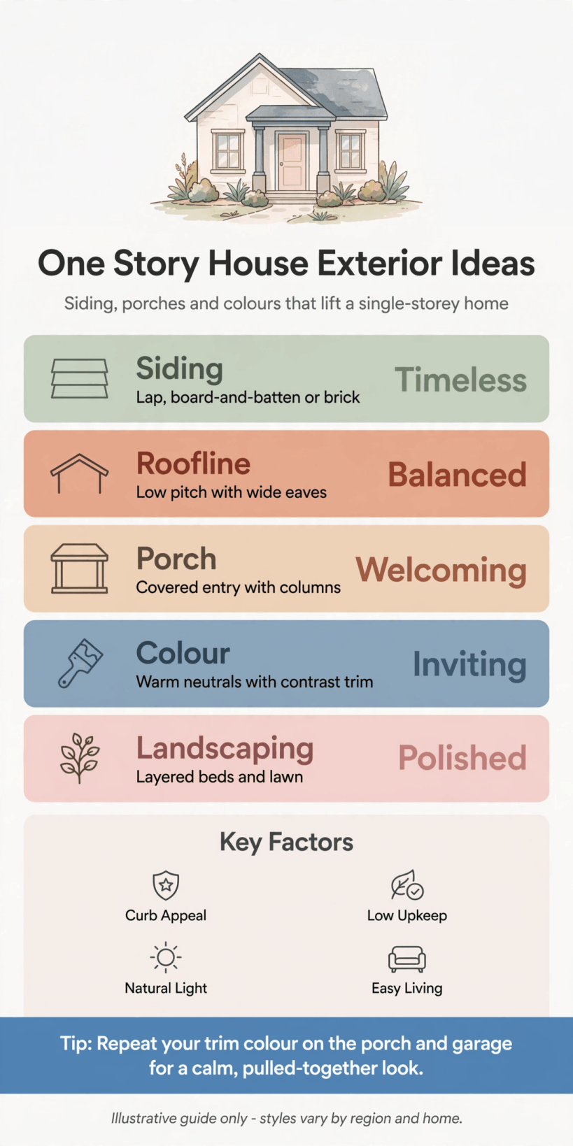
The one-storey exterior at a glance: roof first, then proportion, colour, materials and kerb-side details.
2. Roof Lines That Flatter a Single Storey
On a one-storey home the roof is practically a second facade, often the largest single surface a visitor sees, so its shape and colour lead the whole design. A hipped roof, sloping on all sides, looks settled and traditional and suits long ranch-style plans. A simple gable reads crisp and cottage-like, especially when the gable end faces the street and gets a feature material or a contrasting colour. Low-pitched and skillion roofs lean modern, while a generous overhang, whatever the style, shades walls and windows and gives the house a grounded, deliberate silhouette.
Roof colour deserves as much thought as wall colour, because the two swap visual weight on a low home: a dark roof on pale walls anchors the design, while a pale roof on deeper walls can feel fresh in hot climates. Fascias, soffits and gutters are the frame lines of the picture, and painting them to match the trim ties the roof into the scheme. The exterior-first planning in these new home exterior design ideas shows how a coherent roof and trim story lifts even very modest houses, and the principle scales straight up to family-sized single-storey homes.
3. Layout and Proportion Along the Facade
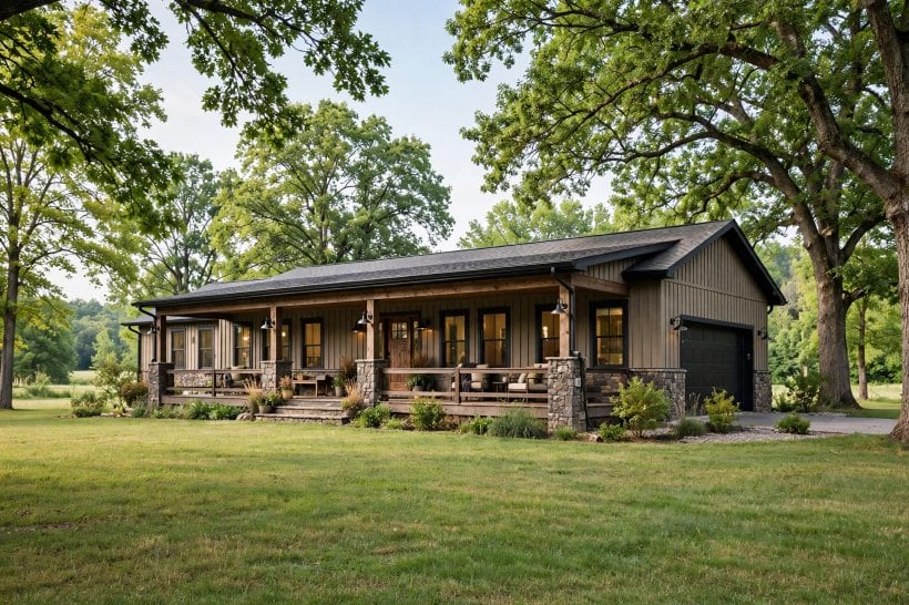
Because a single-storey facade is long, it needs rhythm and a clear focal point, or it drifts. The front door should announce itself, centred on its own section, dressed with a porch, a colour or a change of material, rather than sitting as one more dark rectangle in a row of windows. Vary the wall plane where you can: a projecting bay, a recessed entry or a garage set slightly forward or back breaks the length into readable chapters and casts the shadows that give a flat elevation its depth.
Window spacing carries the rhythm between those chapters. Evenly sized windows marching at one height feel orderly and traditional; grouped or enlarged windows feel contemporary and pull light deeper inside. Keep one unifying element running through the composition, a consistent trim colour, a repeated material or a continuous planting line, so the chapters still read as one book. Stand across the street and squint before committing to changes; from there, proportion problems are obvious, while close up they hide behind detail. The layout discipline in these home designing ideas works outdoors too: focal point first, rhythm second, decoration last.
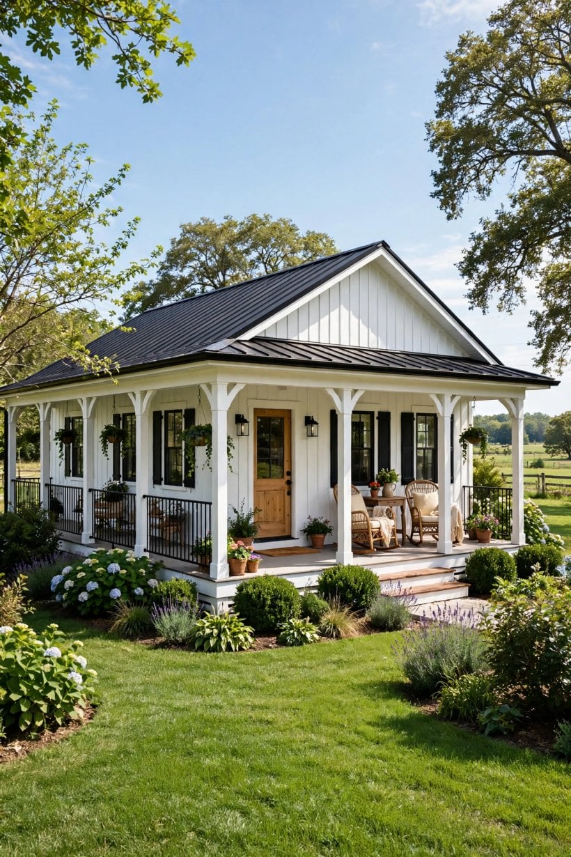
4. Colours That Work on a Wide, Low Facade
Colour on a one-storey home behaves differently than on a tall one, because there is so much of it at eye level. A safe and handsome structure is three colours at most: a main wall colour, a trim colour for fascias, frames and corner boards, and an accent reserved for the front door and perhaps the garage door. Warm off-whites, soft greys and stone tones are the reliable main acts, while deep greens, inky blues and charcoal trims supply the definition that stops a pale, wide facade from looking washed out in bright sun.
Test colours as large painted boards, not chips, and view them in morning and afternoon light and against the roof, which may already be dictating half the palette. Brick, stone and timber elements count as colours in the scheme whether you planned them or not, so count them first and choose paint to complete the picture rather than compete with it. In shaded streets, lean slightly warmer and lighter than your instinct, because a north-facing or tree-covered facade darkens everything. And keep a note of the exact colours used; the household that can touch up the porch rail from a labelled tin is the household whose exterior still looks intentional in five years.
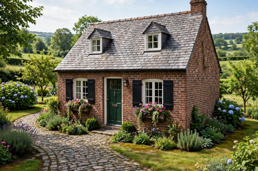
5. Cladding, Brick and Mixed Materials
Material changes are how a long facade gets its chapters without moving a single wall. Brick at the base or around the entry gives weight and permanence; horizontal cladding above lightens the composition and adds the shadow lines that make pale walls interesting. Vertical boards narrow a section visually, which is why they suit gables and entry recesses, while render offers the smooth, quiet background that modern schemes are built on. Mixing two, occasionally three, materials is the contemporary sweet spot; mixing five turns the front of the house into a sample board.
Run material changes to logical stopping points, corners, downpipes, the edge of a porch, so the junctions look structural rather than decorative-forgotten. Where budgets are tight, concentrate the premium material at the entry and let honest paint carry the rest, because the area around the front door is where the eye and the hand both linger. Durability matters as much as looks: materials at ground level meet splashback, mowers and bicycles, so the toughest surfaces belong at the bottom. Households weighing costs will find the spend-on-the-bones thinking in how to make a cheap tiny house useful here: a smaller area of better material beats a whole facade of the thinnest option.
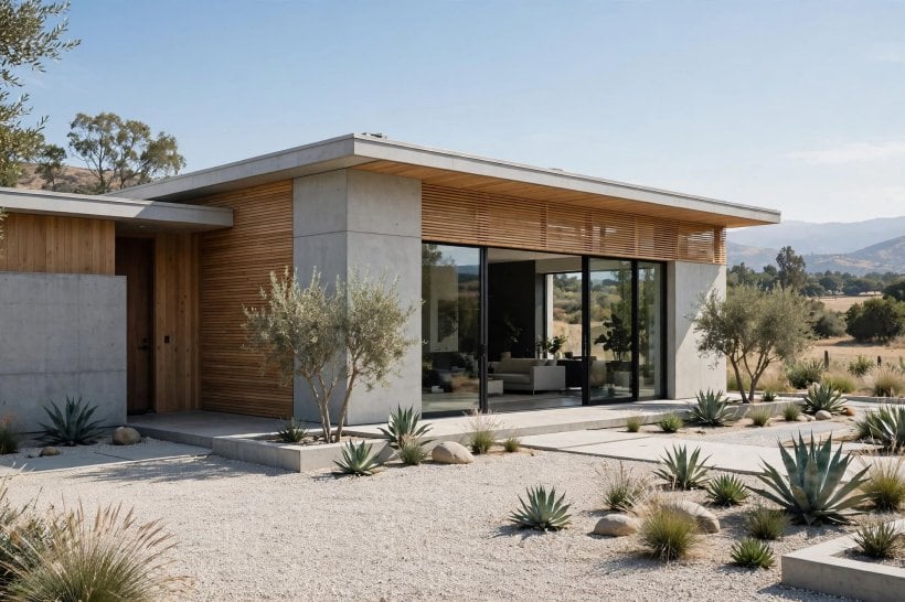
6. Porches, Verandas and the Front Door Moment
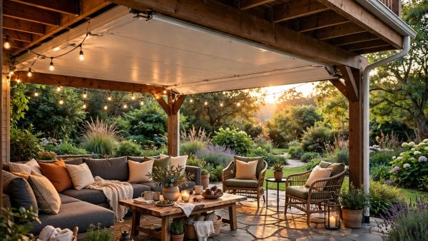
The porch is the handshake of a one-storey home, and it works on three levels at once. Practically, it shelters the door, the post and waiting guests from weather. Architecturally, its roof breaks the long main roof line and gives the facade its focal depth. Socially, a porch deep enough for a bench or a pair of chairs turns the front of the house into a place, not a passage, and few upgrades change daily life as pleasantly as a seat by the front door with a coffee in the morning sun. Even a compact portico, posts, a small roof, a proper light, delivers most of the architectural benefit.
The door itself deserves feature status: a confident colour, honest hardware, a house number that can be read from the street and a light that flatters rather than interrogates. Steps and the path edge should feel as considered as the door, with an even surface and a handrail where the level change asks for one. Planting in pots flanks a doorway better than almost any ornament, provided the pots are big enough not to look apologetic. Tie porch materials back to the house, posts that echo the cladding, a floor that picks up the path, so the whole entry reads as one composed moment rather than a series of purchases.
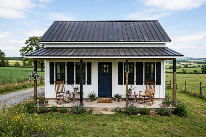
7. Windows, Shutters and Trim Details
Windows are the eyes of a low facade, and their treatment decides whether the house looks alert or sleepy. Consistent frame colour is the cheapest coherence available; mismatched replacements in different whites and browns undo an otherwise careful scheme. Deep-set windows with a proper sill cast the small shadows that make walls look thick and well built, while applied trim boards around openings can fake that substance convincingly on a rendered or clad wall. Shutters, where the style supports them, should be sized as if they could actually close over the window, because undersized decorative shutters are the detail everyone recognises as a shortcut.
Consider privacy and light together at the front of the house: sheer treatments, planting or a section of screening can protect front rooms without the closed-down look of permanently drawn blinds. Window boxes and a simple awning over a sun-beaten front window add charm and practical shade in one move. The same care for openings runs through good interiors, and the window-conscious planning in these modern interior design ideas is a useful cross-check: what frames the view from inside is simultaneously composing the facade from outside, so choose once, carefully, for both audiences.
8. Garages, Driveways and the Approach
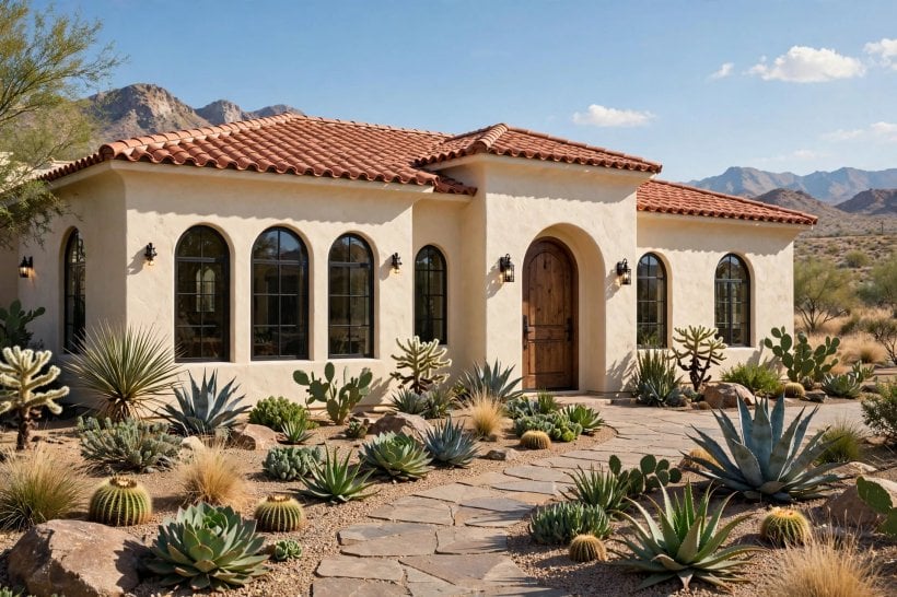
On many one-storey homes the garage is a third of the street frontage, which makes its treatment a design decision, not an afterthought. A garage door in the trim colour recedes politely; in the wall colour it can nearly vanish; detailed with windows or a carriage style it can earn its visual keep. Setting the garage slightly behind the front wall of the house, or turning it to the side where the plot allows, returns the front door to its rightful starring role. Pergola beams or a trellis over the garage door soften its bulk surprisingly well and give climbing plants a job.
The driveway and path finish the approach. Permeable gravel, pavers with planted joints or a well-kept concrete drive in a soft tone all work; cracked, patched and stained surfaces undo good paint faster than any other element. Define the walking route to the door clearly, light it gently at ground level, and give the bins and meters a screened home so the first impression is the house, not its housekeeping. The build-it-once-properly philosophy in how to build your own tiny house applies to the approach as much as to a roof: sound bases, honest materials and tidy edges are what survive weather and years.
9. Landscaping That Frames Rather Than Hides
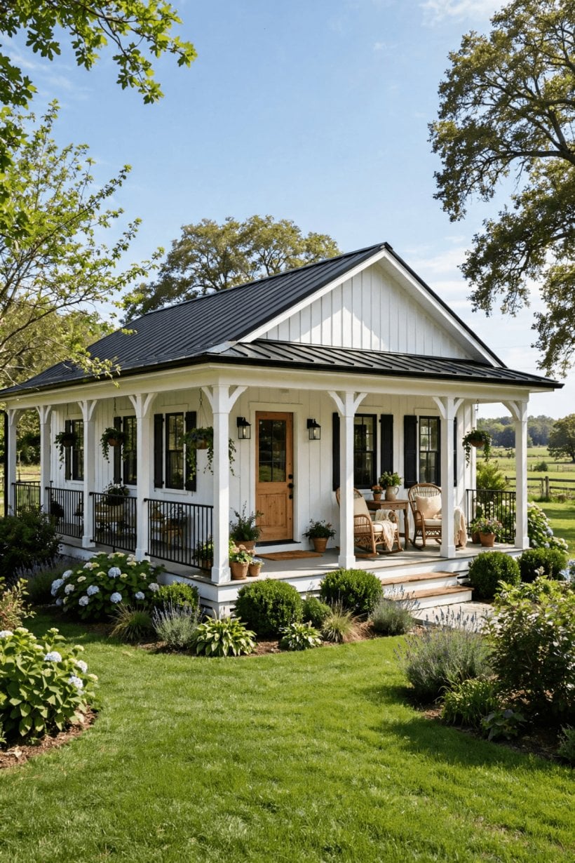
Planting is the soft architecture that finishes a one-storey facade. Its first job is framing: foundation planting that steps down from the corners, a specimen tree placed to balance the composition rather than centre it by default, and ground cover that carries the eye along the facade instead of stopping it at the lawn edge. Vary heights and textures but limit the palette of plant types, because repetition is what separates a designed front garden from a collection of shrubs that happened to survive.
Keep future size in mind with every planting decision, since the classic one-storey mistake is shrubs that grow to swallow windows and porches, throwing rooms into gloom and trapping damp against walls. Choose varieties whose mature size fits the space, keep a clear margin at the wall for air and maintenance, and let one seasonal moment, a spring tree, autumn colour, winter stems, carry the show while evergreen structure does the quiet work. Low walls, edging and a defined bed line give the softness a frame, the same way trim gives windows theirs. Even a modest budget transforms a frontage when it is spent on soil, mulch and a few well-chosen plants rather than many small ones.
10. Costs, Upkeep and Where to Spend First
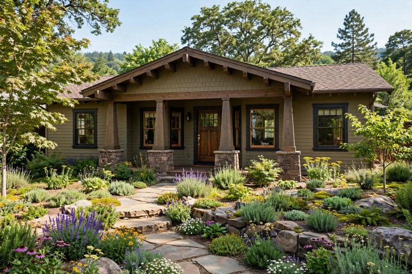
Exterior money works hardest in a strict order. First, the roof and rainwater goods, because no decorative scheme survives a leak or a stained wall. Second, the entry: door, porch repairs, path and lighting, which is where daily life and first impressions meet. Third, paint and cladding repairs, done as full elevations rather than patches, since a one-storey repaint is among the most achievable of all exterior projects. Landscaping and the pretty details come last, and they are also the easiest to phase over several seasons as budget allows, without the house ever looking half finished.
Costs vary widely with region, materials and how much you do yourself, so collect itemised quotes and treat the cheapest full repaint figure with the suspicion it deserves; preparation is the difference between a finish that lasts and one that peels by the second winter. Upkeep on a single storey is refreshingly manageable: an annual wash of walls and paths, gutter clearing, a walk-around after storms, and prompt attention to cracked paint at the weather side. Keep a small stock of the exact exterior colours and a note of material suppliers in the house file, and every future repair becomes a morning’s errand instead of a research project.
Final Considerations
A one-storey home rewards the owner who thinks in long views. Roof first, proportion second, then colour, materials and the welcoming details of porch, path and planting: work through these one story house exterior ideas in that order and each improvement makes the next one easier to choose. Photograph the house from across the street before and after every change, because the street view is the honest one, and it is the view you actually own. Choose the scheme that suits the house you have, its roof, its street and its light, and the simplest facade on the road can quietly become the best kept one.

0 Comments