

Used with care, pink and yellow is one of the happiest pairings in decorating — warm, optimistic and far more versatile than its sweet-shop reputation suggests.
This guide walks through the tones that work, the rooms that suit them and the simple rules that keep the combination fresh instead of sugary.
1. The Basics: Tones, Balance and the At-a-Glance Summary
Every successful scheme starts with tone, not colour names. A dusty, muted rose behaves completely differently from a bright fuchsia, and a soft buttery shade calms a room while a sharp lemon energises it. Decide first whether you want the pairing to feel gentle or bold, then hold every choice — paint, fabric, furniture, art — against that decision. Balance matters too: one colour should lead and the other should answer, with a neutral carrying the rest of the room. The proportions used throughout these tiny house interior paint colours show how a restrained base lets two strong colours shine without shouting.
| Question | Short answer |
|---|---|
| Gentlest version of the pairing? | Blush with pale butter over warm white, plus natural wood and woven texture. |
| Boldest version that still works? | Deep rose with ochre, grounded by charcoal, black or dark timber accents. |
| Safest room to try first? | A bedroom or hallway, where cushions, art and a single painted piece can test the idea. |
| Best neutral partners? | Warm white, soft greige, pale oak and brushed brass or black metalwork. |
| Biggest mistake to avoid? | Equal amounts of two bright tones with no neutral rest between them. |
| Key check before painting? | Test both colours together on a large board and live with them in day and evening light. |
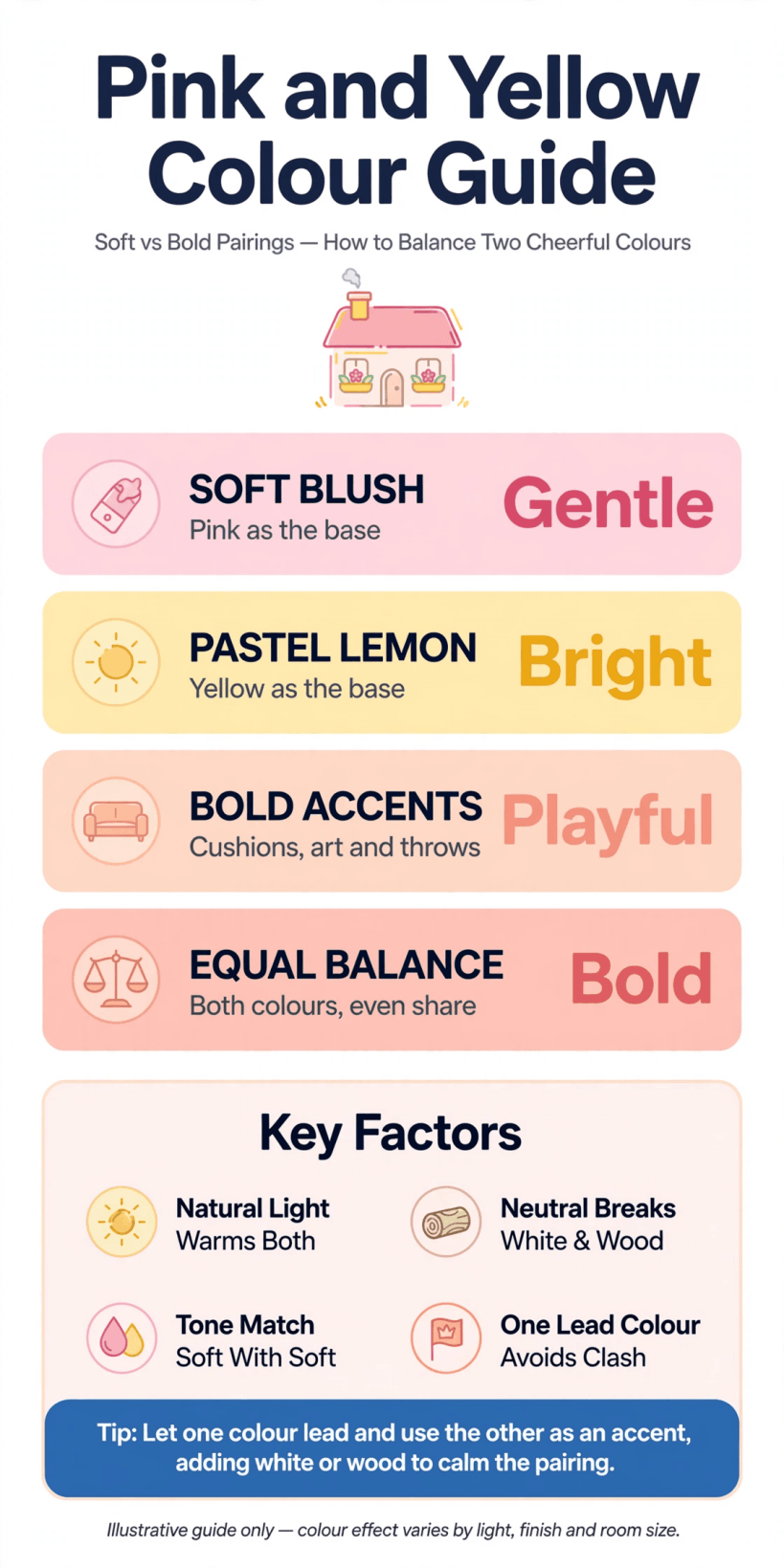
A quick visual summary of the main choices — tone, balance, neutrals and room-by-room ideas — covered in this guide.
2. Getting the Tones Right
Tone is the difference between a scheme that feels designed and one that feels accidental. Hold fabric and paint samples together in the room’s real light, because north-facing daylight cools both colours while evening lamplight warms them. As a rule, pair like with like: dusty with dusty, clear with clear. A muted rose beside a smoky ochre reads sophisticated; the same rose beside a neon lemon fights, because the two colours sit at different levels of saturation and neither will give way gracefully.
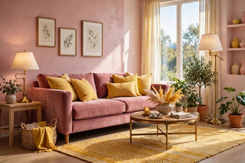
Depth works the same way. Pale with pale feels airy and romantic, deep with deep feels dramatic and cocooning, and the liveliest schemes often mix one pale tone with one deeper partner — blush walls with an ochre chair, for example — so the eye has somewhere to rest and somewhere to land. If you are choosing for a compact home, the layering advice in this tiny house and small-space interior design guide applies to colour exactly as it does to furniture: fewer, larger statements beat many small ones.
3. Living Rooms That Feel Warm, Not Sweet
The living room is where this pairing most often goes wrong, usually because both colours arrive at full strength in equal amounts. Let one dominate quietly — rose-toned walls or a large rug, say — and use the sunnier shade in smaller, movable pieces: cushions, a throw, a lampshade, a single chair. That way the scheme can evolve with the seasons and nothing expensive is locked into the boldest choice.
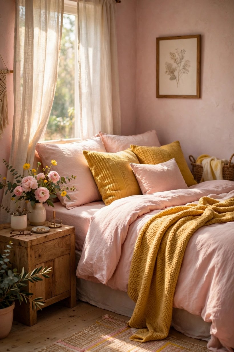
Texture does the calming work. Linen, wool, rattan and mid-tone wood all soften the pairing and stop it reading as a child’s room in adult furniture. Metal finishes matter too: brushed brass flatters both colours, chrome can make them feel colder, and black — used in a picture frame, a floor lamp or a side table — gives the whole arrangement a grown-up outline. For more ways to anchor cheerful colour in a sitting room, browse these tiny house living room ideas and note how each scheme repeats its accent at least three times.
4. Bedrooms: Soft Mornings and Restful Evenings
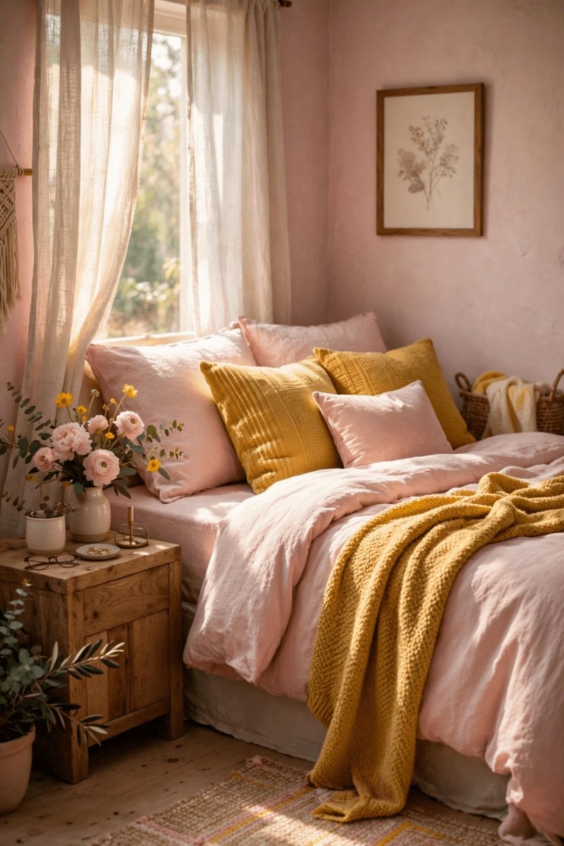
Bedrooms reward the gentlest versions. Blush bedding with a pale golden throw feels like morning light even on a grey day, and the pairing suits guest rooms especially well because it reads welcoming to almost everyone. Keep the wall colour quiet — a warm off-white or the palest rose — and let textiles carry the combination, since bedding is cheap and easy to change when tastes move on.
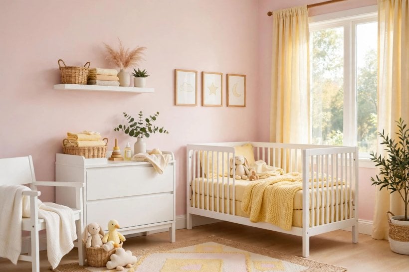
For a more dramatic main bedroom, reverse the emphasis: deep rose on the wall behind the bed, with ochre and cream in the bedding and a dark timber headboard to steady the mood. Lighting temperature changes everything at night, so test with the lamps you actually use. Warm bulbs flatter both colours; anything blue-white will make rose look grey and turn gentle gold tones sharp and chilly.
5. Kitchens and Dining Spaces Full of Appetite
Warm colours belong where food is cooked and shared, and this pairing has a long, cheerful history in kitchens. The safest route is cabinetry in a calm neutral with the duo in tiles, stools, blinds and table linen — or one confident move, such as golden cabinets with rose-toned walls kept very pale. Open shelves of everyday crockery in cream and wood keep the look grounded and practical.
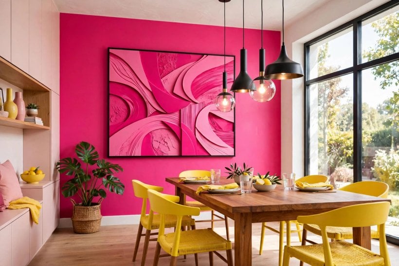
In dining areas, the combination flatters candlelight and evening meals. A rose-toned wall with golden upholstery on dining chairs feels generous and sociable, while the same colours in a breakfast nook — a sunny bench cushion, a blush pendant light — make early starts feel kinder. The planning in these tiny house kitchen design ideas shows how colour blocking can define zones in small cooking spaces without any structural change at all.
6. Bathrooms, Hallways and Small Spaces
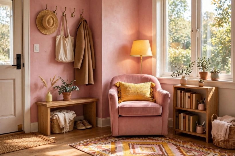
Small rooms are the perfect testing ground because commitment is low and impact is high. A hallway painted in a warm blush with a golden runner and brass hooks feels like a welcome rather than a corridor, and it forgives low light better than most colours. Bathrooms take the pairing beautifully in tiles and towels: rose tiles with golden grout-toned accessories, or sunny walls with blush towels and a plant, both feel fresh without a full refit.
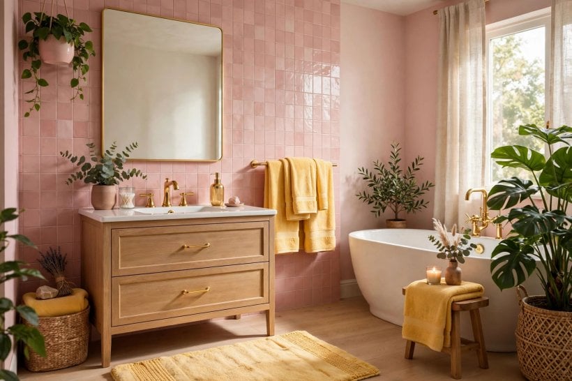
In compact homes the hallway often sets the palette for every room beyond it, so treat it as the scheme’s introduction: one colour here, both colours in the rooms it leads to. These tiny house decorating ideas make the same point about thresholds — small connecting spaces deserve the most deliberate colour choices in the home, because they are seen from everywhere.
7. Palettes to Copy: Six Combinations That Work
Blush and butter. The softest option: blush walls or sofa, butter cushions and curtains, warm white woodwork and pale oak. Best for bedrooms and gentle living rooms that face away from the sun.
Rose and ochre. Deeper and more autumnal. Rose upholstery, ochre walls kept muted, dark wood and brass. Best for dining rooms, studies and north-facing rooms that need warmth.
Coral-pink and marigold. The liveliest pairing, a step towards orange on both sides. Use with plenty of white, rattan and green plants. Best for kitchens, sunrooms and holiday-feeling spaces.
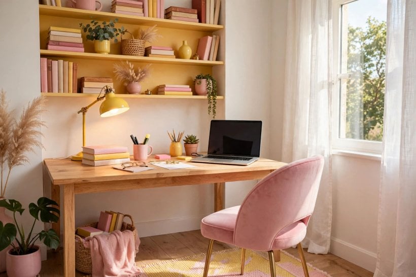
Fuchsia and lemon. High contrast and unapologetic; small doses only — a fuchsia chair, lemon cushions, graphic black and white around them. Best for hallways, home offices and teenagers’ rooms.
Powder pink and pale gold. Quiet luxury: powder-toned walls, pale gold in velvet cushions and picture frames, cream and marble-look surfaces nearby. Best for formal living rooms and calm main bedrooms.
Salmon and straw. Earthy and relaxed, both colours softened towards brown. Linen, terracotta and untreated timber complete it. Best for cottages, garden rooms and anywhere that opens to greenery.
8. Pairings With Other Colours
Two-hue schemes rarely stay two-hue for long, and the colours you add decide the mood. Green is the natural third partner — houseplants alone can supply it — because it sits between the two on the wheel and makes both feel fresher; sage-painted woodwork is a calmer, more permanent way to get the same effect. Blue is the brave choice: a little deep navy or denim sharpens the pairing and stops any hint of sweetness, which is why the combination often appears in tailored, almost tailored-looking interiors.
Red needs care — a step too far and the scheme becomes a fruit salad — but burgundy, oxblood and other browned reds deepen rose beautifully in autumn schemes. White is never wrong, though warm whites flatter while blue-whites argue. Black, as noted, is the outline artist. And if a scheme feels unstable, the fix is usually not another colour but more of the neutrals you already have: wood, stone, cream and woven fibre are the quiet diplomats of this pairing.
9. Pattern, Art and Textiles
Pattern is where the pairing becomes personal. A floral that contains both colours on a cream ground ties a whole room together in one purchase — the classic decorator’s shortcut, and it works in every room from bedroom curtains to a living-room armchair. Stripes feel crisper and more modern: a rose-and-cream stripe with golden cushions, or a golden ticking stripe beside blush walls. Checks and small geometrics sit between the two moods.
Art offers the lowest-risk entry point of all. Two framed prints — one leaning rose, one leaning gold — above a neutral sofa introduce the whole idea for the price of a takeaway, and they can move rooms when you redecorate. Textiles should repeat the story at three heights: something at floor level, something at seat level, something at eye level. That triangle of repetition is what makes a scheme look intentional, a principle that runs through these colourful tiny house interior ideas in room after room.
10. Common Mistakes and How to Fix Them
The first mistake is equal billing at full brightness, which leaves the eye nowhere to rest; fix it by demoting one colour to accents only. The second is mismatched tones — a dusty rose with a neon shade of the sunnier colour — fixed by swapping the brighter piece for a smokier version. The third is forgetting the neutrals: without white, wood or grey to separate them, the two colours blur into a general sweetness, and the fix is almost always to add texture rather than more colour. The fourth is testing paint in the shop instead of at home; both colours shift dramatically with light direction, and a north-facing room may need each tone warmed by a full step. Finally, do not buy everything at once. Live with the walls and one textile layer for a month. The right next piece usually becomes obvious, and the wrong ones never arrive. Small schemes especially benefit from this patience, as the whole-home approach in the complete guide to building your own tiny house demonstrates — decisions made in the right order are the ones you keep.
Final Considerations
Treat tone and balance as the real decisions, and the colours themselves will behave. Let one lead, give the pairing a neutral stage to perform on, and repeat each colour at least three times so the scheme reads as a choice rather than an accident. Start small if you are unsure — a hallway, a guest room, a pair of prints — and let your confidence grow with the compliments. Done with that care, pink and yellow stops being a brave exception and becomes what it should be: the warmest, sunniest corner of your home, whatever the weather is doing outside.
If you are renting, or simply cautious, every idea in this guide has a no-commitment version. Removable wallpaper in a soft rose, cushion covers in a golden weave, a washable runner, framed prints and a painted second-hand side table will build the whole scheme without touching a wall — and every piece can leave with you when you move. Landlords generally smile on colour that arrives in fabric rather than paint, and future-you will thank present-you for choosing the reversible route first. When you do fall in love with the combination, promote it one level at a time: textiles first, then one painted piece of furniture, then — only if it still delights you after a season — a wall.
Seasonal shifts keep the scheme feeling alive rather than fixed. In spring, lean paler: swap deeper cushions for cream and blush, add fresh greenery, and let the sunnier colour appear in flowers and a light throw. In summer, the pairing can take more contrast — crisper whites, a touch of black in frames and lamp bases, and the golden tones turned up in straw, rattan and woven baskets. Autumn is when ochre and deeper rose come into their own alongside wool, velvet and candlelight. Winter asks for warmth most of all: layer the throws, choose the richer versions of both colours, and let warm lamplight do what daylight did in June. None of this needs new furniture. It is the same room, rebalanced four times a year by small, stored, inexpensive pieces.
Finally, trust the slow test over the quick opinion. Colour confidence is not about other people’s reactions; it is about walking into the room on an ordinary Tuesday and feeling quietly pleased. Give any new scheme a month of mornings and evenings before judging it, photograph it at different times of day, and notice which version of the pairing you reach for when you add something new. If you keep choosing it, the scheme is right — and it will carry on working long after decorating fashions have moved somewhere else entirely.


0 Comments