
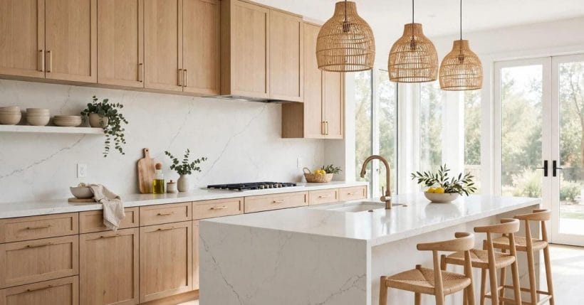
A quartz backsplash does more than protect the wall behind a hob or sink. It carries the countertop’s colour and pattern up the wall, ties cabinets and worktops together, and sets the tone of the whole kitchen, from a quiet pale slab to a bold veined statement that anchors the room.
The ideas below cover the full range: full-height slabs, short upstands, pale and dark quartz, veining, finishes, edges and everyday care. Every idea is a starting point for your own kitchen, to be checked against the room you have, the light it gets and the maker whose slab you choose, with a real sample in hand before you commit.
Full-Height Slabs
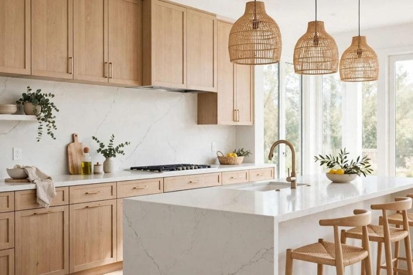
Full-height slabs are the boldest backsplash choice, and the most forgiving to live with. A single unbroken surface removes grout, simplifies cleaning and lets the stone itself carry the kitchen’s character, which is why so many of the ideas below start here.
| Item | What it is |
|---|---|
| A seamless wall | A single slab running from counter to wall cabinets gives a seamless, calm wall with almost no joints to clean. |
| The hob as anchor | A full-height slab behind the hob turns the cooking zone into the kitchen's visual anchor. |
| One material, more space | Carrying the same slab up the wall and across the counter makes a small kitchen feel larger and less broken up. |
| Soft white, quiet room | A full-height slab in a soft white keeps a busy kitchen feeling quiet, even with open shelving nearby. |
| Vein as artwork | A veined full-height slab works like artwork, so the rest of the wall can stay plain. |
| Handleless harmony | Full-height slabs suit handleless kitchens, where the unbroken surface matches the flat cabinet fronts. |
| Stopped at the shelf | A slab that stops at a shelf line, rather than the ceiling, gives the drama of full height without overwhelming a low room. |
| One wall only | In a galley kitchen, a full-height slab on one wall only keeps the corridor feeling open rather than tunnel-like. |
| A neat upstand | A short upstand, just a few centimetres high, protects the wall joint while keeping tiles or paint as the main feature. |
| Matching the counter | An upstand in the same quartz as the counter reads as a neat, finished edge rather than an afterthought. |
| Taller behind the sink | A slightly taller upstand behind the sink catches splashes where they actually land. |
| Paint above, stone below | Pairing a quartz upstand with painted wall above lets you change the wall colour later without touching the stone. |
| The modest choice | A short splashback suits a smaller kitchen or a first home, where a full slab would be more than the room needs. |
| Under open shelves | Upstands work well under open shelves, where a tall slab would fight the shelf line. |
| Mitred corners | A mitred upstand edge, where the quartz turns neatly at the corner, looks tailored rather than cut short. |
| Utility corners | In a utility corner, a simple upstand is often all the protection the wall needs. |
| Brightening a dark kitchen | A soft white quartz backsplash brightens a north-facing kitchen without feeling stark. |
| Quiet grey veining | Pale grey veining on white keeps the wall interesting at close range while reading as plain from the door. |
| With warm wood | A pale slab pairs easily with warm wood cabinets, balancing cool stone against warm timber. |
| Light at the hob | White quartz behind a dark hob keeps the cooking zone light and easy to wipe. |
| Pale on pale | A pale backsplash with pale cabinets creates a calm, continuous kitchen that suits small rooms. |
| Warmed by metal | Pale quartz with brass or warm metal taps warms the whole scheme without changing the stone. |
| Matte in bright rooms | A matte pale finish softens glare in a kitchen with large windows. |
| Shelves provide colour | Pale quartz with open shelving lets the shelves and their contents provide the colour. |
| A grounding line | A dark quartz backsplash grounds a pale kitchen, giving the eye a single strong horizontal line. |
| Depth without darkness | Charcoal quartz behind light cabinets adds depth without darkening the whole room. |
| Near-black elegance | A near-black slab with subtle veining reads as elegant rather than heavy, especially with good lighting. |
| Coordinated metals | Dark quartz pairs naturally with black taps and handles for a coordinated, unfussy scheme. |
| Hiding cooking marks | A dark splashback behind the hob hides everyday cooking marks better than a pale one. |
| Dark stone, warm shelves | Dark quartz with warm wood shelving balances cool stone against warm timber tones. |
| Anchoring a long wall | In a large kitchen, a dark full-height slab can anchor a long wall that would otherwise feel empty. |
| Evening glow | Dark quartz with under-cabinet lighting glows softly in the evening, when the room is used most. |
| Vein as feature | Bold veining turns a backsplash into the kitchen's feature wall, so keep nearby surfaces quiet. |
| Book-matched symmetry | Book-matched slabs, where two mirrored pieces meet, create a symmetrical pattern that suits a hob centrepiece. |
| Sparse and calm | Soft, sparse veining suits a calm kitchen that still wants a little movement in the stone. |
| Echoing the counter | Veining that echoes the countertop pattern ties wall and worktop together without matching exactly. |
| Quiet shelves | A veined slab behind open shelves looks best when the shelves hold few, plain items. |
| Diagonal movement | Diagonal veining draws the eye along the wall, which can make a long kitchen feel more connected. |
| Plain cabinets, loud stone | Veined quartz with plain cabinet fronts lets the stone do the talking while the cabinets stay quiet. |
| Soft matte warmth | A honed, matte quartz finish gives a soft, chalky look that suits relaxed, country-style kitchens. |
| Beige with cream | Warm beige quartz pairs naturally with cream cabinets and wooden worktops elsewhere in the room. |
| Warming a cool room | A warm-toned slab can make a cool, north-facing kitchen feel more welcoming. |
| Fewer fingerprints | Honed finishes show fewer fingerprints than polished ones, which suits a busy family kitchen. |
| Earthy company | Warm quartz with terracotta or stone flooring keeps the whole room in one earthy family. |
| No glare at the hob | A matte finish behind the hob avoids the glare that polished stone can throw back at the cook. |
| Rich and traditional | Warm quartz with dark wood cabinets creates a rich, traditional kitchen without feeling heavy. |
| Tile look, fewer joints | Quartz cut to a tile pattern gives the look of tiling with far fewer grout lines to clean. |
| Large-format rhythm | A large-format tile pattern suits a modern kitchen that wants rhythm without busyness. |
| Subway style | Subway-style quartz pieces bring a classic feel while keeping the easy-clean stone surface. |
| Herringbone accent | A herringbone quartz pattern adds movement to a plain wall, best kept to one zone such as the hob. |
| Sink as detail | Patterned quartz behind a sink turns a practical corner into a considered detail. |
| One pattern only | A geometric quartz pattern pairs well with plain cabinets, where it can be the room's only pattern. |
| Bridging old and new | Tile-look quartz with a matching counter slab bridges traditional pattern and modern material. |
| Polished edges | A polished edge on a full-height slab catches the light and finishes the wall neatly. |
| Joints away from heat | Keeping joints away from the hob centre, where heat and splashes concentrate, makes cleaning easier. |
| Metal trim lines | A slim metal trim between quartz and tile gives a crisp line where two materials meet. |
| Polished for dark rooms | A polished finish reflects light and suits a dark kitchen that needs brightening. |
| Matte for sunny rooms | A matte finish softens a bright, sun-filled kitchen where reflections would distract. |
| Follow the maker | Sealing and care advice comes from the slab maker, so follow their guidance for the stone you choose. |
| Echoing the island | A waterfall edge on an island, carried in the same quartz, echoes the backsplash without repeating it exactly. |
| Exact match | Matching the backsplash to the counter exactly creates the calmest, most continuous kitchen. |
| A tone lighter | A backsplash a tone lighter than the counter lifts the wall while keeping the family together. |
| Veined wall, plain counter | Pairing a veined backsplash with a plain counter lets the wall be the feature and the worktop stay practical. |
| Quartz with anything | Quartz backsplashes sit comfortably with wood, painted and handleless cabinets alike. |
| Pale above, dark below | A pale quartz wall with dark lower cabinets balances light above and weight below. |
| Dark wall, pale uppers | A dark quartz wall with pale upper cabinets keeps the room bright while grounding the cooking zone. |
| Wood above stone | Quartz with a wooden shelf above it warms the stone and gives a place for everyday items. |
| The daily wipe | A daily wipe with a soft cloth keeps a quartz backsplash looking new, with no special routine needed. |
| Mild cleaning only | Mild, non-abrasive cleaning suits quartz, and the maker's care guide is the final word for your slab. |
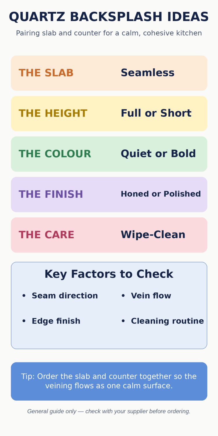
| No grout advantage | A seamless slab wall has almost no grout, which is the main everyday advantage over tiling. |
| Pans off the wall | Keeping hot pans off the wall surface protects both stone and finish over the years. |
| Cover the splash zones | A backsplash that runs behind the hob and sink covers the two zones where splashes actually happen. |
| Like it at arm's length | Choosing a pattern you like at arm's length matters more than one that only impresses up close. |
| Choose for the long term | A quartz backsplash is a long-term choice, so pick the colour you will still like when trends move on. |
1. A seamless wall
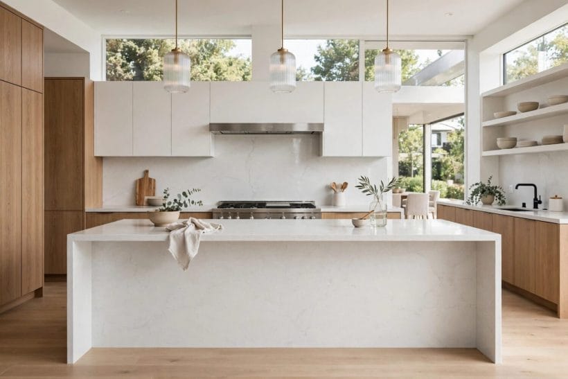
A single slab running from counter to wall cabinets gives a seamless, calm wall with almost no joints to clean. Without grout lines breaking the surface, the eye travels smoothly across the kitchen, and everyday splashes wipe away from one continuous face rather than settling into seams.
2. The hob as anchor
A full-height slab behind the hob turns the cooking zone into the kitchen’s visual anchor. The unbroken stone frames the hob beautifully, and because the slab covers the wall where heat and splashes concentrate, it also does the hardest-working protective job in the room.
3. One material, more space
Carrying the same slab up the wall and across the counter makes a small kitchen feel larger and less broken up. Fewer material changes mean fewer visual stops, so a compact room reads as one calm space instead of a patchwork of surfaces competing for attention.
4. Soft white, quiet room
A full-height slab in a soft white keeps a busy kitchen feeling quiet, even with open shelving nearby. The pale stone reflects light gently, which helps a kitchen that relies on artificial light for much of the day feel brighter without any extra fittings.
5. Vein as artwork
A veined full-height slab works like artwork, so the rest of the wall can stay plain. When the stone itself carries the pattern, you need little else on that wall, and the kitchen avoids the cluttered feeling that comes from pattern fighting pattern.
6. Handleless harmony
Full-height slabs suit handleless kitchens, where the unbroken surface matches the flat cabinet fronts. The shared language of flat planes and hidden detail makes the whole run of units feel designed as one piece rather than assembled from separate parts.
7. Stopped at the shelf
A slab that stops at a shelf line, rather than the ceiling, gives the drama of full height without overwhelming a low room. The shelf itself becomes a natural finishing line, and the wall above can stay painted, keeping the ceiling feeling as high as it is.
8. One wall only
In a galley kitchen, a full-height slab on one wall only keeps the corridor feeling open rather than tunnel-like. Treating the working wall while leaving the opposite wall plain preserves balance, so the narrow room feels designed rather than enclosed.
Short Splashbacks and Upstands
Not every kitchen needs a wall of stone. A short upstand does the essential protective job while leaving the wall free for paint, tiles or shelves, and it suits rooms where the backsplash should support rather than steal the show.
9. A neat upstand
A short upstand, just a few centimetres high, protects the wall joint while keeping tiles or paint as the main feature. It is the quietest option in this list, doing its protective job without asking for attention, which suits kitchens where another material is meant to shine.
10. Matching the counter
An upstand in the same quartz as the counter reads as a neat, finished edge rather than an afterthought. The match is subtle but it signals care, and it avoids the awkward junction where a worktop simply stops against a painted wall.
11. Taller behind the sink
A slightly taller upstand behind the sink catches splashes where they actually land. Sinks throw water further than people expect, especially with a tall tap, so a little extra height in exactly that zone prevents the damp marks that otherwise creep up the wall.
12. Paint above, stone below
Pairing a quartz upstand with painted wall above lets you change the wall colour later without touching the stone. The stone stays put through redecorations, which makes this a flexible choice for anyone who likes to refresh a room’s colour every few years.
13. The modest choice
A short splashback suits a smaller kitchen or a first home, where a full slab would be more than the room needs. It keeps costs and visual weight down while still giving the wall its essential protection at the worktop junction.
14. Under open shelves
Upstands work well under open shelves, where a tall slab would fight the shelf line. The shelf, its brackets and its contents already fill the wall, so a low stone edge below them keeps the composition calm instead of crowded.
15. Mitred corners
A mitred upstand edge, where the quartz turns neatly at the corner, looks tailored rather than cut short. The angled joint reads as deliberate craftsmanship, and it avoids the raw cut edge that can make an otherwise tidy kitchen feel unfinished.
16. Utility corners
In a utility corner, a simple upstand is often all the protection the wall needs. Utility walls take less direct splashing than a hob or sink wall, so a modest stone edge there is proportionate rather than mean.
White and Pale Quartz
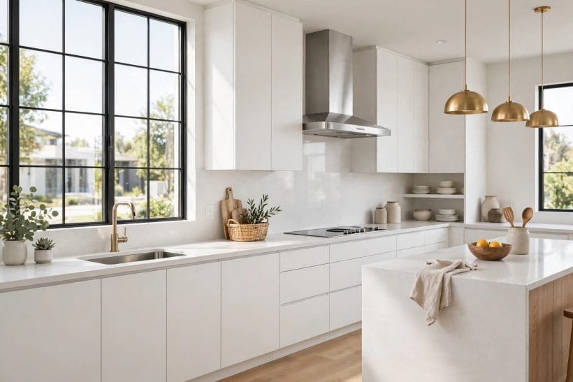
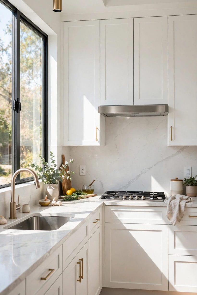
Pale quartz is the safest backsplash choice and, chosen well, far from the dullest. The differences between whites matter enormously in real light, so the ideas below focus on undertone, finish and pairing rather than on whiteness alone.
17. Brightening a dark kitchen
A soft white quartz backsplash brightens a north-facing kitchen without feeling stark. North light is cool and flat, and a warm-leaning white stone lifts it without the clinical glare that a pure, cold white can sometimes produce.
18. Quiet grey veining
Pale grey veining on white keeps the wall interesting at close range while reading as plain from the door. This is the stone to choose when you want character that reveals itself gradually rather than announcing itself the moment you enter.
19. With warm wood
A pale slab pairs easily with warm wood cabinets, balancing cool stone against warm timber. The contrast is gentle rather than stark, which is why pale quartz and oak or walnut have become such a reliable kitchen pairing.
20. Light at the hob
White quartz behind a dark hob keeps the cooking zone light and easy to wipe. The hob itself is dark by nature, so a pale wall behind it stops the cooking corner from becoming a black hole in an otherwise bright kitchen.
21. Pale on pale
A pale backsplash with pale cabinets creates a calm, continuous kitchen that suits small rooms. With no strong colour breaks, the room’s boundaries soften, and a compact kitchen feels less cramped than the same room dressed in contrasting tones.
22. Warmed by metal
Pale quartz with brass or warm metal taps warms the whole scheme without changing the stone. The metal acts like jewellery against the pale wall, adding warmth exactly where the eye rests while the stone stays cool and clean.
23. Matte in bright rooms
A matte pale finish softens glare in a kitchen with large windows. Sunlight on polished stone can bounce uncomfortably, especially at breakfast, so a honed or matte surface keeps a sunny kitchen comfortable to work in.
24. Shelves provide colour
Pale quartz with open shelving lets the shelves and their contents provide the colour. Crockery, plants and everyday items become the decoration, and the pale wall behind them stays a quiet backdrop that never competes.
Dark and Dramatic Quartz
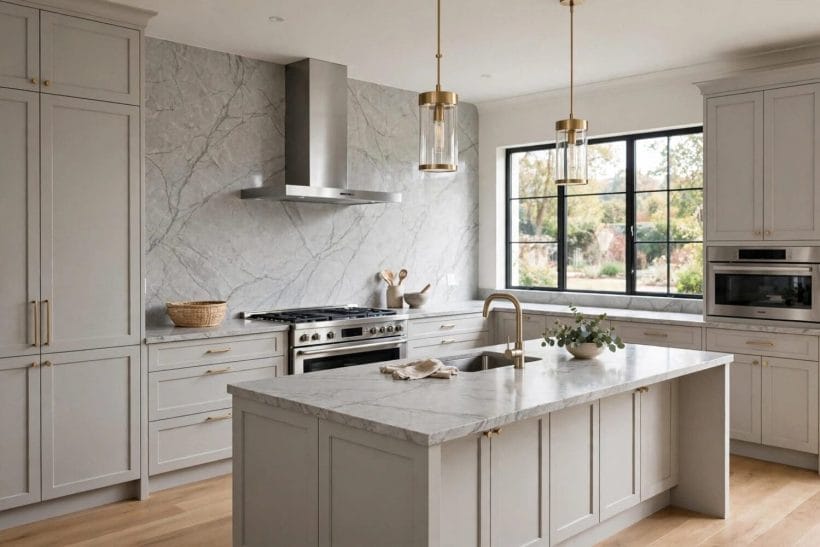
Dark stone asks more of a kitchen’s lighting and more of its owner’s confidence, but it repays both. Used in the right zone and lit well, a dark backsplash adds depth and focus that no pale surface can match.
25. A grounding line
A dark quartz backsplash grounds a pale kitchen, giving the eye a single strong horizontal line. In an otherwise light room, that dark band stops the scheme from floating away, anchoring the worktop run to the wall behind it.
26. Depth without darkness
Charcoal quartz behind light cabinets adds depth without darkening the whole room. Because the dark area is confined to the backsplash zone, the cabinets and ceiling still do the brightening work while the wall gains welcome weight.
27. Near-black elegance
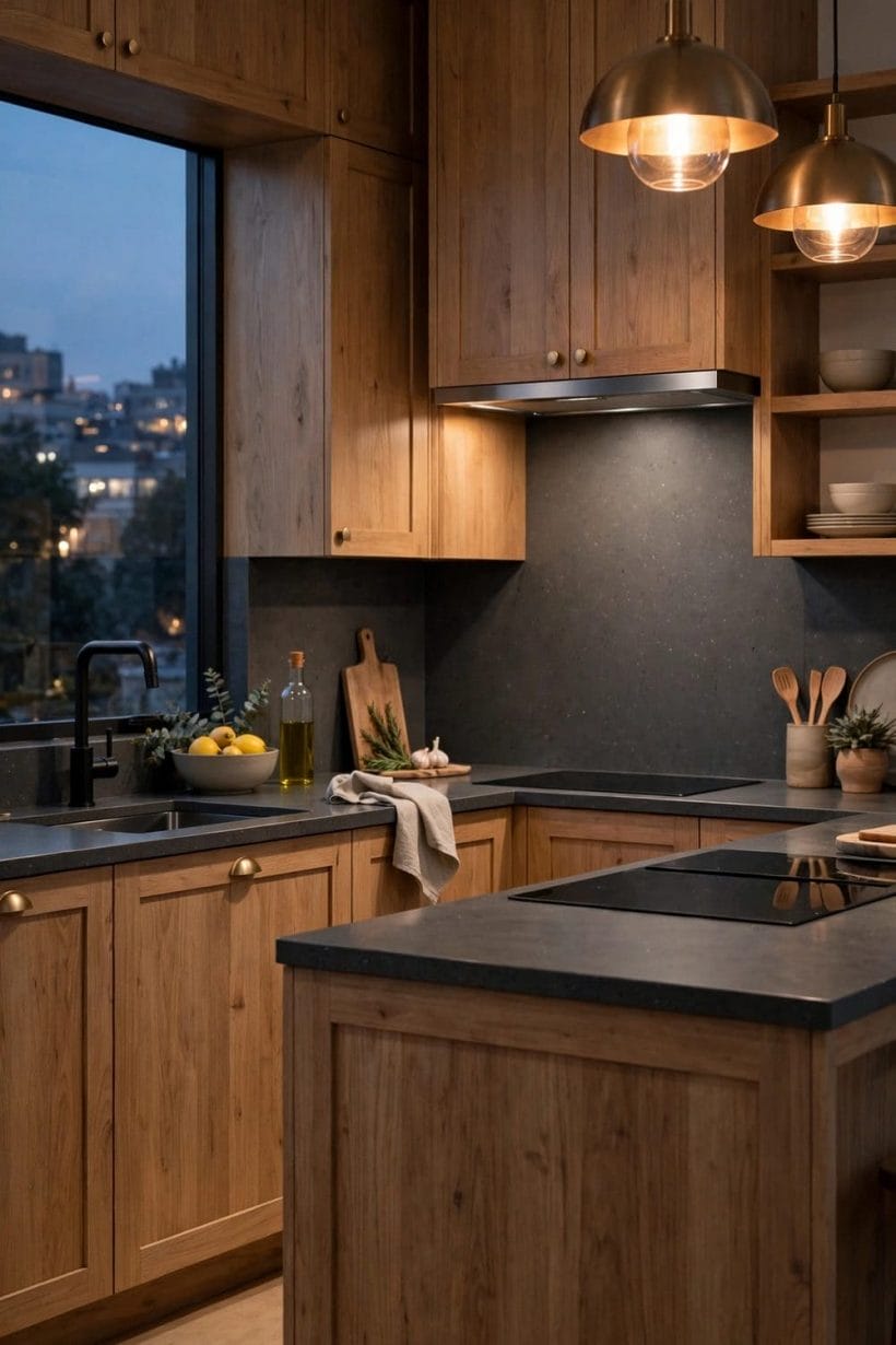
A near-black slab with subtle veining reads as elegant rather than heavy, especially with good lighting. Under-cabinet lights pick out the faint veining and keep the surface from reading as a flat black void after dark.
28. Coordinated metals
Dark quartz pairs naturally with black taps and handles for a coordinated, unfussy scheme. Matching the metal to the stone removes one more decision from the kitchen and gives the whole run a deliberately put-together feeling.
29. Hiding cooking marks
A dark splashback behind the hob hides everyday cooking marks better than a pale one. This is a practical point rather than an aesthetic one, but in a kitchen that is cooked in daily, it is the difference between a wall that always looks tired and one that does not.
30. Dark stone, warm shelves
Dark quartz with warm wood shelving balances cool stone against warm timber tones. The wood stops the dark wall from feeling cold, and the combination suits kitchens that want drama without giving up warmth.
31. Anchoring a long wall
In a large kitchen, a dark full-height slab can anchor a long wall that would otherwise feel empty. A long, pale wall can drift, but a dark stone panel gives it a centre and a purpose, especially behind the main cooking run.
32. Evening glow
Dark quartz with under-cabinet lighting glows softly in the evening, when the room is used most. Kitchens are evening rooms as much as morning ones, and a dark stone that catches warm light can feel more inviting after dark than a pale one.
Veined and Book-Matched Quartz
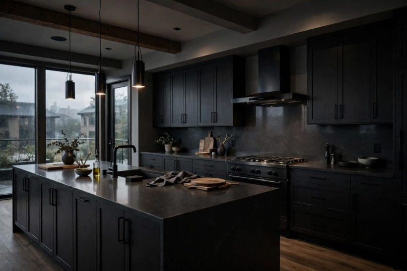
Veining is where quartz stops being a background and becomes the room’s artwork. These ideas are about using that drama well: giving the pattern room, centring it properly and keeping everything around it calm enough to let it breathe.
33. Vein as feature
Bold veining turns a backsplash into the kitchen’s feature wall, so keep nearby surfaces quiet. When the stone is this expressive, plain cabinets and a plain counter are not a compromise but a necessity, giving the vein room to be appreciated.
34. Book-matched symmetry
Book-matched slabs, where two mirrored pieces meet, create a symmetrical pattern that suits a hob centrepiece. The mirror line naturally centres the hob, so the cooking zone gains a formal, almost architectural focus without any extra decoration.
35. Sparse and calm
Soft, sparse veining suits a calm kitchen that still wants a little movement in the stone. A few gentle veins stop a plain slab from feeling flat, while keeping the overall mood as restful as a completely plain surface.
36. Echoing the counter
Veining that echoes the countertop pattern ties wall and worktop together without matching exactly. The family resemblance is enough to make the kitchen feel coherent, while the slight difference keeps it from looking like a single slab simply bent upwards.
37. Quiet shelves
A veined slab behind open shelves looks best when the shelves hold few, plain items. Busy shelving and bold veining fight for the same attention, so restraint on the shelves lets the stone’s pattern carry the wall.
38. Diagonal movement
Diagonal veining draws the eye along the wall, which can make a long kitchen feel more connected. The eye follows the vein’s direction, so a diagonal pattern can pull a long galley wall together instead of letting it split into separate zones.
39. Plain cabinets, loud stone
Veined quartz with plain cabinet fronts lets the stone do the talking while the cabinets stay quiet. This division of labour is the simplest way to use a dramatic slab well, since only one element in the room is ever competing for attention.
Warm and Honed Finishes
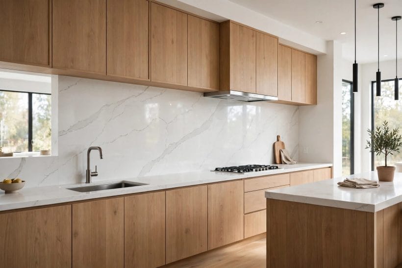
Honed and warm-toned quartz suits kitchens built around timber, texture and everyday use rather than shine. The matte surface changes how the stone feels as much as how it looks, and these ideas lean into that softer, more tactile character.
40. Soft matte warmth
A honed, matte quartz finish gives a soft, chalky look that suits relaxed, country-style kitchens. The absence of shine makes the stone feel more like a natural material and less like a polished product, which fits kitchens built around timber and texture.
41. Beige with cream
Warm beige quartz pairs naturally with cream cabinets and wooden worktops elsewhere in the room. The whole palette stays in one warm family, so the kitchen feels harmonious even when cabinets, counters and walls all differ slightly in tone.
42. Warming a cool room
A warm-toned slab can make a cool, north-facing kitchen feel more welcoming. Where pale grey stone can sharpen an already cool room, a warm beige or sand tone adds the visual equivalent of a degree or two of warmth.
43. Fewer fingerprints
Honed finishes show fewer fingerprints than polished ones, which suits a busy family kitchen. Hands touch backsplashes constantly, around taps and switches especially, so a finish that forgives marks keeps the kitchen looking cared for with less wiping.
44. Earthy company
Warm quartz with terracotta or stone flooring keeps the whole room in one earthy family. The floor and the wall then support each other instead of arguing, which matters in open-plan rooms where kitchen and living areas share one view.
45. No glare at the hob
A matte finish behind the hob avoids the glare that polished stone can throw back at the cook. Cooking already involves bright task lighting, so a surface that absorbs rather than reflects it makes the hob zone more comfortable to stand at.
46. Rich and traditional
Warm quartz with dark wood cabinets creates a rich, traditional kitchen without feeling heavy. The warmth of the stone lifts the dark timber, so the room gains the gravitas of a traditional kitchen while staying welcoming rather than gloomy.
Tile-Look and Patterned Quartz
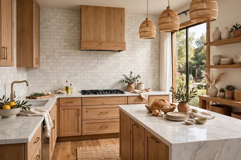
Patterned quartz offers a middle path between slab minimalism and real tiling: the rhythm of tiles with the easy care of stone. The trick is restraint, using pattern as an accent rather than letting it take over the wall.
47. Tile look, fewer joints
Quartz cut to a tile pattern gives the look of tiling with far fewer grout lines to clean. You keep the rhythm and craft feeling of tiles while removing the grout maintenance that puts many people off real tiling behind a hob.
48. Large-format rhythm
A large-format tile pattern suits a modern kitchen that wants rhythm without busyness. Bigger pieces mean fewer lines and a calmer wall, which is why large formats have become the default for contemporary kitchens that still want some pattern.
49. Subway style
Subway-style quartz pieces bring a classic feel while keeping the easy-clean stone surface. The brick pattern is familiar and timeless, so it suits kitchens that want character without committing to a trend that may date.
50. Herringbone accent
A herringbone quartz pattern adds movement to a plain wall, best kept to one zone such as the hob. Confined to a single panel, herringbone feels like a deliberate feature, whereas the same pattern across a whole wall can quickly feel restless.
51. Sink as detail
Patterned quartz behind a sink turns a practical corner into a considered detail. Sinks are often the least designed part of a kitchen, so a patterned panel there lifts an overlooked zone without any extra worktop or cabinet changes.
52. One pattern only
A geometric quartz pattern pairs well with plain cabinets, where it can be the room’s only pattern. Kitchens tolerate one strong pattern gracefully, but two competing geometrics, on wall and floor for instance, tend to make the room feel busy.
53. Bridging old and new
Tile-look quartz with a matching counter slab bridges traditional pattern and modern material. The pattern nods to classic kitchens while the material behaves like a modern surface, which suits renovations where old and new must sit together.
Edges, Joints and Finishes
The details that make a quartz backsplash look expensive are rarely the stone itself but the way it is finished. Edges, joints and the choice between polished and matte decide whether the wall reads as fitted furniture or as a slab cut to size.
54. Polished edges
A polished edge on a full-height slab catches the light and finishes the wall neatly. Where a slab ends in open wall, its edge is on show, and a polished finish turns that edge from a cut end into a deliberate detail.
55. Mitred corners
A mitred corner, where two slabs meet at a clean angle, looks more tailored than a simple butt joint. The angled join hides the slab’s thickness and reads as furniture-making rather than stone-cutting, which suits kitchens aiming for a fitted feel.
56. Joints away from heat
Keeping joints away from the hob centre, where heat and splashes concentrate, makes cleaning easier. Joints are the one place a slab wall can trap grime, so placing them where splashing is lightest keeps the wall at its easiest to maintain.
57. Metal trim lines
A slim metal trim between quartz and tile gives a crisp line where two materials meet. The trim acts as a full stop between surfaces, so neither material has to pretend to finish the other, and the junction looks intentional.
58. Polished for dark rooms
A polished finish reflects light and suits a dark kitchen that needs brightening. Every bit of reflected light helps in a room with small windows, and polished quartz returns more of it to the room than any matte surface can.
59. Matte for sunny rooms
A matte finish softens a bright, sun-filled kitchen where reflections would distract. In a south-facing kitchen, polished stone can throw sharp reflections across the worktop, while matte stone keeps the light diffuse and comfortable.
60. Follow the maker
Sealing and care advice comes from the slab maker, so follow their guidance for the stone you choose. Quartz varies by maker and finish, and the care sheet that arrives with your slab is more reliable than any general advice, including this guide’s.
61. Echoing the island
A waterfall edge on an island, carried in the same quartz, echoes the backsplash without repeating it exactly. The shared material links island and wall, while the different application keeps the kitchen from feeling like one slab repeated everywhere.
Pairings with Counters and Cabinets
A backsplash never stands alone, and its success depends on its neighbours. These ideas treat the wall, counter and cabinets as one composition, with the backsplash either matching, lifting or deliberately contrasting what sits around it.
62. Exact match
Matching the backsplash to the counter exactly creates the calmest, most continuous kitchen. With wall and worktop in one material, the kitchen reads as a single designed object, which is especially calming in open-plan rooms where the kitchen is always on view.
63. A tone lighter
A backsplash a tone lighter than the counter lifts the wall while keeping the family together. The slight lift stops the wall from feeling heavy, and the shared tone family keeps the kitchen coherent without the flatness of an exact match.
64. Veined wall, plain counter
Pairing a veined backsplash with a plain counter lets the wall be the feature and the worktop stay practical. The counter takes the daily wear, so keeping it plain also means marks show less, while the wall carries the visual interest.
65. Quartz with anything
Quartz backsplashes sit comfortably with wood, painted and handleless cabinets alike. The material is neutral enough in character to adapt, which is why it appears in traditional, contemporary and minimalist kitchens without ever looking out of place.
66. Pale above, dark below
A pale quartz wall with dark lower cabinets balances light above and weight below. The dark base grounds the kitchen while the pale wall keeps it bright, a balance that works particularly well in kitchens with limited natural light.
67. Dark wall, pale uppers
A dark quartz wall with pale upper cabinets keeps the room bright while grounding the cooking zone. The pale cabinets reflect light back into the room, so the dark stone adds drama without ever making the kitchen feel enclosed.
68. Wood above stone
Quartz with a wooden shelf above it warms the stone and gives a place for everyday items. The timber shelf breaks the stone wall at exactly the height where hands reach, and its contents add the lived-in warmth that stone alone cannot provide.
Care and Everyday Living
A backsplash is judged over years, not on installation day. These final ideas are about living with quartz: the cleaning it actually needs, the habits that protect it and the choices that still look right a decade from now.
69. The daily wipe
A daily wipe with a soft cloth keeps a quartz backsplash looking new, with no special routine needed. Quartz asks little of its owner, and that low demand is a large part of its appeal in a room that is used hard every single day.
70. Mild cleaning only
Mild, non-abrasive cleaning suits quartz, and the maker’s care guide is the final word for your slab. Harsh scourers can dull a finish over time, so the gentlest approach that removes the mark is always the right one for a surface meant to last decades.
71. No grout advantage
A seamless slab wall has almost no grout, which is the main everyday advantage over tiling. Grout is where kitchen walls age fastest, discolouring and trapping grease, so removing it from the equation removes the wall’s main maintenance burden.
72. Pans off the wall
Keeping hot pans off the wall surface protects both stone and finish over the years. Quartz tolerates normal kitchen heat, but resting a scorching pan against the backsplash is asking more of any surface than it was designed to give.
73. Cover the splash zones
A backsplash that runs behind the hob and sink covers the two zones where splashes actually happen. Walls elsewhere in the kitchen rarely need stone protection, so concentrating the quartz where water and oil land is both practical and economical.
74. Like it at arm’s length
Choosing a pattern you like at arm’s length matters more than one that only impresses up close. You live with a backsplash from across the room, not with your nose to the slab, so judge samples from the doorway as well as from inches away.
75. Choose for the long term
A quartz backsplash is a long-term choice, so pick the colour you will still like when trends move on. Stone outlasts paint trends by decades, which makes a quiet, personal choice wiser than chasing whatever pattern is currently fashionable.
Final Considerations
The best quartz backsplash for your kitchen is the one that fits the room, the light and the way you cook. Start with the height, then the colour family, then the finish, and check every choice against a real sample in your own kitchen’s light before committing.
For the wider kitchen picture, see our kitchen ideas, the solid slab backsplash guide, and quartz countertop issues to check before you buy. Wood lovers may also like knotty alder cabinets, and the general guides at tiny house designs and interior design ideas.

0 Comments