
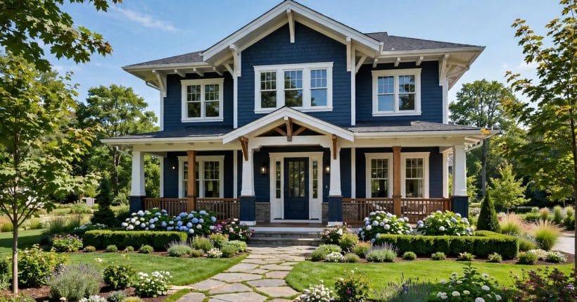
Blue is the colour homeowners reach for when they want a house that stands out without shouting. It sits comfortably in almost every landscape — coastal, wooded, suburban, rural — and it flatters more architectural styles than any other strong colour on the chart.
These seventy-five ideas work through blue houses in order: the shades themselves, how they pair with trim, the materials that carry them, and the styles they suit. The wider exterior picture lives in the exterior home ideas pillar; this post is the blue lane only, covered end to end.
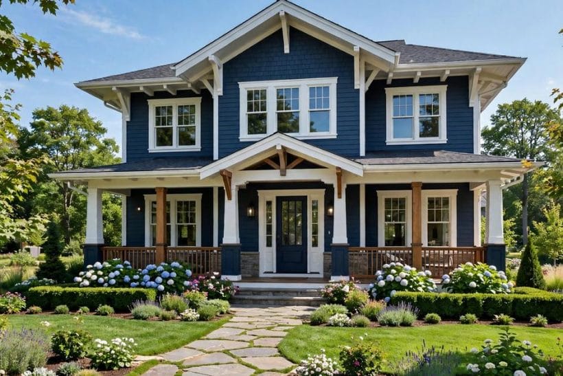
1. Blue Exterior Home Ideas at a Glance
A blue exterior is any house whose main wall colour sits in the blue family — from the palest powder and grey-blue up to deep navy that reads almost black in shade. The shade decides the mood; the trim, roof and door decide whether the blue looks classic, coastal, modern or cottage-soft. What follows is the colour covered properly: shade first, then pairing, material, style and setting, with the checks that keep a blue house looking right for years.
| Question | Short answer |
|---|---|
| Which blue suits most houses? | A mid-tone blue-grey — saturated enough to read as blue, soft enough to live with in every light |
| What trim colour is safest with blue? | Crisp white — it sharpens blue and is the classic pairing on every style from cottage to colonial |
| Does blue fade? | All exterior colours weather; deeper blues show fading sooner, so quality paint and a test wall matter |
| What roof works with blue walls? | Charcoal, weathered grey and black all sit quietly over blue; warm brown roofs fight it |
| Where does the general exterior topic live? | In the exterior home ideas pillar — this post covers the blue angle only |
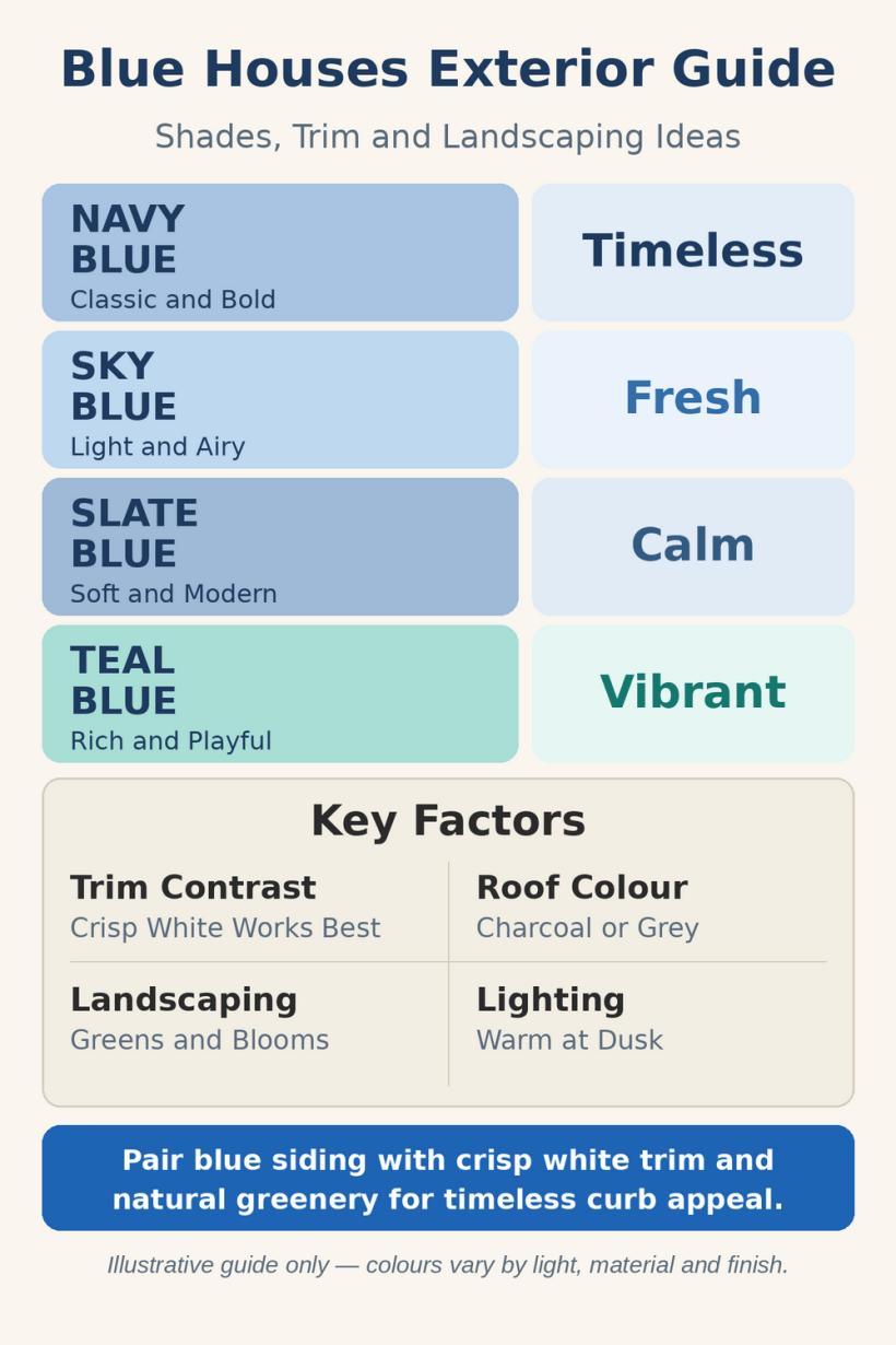
2. The Shades: From Powder to Navy
Every blue decision starts with depth. Pale blues feel like morning light and open sky; mid blues carry the classic house-paint tradition; deep blues bring drama and formality. Walk the scale before choosing — the same house reads as three different homes at three different depths.
1. Start with a soft powder blue
The gentlest entry into the family: a pale, airy blue that reads almost white at noon and unmistakably blue at dusk. It suits cottages and small houses, where a stronger colour would crowd the plot.
2. Try a grey-leaning slate blue
Blue with grey in it is the diplomat of the family — coloured enough to have presence, muted enough to sit beside any neighbour. It is the shade least regretted a decade later.
3. Use a true mid-tone blue for the classic look
The blue of traditional painted houses: clear, confident and friendly. With white trim it gives the textbook picture-book front that suits colonials, capes and farmhouses alike.
4. Go deep navy for formality
Navy walls with bright white trim read tailored and architectural. The depth swallows a large house’s bulk surprisingly well and makes brass, black or natural wood details gleam against it.
5. Pick a dusty blue for a vintage mood
Blue knocked back with a little brown or grey feels aged in the best way — the colour of old painted furniture and weathered coastal sheds. It flatters older houses and informal gardens.
6. Choose a blue-green for a coastal lean
Where blue tips toward green, the house starts to speak of water and weatherboards. The shift is subtle in the tin and obvious on the wall, so sample it outdoors before committing.
7. Keep a pale blue for a shaded plot
Under trees or on a north-facing street, deep colours go darker still. A pale or mid blue holds its identity in low light where navy would disappear into the gloom.
8. Reserve the brightest blues for small doses
A vivid, saturated blue is a wonderful door, shutter or gable colour and an exhausting whole-house one. The strong shades earn their keep as accents against calmer walls.
9. Test the shade in a vertical band, not a dab
Paint a tall test strip and live with it through a full day. Blue changes more between morning and evening than any other family, and a thumb-sized swatch hides that completely.
10. Match the depth to the house’s size
Small houses carry pale and mid blues easily; very large fronts can absorb navy without looming. Depth and scale should rise together — that single pairing prevents most blue mistakes.
3. Blue with White and Cream Trim
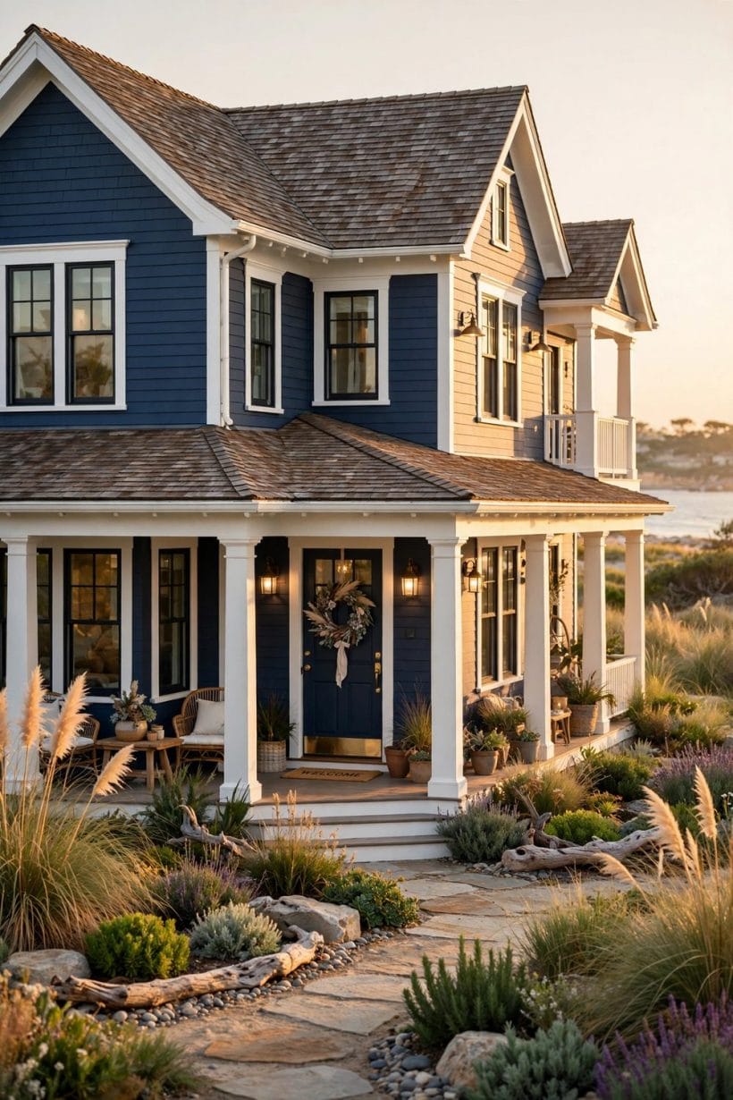
Trim is where a blue house is won or lost. White is the classic partner, cream the softer one, and the ratio between wall and trim decides whether the front feels crisp, gentle or bold. These pairings are the safe ground from which bolder experiments can start.
11. Pair mid blue with crisp white trim
The definitive combination: blue walls, white window frames, white corner boards. It has worked on every style for two centuries because the contrast flatters both colours equally.
12. Soften the scheme with cream instead of white
Cream trim takes the edge off the contrast and warms the whole front. It suits dusty and grey-blues particularly, and older houses whose style predates brilliant white paint.
13. Run white only on the window frames
Restricting white to the glazing bars and sashes gives a quieter front than full trim everywhere. The blue carries the elevation and the white simply draws the windows.
14. Add a white porch ceiling for the classic detail
A pale ceiling over the porch is a beloved tradition on blue houses — it lifts the shade of the porch and gives the entry a finished, deliberate feel from the street.
15. Use off-white on shutters to calm the contrast
Shutters in the wall colour’s pale cousin keep the front composed. Full white shutters on deep blue can chop the elevation into stripes; a softer tone keeps the rhythm gentle.
16. Let the trim disappear on a modern front
On contemporary houses, trim painted the same blue as the walls reads as one sculpted volume. The colour does the talking and the architecture keeps its clean lines.
17. Frame a pale blue house with deeper blue trim
Reversing the usual order — light walls, darker blue frames and door — gives a small house definition without any white at all. The tonal frame suits cottages and beach houses especially.
18. Keep gutters and downpipes in the trim colour
Rainware in white against blue walls draws accidental stripes down the front. Matching it to the trim — or to the wall — makes the necessary plumbing visually disappear.
19. Repeat the trim colour on the garden gate and fence
A white picket or gate in front of a blue house ties the plot to the building in one glance. It is the cheapest way to make the whole frontage feel designed.
20. Choose the white by the blue, not by habit
Blue-whites flatter cool blues; warm whites flatter dusty and green-leaning ones. Hold the trim sample against the wall colour in daylight — a mismatched white makes good blue look wrong.
4. Materials that Carry Blue
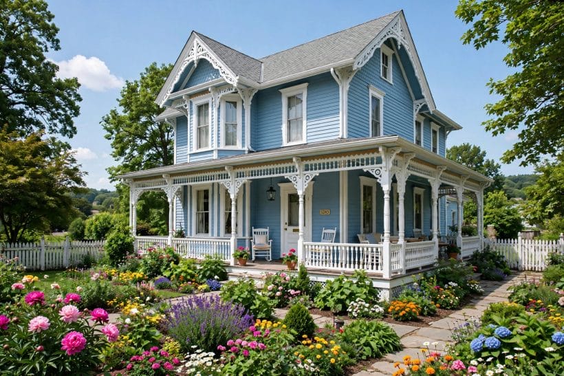
Blue behaves differently on every surface — flat and even on render, shadow-striped on weatherboard, rustic on shingles. The material is half the colour decision, and each one brings its own maintenance rhythm, covered honestly in the checks further down and in the wider paint versus stain guidance for timber fronts.
21. Paint weatherboard blue for the classic rhythm
Horizontal boards break the colour into soft shadow lines that change through the day. Blue weatherboard is the coastal and country standard, and it forgives an imperfect wall better than render.
22. Use shingles stained a weathered blue-grey
Cedar shingles left to silver, or stained a blue-grey, give texture no flat paint can match. The colour sits in the wood rather than on it, aging gracefully between coats.
23. Render a modern house in a flat mid blue
Smooth render takes blue evenly and makes the colour read as pure shape. On simple modern volumes a flat blue is striking; keep the detailing minimal and let the planes speak.
24. Try board-and-batten in deep navy
Vertical battens give a tall, tailored texture that navy suits perfectly. The rhythm of light and shadow down each board stops a dark colour from reading as one flat mass.
25. Pair blue brick stain with stone at the base
Painted or stained brick in a soft blue over a natural stone plinth grounds the colour in something earthy. The stone keeps the blue honest and the blue keeps the stone cheerful.
26. Keep one elevation in natural timber against blue
A cedar-clad gable or porch against blue walls gives the scheme warmth and contrast in a single move. The natural wood stops the blue from feeling applied rather than built.
27. Choose fibre-cement boards where weather is hard
On exposed plots the board itself matters as much as the colour. Modern boards hold paint well and keep a blue finish even where timber would demand constant attention.
28. Let a metal roof finish the material story
A standing-seam roof in charcoal or black over blue walls is the contemporary farmhouse formula. The crisp metal line sharpens the whole elevation and sheds weather for decades.
29. Use blue as the mortar-wash over old brick
A thin colour wash lets brick texture breathe through a soft blue veil — a forgiving way to bring a tired red-brick front into the blue family without hiding its character.
30. Match the material to the street, not just the house
A blue render among brick neighbours shouts; blue weatherboard among timber houses blends. Reading the street’s materials first keeps a bold colour feeling neighbourly rather than defiant.
5. Doors, Roofs and the Details that Finish Blue
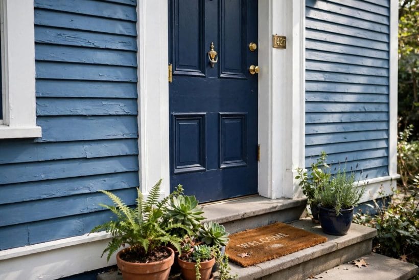
Once walls and trim are settled, three decisions finish the scheme: the roof colour above, the door colour at the centre, and the small hardware details the eye lands on. Blue is generous — it hosts more door colours happily than any other wall colour.
31. Set a natural wood door against navy walls
Warm timber in a field of deep blue is one of the great front-door combinations. The wood glows, the blue deepens, and the entry needs nothing else to announce itself.
32. Paint the door a paler blue than the walls
A tonal door — same family, two shades lighter — gives a calm, designed front. It suits homeowners who want the blue story told quietly rather than announced.
33. Use a black door and black shutters on mid blue
Black accents give blue a tailored, almost formal edge. The combination suits traditional houses and reads smart in every season and every light.
34. Try a yellow door for the brave, classic contrast
Yellow and blue are natural opposites, and a butter or ochre door on a blue house is a beloved cottage pairing. Keep the yellow muted; the contrast is already doing the work.
35. Choose a red door only on the palest blues
Red against deep blue argues; red against powder blue charms. The pairing belongs to small, pale houses where both colours stay gentle and neither has to win.
36. Keep the roof charcoal over any blue
Charcoal shingles are the neutral that never fights blue. They recede, they weather evenly, and they let the wall colour hold the street’s attention undisturbed.
37. Avoid warm brown roofs over cool blues
Brown shingles carry red and orange undertones that argue with blue all day long. If the roof is fixed and warm, lean the wall colour green-blue or dusty, which can meet it halfway.
38. Repeat the door colour in the window boxes
Planters and boxes painted to match the door tie the front together at knee height. Two matched notes — door and boxes — make a scheme look planned rather than accumulated.
39. Finish hardware in black or brass, not chrome
Blue flatters warm and dark metals; bright chrome reads cold against it. Black is the modern choice, aged brass the traditional one — either beats silver on a blue front.
40. Light the entry with a warm-toned lantern
Warm light against blue walls at dusk is the combination that sells the whole scheme to the street. A single well-placed lantern does more than any daytime detail.
6. Blue by House Style
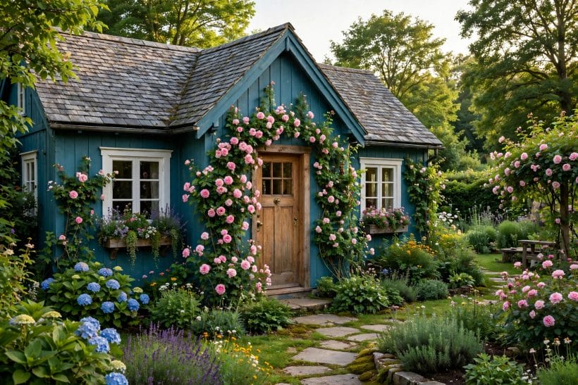
Blue is the rare colour that nearly every architectural style can wear — but each style wants a different depth and a different partner. The neighbouring colour lanes make the point: the grey exterior post covers the neutral family, while shaped houses like the split-level exterior and the tall four-story exterior each take colour in their own way. Here is blue, style by style.
41. Dress a colonial in mid blue and white
Symmetrical fronts were made for the classic pairing. Mid blue walls, white trim, black shutters and a dark door give a colonial its most historically comfortable suit.
42. Give a cottage a dusty or powder blue
Small, informal houses want soft colour. Dusty blue with cream trim and a garden spilling over the fence is the cottage picture at its most settled and least forced.
43. Take a beach house blue-green and weathered
Near the water, blue-green walls with white or silvered timber trim feel inevitable. Let the finish weather a little; a too-perfect paint job argues with the setting.
44. Paint a farmhouse navy with a metal roof
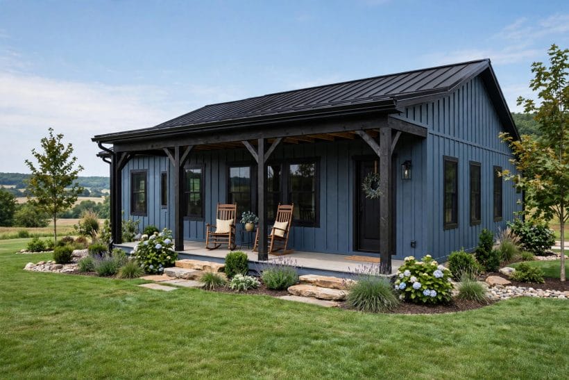
The modern farmhouse formula — deep blue board-and-batten, charcoal roof, natural wood porch posts — reads both rooted and current, and suits new builds on rural plots.
45. Keep a modern house in one flat blue volume
Contemporary architecture often wants a single colour with no trim contrast at all. A mid or deep blue across render or panel makes the form itself the whole statement.
46. Soften a Victorian with muted, layered blues
Ornate fronts can carry two blues — a muted body colour with a deeper one on the trim and details. The layering respects the architecture’s love of picked-out detail.
47. Use pale blue on a bungalow with stone piers
Bungalows sit low and wide; pale blue keeps them light while natural stone porch piers ground the scheme. The combination is calm, crafted and very liveable.
48. Try slate blue on a shingle-style house
Shingle houses and slate blue were made for each other — grey-blue stained shingles, white trim, and a weathered roof give the rambling coastal-classic look in full.
49. Give a tiny house a confident mid blue
Small footprints take strong colour bravely. A mid blue on a tiny house exterior makes the little building read as a jewel in its clearing rather than a shed that wandered in.
50. Let a brick terrace join in with a blue front door only
Where walls cannot change — brick terraces, listed fronts — the blue story can still be told at the door, the frames and the railings. A partial scheme, consistently kept, reads as deliberate.
7. Blue in the Landscape
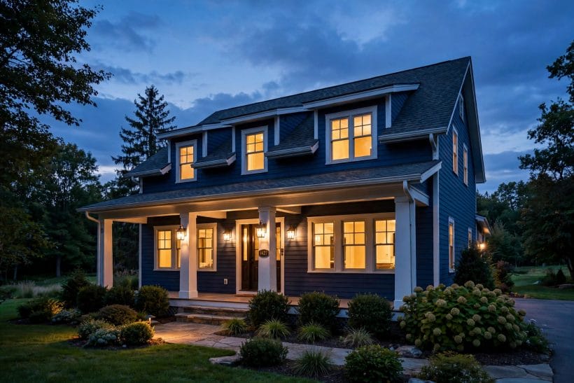
A blue house is always seen against green — lawn, hedge, trees, sky. The planting in front of it can sharpen the colour or fight it, and the hard landscaping at its feet sets the tone before the door is reached.
51. Plant deep green against blue for contrast
Dark evergreen foliage is blue’s best frame: the green deepens, the blue brightens, and the house sits composed in its garden in every season of the year.
52. Use silver and grey foliage to soften the front
Silver-leafed plants bridge blue walls and green lawns gracefully. A drift of grey foliage at the foundation line makes the colour change feel planted rather than painted.
53. Keep foundation planting low under pale blues
Tall shrubs against a pale house eat the colour and the windows together. Low, mounded planting keeps the light walls visible and the front open and welcoming.
54. Choose a pale gravel or stone path to the door
Light hard landscaping reflects daylight up onto blue walls and keeps the entry bright. Dark tarmac against dark blue can make the whole approach feel heavy.
55. Let white and yellow flowers do the accenting
Against blue, white flowers read crisp and yellow ones read joyful — the two easiest planting accents the colour has. Pink can argue with some blues; test it in one bed first.
56. Frame a navy house with lawn, not shrubs
Deep blue needs breathing room. A clean lawn edge and a few sculptural plants suit navy better than a crowded border pressing against the walls.
57. Grow a climber on a trellis beside the door
Green climbing growth softens the junction between wall and garden and gives a blue front a lived-in softness. Keep it on a trellis, off the siding, for the paint’s sake.
58. Match the fence to the trim to extend the scheme
A boundary fence in the trim colour carries the house’s palette to the plot’s edge. The whole property then reads as one composition rather than a house plus a fence.
59. Site a blue house to borrow the sky
On open plots, blue walls under a big sky double their effect — the colour rhymes with what’s above it. It is the one wall colour that gains from an exposed, unsheltered setting.
8. Light, Weather and Fading
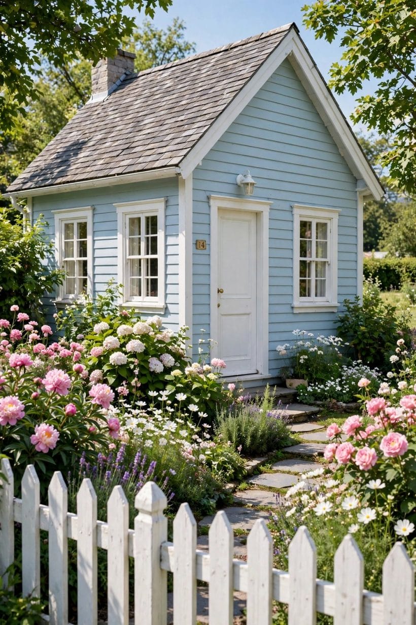
Blue is the most light-sensitive of the common house colours, and the most honest about weather. Choosing it well means choosing it for the light the house actually gets — and planning for how the colour will age on each elevation.
60. Expect south walls to lighten first
Sun-facing elevations fade fastest and blues show it early. A slightly deeper shade on the sunniest wall, or the best paint the budget allows, keeps the house even for longer.
61. Watch north walls go deeper and greener
In permanent shade, blue drifts dark and can tip green under trees. Choose a cleaner, slightly warmer blue for shaded houses so the drift lands on blue, not on murk.
62. Judge the colour on a grey day, not a sunny one
Sunlight flatters every blue; overcast light tells the truth. If the shade still pleases under a flat grey sky, it will please in the light the house wears most of the year.
63. Plan repainting by elevation, not by house
The sunny gable may need attention years before the sheltered front. Painting elevation by elevation keeps a blue house fresh without the cost of a whole-house campaign each time.
64. Keep the formula recorded for touch-ups
Blue touch-ups show when the mix is even slightly off. Keep the exact paint, base and tint recorded in the house file — future you will be grateful every single time.
65. Choose quality paint for saturated blues
Deep blues need more pigment and punish cheap paint with chalking and patchy fade. On this family more than any other, the better tin is the cheaper decision over the decade.
66. Let weathered blue-grey be a finish, not a failure
On informal houses — beach, country, shingle — a blue that silvers gently with age is a look in its own right. Decide in advance whether the house is a crisp-blue or a weathered-blue house.
67. Wash the walls before judging the colour
Grime greys every blue and convinces owners the paint has failed when it has only dirtied. A gentle wash each spring restores the colour and postpones repainting by years.
9. Blue Beyond the Walls
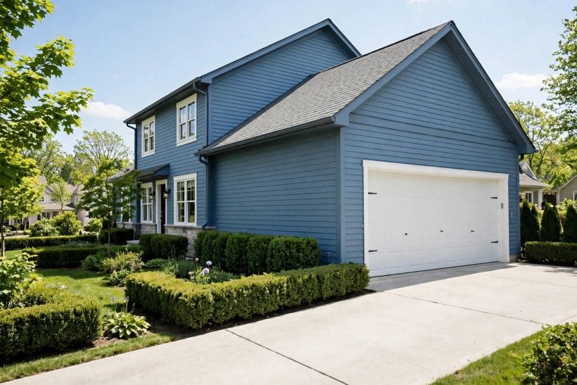
The colour story need not stop at the walls. Outbuildings, fences, garden structures and even the garage can carry blue in ways that make the whole plot feel composed — or, dosed carelessly, can tip a good scheme into a theme park.
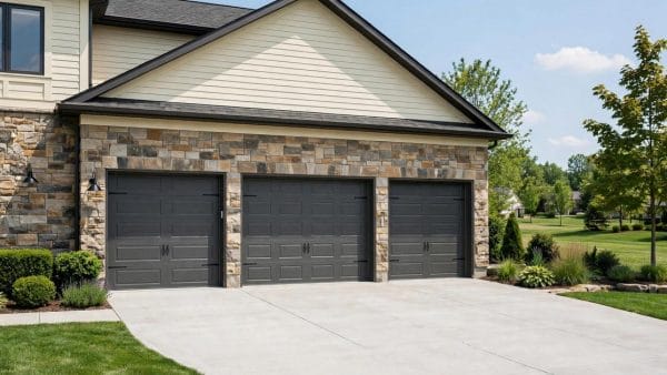
68. Paint the garage to match the house exactly
A detached garage in the same blue and trim reads as part of the architecture; a garage in any other colour reads as an apology. Match it fully, including the door treatment.
69. Give the shed the wall colour, one shade deeper
Garden buildings sit against green, which deepens colour visually. The house blue taken one shade deeper keeps the shed in the family without stealing the house’s role.
70. Use blue on a garden room for a deliberate echo
A summerhouse or studio painted to match the house ties the far end of the garden to the near one. The echo across the lawn is one of the most satisfying moves a plot can make.
71. Keep fences neutral and let the house hold the blue
One blue building per view is usually enough. Fences in soft green, grey or natural timber let the house’s colour stay the single strong note the eye lands on.
72. Repeat blue in one piece of outdoor furniture
A bench or a pair of chairs in the wall colour near the door is the lightest possible echo — movable, cheap, and just enough to say the scheme was thought about.
73. Paint a blue ceiling on the porch roof
The traditional pale-blue porch ceiling belongs here too: it is blue beyond the walls in its most charming form, and it suits blue houses of every depth and style.
74. Let the mailbox and house numbers join quietly
Small metal details in black or brass keep the blue company without adding new colours. Consistency in the small things is what makes a scheme feel finished from the kerb.
75. Stop adding blue before the plot feels themed
The last idea is restraint: walls, one echo, and done. Blue charms as a house colour and tires as a total environment — knowing where it stops is the mark of the best blue houses.
10. Choosing and Checking Before You Commit
Blue rewards a little method. Start with the street: note the neighbours’ colours and the plot’s light, then shortlist three depths — pale, mid, deep — and paint a tall test band of each on the least-seen elevation. Live with the bands through sun and cloud before choosing; blue changes its mind more between lights than any other colour.
Check the roof next: if it is warm-toned and staying, lean the shortlist toward dusty or green-leaning blues that can meet it. Confirm the trim pairing against the actual wall sample, in daylight, not under shop lights. Finally, walk the plan past any local rules — some streets and historic districts guide exterior colour, and a quiet check first beats a repaint order later. The maintenance rhythm for timber fronts is covered in the paint versus stain guidance linked earlier; for everything else, the rule is simple: better paint, recorded formula, washed yearly.
One last check belongs to the street rather than the house: view the finished colour from the pavement, not the garden. Blue that glows beautifully among your own shrubs can read cold and flat against a grey road and a pale sky, and the street’s view is the one the house presents to the world every day. If the colour holds from across the road in flat light, it will hold anywhere — and if it falters there, a half-shade deeper or a warmer trim is usually the whole correction.
Final Considerations
Blue endures as a house colour because it does two things at once: it gives a home a clear identity on its street, and it stays gentle enough to live with for decades. Choose the depth for the house’s size and light, pair it with trim that flatters rather than fights, and let the planting and the sky do the rest. The seventy-five ideas above are a menu, not a manifesto — the best blue houses usually come from three or four of them, kept consistently.

0 Comments