

Two whites can look identical on a tiny swatch and completely different on your walls. One leans warm and forgiving, the other cleaner and brighter — and the right choice depends on your light, your floors and the mood you want.
Here is a calm, side-by-side look at both favourites, with sampling tips that actually work in real rooms.
1. The Quick Answer: Two Whites, Two Personalities
Most people arrive here after searching for Benjamin Moore White Dove and wondering how it stacks up against the other white everyone recommends, Pure White. The short version is simple. White Dove is loved for a soft, warm, welcoming character that rarely feels stark. Pure White is loved for a cleaner, brighter character that feels crisp and modern. Neither is a true, icy white, and neither is creamy in an old-fashioned way — they sit close together on the spectrum, which is exactly why the choice between them confuses so many people. The differences are subtle in the tin and much clearer across a whole wall, especially once floors, fabrics and daylight join the picture.
| Question | Answer |
|---|---|
| Which white feels warmer? | White Dove generally reads warmer and softer, with a gentle, cosy quality that flatters natural materials. |
| Which white feels brighter and crisper? | Pure White generally reads cleaner and brighter, with a fresher feel that suits contemporary schemes. |
| Which is safer in a dim room? | White Dove is often the kinder choice in low light, where brighter whites can turn flat or slightly grey. |
| Which suits a sunny, modern space? | Pure White often shines in strong daylight, keeping its composure where a warm white may feel a touch creamy. |
| Can I use both in one home? | Yes — many people pair one on walls with the other on trim or cabinets, but sample the combination together first. |
| How do I decide for sure? | Paint large sample boards, move them around the room, and judge them in morning, midday and evening light before buying. |
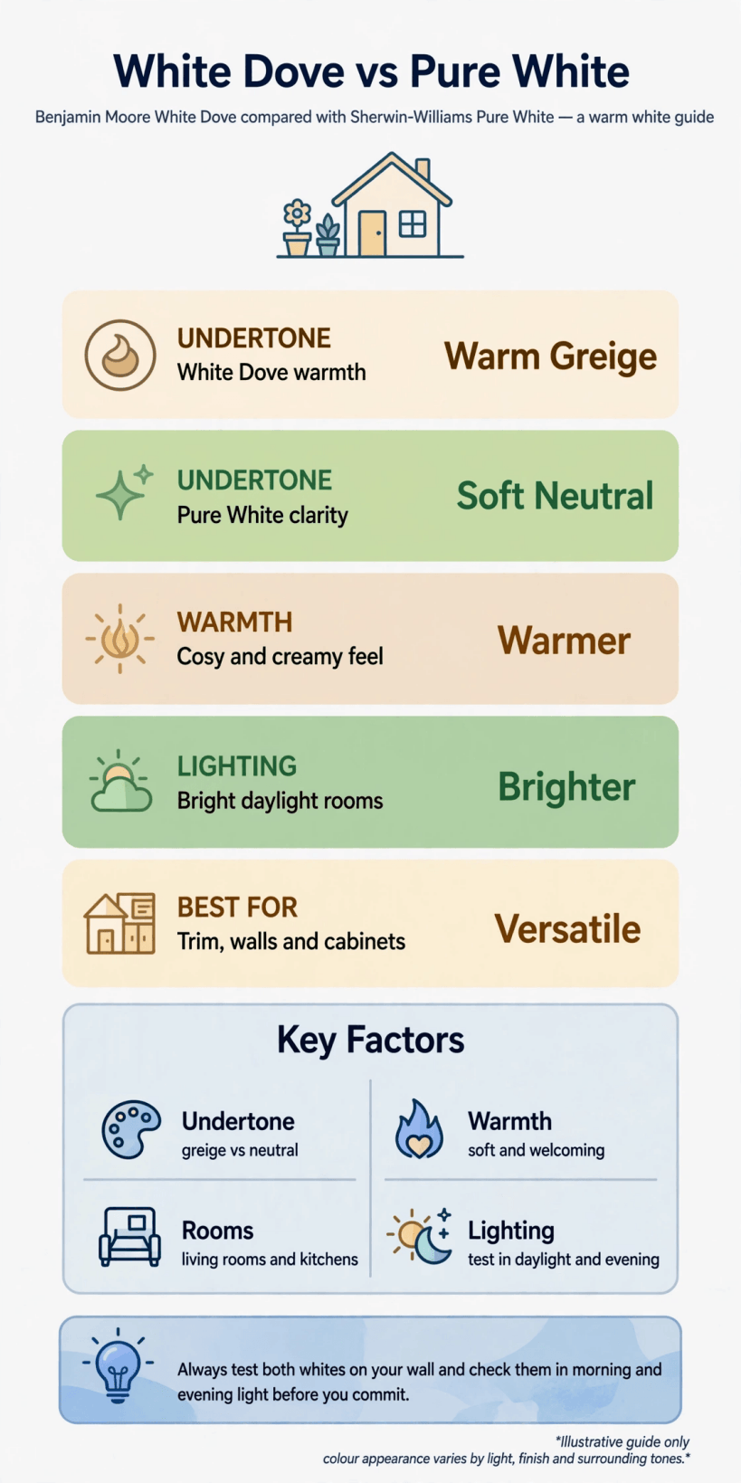
A visual summary of the two whites — their warmth, their brightness, and the rooms where each one tends to feel most at home.
Keep one idea in mind as you read on: paint colour is not a fixed thing. It is a relationship between the pigment, the light in your room and everything standing next to it. That is why two neighbours can use the same white and get noticeably different results, and why the sampling advice later in this guide matters more than any description — including this one.
2. Warm Versus Bright: The Core Difference
Stand the two whites side by side on a large board and the personalities appear within minutes. White Dove settles into itself, soft and slightly enveloping, the kind of white that makes a room feel finished rather than freshly painted. It takes the edge off strong contrasts, sits happily beside warm woods, woven textures and aged metals, and rarely draws attention to itself. In a word, it behaves like a background — present, but never pushy.
Pure White has a different energy. It lifts a room, sharpens outlines and makes neighbouring colours look a little more vivid by comparison. Artwork pops against it, black accents read crisper, and a simple white scheme feels deliberate and gallery-like rather than plain. That brightness is its gift and its risk: in the wrong light it can feel cooler and more clinical than you expected, particularly on large unbroken walls with little texture to soften it.
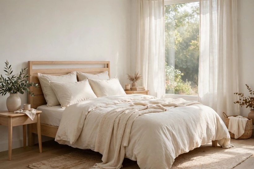
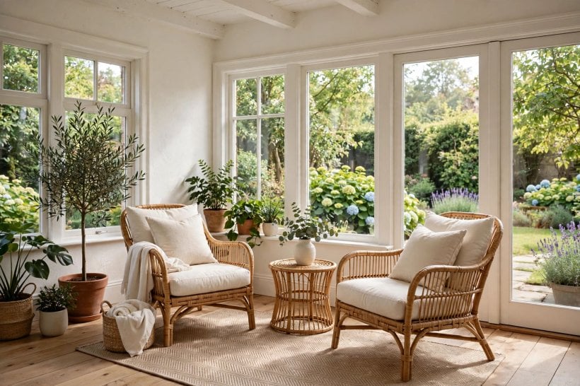
Think of the choice as setting the room’s temperature. Warm-leaning schemes — oak floors, linen sofas, rattan, warm brass — usually thank you for choosing the softer white. Cool-leaning schemes — pale grey floors, chrome, glass, black window frames — usually thank you for the brighter one. The overviews in tiny house interior paint colors show this balancing act across many small rooms, and it is worth studying your own furniture honestly before you decide which family your home belongs to.
3. How Each White Behaves in Your Light
Daylight is the strongest ingredient in any white paint. Rooms filled with warm, direct sun will push an already warm white further toward cream by the afternoon, while the brighter white tends to stay composed and simply glow. If your main living space faces the sun for most of the day and you want a clean, airy feel, that composure is a real advantage worth weighing.
Rooms with cooler, indirect light tell the opposite story. There, bright whites can lose their sparkle and settle into a flat, slightly shadowy version of themselves, while the warmer white keeps a gentle life in it and stops the room feeling chilly. This is why the same bright white that looks stunning in a sun-drenched showroom kitchen sometimes disappoints in a small, shaded bedroom at home.
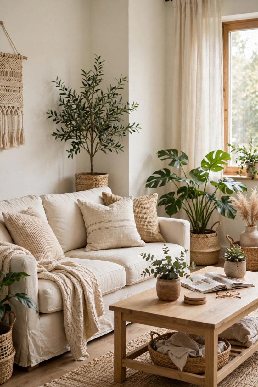
Evening light rewrites the picture again. Warm bulbs soften both paints and pull them closer together, which is comforting news if you are torn between them — after dinner, houseguests will never guess there was a dilemma. Judge your samples at the times you actually live in the room, and give extra weight to those hours. For more on designing around natural light in compact homes, tiny house and small-space interior design ideas is a helpful companion read.
4. Undertones, Explained Without the Jargon
Every white carries a whisper of another colour underneath, and that whisper is what people mean by undertone. In these two favourites, the whispers point in different directions: one toward warmth and softness, the other toward a cleaner neutrality. You rarely see the undertone alone — you see its effect. It is the reason a white can look perfect beside one sofa and oddly unsettled beside another, even though both rooms were painted from the same tin.
The easiest way to reveal an undertone is comparison. Hold your sample against a plain sheet of white paper, then against your flooring, your largest piece of furniture and any fixed stone or tile. The white will suddenly declare itself — warmer than the paper, cooler than the floor, or surprisingly friendly with both. Do this test with both paints, in the actual room, and the decision often makes itself.
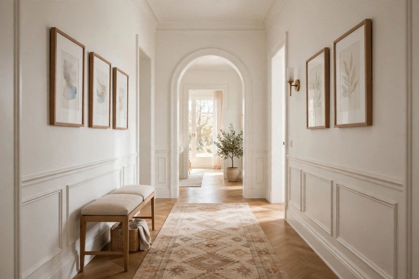
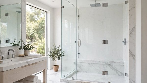
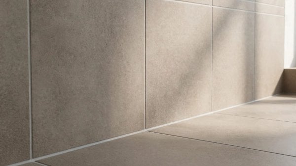
Fixed elements deserve the loudest voice in this conversation. Floors, stone counters, tiles and large appliances are expensive to change, so the white must adapt to them, not the other way round. Warm-toned stone and timber usually ask for the softer white’s diplomacy. Cool-toned stone, stainless steel and crisp porcelain usually welcome the brighter white’s clarity. Let the room’s permanent residents vote first, then let your taste break any tie.
5. Kitchens and Cabinets: Where Whites Work Hardest
Nowhere is a white judged more harshly than on kitchen cabinets. Cabinets are seen up close, in mixed light, next to counters, splashbacks and appliances, and they show every nuance a wall can hide. The warmer white is a long-standing favourite for cabinetry in classic and transitional kitchens, because it softens the boxiness of fitted furniture and pairs gracefully with warm counters, timber stools and unlacquered metals that deepen in tone over time.
The brighter white earns its place in sleeker kitchens. Flat-fronted cabinets, pale stone, integrated appliances and minimal handles all suit its cleaner register, and it can make a compact kitchen feel spotless and wide awake. If your kitchen is small — and in a tiny home it almost certainly is — that sense of freshness matters at breakfast time more than any photograph can show. The layouts in kitchen design ideas for tiny houses and small spaces give a good sense of how cabinet colour changes the whole feel of a compact cooking space.
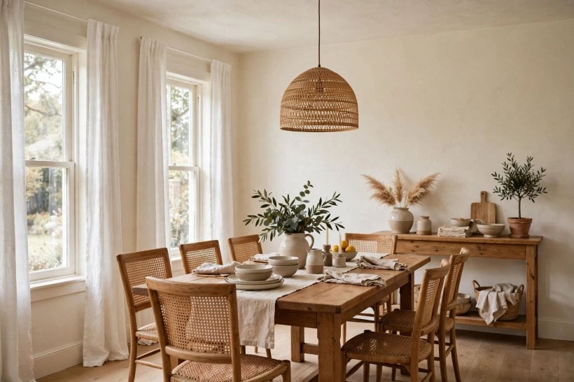
One practical rule settles many kitchen arguments: sample the cabinet colour against the counter and floor together, as a trio, never alone. A white that looks perfect on a lone door can turn quarrelsome next to a strongly veined stone or a golden timber floor. Paint a spare door or a large board, prop it in place for two full days of cooking and light changes, and only then commit the whole kitchen to it.
6. Living Rooms and Bedrooms: Mood Matters Most
In living rooms, white is the stage rather than the performance, and each of these two sets a different stage. The warmer white wraps a seating area in softness. It flatters bookshelves, textured cushions, houseplants and the warm pools of lamplight in the evening, and it forgives the slight unevenness of older walls. Rooms painted in it tend to feel gathered-in and conversational, which suits homes where the living space doubles as a reading nook, a work corner and a family cinema.
The brighter white opens a living room up. It sharpens a media wall, gives artwork a gallery confidence, and makes limited square footage feel less apologetic. In a small home that brightness can be transformative at midday. Just soften it with texture — wool throws, matte ceramics, timber side tables — so the room feels curated rather than clinical when the sun goes down.
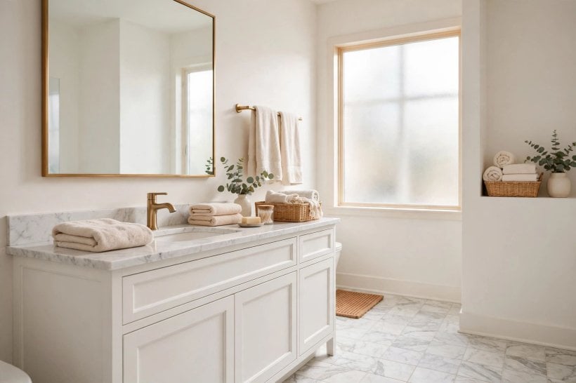
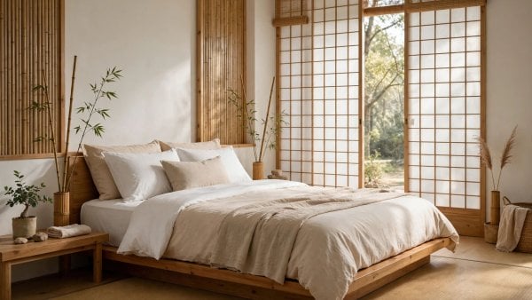
Bedrooms lean personal. If your idea of rest is a cocoon — layered bedding, warm bedside light, a soft hush — the warmer white usually supports that mood with less effort. If you wake best in a room that feels like fresh linen and morning air, the brighter white is your ally. The restful schemes in modern tiny house bedroom ideas show both moods done well, and they are a reminder that there is no universally correct white, only the white that matches the feeling you are building.
7. Trim, Ceilings and Doors: The Supporting Cast
Trim is where many white schemes are quietly won or lost. A common, elegant approach is to let walls and trim share one white but change the finish — a softer sheen on the walls, a slightly glossier one on the woodwork — so the architecture reads as one calm whole with gentle shadow lines doing the decorative work. Both of our two whites handle this treatment gracefully, the warmer giving a traditional softness, the brighter a sharper definition.
Mixing the two is also possible and often lovely: the softer white on walls, the brighter on trim and doors, creates a subtle outline that makes rooms look tailored without any obvious contrast. The reverse — bright walls, warm trim — is trickier, because the trim can appear slightly creamy next to cleaner walls, which some people love and others read as inconsistency. Sample the exact pairing on one doorway before rolling it out across the house.
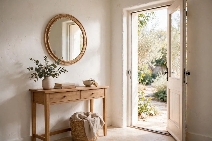
Ceilings deserve a thought, too. Carrying your wall white onto the ceiling keeps a small room feeling unbroken and taller, while switching to the brightest option overhead can lift a low ceiling in a dim room. Doors painted to match the trim disappear calmly; doors in the contrasting white become quiet features. None of these choices is expensive to test, and blue and white interior design ideas for tiny houses shows how much mileage small homes get from these understated decisions.
8. Sampling Properly: The Step Nobody Regrets
If this guide has one sermon, it is this: never choose a white from a swatch card. Cards are tiny, printed rather than painted, and viewed under shop lighting that flatters everything. Buy sample pots of both paints — the second appearance of our search phrase, Benjamin Moore White Dove, on your list, and Pure White beside it — and paint them onto large boards you can carry from room to room. Two coats, fully dried, on the biggest boards you can manage.
Then live with the boards. Prop them against different walls, beside the sofa, near the window, and behind the television. Look in the morning before the room warms up, at noon, and under your evening lamps. Photograph them if it helps, but trust your eyes in the room more than a screen. Most people find the answer arrives on day two, not in the shop, and it arrives with a confidence no colour card can offer.
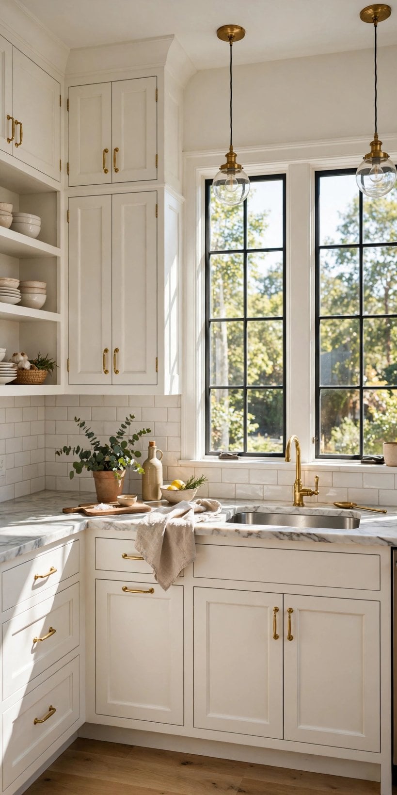
Label everything as you go — board backs, sample pots, and a note of which room each verdict belongs to, because a white chosen for a bright kitchen may be wrong for a shaded hallway in the same home. In compact homes where rooms flow into each other, also check the sightline from one space into the next. Consistency across a doorway usually matters more than perfection inside any single room.
9. Finishes, Sheens and Practical Wear
The same white behaves differently in different finishes, so choose the sheen as carefully as the colour. Flatter finishes hide gentle wall imperfections and feel calm and chalky, which flatters the warmer white in bedrooms and living rooms. Finishes with more sheen reflect more light, feel a touch brighter, and wipe clean more easily — a genuine advantage in hallways, kitchens and homes with children or dogs, where walls earn their keep.
Cabinets and trim usually take a tougher, slightly glossier finish than walls, whatever white you choose, because they are handled, knocked and cleaned the most. Keep a small amount of the exact paint, labelled with its finish, for touch-ups, and note the product name somewhere safe. White paint is notoriously hard to match from memory later, and a labelled leftover pot turns a future scuff from a repainting project into a two-minute repair.
Budget honestly for quality and quantity rather than hunting for the cheapest tin. Walls in small homes are seen at close range all day, and a paint that covers evenly in fewer coats saves time, mess and frustration that no small saving can repay. Ask your supplier to confirm coverage for your room sizes and surface condition, and buy a little more than the estimate rather than risking a mid-wall emergency run with a wet roller in the car.
10. Common Questions and Gentle Myths
One myth says a warm white will look yellow. On its own, in a suitable room, the warmer of our two reads simply as a soft white — the warmth shows mainly beside something cooler. Another myth says a bright white will feel cold and institutional. With texture, timber and warm light around it, the brighter white usually feels fresh rather than cold. Both myths survive because people judge whites in isolation, under bad light, in the worst possible viewing conditions — the paint shop.
People also ask whether one of these whites is more fashionable, as if the other were about to expire. Whites at this level of popularity endure precisely because they are not novelties. Rooms change around them — cushions, art, rugs, even flooring tones — and a well-chosen white accommodates all of it. Choose for your light and your fixed elements, and fashion becomes irrelevant. If you are planning wider changes, tiny house kitchen design ideas and how to build your own tiny house both show how a restrained wall colour lets the interesting parts of a home do the talking.
Finally, remember that two rooms in one home may honestly deserve two different answers, and that is not indecision — it is design. A shaded, cosy bedroom and a sunlit, open kitchen are different briefs. As long as the whites are cousins rather than strangers, and the transition between them happens at a doorway rather than mid-wall, the home will feel coherent and considered.
Final Considerations
Choose the warmer white if your home leans cosy, your light is soft or indirect, and your floors and furnishings run warm. Choose the brighter white if your rooms are sunlit, your scheme is crisp and contemporary, and you love a clean outline around everything. Sample both properly, in your own light, beside your own furniture — then trust the boards over every opinion, including the ones in this guide. A white chosen that way rarely disappoints, because it was chosen where it will actually live.

0 Comments