

Some rooms feel settled the moment you walk in, while others nag at you for reasons you cannot name. Very often the difference is balance: how the eye’s weight is shared across the space.
This article explains the three classic types, symmetrical, asymmetrical and radial, with plain ways to use each one, judge visual weight, and fix a room that feels quietly lopsided.
1. Balance in Design at a Glance: Why Rooms Feel Right or Wrong
Balance interior design is less about rules than about what the eye does on its own. Confronted with a room, we instinctively weigh each side of it: a tall bookcase against a low sofa, a dark wall against a bright window, a cluster of small objects against one large one. When the weights feel roughly equal, the room reads as calm, finished and welcoming. When they do not, we feel a low, persistent urge to adjust something, even if every individual piece is beautiful. The encouraging news is that balance is a skill of arrangement, not of budget. The same furniture, moved with intention, can tip a room from restless to settled in an afternoon. Designers talk about three routes to that settled feeling. Symmetrical balance mirrors one side against the other. Asymmetrical balance matches different objects of equal visual weight. Radial balance arranges everything around a centre point. Most real rooms blend all three, using one as the lead and the others in supporting roles, much as the layouts in tiny house living room ideas combine order and improvisation in very small footprints. The table below introduces the three types before the sections that follow give each one its own space.
| Balance type | How it works | Feels like | Suits |
|---|---|---|---|
| Symmetrical | One side mirrors the other around a centre line | Calm, formal, ordered | Bedrooms, formal lounges, hallways |
| Asymmetrical | Different objects with equal visual weight balance each other | Relaxed, lively, personal | Family rooms, eclectic spaces, studios |
| Radial | Elements radiate from or gather around a central point | Focused, social, dramatic | Dining rooms, round tables, fireplaces |
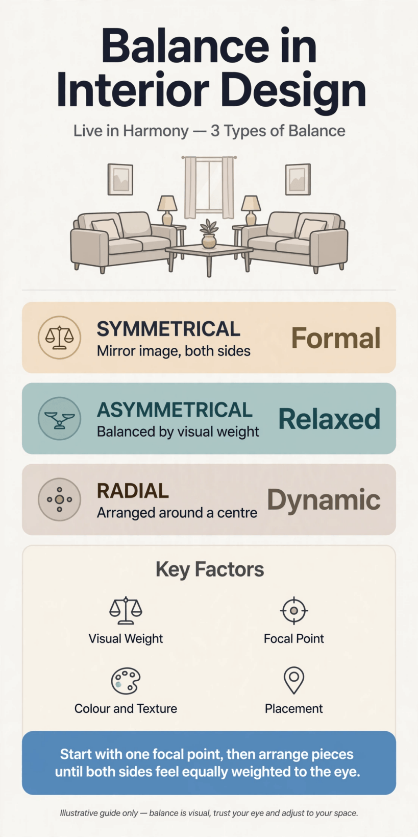
A quick visual guide to the three types of balance and the rooms each one suits.
2. Symmetrical Balance: The Mirror and Its Calm
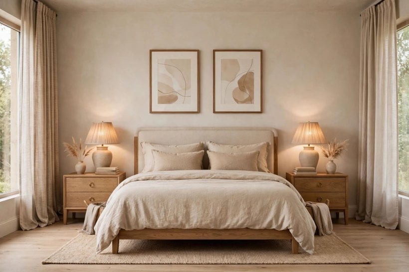
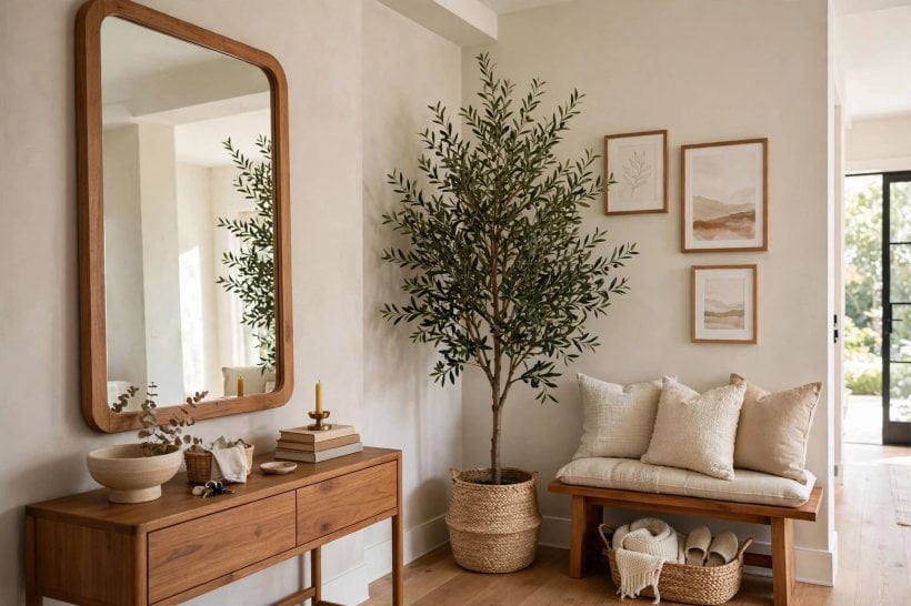
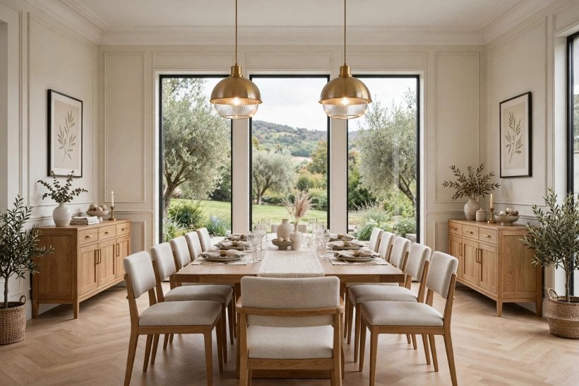
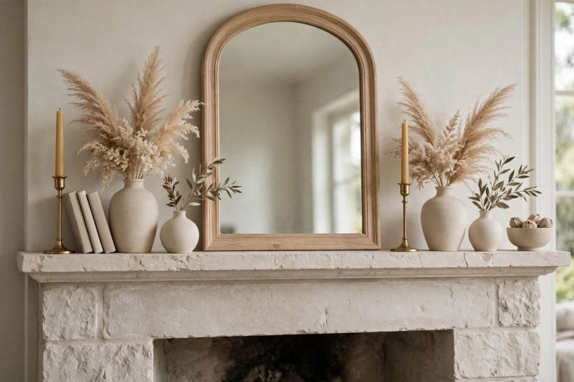
Symmetrical balance is the oldest arrangement in the book: pick a centre line, often a fireplace, a bed, a window or a piece of art, and place matching or near-matching elements on either side. Two armchairs flank a fireplace; two lamps echo across a bed; twin bookcases frame a doorway. The eye reads the pairing instantly and relaxes, because it has no work left to do. This is why symmetry dominates hotel bedrooms, formal entrances and anywhere a sense of ceremony is welcome. True mirror symmetry, where both sides are identical, is the strictest version and the easiest to get right; near-symmetry, where pairs match in size and weight but differ in detail, keeps the calm while letting a room breathe. A pair of lamps in the same shape but different finishes, or two chairs in the same fabric with different cushions, give order without stiffness. The risk to watch is monotony: a perfectly mirrored room can feel like a showroom nobody lives in. Break it gently with one organic, unpaired note, a plant, a stack of books, a throw with a mind of its own, and the symmetry becomes hospitality instead of display.
3. When Symmetry Suits: Formal Rooms and Restful Bedrooms
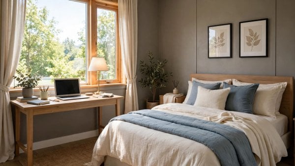
Symmetry earns its keep wherever rest or ceremony is the point. In bedrooms it is nearly unbeatable: a centred bed, matching nightstands and paired lamps create the visual equivalent of a deep breath, and the arrangement is practical too, giving each sleeper equal light, surface and reach. It is no accident that the most restful schemes in bedroom interior design for tiny houses lean on this pairing even in very compact rooms. Hallways and entrances also love symmetry, because a balanced first view, console centred, objects paired, tells visitors the house is composed and they can relax. Formal dining rooms use it around the table, and living rooms use it to give a fireplace or a large window the dignity of an altar. Symmetry is also the fastest fix for a room that feels chaotic; pairing what you already own and centring the arrangement can impose visible order in an hour. Where it struggles is in rooms with awkward architecture, offset windows, sloped ceilings or doors in inconvenient places, where forcing a mirror image fights the building itself. In those rooms, symmetry can still govern one wall or one grouping while the rest of the room follows a looser logic, and that compromise is usually the most comfortable answer of all.
4. Asymmetrical Balance: Equal Weight, Different Shapes
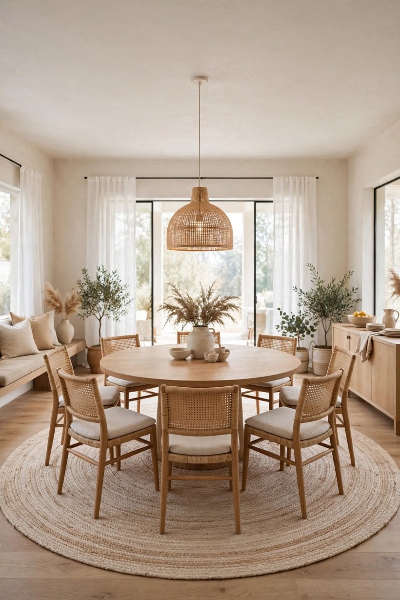
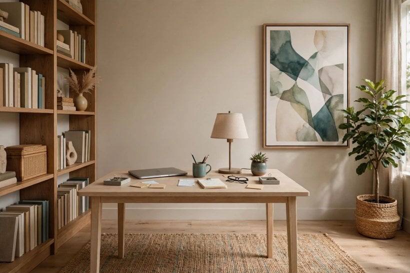
Asymmetrical balance is symmetry’s relaxed sibling, and the one most real homes actually live by. Instead of matching pairs, it sets different objects of similar visual weight against each other: a sofa on one side of the room answered by two chairs and a floor lamp on the other; a large dark painting balanced by a cluster of smaller, brighter frames. The room feels settled without feeling staged, and it can absorb the furniture you already own, including the odd, inherited and one-of-a-kind pieces that give a home its character. This is where balance interior design becomes a craft rather than a formula, because no two sides match and the judgement happens by eye. The trick is to compare weights, not shapes. Stand back, squint slightly so details blur, and ask whether one side pulls harder than the other; then adjust by adding, removing or swapping one element at a time. Asymmetry also handles real architecture gracefully: the window that sits off-centre, the radiator that cannot move, the door that breaks the wall. Rather than fighting them, an asymmetrical scheme recruits them, letting a tall plant answer a bookcase or a bright rug anchor a pale corner. Done well, it is the most forgiving and personal of the three types.
5. Working With Visual Weight: Size, Colour, Texture and Light
Visual weight is the currency all three balance types trade in, and it follows learnable rules. Large objects weigh more than small ones, but a small object in a hot, dark or shiny finish can outweigh a larger piece in pale matte fabric. Dark colours weigh more than light ones; warm colours advance and claim attention; cool colours recede and lighten a side. Texture adds weight too: rough, busy, high-contrast surfaces pull the eye harder than smooth quiet ones, and pattern weighs more than plain almost every time. Light is the invisible furniture: a bright window or a lit corner weighs heavily, which is why a lamp placed in a dull corner can balance a sunlit one. Position matters as much as the object itself, since things weigh more the farther they sit from the room’s centre, like weights on a seesaw. Practical habits follow from all this. When one side feels heavy, you have four gentle levers: shrink it, lighten its colour, quiet its texture, or strengthen the other side instead. Photographing the room and studying the snapshot, ideally in black and white, strips away charm and shows pure weight distribution, which is why designers reach for the camera before they reach for the credit card.
6. Radial Balance: Rooms That Revolve Around a Centre
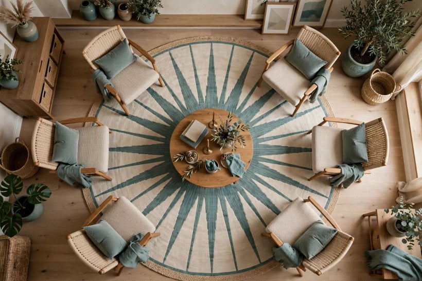
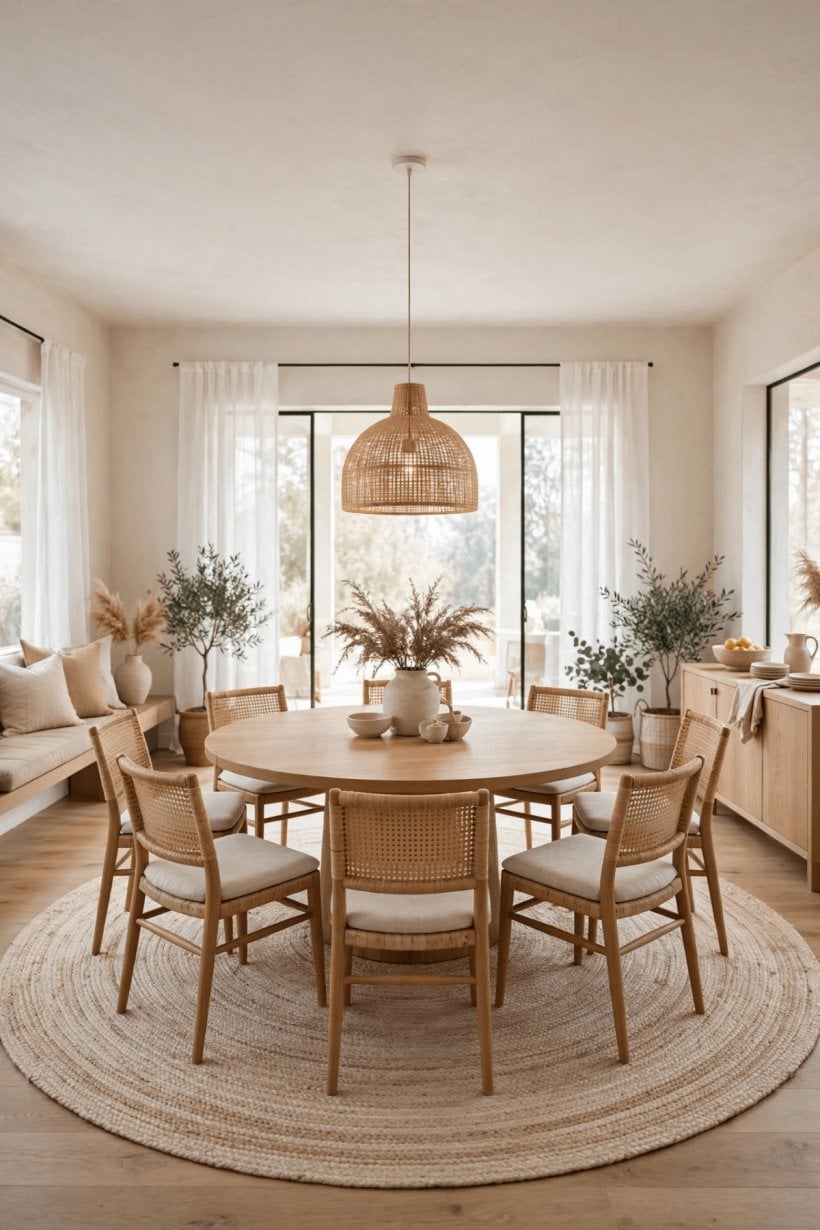
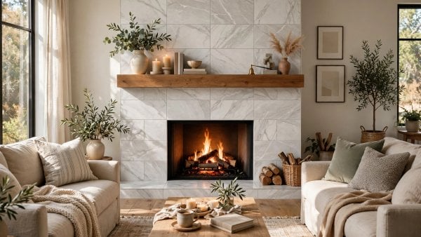
Radial balance arranges a room the way ripples circle a stone: everything relates to a centre. Dining rooms are its natural home, with chairs gathered around a table, a pendant hanging over the middle and a rug anchoring the whole constellation. Fireplaces create radial schemes too, drawing seating into an arc that faces the flames, as do round coffee tables circled by a sofa and chairs, conversation pits, and entry halls organised around a central table with a vase. The centre does the organising, so the individual pieces can be varied, mismatched, even eccentric, and the room still reads as composed. Radial balance is deeply social: it turns furniture into a gathering rather than a display, and it gives every seat a fair share of light, warmth and company. Its demands are space and honesty about the centre; a radial scheme with a weak or cluttered centre feels like a meeting nobody is chairing. Keep the middle object worthy, a table with presence, a hearth kept tidy, a pendant at the right height, and clear the circulation ring around it so people can move without breaking the spell. In open-plan rooms, a radial dining or seating group can hold its own territory beautifully inside a larger space, a trick as useful as any in colourful tiny house interiors.
7. Balancing Colour, Pattern and Texture Across a Room
Furniture is only half the scales; the finishes weigh in too. A dark accent wall needs answering, perhaps by dark-framed art, a deep-toned rug or shadowy cushions distributed on the opposite side, or the room tips toward the heavy wall like a listing ship. Colour balance rarely means equal quantities; it means equal presence. A small amount of a saturated colour, repeated in two or three places across the room, can hold its own against whole walls of a quiet neutral, and this echoing, often called repetition, is one of the most reliable tools in the box. Pattern follows the same law: one bold pattern can dominate happily if quieter patterns or plain textures elsewhere give it room, while several loud patterns at the same volume fight. Texture balances across materials as well as colours: pair the rough with the smooth, the shiny with the matte, the hard with the soft, and distribute each family around the room instead of concentrating all the timber on one side and all the glass on the other. Even the garden obeys this instinct, which is why the layered plantings in tiny house landscaping ideas repeat colours and forms across a plot to make it feel whole.
8. Balance in Small Rooms and Open Plans
Small rooms and open plans look like opposite problems, but balance solves both the same way: decide where the weight gathers, then distribute it on purpose. In a small room, every object weighs double, so choose fewer, calmer pieces, keep large items in lighter colours and finishes, and use symmetry in miniature, a centred bed or desk with paired storage, to make the space feel deliberate rather than crammed. Mirrors and glass earn their place here not as tricks but as weight-reducers, reflecting light instead of absorbing attention. A small room also benefits from vertical balance: tall, slim storage on one side answered by art or shelving at a similar height on the other, so the eye travels up as comfortably as across. Open plans need the opposite discipline: enough weight to define zones. Each zone, lounging, dining, working, should balance within itself first, using rugs, lighting and radial or symmetrical groupings, and the zones should then balance each other across the whole floor, so the heavy kitchen end is answered by an equally committed living end. The in-between furniture, consoles, plants, open shelves, acts as ballast. Studios that manage this feel like several small, calm rooms holding hands, an effect the layouts in tiny barn house interiors achieve inside single open volumes.
9. Fixing a Room That Feels Lopsided
Diagnosis comes before decoration. Stand in the doorway and let your eyes settle; notice where they land first and where they never go. Take a photograph, study it small, and try it mirrored, which instantly exposes the side carrying too much. The usual culprits repeat: all the tall furniture herded along one wall, all the colour in one corner, a gallery wall facing a blank one, the television’s black rectangle unanswered, or a bright window opposite a dark, dull corner. Fixes follow the weight rules and are mostly moves, not purchases. Shift one tall piece across the room. Move the rug so it anchors the lighter side. Hang the picture from the crowded wall on the empty one. Add a lamp to the dull corner and a plant to the stark one. Swap the dark cushions to the pale sofa and the pale throw to the dark chair. Work in single moves, stepping back to the doorway after each, because balance is a threshold you cross gradually and can overshoot. When the room finally feels settled, it often turns out nothing new was bought at all; the pieces were fine, and only their conversation needed rearranging, which is the most satisfying sentence in decorating.
10. A Simple Balancing Routine for Any Room
Finish with a routine you can run in any room, rented or owned, in under an hour. First, choose the room’s lead balance type: symmetry for rest and ceremony, asymmetry for lived-in ease, radial wherever people gather around a centre. Second, find the centre line or centre point that type needs, and arrange the largest pieces against it before touching anything small. Third, do the weight audit from the doorway: squint, photograph, and compare sides for height, darkness, pattern and shine. Fourth, adjust with the gentle levers, move, swap, lighten, repeat a colour, until both sides pull equally and the centre holds. Fifth, add the one living, slightly irregular note, a plant, books, a handmade object, so the balance feels human rather than installed. Live with the result for a week before buying anything to improve it; balance settles in the mind as much as in the room, and most second thoughts are about small styling, not structure. Keep the doorway photograph as your record. Small bedrooms reward this routine most of all, as the compact schemes in tiny house bedroom ideas show, where a centred bed and paired storage do the balancing almost by themselves. Rooms drift out of balance gradually as life adds objects, and the household that re-runs this small routine each season keeps the calm that made the room work in the first place, with no drama and very little shopping.
Final Considerations
Balance is the quiet agreement a room makes with the people in it: nothing shouts from one side, nothing is forgotten on the other. Whether you choose the mirror’s calm, the improviser’s ease or the gathering’s circle, the method is the same: weigh by eye, adjust gently, and trust the feeling of settledness when it arrives. Start with the room that nags you most, move before you buy, and let harmony prove how much of it was already in the house.

0 Comments