

Blue and white is the bathroom’s oldest friendship: water’s colour against porcelain’s, deep enough to feel composed, clean enough to feel washed. Done well it never shouts — it settles a room the way a held breath settles a swimmer.
This survey is the colour lane only within the bathroom ideas collection — blue in all its depths, carried on white. Layouts in general belong to the pillar; the neighbouring style and material lanes are linked below, not absorbed.
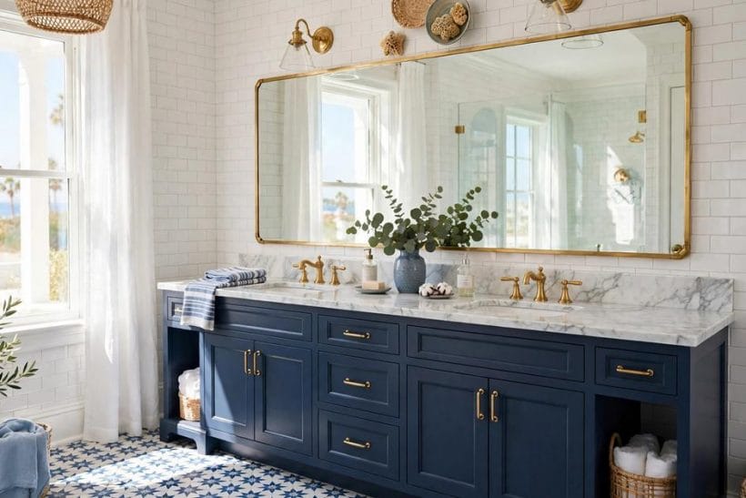
1. Blue Bathroom Ideas at a Glance
A blue bathroom is a bathroom whose colour structure is built from blue — in paint, tile, cabinetry, stone or textiles — balanced against the white of sanitaryware, paintwork or pale surfaces. Its attributes are a question of depth (ink and navy at one end, mist and powder at the other), of placement (which surfaces carry the colour and which stay white), of temperature (greens and greys inside the blue family pull a scheme coastal, classic or cold), and of company (the metals, timbers and patterns that keep blue serene rather than stark). Blue earns its bathroom keep honestly: it is the colour of water and of clean linen, it flatters skin less cruelly than many fashionable shades, and it spans from a child’s splashy family room to the most composed hotel-style ensuite without changing its nature — only its depth and its manners.
| Question | Short answer |
|---|---|
| Which blue suits a bathroom best? | The depth the room’s light can afford. Bright rooms with real daylight carry navy and ink handsomely; small or north-facing rooms usually glow better in mid and pale blues, which borrow light instead of spending it. Paint a large sample and live with it morning and evening — blue shifts temperature more than most colours as light changes. |
| Where should the blue go — walls, tiles or vanity? | One generous carrier, supported quietly. A tiled shower wall, a painted vanity, or fully painted walls each make a fine lead; two leads compete and three quarrel. The survey’s recurring pattern is one blue commitment, white sanitaryware and pale floors around it, and small blue echoes — towels, a stool, a print — tying the composition together. |
| How does blue and white avoid feeling cold? | Warmth smuggled in through the supporting cast: warm white rather than blue-white paint, natural timber, woven baskets, brass or brushed metals, and warm light. Blue itself is not the cold culprit; a scheme of blue, chrome, gloss and blue-white light is. Change the company before blaming the colour. |
| Which neighbouring lanes does this post leave alone? | Style and material have their own surveys: the classic, panelled manners of the traditional bathroom lane, the tile survey of the ceramic tile bathroom post and the all-white discipline of the white bathroom lane. Blue visits all of them as a guest; here it is the host, and colour decisions lead. |
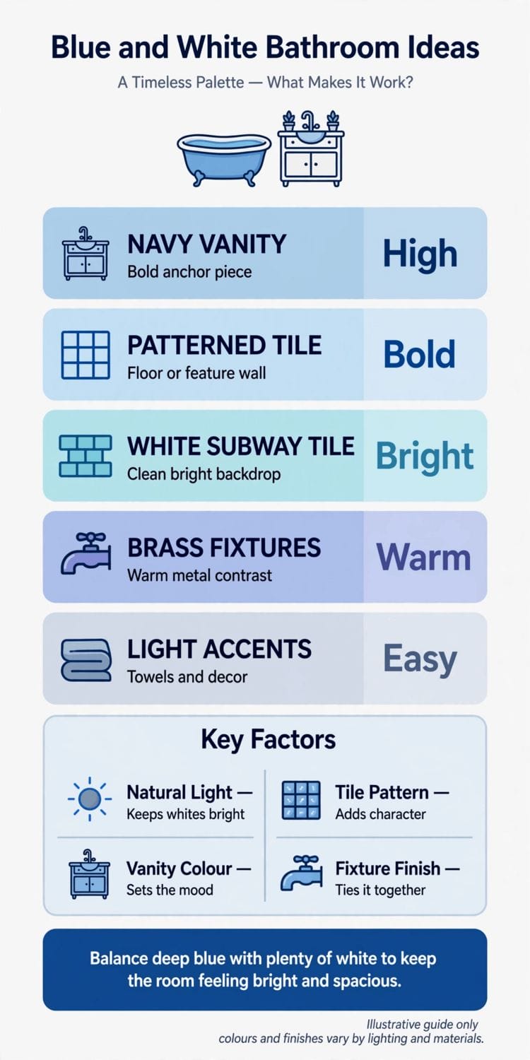
2. The Blue Ground: Paint, Tile and the Room’s Big Surfaces
Colour placement is the whole game. These first ideas set the room’s ground — the surfaces the eye takes in at once — before any fixture is chosen.
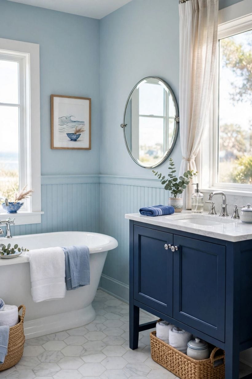
1. Paint the walls a mid blue and keep everything else white
The classic composition: blue walls as the room’s weather, white suite, white woodwork and pale floor as its light. It forgives small rooms and tired suites alike, because the colour does the decorating.
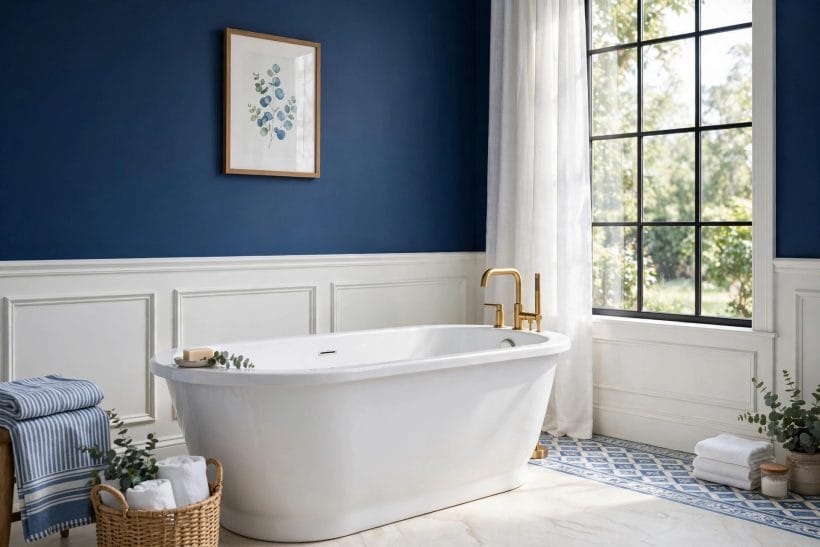
2. Take navy only as far as the dado or panelling line
Deep blue below a rail, warm white above, is the scheme’s most flattering geometry — depth where the body sits, light where the face meets the mirror.
3. Tile one wall fully and paint the rest to match its palest tone
A single tiled wall — usually the shower or the bath’s end — in a chosen blue, with painted walls pulled from the same family, gives richness without a full tile bill or a darkened room.
4. Use pale blue as the room’s idea of white
In a bright room, the palest blue on walls and ceiling reads as freshness itself, barely colour at all, while white ware gleams against it.
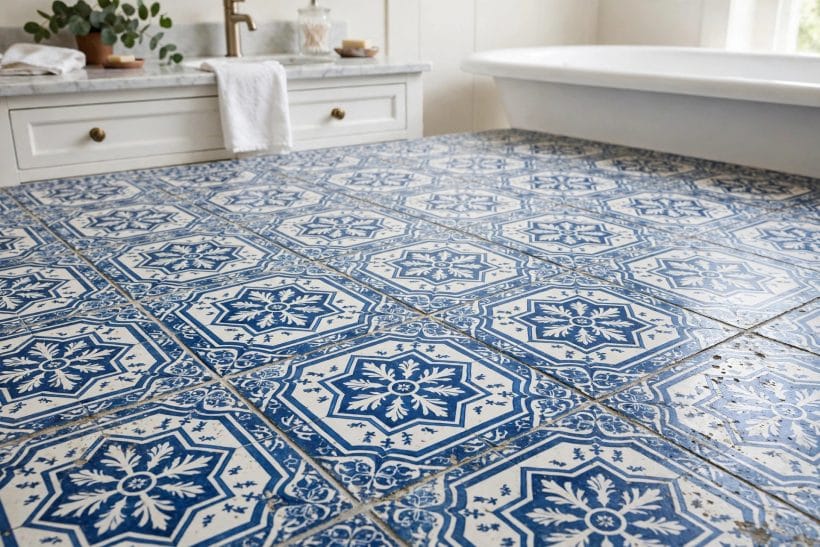
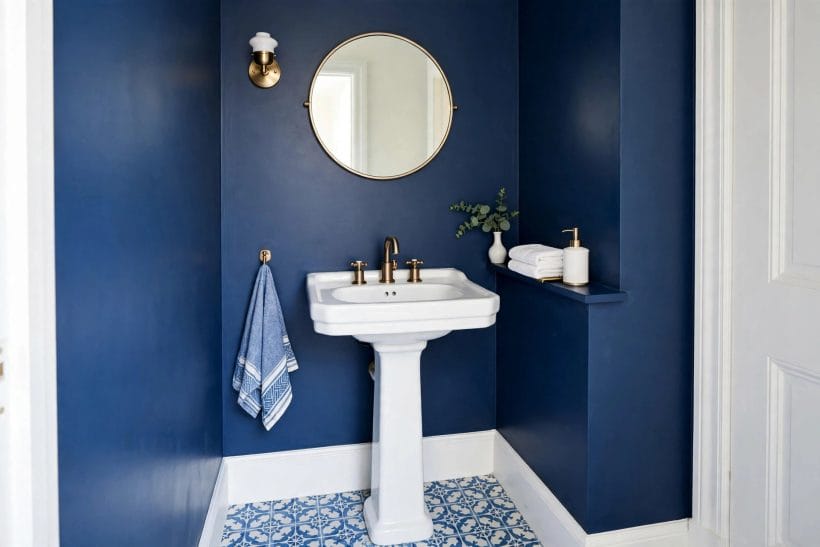
5. Lay blue and white patterned floor tiles as the room’s rug
Encaustic-look patterns underfoot let the walls stay white and calm while the floor does the smiling. Keep grout pale and the pattern’s scale matched to the room’s size.
6. Carry blue onto the ceiling of a small room
A pale blue ceiling in a compact bathroom lowers nothing and lifts everything — the sky effect. Keep walls white and the trick reads as air, not paint.
7. Choose blue-green where the light is warm
Teals and sea-greens flatter warm, sunny rooms and sit happily with brass and timber. In cool north light the same paints can turn swampy; sample against the room’s own daylight.
8. Choose blue-grey where the light is cool
Greyed blues stay composed in flat northern light and pair naturally with chrome, marble and stone. They are the tailored end of the family — serene, adult, unfussy.
9. Keep one wall white even in the deepest scheme
A single white surface — behind the mirror, say, or the ceiling kept pale — gives deep blue its contrast and the room its breath. All-blue rooms photograph boldly and live heavily.
10. Let the bath’s exterior carry the colour
A painted roll-top or slipper bath in mid or navy blue, in an otherwise white room, is the scheme in one object: generous, movable in feeling, and endlessly photogenic.
11. Match grout to the scheme, not the tile alone
Pale grout with blue tile keeps the grid fresh and graphic; toning grout softens it into a field.
3. Vanities, Mirrors and Storage in Blue
Furniture is where blue gets personal — the pieces touched daily. The modern bathroom ideas survey handles the contemporary fittings language; here the same pieces wear this lane’s colour.
12. Paint the vanity the room’s deepest blue
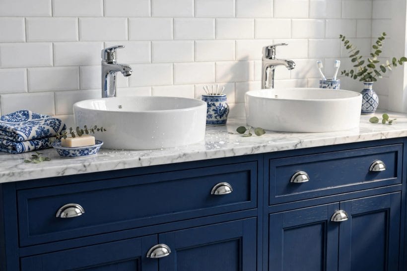
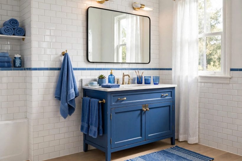
A navy or ink vanity under a white top is the scheme’s hardest-working single move: it anchors the room, hides daily splash-marks gracefully and makes white basins look carved from light.
13. Set a white basin on blue, never blue on blue
Coloured basins inside coloured vanities muddy both. The white vessel or inset basin is the scheme’s punctuation — keep it bright and let the cabinet carry the depth.
14. Frame the mirror in the vanity’s blue
A painted mirror frame echoing the cabinet ties the wall together at eye level, costs almost nothing and makes mixed furniture read as a set.
15. Use a pale blue cabinet in a child’s bathroom
Powder and sky blues on cabinetry keep children’s rooms cheerful without cartoon colours, and repaint gracefully as the children grow into mid-blue tastes.
16. Line open shelves with blue and white china
Jugs, bowls and folded towels in the scheme’s two colours turn storage into display. The discipline is strict — nothing off-palette earns a shelf — and the effect is calm abundance.
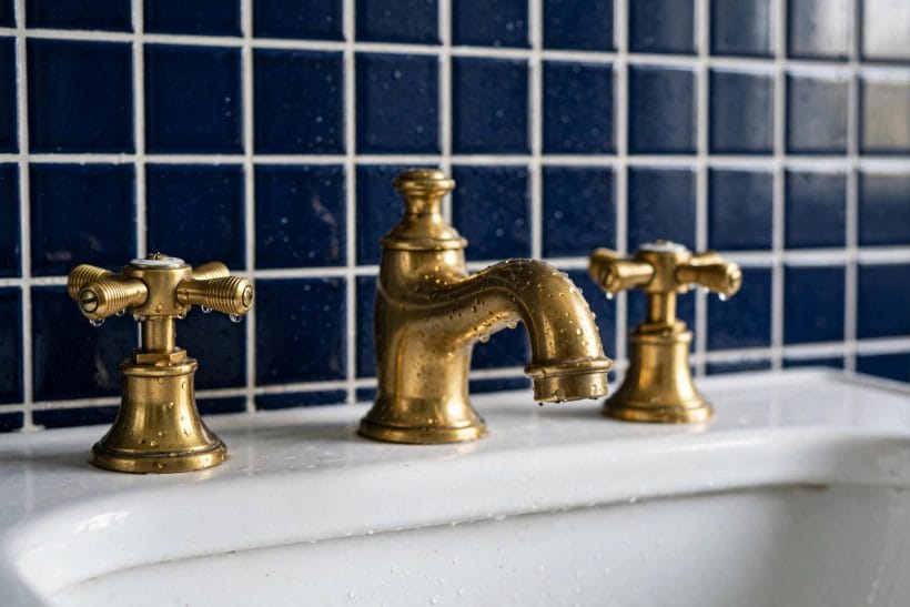
17. Paint a freestanding cabinet rather than fitting one
In awkward rooms a painted dresser or washstand in the chosen blue gives storage with furniture manners, and can move house with its owners in a way fitted units cannot.
18. Keep handles warm against blue paint
Brass, bronze and timber knobs warm a blue cabinet the way jewellery warms a dress. Chrome stays correct for the grey-blue, tailored schemes and chills the warmer ones.
19. Take blue inside the cabinet doors
A paler tint of the exterior colour inside cupboards and drawers is a private pleasure every morning — the scheme finished properly, where only the household looks.
20. Use a blue stool as the room’s movable note
A painted stool beside the bath holds towels, books and the bather’s tea, and can carry a bolder blue than any fixed surface would risk. Small, useful, changeable.
21. Mirror with a second mirror, not with more colour
Where light is short, a second mirror or a mirrored cabinet multiplies it without diluting the palette. Blue schemes live on light; guard the room’s supply of it.
22. Stencil or stripe a plain cabinet for a child’s room
A simple white stripe or stencil over mid blue personalises a cabinet for almost no cost, and paints out in an afternoon when tastes grow up. Reversibility is a family virtue.
4. Baths, Showers and the Wet Architecture
Where the water lives, blue is most at home. These ideas spend the colour on the room’s working architecture, with drainage and waterproofing left — as always — to the trades and local rules.
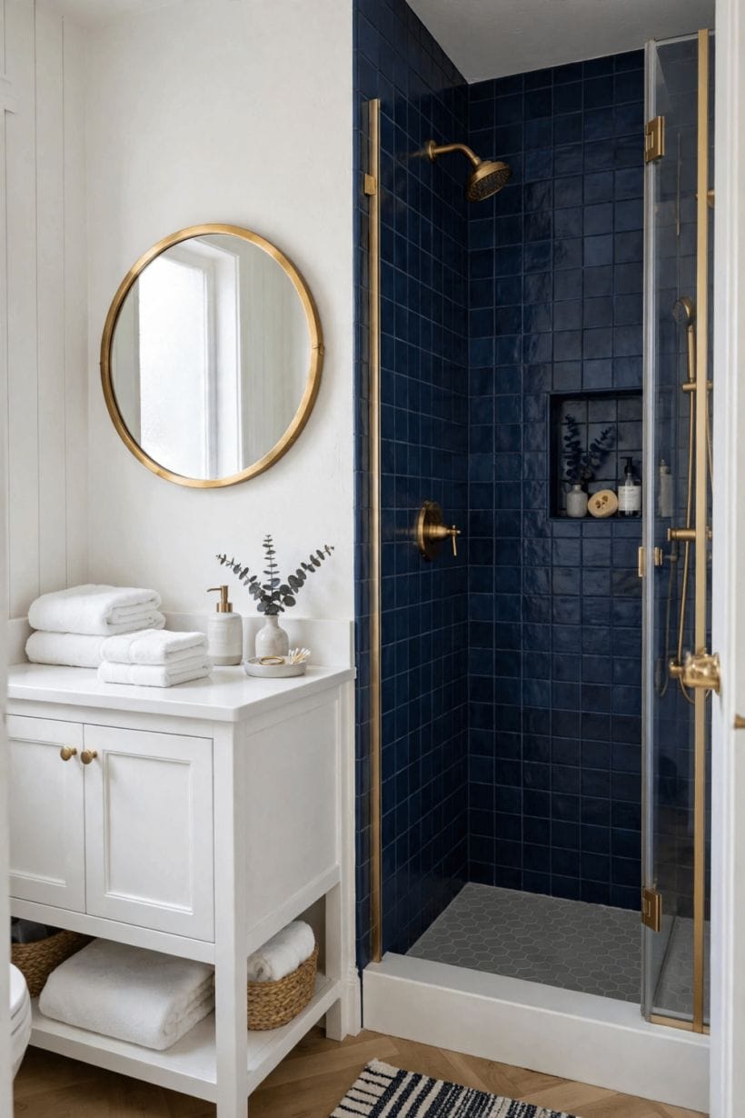
23. Tile the shower interior in graduated blues
Deeper tiles low, paler above, or one rich field throughout with a pale ceiling — the shower becomes the room’s grotto, and stepping in feels like entering the colour itself.
24. Use white subway tile with a blue feature band
A single band or panel of blue within a white tiled shower gives the scheme at a fraction of a full retile’s cost and commitment — and can be retiled alone when tastes change.
25. Set a blue mosaic floor in the shower
Small mosaics give grip underfoot, follow the floor’s falls to the drain kindly, and concentrate the scheme’s richest colour exactly where water explains it.
26. Paint the bath’s exterior navy in a white room
Repeated here as architecture rather than furniture because it works like architecture: the room’s single sculptural object, coloured. White floor, white walls, one blue bath — a composition that never dates.
27. Choose pale blue glass screens to keep light moving
Tinted and frosted screens in the palest blue-grey filter light without blocking it, keeping small showers bright. Heavy frames fight the effect; minimal metalwork preserves it.
28. Carry the floor’s blue pattern into the shower threshold
Continuing a patterned floor through the shower’s entrance — with its falls and drainage built by the tiler — makes wet rooms read as one designed space rather than a box within a box.
29. Keep white ware, always, as the scheme’s constant
Across every idea in this survey the sanitaryware stays white. It is the note that makes blue read as colour rather than as gloom, and the cheapest insurance the scheme owns.
30. Use blue inside a niche, white outside
A shower niche lined in the rich blue of the feature wall, within a white shower, gives the colour a frame and the bottles a backdrop. Small stages flatter small budgets.
31. Let a blue ceiling crown a white shower room
In a fully white wet room, a mid-blue ceiling is the one gesture the room needs — the sky over the water, in paint alone. Keep light fittings warm to flatter it.
32. Choose stone with blue-grey veining as the quiet carrier
Marbles and stones veined in blue-grey deliver the palette with no paint at all — the connoisseur’s route, judged on the slab, in daylight, before it is cut.
33. Repeat the shower’s blue in the room’s towels only
Where tiles are white and walls are white, the shower’s curtain, towels and mat can carry the whole scheme weekly-changeably. The least permanent version of the idea, and often the wisest first step.
5. Pattern, Texture and the Small Scales
Blue stays lively at small scales — pattern, weave and grain. This is also where the coastal cousin visits, and its full survey lives at coastal bathroom ideas.
34. Spend toile or a scenic print once, as wallpaper above tiling
A blue and white scenic paper above a white tiled dado is the scheme at its most romantic. One wall or the whole upper room, never both paper and patterned floor together.
35. Use ticking stripe as the scheme’s working pattern
Blue and white ticking on blinds, towels and a bath mat brings the palette’s textile soul — orderly, washable, unpretentious — and mixes with every other pattern in this section.
36. Lay a striped runner the length of a galley bathroom
Long stripes pull a narrow room’s eye to its end and make it feel intentional. Choose washable weaves and keep the stripe’s blue inside the room’s family.
37. Mix two blues, never five
A deep and a pale from the same family — ink with mist, navy with powder — give the scheme depth without discord.
38. Let willow-pattern china be the room’s art
Plates and jugs in the classic blue and white transferware carry centuries of the palette’s authority. Hung or shelved in a bathroom they read as both ornament and humour.
39. Use seagrass, rattan and pale timber as the warm texture
Natural woven textures are the scheme’s central heating. A laundry basket, a stool, a bath bridge in pale wood — each one takes the chill off blue and white without adding a third colour.
40. Choose brushed and woven textures over gloss in pale schemes
Pale blue in high gloss can feel clinical. Matt paint, honed stone, woven cotton and unglazed ceramics keep the same palette domestic and touchable.
41. Keep pattern scale honest to room size
Large patterns in tiny rooms overwhelm; small prints in large rooms fuss.
42. Use blue glass as the scheme’s jewellery
Bottles, jars and a vase in blue glass catch window light and throw it gently around the room. A windowsill row of them is the cheapest beautiful thing in this survey.
43. Fold towels as the daily restyle
White towels with a blue-edged set for guests, rolled in a basket or stacked on the stool — the scheme renewed by laundry rather than by shopping. Orderliness is the pattern here.
44. Frame small prints in white or pale timber
Blue and white artwork — coastal sketches, botanical blues, a child’s swimming certificate — in pale frames extends the scheme up the walls without a drop of paint.
6. Light, Metal and Finishing the Scheme
Final layers decide whether a blue bathroom feels composed or cold. The white bathroom lane shares the same light discipline from its own side of the palette.
45. Light blue rooms warmly, at face height
Sconces either side of the mirror, warm in tone, flatter faces and warm the whole palette. A single cold ceiling light is how good blue schemes acquire their chilly reputation.
46. Choose brass to warm mid and navy blues
Unlacquered and brushed brass against deep blue is the scheme’s most luxurious partnership, ageing gracefully together. Keep every metal in the room in the same warm family.
47. Keep chrome for the grey-blue schemes
Tailored blue-greys, marble and chrome compose the hotel register of the palette — crisp, calm and masculine in feeling. Mixing chrome with brass in one small room satisfies neither.
48. Use black accents sparingly to sharpen pale blues
A black-framed mirror, a black stool or tap accents give powder-blue rooms their outline. A little goes far; black is the eyeliner, not the outfit.
49. Bring one plant, generously
Green is the palette’s unofficial third colour, arriving by leaf. A fern, a trailing plant on the stool, eucalyptus in the blue glass vase — life against the tiles.
50. Hang a white curtain, always, at a blue room’s window
White linen or cotton at the window keeps daylight clean as it enters and stops patterned blinds fighting tiled walls. The room’s light should arrive uncoloured.
51. Seal the scheme with scent and order
A composed bathroom smells composed — soap in a dish, a candle, nothing stale on the surfaces. Colour schemes are judged partly by nose, whether households admit it or not.
52. Keep the floor pale, whatever the walls do
Across the survey’s strongest rooms the floor stays light — pale stone, white, light timber-look or the patterned exception spent deliberately. Pale floors bounce light up onto faces, where bathrooms need it.
53. Reserve the boldest blue for what can be repainted
Paint is the scheme’s reversible layer; tile is its permanent one. Households unsure of navy should live with it in paint and a vanity first — the tiles can follow next year, convinced.
54. Photograph the room at night before finishing
Bathrooms are used lit, early and late. If the scheme holds at night under its own warm light — no greyness, no chill — it is finished.
55. Keep spare tiles and the paint’s name filed
A stored box of the feature tile and the paint colour’s name, kept with the house paperwork, are the scheme’s insurance. Small repairs stay invisible when the originals can be matched exactly.
7. Blue in Small, Dark and Awkward Bathrooms
The colour lane in difficult rooms — small footprints, borrowed light and ensuites carved from corners, where blue must be spent with the most care.
56. Spend pale blue generously in a windowless ensuite
Without daylight, mid and pale blues lit warmly read as freshness rather than darkness. Deep blues in windowless rooms depend entirely on the lighting design; sample under the room’s own bulbs.
57. Use one mirrored wall to double a pale scheme
A large mirror or mirrored cabinet across from the palest blue wall borrows its colour and returns it with light.
58. Keep the floor continuous and pale in a small room
A single pale floor running wall to wall, including into a walk-in shower’s falls, removes the visual fences that shrink small bathrooms. The blue belongs on walls and furniture here.
59. Take tiles only to the height the room needs
Half-tiled walls with blue paint above keep small rooms light and bills sane, and let the colour change in an afternoon years later. Full-height tiling is a commitment small rooms rarely need.
60. Choose a wall-hung vanity in the deep blue
Floating the vanity shows the pale floor beneath, eases cleaning and puts the scheme’s deepest note at the room’s centre of gravity. Confirm the wall’s fixing strength with the installer.
61. Let the door carry the blue in a rented bathroom
Where walls cannot be painted, a painted door, towels, a mat and blue glass compose the scheme reversibly. Landlords keep their white; tenants get their colour.
62. Use vertical stripes to lift a low ceiling
A striped blind, a vertically-laid tile or a tall mirror borrows height the room does not have. In blue and white the trick reads as freshness rather than effort.
63. Keep one unbroken white surface for the eye to rest on
In the smallest rooms the ceiling or the shower’s glass wall should stay clear and pale. Resting places are what let the coloured places sing.
64. Borrow blue from an adjoining bedroom’s scheme
An ensuite continuing its bedroom’s blue family, deeper or paler by a step, makes two small rooms feel like one suite. Abrupt colour changes shrink both.
65. Test the scheme at the mirror, where faces judge it
Stand at the basin morning and night during sampling. A blue that flatters walls but greys a face has failed the bathroom’s first duty, whatever the photographs promise.
8. Keeping Blue Fresh: Care, Restyling and Growing With the Scheme
Blue bathrooms age gracefully when they are kept like linen — washed, aired and occasionally restyled at the textile layer rather than rebuilt.
66. Wash pale grout back to white on a rhythm
Blue schemes are judged against their whites. A regular gentle grout clean keeps the contrast the design was built on; grey grout lines quietly date the whole room.
67. Restyle by towels and mat before repainting
A deeper towel set for winter, paler for summer, and the room changes mood twice a year for the price of laundry. The paint and tile underneath stay the constant the scheme needs.
68. Touch paint in the wettest corners first
Steam finds the corners above showers and baths. Sound preparation and bathroom-grade paint, touched in early where it tires, keep a painted scheme fresh for years.
69. Rotate the blue glass and china seasonally
The windowsill bottles and the shelf jugs can change with the household’s mood and the garden’s flowers. Small rotations keep a fixed scheme feeling chosen rather than inherited.
70. Grow the scheme deeper as children grow up
Powder blue at five can become mid blue at twelve and navy accents at sixteen, in paint and textiles alone. The white bones never change; the colour matures with its owners.
71. Let guests meet the scheme at its best
The guest towel set, the good soap, the plant refreshed — blue and white’s hotel register is achieved by presentation, not by refitting. Keep the guest layer ready and the room always half-prepared.
72. Replace chrome’s tired pieces in kind, promptly
Pitted taps and a tired rail grey a scheme faster than ageing paint. Replacing metalwork in the room’s established family keeps the composition’s outline crisp.
73. Keep the scheme’s story to two blues as it evolves
Every restyle tempts a new blue. Hold the family’s discipline — one deep, one pale, white between them — and additions harmonise instead of accumulating.
74. Photograph the room yearly, same angle
A small archive shows what is actually ageing — usually grout, sealant and textiles, never the colour itself. Maintenance aimed by evidence beats maintenance by anxiety.
75. End where the scheme began: colour, carried on white
Years in, the rooms that still delight are the ones that kept the original bargain — blue spent deliberately, white kept bright, warmth in the company. Everything else was decoration; this was the design.
9. Checks and Mistakes: Before the First Purchase or the First Stone
Sample before committing, in the room, at two times of day. Blues change temperature more than any other family as light moves, and a bathroom’s light — window, mirror lighting, early mornings — is specific. Paint boards, hang them by the bath and the basin, and live with them through a bright day and a grey one. The blue that survives both is the room’s blue; the one that only survives sunshine belongs to a different house.
Keep the scheme’s accounts balanced. One generous carrier of colour, white ware without exception, a pale floor in almost every case, warm company — timber, weave, warm metal, warm light — against the colour’s cool nature. The classic mistakes are all imbalances: blue on blue on blue until the room drowns; blue-white paint, chrome and cold light composing a clinic; pattern on floor, walls and textiles at once. When a blue bathroom disappoints, rebalance the company before repainting the colour.
And respect the wet trades’ territory. Tiling, waterproofing, drainage falls and electrical work in bathrooms are regulated, consequential jobs for qualified local trades; this survey spends paint and pattern, not instructions for them. A colour scheme chosen well deserves to be built soundly underneath.
10. Costs and Pulling It Together
Costs in a blue bathroom follow the carrier, not the colour. Paint-led schemes are the gentlest — paint, a vanity’s refresh, textiles and glassware can transform a white suite for the price of a careful weekend’s shopping. Tile-led schemes spend where all tiling spends: the tiles themselves, preparation and waterproofing, and the tiler’s time, with mosaics and patterns adding labour. Stone-led schemes price from the slab. In every case the scheme’s discipline — one carrier, white ware kept, floors left pale — is also its economy: money concentrated where the eye goes, saved everywhere else.
Pull a room together in the survey’s order: fix the depth the room’s light can afford; choose the one carrier; set the white ware and pale floor as constants; warm the company — timber, weave, metal, light; then let pattern and blue glass finish it. Rooms built in that order rarely need rescuing, and the result is the palette’s old promise kept: water’s colour, porcelain’s light, and a bathroom that feels washed clean every time the door opens.
Final Considerations
Blue and white has outlasted every bathroom fashion of the last century because it is not really a fashion. It is the room’s own materials — water, porcelain, linen, daylight — agreeing with each other. Schemes built on that agreement do not date; they simply get repainted, retoweled and lived in, decade after decade.
So choose your depth honestly, spend the colour generously in one place, and keep its company warm. The bathroom that results will do the quietest, most valuable thing a bathroom can do: make an ordinary morning feel composed.

0 Comments