

Some colours decorate a room; this one changes its temperature. Tideland Haven is a soft blue-green — sea glass with the brightness turned down — and it is the shade people reach for when a coastal room needs calm without going cold.
Here is where tideland haven works hardest, what to pair it with, and how to test it so the colour on your wall is the colour you meant to buy.
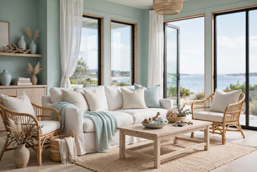
1. Tideland Haven at a Glance
The entity is a paint colour: a muted blue-green in the sea-glass family, sitting between aqua and sage, greyed down so it behaves like a neutral with a personality. Colours in this family earn their keep in coastal and light-filled interiors because they borrow their register from water and weathered glass — fresh in daylight, restful in the evening, and quiet enough to cover large areas without shouting. Its attributes are the balance of blue to green, the grey that mutes it, and the way both shift under your light; everything in this guide follows from those three.
| What colour is Tideland Haven? | A soft, muted blue-green — the colour of sea glass or shallow water over sand. It is neither a true blue nor a true green, and the grey in it keeps it calm rather than candy-bright. |
| What is its undertone? | Green-leaning, with a greyed, weathered quality. Against pure blues it will read greener; against sage and grey-greens it will read fresher and more aquatic. |
| Where does it work best? | Living rooms, bedrooms, bathrooms, kitchen cabinetry and coastal exteriors — anywhere you want watery calm with enough depth to hold white trim and natural textures. |
| What does it pair with? | Crisp or creamy whites, pale weathered woods, rattan and linen, brushed nickel or aged brass, and accents of coral, navy or driftwood grey used sparingly. |
| What can go wrong? | Light. In a dim north-facing room it can fall grey and chilly; under warm evening bulbs it can swing greener than the swatch promised. Testing in your own light is not optional with this colour family. |
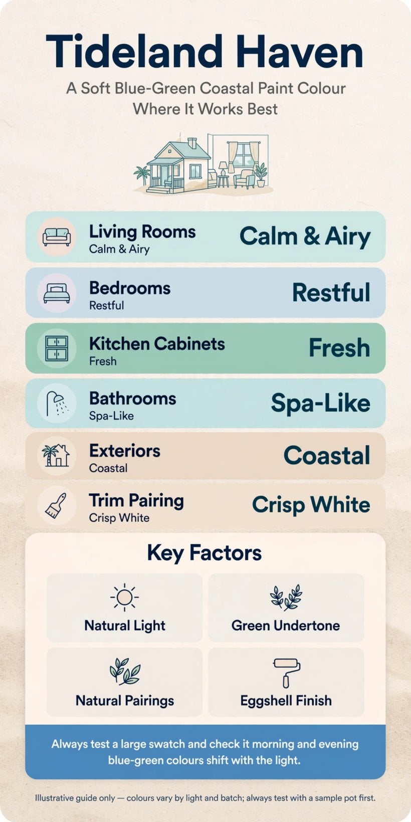
At a glance: a greyed blue-green that acts like a calm neutral — light decides whether it leans blue, green or grey, so test it where it will live.
2. The Colour Itself: Blue-Green Balance and the Grey That Calms It
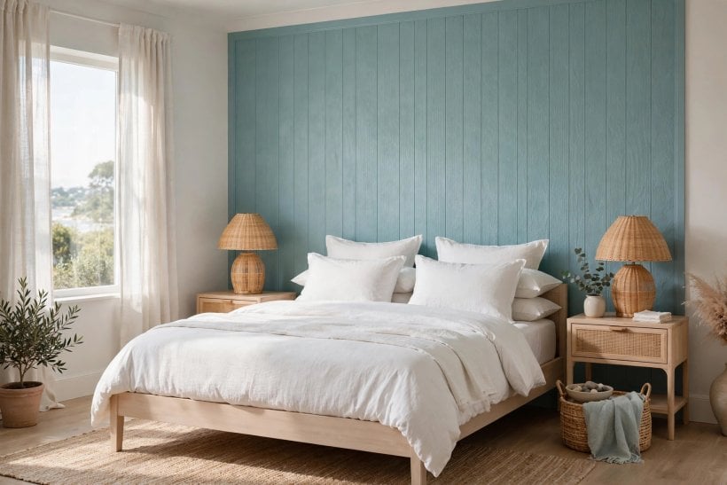
Blue-greens live on a sliding scale. At one end sits aqua — bright, youthful, unmistakably blue-green; at the other, sage — greyed almost to neutrality, reading green in most lights. Tideland Haven sits between them, closer to the middle: clearly a colour, never a pastel shout. That position is its usefulness. It has enough blue to feel fresh and watery, enough green to sit comfortably with plants, timber and garden views, and enough grey to stop it turning childish on a large wall.
Why the Muting Matters
Unsaturated colour is what lets a shade like this cover four walls, a run of cabinets or a whole house exterior without exhausting the eye. The grey content does the same work it does in these colourful tiny house interiors that still manage to feel restful: it lowers the volume so other things — texture, grain, daylight — can be heard. If you have ever loved a colour on a chip and flinched at it on a wall, the difference was usually saturation, not hue.
How It Differs From Its Neighbours
Against mint, it is deeper and greyer. Against teal, it is softer and lighter. Against a blue-grey, the green in it steps forward. These comparisons matter at the paint counter, where a dozen near-identical chips separate into quite different walls at home. Decide which neighbour you are avoiding — too sweet, too dark or too cold — and you have the test every sample must pass.
3. Light Changes Everything: Testing Before You Commit
No colour family is more light-sensitive than blue-green, because our eyes read its balance against whatever the light is doing. North light, which is cool and indirect, pushes it towards blue-grey; strong southern or western sun warms it and lets the green forward; warm artificial light in the evening can make it feel almost sage. The same tin will honestly produce three rooms, and all three are the real colour.
A Testing Routine That Works
Paint the largest swatch you can bear — on the wall itself or on a board you can move — and live with it for a full day: morning, midday, dusk and lamplight. Move the board between the brightest and dimmest walls, and beside the trim and flooring it will actually meet. The disciplined approach in this guide to tiny house interior paint colours applies to any shade, but double the observation time for a blue-green: decide on the version of the colour you see most hours of the day, not the version you saw for ten minutes at noon.
When the Light Is Against You
In a persistently dim or north-facing room, expect the grey in the colour to dominate. You can compensate with warmer whites beside it, layered warm lighting and natural textures, or step to using it on one wall or on cabinetry rather than all four walls. What you cannot do is argue with the light — choose the deployment that flatters the room you have.
4. Living Rooms: Calm Background, Natural Texture
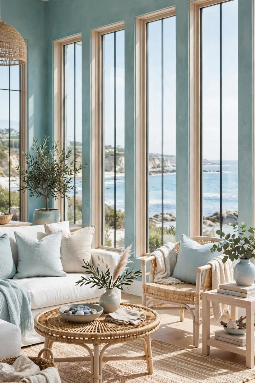
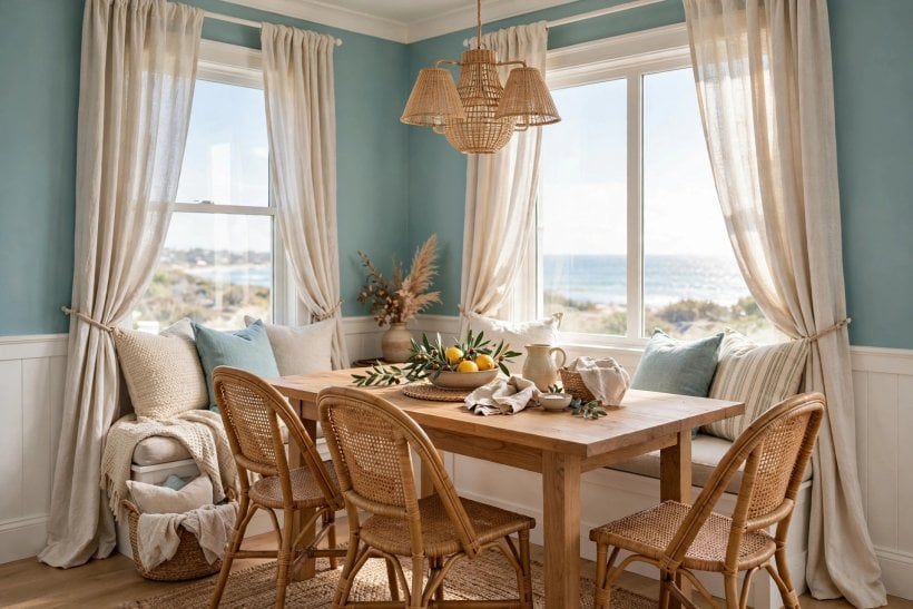
The living room is this colour’s home ground. As a wall colour it gives white upholstery, pale timber and woven textures something cool and quiet to sit against, and it carries a coastal feeling without a single themed accessory. Keep the largest furniture pieces neutral — linen, cotton and light wood — and let cushions, throws and art bring the small warm notes of coral, clay or brass that blue-green needs to stay awake.
How Much of the Room
Four walls works in a bright room and makes a serene, enveloping space of it; in a smaller or dimmer room, one or two walls with a warm white elsewhere keeps the freshness and drops the risk. The schemes in these living room paint ideas for tiny houses show the same logic at compact scale: the colour does the atmosphere, and restraint does the rest. Ceilings stay white or the palest warm tint — a coloured ceiling closes this particular colour down.
5. Bedrooms: The Restful Register
Bedrooms ask colour to do one job — lower the heart rate — and a greyed blue-green is physiologically well suited to it, sitting in the cool, quiet part of the spectrum without the chill of a pure blue. It is a natural behind the bed as an accent wall, or on all walls in a bright room paired with white bedding, natural linen and warm bedside light to keep the evenings kind.
Pairing for Sleep
Keep contrast low and texture high: washed linen, a woven throw, pale timber and one or two deep notes — a navy cushion, a dark timber frame — to give the softness a spine. The small-space discipline in these small bedroom interior design ideas for tiny houses is the same one this colour rewards: few pieces, honest materials, nothing that glitters when the light goes down.
6. Kitchens and Cabinets: Where the Colour Earns Its Keep
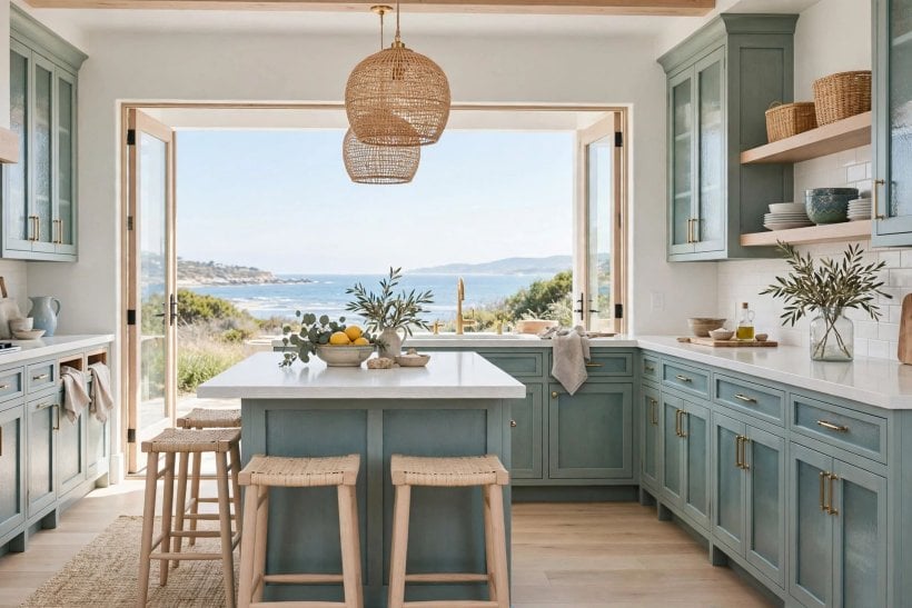
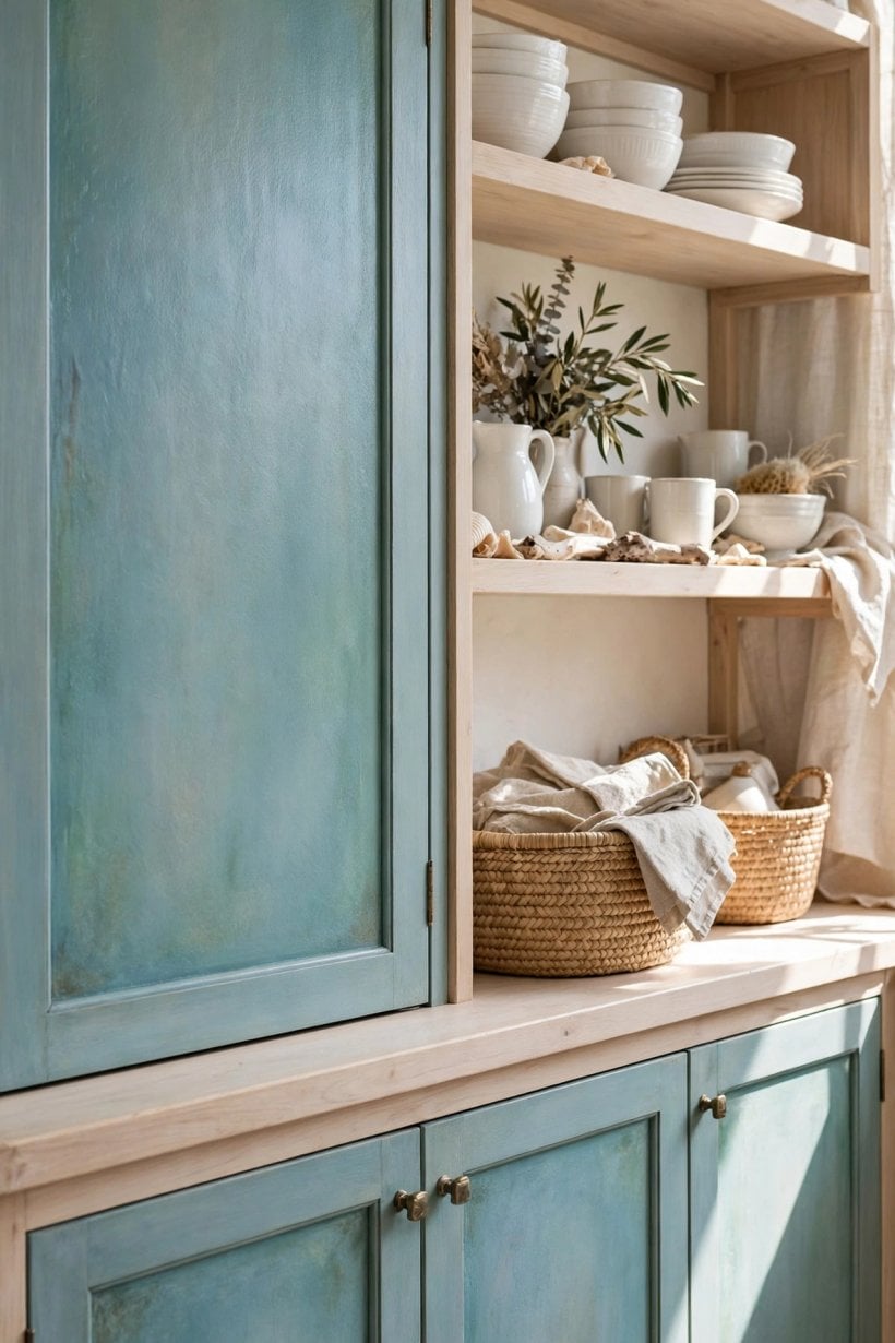
Painted cabinetry is where this shade quietly outperforms almost everywhere else. On lower cabinets or a full kitchen run it reads fresh against white worktops and walls, hides the everyday scuffs of a working kitchen better than white paint does, and brings the coastal register into the most practical room in the house. Pair it with brushed nickel for a cooler, contemporary feel or aged brass and timber for warmth.
Uppers, Lowers and Islands
The forgiving formula is colour below, white above: blue-green base cabinets ground the room while white uppers keep it bright. A single island in the colour achieves the same effect in a white kitchen. The layouts in these tiny house kitchen designs and the broader kitchen ideas collections show how cabinet colour does the decorative work in small kitchens where there is no room for ornament — one good colour, honestly applied, is the whole scheme. Use a durable cabinet-appropriate paint and finish; a kitchen is a wear surface, not a backdrop.
7. Bathrooms and Laundry Rooms: The Spa Register
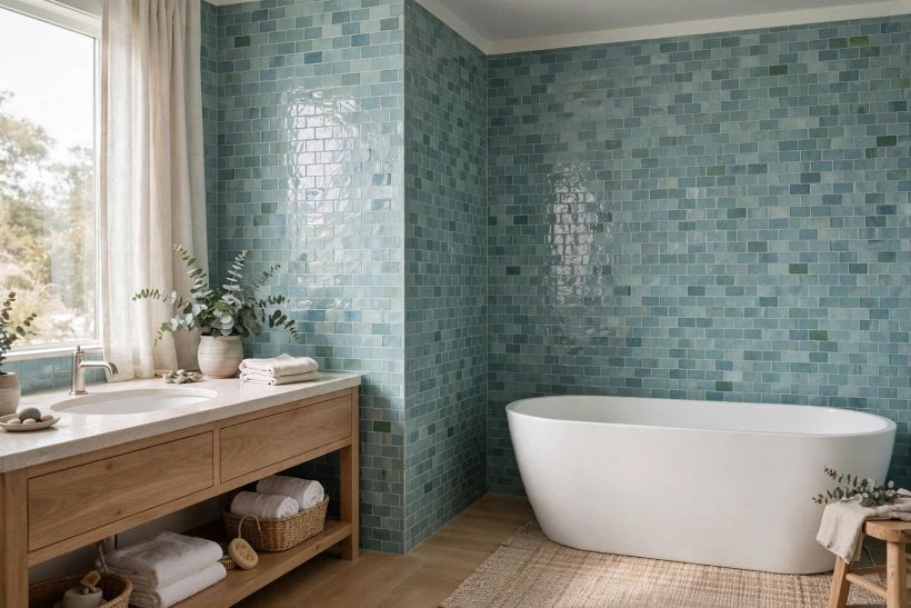
Water-coloured walls in the room of water is the oldest trick in the coastal book, and it still works. In a bathroom, this blue-green flatters white sanitaryware, sits naturally with stone, pale tile and timber, and turns a small windowless room — with good warm artificial light — into something that feels deliberately spa-like rather than merely small. On a vanity unit it does the same job at furniture scale.
Vanities, Tile and the Supporting Cast
The colour does not have to carry the bathroom alone. A vanity painted in the shade against white walls and pale stone gives the room its water note with a tenth of the paint, and it can be repainted in an afternoon when tastes move on. As a tile colour — in handmade-look ceramic or glass — it gains depth and variation that flat paint cannot imitate, at a correspondingly permanent commitment. Choose paint where you want flexibility and tile where you want jewellery, and keep grout pale and warm: a cold grey grout line can make the softest blue-green look chilly and cheap, while a warm white grout lets it glow. Timber mirror frames, a woven basket and one plant complete the register without a single object that mentions the sea.
Moisture and Finish
Bathrooms are a finish question before they are a colour question: use a paint formulated for humid rooms, in a sheen that can be wiped, and ventilate as well as your building allows, because no colour survives peeling. In laundry rooms the colour earns a bonus — it makes a purely functional space feel cared for, which matters more than it should in rooms we use every day.
8. Exteriors, Porches and Front Doors
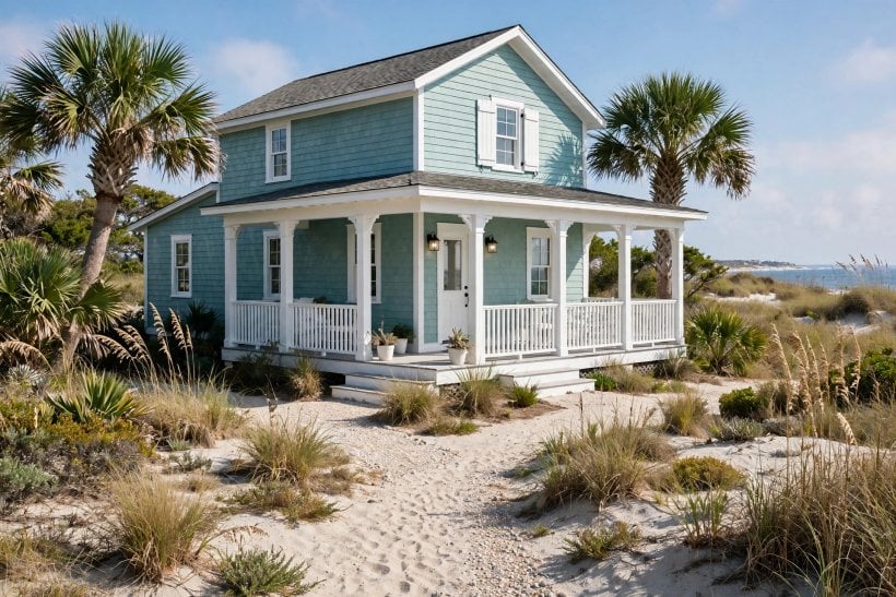
Outside, this colour joins a long tradition of coastal cladding — weathered, watery shades that sit comfortably against sky, sea, sand and greenery. On a whole house it wants crisp white trim to draw its edges; on a front door or porch ceiling it delivers the coastal note at a fraction of the commitment. Exterior light is stronger and bluer than indoor light, so expect the colour to read lighter and fresher outside, and test on the actual elevation at different hours.
Porches, Doors and Woodwork
A blue-green porch ceiling is a beloved convention in coastal regions, said to keep the sky — and, folklore claims, insects and wandering spirits — at bay; whatever you believe, it makes a porch feel cool at midday. For painted exterior woodwork generally, the preparation and maintenance realities in this guide to paint versus stain for exterior wood decide how long any colour lasts out there: the shade is the easy part, the substrate is the work.
9. Pairings: Whites, Woods, Metals and Accents
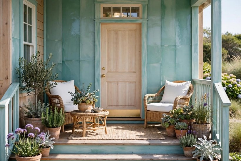
Every colour is judged by its company. The whites you choose set the temperature: a crisp, slightly cool white sharpens the colour and reads contemporary; a creamy warm white softens it towards the traditional coastal look. Test trim paint beside the swatch, not from memory — a white that looks neutral alone can turn yellow or pink next to a blue-green.
Woods, Fibres and Metals
Pale and weathered woods — white oak tones, driftwood greys, rattan, cane and linen — are this colour’s native company, adding warmth without contrast. Dark timber works too, as an anchor in small doses. For metals, brushed nickel and chrome keep the register cool and clean; aged brass and bronze warm it and suit traditional rooms. Accents should be few and deliberate: coral and clay for warmth, navy for depth, and always in textiles and objects you can change, not in the second paint tin.
Carrying the Colour Through a Whole Home
Blue-green rewards repetition. Used once, in one room, it is a pleasant surprise; carried gently through a home — a bedroom wall answering a bathroom vanity, a front door echoing the kitchen cabinets — it becomes the thread that makes separate rooms feel like one house. The trick is variation in scale rather than repetition of the same gesture: full walls where light is best, furniture and doors where it is weaker, and textiles in the same family where paint cannot go. Keep the trim colour identical throughout and the woods in one family, and the colour can appear in five rooms without ever feeling like a theme. In open-plan spaces, let it define the quieter zone — the reading end, the dining end — while warm white holds the working end, so the plan reads as two calm rooms in conversation rather than one room in two minds.
Small Rooms and Rentals
In compact or rented spaces, the colour can arrive without a wall ever being painted: cabinet fronts you are allowed to paint, a bookcase back panel, textiles, art and ceramics in the same family build the register reversibly. The small-footprint schemes in these apartment interior design ideas for tiny houses run on exactly this principle — colour as a layer you own, not a change you beg permission for.
10. Finishes, Sampling and Buying Checks
Finish changes colour as surely as light does. Flat and matte finishes deepen and soften a blue-green and forgive wall imperfections, but mark more easily; eggshell and satin add a slight sheen that lifts the colour and wipes clean, which suits kitchens, bathrooms and hallways; cabinet finishes should be the hardest-wearing the range offers, because doors are touched a hundred times a day. Keep the sheen consistent with the room’s job, not with a showroom’s lighting.
The Sample Discipline
Buy the sample pot. Paint boards, not chips, and check them in every light the room gets. When you commit, buy enough of the colour in one purchase for the whole job and note the batch — mixed batches of a muted colour can dry a half-shade apart, a difference invisible in the tin and obvious across a wall. Keep a labelled touch-up pot; blue-greens are forgiving to touch in, but only with the same batch and sheen.
Final Considerations
Tideland Haven succeeds because it is a colour with its volume lowered: blue enough to feel like water, green enough to live with gardens and timber, grey enough to behave like a neutral across walls, cabinets and whole exteriors. Its one demand is honesty about light — test it in the room, at the hours you live there, and deploy it at the scale your light supports, from four walls in a bright living room to a single door in a dim one.
Pair it with warm whites, pale woods and natural fibre, give it one warm accent and good light, and it will do what coastal colours have always done: make an ordinary room feel like it is nearer the sea than it is.

0 Comments