
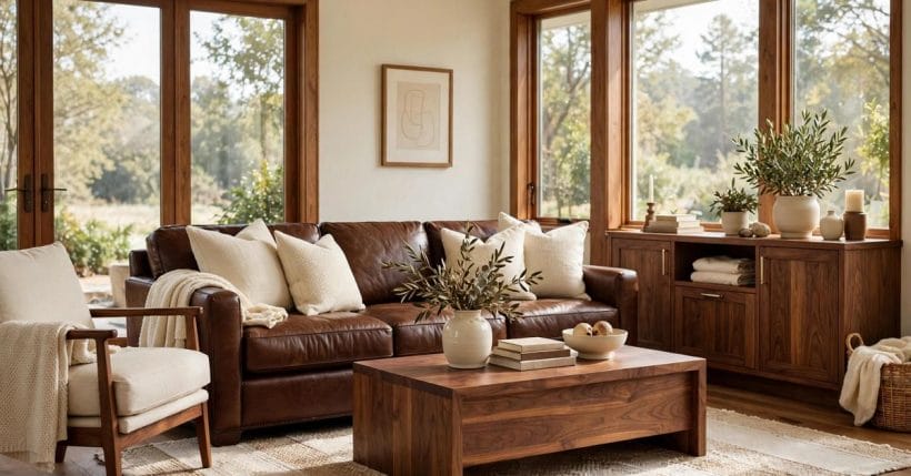
Brown is the color people live with before they ever choose it. It is the timber floor, the leather chair, the wooden table, the basket by the door, the soil in the garden bed outside the window. Because brown arrives in a home through materials rather than through paint charts, it rarely needs an introduction, and it forgives a great deal. The question that follows it everywhere is a practical one, and it is the question behind this guide: colors that go with brown, chosen in general terms, by warmth, depth and finish, so that any brown already in a room can find its companions without a single invented code or value.
Brown is not one color. It is a whole family, running from pale sand and warm camel through caramel, chestnut, walnut and coffee to deep chocolate and near-black espresso tones. Some browns lean warm and golden, others lean cool and grey, and a few sit quietly in the middle. Every pairing in this guide starts from that simple truth: name the brown you actually have — its depth, its warmth, its surface — and the partner colors suggest themselves. A pale sandy brown wants different company from a dark chocolate one, and a glossy leather brown wants different company from a rough woven one. Get the brown right first, and the rest of the room becomes a series of easy decisions.
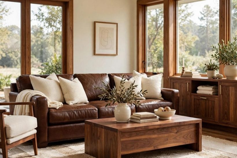
1. Brown at a Glance: A Family, Not a Single Color
Think of brown as a staircase rather than a step. At the top sit the palest browns: sand, oat, pale camel and light timber tones that behave almost like neutrals. They lighten rooms, they sit comfortably beside white and cream, and they rarely dominate. In the middle sit the working browns: caramel, honey, mid walnut and warm chestnut, the colors of most wooden furniture, leather seating and timber floors. At the foot of the staircase sit the deep browns: coffee, dark chocolate and espresso, colors with real weight that anchor a room and ask for paler company to keep them from closing the space in.
Warmth is the second thing to notice. A warm brown carries gold, red or honey inside it, and it glows under lamplight. A cool brown carries grey or a faint purple shadow, and it stays calmer and more reserved. Most browns in real homes are warm, because timber and leather tend that way, but cool browns appear in weathered wood, grey-washed timber and some dark stains. Warm browns welcome cool partners; cool browns welcome warm ones. That single exchange — warmth answered by coolness, or coolness answered by warmth — is the engine behind almost every successful brown pairing.
Finish matters as much as color. A polished dark timber reflects light and reads as formal; the same tone in rough linen or matte clay reads as relaxed. Leather shines, wool absorbs, stone stays cool, and each surface changes how the brown beside it is perceived. When a pairing looks wrong, the culprit is often not the second color at all but a clash of finishes: too much shine against too much shine, or too much matte softness with nothing to give the room an edge. The sections that follow keep finish in view throughout, because brown pairings are made as much by surface as by shade.
2. Why Brown Pairs So Easily: Warmth, Depth and Patience
Brown is patient. Unlike a vivid color that demands the room revolve around it, brown is content to be the background, the anchor, or the quiet middle of a scheme. It sits happily beneath stronger colors, it warms up pale ones, and it gives bright accents a place to land. That patience is why brown rooms so rarely look like mistakes: even an unplanned brown — a floor that came with the house, a sofa inherited from family — can be made to look deliberate with one or two thoughtful partners.
Brown also brings a sense of the natural world indoors. It is the color of earth, bark, stone and grain, and rooms dressed in it tend to feel grounded and calm. Partner colors that share that natural feeling — leaf greens, sky blues, stone greys, harvest golds — tend to sit beside brown without argument. Partner colors from the opposite world, the sharp and the synthetic, can still work, but they need more care: a vivid partner wants a smaller share of the room and a neutral mediator to keep the peace.
There is one more reason brown pairs well, and it is the most useful of all. Brown is forgiving of proportion. A small amount of a partner color — a cushion, a throw, a vase, a single painted wall — is often enough to change a brown room completely, while a large amount rarely ruins it. That forgiveness means brown pairings can be tested cheaply: try the partner in textiles and objects first, live with it for a while, and only then commit it to walls or large furniture. The testing discipline in the final sections of this guide leans on exactly that habit.
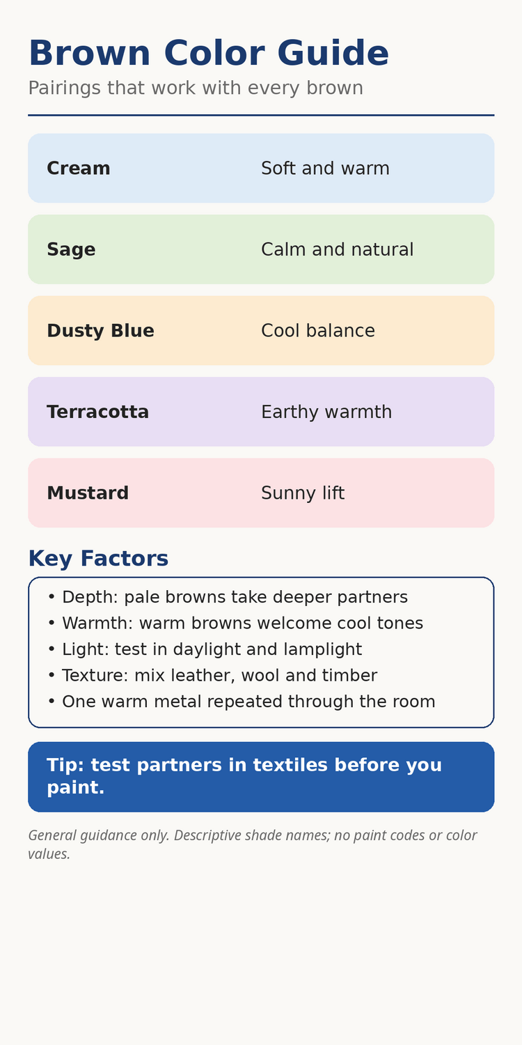
3. Reading a Brown Before You Pair It: Depth, Warmth and Finish
Before choosing any partner, spend a few minutes reading the brown itself. Look at it in daylight and again under lamplight, because brown changes more between those two lights than most colors do. A warm caramel that glows in the morning can turn flat and dull under cool evening light, while a deep chocolate that looks almost black by day can soften beautifully in warm lamplight. The partner you choose should flatter the brown in the light the room is actually lived in, which for most rooms means the evening.
Depth decides how much help a brown needs. Pale browns need little help: they are already light, so their partners can be deeper, richer or more colorful without any risk of gloom. Mid browns are the most flexible of all, pairing upward with pale colors and downward with deep ones. Deep browns need the most care, because they absorb light and visual weight. Give a deep brown pale partners, reflective surfaces and warm light, and it becomes luxurious; leave it surrounded by other dark tones, and it becomes heavy. The rule is simple: the deeper the brown, the paler and brighter its main partner should be.
Warmth decides the direction of the pairing. A warm brown asks for a partner that either echoes its warmth — cream, gold, terracotta — or answers it with coolness — sage, dusty blue, soft grey. A cool brown asks for the reverse: warm creams, honey tones and brass rather than more coolness. When a brown room feels wrong and nobody can say why, the usual cause is warmth piling on warmth until the room feels stuffy, or coolness piling on coolness until it feels cold. One deliberate change of temperature in the partner color usually fixes it.
4. The Quiet Neutrals: Cream, White, Stone and Soft Grey
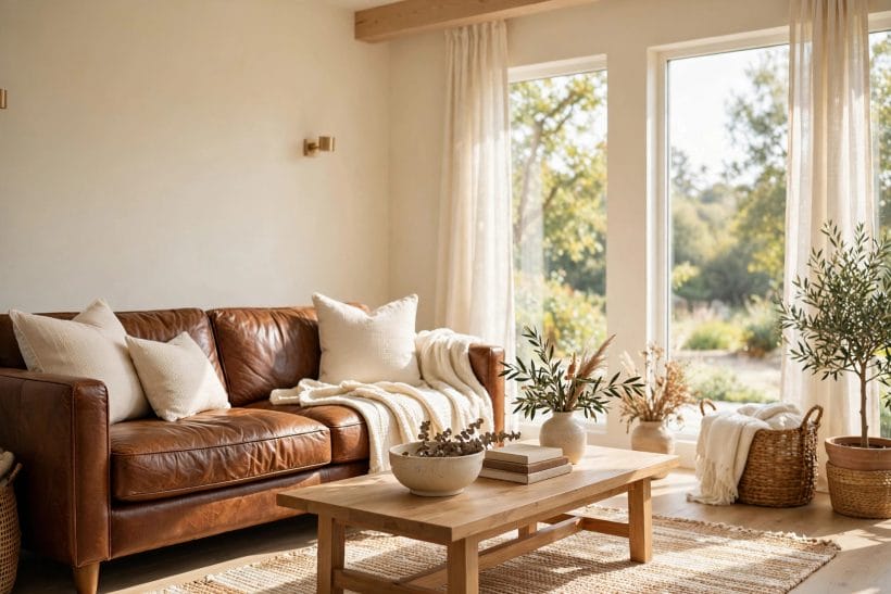
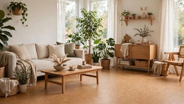
The safest brown pairings are also the most enduring. Cream is brown’s oldest friend: warm cream softens every brown from sand to chocolate, and it does so without ever competing. Use cream on walls behind dark timber, in bedding against a walnut bed, in linen curtains beside leather seating, and the brown instantly reads as richer and more intentional. Warm white works the same way in brighter rooms, though it suits pale and mid browns better than the deepest ones, where cream’s softness is kinder.
Stone and soft grey are the cooler neutrals in this family, and they suit brown best when the brown itself is warm. A warm grey wall behind a caramel sofa, or a stone rug beneath a walnut table, gives the room a modern calm that cream alone cannot. The grey should lean warm rather than icy: a grey with a hint of beige inside it meets brown halfway, while a cold blue-grey can leave a warm brown looking stranded. The companion guide to light grey pairings works through those undertones in detail, and it is worth a read before any grey is chosen for a brown room.
Charcoal is the bold neutral in this group, and it belongs with brown only in generous, well-lit rooms. A charcoal wall behind a pale timber bed or a camel chair is striking, because the pale brown becomes the light in a dark room. The reverse — charcoal beside deep chocolate — needs careful lighting and pale textiles to keep the room from closing in. As a general habit, keep one clear light source in every brown-and-charcoal room: a cream rug, pale bedding, or a light timber floor that carries daylight across the space.
5. The Greens: From Sage Calm to Living Leaf
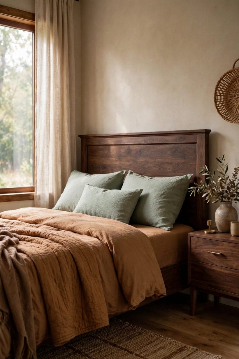
Green is brown’s natural partner, and the pairing is as old as a walk through woods. Sage green is the gentlest form of it: muted, grey-green, restful beside every brown from pale oak to dark chocolate. Sage walls with timber furniture, sage bedding with a walnut bed, sage cushions on a caramel sofa — all of them read as settled and calm, because the pairing echoes the colors of bark and leaf without ever shouting. For a brown room that needs peace more than drama, sage is the first partner to try.
Deeper greens bring more presence. Forest and moss tones beside mid and dark browns create a rich, library-like feeling, especially with brass or timber details and warm lamplight. Olive sits between sage and forest, warmer than both, and it flatters golden browns particularly well. The detailed working of this whole family — which browns, which greens, and how the two are married through wood and plants — is set out in the companion guide to brown and green combinations, which is the natural next read after this section.
Bright leaf green is the lively edge of the family and needs a lighter hand. Used as an accent — plants, a cushion, a piece of art — it wakes a brown room up beautifully, because living plants are the one green that never argues with timber or leather. Used across whole walls beside a deep brown, it can feel busy. Let plants do the bright work, keep painted greens muted, and the brown-green pairing stays the easiest success in the whole guide.
6. The Blues: Cool Balance for a Warm Color
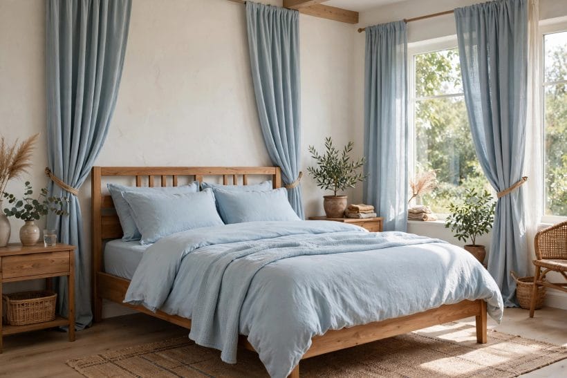
Blue is the cool answer to brown’s warmth, and it is the pairing that makes a brown room feel composed rather than simply cozy. Dusty blue is the most reliable form: soft, slightly grey, calm beside caramel, walnut and chocolate alike. A dusty blue wall behind a leather chair, dusty blue linen on a timber bed, or dusty blue pottery on a walnut shelf all give the eye a cool place to rest, and the brown beside them looks warmer and richer by contrast.
Navy is the bolder blue partner, and it works best as a deep accent rather than a competing field. Navy cushions on a camel sofa, a navy rug under a walnut table, or a single navy wall in a room of pale browns all carry authority without weight. Navy beside deep chocolate needs a pale mediator — cream or stone — between them, or the two dark tones can sit heavily together. Pale sky blue, at the other end of the family, suits pale browns best: sand, oat and light timber with sky blue read as fresh and coastal, and they suit bright rooms with generous daylight.
Teal deserves a mention because it sits between blue and green, and brown is one of the few colors that welcomes it without fuss. A muted teal accent — a vase, a throw, a painted chair — beside mid brown timber is quietly sophisticated, and it suits rooms that want a little more character than sage or dusty blue alone provide. Keep teal muted rather than vivid, and let brown stay the larger share of the room.
7. The Warm Companions: Terracotta, Mustard, Rust and Blush
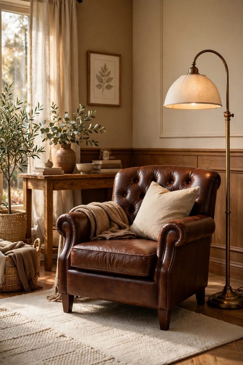
Warm partners beside brown are a celebration rather than a contrast, and they suit rooms that want to feel generous and welcoming. Terracotta is the most natural of them: it shares brown’s earthy family, so it sits beside timber and leather without any friction, and it brings a sun-baked warmth that plain brown alone can lack. Terracotta pottery, cushions or a single feature wall beside walnut or caramel furniture is one of the most forgiving warm pairings there is.
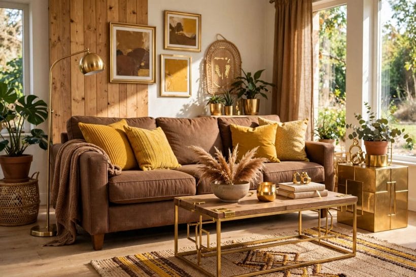
Mustard and ochre golds bring light into a brown room. A mustard throw on a chocolate sofa, ochre cushions against walnut, or a golden rug beneath a timber table all lift the scheme, because gold is the bright edge of brown’s own family. These golds should stay in accents rather than fields: a whole mustard wall beside a dark brown suite can feel loud, while mustard in textiles feels sunny and deliberate. Brass and gold metals play the same role in a harder finish, and they are covered in the next section.
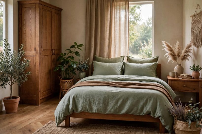
Rust and blush sit at the two ends of the warm scale. Rust is terracotta deepened toward brown itself, and it works as a near-tone partner: rust beside chocolate, rust beside caramel, each enriching the other without contrast. Blush is the surprise of the family — a soft pink that beside brown reads as gentle and grown-up rather than sweet, especially in bedrooms, where blush bedding with a walnut bed or blush curtains beside timber wardrobes feels calm and romantic. Blush needs brown’s grounding to stay elegant; without it, blush alone can drift toward the nursery.
8. Metals, Timber and Texture: The Finish That Marries a Pairing
Color pairings are only half the story. In a brown room, the finishes — metals, timbers, fabrics and stone — do much of the marrying between colors, and they can rescue a pairing that looks uncertain on a chart. Brass is brown’s great ally: warm, golden and reflective, it lifts dark browns, warms pale ones, and gives any partner color a shared accent to gather around. A brass lamp beside a brown sofa, brass handles on walnut cabinets, or a brass frame above a sage wall all tie the scheme together with a single repeated note.
Other metals play cooler roles. Blackened iron and matte black suit brown in rustic and modern rooms alike, giving timber and leather a firm edge. Copper echoes terracotta and rust partners beautifully, while brushed nickel and pewter suit cool browns and grey partners better than warm ones. The habit to keep is repetition: one metal, used in at least a few places, reads as a decision, while a different metal on every fixture reads as an accident.
Texture is the final marriage-maker. Brown beside brown can feel flat unless the surfaces differ: smooth leather against woven wool, polished timber against rough linen, matte clay against soft velvet. When two colors feel too close, change the texture of one of them before changing the color itself. A velvet cushion in the same brown family as a leather sofa, or a nubby rug beneath a polished table, gives the eye the difference it was missing, and the pairing suddenly reads as layered rather than monotonous.
9. Room by Room: Kitchens, Living Rooms, Bedrooms and Bathrooms
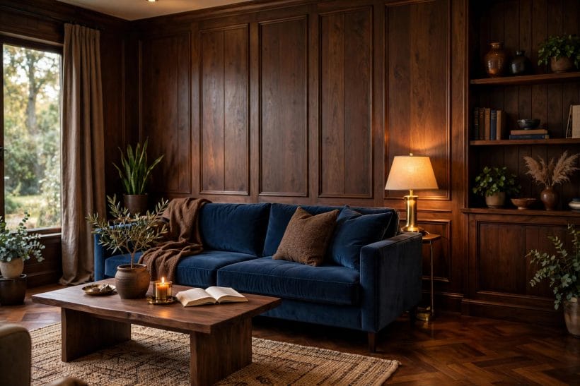
Every room asks brown a different question. In living rooms, brown usually arrives as seating or timber, and the partner color sets the mood: sage or dusty blue for calm, cream and stone for lightness, terracotta or mustard for warmth. The brown living room is the most forgiving room in the house, because sofas and timber accept almost any partner in textiles, and the whole scheme can be changed with cushions and throws. The companion collection of brown living room ideas shows the full range, from pale timber schemes to deep leather rooms, and it is a useful gallery to browse before committing.
Bedrooms ask brown to be restful. Walnut beds, timber wardrobes and caramel bedding all pair beautifully with cream, sage and blush, and the bedroom is where blush earns its place. Keep the partner palette to two colors besides the brown itself, keep the lighting warm and low, and let bedding carry the partner color so the scheme can change with the seasons. The companion collection of brown bedroom ideas works through the same discipline room by room, with the brown staircase — from cream-brown to chocolate — as its organizing thread.
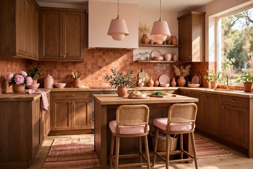
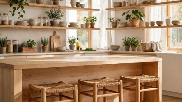
Kitchens and bathrooms ask brown to work harder. In kitchens, brown appears in timber cabinets, wooden worktops and stone floors, and it pairs best with cream, sage and soft white, which keep a working room bright. In bathrooms, timber vanities and stone tiles welcome cream, sage and dusty blue, and warm metals in taps and mirrors repeat the brass habit from the living room. In both rooms, keep the brown to cabinetry, flooring or one timber feature, and let the partner color own the walls and textiles, so the working room stays light. Seating-led pairings, where a brown sofa meets a contrasting wall, follow the same logic in reverse, and the guide to a brown couch against grey walls is the clearest worked example of warm seating answered by a cool field.
10. Checks Before You Commit: Light, Samples and Proportion
No pairing should be committed on the strength of a chart alone. Brown changes with light more than most colors, so every partner deserves a sample test in the room itself: a painted board leaned against the wall, a cushion borrowed from another room, a throw draped over the sofa, all judged in morning light, in afternoon light, and again under the lamps that will actually light the room in the evening. A pairing that passes all three lights is a safe one; a pairing that passes only one is a gamble.
Proportion is the second check. As a working habit, let one color lead, one answer, and one rest the eye. Brown will usually be the lead or the answer, rarely both. Give the lead color the largest share, the answering color a clear but smaller share, and the resting color — cream, stone, natural linen — the quiet spaces between them. Rooms that feel busy usually have two colors competing for the lead; rooms that feel flat usually have no answering color at all. Moving a cushion or a rug from one side of the room to the other is often enough to restore the balance.
The final check is the simplest: live with the pairing in textiles before committing it to paint or furniture. Brown’s great gift is that its partners can be tested for the price of a cushion, and a fortnight of living with a partner color teaches more than any guide can. If the partner still pleases after daily use, it belongs in the room. If it starts to tire, it was never the right partner, and the cost of discovering that in a cushion is nothing at all. The same patient habit underlies the broader discipline of choosing a whole-house palette, which the guide to a tiny house color palette sets out as a single coherent scheme rather than a room-by-room improvisation.
Final Considerations
Brown rewards patience and punishes haste, but it rarely punishes a wrong partner severely. The pairings in this guide share one habit: the brown is read first, for depth, warmth and finish, and the partner is chosen to answer it — cool for warm, warm for cool, pale for deep, and a quiet neutral always in reserve. Cream, sage, dusty blue, soft grey, terracotta and mustard will cover almost every brown room a home can present, and brass, timber and texture will marry whichever two are chosen.
For the reader arriving with a single question, the answer in brief is this: colors that go with brown are the colors that either share its earthiness or answer its warmth — creams and stones for safety, greens and blues for calm, terracotta and gold for generosity, and one warm metal to tie the whole room together. Start with textiles, test in the room’s own light, and let the brown lead. The companion guides in this series carry the same discipline further: the boldest color in the box gets its own treatment in the guide to working with chartreuse, for the day a brown room wants a single vivid note against all that calm.


0 Comments