
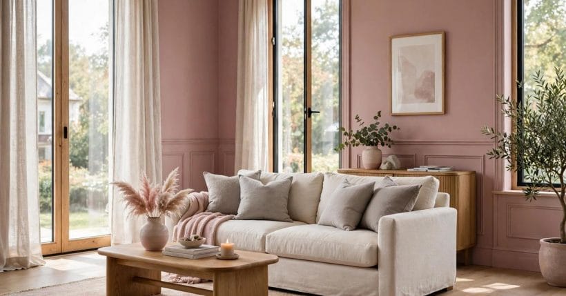
1. The Colour People Keep Asking About
Dusty rose is one of those colours that everyone recognises and nobody quite agrees on. Show the same pink to ten people and you will hear ten names for it: old rose, faded pink, mauve, blush, even brown. The question in the title is a real one, asked by people standing in front of a wall or a sofa and wondering whether what they are seeing is dusty rose at all. This guide explains what the colour is, how to read it, and how to live with it — in general terms, without pretending that any single paint name or code settles the matter.
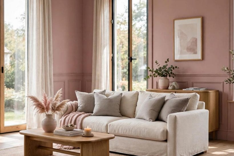
The short answer is that dusty rose is a pink that has been softened. Imagine a clear pink with grey and a little warmth stirred through it, until the brightness settles and the colour feels muted rather than sweet. That muting is the whole character of the colour: it is pink that has grown up, pink that sits quietly in a room instead of asking for attention.
2. Reading the Undertone
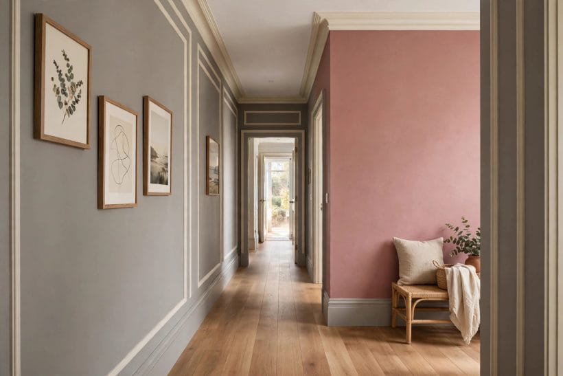
Every dusty rose leans somewhere, and the lean is what you are really choosing. Some lean warm, toward terracotta and clay, and they feel cosy and sunlit. Others lean cool, toward grey and mauve, and they feel calm and a little more formal. Hold a swatch against a plain white card in daylight and the lean shows itself: the warm ones glow faintly orange beside the white, the cool ones turn faintly lavender.
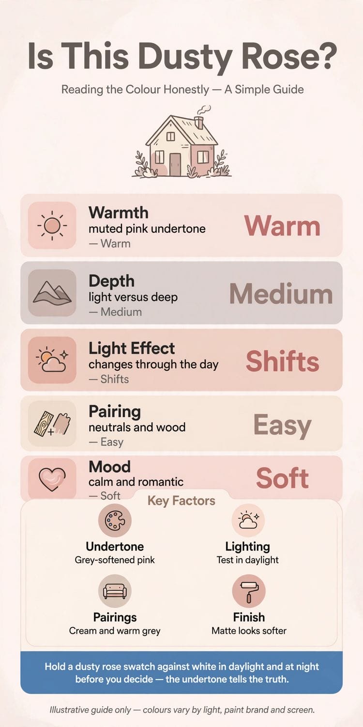
Undertone matters because it decides what the colour does to a room. A warm dusty rose makes a north-facing room feel less cold, while a cool one can make a sun-drenched room feel calmer. Neither is better in itself. The right one is the one whose lean suits the light and the mood of the room it will live in.
Undertone is easier to judge with a comparison than on its own. Hold two dusty rose swatches side by side against the same white card and the difference between a warm lean and a cool lean becomes obvious, where a single swatch can look neutral. Take the comparison into the room itself, because the room’s light and its existing colours shift the reading again. A swatch that leans warm in the shop may lean cooler beside grey furniture, and that shift is worth knowing before you commit.
3. Light Changes Everything
Dusty rose is famously changeable in different light, and that changeability is the reason so many people ask whether their colour really is dusty rose. In morning light it can look soft and grey; in warm evening light the same wall can look distinctly pink; under cool electric light it can flatten toward mauve. None of those readings is wrong. They are all the same colour meeting different light.
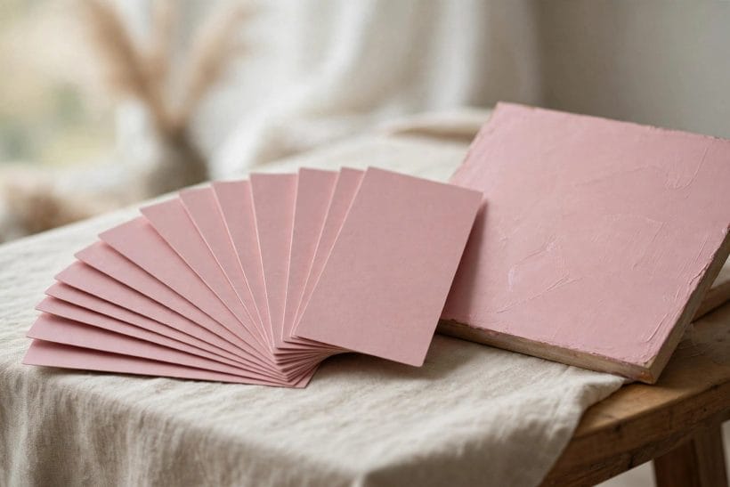
The practical answer is to test in the room itself. Paint a large test area — a board, not a tiny patch — and live with it for a few days, looking at it in daylight, in the evening and under the room’s own lights. A colour that pleases you in all three lights is a colour you can live with. One that only pleases you in the shop is not.
Electric light deserves its own test, because most rooms are lived in after dark. Look at the test area under the room’s actual bulbs, not just in daylight, and notice whether the colour warms, cools or flattens. Warm white bulbs flatter dusty rose, while cool daylight bulbs can make it look grey and tired. If the room’s lighting cannot be changed, choose the colour under the light it will actually live in.
4. Is It Dusty Rose, Blush, or Mauve?
The names around dusty rose overlap, and the boundaries between them are matters of judgement rather than fact. Blush is usually lighter and fresher, with less grey in it. Mauve is usually cooler and more purple, with the pink pushed further back. Dusty rose sits between them: deeper than blush, warmer than mauve, and greyer than either.
It helps to stop worrying about the exact name. What matters in a room is not whether a colour qualifies for a label, but whether its depth, warmth and grey content suit the space. If a colour looks like dusty rose to you, behaves like dusty rose in your light, and pairs the way dusty rose pairs, then for every practical purpose it is dusty rose — whatever the tin says.
Paint names are marketing as much as description, and the same colour can wear several names across different ranges. Rather than chasing a name, describe what you want in plain terms — a muted pink, softened with grey, leaning warm or cool — and judge swatches against that description. A colour that matches the description will suit the room, whatever the tin calls it, and a colour that merely carries the right name may not.
5. Pairings That Work
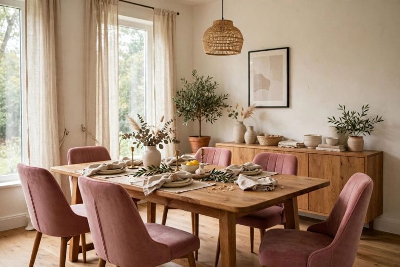
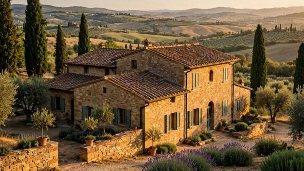
Dusty rose is an easy colour to pair, which is part of its appeal. Cream and warm white lift it and keep it fresh. Light grey paint plays a similar quiet supporting role. Warm grey deepens it without competing. Natural wood — oak, walnut, rattan — grounds it and stops it feeling precious, a balance Italian villa home designs strike with stone and timber. Soft green, especially sage and olive, sits beautifully against it, because green is pink’s natural complement and the muted versions of both colours share the same quiet register.
Pairings to handle with care are the loud ones. Strong red, hot pink and vivid purple fight dusty rose for attention and usually win, leaving it looking muddy. Black can work in small doses — a frame, a lamp base — but large areas of black beside dusty rose can make the pink look washed out. When in doubt, pair it with something quieter than itself.
6. Dusty Rose Room by Room
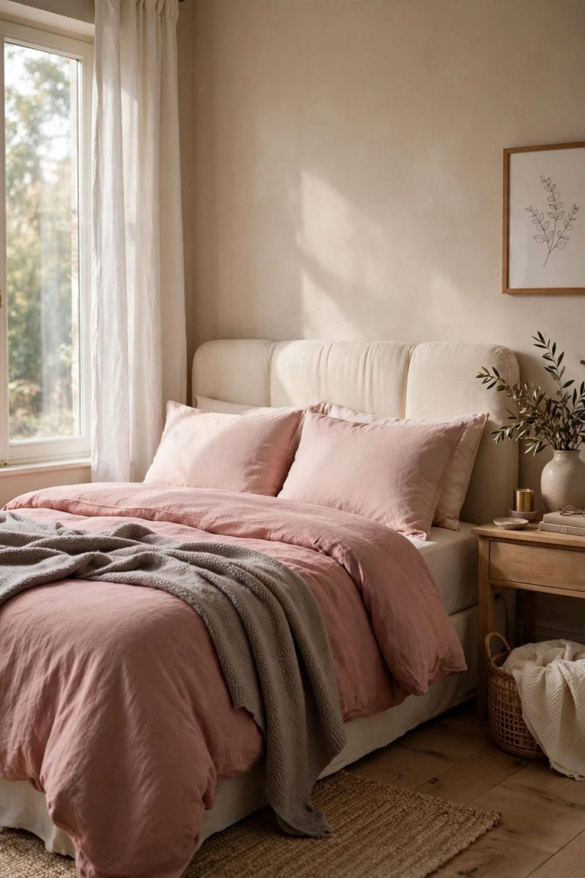
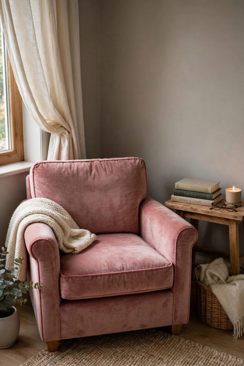
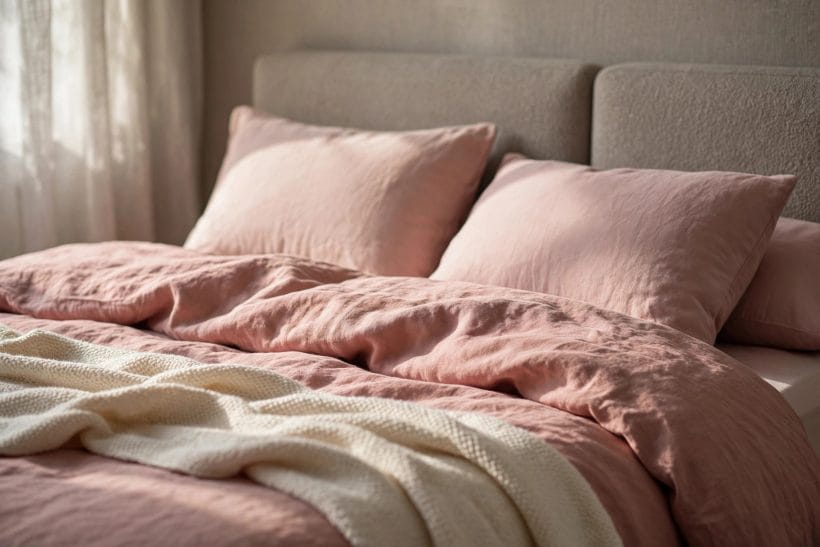
In a bedroom, dusty rose is at its most natural: soft, restful and forgiving in morning light. Bedding in cream and natural linen lets the wall colour do the work without tipping the room into sweetness, much as brown living room ideas let one warm colour lead. In a living room it works best as a wall colour with neutral furniture, or the other way round — neutral walls with dusty rose upholstery as the room’s warm note, arranged the way coffee table pictures arrange a living room around one centrepiece.
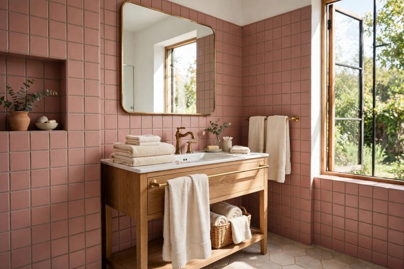
In kitchens and bathrooms it needs a little more care, because tiles, worktops and fixtures all bring their own colours to the conversation. A dusty rose tile or cabinet works when the other surfaces stay quiet, as in Tuscan style bathrooms, where warm materials lead. — cream, warm white, natural wood — and struggles when they compete. In a hallway, where light changes along its length, test along the whole run rather than in one spot.
In a bathroom, steam and humidity change how a colour behaves as well as how a finish wears. A dusty rose tile or painted wall in a steamy room needs a finish that tolerates moisture, and the colour itself can look deeper when the air is damp. Test in the room’s real conditions, after a shower if possible, rather than in a dry showroom, so the colour you choose is the colour you will actually live with.
7. Finishes and Texture
Finish changes how dusty rose reads almost as much as light does. A matte finish keeps the colour soft and chalky, which suits the muted character of the colour. Painted staircases show the same finish-first thinking on wood. A satin or eggshell finish adds a little glow and is easier to clean, which matters in busy rooms. Gloss sharpens the colour and can make it look harder and pinker than intended, so it is rarely the best choice for large dusty rose areas.
Texture does similar work. Linen, wool, velvet and brushed cotton all soften dusty rose further, while smooth leather and lacquer sharpen it. Mixing textures within the same colour family — a velvet cushion, a linen throw, a matte wall — gives the colour depth without needing a second colour to do the job.
8. The “Dreaded” Part: When It Goes Wrong
People call dusty rose “dreaded” for a reason, and it is worth naming. The colour goes wrong when it is too sweet, too pink or too flat — when the grey that should mute it is missing and the room ends up looking like a nursery, or when the colour is applied so thinly and evenly that it reads as a single pink sheet with no depth. Both failures come from the same cause: choosing the colour from a tiny swatch instead of from a large test in the room’s own light.
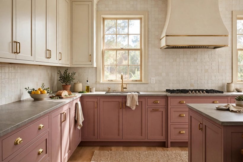
The other common failure is pairing. Dusty rose beside the wrong white — a cold, blue-white rather than a warm cream — can look dirty rather than soft, because the contrast exposes the grey in the pink. Test the white beside the pink, not on its own, and choose a white with a little warmth in it.
The white you pair with dusty rose deserves as much attention as the pink itself. A cold, blue-white beside a warm dusty rose can make the pink look grubby, while a warm cream lets it glow. Test whites the same way as the colour: large areas, in the room’s light, beside the pink rather than on their own. The right white is the one that makes the pink look intentional.
9. Living With It Long Term
Dusty rose ages well, which is not true of every fashionable colour. Because it is muted, it does not tire the eye the way a bright colour can, and because it is warm, it does not go cold in winter light. It also repaints easily: its muted character means touch-ups blend better than they do with saturated colours, and it sits comfortably under new furniture and art as tastes change.
If you tire of it, dusty rose is forgiving to change. It covers well with warm whites and soft greens, and it makes a good base for deeper colours later. A room that has lived happily in dusty rose for years has usually been a room where the colour was chosen carefully in the first place — tested large, in real light, against its real pairings.
10. The Honest Test
So, is it dusty rose? Hold a swatch against white in daylight and at night. Ask whether the pink is softened by grey, whether it leans warm or cool, and whether it still pleases you in all three lights. If the answer is yes, the name hardly matters — you have found a colour that behaves like dusty rose, and that is the only test that counts in a real room.
And if the answer is no — if the colour is too bright, too purple or too flat — you have still learned something useful. You have learned which direction to move: greyer, warmer, cooler or deeper. Colour choosing is rarely a single decision. It is a short walk toward the right muted pink, and dusty rose is a good place to aim for.
If you are choosing between two dusty roses, paint both on the same large board, side by side, and live with the board for a few days. Move it around the room, lean it against different walls, and look at it in morning, evening and electric light. The winner is rarely the one that looked best in the shop; it is the one that still pleases you on the third day, in the worst light the room offers.
Final Considerations
Dusty rose earns its popularity by being a pink that behaves: softened by grey, warm or cool by lean, changeable in light but steady in character. Test it large, in the room’s own light, against its real pairings, and judge it by how it lives rather than by what it is called. Chosen that way, it is a colour that stays beautiful far longer than the trends that made it fashionable.


0 Comments