
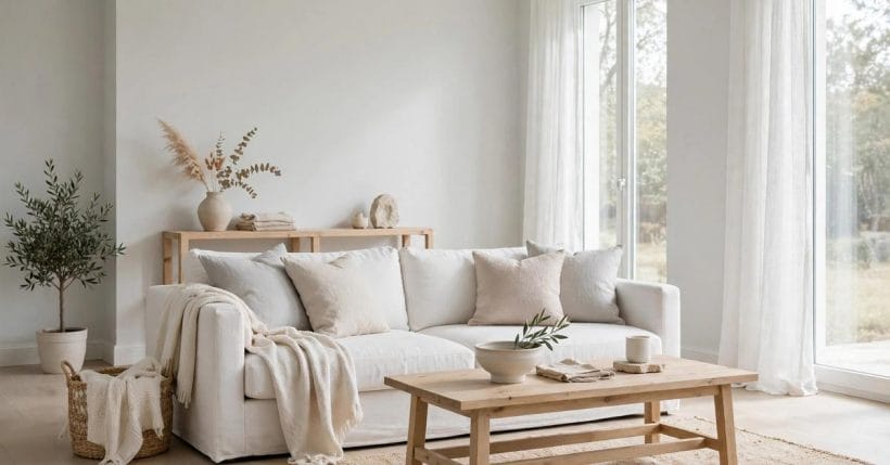
‘I’m looking for a grey paint that is so light it almost isn’t there.’ That request — one of the most-searched paint questions there is — sounds simple and is anything but. At the palest end of the scale, grey stops behaving like a colour you choose from a chart and starts behaving like a rumour: present, influential, and entirely at the mercy of the room it lands in.
This post stays deliberately narrow: choosing one very light grey for one specific room. The complete colour guide — the whole family of light greys, their undertones catalogued and compared — already exists on this site as the light gray colour guide, and it owns that wider subject. Here, everything is about the last, palest step: how to pick a grey that whispers in your room rather than somebody else’s photograph.
1. The Palest Grey, Summarised
Five ideas organise the choice, and the table below mirrors the summary graphic:
| Element | What it is | In a word |
|---|---|---|
| The Colour | Palest grey, near-white | Barely there |
| Undertones | Blue, green, violet or warm | Hidden |
| Daylight | The room decides the read | Decisive |
| Testing | Big samples, three lights | Essential |
| Pairings | White trim, warm wood | Gentle |
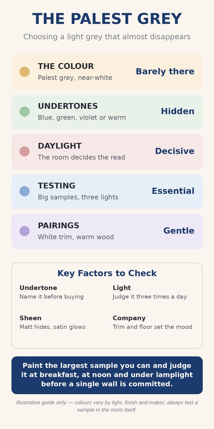
The graphic’s four factors are the post in miniature: name the undertone before buying; judge the colour at three times of day; remember that sheen changes the read as surely as pigment does; and let the trim and floor — the company the grey keeps — settle its mood. Its tip is the method in one line: paint the largest sample you can, and judge it at breakfast, at noon and under lamplight before a single wall is committed.
2. Why ‘Almost White’ Is a Decision, Not a Default
It is tempting to treat the palest grey as the safe option — the colour you choose when you cannot choose. In practice the palest greys are the least forgiving paints in the shop, precisely because there is so little pigment to argue with the light. A mid-grey holds its character from dawn to dusk; a near-white grey is re-interpreted by every hour, every bulb and every object in the room.
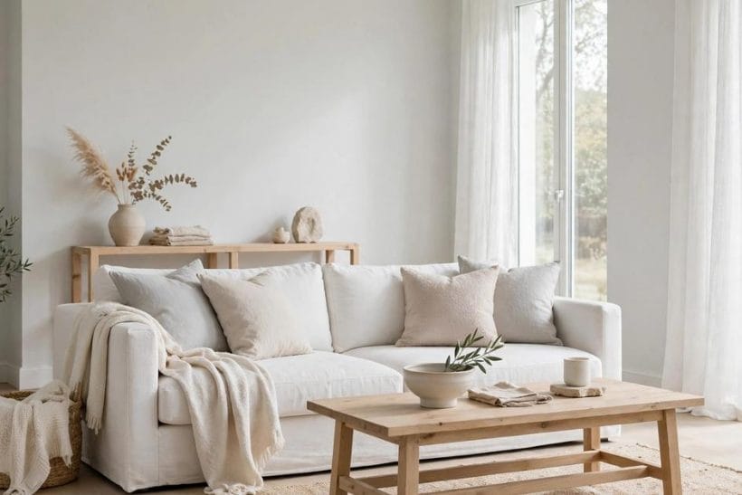
That sensitivity is also the prize. Chosen well, the palest grey gives a room the cleanliness of white with a shadow of depth white cannot offer: edges soften, daylight feels filtered rather than bounced, and furniture gains a quiet backdrop that flatters wood, linen and skin tones alike. Compare it with pure white, which many rooms try first: white reflects so much light that its shadows go blue-grey on their own, the room feels larger but colder, and every scuff announces itself. The palest deliberate grey takes that same shadow colour and makes it the wall itself — controlled, even, and chosen — which is why rooms in it feel designed where white rooms so often merely feel painted. The bedroom in the photograph is the effect at its best — serene not because the room is empty, but because the wall colour refuses to compete.
3. Undertones: The Colour Inside the Colour
Every pale grey is a near-white with a leaning: towards blue, towards green, towards violet, or towards the warm, stony side of the scale. At full strength these leanings are personality; at the palest end they are destiny, because the undertone is most of what the eye actually receives. Two paints that look identical on the shelf strip part company on the wall for exactly this reason.

The practical discipline is to decide which leaning your room wants before you fall for a name. Cool-leaning greys — the blue and violet side — feel crisp and gallery-like; green-leaning greys feel botanical and calm; warm-leaning greys feel like stone, plaster and old linen. None is correct. What is incorrect is choosing the leaning by accident, which is what happens when a colour is picked from a two-centimetre chip under shop lighting.
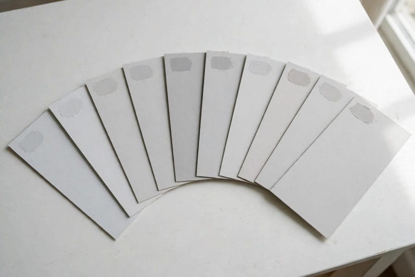
A reliable way to see an undertone is comparison: put the candidate beside a true white and beside its neighbours on the strip, and the leaning announces itself — the grey that looked neutral alone suddenly shows its blue, its green, its warmth. The full catalogue of leanings, with the wider family’s named shades, is the colour guide’s territory, linked in the introduction; here it is enough to name yours deliberately.
4. Light in Your Room: The Real Colourist
Ask not what colour the paint is; ask what light it will live in. North-facing rooms receive cool, blue-grey daylight that pushes pale greys cooler still — a blue-leaning grey can turn icy there, while a warm-leaning one stays composed. South-facing rooms flood the same paint with warmth and can wash a very pale grey almost to white at noon.
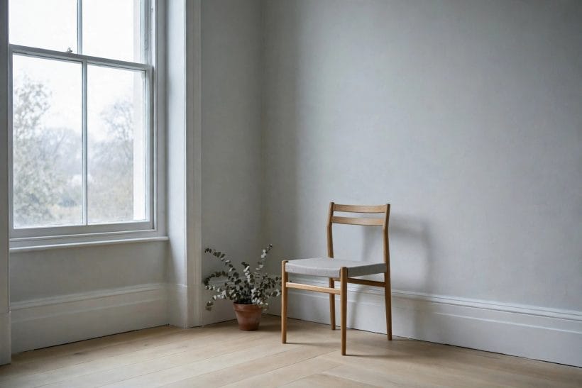
East and west rooms split the difference by the clock: morning rooms glow early and cool later; evening rooms do the reverse, which is why a west-facing sitting room’s grey must be judged at the hour the room is actually used. Artificial light is the fifth direction: warm bulbs forgive and flatter pale greys; cool, blue-white bulbs interrogate them. The window photograph is the principle in one image — the paint near the glass and the paint in the corner are, to the eye, two different colours from one tin.
Two quieter influences deserve a sentence each, because they ambush otherwise careful choices. Floors cast colour upward — a warm oak floor lends its glow to a pale grey all day, while a cool grey tile floor doubles the paint’s coolness. And window dressings tint the light itself: linen sheers warm it, bright white blinds cool it. Judge the paint with the room’s floor uncovered and its curtains as they will actually hang, or the test is of somebody else’s room.
5. Testing Properly: Big Boards, Three Lights
At the palest end, small tests lie. A brush-out the size of a postcard shows pigment; it cannot show behaviour — how the colour holds a whole wall, meets the ceiling, and changes across the day. Paint the largest boards you can manage, or paint directly onto two walls that meet at a corner, so the colour is seen in both its lit and shadowed readings at once.
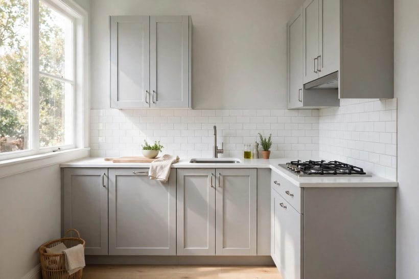
Then run the graphic’s three-light protocol. Breakfast: the fresh morning read, when the undertone is most exposed. Noon: the maximum-light read, when a too-pale grey reveals whether it will vanish entirely. Lamplight: the evening read, under the bulbs the room actually uses, when warm-leaning greys glow and cool-leaning ones can turn stern. A candidate that pleases in two of three and behaves in the third is your colour; one that only pleases at noon is a photograph, not a paint.
Live with the boards for at least a full day and a full evening before deciding. Pale greys are slow colours — their whole appeal is in how they hold a room across hours — and a decision made in twenty minutes in a shop is the single most common cause of the wrong-grey repaint.
6. Sheen and Surface at the Pale End
The same grey in matt and in satin is two colours. Matt finishes absorb light and push the colour deeper and softer — flattering to imperfect walls and to the calm, chalky read most people want from a pale grey. Satin and silk finishes reflect, lightening the read and sharpening the undertone, while showing every trowel mark the wall owns.
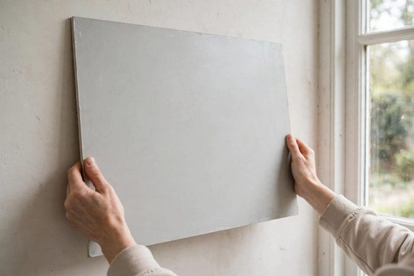
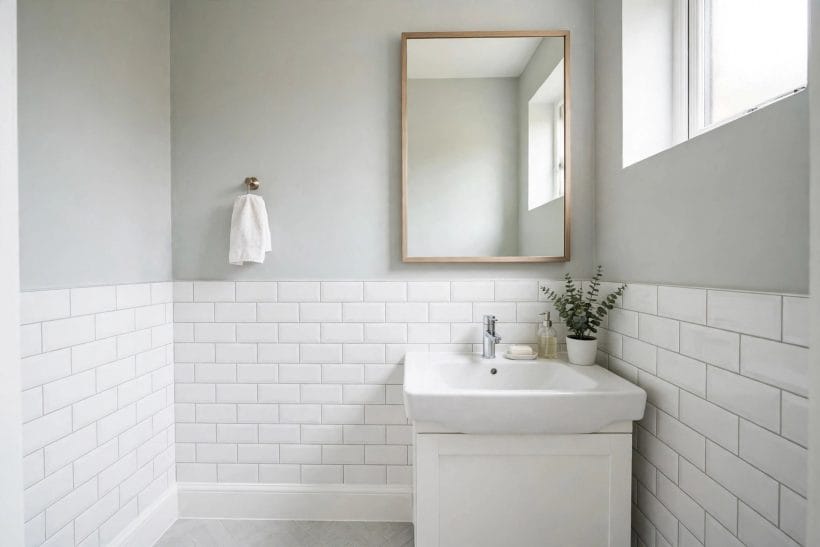
The door in the photograph demonstrates the household compromise: satin on the woodwork, where durability and a gentle sheen are wanted, matt on the walls. At the palest end, that sheen difference alone can supply all the contrast a scheme needs — trim, walls and woodwork in one colour family, separated only by finish. It is the quietest version of the two-tone idea, and it suits rooms that want serenity more than statement.
7. Pairing the Palest Grey: Trim, Wood and One True Colour
A near-white grey is a supporting actor, and casting its partners well is half the result. Pure white trim against it gives the classic architecture: the grey reads as colour, the white as structure. Warm woods — oak above all — keep the scheme from cooling into sterility, the pairing the graphic names ‘Gentle’ and the kitchen photograph below this section’s sibling rooms demonstrate daily.
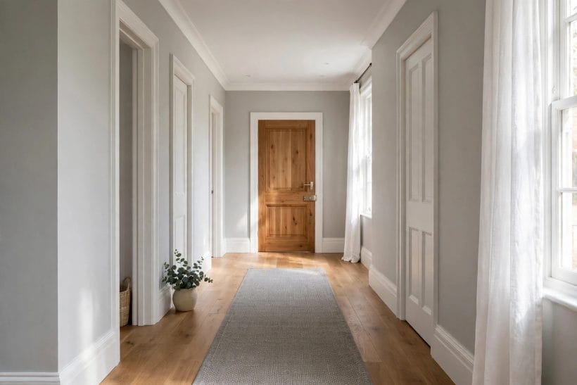
And one true colour, used sparingly, makes the grey look intentional rather than undecided. A single deep accent in the room — the ink of midnight blue on a door or a cabinet run, the softened drama of plum in textiles — gives the palest walls a foil to be pale against. Existing furniture counts in this casting too: the brown couch with grey walls combination works precisely because warm leather and pale grey keep rescuing each other from blandness.
Floors are the partner nobody tests and everybody sees. Pale grey above pale ash or grey-washed boards can read as one continuous cool surface — sleek in a kitchen, chilly in a bedroom. The same grey above honey oak or a warm rug warms by association. When a test board pleases you, hold it against the floor it will live above before falling further; more pale-grey romances end at the skirting board than at the swatch.
8. One Room, Start to Finish: The Sequence
Gathered into an order of work, the method of this post runs: first, name the room’s light honestly — its aspect, its hours of use, its bulbs. Second, choose the undertone family that light calls for, using comparison against true white. Third, test two or three candidates as large boards through a full day and evening. Fourth, fix the sheen split between walls and woodwork. Fifth, confirm the pairings — trim, floor, the one true colour — against the dried boards, not against memory.
Only then buy the paint for the room, keep the boards until the walls are dry — wet paint reads darker and cooler than its finished self, and many a right colour has been panicked over at the wrong hour — and judge the result at the same three lights the boards were judged by. The sequence is slower than grabbing a tin, and faster than repainting.
9. When It Reads Wrong: The Three Failures
Almost every pale-grey disappointment is one of three. It reads blue: the undertone was cooler than the room’s light could forgive — the fix is a step towards the warm or green side of the family, not a darker colour. It reads as nothing: the grey is too pale for a very bright room, washed to white by noon — the fix is the same undertone one step deeper, which at this end of the scale is still very light indeed.
Or it reads cold and flat in the evening: a sheen and lighting problem as often as a pigment one — warmer bulbs, a matt-er wall finish, and textiles in the warm register usually rescue it without a repaint. Diagnose which of the three you have before reaching for another tin; each failure has a different cure, and the wrong cure compounds it.
One more mercy is worth knowing: at this end of the scale, corrections are cheap in paint terms. Shifting one step warmer or one step deeper usually takes a single coat over a pale base, because nothing dark needs burying. The palest grey is thus the most revisable colour in the house — a forgiving place to learn how your rooms’ light behaves, and knowledge that transfers to every stronger colour you choose afterwards.
10. The Neighbourhood of Near-Whites
The palest grey lives in a family worth knowing, because its neighbours are the answers when grey is nearly — but not quite — right. Greige warms the formula towards beige; warm whites keep a breath of pigment without the grey’s cool shadow; the palest stone and plaster tones borrow their depth from texture rather than tint. The site’s tiny house interior paint colours and its tiny house colour palette guide tour that wider neighbourhood room by room.
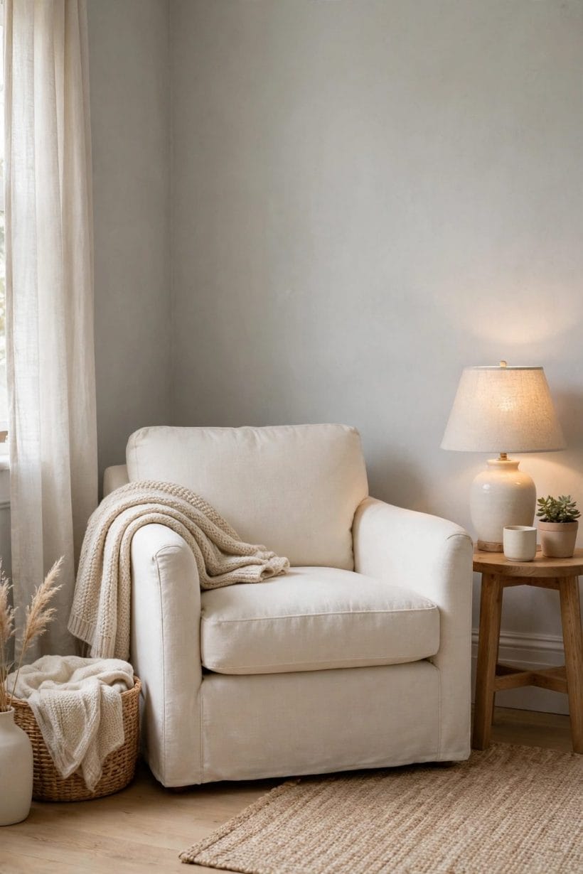
But if the wish that brought you here is the original one — a grey so light it almost isn’t there — then the family tour ends where it began: with the discipline of the undertone named, the boards painted large, and the three lights consulted. Do that, and the whisper of a colour rewards you every hour of the day, exactly as the lamplight photograph promises.
Final Considerations
Choosing the palest grey is a small decision with an outsized effect, because the colour is mostly light wearing a hint of pigment. Respect that and the choice becomes simple: name the undertone, test it large, judge it at breakfast, noon and lamplight, and let the room — not the chart, not a photograph — have the final say. For the whole light-grey family in depth, the colour guide linked at the start remains the owner’s manual; for this one room, you now have everything the decision needs.

0 Comments