
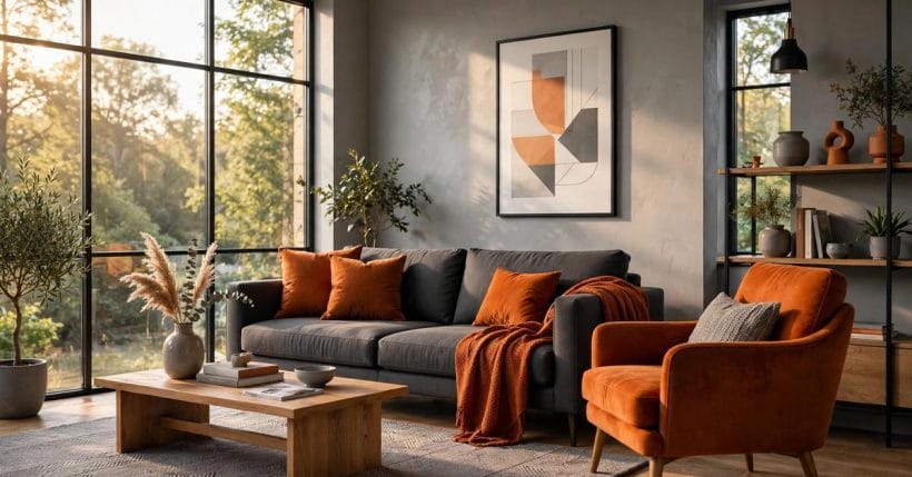
Grey is the calmest colour in the house, and orange is the warmest — which is exactly why they need each other. Grey alone can drift toward the chilly and the flat; orange alone can shout. Together, balanced with a little discipline, they make rooms that feel both composed and alive.
This post works the pairing properly: how much of each, which greys and which oranges, room by room — seventy-five ideas for the confident, comfortable middle ground where a grey base meets a warm orange accent.
1. Grey and Orange at a Glance
Grey and orange sit opposite each other in temperament: grey is a neutral built from black and white, cool or warm depending on its undertone; orange is grey’s warm complement, the colour of firelight, terracotta and autumn. In a room, the working arrangement is almost always the same — grey as the field, orange as the event. The walls, sofa or cabinets carry the calm; the cushions, chair, art or door carry the warmth. Readers arrive with the plain search phrase gray and orange, and the pairing they are picturing is that one: a composed grey room, lit from inside by orange. It is a pairing with a long domestic history, too — grey has been the quiet backdrop of northern interiors for generations, and orange is the colour those rooms always reached for when they wanted warmth without fuss.
This post is the colour-pair member of a small paint family. The cluster it belongs to — enduring paint colours that homes keep returning to, the greige undertones guide, and the single-colour studies of taupe and charcoal — treats colour the same way throughout: no brand names, no colour codes, no invented colour-of-the-year claims, just the behaviour of the colours themselves in real rooms and real light.
| Question | Short answer |
|---|---|
| What is the basic recipe? | Grey as the large, calm base; orange as the smaller, warmer accent — with wood, white and green plants as the peacemakers between them |
| Which grey works best? | A mid grey with a warm undertone for living spaces; cooler blue-greys suit bright, sun-washed rooms and can turn cold in dim ones |
| Which orange works best? | Burnt, rust and terracotta oranges behave like neutrals with warmth; bright tangerine is a spice — powerful, and best in small doses |
| Where does the pairing fail? | At fifty-fifty: equal fields of grey and orange fight. One must lead, and it is almost always grey |
2. The Balance: How Much of Each

1. Grey leads, orange punctuates
Start from the feature room’s arrangement and the living room above: grey on the big surfaces — walls, sofa, rug — and orange arriving in cushions, a chair, a throw, a print. The eye reads calm first, warmth second, and the room feels designed rather than decorated.
2. The three-layer rule
Think of the pairing in layers rather than percentages: a grey ground, a middle layer of wood and white that separates the two colours, and orange accents on top. The middle layer is what stops grey and orange from grinding against each other.
3. One orange hero
Give each room a single orange protagonist — the armchair, the door, the artwork — and let everything else orange be supporting cast. Two heroes per room is a duel; one hero and an echo is a composition.
4. Repeat the accent three times
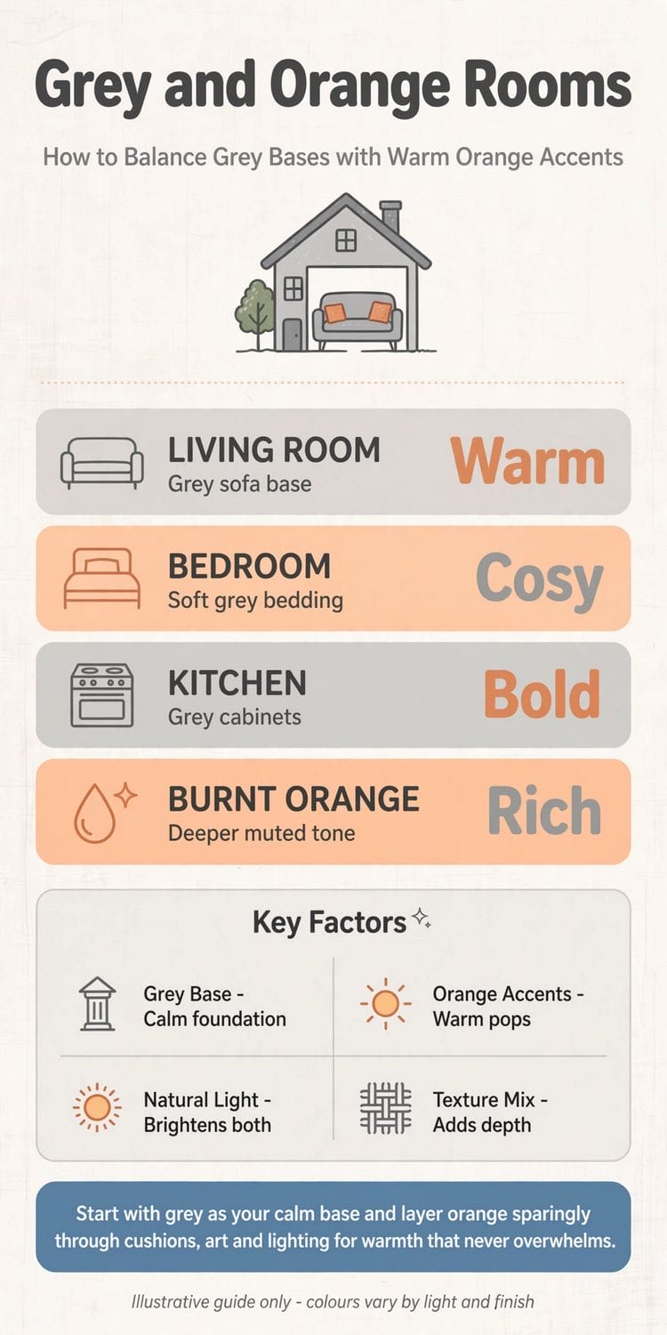
An accent used once looks lost; used three times, in varied sizes, it looks intentional. Cushions, a vase and a book spine in the same orange family will carry a whole grey room — the rule the infographic’s tip is built on.
5. Let texture do the shouting
Orange in velvet, boucle, terracotta and aged leather speaks at different volumes. A muted room can take orange’s full texture range; a busy room should take orange in one texture only, repeated calmly.
6. Wood is the third colour
Warm wood — oak, walnut, teak tones — is the treaty between grey and orange, because it shares something with both. A grey-orange room without wood often feels like a showroom; with it, like a home.
7. White keeps it breathable
White ceilings, trims and ceramics stop the pairing closing in. In small or dim rooms, raise the white’s share and lighten the grey; the orange will glow the more for the air around it.
8. Test the ratio with textiles first
Before painting anything orange, borrow the cushions and throws and live with the balance for a week. Textiles are the pairing’s rehearsal: cheap to change, honest about light, and quick to reveal whether your room wants more warmth or less. Note what the rehearsal teaches that no swatch can: how the pairing behaves at breakfast, at noon and under the lamps you actually own — three different rooms wearing the same two colours.
3. Living Rooms in Grey and Orange
9. The grey sofa, orange cushions classic
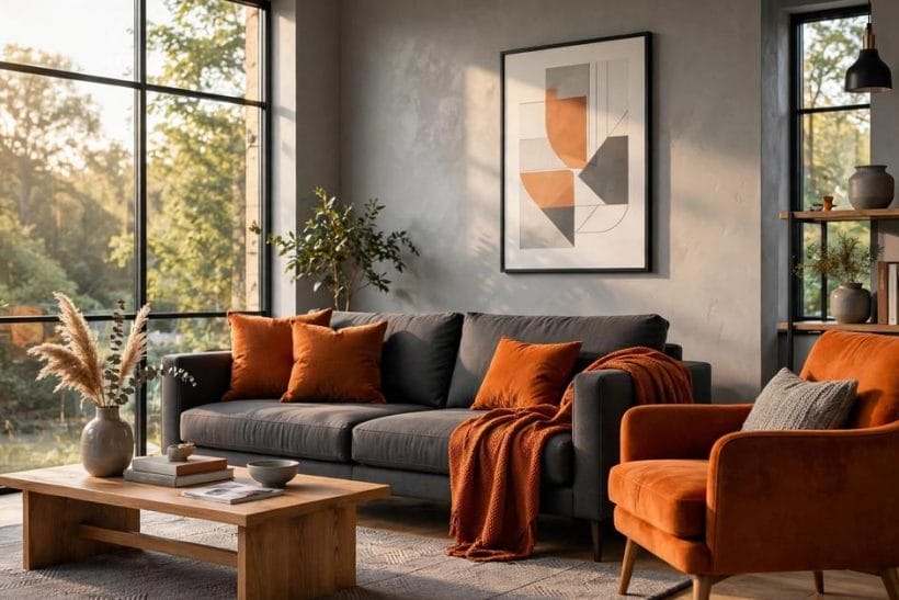
The pairing’s home fixture: a mid-grey sofa is the most forgiving base in decorating, and orange cushions are its oldest friend. Velvet or linen, two or three in graded oranges, and the sofa changes season without changing itself.
10. The orange armchair
One burnt-orange chair — as in the feature room — anchors a grey living room like a hearth. Place it where firelight or lamplight reaches it in the evening, and it will earn its keep nightly.
11. Abstract art in the pair’s colours
Large, simple abstract prints in orange and grey, like the one above the sofa in gallery one, let a renter or a cautious decorator run the whole scheme from a single frame. Art first, commitments later.
12. The grey rug under orange
A patterned grey rug steadies orange furniture: the chair glows against it, and the floor’s calm spreads the accent’s energy. Keep the rug’s pattern tonal — grey on grey — so it whispers under the orange’s speech.
13. Terracotta instead of tangerine
For living rooms used mostly by lamplight, the earthen oranges — terracotta, rust, clay — outperform bright citrus tones, which can look harsh after dark. Earthen orange under warm light is the pairing at its most flattering.
14. Orange through the hearth
Flame is the original orange accent. A grey room with a working fire, candles or even a row of amber glass near the hearth gets its orange for free, moving and alive; build the fixed accents to harmonise with firelight’s tone.
15. Bookshelves as colour
On grey shelving, a run of orange spines and ceramics is an accent you can re-shelve in an afternoon. It is the pairing’s most flexible instrument — useful for testing how much orange a room wants before anything is painted.
16. The grey media wall, warmed
A charcoal media wall can swallow a room’s warmth; an orange-toned artwork, a leather pouffe and warm-white lighting restore the balance. The screen’s black joins the grey family when off, so count it as grey in your reckoning.
4. Bedrooms: Soft Grey, Warm Wake-Up
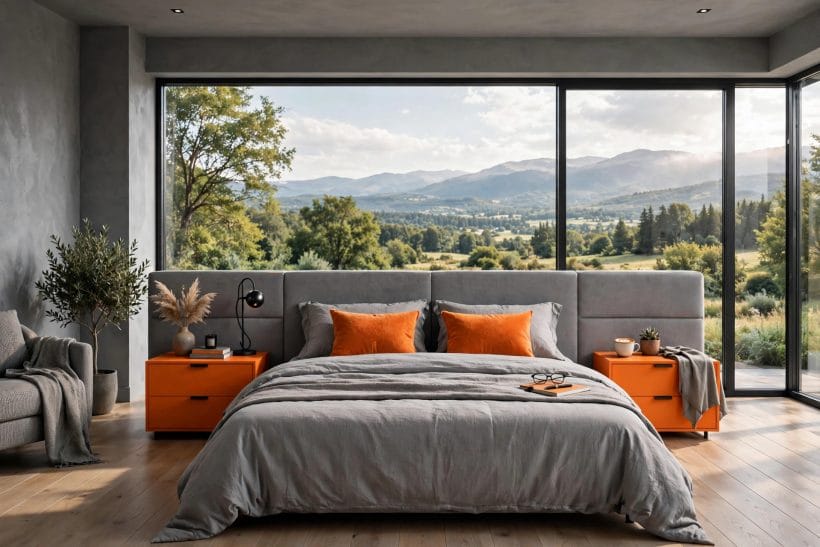
17. Grey bedding, orange cushions
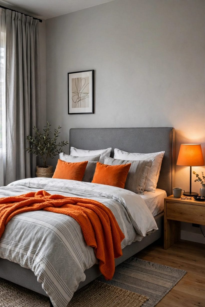
The bedroom above states the recipe: grey bedding as the field, orange arriving in cushions and the bedside cabinets. It is serene at midnight and cheerful at seven — a rare double act, and the reason this pairing loves bedrooms.
18. Keep orange away from the pillow
Orange near the face can feel alerting at bedtime. Place it at the foot of the bed, on the cabinets, in the art — anywhere the closing eye meets it last and least.
19. The upholstered grey headboard
A tall grey headboard is the bedroom’s calm architecture; against it, a single orange throw across the foot of the bed is enough accent for the whole room. Grey’s softness here is literal as well as visual.
20. Burnt orange for north-facing bedrooms
Rooms with cool, grey daylight from the north can take the deepest oranges without glare — indeed they need them, since cool light greys colours down. Test swatches at the room’s dimmest hour, not its brightest.
21. Orange lampshades at dusk
Amber and orange shades on bedside lamps tint the whole room’s evening light toward firelight. Against grey bedding the effect is hotel-calm with a pulse — and it costs a shade, not a scheme. Choose the shade for the light it gives, not only for its look switched off: the glow through an orange shade is the accent doubled.
22. The dressing corner
An orange stool or a rust-toned cushion on the dressing chair gives the bedroom’s working corner its own identity within the scheme. Small rooms in the house benefit from these micro-zones of the accent.
23. Children’s rooms, gently
Grey keeps a child’s room from visual chaos while orange supplies the joy: cushions, storage boxes, one painted drawer front. The scheme grows up gracefully, because grey never has to be apologised for later.
24. Guest rooms that feel hosted
Grey says the room is fresh; orange says someone thought about you. A folded orange throw on grey bedding is the guest-room signature of this pairing — welcoming without a word of print or pattern.
5. Kitchens and Dining Rooms
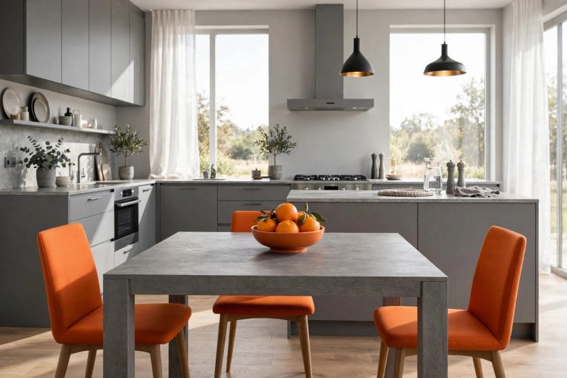
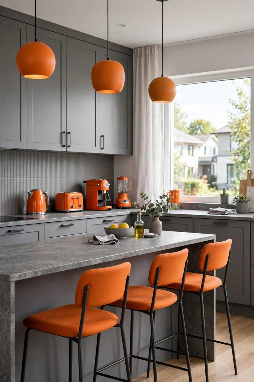
25. Grey cabinets, orange chairs
The kitchen-diner above inverts the living-room recipe: grey does the fitted work — cabinets, stone table — and orange takes the movable furniture. Dining chairs in burnt orange around a grey table is the pairing’s most sociable arrangement.
26. The bowl of oranges principle
Sometimes the accent is literally fruit: a bowl of oranges on a grey counter is colour, still life and grocery in one. Citrus, pumpkins, copper pans and amber glass all play this role — the edible and metallic cousins of orange paint.
27. Orange through cookware and cloth
Tea towels, a enamelled pot, seat pads: the kitchen’s small textiles can carry the accent in washable, changeable form. Kitchens tire of schemes faster than any room; let their orange be the kind you can launder.
28. Grey tiles, warm grout-light
Grey splashback tiles under warm under-cabinet lighting pick up an amber cast that flatters food and faces. It is orange by lighting rather than by pigment — the subtlest entry in this whole post, and often the most successful.
29. The painted island or dresser
One fitted piece — an island front, a dresser, a pantry door — in burnt orange gives a grey kitchen its landmark. Fitted colour is a commitment, so take it from the earthen end of the family, which ages with more grace than brights.
30. Dining by candlelight
Grey dining rooms are candlelight’s friend: the neutrality deepens, and every flame is an orange accent multiplied. Orange napkins or glassware at a grey-set table double the effect — the pairing performing at its favourite hour.
31. Breakfast nooks in citrus
Morning rooms can carry the brightest oranges in the house, because morning light is kind to them and appetite likes warmth. A citrus cushion run in a grey nook is the day started in the right key.
32. Keep worktops neutral
In kitchens, let the worktops stay in the grey-white-wood peacekeeping layer, however bold the chairs. Food is colourful enough; the stage should not compete with the performance three times a day.
6. The Orange Family: From Tangerine to Terracotta
33. Burnt orange, the diplomat
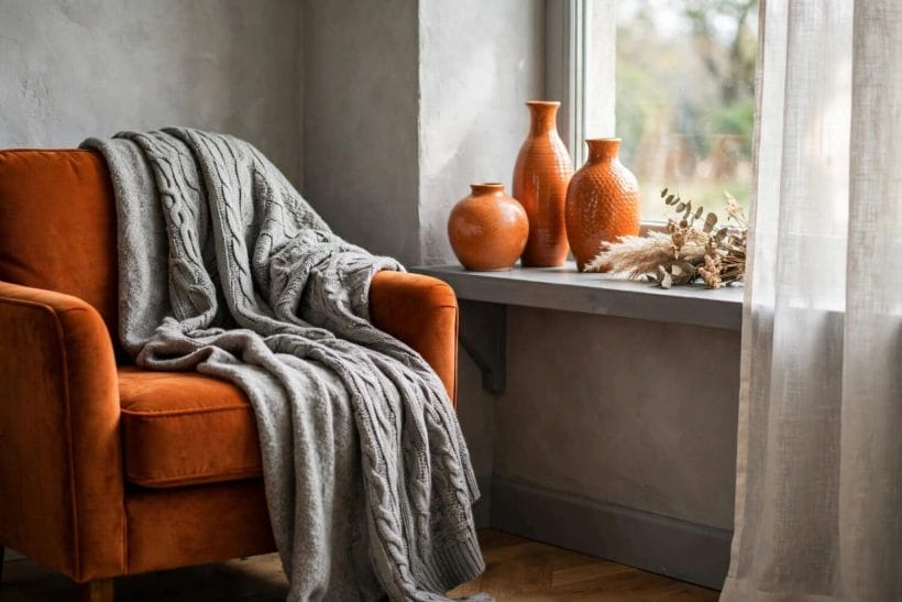
Browned with a little black or umber, burnt orange behaves almost like a neutral with a heartbeat — the chair in the view above. It is the orange to choose when the scheme must last a decade.
34. Terracotta, the earth orange
Clay’s own colour brings texture with it: pots, tiles, unglazed ceramics. Terracotta against grey reads Mediterranean and handmade, and it pairs with plants better than any other member of the family.
35. Rust and brick
Deeper, redder oranges — rust, brick, paprika — suit autumnal, library-ish rooms and leather. Against charcoal they are sumptuous; against pale grey they can shout, so deepen the grey when you deepen the orange.
36. Apricot and peach, the softeners
Orange lightened toward apricot is the family’s gentle end: bedrooms, nurseries and anyone nervous of the full strength. Against warm grey it reads as a blush of warmth rather than a statement.
37. Tangerine, the spice
True bright tangerine is magnificent in teaspoon quantities — a vase, a cushion front, a lampshade lining — and exhausting by the chairful. Dose it like chilli: you can add, you cannot subtract.
38. Copper and bronze, the metallic oranges
Metallic orange-browns give the accent with a shine instead of a shout: lamp bases, handles, a kettle, picture frames. In grey rooms they read as jewellery — small, warm, and clearly deliberate.
39. Marigold and amber
Yellow-leaning oranges glow in daylight rooms and glass: amber bottles on a grey windowsill, as above, are stained glass for people who cannot commission stained glass. Group them in odd numbers and let the sun do the decorating.
40. Gradients within one room
The family mixes well with itself: burnt orange chair, terracotta pots, apricot cushion. A gentle gradient across three oranges looks richer than any single shade matched exactly — nature never matches, and rooms may follow her. The one discipline is family resemblance: keep the gradient inside one temperature — all earthen, or all citrus-bright — and the mix reads as richness rather than indecision.
41. The grey throw test
The view above holds the pairing’s whole philosophy in one chair: orange upholstery, grey knit thrown over it. When in doubt about a combination, drape before you buy — textiles rehearse what paint and upholstery will perform.
7. Home Offices and Studies
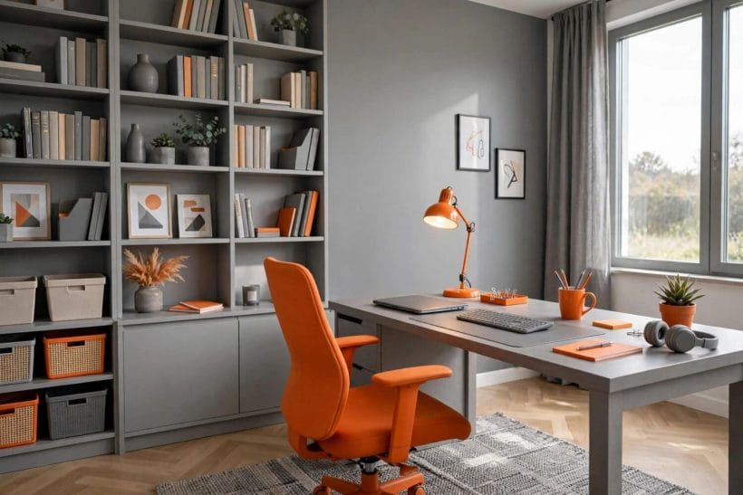
42. The orange desk chair
The office above makes its move with furniture: grey shelving and desk as the calm infrastructure, an orange chair as the room’s energy. For rooms where you must feel awake, this is the pairing’s most functional arrangement.
43. Grey for the video-call backdrop
Grey walls and shelving photograph neutrally on calls — no colour cast on skin, no visual noise. Keep the orange to your side of the camera, or in one deliberate artwork, and the backdrop stays professional while the room stays yours.
44. Orange desk accessories
Lamp, mug, notebook, tray: the desk’s small tools in orange are morale in object form. They cost little, cluster well, and can be cleared into a drawer when the room must turn formal.
45. Storage in graded oranges
Boxes and files in graded oranges on grey shelves turn storage into the scheme’s rhythm section. The gradient does the decorating; the labels do the finding.
46. A grey rug for chair wheels and calm
Under the desk, a grey rug absorbs the office’s visual and actual noise, and gives the orange chair a stage. Choose a flat weave that wheels forgive.
47. Reading corners in studies
Every office deserves its off-duty corner: a grey armchair, an orange cushion, the lamp from idea forty-four’s family. The pairing divides the room’s moods without a wall in sight.
48. Pinboards and art in orange frames
Thin orange frames on grey walls organise the study’s paper life into the scheme. It is the cheapest architectural line in this post — a frame’s edge — and it works in rented rooms where paint is forbidden.
49. Plants as the third voice
Green is the pairing’s natural mediator, and offices need it most. A plant on the grey desk, echoing nothing and calming everything, completes the triangle that grey and orange begin. If the office doubles as a guest room, the same plant mediates the room’s change of shift, softening the desk’s working geometry for whoever sleeps there.
8. Walls, Textiles and Small Accents
50. Painting one wall orange
A single wall in deep burnt orange behind grey furniture is the scheme’s boldest mainstream move. Choose the wall the room’s main seat faces away from — you sit in the grey, looking at the warmth, not sitting inside it.
51. Grey walls in two depths
Two greys — paler on most walls, deeper on one — give the room architecture before orange arrives. Depth differences within grey are the quiet structure that lets a few orange objects carry the whole colour story.
52. Wallpaper with the pair woven in
A grey-ground wallpaper carrying an orange motif spreads the accent evenly and softly. It suits halls and dining rooms where furniture is sparse and the walls must do more of the work.
53. Cushions: the adjustable accent
Cushions remain the cheapest unit of orange: two on the grey sofa, one on the chair, swapped by season. Keep their fabrics mixed — velvet, linen, knit — so the colour reads as a material story, not a paint chart.
54. Throws and blankets
An orange throw on a grey chair, a grey throw on an orange one — the draped crossing, as in gallery four, is the pairing’s signature gesture. It also doubles as the scheme’s thermostat, visually and literally.
55. Curtains in grey, linings in orange
Grey curtains with an orange lining flash warmth only when the curtains move or close — a private joke of a detail. Orange tiebacks achieve a simpler version of the same flash.
56. The painted door
An interior door in burnt orange — the hall in gallery six shows it — turns a circulation space into the scheme’s exclamation mark. Doors are ideal accent vehicles: bounded, paintable in a day, and seen in passing rather than stared at.
57. Ceramics and glass
Orange pottery on grey shelves, amber glass in grey windows: the small hard goods carry the accent with a shine textiles cannot. Collect them slowly and the room gathers meaning along with colour. Amber glass deserves its own word: held to the light it is orange made luminous, and a grey windowsill of amber bottles is this scheme’s stained glass — cheap, movable and quietly theatrical.
9. Bathrooms, Halls and Finishing Touches
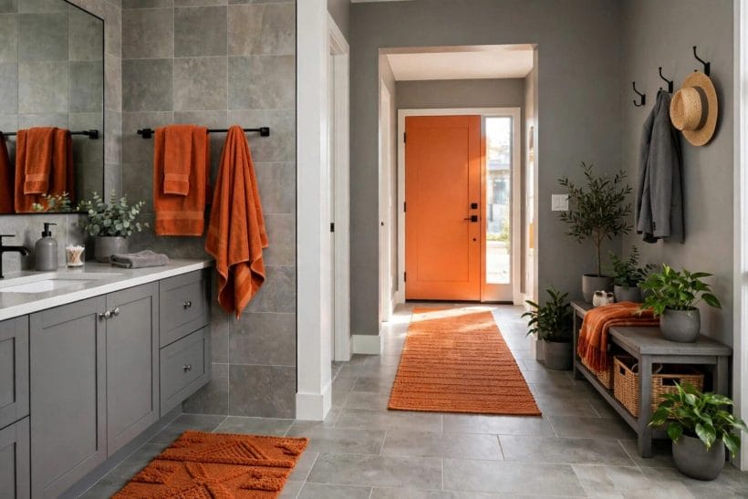
58. Orange towels in a grey bathroom
The bathroom above runs the scheme on linen alone: grey tiles and cabinets, orange towels and bath mat. It is the renter’s and the cautious decorator’s perfect scheme — a full colour story that folds into a drawer.
59. Grey tiles, warm metals
Copper and brushed-brass fittings are the bathroom’s metallic oranges, glowing against grey tile without a drop of paint. They also age into the scheme, deepening rather than dating.
60. The hall runner
A woven orange runner on a grey hall floor leads the eye and the guest. Halls are the pairing’s natural gallery: little furniture, much wall, and a welcome that benefits from warmth at the threshold.
61. Stairwells and landings
Grey walls up the stair, orange in the runner and one print at the turn: the vertical rooms take the scheme in stride, and the accent helps mark the journey between floors.
62. The orange front-of-house moment
A painted front door in a deep orange against a grey facade — or the reverse — is the pairing’s public face. Deep, earthen oranges weather the role best; keep the gloss level matched to the house’s other paintwork.
63. Small rooms, full scheme
A cloakroom or box room can hold the pairing at full strength — orange walls, grey woodwork — because small rooms forgive intensity. It is the house’s jewel box, and guests remember it disproportionately.
64. Outdoor rooms
Grey stone and rendered walls outside, orange in cushions, pots and lanterns: the pairing survives the garden gate intact, and terracotta is already halfway there. Bring the textiles in at night and the scheme lasts the summer.
65. Seasonal rotation
The pairing’s accents swap by season beautifully: marigold and citrus for summer, rust and copper for autumn, apricot for spring. Grey, the faithful base, never has to move — that is the entire point of choosing it.
66. What to leave grey
Ceilings, woodwork in most rooms, the largest upholstery, the fitted furniture: leave the expensive, architectural things grey or neutral, and spend the orange on the replaceable. Schemes age at the speed of their most permanent colour.
10. Light, Undertones and Pairing Checks
67. Grey’s undertone decides everything
Greys lean blue, green or violet — cool — or toward beige and brown — warm. Warm-leaning greys flatter orange instinctively; blue-greys make orange flare hotter, which some rooms want and bedrooms rarely do. The undertone reading method in the paint cluster’s greige guide, linked at the start, applies to every grey in this post.
68. Read the room’s light first
Cool daylight greys colours down and warms nothing; south-facing sun forgives and flatters both colours. Judge swatches at morning, noon and lamplight before committing — the pairing is a relationship, and light is its third party.
69. Lamplight warms the treaty
Warm-white bulbs pull grey toward greige and deepen orange toward ember — the evening version of this scheme is warmer than its daytime self. If the evening version pleases you, the scheme is right; rooms are mostly lived in after dark.
70. Charcoal changes the register
Deepen the grey to charcoal and the pairing turns dramatic: orange becomes ember-like against it. The charcoal study in the cluster, linked in the first section, treats that depth on its own; here, know that charcoal plus orange is evening wear — glorious, and too much for a nursery.
71. Pale grey changes it back
At the pale end, silvery grey with apricot is almost a pastel scheme. Small, bright rooms and spring moods live here. Keep textures strong, or the room drifts from serene to insipid.
72. The beige bridge
Where grey and orange refuse to settle, beige and greige are the mediators — a beige rug, greige curtains. The beige living room ideas in this series show the mediating colour running a whole room; here it need only run an armistice line.
73. Brown, the neighbouring warmth
Leather, dark wood and brown textiles extend orange’s warmth toward earth, and grey keeps the result from heaviness. The brown bedroom ideas post explores that warmer neighbour; grey and orange sits one step cooler and brighter on the same road.
74. The photograph test
Photograph the room in flat daylight and look at the picture on a screen: the camera exaggerates imbalance honestly. If the orange reads as scattered dots, gather it; if it reads as one shout, soften or deepen it. The test takes a minute and settles arguments.
75. The pairing in one sentence
Grey is the room’s composure and orange is its welcome; keep the first in charge and the second on good behaviour, mediate with wood and white, and the two will share a house happily for as long as you care to live in it.
Final Considerations
Grey and orange is not a trend to be caught but a relationship to be balanced: a calm field, a warm event, and the discipline to keep them in that order. The seventy-five ideas above are that balance worked room by room — living, sleeping, cooking, working and washing — with the earthen oranges doing most of the lasting work. None of it requires bravery, either — grey forgives, orange visits, and both can be adjusted cushion by cushion until the room feels like the people who live in it.
It closes the paint cluster this series has built — taupe, charcoal, greige and the enduring families are all linked from the first section — and it may be the most liveable of them, because it is the only one with a hearth built in. Start with cushions on a grey sofa, and let the room tell you how much fire it wants.


0 Comments