
It is the most walked-through, least thought-about space in the house. Give its walls a plan, and every arrival home starts feeling better.
These seventy-five ideas treat the passage as a real room: treatments, colours, lighting and runners in a workable order, from the front door mat to the far end wall.
1. Read the Space First: Width, Light and the At-a-Glance Guide
Measure the narrowest point, note where doors swing, and stand at both ends at different times of day to see what the light actually does. Narrow passages forgive little: bulky treatments steal centimetres, dark colours advance, and anything hung at head height will be brushed by shoulders and shopping bags. Good hallway wall ideas begin with the route’s job — welcome, storage, gallery or all three — and give every treatment a clearance test before a beauty test. Check which walls carry pipes, cables or meters before planning panelling or heavy fixings, and ask a local tradesperson if a wall’s construction is unclear, because drilling the wrong wall is the one hallway mistake that is genuinely hard to reverse. Then choose one leading idea per wall, not five competing ones.
| Feature | Helps Most When | Watch Out For |
|---|---|---|
| Panelling | Walls take daily knocks | Depth stolen in tight spots |
| Deep colour | Long, bright passages | Gloom in windowless stretches |
| Mirrors | Light needs borrowing | Reflections of clutter |
| Gallery rows | Long blank walls | Frames knocked out of level |
| Runner | Noise and cold floors | Trip edges at doorways |
| Wall lights | Ceilings are low or busy | Shades at head height |

Treatments, colours and lighting compared at a glance, with the clearance warning that saves every scheme.
2. Panelling and Wall Treatments With Staying Power
Treatments earn their place in a passage by surviving it. Anything applied to these walls will be leaned on, brushed past and knocked by furniture being carried through, so choose profiles and finishes that can be wiped, touched up and partly repaired. Shallow treatments suit narrow routes; deeper, ledged styles belong in wider entrance halls. The crafted, layered approach in our tiny house decorating ideas translates well here, because small-space panelling has always had to be slim, tough and honest about its dimensions.
1. Half-height board panelling. Boards to chair-rail height with a slim ledge take the knocks, wipe clean, and give the upper wall freedom for colour or art above.
2. Shaker-style applied moulding. Shallow timber rectangles, painted out with the wall, add architecture for very little depth — the narrow passage’s best friend.
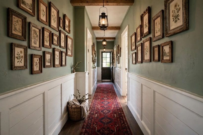
3. Tongue-and-groove painted in a deep tone. Vertical boards below, soft colour above: cottage character with a surface that shrugs off muddy dog shakes and umbrella drips.
4. A single ledge shelf at picture height. One slim ledge running the length of the wall displays art, plants and post without a single item projecting at shoulder height.
5. Limewash or textured paint. Movement and depth without any physical profile at all; ideal where every millimetre of width is already spoken for.
6. Washable wallpaper above a painted dado. Pattern lives safely above the knock zone, while the hard-wearing painted section below handles real life and repaints easily.
7. Timber slats on one short section. A contained run of slats at the entrance end defines arrival, hides a meter cupboard door and stops before it can overwhelm.
8. Brick slips on the end wall only. Real texture at the visual stop of the passage, where nobody brushes past it, gives depth without narrowing the route itself.

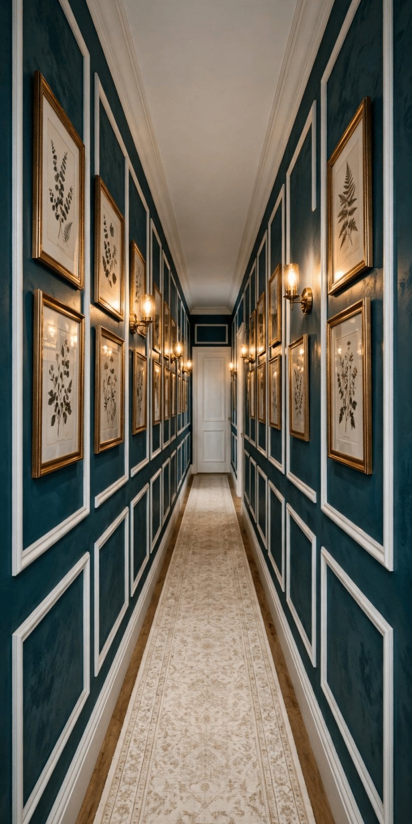
9. Painted panelling in the wall colour. When in doubt, paint the treatment out completely; shadow and proportion do the decorating while colour stays calm and unified.
3. Colour Strategies for Narrow, Dark and Long Passages
Colour is the cheapest renovation this space will ever get, and the rules are kinder than folklore suggests. Dark tones do not automatically shrink a passage; used on the end wall they shorten a too-long route pleasantly, and used everywhere with good lighting they create the cocoon guests remember. Pale tones lift windowless stretches but show every scuff at hand height, so finish choice matters as much as shade. Test at both ends and at midday and lamplight, as our tiny house interior paint colours guide insists for any high-impact decision.
10. End wall in a deeper tone. One confident end wall pulls a long passage into proportion and gives art or a mirror a backdrop worth walking toward.
11. Colour-drenched, including the doors. Walls, skirting and doors in one mid tone erase visual chopping and make a small entrance feel tailored rather than apologetic.
12. Pale walls, coloured ceiling. A soft tint overhead lowers a too-tall, narrow passage into friendliness while walls stay light and forgiving.
13. Two-tone with the darker tone low. Deep below the rail, pale above: the classic scheme hides scuffs exactly where they happen and lifts light exactly where eyes travel.
14. Warm white with one coloured door. Keep the passage neutral and let the door at the end carry the personality; repainting a door is an afternoon, not a project.
15. Striped wallpaper on the long wall. A fine vertical stripe lengthens low ceilings, while a horizontal one stretches short passages; keep the palette tonal so it whispers.
16. Green in any depth. The passage colour of the decade for good reason: it flatters timber, brass and every skin tone passing the mirror at the door.
17. Sample boards walked along the route. Paint large boards and carry them the length of the space at breakfast and dusk before committing a single wall to the shade.
18. Satin finish at hand height. Whatever the colour, a wipeable sheen on the lower wall is the difference between a scheme that lasts and one that tires.
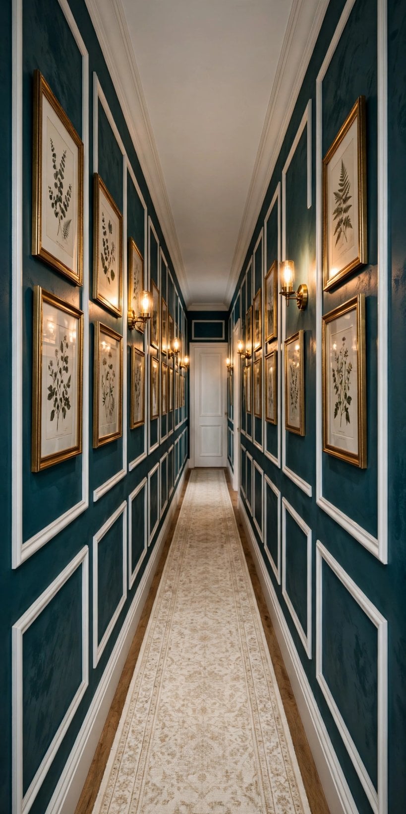
4. Mirrors, Art and Gallery Walls That Survive Traffic
Things hung in a passage live dangerously, so hang them like you mean it: proper fixings for the wall type, frames with a little depth tolerance, and arrangements that look intentional even when one frame is slightly out of level after a shoulder brush. Mirrors should reflect something worth doubling — a window, a plant, a lit doorway — never the shoe pile. Art rows work best with a strict top or centre line and generous spacing, echoing the composed walls in our colourful tiny house interior ideas.
19. One large mirror opposite the light. A single generous mirror doubles daylight and gives the leaving-the-house check a proper station, without a gallery of small reflections.
20. A strict-centre-line art row. Frames of mixed sizes hung on one shared centre line look curated and forgive the occasional knock back to level.
21. Picture ledges instead of frames. Ledges let art rotate with seasons and children’s output, with zero new holes and zero commitment beyond the ledge itself.
22. Black-and-white photography series. A single-medium series in matching frames reads calm in a busy route and flatters every wall colour behind it.
23. One oversized piece at the end. The end wall is a canvas: one big, calm artwork there gives the whole passage a destination and a mood.
24. Rounded mirrors for tight corners. Circles soften the geometry of narrow turns and remove the sharp frame corner that shoulders find in the dark.
25. Family timeline wall. Photographs in date order along the long wall turn the daily route into the house’s story; keep frames uniform to hold the calm.
26. Nothing hung at swing height. Map every door’s swing before hanging anything, because the frame behind a door has a lifespan measured in weeks.
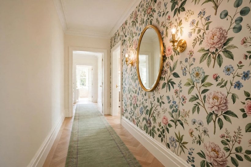
5. Lighting: Ceiling, Wall and the Borrowed-Light Tricks
Passage lighting must do three shifts: bright welcome, safe midnight route and flattering glow for the mirror check. A single central pendant rarely manages all three, so layer: ceiling light for cleaning and arrivals, wall lights for evening character, and a low guide light for the night. Warm tones flatter faces and timber, dimmers civilise everything, and glass shades aimed downward will dazzle anyone taller than the designer expected, so test from the tallest household member’s eye line.
27. Wall lights instead of pendants in low passages. Sconces keep the ceiling clear, wash the walls with interest and stop the ducking dance under a low-hung shade.
28. A statement pendant only where height allows. In a tall entrance hall, one generous pendant is the room’s chandelier moment; measure the drop against the tallest visitor, not the sofa.
29. Picture lights over the art row. Slim lights above the gallery line make the passage feel like a small museum in the evening and flatter every frame beneath.
30. Motion-sensing low guide lights. Gentle lights at skirting level guide night journeys without waking the house or ruining anyone’s night vision.
31. Borrowed light through glazed doors. Glazed or half-glazed internal doors lend daylight deep into the route; check privacy and any local safety glazing requirements first.
32. Dimmers on the ceiling circuit. Arrival-bright for wet coats and lost keys, low and warm for the evening: one control, two completely different halls.
33. Uplighters at the end wall. A pair of uplights washing the end wall makes the passage feel longer, taller and deliberately finished at its furthest point.
34. Bulbs matched across fittings. One warm colour temperature throughout; a blue-white bulb among warm ones makes the whole scheme look like a mistake.
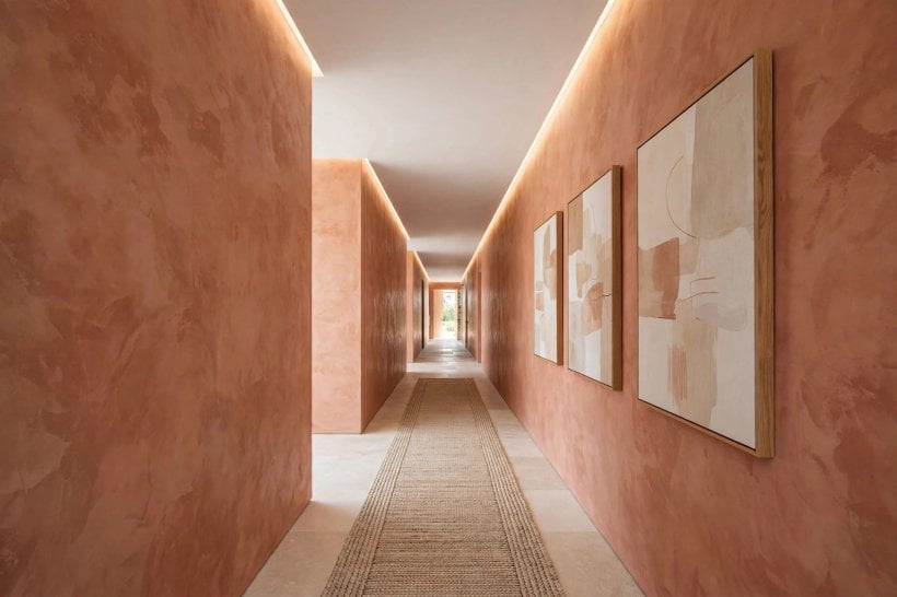
6. Runners, Floors and the Sound of Arrival
The floor writes the passage’s soundtrack. A runner softens footsteps, catches the day’s grit at the door end and introduces the scheme’s pattern or deepest colour at ankle height, where it cannot overwhelm. Fit matters more than fibre: the runner must lie flat, end before door swings, and sit on underlay that grips the floor beneath rather than skating on it. Bare-board and tiled routes gain warmth from even a short runner at the entrance section alone.
35. Runner at eighty percent of the length. Leave a border of floor visible at both ends and sides; a runner that fills everything reads as carpet that lost its fitting.
36. Pattern that hides the evidence. A small, busy pattern in mid tones conceals crumbs, pet hair and mud season with a grace plain colours cannot manage.
37. Washable runner, honestly washable. Choose one that fits your machine or can be hosed outside, because a runner you cannot clean becomes a very long doormat.
38. Non-slip underlay, always. The safety layer is non-negotiable on hard floors, especially at the foot of stairs where momentum and socks meet.
39. Vintage-look runner for instant history. Faded, traditional patterns forgive wear, flatter period woodwork and make new schemes feel settled within a week.
40. Two short runners instead of one long. In an L-shaped route, two matched short runners turn the corner more honestly than one runner folded around it.
41. Bare floor with a serious door mat. Where runners will not sit flat, skip them: a large, recessed or heavy door mat plus good lighting is safer and looks intentional.
42. Stair runner continuing the story. If the passage feeds stairs, carrying the same runner family upward ties the levels together; have winders measured by the fitter.
7. Storage, Hooks and Furniture That Earn Their Width
Entrance storage decides whether the scheme survives real life. Every item admitted to the passage must justify the centimetres it steals, sit as flat as possible, and hold the things that actually arrive daily: keys, post, coats, shoes and one bewildered umbrella. Closed pieces calm the view; open hooks work hard if they are edited weekly. The slim-profile discipline in our tiny house closet design ideas is the exact mindset this space demands.
43. A shallow console with drawers. A narrow console catches keys and post in drawers, hosts a lamp and a plant, and asks for barely more depth than a skirting board’s ambition.
44. Hooks on a painted board. A timber board takes the fixings, the wall takes none of the strain, and the whole row can move when the household’s coat count changes.
45. A bench with shoe storage beneath. Sit to lace, store below, hang above: the entrance trilogy in one footprint, and the most-used furniture in many homes.
46. Closed shoe cabinet, slimline. Tilt-out cabinets hide the shoe mountain in a hand’s depth; measure the household’s largest boots before ordering, not after.
47. One basket for the overflow. Scarves, gloves and dog leads live in a single lidded basket; when it overflows, the rule is editing, not a second basket.
48. Key bowl and post tray on the console. Two small, fixed landing spots end the daily archaeology of pockets, bags and coat piles at the front door.
49. Nothing stored on the floor line. Keep the walking line itself sacred and clear; storage lives on walls and in furniture, never as a slalom of bags and boxes.
50. A full-length mirror on the storage door. The wardrobe or cupboard door at the end earns a mirror, combining the leaving check with storage in a single surface.

8. Small, Dark and Rental-Friendly Versions
The smallest passages respond best to confidence plus restraint: one treatment, one colour decision, one light upgrade, done properly. Renters can achieve most of this list with paint where permitted, ledges, runners and lighting that plugs rather than wires in, keeping every change reversible. Darkness is solved by layering borrowed light and reflective surfaces before it is solved by paler paint, and width is protected by choosing flat, flush and shallow at every decision, exactly as the homes in our tiny house living room ideas demonstrate daily.
51. Peel-and-stick panelling look. Removable panels and trims give the panelled effect without a landlord negotiation; test removal in a hidden corner first.
52. Plug-in wall lights with cord covers. Sconce style without an electrician: cords run in paintable covers along the skirting and look fitted from a day’s distance.
53. Leaning mirror, secured. A tall mirror leaned and safety-fixed at the end wall borrows light and length; never leave it unsecured in a traffic route.
54. Pale runner on a dark floor. The single fastest lift for a gloomy route: light underfoot changes the perceived light of the whole passage instantly.
55. Art in poster frames with acrylic glazing. Light, safe and inexpensive frames let renters and families hang generously without weight, risk or wall damage anxiety.
56. Over-door hooks and organisers. The back of the door is free real estate for scarves and bags in a passage with no wall to spare.
57. Battery picture lights. Rechargeable lights over art give the gallery glow with no wiring, no holes beyond the frame’s own and no electrician’s invoice.
58. One colour, everywhere, in rentals. Where repainting one wall is allowed, take it onto the doors and woodwork too: maximum transformation for a single tin.
9. Doors, Skirting and the Details Nobody Photographs
Passages are seen at close range and in passing, so the small architecture matters: skirting depth, door furniture, the line where wall meets ceiling. Upgrading these quiet elements lifts every scheme built on top of them. Match metals across handles, hinges and light fittings, keep paint finishes consistent between doors and trim, and give the front door’s inner face the same respect as its street face, because it is the one you will look at ten thousand times.
59. Skirting painted with the wall. Blending skirting into the wall colour stretches perceived height and makes panelling lines cleaner in modern schemes.
60. Contrasting skirting in traditional schemes. A crisp, deeper skirting line grounds pale walls and hides the scuffs that live at vacuum height permanently.
61. Door furniture in one finish. Handles, hinges and letterbox in a single metal family is the jewellery rule: mixed metals look accidental at close range.
62. The front door’s inner face, painted boldly. A deep or joyful inner door gives arrivals a full stop of colour and photographs beautifully against calm passage walls.
63. Numbers and names with intention. House numbers, a post slot and a knocker chosen as a set make the entrance feel considered before the door even opens.
64. Soft-close and draught care. A door that closes quietly and seals kindly changes the passage’s whole temperament; adjust hinges before blaming the door.
65. Ceiling line kept crisp. A clean, pale line where wall meets ceiling (or a deliberate colour drench) is the frame every passage scheme hangs inside.
66. Switch plates that disappear. Paintable or wall-matched plates remove the white plastic confetti that breaks up otherwise calm, coloured walls.

10. Seasonal Care, Touch-Ups and Keeping the Welcome Fresh
A passage works harder per square metre than any room in the house, so it needs a maintenance rhythm rather than an annual rescue. Keep the wall colour’s touch-up pot accessible, rotate runners before wear paths set in, and treat the entrance as a seasonal stage: lighter art and a plant in spring, a deeper runner and warmer bulbs when the clocks change. The systems habit from our smart tiny house design ideas applies perfectly: little and often beats heroic and rare.
67. Touch-up pot in the hall cupboard. Labelled wall paint plus a small brush lives where the scuffs happen, so repairs take four minutes, not a free Saturday.
68. Monthly frame-and-ledge dust. A two-minute pass with a dry cloth keeps the gallery line looking deliberate instead of forgotten.
69. Runner rotation and deep clean. Turn the runner end-to-end each season to share the wear, and deep-clean before the pattern starts telling the traffic story.
70. Bulb check each autumn. Replace tired bulbs before the dark months and re-check colour temperature matches across every fitting in the route.
71. Hook audit each season. Coats migrate; return out-of-season pieces to wardrobes so the entrance row stays a system, not a landslide.
72. Door mat upgrade before winter. A fresh, larger mat in autumn saves the runner, the floor and the walls from the wet season’s worst weekends.
73. Art refresh with the seasons. Swap two or three pieces on the ledges quarterly; the passage feels renovated for the price of a quiet half hour.
74. Photograph the finished route. One photograph from each end, saved with paint names and runner details, makes every future repair a matching exercise, not a guessing game.
75. The ten-second arrival test. Walk in with shopping, in the rain, in the dark: if the welcome still works then, the design is finished; if not, fix that moment first.
Final Considerations
Treat the passage as a room with a job, not a leftover between rooms. Choose treatments that survive traffic, colours tested in the real light at both ends, lighting in layers and a runner that lies flat and washes well, and the whole home will feel better connected. Check fixings against each wall’s construction, keep the walking line clear at all times, and maintain the scheme little and often. Do that, and the most passed-through space in the house becomes the one that quietly proves how considered the rest of it is, every single time the front door opens.


0 Comments