

Pattern is the fastest way to give a plain room a personality, and the fastest way to make it feel restless when the mix goes wrong. The good news is that successful pattern layering follows learnable rules: vary the scale, let colour do the connecting, and give every print a clear role. This article shares the decorating secrets that make layered patterns look deliberate, calm and completely liveable.
1. At a Glance: The Essentials First
| Detail | What to Know |
|---|---|
| The core rule | Mix large, medium and small scales, never three of a kind |
| The glue | One shared colour palette running through every print |
| Safe starting point | Three patterns: one hero, one support, one accent |
| Best first surfaces | Cushions, throws, curtains and rugs before walls and sofas |
| Rest for the eye | Solid colours and plain textures between patterned pieces |
| Quick test | Squint or take a photo: the mix should read as one family |
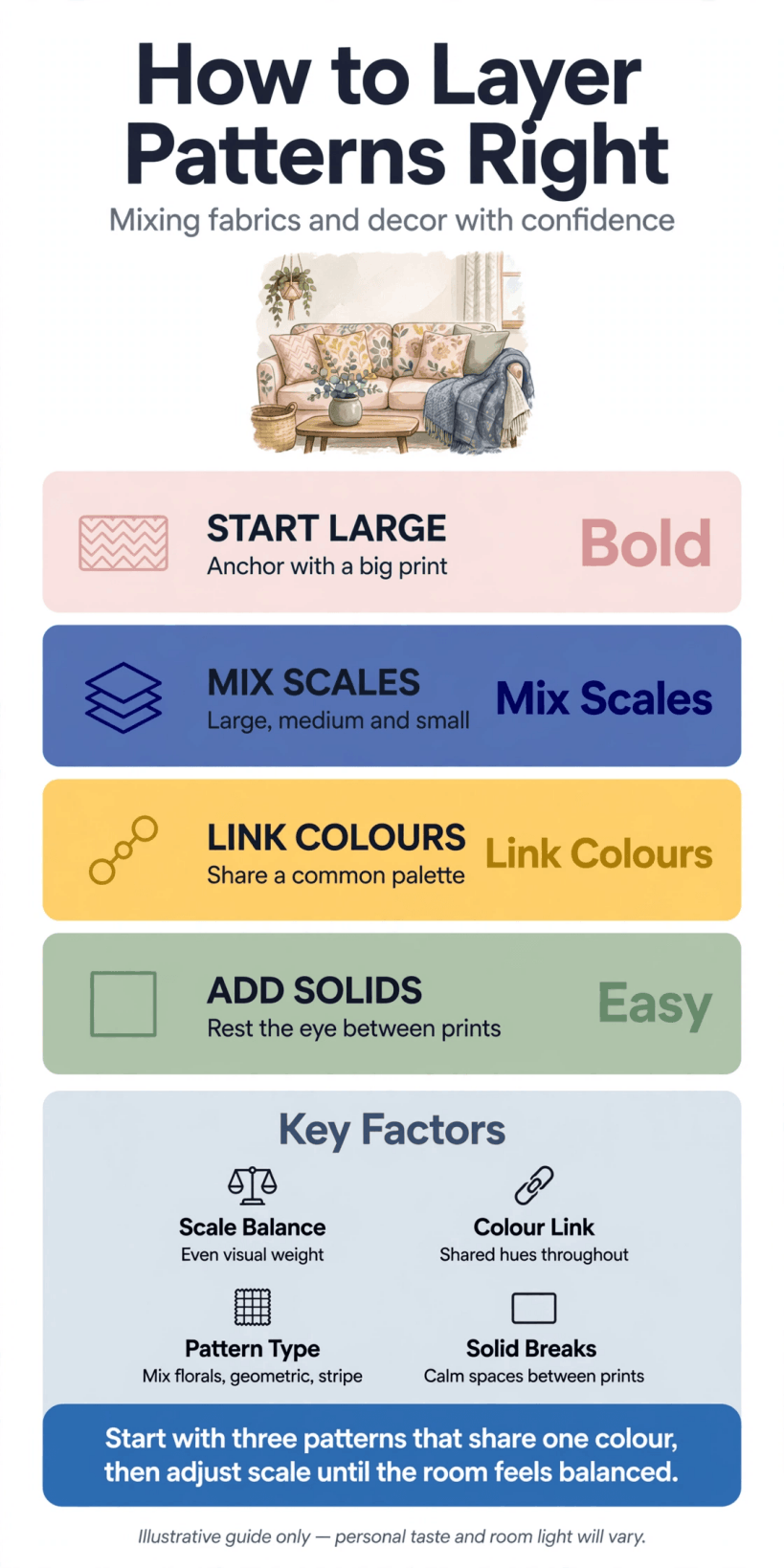
At a glance: the scale, colour and balance rules behind patterns that work together.
Decorators who layer pattern confidently are rarely braver than everyone else; they are simply more systematic. They decide the palette before they shop, they check the scale of every print against the pieces already in the room, and they leave breathing space between busy areas. That system is what this article unpacks, section by section, so you can apply it to a single cushion refresh or a whole-room scheme.
One reassurance before we begin: pattern mixing is forgiving when the foundations are right. If the colours belong to one family and the scales are clearly different, even quite different prints, a stripe, a floral and a geometric, will settle together happily. Most failures come from ignoring one of those two foundations, not from a lack of talent, and both are easy to fix once you can see them.
2. Start With Scale: Large, Medium and Small
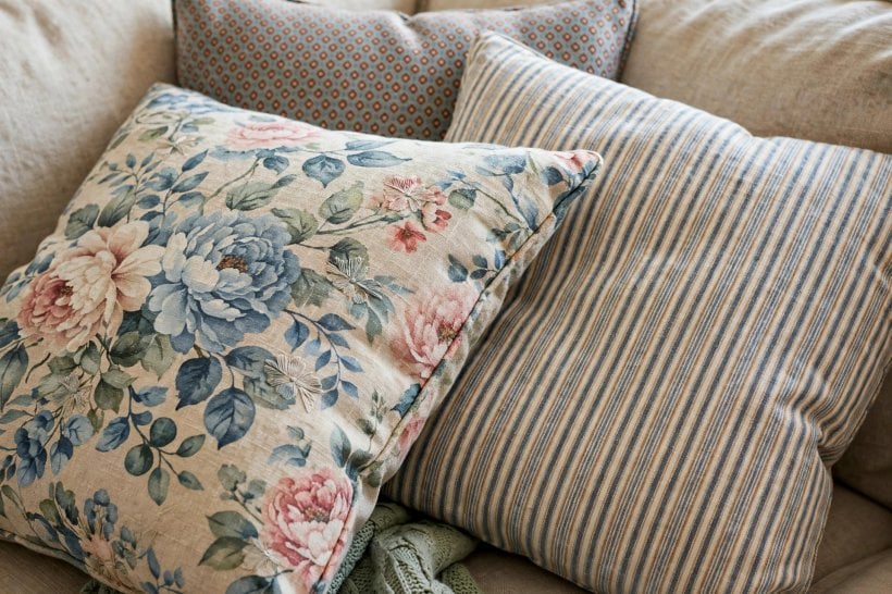
Scale is the single most useful idea in pattern mixing. Every print has a scale: the size of its repeat and motifs. A successful mix contains a clear large, a clear medium and a clear small, so the eye reads them as a hierarchy rather than a competition. Two patterns of similar scale fight, because neither leads; two patterns of very different scale relax, because one clearly supports the other.
In practice, let the largest pattern own the largest surface: a bold floral or oversized check on curtains or a rug, a medium stripe or geometric on upholstery, and a small ditsy print, pinstripe or mini-check on cushions and lampshades. Stand back and squint. If you can instantly tell which pattern is the hero and which are the backing singers, the scales are working. If everything blurs into equal visual noise, swap one piece for a clearly bigger or smaller print.
Small rooms reward the same discipline. The compact schemes in our guide to tiny house living room ideas show how one generous pattern, kept on the biggest soft surface, can make a tight space feel designed rather than decorated, while small prints scattered everywhere simply make it feel busy. When in doubt in a small room, go larger with the hero print and smaller with everything else.
3. The Three-Pattern Recipe
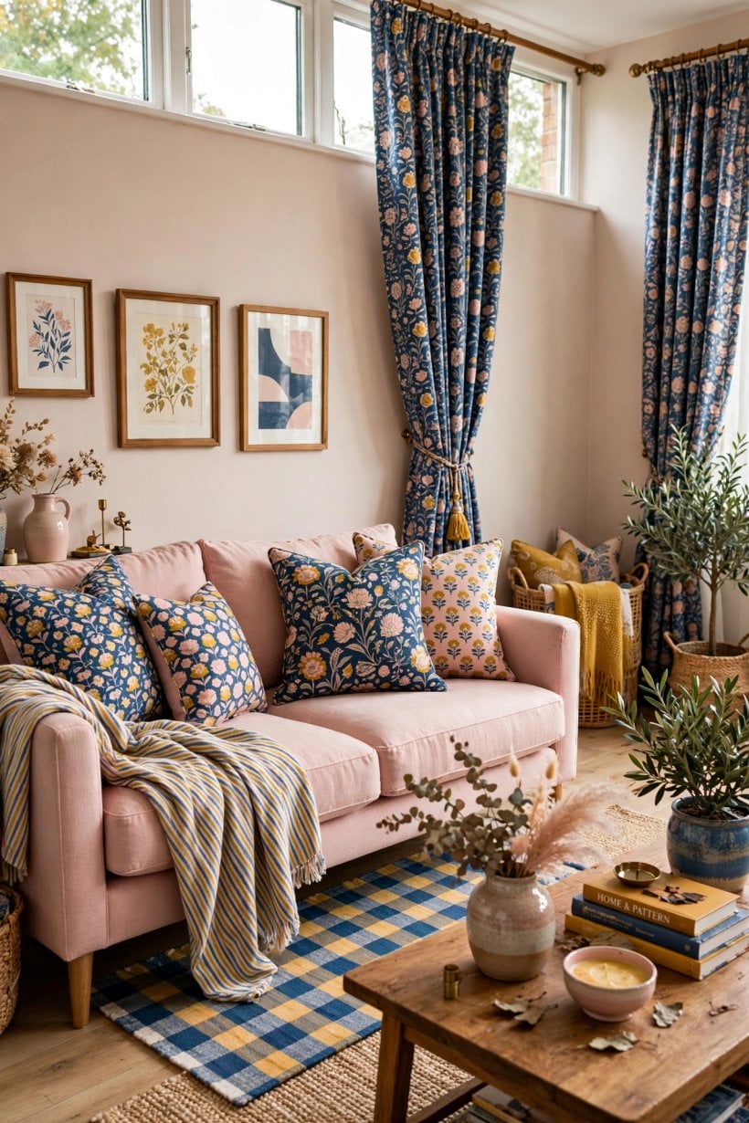
If you only remember one method, make it this recipe: one hero pattern, one supporting pattern and one accent pattern, tied together by colour. The hero is the largest scale and usually the most colourful. The support is a simpler, more structured print, a stripe, check or geometric, in a medium scale. The accent is small-scale and can afford to be the quirkiest, because it appears in the smallest doses.
Distribute the three unevenly. A rough guide that rarely fails is to let the hero cover the most area, the support about half as much, and the accent a scattering: two cushions, a throw, a single shade. Even distribution is what makes mixes feel frantic, because the eye cannot settle. Uneven distribution creates rhythm, the same reason odd numbers and triangles recur in styling advice for everything from shelves to planting.
Once the recipe works, you can stretch it. Add a fourth pattern only when it clearly belongs to an existing scale family and shares the palette, and consider texture as your free extra layer: a plain wool throw, a slubby linen and a smooth leather cushion add depth without adding print. Many people find that texture, not another pattern, was what their scheme was missing all along, especially in neutral rooms like those in our round-up of colorful tiny house interior ideas, where colour and pattern trade places as the main event.
4. Colour Is the Glue
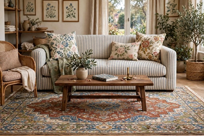
Colour is what persuades very different prints to behave like relatives. Choose a palette of two or three main colours plus neutrals, and make sure every pattern contains at least one of them. The hero print usually sets the palette: pull its colours out and repeat them, in different proportions, across the other patterns and the room’s solids. A colour that appears only once in a scheme looks like a mistake; a colour repeated three times looks like a plan.
Match the mood of the colours as carefully as the colours themselves. Prints in soft, dusty versions of a palette mix easily with each other but jar against one print in a neon-bright version of the same hue. The same applies to temperature: warm-based patterns sit happily together, and a single icy tone in a warm scheme will keep catching your eye for the wrong reasons. Paint charts and fabric swatches from the same colour family are your friends here.
White and other neutrals need choosing, too. A bright white in one print and a creamy white in another read as a mismatch at close range, so check patterns side by side in daylight before committing. Finally, repeat your palette beyond the soft furnishings: a picture frame, a vase or a book in the scheme’s colours quietly stitches patterned areas into the rest of the room.
5. Mixing Pattern Families
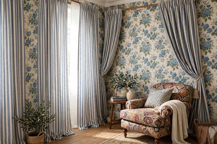
Patterns fall into loose families: structured geometrics and stripes; organic florals and botanicals; playful spots, animal prints and abstracts; and traditional motifs such as plaids, damasks and toile. The easiest mixes take one pattern from different families rather than three from the same one, because contrast of character, curvy against straight, soft against sharp, is what creates interest. A floral beside a stripe is a classic precisely because their characters differ while their colours agree.
Within a family, mixing is possible but demands more care with scale. Two florals can work if one is large and loose and the other tiny and dense, with a stripe or solid between them. Two stripes work if their widths are obviously different. What rarely works is two medium-scale patterns from the same family in similar colours: they merge into visual static, and each makes the other look like a printing error.
Bedrooms are the perfect place to practise family mixing, because bedding lets you test combinations cheaply and washably. The schemes in bedroom interior design for tiny houses show how a patterned duvet, a striped throw and a small-print cushion can share one bed without a murmur of conflict, a low-stakes rehearsal for bigger rooms.
6. Stripes, Checks and Geometrics: The Peacemakers
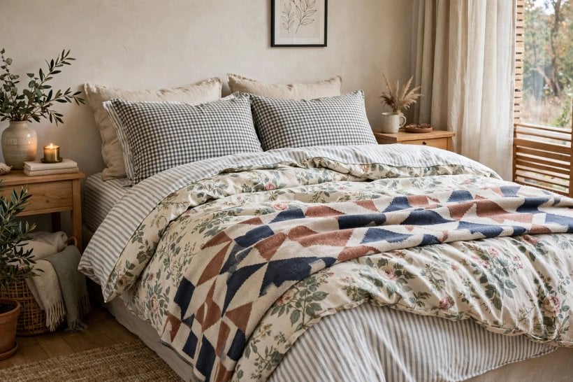
Structured patterns are the peacemakers of any mix. A stripe, a check or a simple geometric gives the eye straight lines to rest on between curvier prints, and their regularity makes neighbouring patterns look more intentional. If a scheme feels almost right but slightly chaotic, adding a stripe is the decorator’s first fix, and removing one competing organic print is the second.
Use their direction deliberately. Vertical stripes lift low ceilings on curtains; horizontal stripes widen narrow cushions and runners; a diagonal or chevron adds energy and suits hallways and other pass-through spaces. Checks read cosier and more traditional than stripes of the same colours, while geometrics read crisper and more modern. Choose according to the mood you want the room to keep, not just the colours you want it to wear.
Watch the meeting points. Where a striped cushion sits on a checked throw, one of them should clearly dominate in scale, and a solid piping or border between two patterns can act as a full stop that stops them arguing. Upholstery with a structured print is also the most forgiving base if you like changing cushions seasonally: the room’s skeleton stays calm while the accents rotate.
7. Florals, Botanicals and Organic Prints
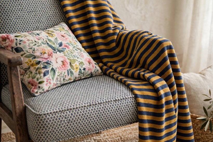
Organic prints bring the softness that structured patterns cannot. A floral hero, on curtains, a headboard or a statement chair, gives a room its romantic or garden character, and botanical prints do similar work in a fresher, greener register. Their irregular repeats are forgiving to live with, hiding the small misalignments that would shout from a geometric, which is one reason they suit busy family rooms and pet-friendly homes.
The secret with florals is controlling the background. A floral on a pale ground reads light and modern; the same motifs on a dark ground read dramatic and traditional. Keep the ground colour consistent across organic prints in one room, and let solids in the ground colour, a plain linen cushion the exact cream of the curtain background, give the pattern room to breathe. Crowding two large florals together without a plain or striped gap is the most common way this family overwhelms a room.
In bedrooms, organic prints earn their keep at pillow scale, where a small floral against a striped or plain duvet delivers the layered look without pattern on every surface. Our collection of tiny house bedroom ideas includes several schemes built on exactly that restraint: one organic print, one structure, plenty of plain, and a bed that looks inviting rather than busy.
8. Pattern in Small Rooms, Rentals and Tight Budgets
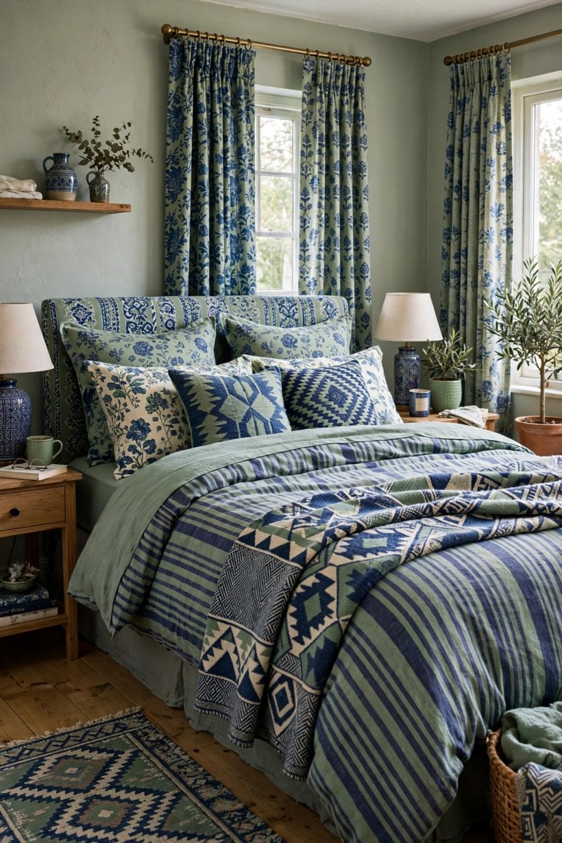
Small rooms do not need fewer patterns; they need clearer hierarchy. One hero print, one support and solids elsewhere will make a compact room feel richer than a large one, because pattern at close range is immersive. Keep the palette tight, two colours plus a neutral is plenty, and repeat the hero print at least twice, a cushion and a shade, for example, so it reads as a theme rather than a stray.
Renters and the commitment-shy should layer through things that move house with them: cushions, throws, rugs, bedding, towels and table linen. A patterned rug over a landlord’s carpet, a bold throw over a plain sofa and printed curtains on a tension rod can transform a room without touching a wall. Even outdoor cushions follow the same rules, and the planting-plus-textile approach in our tiny house landscaping ideas shows pattern working just as happily on a patio as in a parlour.
Budget stretches furthest when you buy the accent patterns last and the solids first. Plain, good-quality basics in your palette will serve every future scheme, while a £-friendly cushion cover in this year’s favourite print can change for the price of a takeaway. Second-hand and remnant fabrics suit small accent pieces perfectly, and a sample pot of discipline, one print per shopping trip, tested at home in daylight, prevents the expensive almost-right purchases.
9. Where Pattern Earns Its Keep: Furnishings Versus Surfaces
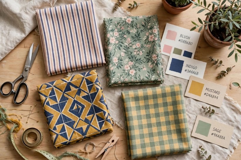
Not all surfaces deserve pattern equally. Soft furnishings are the natural home of print: they are changeable, washable and relatively affordable, and they sit at the heights where the eye lingers. Floors come next: a patterned rug defines a zone and hides a multitude of daily sins, while patterned tiles suit hallways, kitchens and bathrooms where their repeat can run uninterrupted and their practicality shines.
Walls and large upholstery are the commitment surfaces, so give them the calmest patterns or none. A small-scale, low-contrast wallpaper can be a beautiful backdrop that behaves almost like a solid, and a sofa in a subtle stripe or texture will outlast a sofa in a dramatic floral in both fashion and flexibility. The rustic schemes in our feature on a tiny barn house interior demonstrate the principle: structure and large surfaces stay plain and honest, while pattern arrives on the pieces you can pick up, shake out and swap.
Ceilings and the insides of things are the playful exception. A patterned lining inside a plain curtain, a printed interior to a lampshade that glows at night, or a bold paper inside a bookcase back delivers pattern as a surprise rather than a statement. These glimpses are often what visitors remember, precisely because the rest of the room had the confidence to stay quieter.
10. Common Mistakes and Quick Fixes
The commonest mistake is the equal-weight mix: three medium patterns, evenly spread, none in charge. The fix is hierarchy: enlarge one, shrink one, or demote one to a solid in its main colour. Close behind comes the orphan colour, a pattern containing a shade found nowhere else in the room. Either repeat that shade twice more in small accessories or accept that the piece belongs in another room, however much you love it.
Scale twins cause subtler trouble: a cushion and a rug whose motifs are nearly the same size will vibrate against each other from across the room. Separate them physically, pattern needs plain neighbours, or change one. And beware the theme-park effect, where every pattern illustrates the same subject, all florals, all nautical, all safari. One themed print is charming; four is a gift shop. Contrast of character, remember, is what makes a mix feel grown-up.
Finally, test like a decorator. Gather the actual fabrics together in the actual room, in daylight and lamplight, and live with the pile for a day before cutting or keeping. Photograph the arrangement; a phone screen flattens a scheme into colour and scale and reveals clashes your eye excuses in person. The testing habits in our tiny house living room ideas guide apply here too: decide in the room, at the times of day you use it, not under shop lights.
Final Considerations
Layered pattern is a skill of relationships, not of individual prints: scale against scale, colour against colour, busy against calm. Master the hierarchy of large, medium and small, let one palette run through everything, and give the eye solid places to rest, and pattern layering becomes a repeatable method rather than a talent you either have or you do not.
Start small and inexpensively: a hero cushion, a striped throw, a small print that shares their colours. Live with the trio, adjust the proportions, then build outward to curtains, rugs and perhaps one glorious patterned chair. Rooms dressed this way feel collected over time, because they were, and every new pattern you meet in a shop will be judged by the only question that matters: does it know its place in the family?


0 Comments