

One wall of deep navy can change a room the way a good frame changes a picture: everything else suddenly looks more deliberate. Navy is dark without being cold, classic without being dull, and forgiving of real life. This guide covers which wall to choose, the colours and materials that love navy, realistic costs, and the practical details that keep navy blue walls looking rich rather than heavy.
1. Navy Blue Accent Walls at a Glance
An accent wall works because it gives a room a destination. With navy blue walls elsewhere in the house kept pale and quiet, a single deep wall pulls the eye, anchors the furniture and makes lighter colours around it look brighter by contrast. Navy suits more rooms than almost any other dark colour because it behaves like a neutral with confidence: it welcomes warm wood, cool stone, brass, chrome, linen, leather and most artwork. The decisions that matter are surprisingly few: choose the right wall, test the exact shade in your own light, pick a finish that matches the room’s workload, and prepare the surface properly so the colour goes on evenly. The table below sums up the essentials before the details, and this guide then walks through living rooms, bedrooms, pairings, finishes, small spaces, budgets and painting technique, so you can move from admiring photographs to a wall of your own with your eyes open.
| Decision | Popular options | What it affects |
|---|---|---|
| Wall choice | Fireplace wall, headboard wall, sofa wall, alcove | Focus, balance, how dark the room feels |
| Shade | Blue-black navy, classic navy, teal-leaning navy | Warmth, light behaviour, mood |
| Finish | Matt, eggshell, satin | Sheen, scuff resistance, how flaws show |
| Partners | Warm white, oak, brass, rattan, blush, rust | Whether navy feels crisp, cosy or dramatic |
| Best rooms | Living room, bedroom, study, hallway, bathroom | Light levels and how long you linger |
| Key check | Test patches in day and evening light | Avoids costly shade regrets |
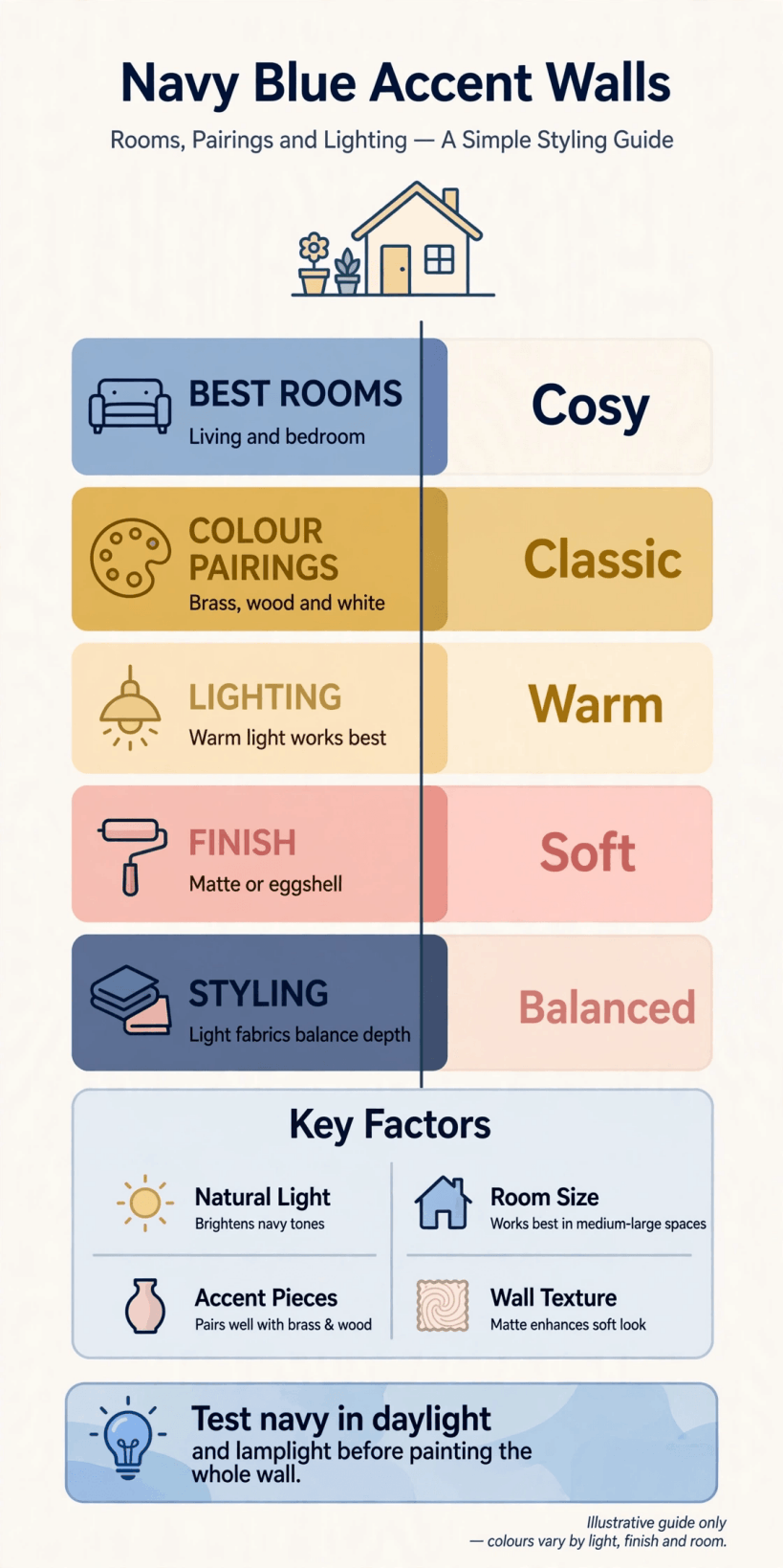
The essentials at a glance: wall choice, shade, finish and the partner colours that make navy sing.
2. Choosing Which Wall Deserves the Navy
Choose the wall the room already looks at. In most living spaces that is the fireplace wall, the wall behind the main sofa, or the wall a bed or desk already faces. A natural focal wall has few interruptions; a wall chopped up by doors, windows and radiators fights the colour and can end up looking like a mistake rather than a statement. If the room has a chimney breast, painting the breast and its alcoves can work beautifully, but painting only the breast in navy while the alcoves stay pale gives a cleaner, more architectural result in smaller rooms.
Light matters as much as layout. A wall that receives direct window light will read brighter and bluer; a wall opposite the window, lit only by reflection, reads darker and moodier, which can be exactly right for a snug or media room. Test with that in mind rather than fighting it. If you are nervous, start with the wall behind you when you sit down, the one you face less often, in a room you pass through, or take confidence from the colour stories in our colorful tiny house interior guide, where deep colours earn their place by being balanced with plenty of light neutrals. And remember the exit strategy: an accent wall is one wall. Repainting it is a weekend, not a renovation, which makes navy one of the lowest-risk dramas in decorating.
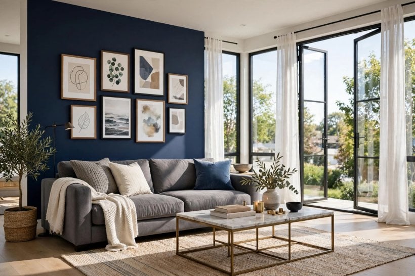
3. Navy in the Living Room
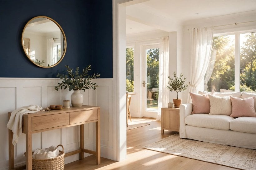
The living room is navy’s natural stage. A deep wall behind the sofa gives pale upholstery a backdrop to glow against, makes a television recede when it is off, and turns shelves and artwork into a gallery. Style the wall in layers: a large mirror or artwork to break the expanse, warm metal in lamps and frames to catch the light, and textiles in rust, ochre, cream or blush to keep the temperature comfortable. Navy loves texture, so boucle, linen, velvet and worn leather all deepen the effect rather than competing with it.
Balance is the skill. If the navy wall is doing the heavy lifting, let the other walls stay a warm white or very pale grey, keep the ceiling light, and repeat small navy notes, a cushion, a throw, a vase, so the wall feels connected to the room rather than pasted onto it. The zoning tricks in our tiny house living room ideas apply at any scale: group furniture around the focal wall, leave breathing space at the edges, and light the scene in pools rather than one bright wash. In open-plan spaces, a navy wall can quietly define the sitting zone without a single partition, which is one of the cheapest architectural moves you will ever make.
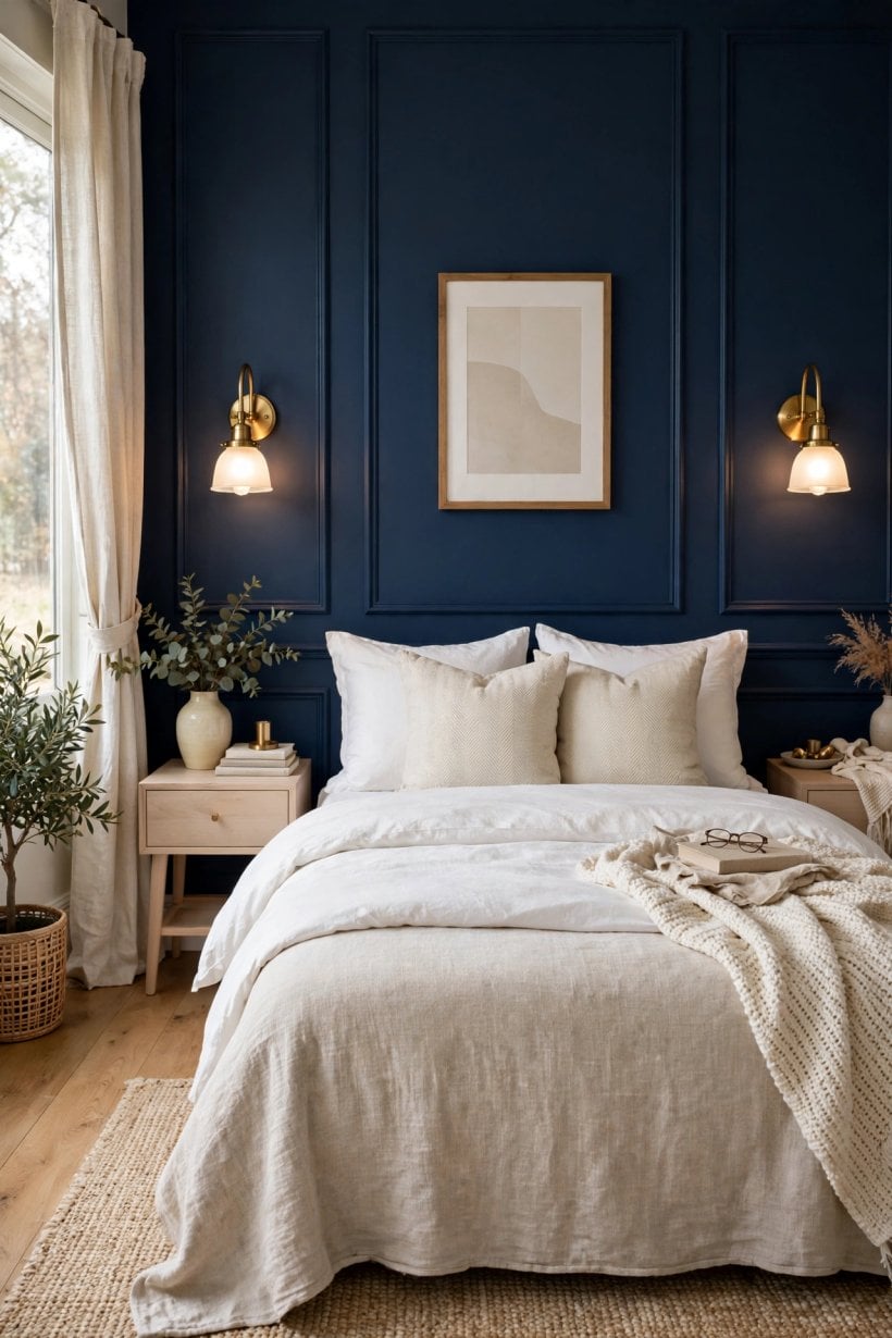
4. Navy in the Bedroom: Calm, Dark and Restful
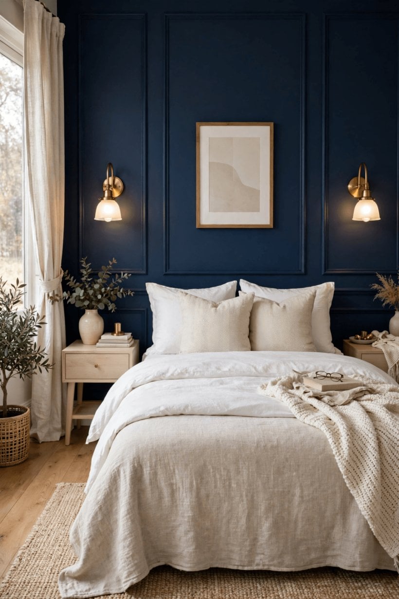
Bedrooms forgive darkness because darkness is the point. A navy wall behind the headboard creates a cocoon that makes white or pale bedding look hotel-crisp and helps a plain bed feel like a boutique stay. Choose the headboard wall so the colour is mostly behind you at night; you enjoy the drama on entering, then sleep in calm. Softer, slightly greyed navies suit bedrooms best, and warm bedside light, amber bulbs, brass or wood lamps, keeps the blue from turning chilly after dark.
Layer the palette gently: natural linen, warm whites, mid-tone wood and one accent, perhaps blush, sage or ochre in cushions and a throw. Curtains in a tone close to the wall make the whole end of the room feel upholstered. The restful layouts in our tiny house bedroom ideas collection follow the same rule as a navy scheme: one strong gesture, then quiet support from everything else. In a child’s or guest room, navy is equally at home; it hides scuffs better than pale colours, pairs with almost any bedding children choose, and grows up gracefully when tastes change, needing only new textiles rather than a full repaint.
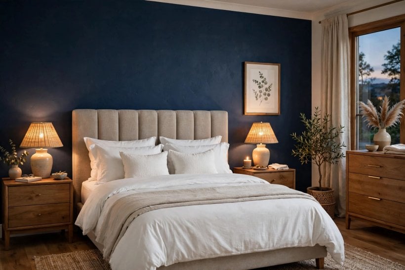
5. Pairing Navy With Wood, Metal and Stone
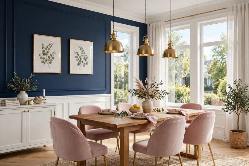
Navy is a social colour; it makes its neighbours look better. Warm woods are its oldest friends: oak, walnut and teak all glow against deep blue, which is why navy cabinetry and panelling suit cottages and modern homes alike. Pale woods keep the scheme Scandinavian and airy, while dark woods push it toward library richness. If your furniture is mostly cool grey, add one warm wood piece, a sideboard, a stool, a frame, to stop the room feeling cold.
Metals set the jewellery. Brass and gold warm navy instantly and suit traditional rooms; chrome and blackened steel sharpen it for contemporary spaces; copper sits between the two and loves navy in kitchens and studies. Stone and ceramics play along too: white marble or pale quartz against navy is a classic kitchen and bathroom pairing, while terracotta tiles and handmade pottery bring Mediterranean warmth. The honest-materials approach in our tiny barn house interior ideas shows the same chemistry, where timber and simple finishes flatter strong colour. The rule of thumb: navy provides the depth, so let partners provide the warmth, the shine or the grain, and repeat each partner at least twice so nothing looks accidental.
6. Paint Finishes, Lighting and How Navy Behaves
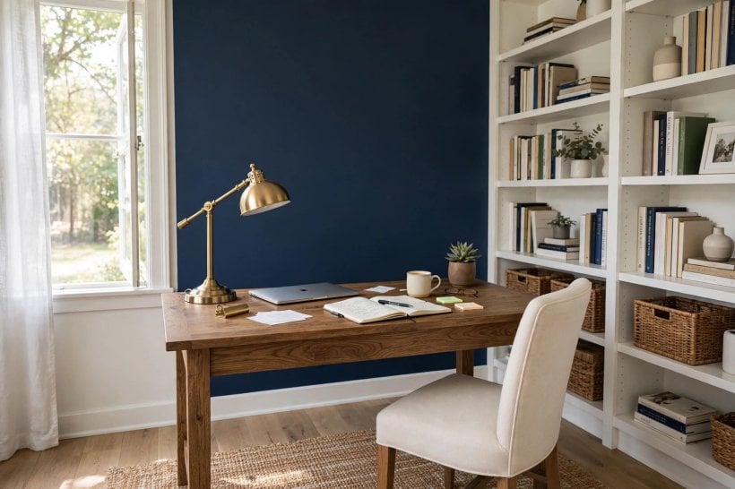
Finish changes navy more than shade does. Matt paint gives the deepest, velvety colour and hides minor wall flaws, which is why it is the favourite for living rooms and bedrooms, but traditional matt marks easily. Modern washable matt and soft eggshell finishes are the practical compromise for family spaces, adding a whisper of sheen that wipes clean. Satin and gloss are bold choices: a high-sheen navy wall or ceiling is dramatic and historic-house glamorous, yet it will broadcast every bump and brushstroke, so reserve it for smooth, well-prepared walls, woodwork, or smaller statements like the inside of a bookcase.
Then watch the light. North-facing rooms receive cooler light that pushes navy toward inky blue-black, moody and elegant but demanding warm bulbs and textiles. South-facing rooms can take the purest, bluest navies and still feel welcoming. Always test big swatches, painted on card you can move, and check them morning, noon and by lamplight before committing. Bathrooms add one more variable: moisture-friendly bathroom paints in navy look superb with pale tiles, a pairing explored in our tiny house bathroom ideas, provided ventilation keeps steam from sitting on the finish.
7. Small Rooms, Hallways and Rental-Friendly Options
Conventional wisdom says small rooms must be pale; navy disagrees, politely. In a genuinely small room, a single deep wall can blur the sense of boundary, especially when the skirting and adjacent details are handled cleanly, and the far wall often looks further away in a dark colour than in a bright one that exposes every shadow. Box rooms, studies and reading corners become intentional cocoons. Keep the floor and ceiling light, limit the palette to navy plus two partners, and the smallness reads as snug rather than cramped.
Hallways are the perfect first experiment: you pass through rather than sit, so drama has no time to overwhelm, and a navy hall makes every room off it look brighter by contrast. Renters and the commitment-shy have options too: peel-and-stick wallpaper in navy, a large painted canvas or fabric panel, navy on a freestanding bookcase back, or painting just a door, a niche or the wall inside a doorway arch. Even the entryway vignettes in our tiny house landscaping ideas follow this logic at the front door: a strong colour moment, carefully placed, changes how the whole home is greeted. Start where the stakes are smallest, and navy will likely talk you into a bigger wall.
8. Costs and Budget Planning
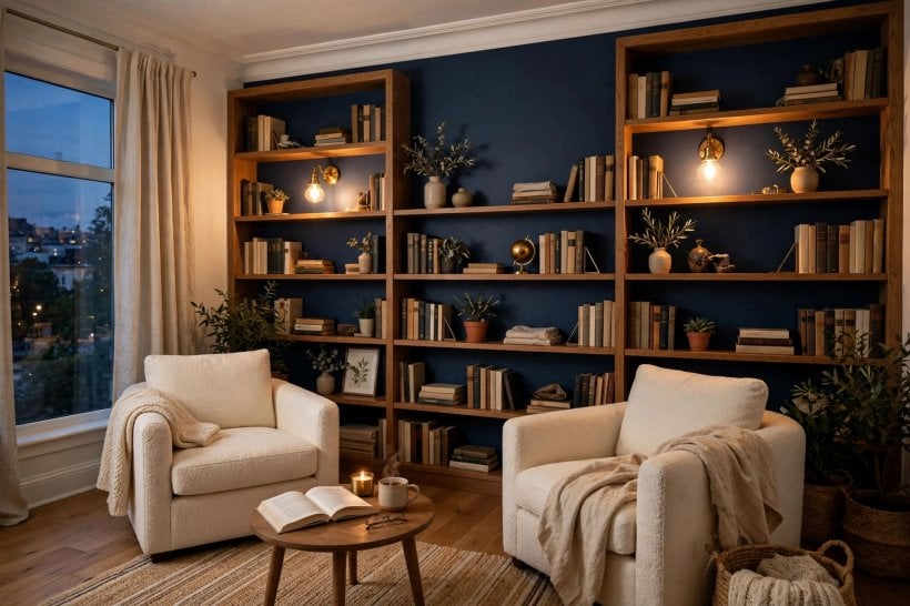
A navy accent wall is one of the cheapest transformations in decorating, because the main ingredient is a single tin of paint. Budget by line item anyway: tester pots in two or three shades, because the wrong navy is the most expensive mistake; quality paint, since deep colours often need an extra coat and cheap paint can mean three coats instead of two; a tinted primer or a grey undercoat, which helps dark colours reach depth evenly; rollers, brushes, tape, sheets and filler. If you hire a decorator, expect to pay for preparation and two to three coats of careful work rather than for the square metres alone.
Optional extras deserve honest pricing too: panelling or trim added to the wall before painting, picture lights or new lamps to flatter the colour, and the textiles that complete the scheme. None is compulsory, and the phased approach in our guide on how to build your own tiny house works here in miniature: paint first, live with it, then add layers as budget allows. Keep the leftover paint, labelled with the room and date; dark colours show touch-ups kindly if the same batch is used, and a labelled tin in the cupboard is the cheapest insurance your future self will ever buy.
9. Practical Details: Prep, Painting and Touch-Ups
Dark paint is honest paint: it shows preparation, or the lack of it. Fill cracks and dents, sand them smooth, wash away grease and dust, and mask edges with good tape pressed down firmly. A tinted primer or first coat in a mid-grey or the paint manufacturer’s recommended undercoat stops pale walls grinning through and gives the navy its true depth in fewer coats. Cut in edges carefully with a brush, then roll in overlapping sections, keeping a wet edge so no lap lines dry into view.
Expect two coats minimum and check the wall in daylight before deciding it is finished; deep colours often look patchy while drying and settle as they cure, so judge after the full drying time, not after an hour. Keep the room ventilated, allow furniture back only when the paint has hardened, and store your labelled leftovers for the inevitable scuff. Touch-ups on matt navy are best dabbed and feathered with a small roller rather than brushed, and test any repair in an unobtrusive corner first. Small rituals, felt pads on furniture feet, a soft cloth for dust, which shows more on dark walls, keep the wall looking freshly painted far longer than heroic annual redecoration.
10. Mistakes to Avoid
The commonest navy mistake is choosing from the tin lid. A shade that looks perfect on a screen or a tiny swatch can go almost black on a whole wall, or flash purple or teal in your light; testers on movable card, viewed at different hours, prevent nearly all shade regret. The second mistake is painting the wrong wall: a fragmented wall, or the wall you face from the sofa in a room that gets little light, can make the colour feel like it is advancing on you. Choose the wall the room already celebrates.
Third, do not starve the scheme of contrast. Navy with dark furniture, dark floors and no pale relief becomes a cave, however expensive the pieces. Add the light ceiling, the pale rug, the warm lamp. Fourth, skimping on coats: stopping at one patchy coat and blaming the colour. Fifth, forgetting the fifth wall and the trim: decide deliberately whether skirting stays crisp white, which sharpens navy beautifully, or goes navy too for a cocooned, contemporary wrap. Finally, treat navy as permanent in your planning but temporary in your commitment; it is paint. The rooms that succeed are the ones where someone tested, prepared and balanced, not the ones where someone simply bought the most dramatic tin.
Final Considerations
A navy accent wall succeeds because it is both brave and reversible: one weekend of painting buys years of atmosphere. Choose the wall with a natural claim on attention, test the shade like you mean it, and build the supporting cast, warm light, honest materials, pale relief, with as much care as the colour itself. Do that, and navy stops being a trend and becomes what it has quietly been for centuries: the backdrop that makes a room feel finished.
If you are still hesitating, begin with the smallest stage, a hallway, an alcove, the back of a bookcase, and live with it for a month. Most people find the colour grows calmer and more companionable with time, and the second wall follows of its own accord. Pair your finished scheme with the restful touches in our bedroom interior design for tiny houses collection if the bedroom is next, and enjoy the rare decorating decision that guests always notice and owners rarely regret.



0 Comments