

Purple and teal is the pairing that looks expensive before you spend anything — two jewel tones that sit opposite enough to spark, close enough to harmonise.
These 25 ideas show how to balance the pair room by room: which one leads, what grounds them, and the finishes that stop two bold colours from fighting.
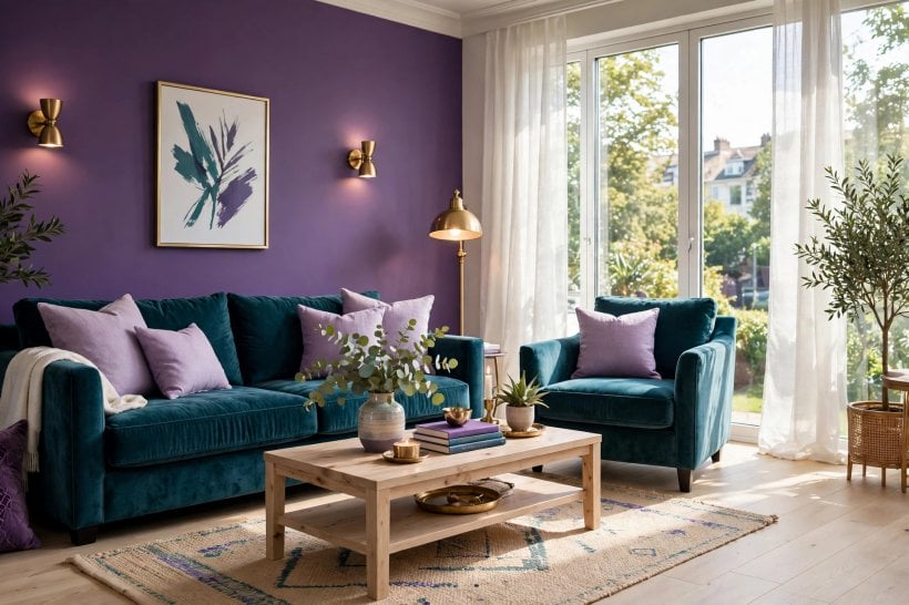
1. Purple and Teal at a Glance
Treat purple and teal as one entity with two poles: teal is the cool, blue-green anchor; purple is the warm-leaning jewel that adds drama. A room works when one pole clearly leads, the other accents, and a neutral field — warm white, soft grey, natural wood — gives both somewhere to rest.
| Why do they pair well? | Both are jewel tones with real depth; teal’s blue-green base and purple’s red-blue mix create contrast without clashing. |
| What ratio works? | Roughly one lead colour, a supporting share of the second, and a neutral remainder — never an even split. |
| Best neutrals with them? | Warm white, pale greige, natural oak and linen — cool greys can make both colours look muddy. |
| Best metal? | Brass and antique gold: their warmth bridges the pair and reads luxurious against both. |
| Biggest mistake? | Equal amounts of dark purple and dark teal with no light relief — the room turns into a cave. |
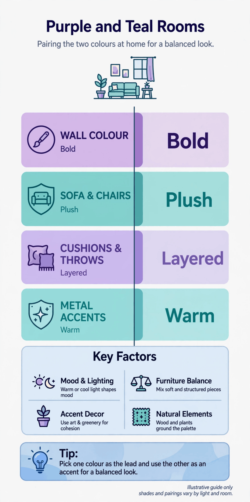
At a glance: let one colour lead, ground the pair in warm neutrals, and let brass do the bridging.
2. How the Pairing Works: Depth, Temperature and Ratio
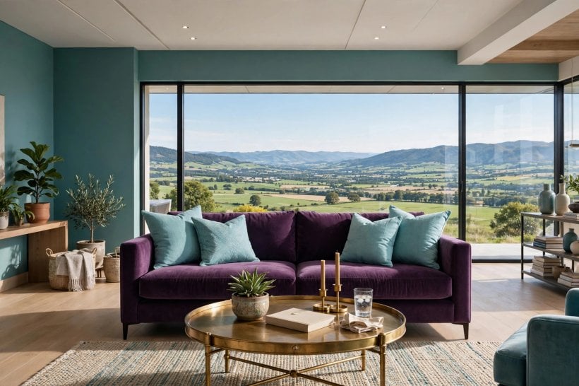
Teal carries blue and green; purple carries blue and red. The shared blue is the handshake — the reason the two feel related — while green and red pull in opposite directions and supply the energy. The practical consequence: keep the two colours at similar depth. Deep teal with deep plum sings; deep teal with pale lilac looks like an accident unless the lilac is deliberately the light note in a dark scheme.
Ratio is the second discipline. Rooms in this pairing read best when one colour owns the large surfaces and the other appears in two or three deliberate places. The same lead-and-support logic structures the schemes in these colourful tiny house interiors, where small rooms force every colour to earn its share. Choose the lead by light: north-facing and dim rooms often suit purple leading (it brings the warmth), while bright rooms can let teal’s coolness lead.
3. Living Room Ideas
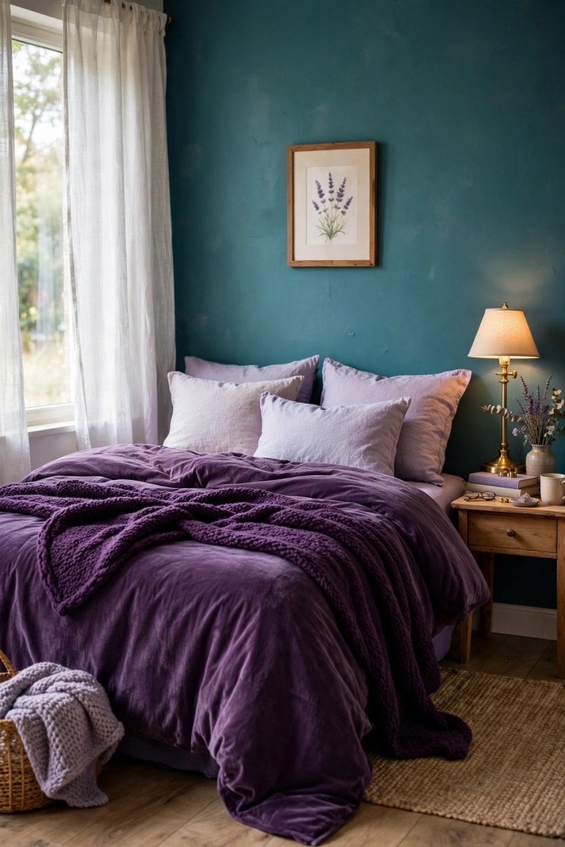
The living room is where the pairing performs best, because upholstery gives both colours soft, light-absorbing surfaces. Start with the largest piece and let everything else answer it.
1. Teal Sofa, Purple Cushions and Throws
The classic arrangement: a deep teal sofa as the anchor, cushions and a throw in plum, aubergine or grape. Vary the purple across two tones so it reads layered, not matched.
2. Purple Accent Wall Behind a Teal Reading Chair
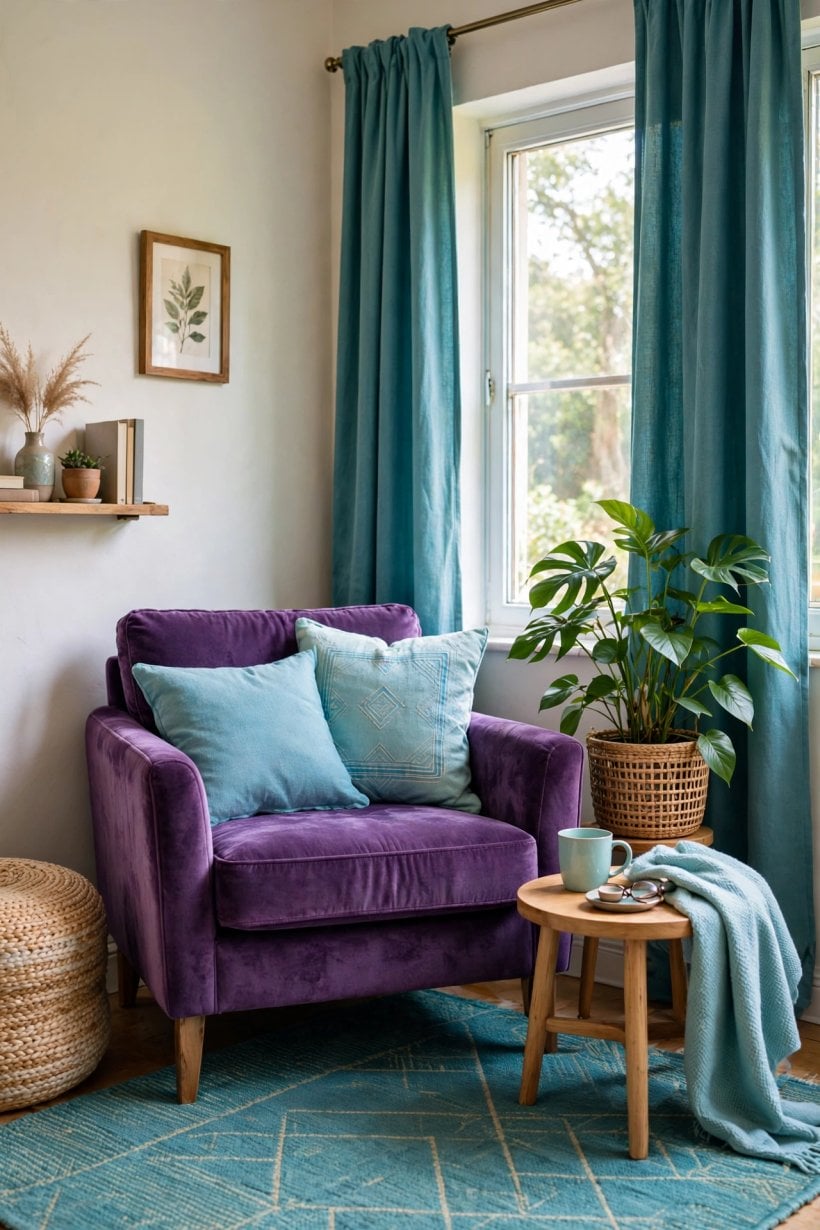
One plum wall, a teal velvet chair in front of it, brass floor lamp beside. The chair becomes a jewel in a setting — a single strong picture instead of colour everywhere.
3. Peacock Palette Layering
Borrow the peacock feather directly: teal and purple with small strikes of gold and emerald in cushions, a rug border or artwork. The natural reference keeps the combination feeling designed by nature, not by swatch card.
4. Purple Rug Under Teal Seating
Put the purple on the floor — a deep violet or patterned purple rug — and keep seating teal. Grounding the darker-warm colour low lets the eye travel upward into light.
5. Teal Curtains Framing Purple-Toned Art
Full-height teal curtains supply the room’s cool frame; one large artwork carrying purples and magentas becomes the warm event inside it.
4. Bedroom and Dining Ideas
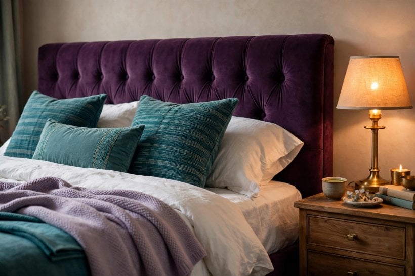
Bedrooms want the pairing at lower volume — same colours, softer depths and more neutral bedding or walls between them. Dining rooms can take the full drama, because they are used in the evening, under warm light, for shorter sittings. Colour behaviour under warm lamps is worth checking against the guidance in living room paint ideas for tiny houses, where light temperature changes how paint reads after dark.
6. Teal Headboard Wall, Purple Bedding Accents
A teal wall behind the bed, white or linen bedding, and purple confined to cushions, a throw and one lampshade. Restful first, jewel-box second.
7. Plum Dining Chairs Around a Dark Table
Upholstered plum dining chairs with teal shown in glassware, a runner or the sideboard’s painted interior — colour you notice when seated, not a scheme that shouts from the door.
8. Purple Ceiling, Teal Walls for Evening Rooms
The bold move: a deep purple ceiling (the “fifth wall”) over teal walls in a dining or media room. Under lamplight it reads as dusk sky — atmospheric, deliberate and unforgettable.
9. Ombre Textiles Bridging Both Colours
Cushions, throws or curtains dyed in a purple-to-teal gradient literally blend the pair in one object. Use one ombre piece per room as the bridge; more turns gimmicky.
10. Teal Bedroom Walls With a Purple Velvet Bench
Calm teal walls, a single purple velvet bench or ottoman at the bed’s foot. One luxurious purple object against a teal field is the bedroom version of the pairing at its most elegant.
5. Kitchen and Bathroom Ideas
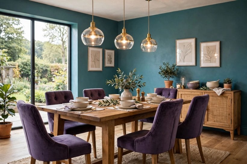
Hard-surface rooms need the pairing handled in materials, not just paint: tile, cabinet colour, enamel and glass carry the colours with more permanence, so commit the bigger colour to the element you would change last.
11. Teal Kitchen Cabinets, Purple Kept to Textiles
Teal cabinetry is proven and durable; bring purple in through seat pads, a Roman blind and pottery — parts that can change when taste moves on.
12. Purple Tile Splashback With Teal-Green Grout Companions
Deep purple tiles are dramatic in small doses — a splashback or a single shower wall — with surrounding surfaces in teal-leaning neutrals so the purple stays the event.
13. Teal Bathroom Walls, Purple Towels and Glass
Bathrooms flatter teal (water’s colour); add purple through towels, a bath mat and coloured glass bottles. Small, swappable, and the pair reads spa-like rather than loud.
14. Two-Tone Cabinetry: Teal Lowers, Soft Purple Uppers
Only for the committed: teal base cabinets with very desaturated, grey-leaning purple uppers, tied together by brass handles. Keep a sample board for a week before ordering — this scheme lives or dies on the purple being muted enough.
15. Purple Enamel and Teal Accessories in a Utility Space
Laundry and boot rooms forgive boldness. A purple enamel sink or painted units with teal storage boxes turns a chore space into a small pleasure.
6. Small Spaces and Tiny Homes
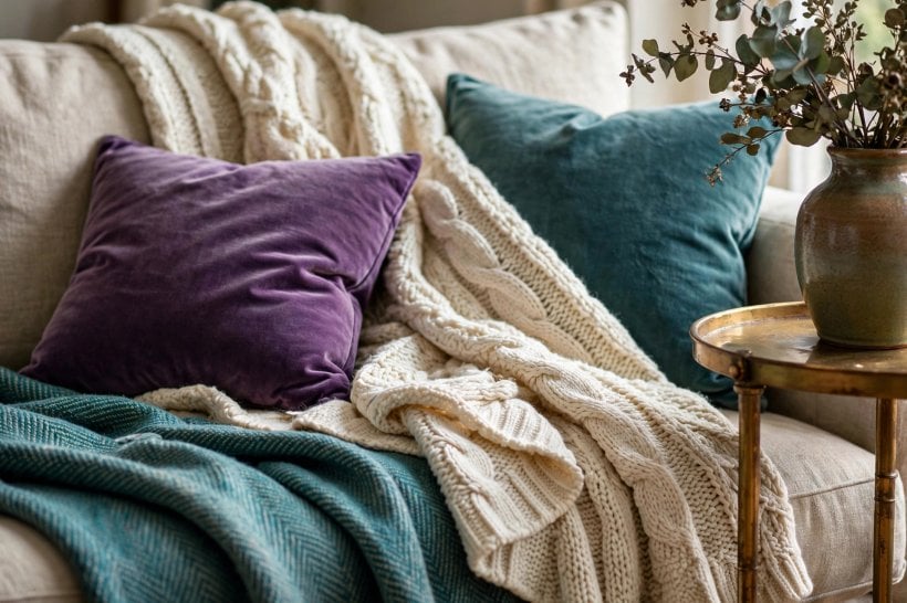
In a small home the pairing has a second job: zoning. Two colours can divide one open room into living, dining and sleeping territories without a single partition — the same trick used throughout these small living room ideas. The discipline is stricter at small scale: fewer objects, so each coloured piece must be the right piece.
16. Zone With Colour: Teal Living End, Purple Sleeping End
In a studio or tiny home, paint or furnish one end in teal-led scheme and the other purple-led. The colour change marks the boundary your body reads instantly.
17. One Purple Statement Piece Only
A single purple armchair, rug or cabinet in an otherwise teal-and-neutral small room. Restraint is what makes the piece feel expensive.
18. Teal and Purple Inside Shelves and Alcoves
Paint the backs of shelves or the inside of an alcove — teal in one, purple in another. Colour in shallow doses gives depth without consuming the room’s light.
19. Lighten Both Colours for Low-Light Spaces
Small rooms with small windows should use the pair’s paler family — dusty teal and mauve or lilac-grey — reserving full saturation for cushions and art. The schemes in tiny living room ideas show how pale walls keep colour accents vivid rather than heavy.
20. Repeat Each Colour Three Times
The decorator’s rule that stops accents looking lost: each colour appears at least three times at different heights — low (rug), middle (upholstery), high (art or curtain). Fewer, and a piece looks like a mistake.
7. Finishes, Metals and Neutrals That Hold the Pair Together
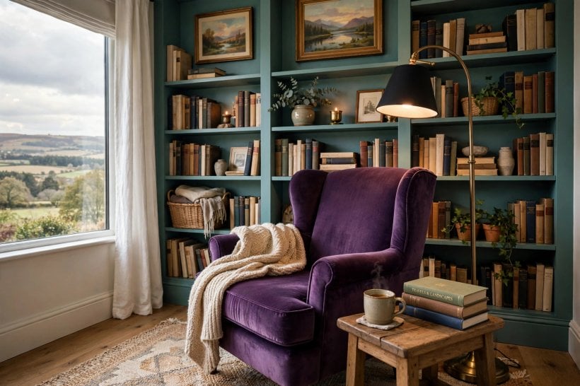
Brass and antique gold are the pairing’s best friends: warm metal reflects warmly against purple and strikes a complementary spark against teal. Black metal reads modern and graphic; chrome tends to chill both colours and can make purple look cheap. Natural wood — especially warm oak and walnut — is the neutral with the most work to do, softening the jewel tones into something liveable, as the material pairings in modern living room interior design ideas demonstrate across many palettes.
21. Brass Lighting as the Bridge
Brass pendants, sconces and lamp bases, repeated in both colour zones, stitch the room together — metal is the neutral both colours agree on.
22. Warm Wood Flooring or Furniture as the Base Note
A warm wood floor under a purple rug and teal sofa keeps the scheme grounded in the natural world the colours came from.
23. Cream and Linen Instead of Stark White
Bright blue-white walls fight both colours; creamy whites and natural linen sit quietly behind them. Choose whites with a warm or yellow base.
24. Black Outlines in Small Doses
A black picture frame, a black side table, black curtain hardware — thin black lines sharpen jewel tones the way leading sharpens stained glass.
25. Pattern That Contains Both Colours
One patterned fabric or rug carrying purple and teal together (floral, ikat, peacock motifs) proves the pairing inside a single object and tells you exactly which tones of each to use elsewhere.
8. Lighting: Where Purple and Teal Schemes Succeed or Fail
Both colours are light-sensitive. Under warm lamplight, purple warms toward plum and teal deepens toward emerald — the evening version of the scheme is richer than the daytime one. Under cold, blue-heavy daylight or harsh white LEDs, purple can turn bruised and teal can turn municipal. Test large swatches on the wall and live with them through a full day and evening before committing paint.
Practical rules: keep artificial light warm-white; place the colours where light actually falls rather than in the room’s darkest corner; and in a dim room, raise the lighter of the two colours to the bigger share. If a scheme looks wrong, it is usually the light or the ratio — not the pairing itself.
9. Mistakes to Avoid With Purple and Teal
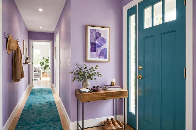
The failures are consistent. The even split: half purple, half teal, no neutral — the room vibrates. Mismatched depths: jewel teal beside pastel purple with no bridging tone. Cold whites and chrome: they chill the pair into a corporate palette. Too many purples: plum walls, grape sofa, lilac cushions and violet art is not layering, it is a flood — two purple tones plus the teal is plenty. And forgetting the floor: a cold grey floor under warm jewel tones quietly undermines everything above it; a warm rug fixes it in an afternoon. The decorating discipline in how to decorate a tiny living room — edit, repeat deliberately, test in place — prevents every one of these.
10. Costs and the Practical Order of Work
The pairing is unusually budget-friendly because its cheapest form is paint and textiles, and its expensive form is the same colours in upholstery and tile. Work in that order: decide the lead colour from the room’s light; test and paint the walls; bring the supporting colour in with textiles and one statement piece; add brass and wood to bridge; live with it; then commit to the permanent elements — sofa, cabinets, tile — in the colour you have proved you love. Costs are driven by those permanent pieces and by fabric quality, not by the paint, so the scheme can start small and deepen over time without waste.
Final Considerations
Purple and teal succeed when they are treated as one jewel-toned entity with a clear internal order: one colour leads, one supports, warm neutrals rest between them, and brass ties the knot. Honour the ratio and the pairing looks rich in a palace or a tiny house alike.
One last encouragement: this pairing is forgiving of small budgets and small rooms precisely because its power lives in colour relationships, not in costly objects. A tin of teal paint, a plum throw and a brass lamp from a charity shop will teach you more about whether you love living with purple and teal than a showroom ever could — and if you do love it, every permanent piece you buy afterwards is bought with proof.
Start reversible — paint, cushions, a rug, one brave chair — and let the room teach you its light before you buy anything permanent. That patience is what separates the purple and teal rooms people photograph from the ones they repaint.

0 Comments