

Wallpaper is the fastest way to give a living room a point of view. One papered wall can set the colour palette, flatter the sofa and make plain furniture look deliberate, all without changing a single piece you own.
This guide gathers 75 wallpaper ideas into the themes that actually help you choose: layouts, sofa pairings, colour stories and layered lighting. Think of your living room background as the quiet stage set for everything in front of it, and pick a paper that plays that role well.
1. Wallpaper Living Room Ideas at a Glance
The 75 ideas in this guide are grouped, not scattered. Layout ideas come first, because which walls you paper matters more than which pattern you pick. Then come sofas, colour, scale and lighting, the four things that decide whether a paper looks expensive or accidental. Start with these quick answers.
| Question | Short answer |
|---|---|
| Which wall should I paper first? | The wall your sofa faces or sits against; it is the one you look at most. |
| One wall or all four? | One wall for bold prints, all four for quiet textures and small-scale patterns. |
| What sofa colour is safest? | A plain fabric in one of the paper’s secondary colours, never its loudest shade. |
| Can wallpaper work in a small room? | Yes; small rooms suit either very quiet papers or confidently large prints, rarely anything in between. |
| How do I test a paper? | Pin up the largest sample you can get and live with it through a full day of changing light. |
| What about lighting? | Plan it with the paper; warm, layered light flatters pattern, while one harsh ceiling light flattens it. |
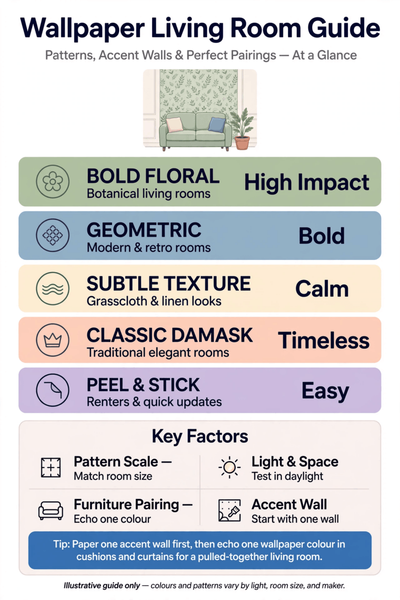
The wallpaper shortlist at a glance: layout first, then sofa, colour, scale and light.
A useful rule runs through all 75 ideas: wallpaper is a background, not a solo act. The moment a paper is fighting the sofa, the curtains and the rug at the same time, the room feels restless. Choose the paper to support the furniture you already love, and let one other element, perhaps cushions or a single chair, echo it. Everything else can stay quiet.
2. Start With the Layout: Which Wall Earns the Paper
Layout ideas begin with the feature wall behind the sofa, the most forgiving place for a first paper. The sofa’s back hides the paper’s lower half, so the pattern reads as a frame for your seating rather than a wall you must keep perfect. It also means you see the paper from the chairs opposite, at conversational distance, where medium and large prints look their best.
The second layout family papers the wall you face: behind the television or around the fireplace. A paper here has to tolerate a screen or a mantel display in front of it, so busier patterns work best in the gaps at either side, or as a chimney-breast-only treatment with painted walls alongside. Papering just the chimney breast is a classic small-budget idea: one roll can be enough, and the alcoves either side take a deep paint colour pulled from the print.
Third, consider the wrap: paper on all walls in a soft, low-contrast design. This suits period rooms, north-facing rooms and anywhere you want a cocooned feel, and it is the layout that tiny homes do brilliantly, as the compact schemes in tiny house living room ideas show. Finally, the half-and-half layout: paper above a picture rail or panelling, paint below. It protects the paper where chair backs and children’s hands land, and it stretches one roll a long way.
3. Sofas Against Pattern: Letting Furniture Breathe
The sofa is the largest object the paper will ever sit behind, so pair them deliberately. The safest of all the sofa ideas is also the prettiest: a plain sofa in a colour lifted from the paper’s background or its quietest motif. The pattern then appears to have been chosen for the sofa, and the sofa for the room, even if you bought them years apart.
If your sofa is patterned, reverse the logic: the paper must be the quiet partner. Fine stripes, small geometrics and textured plains let a patterned sofa keep the starring role. Two medium-scale patterns together almost always clash, because the eye cannot decide where to rest. One large, one small, one plain is a reliable formula across every seating idea in this guide.
Shape matters too. A low, sleek sofa shows more of the wall, so the paper’s repeat will be fully on display; a high-backed, traditional sofa hides the lower pattern and suits papers whose interest sits higher up. Give the sofa a little breathing room as well: even a few centimetres of shadow gap between sofa back and wall stops the pairing looking squeezed, and lets both pieces read clearly. Finish with cushions that borrow one colour from each, and the arrangement looks composed rather than matched.
4. Bold Prints in Small Rooms
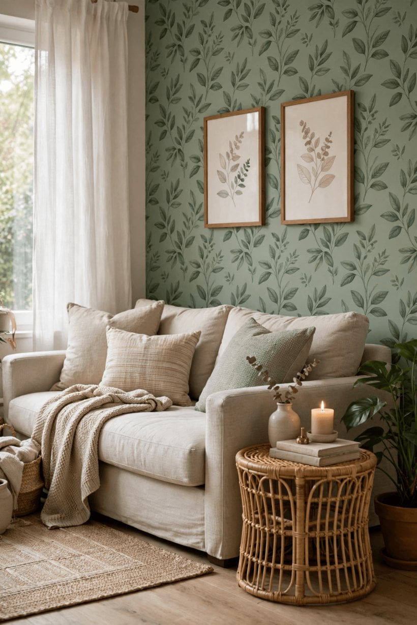
Small living rooms inspire timid choices, but the boldest ideas often work best in them. A large-scale floral, a dramatic botanical or a strong geometric on one wall gives a compact room a sense of intention that pale, apologetic papers never achieve. The print becomes the room’s artwork, and everything else can be simple, which is exactly what a small space needs.
The trick is containment. Keep the bold paper to one wall, paint the others in its background colour so the edges dissolve, and repeat just one of its colours in a cushion, a throw or a lampshade. Contained this way, a big print reads as depth rather than noise, and visitors remember a confident room instead of a small one. This is the same principle that makes colorful tiny house interior schemes work: colour is generous, but it is always organised.
Scale is your steering wheel. In a small room, a tiny, busy repeat can vibrate unpleasantly, especially in bright light, while an oversized motif has room to breathe because you see fewer repeats. If you love a small print, confine it to the chimney breast or the wall inside a shelving run, where its busyness is framed. And always judge bold papers from the doorway, not nose-close: that first view is the one the room will be remembered by.
5. Colour First: Reading a Paper’s Palette
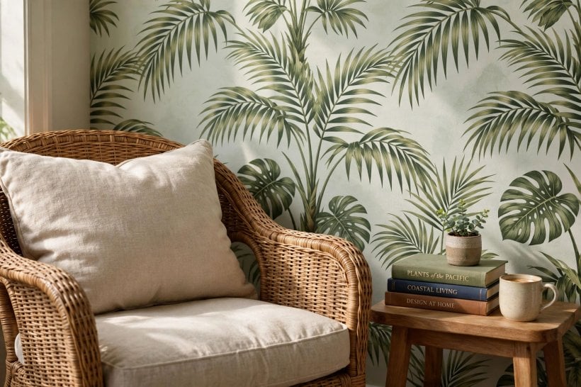
Every paper carries a palette of three to five colours, and the colour ideas in this guide all start with reading it properly. Squint at the paper from across the room: the colour you mostly see is the lead colour, and that is the colour the room will feel like. The background colour is the one to match for adjoining paint, because it is literally the paper’s own ground.
Next, mine the palette. The second colour is your sofa or curtain colour. The third, usually the smallest accent in the print, is for cushions, a footstool or a painted side table. Working this way guarantees harmony without buying a single matching accessory set, and it leaves the rest of your scheme free to evolve. If a paper’s palette contains a colour you dislike, walk away: you will see that colour every day, in daylight and lamplight, for years.
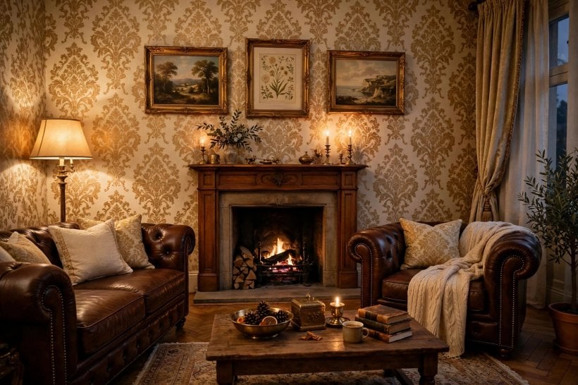
Temperature deserves a thought too. Warm-based papers in ochre, blush, rust and cream make north-facing rooms feel friendlier, while cool-based papers in sage, slate and ink sharpen sunny rooms and stop them glaring. The restful palettes used in tiny house bedroom ideas prove how much temperature changes mood, and living rooms obey the same rules. When in doubt, choose the paper whose background colour flatters your skin tones in lamplight; you will spend more evenings with it than afternoons.
6. Quiet Papers: Texture, Grasscloth Effects and Subtle Geometrics
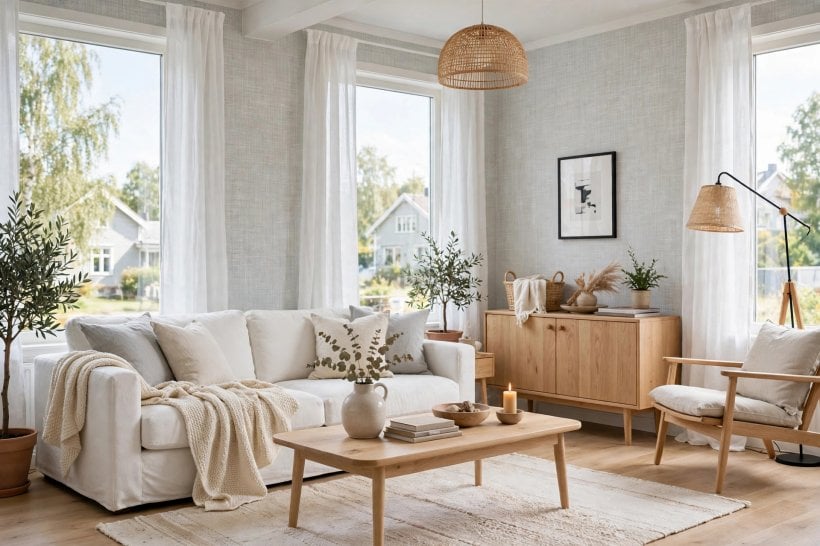
Not every good paper shouts. The quiet family, including grasscloth and grasscloth-effect designs, linen weaves, soft geometrics and tone-on-tone botanicals, adds depth that paint alone cannot. These are the papers for all-four-walls layouts, for open-plan spaces where the living area flows into a kitchen, and for anyone who changes cushions and art with the seasons and needs a forgiving backdrop.
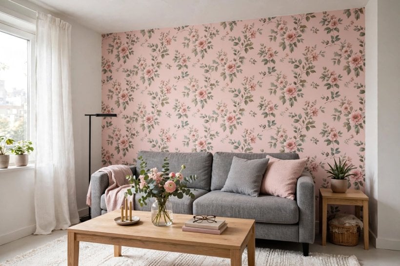
Texture rewards close looking. A woven-look paper catches raking light beautifully, changes gently through the day, and hides a multitude of small wall imperfections that flat paint would advertise. Subtle geometrics do similar work with a little more rhythm: a fine diamond, a soft trellis or a broken stripe gives the eye a pattern to follow without demanding attention, and pairs happily with both modern and traditional furniture.
Quiet papers are also the diplomat’s choice for shared spaces. In a room that doubles as a workspace or guest room, a calm paper pleases everyone, the same way the flexible schemes in bedroom interior design for tiny houses balance rest with daily use. If you choose quiet, spend the drama budget elsewhere: one striking chair, a big plant or an oversized piece of art will keep the room from ever feeling plain.
7. Pairing Wallpaper With Paint, Wood and Trim
Wallpaper never meets a room alone; it meets skirting, doors, shelving and woodwork, and the pairing ideas here prevent the commonest disappointments. First, paint the trim from the paper’s palette rather than defaulting to brilliant white, which can look starkly blue against warm prints. A soft off-white drawn from the paper’s lightest tone keeps the whole wall feeling woven together.
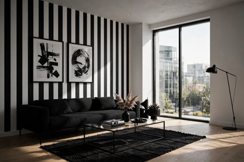
Wood tones are the second pairing to check. Warm oak and walnut sit happily with warm papers; grey-washed floors and pale ash ask for cooler prints. Hold your sample against the floor and against your largest wooden piece before ordering. If they argue, believe them: the argument will still be there at full scale, only bigger. Painted furniture is the peacemaker, since a bookcase or cabinet painted in the paper’s accent colour can bridge a wood tone that nearly works.
Finally, think about where paper stops. A clean stop at a picture rail, a corner or the edge of a chimney breast looks intentional; a stop mid-wall because the roll ran out looks like a mistake. Order with the stops planned, and consider painting inside alcoves or a shelving wall in the paper’s background colour to stretch a design around the room without buying more rolls, a thrifty trick borrowed from tiny barn house interior projects where every material is made to work hard.
8. Layered Lighting: How Light Changes a Pattern
Lighting is the most underestimated of all the wallpaper decisions, because a paper is only ever as good as the light falling on it. A living room background lit by a single central bulb looks flat and grey at night, however beautiful the print. Layered lighting fixes this in three bands: ambient light for the whole room, task light where you read, and accent light aimed at the paper itself.
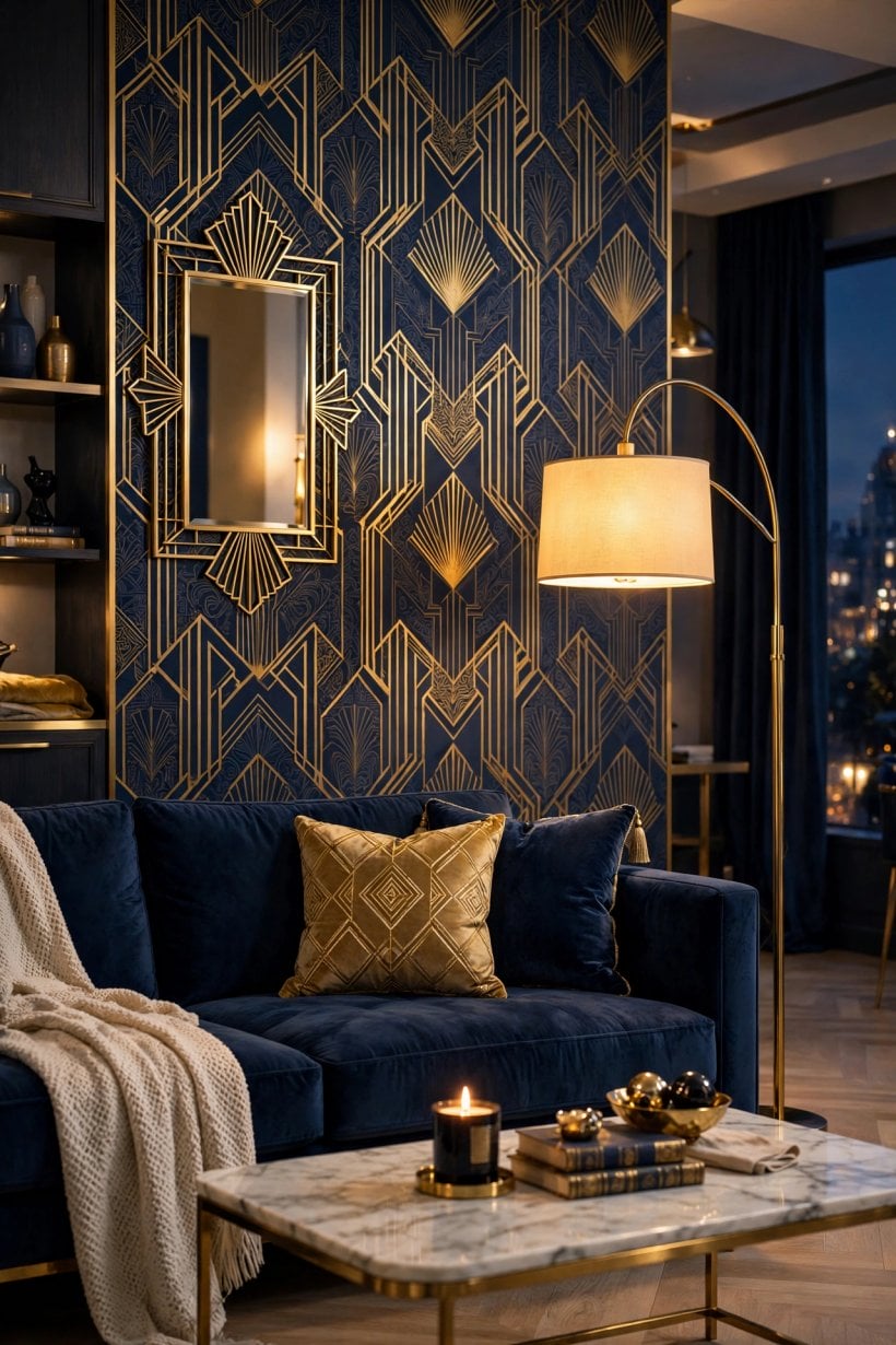
Accent light is where the magic lives. A picture light, a pair of wall washers or a floor lamp angled across the wall creates gentle modelling that reveals texture and deepens colour; metallic and mica-flecked papers genuinely glow under it. Fit dimmers wherever you can, because the same paper needs brightness on a winter afternoon and softness by evening, and a dimmer lets one room serve both.
Daylight deserves equal respect. Test samples on the wall they will live on, and look at them morning, noon and evening: south-facing light bleaches delicate colours over time, while north-facing light turns blues greyer and creams colder. If a paper only looks right at midday, it is the wrong paper for that wall. The layered approach used in tiny house bathroom ideas, where mirror light, ceiling light and soft accents each do a job, translates directly to the sitting room.
9. Pattern Scale, Repeat and Hanging Practicalities
The practical ideas matter as much as the pretty ones. Pattern repeat is the distance before a design starts again, and it decides how much paper you waste matching each strip. Large repeats in bold designs can consume an extra roll in an average room, so calculate from the maker’s stated repeat and your wall height, or ask the shop to calculate for you, and keep the receipt until the room is finished.
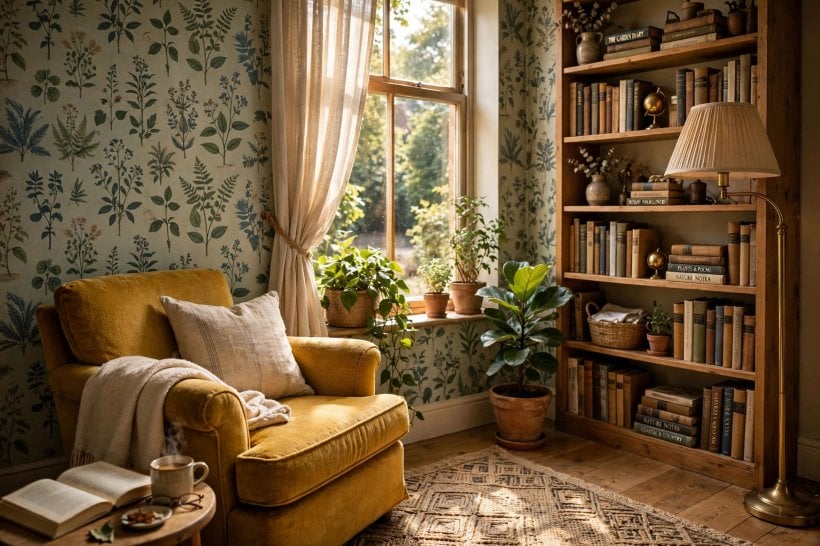
Scale, meanwhile, should be judged at viewing distance. A repeat that looks delicate in the hand can vanish across a room, while a motif that seems huge on the roll settles beautifully once you see only three or four repeats on the wall. Tape two sample lengths side by side if you can; a single narrow strip never shows you the rhythm of a pattern, and rhythm is what you will actually live with.
Preparation is the unglamorous decider. Paper magnifies lumps, cracks and old paste, so wash, fill and sand walls properly, and line them if they are rough or if the paper is thin or pale. Hang the feature wall first while your energy is fresh, work away from the main light source so seams shadow less, and keep spare offcuts: a saved strip makes invisible repairs possible years later, long after the design is discontinued.
10. Renting, Budgeting and Keeping Paper Looking Fresh
Renters are not excluded from these ideas. Peel-and-stick papers have improved enormously and suit a single feature wall in a rented room, provided the paint beneath is sound and you keep the backing sheets and a note of the design name. The same single-wall discipline applies: one strong wall, painted companions, and a scheme you can reverse in a weekend when you move.
Budget honestly. The paper itself is only part of the cost: add paste, tools, lining paper where needed, and either a decorator’s time or your own weekend. One feature wall in a mid-range paper often delivers most of the joy of a full room at a third of the spend, which is why so many of the 75 ideas in this guide are single-wall schemes. Spend the saving on the lighting that will show the paper off, rather than on a second wall of paper nobody can see behind the bookcase.
Keeping paper fresh is mostly about touch and sunlight. Washable and scrubbable finishes earn their keep behind sofas and beside doors; keep a soft cloth routine for dust along the top edge where paper meets ceiling. Fading is the slow enemy, so rotate art occasionally and let curtains do their job on the sunniest afternoons. Careful, unfussy maintenance like this is the thread running through all good small-home care, from sitting rooms to the practical routines in how to build your own tiny house guides.
Final Considerations
Seventy-five ideas reduce to a handful of decisions: which wall, which scale, which colours from the palette, and which light will fall on the finished wall. Get the layout right first, let the sofa and the paper share a palette rather than compete, test big samples through a full day, and plan the lighting as part of the paper rather than an afterthought.
Do that, and wallpaper stops being a risky flourish and becomes what it should be: the calm, characterful backdrop that makes everything you already own look better. Start with one wall, live with it, and let the room tell you whether it wants more. Most rooms, honestly decorated and kindly lit, are asking for less courage than you think, and more patience with samples than you expect.

0 Comments