
Glamour, geometry and a little gold: few decades dress a room as confidently as the twenties. This guide to 1920s design walks through the shapes, colours, furniture and small details that make the look feel rich rather than themed.
Take it one room, one palette and one statement piece at a time, and the style settles in gracefully.
1. What Defines the Look of the Decade
At its heart, 1920s design is a celebration of pattern, shine and optimism. Rooms leaned into strong geometry — sunbursts, chevrons, zigzags and stepped profiles borrowed from new skyscrapers — and balanced that energy with luxurious materials: velvet, marble, lacquer, mirror and warm metallics. It was a deliberate break from heavy Victorian clutter, favouring sleeker furniture, bolder colour and decoration that felt modern, musical and a little theatrical. The trick today is to borrow the confidence without turning your home into a film set: choose two or three motifs, repeat them calmly, and let plain surfaces give the pattern room to breathe. If you enjoy fearless colour in small spaces, our colorful tiny house interior ideas show the same brave spirit in a contemporary setting.
It also helps to remember what the style was reacting against. The generation that furnished these rooms had lived through a war and an epidemic, and their interiors answer with light, music, dancing and company. That is why the look pairs its formality with comfort: chairs are low and welcoming, lighting is warm rather than clinical, and every room keeps a corner ready for conversation. Hold onto that spirit — pleasure first, pattern second — and modern versions of the style rarely tip into costume. A room should still work for breakfast, laptops and muddy dogs; the glamour is a layer, not a museum rope.
| At a Glance | Signature Choice | How to Use It |
|---|---|---|
| Core shapes | Sunburst, chevron, stepped and fan motifs | Repeat one motif in three places, then stop |
| Hero colours | Emerald, navy, black, cream and gold | One deep colour, one neutral, one metallic |
| Key materials | Velvet, marble, mirror, lacquer and brass | Mix one plush texture with one shiny surface |
| Furniture mood | Low, sleek and curved in places | Fewer, better pieces with clear floor space |
| Lighting | Tiered shades, opal glass and wall sconces | Warm, layered light rather than one bright ceiling bulb |
| Finishing details | Fringing, fluting and geometric glassware | Small doses carry the theme furthest |

A quick visual summary of the shapes, colours and materials that give a room its Deco character.
2. Deco Shapes and Confident Geometry
Geometry is the grammar of the style. Sunburst fans spread across mirrors, cabinet doors and headboards; chevrons march along floors and fabrics; stepped silhouettes echo the setback towers rising in American cities at the time. Start with the largest gesture you can afford — a fan-shaped mirror over a mantel, a chevron rug, or a stepped bookcase — and then echo its angles in two smaller places, such as cushion trim and a picture frame. Keep the geometry crisp: this look loves a clean line and dislikes fussiness. Curves play a supporting role, softening the angles through scalloped chair backs, arched doorways and rounded cocktail cabinets, so a room feels elegant rather than severe. When in doubt, draw the room’s shapes on paper; if you can spot your chosen motif three times and no more, the balance is probably right.
Scale matters as much as shape. A large motif on a small cushion looks playful, while the same motif miniaturised across a whole wall can feel busy and restless. In general, let the biggest surface carry the biggest pattern: floors and rugs can handle bold chevrons, walls prefer a medium fan or stripe, and accessories shrink the motif down to trims, handles and glassware. Door furniture is an overlooked opportunity — stepped or octagonal handles quietly repeat the architecture every time you enter the room. Even picture-hanging can join in: a stepped gallery arrangement, rising and falling like a skyline, gives plain prints a period frame of mind without replacing a single artwork.

3. Colour Palettes That Sing
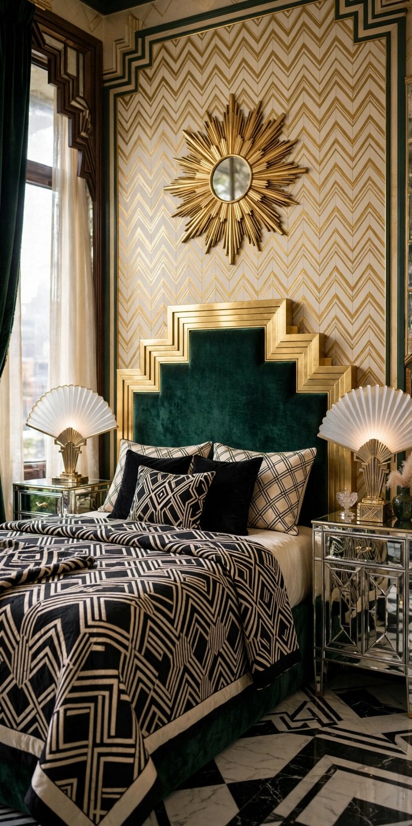
Colour in this era is jewel-box rich. Emerald green, sapphire and navy, deep teal and plum all pair beautifully with black, cream and a glint of gold or chrome. For a calmer scheme, build on warm neutrals — ivory, taupe and soft grey — and let one saturated colour do the talking through velvet chairs or a lacquered cabinet. Metallics are colours in this style, not afterthoughts: brass warms a palette, chrome cools it, and rose-tinted metals flatter pink and burgundy schemes. Test colours in the room’s real light before committing, because deep shades shift dramatically between morning and lamplight. A useful rule is sixty percent neutral ground, thirty percent hero colour and ten percent metallic shine, adjusted bravely if your room is blessed with tall windows and generous daylight.
Three ready-made palettes cover most homes. The grand hotel scheme pairs emerald and black with cream and brass, and suits living rooms that entertain after dark. The ocean liner scheme runs navy, white and chrome with flashes of red, crisp enough for halls, kitchens and bathrooms. The blush boudoir scheme softens everything with dusty pink, burgundy, ivory and rose-gold metal, made for bedrooms and dressing corners. Whichever you choose, paint the ceiling a warm white rather than a blue one, keep woodwork glossy or satin for that lacquered hint, and repeat the hero colour in at least one soft furnishing so walls and furniture agree with each other.
4. Furniture: Silhouettes and Star Pieces
Furniture of the period sits lower and sleeker than what came before, with smooth veneers, curved corners and an air of the ocean liner. Look for a barrel-backed armchair, a velvet sofa with clean arms, a mirrored or lacquered drinks cabinet, and tables in marble, glass or dark polished wood. Exotic-look veneers with dramatic grain were prized; today, responsibly sourced wood with a beautiful figure gives the same richness, and it is worth checking a seller’s sourcing claims before you buy. Rattan and cane appear too, especially in sunrooms and bedrooms, lightening the mood. Arrange pieces with breathing room and a clear centre — the style is sociable, designed for conversation, music and cocktails rather than for storage. For more proof that restraint flatters small rooms, browse our modern tiny house interior ideas and borrow their editing discipline.
If you are buying one piece at a time, start with the armchair. A single sculptural chair in velvet, with a fan or channel-stitched back, announces the whole scheme and forgives a plain sofa beside it. Next comes the cabinet or sideboard, ideally with fluted, mirrored or inlaid detail, because storage furniture covers the most visual ground after seating. Tables can be simple — round marble or glass tops on metal bases appear in countless period photographs — and a pair of small side tables often serves better than one grand coffee table, keeping the centre of the room free for dancing, children or sprawling Sunday newspapers.
5. Walls, Floors and Pattern That Grounds a Room
Pattern works hardest on the biggest surfaces. Floors of the era favour drama underfoot: black-and-white chequerboard or chevron tiles in halls and bathrooms, richly grained parquet in living rooms, and deep-coloured rugs with geometric borders over plain boards. Walls can stay quieter than you might expect — many period rooms used plain, slightly glossy paint in cream or pale gold, reserving pattern for a single wallpapered wall of fans, feathers or stylised florals. Picture rails, slim battens and stepped skirting details add architecture without cost or clutter. If you rent, a large geometric rug and a framed panel of period-style wallpaper deliver most of the effect reversibly. Whatever you choose, repeat the floor’s geometry somewhere above knee height — a cushion, a lampshade, a mirror’s frame — so the room reads as composed rather than coincidental.
Do not overlook the fifth wall. Ceilings in confident period rooms were rarely stark white: a soft cream, a whisper of gold, or a bordered stencil softened the transition and made lamplight feel warmer. Modern homes can borrow a gentler version — paint the ceiling the palest shade of the wall colour, or add a simple stepped cornice line in a slightly deeper tone. Underfoot, remember comfort and acoustics: hard geometric floors shine in halls and bathrooms, but living rooms and bedrooms ask for a rug’s softness, and a bordered rug over boards or plain carpet is the easiest period gesture of all.

6. Lighting and Metallic Shine
Lighting is jewellery for these rooms. Tiered pendant shades, opal glass globes, fan-shaped wall sconces and torch-style uplighters all spread a flattering, shadow-soft glow that suits evening rooms beautifully. Layer at least three sources in a living room: a central pendant on a dimmer, a pair of wall or table lights at seated eye level, and one small lamp for corners. Metal finishes should agree with each other — mostly brass, mostly chrome, or a deliberate two-to-one mix — and mirrors multiply every lumen you pay for, so place one where it can catch lamplight rather than a blank wall. Frosted and opal shades are kinder than clear bulbs in this style, echoing the era’s love of glow without glare. Candles in geometric holders still count, and they make metallic surfaces flicker the way the original rooms intended.
Bulb choice finishes the effect. Warm-white bulbs with a low colour temperature keep jewel colours honest and skin tones kind, while dimmers let a room slide from bright morning practicality to evening glamour without changing a fitting. Table lamps deserve the same geometric discipline as everything else: stepped bases, column stems and drum or tiered shades all sit comfortably in the scheme. In hallways and on staircases, a pair of matching wall lights beats a single pendant for both safety and ceremony, marking the route through the house like lights along a promenade deck.

7. The Bedroom, Deco Style
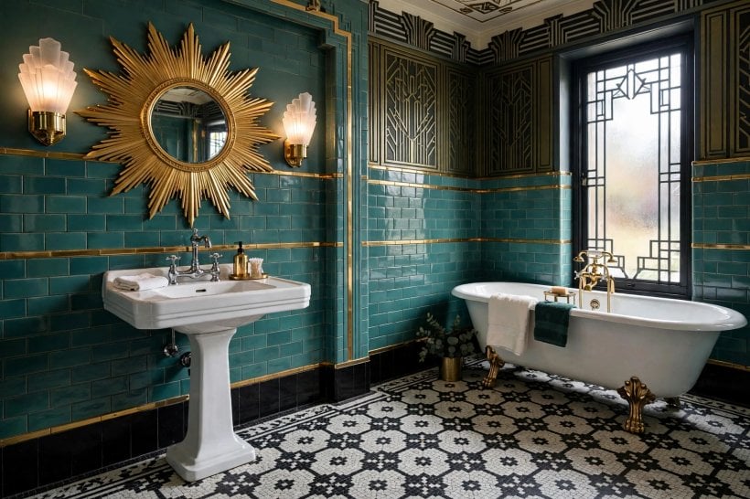
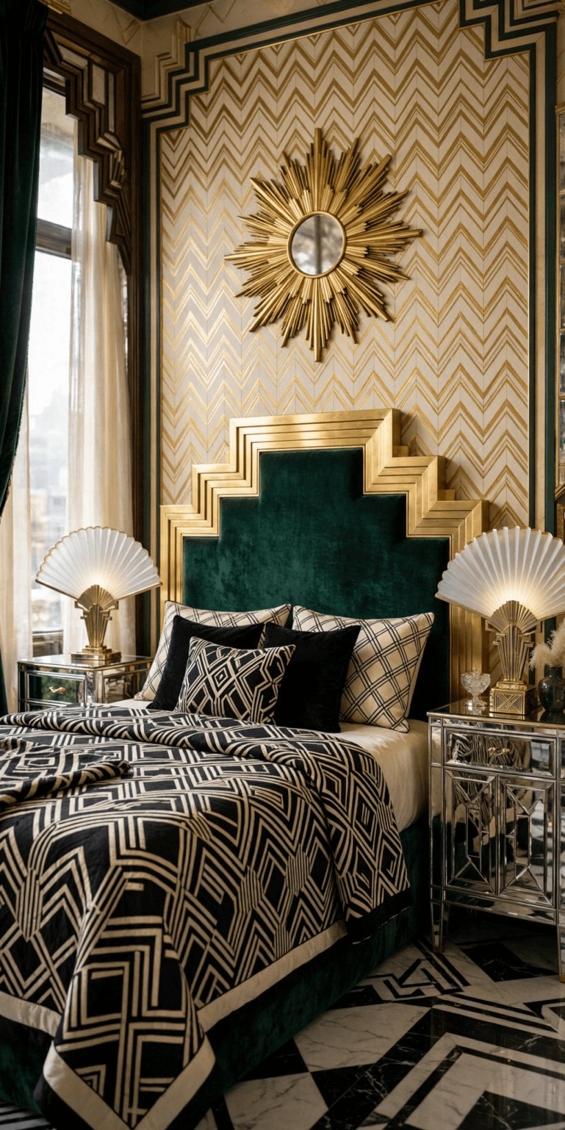
A period-style bedroom balances glamour with genuine restfulness. The bed is the headline: a scalloped, fan or stepped headboard in velvet makes the whole room feel dressed, especially in emerald, blush or midnight blue. Symmetric bedside tables and matching lamps keep the composition calm, while mirrored or lacquered surfaces add the shine the style loves. Bedding stays mostly plain — crisp cream or white with a single patterned throw or cushions in a geometric print — so the headboard keeps its crown. Storage hides behind beautiful doors: a fluted wardrobe or a veneered dresser with a tri-fold mirror turns dressing into a small ceremony. The same principles scale down happily; our modern tiny house bedroom tour and our tiny house bedroom decor ideas both show how one strong headboard and tidy symmetry transform compact sleeping spaces.
Sleep itself improves when the glamour is edited. Keep screens and clutter out of sight behind those beautiful doors, choose blackout linings in a colour that matches your drapes, and let the room’s one pattern live on cushions you can change with the seasons. A small vanity or a tray on the dresser — for a watch, a book, a glass of water — channels the era’s dressing-table ritual and keeps bedside surfaces calm. If two people share the room, matching lamps matter more than matching tastes in art: symmetry at the bed is what the eye reads first, and it forgives almost everything else.

8. Kitchens, Bathrooms and Hardworking Rooms
The look adapts surprisingly well to hardworking rooms. In kitchens, think glossy cabinet fronts in cream, black or deep green, geometric tile in a brick or herringbone layout, and unlacquered brass or chrome hardware that ages gracefully. Open shelving suits the era’s collected glassware, and a chequerboard floor, even in sheet form, does heavy thematic lifting for little money. Bathrooms are natural territory: black-framed mirrors, fan or hexagon tiles, pedestal basins and high-contrast grout lines all channel the period while remaining thoroughly practical. Keep modern plumbing and ventilation quietly up to date, and check with your city or county about permits before moving pipes or electrics, since rules vary by place. Compact-room planning helps here too — our tiny house kitchen design guide is full of layout discipline that suits period styling in small kitchens.
Practicality deserves one more paragraph, because these rooms earn their keep daily. Choose tiles with a matte or satin finish where floors get wet, seal pale grout in splash zones, and favour cabinet paints that can be wiped and touched up rather than delicate lacquers near the hob. Period style never asked anyone to cook badly or clean heroically; it simply dressed efficient rooms beautifully. Keep worktops as clear as the era’s best hotel kitchens, store tools in those handsome cupboards, and let one beautiful object — a kettle, a clock, a framed print — carry the theme at eye level.
9. Living Rooms Made for Gathering
These were sociable rooms, arranged for talk, music and the new pleasure of the cocktail hour. Anchor the seating around a rug with a geometric border, face chairs toward each other rather than toward a screen, and give every seat a small table within reach. A drinks trolley or mirrored cabinet is the era’s signature host — style it with a few beautiful glasses and one plant, not a crowd of bottles. Art leans graphic: framed prints of stylised landscapes, fashion plates or simple sunburst studies in black and gold frames. Books, a gramophone-style speaker hidden in plain sight, and low, warm lamplight finish the scene. If you are furnishing a compact sitting room, our tiny house living room ideas offer layouts that keep conversation, not the television, at the centre.
Music deserves a deliberate place in the plan. Whether your source is a record player, a small speaker or an actual piano, give it a composed corner with a chair beside it for listening, rather than treating sound as an afterthought. Board games, cards and a shelf of well-loved books also belong here; the period room was furnished for lingering, not for passing through. Finally, dress the mantel or the longest wall with one confident arrangement — a fan mirror, two sconces, a pair of vases — and resist adding more. In this style, the pause between decorations is what makes each one feel expensive.

10. Sourcing, Budget and Careful Restoration
You can build this look at almost any budget by mixing one genuine or high-quality hero with quieter supporting pieces. Vintage markets, auctions and salvage yards yield mirrors, lighting and cabinets with real presence; check wiring on old lamps and have it renewed by a qualified electrician before use, and ask sellers plain questions about condition and materials rather than assuming a romantic story. Reproductions are plentiful — judge them by weight, finish and the sharpness of their geometry, since soft, blurry motifs betray the style fastest. Spend first where hands and eyes land daily: chair fabric, the mirror, the rug. Save on paint, plain curtains and simple frames. Restoring a period home adds a further duty of care: photograph details before work, keep original features where they survive, and check local heritage guidance before altering protected elements. More small-space sourcing inspiration waits in our tiny house bedroom ideas, where every purchase has to earn its place.
A realistic order of work keeps costs and chaos down. Begin with paint and lighting, because they change the room’s temperature for the least money and effort. Add the rug and the mirror next, then the hero chair or cabinet when the right one appears — patience is a genuine sourcing strategy, and the style rewards those who wait for the right silhouette. Keep a small reserve for the unglamorous essentials: picture hooks that hold weight, lamp rewiring, felt pads, touch-up paint. A room assembled this way, layer by layer, usually ends up more personal and less expensive than one bought in a single themed sweep.
Final Considerations
The enduring appeal of this decade is its optimism: strong shapes, rich colour and a belief that everyday rooms deserve a little ceremony. You do not need a ballroom or a perfect period house to enjoy it. Repeat one motif, commit to one jewel colour, add one piece with genuine shine, and keep the rest calm. Do that in a single room first, live with it through changing light and seasons, and the style will tell you honestly how far it wants to travel through the rest of your home.


0 Comments