
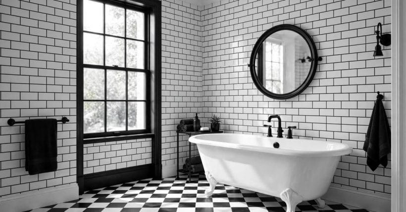
The black and white bathroom is design’s oldest modern scheme: two tones, no hiding place.
These seventy-five ideas compose the two tones room by room — layout, vanity, tiles and pattern, fittings, the wet zone, the floor, and the softening finish — with the general room planning carried in the wider bathroom ideas survey, to which every room here links back.
1. Black and White Bathroom Ideas at a Glance
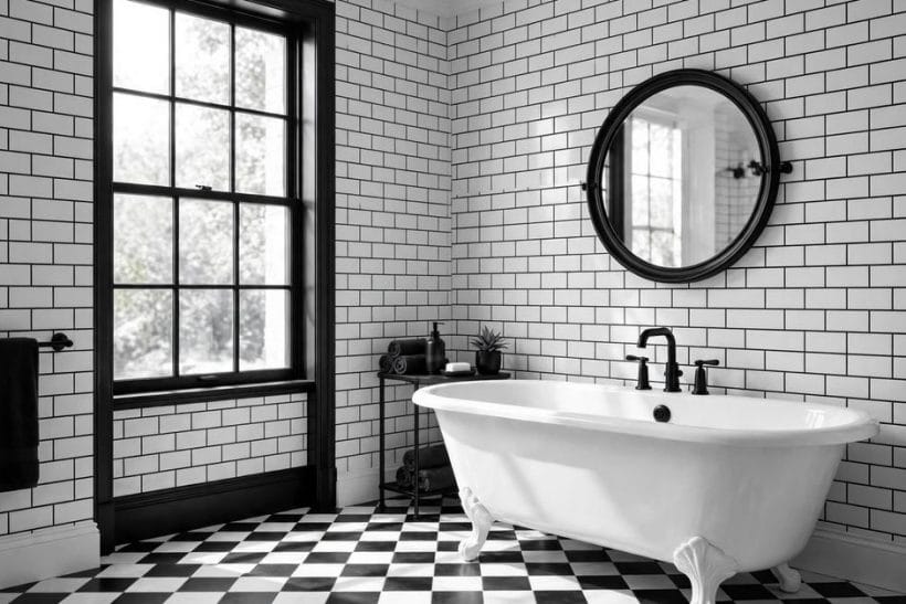
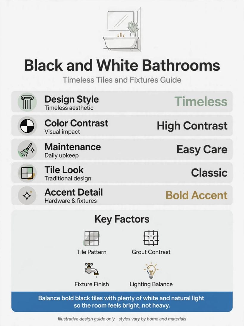
A black and white bathroom is a bathroom composed in the two tones alone: white as the usual field — walls, floor, sanitaryware — with black rationed to fittings, frames, grout and one or two larger gestures, or the pair inverted in large bright rooms.
| Question | Short answer |
|---|---|
| What is the right ratio of black to white? | White as the field, black as the punctuation — roughly a fifth to a third black by area, concentrated in fittings, frames, grout and one larger gesture. Invert it only in a large bathroom with generous daylight. |
| What pattern suits a black and white bathroom? | One patterned surface per room: a chequer or hexagon floor, a metro grid with contrasting grout, or veined stone-look tile as pattern without repetition. A second pattern is where the scheme starts to buzz. |
| What metal finish works with black and white? | One thread throughout: matte black for the crispest graphic lines, polished chrome for the classic hotel register, brushed nickel to soften. The screen frame, taps, rail and flush plate must all agree. |
| How do you stop it feeling stark or cold? | Warm bulbs, white towels with real texture, one timber object, a plant, and a woven runner underfoot — softness added through materials and light, never through a third colour. |
| Does black and white suit a small bathroom? | Particularly well, with the black rationed to metal and grout: white field, black taps and frame, a patterned floor if the room wants one event. The scheme’s clarity makes small rooms read as deliberate rather than compromised. |
2. Layouts: Composing a Room in Two Tones
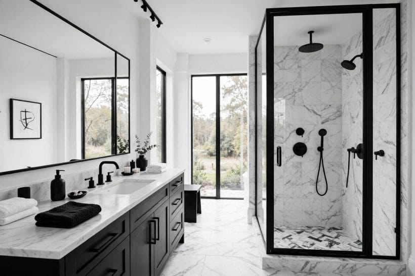
A black and white bathroom is an exercise in proportion: the two tones must be rationed, or the room turns either stark or gloomy. The layouts here treat black as the accent with weight and white as the field it plays on — inverting the pair only where a room is large and bright enough to carry it. The palest pole of the same family — the all-white room — is composed in white bathroom ideas; this post is the two-tone composition itself.
1. Keep white the field and black the punctuation in most rooms
The durable ratio: white walls, floor and sanitaryware as the ground; black in the fittings, the frame, the grout, one piece of furniture.
2. Invert the ratio only in a large, bright bathroom
Black walls with white fixtures is the scheme’s dramatic pole — magnificent with daylight and space, oppressive without them.
3. Zone the room by tone: pale at the vanity, deeper at the wet end
A gentle gradient — bright where faces are judged, deeper where water flies — gives the two tones a geography. The room’s ends differ without a single coloured object being introduced.
4. Run the vanity as a black piece against white walls for a furniture-led layout
A black vanity, freestanding in character, is the layout’s anchor opposite to the white bath — the room’s two objects in dialogue. Everything else can afford to be quiet between them.
5. Float white fixtures in a black-walled room for the gallery effect
Where the walls are black, wall-hung white basins and a white bath float like exhibits. The effect depends on immaculate lines: any clutter reads twice as loud against the dark ground.
6. Use a chequered or bordered floor to organise a long room
A patterned floor draws a long bathroom’s eye down its length and gives its zones a shared carpet.
7. Centre the bath on the room’s axis and let symmetry do the decorating
Two-tone rooms love order: a bath centred under a window, twin basins, matched sconces. Symmetry is the monochrome scheme’s native ornament — cheaper than pattern and as effective.
8. Divide the wet zone with a black-framed screen as the layout’s ruled line
The grid screen is both partition and drawing: it zones the shower, repeats the scheme’s black in its largest single gesture, and keeps the room’s sightlines open through clear glass.
9. Give a small bathroom the pale treatment with black confined to metal
In the smallest rooms, black belongs to the taps, the frame, the rail and the mirror’s edge — nowhere larger. The scheme survives at miniature scale precisely by this rationing.
10. Balance a black floor with white walls and a pale ceiling, unbroken
A dark floor grounds the room and hides its daily life kindly, provided everything above it stays light. The horizon line where black floor meets white wall is the scheme’s boldest single decision.
11. Let the door and its furniture join the scheme, not fight it
A door painted in the room’s black or white — with its handle in the scheme’s metal — completes the composition at the room’s most-touched point.
3. Vanities and Basins: Where the Contrast Sits
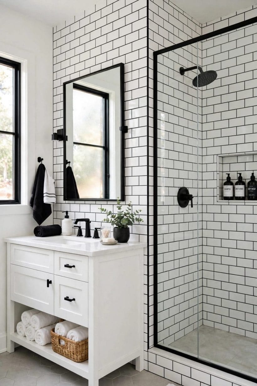
The vanity is where the two tones meet at eye level, and where the scheme’s contrast should be at its most deliberate. Shared-basin planning and the double-vanity question are worked through in double sink bathroom ideas; here the vanity is judged as the monochrome room’s centrepiece.
12. Choose a black vanity against white tile for the scheme’s signature picture
The black vanity on a white ground is the photograph every monochrome bathroom is judged by: graphic, tailored, unforgettable. Keep its top pale and its surroundings quiet, and it needs nothing else.
13. Set a white vanity in a black-walled room and light it like a stage
The inversion at the vanity — pale furniture, dark walls — wants dedicated mirror light to keep faces kind. The vanity becomes the room’s lantern, and its grooming light does double duty.
14. Use a stone counter with honest veining as the scheme’s only pattern
Natural veining is monochrome’s native pattern: grey movement on white, unrepeatable and calm. On the vanity top it supplies all the decoration the two tones allow themselves.
15. Pick black basins on a white counter for punctuation at hand height
Dark basins are the scheme’s boldest small move: sculptural, graphic, and honest about showing every drop — which in a guest bathroom reads as confidence, and in a family one as a cleaning rota.
16. Choose white basins on a black counter for the tailored middle
The reverse pairing — pale basins on a dark top — is easier to live with and nearly as graphic.
17. Frame the vanity’s mirror in black as the room’s drawn line
A black-framed mirror over either vanity colour draws the scheme’s signature line at face height. Twin mirrors over twin basins, identically framed, double the effect with discipline.
18. Keep vanity hardware in the scheme: black on white, chrome on black
Handles are the vanity’s jewellery and should obey the contrast logic — dark metal on the pale piece, bright metal on the dark one — so the eye reads intention at the smallest scale.
19. Use an open washstand in black metal for a period-graphic vanity
A washstand — basin on a black frame, shelf below — recalls the scheme’s early-plumbing origins and keeps the floor visible. Towels folded on its shelf are its storage and styling in one.
20. Run twin vanities as identical twins, never near-matches
Monochrome exposes asymmetry mercilessly. Two vanities must match exactly — same piece, same basin, same mirror — or the scheme should choose one long shared run instead.
21. Hang mirrored cabinets in black frames to give the vanity storage without bulk
A pair of black-framed mirrored cabinets over the basins stores the daily bottles at face height and doubles the mirror the scheme wants anyway.
22. Keep the counter bare but for the daily few in black or white containers
Against this graphic ground, branded bottles are graffiti. Decanted into black, white or glass, the daily things become part of the composition; left in their packaging, they are its only colour — and its worst.
4. Tiles and Patterns: Grids, Checks and Hexagons
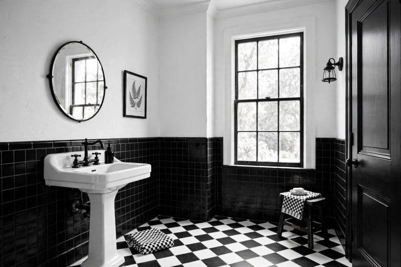
Pattern is where black and white stops being a colour scheme and becomes a design language: the metro grid, the hexagon field, the chequer, the marble vein. The stone version of the language, in pale luxury register, is carried through marble bathroom rooms; here pattern is rationed by the strictest rule in this post — one patterned surface per room.
23. Lay white metro tiles with black grout for the scheme’s classic grid
The white brick tile with a dark joint is monochrome’s wallpaper: cheap, honest and graphic in a way that suits black fittings perfectly.
24. Run black metro tiles with white grout where the drama is wanted
The inverted grid — dark tile, pale joint — turns a shower or a splashback into the room’s graphic event.
25. Choose small black and white hexagons for a period floor
Hexagonal mosaics in the two tones, plain or in simple flower-and-field patterns, give the floor its early-bathroom authenticity. Their scale suits small rooms and follows a shower fall gracefully.
26. Keep chequerboard to the floor, and size its squares to the room
The chequer is the scheme’s loudest pattern and belongs underfoot, in squares scaled to the space — large in a big room, fine in a small one.
27. Use a veined large-format tile for pattern without repetition
Big tiles with marble-style veining pattern a wall the way weather patterns a sky — no repeat, no grid. In the wet zone they make the shower feel carved from one block.
28. Border a plain field with a black tile line to draw the room’s edges
A single black course at the skirting, the picture rail line or the shower’s edge frames white tiling like a mount frames a print. It is pattern’s cheapest form and often its most elegant.
29. Mix tile formats only within one tone at a time
Metro on the walls and hexagon on the floor can share a room if both are white-ground; the formats converse because the colour is silent.
30. Take the wet zone’s tile to the ceiling for a carved reading
Tiling the shower full height — especially in the scheme’s deeper treatment — makes the wet end read as a carved alcove rather than a clad corner.
31. Paint one wall instead of tiling it, in the scheme’s white
A room tiled everywhere in pattern’s language needs one resting surface. A painted wall in the scheme’s warm white carries the mirror and the art kindly, and proves the tiles were chosen, not defaulted.
32. Vary the bond quietly: brick bond on the walls, a stacked bond in the shower
The same white metro tile laid two ways — running bond in the room, stacked in the wet zone — gives the scheme a whisper of variation that costs nothing and reads as draughtsmanship.
33. Match grout to the scheme’s logic on every surface
Dark grout on white tile, pale grout on black, and never a grey compromise that belongs to neither.
5. Fixtures and Fittings: Black Metal, Chrome and the One Finish Rule
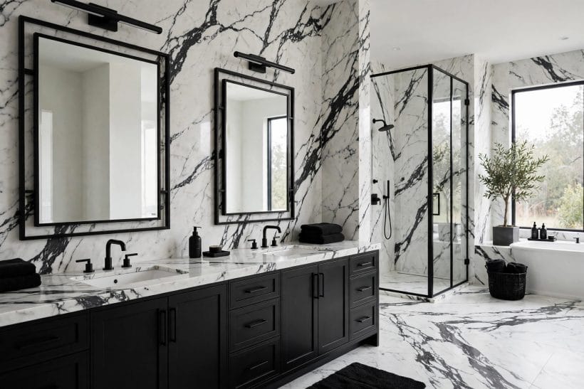
Monochrome’s fittings follow the same discipline as any scheme’s — one metal thread — with an added temptation to resist: treating black itself as a fitting finish and a colour at once.
34. Run matte black fittings as the room’s drawn lines
Black taps, shower, rail and flush plate draw the scheme’s lines in three dimensions: every fitting a stroke. Against white tile it is the crispest composition a bathroom can make.
35. Choose polished chrome for the classic, light-catching thread
Chrome on black and white is the scheme’s traditional metal — bright against the dark pieces, quiet against the white, and replaceable like for like for decades.
36. Keep brushed nickel as the soft option where black feels too graphic
Nickel’s greyed sheen sits between the two tones and softens the scheme’s contrast at its smallest scale. It suits rooms that want monochrome’s calm without its poster-like punch.
37. Show the shower’s pipework in the room’s metal, run level and true
Exposed pipework in the chosen finish reads as the scheme’s honesty: plumbing drawn on the wall. Run dead level and plumb, it is ornament; run crooked, it is evidence.
38. Fit a black-framed enclosure or screen and let it be the largest fitting
The screen’s grid is the fittings’ theme at architectural scale — the one black gesture big enough to balance a pale room.
39. Choose crosshead or lever handles and repeat the shape family
Basin, bath and shower controls in one design family keep the room composed at hand height. Two competing handle designs in a graphic scheme is a visible quarrel.
40. Let the heated rail match the thread and carry the towels’ white
The rail in the scheme’s metal, loaded with white towels, is monochrome’s softest picture — and the room’s warmth and storage in one wall-mounted object.
41. Keep the flush plate and the small ironmongery inside the finish
Plates, hinges, hooks and the door handle are the thread’s last mile. A chrome flush plate in a black-fitted room is a full stop in the wrong ink — small, and read every day.
42. Use black for the waste and trap where they show, or hide them honestly
Visible pipework under a washstand should wear the scheme’s finish; under a cabinet it should simply vanish.
43. Complete the hand-height set: hooks, rings and rails in the same finish
The small fittings at hand height — the robe hook, the hand-towel ring, the glass shelf’s brackets — are read more closely than any others.
44. Resist novelty finishes: the scheme’s strength is its short palette
Copper, gold and rose metals each start a new scheme. Monochrome’s authority comes from refusal — two tones, one metal, nothing else admitted without a full redesign.
6. Showers, Baths and Glass: The Wet Zone in Two Tones
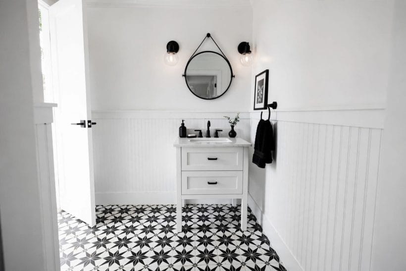
The wet zone is where monochrome meets water, and the two tones divide the labour: white for the surfaces that must look clean, black for the lines that organise them. The bath forms themselves — roll-tops, deep soakers, painted exteriors — are surveyed in freestanding bathtub ideas; here they are placed and dressed in the two-tone register.
45. Choose a white freestanding bath as the room’s pale sculpture
Against any darker treatment, a white bath is the scheme’s luminous centre — the object the room is composed around. Give it air on all sides and the simplest fittings in the room’s metal.
46. Paint the bath’s exterior black for the scheme’s boldest single object
A black-outside, white-inside bath is monochrome in one object: dramatic, period-true, and the fastest way to give a plain room its centrepiece. It wants a pale floor beneath it to stand on.
47. Use a black grid screen to zone the shower without closing it
The fixed black-framed screen — no door, no seals to fail — is the scheme’s signature divider: water stopped, light and sightlines passed, the wet zone drawn rather than boxed.
48. Tile the shower’s back wall in black and keep its sides white
One dark wall at the shower’s end gives the wet zone its depth cue and its photograph.
49. Set a white shower tray or a pale tiled fall to keep the wet zone bright
A pale shower floor reflects light upward and shows the water’s honesty. Against a dark back wall it completes the zone’s own small composition of the two tones.
50. Run a long black channel drain as the floor’s single line
A channel drain in the scheme’s black replaces the central grate with one ruled line at the shower’s edge — drainage as draughtsmanship, entirely in the scheme’s spirit.
51. Fit twin black shower heads where the shower is the room’s main event
In a bathless monochrome bathroom, the shower takes the drama: two heads on the shared pipework, a bench, lined niches. The symmetry suits the scheme, and the black fittings carry it.
52. Line the niche in the opposite tone to its wall
A niche cut into a white shower wall and lined in black — or the reverse — becomes the zone’s small framed picture, and gives bottles a home that composes instead of cluttering.
53. Choose clear glass throughout and let the frames draw
Frosting and printed glass fight the scheme’s clarity. Clear glass with black or chrome frames keeps the wet zone transparent to the room’s composition — the frames are the pattern.
54. Ground a white bath on black feet or a black plinth
Claw feet, a plinth or a painted apron in the scheme’s black ties the white bath to the floor’s tone and repeats the dark note at the room’s centre.
55. Add a simple bench in white stone or black timber inside the shower
One bench, in either tone, serves sitting and staging, and its single block of colour anchors the shower’s composition at seat height.
7. Floors: The Room’s Biggest Pattern Decision
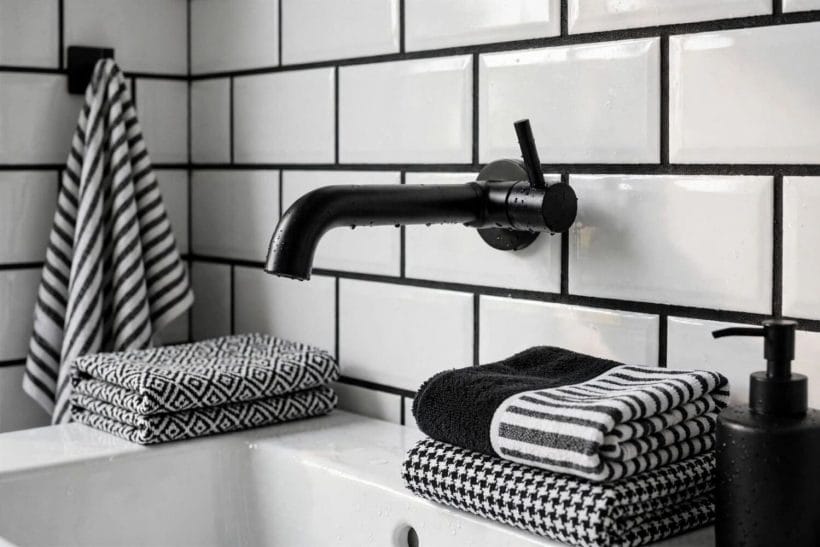
In a monochrome bathroom the floor is usually the largest patterned surface and the decision the whole room is judged by.
56. Lay a black and white chequer scaled to the room’s size
The classic floor, in squares proportioned to the space: broad checks in a large room read as grandeur; small checks in a small room read as period charm.
57. Choose hexagon mosaics for a softer, finer field
Where the chequer shouts, the hexagon field murmurs — a fine two-tone texture that suits small rooms and traditional houses. Its many joints are also quiet grip under wet feet.
58. Run large white tiles with a black border for a framed calm
A pale field with a dark border course draws the floor as a picture: calm in the middle, deliberate at the edges.
59. Take black tiles across the whole floor for a grounded, evening room
An all-black floor under white walls is the scheme’s grounded pole — dramatic, forgiving of nothing in dust but everything in mood.
60. Use a veined stone-look floor as pattern that behaves like a plain
Marble-effect large tiles give the floor movement without geometry — pattern at the volume of a whisper. It is the choice for rooms whose walls already carry the grid or the check.
61. Carry the floor’s pattern up the shower’s floor only, not its walls
Continuity underfoot unifies the wet zone with the room; pattern stopped at the shower’s threshold keeps the walls calm. The same tile, continued, makes a small bathroom read as one carved space.
62. Keep grout colour part of the floor’s design, chosen on a sample board
On a two-tone floor grout decides whether the pattern reads as checks or as a grid of grout.
63. Warm a hard floor with a white or natural runner
A woven runner between bath and vanity softens the floor’s geometry at the two places feet stand longest, and adds the textile note the hard scheme needs.
64. Consider underfloor warmth where the budget reaches, for the barefoot hours
Monochrome’s favourite floors are stone and ceramic — cold at dawn in a northern house.
65. Let the floor meet the walls with a skirting in one of the two tones
A black skirting under white walls, or white under black, draws the room’s base line deliberately. The skirting is the floor’s frame — in a two-tone room, even the frame is a design decision.
8. Lighting, Mirrors, Storage and Softening the Graphic Edge
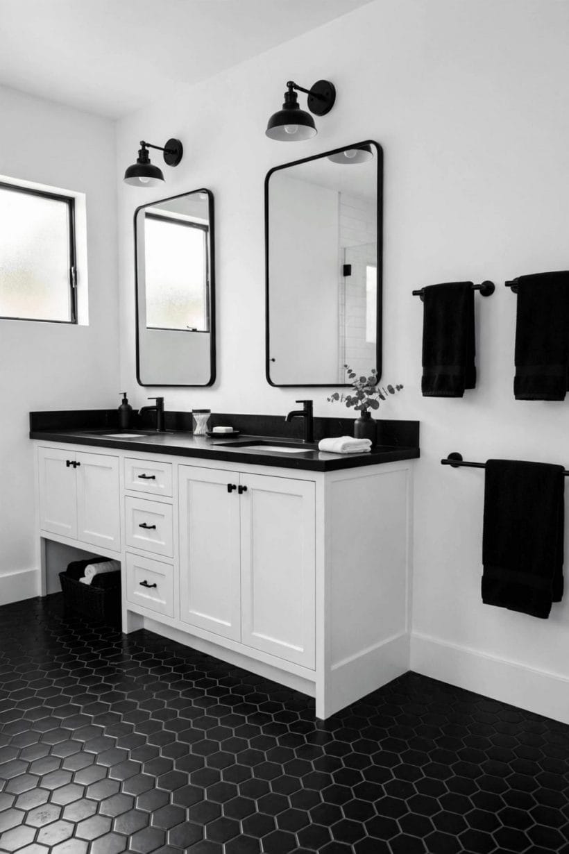
Monochrome’s risk is severity: a room of contrast can forget to be kind. The finishing layer — warm light, soft textiles, timber in one place, something living — is how the scheme keeps its graphic strength and gains a pulse. Its standards borrow from the rooms composed in luxury master bathroom ideas, translated into two tones.
66. Light faces warmly and from the front; monochrome forgives no cold bulb
Cool light turns the scheme clinical — white to blue, black to void. Warm bulbs keep the whites creamy and the blacks deep, and faces the colour they are.
67. Hang a black-framed mirror as the vanity wall’s picture
The mirror’s black frame is the scheme’s portrait frame, hung at face height where it is read daily. Round softens the room’s grids; rectangular repeats them — choose by the room’s temperament.
68. Run sconces in the room’s metal at both sides of the mirror
Paired lights in the fittings’ finish frame the face with even light and draw the vanity’s composition closed. They are the scheme’s jewellery worn at eye level.
69. Store everything behind black or white doors; show nothing branded
Monochrome storage is invisible by colour: cabinets in either tone, their contents decanted. The scheme’s calm is a storage achievement before it is a colour one.
70. Fold the towels in pure white, always, as the scheme’s soft constant
White towels are monochrome’s textiles: bright against either ground, replaceable anywhere, and the room’s softest geometry when folded with care. Coloured towels are how this scheme quietly ends.
71. Introduce one timber object — a stool, a tray, a bath caddy — for warmth
A single piece of real wood is the scheme’s hearth: the eye rests on its grain amid the graphic order. One piece composes; a timber scheme would be a different room entirely.
72. Set a plant in a black or white pot as the room’s living green
Green is the colour monochrome secretly needs, supplied by life rather than paint. A fern or a trailing plant in a scheme-coloured pot softens the wet zone’s lines and thrives on its humidity.
73. Add a woven basket or natural mat as texture the tones cannot supply
Rush, sisal and woven cotton bring the fibre note that tiles and metal lack. In natural tones they sit inside the palette’s spirit while warming its touch.
74. Keep a bath caddy and a carafe: the room’s small ceremonies
A caddy across the bath, a water glass on the vanity — the ceremonies of use, in the scheme’s materials. Monochrome at its best is not a showroom; it is a room with habits.
75. Finish with scent in a plain vessel and a clear counter, nightly
The last layer is discipline: counters cleared, one plain vessel of scent, towels straight. The two-tone room shows disorder at twice the volume — and shows order at twice the reward.
9. Checks and Mistakes: Before the First Purchase or the First Fitting
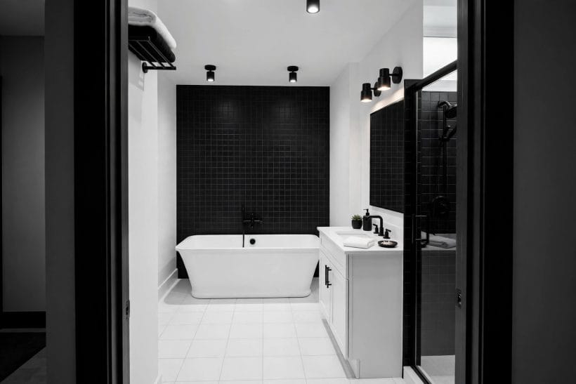
The monochrome scheme’s classic mistakes are failures of rationing: a second pattern admitted because the first looked lonely, black spread until the room turned to gloom, a novelty metal finish wandering in from another suite.
Plain duties in their plain sentences: black tiles and fittings show hard-water marks honestly and need the cleaning rhythm the household can actually keep; glass must be the proper safety kind for bathrooms; and electrics belong in the correct zones, fitted by a qualified installer.
Finally, judge the scheme on a full sample board — floor, wall tile, grout, one fitting, one towel — in the room’s own light before anything is ordered.
10. Costs and Pulling It Together
Costs follow the room’s usual order: the palette itself is free and tiles in two tones cost no more than tiles in ten; the spend concentrates where it always does — fittings that will be touched daily, glass, and the floor’s laying.
Pull the room together by repeating the same black in the same finish at every scale — grout, frame, tap, rail — and the same warm white on wall, towel and ceiling.
Final Considerations
A black and white bathroom succeeds when it feels less like a colour scheme than like a drawing of a bathroom — every line intended, nothing accidental.
Start with the sample board and the floor decision, and the rest of the room tends to fall into place behind them.


0 Comments