
1. Blue Tile Bathrooms at a Glance
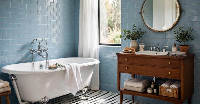
Blue is the bathroom’s oldest colour and still its most forgiving: cool without coldness, calm without dullness, and at home in every era from the vintage bathroom to the newest small-room makeover. This collection of vintage blue tile bathroom ideas leans into that heritage — powder blues and navies, subway and hex, chrome and wood — while covering the whole modern subject around it: layouts, vanities, patterns, space-saving fixtures, light and care. Blue tile leads; everything else is chosen to serve it.
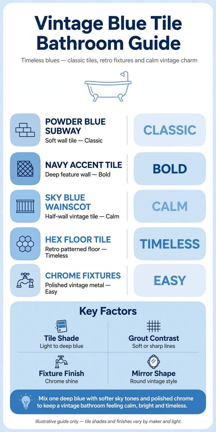
| Part | What It Covers | Why It Matters |
|---|---|---|
| POWDER BLUE SUBWAY | Soft wall tile | Classic |
| NAVY ACCENT TILE | Deep feature wall | Bold |
| SKY BLUE WAINSCOT | Half-wall vintage tile | Calm |
| HEX FLOOR TILE | Retro patterned floor | Timeless |
| CHROME FIXTURES | Polished vintage metal | Easy |
Mix one deep blue with softer sky tones and polished chrome to keep a vintage bathroom feeling calm, bright and timeless.
That mixing rule is the difference between a blue bathroom and a blue mood. One depth of blue, used everywhere, flattens a room; two or three tones of it — a deep accent, a mid wall, a pale floor or ceiling — give the eye the same pleasure it gets from the sea and sky the colour is borrowed from. Seventy-five ideas follow, arranged from keeping vintage tile to caring for it.
2. Vintage Blue Tile, Kept and Celebrated
The first nine ideas are for the bathrooms that already have it: original blue tile, often mid-century, more often threatened than cherished. The wider subject at every scale sits in the bathroom ideas pillar; this section argues the vintage case — that kept tile, honestly repaired, beats replacement on charm, cost and waste alike.
1. Keep the Original Tile, Cleaned First
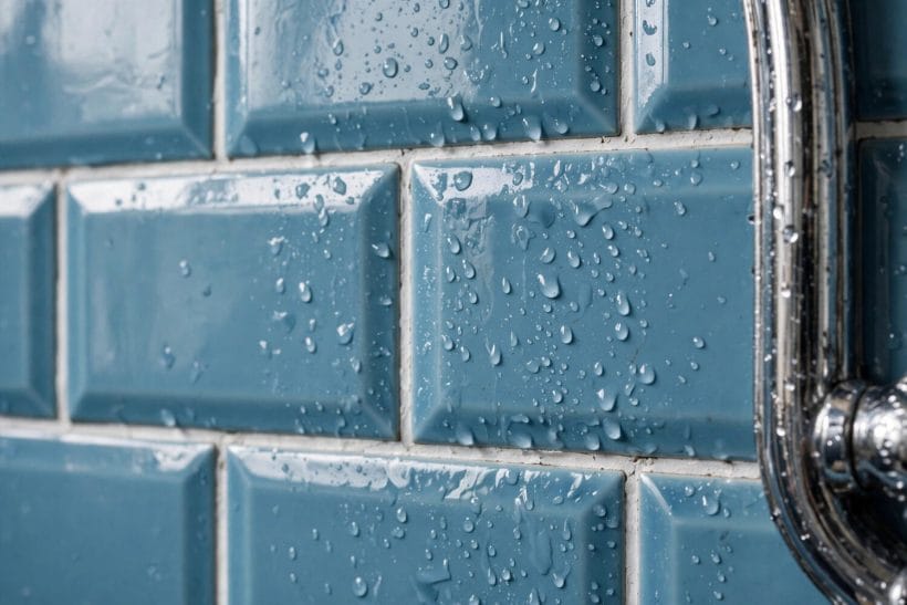
Before any verdict on old blue tile, clean it properly and regrout a sample patch: decades of dullness are usually soap and tired grout, not failed glaze. Vintage tile that survives cleaning has a depth of colour modern ranges rarely match.
2. The Blue and White Pairing
Vintage blue never travelled alone: white sanitaryware, white ceilings and white towels were its built-in contrast. Restoring that pairing — rather than introducing a third colour — is the fastest route back to the room’s original poise.
3. Retro Fittings With Real Age
Crosshead taps, exposed valves and a high-level cistern read as correct against vintage tile because they are its contemporaries. Kept and serviced, original fittings carry an authenticity no reproduction budget buys afterwards.
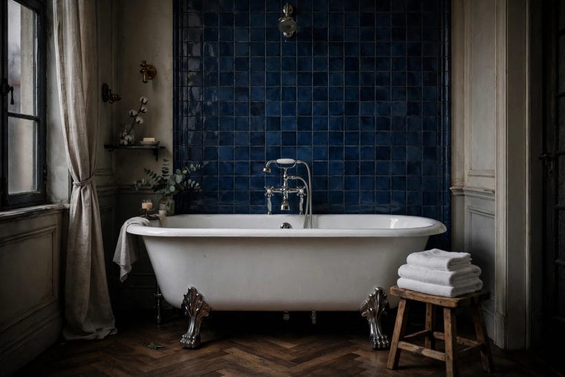
4. A Clawfoot Bath Against Blue Tile
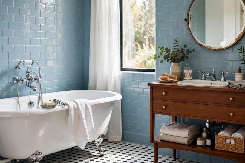
The clawfoot bath is vintage blue tile’s natural partner: sculptural, freestanding, and happy against a tiled wall it never touches. The pairing is the era’s postcard image, and it still stops a scroll today.
5. Checkerboard Floors, the Period Partner
Black-and-white or blue-and-white checkerboard is the floor vintage bathrooms were drawn with. Under blue walls it anchors the room in its period and hides a forgiving amount of everyday life between cleans.
6. Warm Wood as the Vintage Softener
A wooden vanity, a teak bath mat, a framed mirror in mid-tone timber: wood was always in these rooms, warming the blue’s coolness. It remains the easiest way to stop a vintage bathroom feeling like a museum.
7. Mirrored Cabinets and Sconces
The mirrored medicine cabinet and a pair of sconces are period furniture as much as fittings. Together they give the vintage room its face-level ritual — light either side of the glass, everything else within reach.
8. Border Tiles Kept as the Accent
Many vintage schemes carry a patterned or contrasting border at picture height. Keep it even when the field tile is repaired around it: the border is the room’s signature, and signatures are what make old bathrooms valuable.
9. Repair, Don’t Replace
A cracked tile is a repair; a dated colour is an opinion. Vintage blue tile in sound condition should be treated as the asset it is — the next section’s new schemes spend good money imitating what a kept bathroom already owns.
3. Layouts That Let Blue Tile Lead
Layout decides how much blue a room can carry and where it earns its keep. The small-room layouts in the tiny bathroom ideas collection solve the same puzzle at tighter scale; here the plans are arranged around the tile itself.
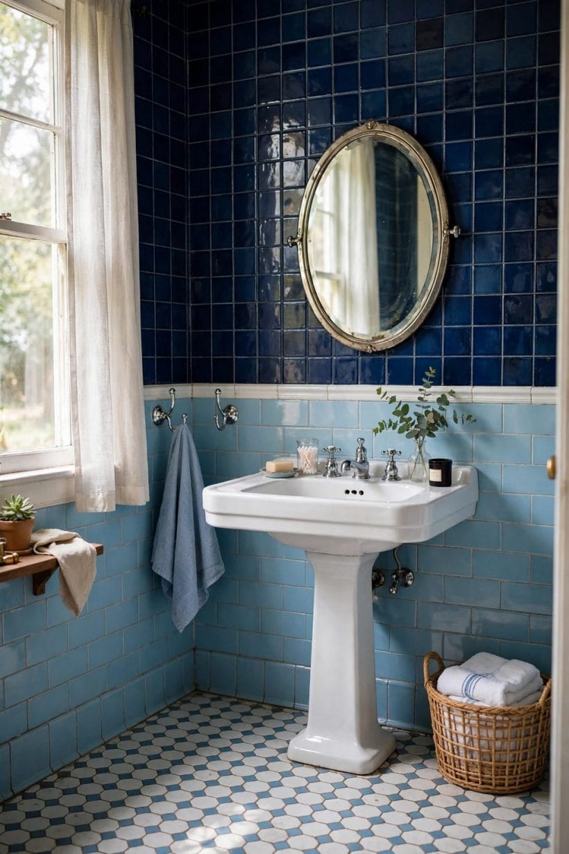
One layout habit underlies all eight: decide the tile’s territory before choosing the tile. A wall’s worth of blue behaves differently from four walls’ worth — in light, in budget, in how much pattern the room can carry — and the territory should be settled by the room’s shape and the household’s appetite, not by the size of the tile sample that arrived in the post. Walk the room, mark the wet zones, and let the plan follow the plumbing.
10. Tile the Wet Wall Only
One fully tiled wall — the bath or shower wall — with painted walls elsewhere: the layout that lets a strong blue make its statement inside a budget and inside a small room’s tolerance.
11. The Full Wrap
Blue tile on every wall, taken high: immersive, calm and unmistakably committed. The full wrap suits larger rooms and pale blues; in a small room it asks for the lighter tones of idea 52.
12. The Shower as the Blue Room
Keep the room neutral and make the shower enclosure the blue event: tile, fittings and light all inside the glass. The eye reads a jewel box set into a calm room.
13. An Alcove Bath Framed in Blue
A bath set into an alcove, the alcove’s three walls tiled blue to the ceiling: architecture and colour drawn in one gesture. The frame makes even a plain bath look installed rather than placed.
14. The Half-Tile Line
Tile to wainscot height all round, paint above: the vintage layout that balances hygiene, cost and colour. The line itself becomes a shelf-edge for bottles and plants along the bath wall.
15. Blue Behind the Basin Only
A splashback field of blue behind the basin and mirror, walls otherwise plain: the smallest layout commitment in this section, and the one renters of the idea — if not the flat — should start from.
16. The Tiled Bath Panel
Tile the bath’s apron and panel in the wall’s blue so the bath reads as built into the tiling. It is the layout trick that makes a standard tub look bespoke for the price of a few tiles.
17. The Walk-In Shower Wall
A single walk-in shower wall in blue, the rest glass and air: the modern layout wearing vintage colour. Without a door or tray edge interrupting it, the tiled wall becomes the room’s artwork.
4. Vanities Against Blue Tile
The vanity is where blue tile meets its daily companion, and the meeting can flatter or fight. Cabinetry across the colour range is gathered in the white bathroom cabinets collection; this section pairs materials and forms with blue specifically.
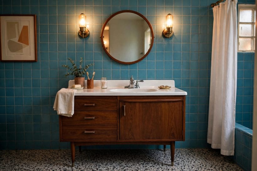
18. The White Vanity, the Classic Answer
White cabinetry against blue tile is the pairing that never misses: crisp, clean-reading, and kind to every blue from powder to navy. It is the safe choice that does not look like one.
19. Warm Oak Against Cool Blue
Oak and blue are colour-wheel diplomacy: the wood’s warmth answers the tile’s coolness measure for measure. Mid-tone oak vanities are the single most reliable way to make a blue bathroom feel welcoming.
20. A Wall-Hung Vanity Lifts the Line
Floating the vanity lets the tiling run beneath it uninterrupted and shows more floor — the room breathes, cleaning simplifies, and the tile, not the furniture, owns the wall.
21. The Pedestal Basin, Period and Proud
Where storage can live elsewhere, a pedestal basin gives vintage blue tile its original partner and a small room its airiest floor plan. Nothing to clean under, nothing to date the room but charm.
22. Double Basins on One Blue Wall
Two basins along a single tiled wall turn the morning queue into a shared ritual and double the case for the tile: a long blue field with twin mirrors is a hotel move that works at home.
23. A Vintage Dresser, Converted
An old dresser or washstand plumbed as a vanity brings genuine period timber into a blue room — the one piece of furniture that can out-vintage the tile itself. Seal the top honestly and it serves for decades.
24. Blue on Blue: the Painted Vanity
A vanity painted a deeper or softer blue than the tile commits to the colour story completely. Tonal layering — navy below, powder above — is the sophisticated version of the all-blue room.
25. Marble Tops, Used Gently
A pale stone top cools a warm vanity and warms a white one, and its veining gives blue tile a quiet pattern to answer. Keep the stone pale; the tile is the colour event.
26. Open Shelves Keep the Tile Visible
Open shelving under or beside the basin leaves the tiled wall on show and forces the beautiful kind of tidiness: folded towels, glass jars, nothing in a shouty bottle.
5. Blue Tile Patterns and Placements
Pattern is where blue tile earns variety without changing colour. The neighbouring family — rooms built on white tile — is explored in the white tile bathroom ideas collection; here every pattern stays blue.
Pattern also decides how a wall ages. Busy patterns hide the small irregularities of old walls and the honest wear of family life; plain fields show both, and reward the rooms that can keep them calm. Choose the pattern for the wall you have and the decade you want from it — the tile will be looked at longer than any other surface in the house, usually at the start of the day, at close range, in unforgiving light.
27. Subway Blue, Brick-Laid
The elongated tile in a running bond is the pattern vintage made famous and modern rooms keep borrowing. In gloss blue it is all light-play; in matt, all calm. Either way, it never argues with the fittings.
28. Square Tiles, the Vintage Grid
Plain squares in a straight grid are the honest vintage pattern — the one under most original schemes. Laid with slim grout lines they read as serene colour fields rather than pattern at all.
29. Herringbone in the Shower
Herringbone gives a single blue movement and direction, best spent where water and light animate it: the shower wall. It costs laying time rather than tile money, which is the right way round.
30. Hexagons, Small and Classic
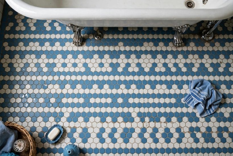
Small hex tiles are the vintage floor’s signature and a forgiving wall pattern in showers. In blue they let grout become the pattern’s second colour — pale grout for air, dark for definition.
31. Gloss Blue, Light Bouncing
A gloss glaze throws window light around a room and makes blue look wet and deep. It is the finish that saves north-facing bathrooms, at the honest price of showing water marks sooner.
32. Matt Blue, the Calmer Wall
Matt and satin glazes hold blue steady and soft, forgiving splashes and suiting the spa-tempered room. Large matt tiles in a mid blue are the closest tile comes to painted plaster — with better manners around water.
33. Two Blues, Tonally Layered
Mixing two blues in one field — random, banded or faded ombre-style from deep to pale — builds the tonal depth the opening rule asks for. Keep both blues the same temperature or the wall will quarrel with itself.
34. The Border Stripe at Picture Height
A single stripe of deeper blue or a patterned border run at eye height gives a plain field its architecture. It is also the cheapest elevation in this whole section: one row changes the room.
6. Fixtures and Space-Saving Fittings
Blue tile rooms are often small rooms, and their fittings must earn floor space like tenants. Compact sanitaryware across the wider subject is covered in the bathroom interior design for tiny houses collection; the fittings below are chosen for tiled rooms specifically.
35. The Wall-Hung Loo, Floor Freed
A wall-hung pan lets the tiling sweep beneath it and returns a hand’s breadth of floor that reads as a foot’s worth. Against blue tile it also floats the whiteware, keeping the vintage calm contemporary.
36. The Short-Projection Basin
Basins that project less into the room are the small bathroom’s quiet enabler: the door swings, knees clear, and the blue splashback behind still gets its full field.
37. A Compact Bath, Full Comfort
Shorter, deeper baths trade length for soak and give the tile budget a smaller, richer field to cover. In a blue room the bath is furniture — choosing it well matters more than choosing it big.
38. Corner Basins in Truly Tiny Rooms
A corner basin turns the room’s most wasted angle into its washstand and leaves the blue tile a straight wall to dress. Paired with a corner mirror it feels designed, not squeezed.
39. Exposed Valves, the Vintage Detail
Exposed shower and bath pipework in chrome is both period-correct and practical — every joint inspectable, every part replaceable — and it draws bright lines of metal across the blue like jewellery.
40. A Rail Shower Over the Bath
The bath-mounted rail shower keeps one set of fittings doing two jobs and keeps the tiling’s story simple: one blue alcove, bath below, shower above, screen to close it.
41. Slim Heated Rails
A tall, narrow heated rail takes the wall space a radiator wastes and returns warm towels: in a blue room, choose chrome and let it join the fittings’ metal family.
42. The Frameless Screen Keeps Tile on Show
Clear frameless glass over a bath or in a walk-in corner refuses to interrupt the tiling — the blue runs visually through the screen, and the room stays one room.
43. Storage Inside the Mirror
A mirrored cabinet hides the bottles that would otherwise colonise the tile’s ledges. Storage behind the glass is the space-saving fitting vintage bathrooms invented and modern ones still need.
7. Light, Mirrors and Metal Finishes
Blue is a colour made of light: the same tile reads three ways under three bulbs. Bath-centred ideas — the tub as the room’s subject — fill the bathtub tile ideas collection; this section tunes light and metal around blue walls.
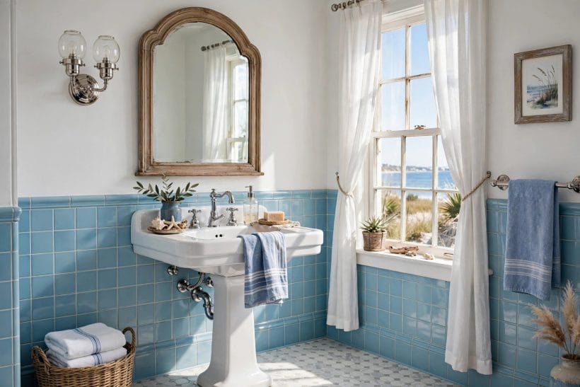
44. Chrome, Blue’s Oldest Friend
Chrome and blue tile have a century of practice together: the metal’s cool shine doubles the tile’s light and never clashes with any depth of blue. When in doubt, chrome is the answer that predates the question.
45. Brass Warms the Blue
Unlacquered brass against blue is the warm-cool contrast at its most elegant: taps, rails and mirror frames glowing amber against the cool field. It is the finish that makes powder blue feel luxurious.
46. Black Fittings Sharpen It
Matt black taps and frames draw a hard modern outline around vintage blue, sharpening the whole scheme. Use black where the room needs definition — over pale blues it is calligraphy.
47. A Big Mirror Doubles the Tile
One generous mirror reflects the tiled wall back into the room, doubling the colour’s presence without another tile laid — and doubling the light with it. Round mirrors soften; rectangles sharpen.
48. Sconces at Face Height
Light either side of the mirror, at the face’s own height, is the flattering arrangement every vintage bathroom knew. Against blue tile, opal glass shades keep the period and lose the glare.
49. Frosted Glass Keeps It Soft
Frosted or fluted glass — in a window, a screen or a cabinet door — passes light and keeps privacy, and its softness is the natural companion of blue’s calm. Clear glass is crisper; frost is kinder.
50. Warm Bulbs in a Cool Room
Warm-toned light stops blue tile reading cold at night: the room stays blue but stops being chilly. It is the cheapest temperature adjustment in the bathroom, made at the bulb.
51. A High Window or Skylight
Daylight from above is blue tile’s favourite light — even, shadowless and flattering to glaze. Where a high window or skylight is possible, the tiling below it needs no other decoration.
8. Small Blue Tile Bathrooms
Small rooms are where blue tile is most doubted and most useful: pale blues recede, gloss bounces, and a disciplined layout makes colour do the work of space. Eight applications follow.
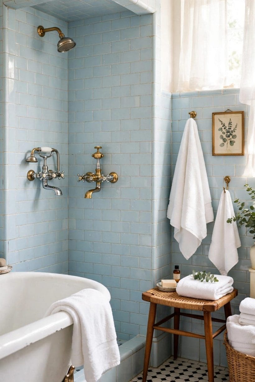
The psychology is worth trusting: a small blue room feels like a pool house or a ship’s cabin — compact by design, not by failure — where a small white room can feel like a cupboard that lost an argument. Colour gives the smallness a story. The eight ideas below spend that story carefully, because in a tiny room every choice is at arm’s length and there is nowhere for a mistake to hide.
52. Light Blue in the Smallest Room
Pale blue is the small bathroom’s expanding colour: cooler and calmer than white, kinder than grey, and it pushes walls back by mood rather than by measurement.
53. Tile Halfway, Paint Above
Half-height tile with the same blue carried up in paint keeps the colour story whole while halving the tile bill and the visual weight — the small room’s favourite compromise.
54. One Blue Wall, Three Quiet Ones
A single blue wall behind the basin, the rest in soft white: colour with an exit strategy, and enough contrast to make the blue read as a deliberate jewel.
55. Small Tiles Suit Small Rooms
Small-format tiles keep their proportions honest in small rooms — more grout lines, more texture, no giant pattern chopped awkwardly at the corners. Mosaics and small squares are the tiny room’s scale-correct choice.
56. Floor Into Wall, One Material
Running the same blue from floor up one wall folds the room’s edges away and makes its footprint genuinely hard to judge — the oldest small-room illusion, still undefeated.
57. Pale Grout Keeps It Airy
Pale grout between blue tiles keeps the field light and the pattern gentle; dark grout is drama, and small rooms usually have enough drama from their dimensions.
58. A Blue Ceiling, in Small Doses
Painting the ceiling a soft blue lowers it cosmetically and completes the colour wrap without a tile above shoulder height — a cocooning trick for rooms with height to spare and width to gain.
59. The Doorless Shower Corner
An open, tiled shower corner — walk-in, screenless where the layout allows — removes the door’s swing and the cubicle’s bulk from the room’s plan, and the blue tiling becomes the shower’s only wall.
9. Floors, Paint and the Colours Around Blue
Blue tile never colours a room alone: floors, ceilings and accents set its temperature. The dark dramatic end of the tile family is explored in the slate tile bathroom ideas collection; this section stays around blue.
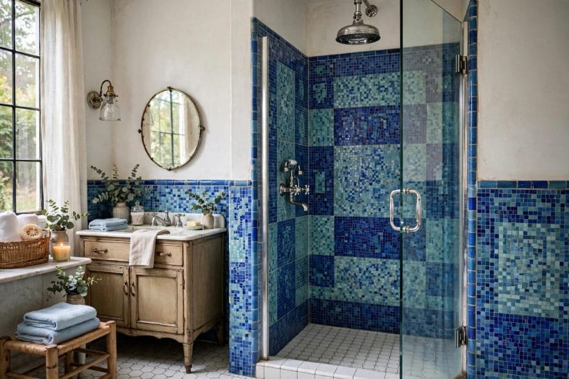
60. White Floors, Blue Walls
A pale floor under blue walls lifts the whole scheme and keeps the room’s hygiene reading bright. It is the combination estate agents photograph and small rooms survive by.
61. Wood Warmth Underfoot
Wood or wood-effect flooring under blue tile imports the warmth of idea 19 at floor scale — the room’s cool walls gain a warm ground, and bare feet approve in every season.
62. Navy as Blue’s Deep Partner
Navy paint or cabinetry beneath powder-blue tile gives the scheme its bass note. The deep-light pairing is the tonal rule of §1 rendered as a floor plan.
63. Soft Grey, the Neutral Between
Where white feels stark, soft grey grout, paint or towels mediate between blue and everything else — the neutral that lets blue be the only colour decision in the room.
64. Blush and Coral, the Vintage Warmth
A blush towel, a coral stool: small warm accents are how vintage rooms kept blue from solemnity. In textiles they can be changed with the season — the tile stays, the warmth rotates.
65. Plants Against Blue Tile
Green is blue’s natural neighbour, and a fern or trailing plant against blue tile looks like it was planted by the colour wheel itself. Bathrooms’ humidity keeps the arrangement honest with minimal care.
66. Cream Instead of Brilliant White
Cream sanitaryware and paint soften vintage schemes whose original whites were never brilliant. Against older blue tile, cream reads as accuracy where stark white reads as argument.
67. Black Accents, Sparingly
A black frame, a black stool, a single black rail: punctuation, not prose. Sparingly used, black gives blue tile the definition that stops a soft scheme drifting into vagueness.
10. Blue Tile Care and Honest Limits
The maintenance truth and the limits, stated plainly: blue tile is durable, repairable and forgiving — but it has a temperament, and the last eight ideas are about living with it well.
None of this section is specialised work. It is the ordinary rhythm of a tiled room — wipe, inspect, regrout when the grout tires, mend the chip before it spreads — done little and often rather than heroically and late. Blue tile asks less than almost any wall finish in the house; what it asks, it asks consistently, and the rooms that answer are the ones still looking deliberate decades after the tiler left.
68. Cleaning the Glaze Without Dulling It
Blue glaze shows its care: gentle cleaners and soft cloths keep the colour’s depth, while abrasive habits fog it slowly and permanently. The weekly wipe is the whole secret; there is no second secret.
69. Regrouting Refreshes Vintage Tile
When an old blue wall looks tired, the grout is usually the tired part. Raking out and renewing grout transforms vintage schemes for a fraction of a re-tile — always priced before replacement is.
70. Limescale Shows on Deep Blue — Plan for It
Honesty: pale scale marks deep blue more visibly than it marks white. In hard-water homes, mid and pale blues — or a wiping habit at the shower wall — keep the peace.
71. Matching a Discontinued Blue
Old blues are hard to match exactly; reclaim yards and spare-tile boxes are the honest sources, and a deliberate contrast patch — treated as a feature — beats a near-miss pretending to blend.
72. Chips Repaired, Not Hidden
Small chips in glazed tile can be filled and colour-touched to near-invisibility at normal viewing distance. It is repair, not restoration — and at bathroom distances, repair is what the eye actually asks for.
73. Sealing Where the Tile Asks
Glazed wall tile needs no sealing, but porous stone-look tiles, crackle glazes and all grout benefit from it in wet zones. The maker’s word for the specific tile governs — there is no universal bottle.
74. When Blue Dates a Room
Blue dates a room only when everything around it dates too: refresh the paint, the textiles, the mirror and the light, and the same tile reads as chosen again. Colour is rarely the antique — context is.
75. Keep the Blue, Change Everything Else
The closing idea is the collection’s thesis in one line: blue tile is the bathroom’s most keepable surface. Floors, fittings, paint and light can all be renewed around it — the tile, kept and celebrated, thanks you by looking intentional forever.
Final Considerations
Blue tile’s long reign is not nostalgia; it is performance. The colour calms, the glaze endures, the vintage examples keep proving that a kept bathroom out-charms a replaced one — and the new schemes in this collection work because they obey the same rules the old ones did: tones layered, chrome or brass for company, wood for warmth, light for life. Choose your depth of blue, commit to its partners, and let the tile do what it has done for a century: make the smallest room in the house the calmest.


0 Comments