

Most living rooms are decorated from the floor up and forgotten at the top — yet the ceiling is the room’s largest unbroken surface.
These seventy-five ceiling designs for a living room cover the whole overhead family: coffers and trays, beams and paint, plaster detail and layered light, layouts that organise the sofas below, low-ceiling rescues, and the care and cost drivers that decide the finish.
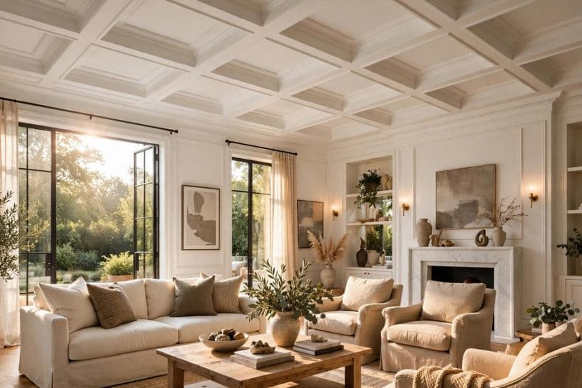
1. Living Room Ceiling Designs at a Glance
A living room ceiling design is the treatment of the room’s overhead plane — shape, structure, surface and light — chosen to suit its height, its furniture layout and how the household lives under it. This post stays strictly with living room ceilings. The wider living room survey lives in living room ideas, and one profiled sibling — the recessed tray — has its own living-room treatment in tray ceiling living room ideas, so nothing here needs to pretend one ceiling does every job.
| Question | Short answer |
|---|---|
| What decides a ceiling design? | Room height first, then light, the furniture layout below, and how much visual weight the room can carry overhead |
| Which designs add the most character? | Coffers, beams and tray profiles — structure the eye can read from the sofa |
| What helps a low ceiling most? | Shallow profiles, pale colour, cove light and keeping the centre of the ceiling calm |
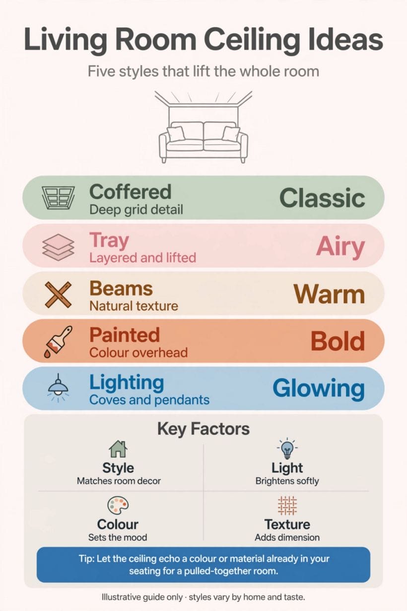
| Where does the keyword sit? | Ceiling designs for living room work best when the ceiling echoes a colour or material already in the seating below |
| What needs checking first? | What the existing ceiling is made of, where the joists and wiring run, and headroom rules where you live |
2. Coffered and Panelled Ceilings
The infographic’s first row gives coffers the classic verdict: a deep grid overhead gives a living room architecture — proportion, rhythm and shadow — before a single picture is hung.
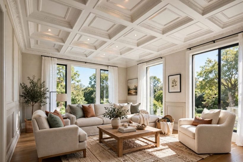
1. A deep white coffered grid, classically proportioned
The full traditional treatment: deep, well-spaced coffers in soft white, giving the room instant architecture. It asks for real height and repays it — the grid’s shadow play changes from morning to lamplight, so the room never wears the same face twice.
2. Shallow coffers for ordinary ceiling heights
The same rhythm at a gentler depth suits rooms without grand height. Shallow coffers keep the pattern while leaving headroom and light intact — the honest version for most real houses.
3. A timber coffered ceiling for warmth
Dark wood coffers wrap a living room in warmth and weight. Balance them with pale sofas, light floors and generous windows, or the mood tips from cosy to cave.
4. Coffers aligned to the seating plan
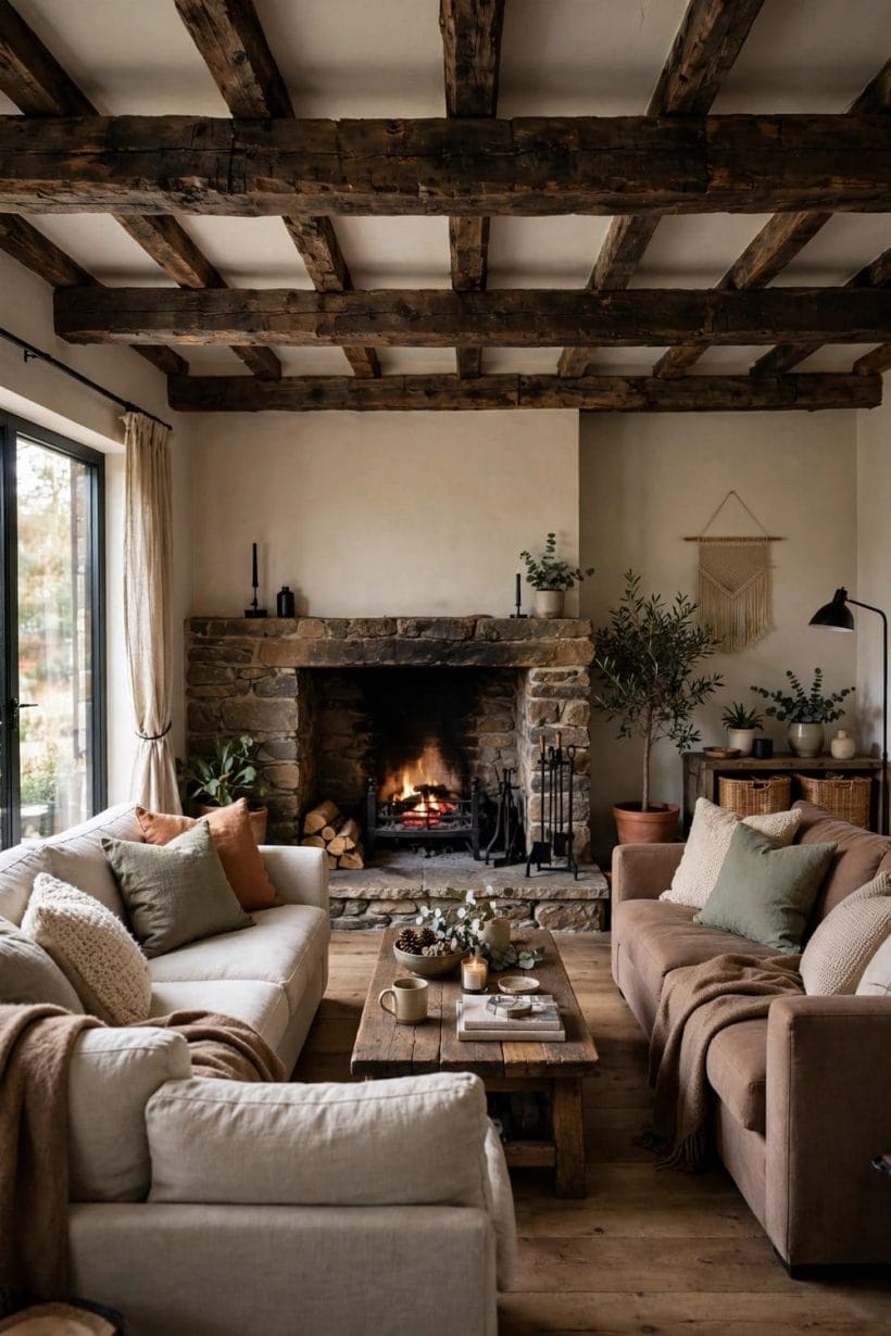
Let the grid follow the furniture: coffers centred over the sofa grouping and the fireplace axis make the room feel planned from above. A grid that ignores the layout below reads as an afterthought.
5. One statement coffer over the conversation zone
A single large coffer above the main seating marks the room’s social heart without committing the whole ceiling. The rest of the plane stays calm, and the eye learns where the room gathers.
6. Painted coffers in a soft contrast colour
Coffers picked out in a gentle contrast — pale grey-blue, warm putty, a whisper of sage — gain depth without darkness. Keep the contrast low and matte; gloss overhead argues with the television.
7. Panelled ceiling squares without depth
Flat applied moulding squares borrow the coffered rhythm at a fraction of the build. On a sound flat ceiling they read as panelling rather than structure — the kindest version where depth must be faked, not built.
8. Coffers with discreet downlights centred in each bay
A small downlight centred in selected coffers layers neat, even light into the grid’s own geometry. Plan the circuit before the carpentry: lights added after the grid is built rarely land where the pattern wants them.
9. A coffered border with a calm centre
Run the grid as a deep border and leave the centre plain. The room keeps a sense of height in the middle — where a pendant or fan may hang — while the edges carry all the architecture and shadow.
3. Tray, Cove and Recessed Ceilings
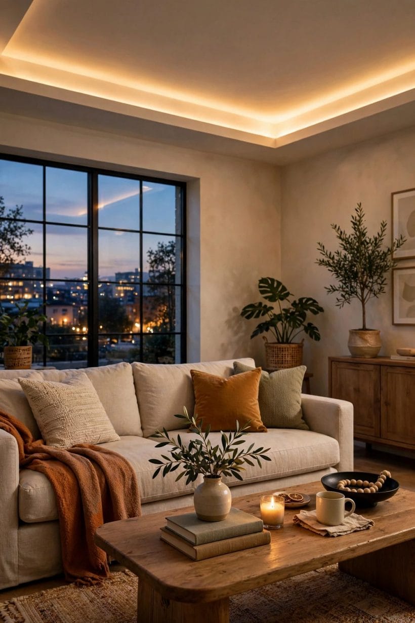
The tray family lifts the centre of the ceiling away in steps or curves, and the generic tray survey in tray ceiling ideas covers the profile itself — this section stays with what trays do for a living room specifically.
10. A classic stepped tray over the whole room
One or two clean steps rising to a raised centre give a living room quiet grandeur and a natural home for cove light. The steps should echo the room’s proportions — wide rooms take wide steps, narrow rooms a single shallow rise.
11. A tray that mirrors the rug and sofa layout
Shape the recess to the seating island below and the ceiling becomes the layout’s confirmation: rug, sofas and ceiling all telling the same plan. It is the most designed-feeling version of the tray, and the easiest to light well.
12. Cove lighting hidden in the tray step
A concealed light source washing the raised centre is the tray’s party trick — soft, shadowless, flattering to everyone on the sofas. Keep the source hidden from seated eye level or the glow reads as a strip light.
13. A curved cove for a softer room
Where steps are crisp and architectural, a curved cove transition is gentle and organic. It suits rooms with rounded furniture, arched openings or a generally soft scheme, and it forgives ceilings whose edges are less than perfectly straight.
14. A double tray in a long room
Two raised fields along a long living room break its tunnel feeling into two bays — one for conversation, one for reading or media. Each bay can carry its own light scene.
15. A painted tray centre in a deeper tone
Paint the raised centre a shade deeper than the walls and the ceiling feels taller and more intimate at once. The trick works because the eye reads the darker field as further away — a small, honest optical kindness.
16. A tray with a timber-lined centre
Line the raised field in pale timber or timber-effect boards and the ceiling gains warmth exactly where light gathers. It pairs naturally with floors and coffee tables below, tying the room’s top and bottom into one material story.
17. A shallow recess rather than a full tray
Where height is short, a single shallow recessed panel gives the tray’s definition without stealing real headroom. Even a modest rise, well lit, reads as intention — and intention is most of what ceiling design ever is.
18. Peripheral soffits that frame the room
A dropped border soffit around all four walls frames the ceiling like a picture mount and hides curtain tracks, ducts and light coves in one move. The centre stays high; the edges do the work.
4. Beams and Timber Overhead
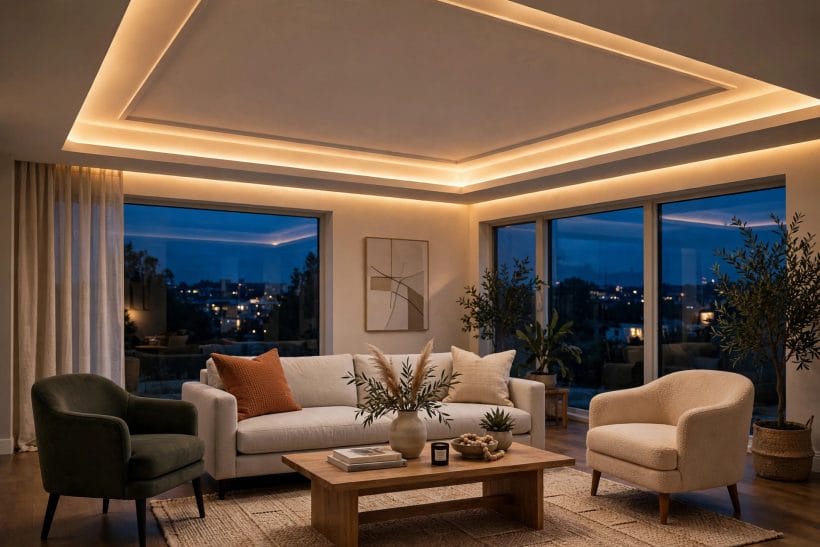
Beams are the ceiling’s oldest decoration — structure you can see. Real or honestly faux, they set a room’s rhythm from above and ask only that their spacing respect the layout below.
19. Exposed structural beams, celebrated as found
Where genuine beams exist, the design is simply to honour them: clean, seal or limewash, and arrange the room to their rhythm. Their irregularity is the charm — straightening or boxing them away trades character for tidiness at a bad rate.
20. Faux box beams in a regular rhythm
Lightweight boxed beams give new rooms the same cadence without structural work. Space them evenly and size them generously — skinny beams read as strips, not structure — and match a timber the room already owns.
21. Dark beams on a white ceiling
The high-contrast classic: near-black or deep walnut beams over a white plane. It is bold, graphic and unforgiving of clutter below, so it suits calm schemes with pale sofas and few, large pieces of furniture.
22. White-painted beams for a coastal calm
Beams painted out in the ceiling’s own white keep the rhythm and lose the weight. Seaside and Scandinavian-leaning rooms love the version — all the architecture, none of the heaviness, and light bouncing everywhere.
23. Beams that run with the room’s long axis
Beams parallel to the long walls stretch a room’s feeling of length; across it, they gather it in. Choose the direction by the effect you need, then let the main sofa sit square to the rhythm so the plan reads deliberate.
24. A single king beam over the fireplace axis
One substantial beam on the room’s main axis — fireplace to window, door to hearth — gives a modest room a spine. It can carry the mantel’s material story upward and give pendants a natural hanging line.
25. Reclaimed-look timber for a lived-in room
Beams with a weathered, reclaimed character suit rooms built from linen, leather, wool and stone. Keep their finish matte and their company natural; reclaimed timber beside glossy modern surfaces argues in two languages at once.
26. Beams with lights mounted between them
Small spotlights or pendants hung from the beams themselves layer light at the rhythm the ceiling already set. Wire runs must be planned before fitting — surface cable added later spoils the honesty the beams exist to give.
27. Shiplap and boarded ceilings between beams
Board the fields between beams in tongue-and-groove or shiplap, painted or timbered, and the ceiling gains a crafted, cabin-calm texture. It is the version that most flatters rooms with garden views and natural textiles.
5. Painted Ceilings and Colour Overhead
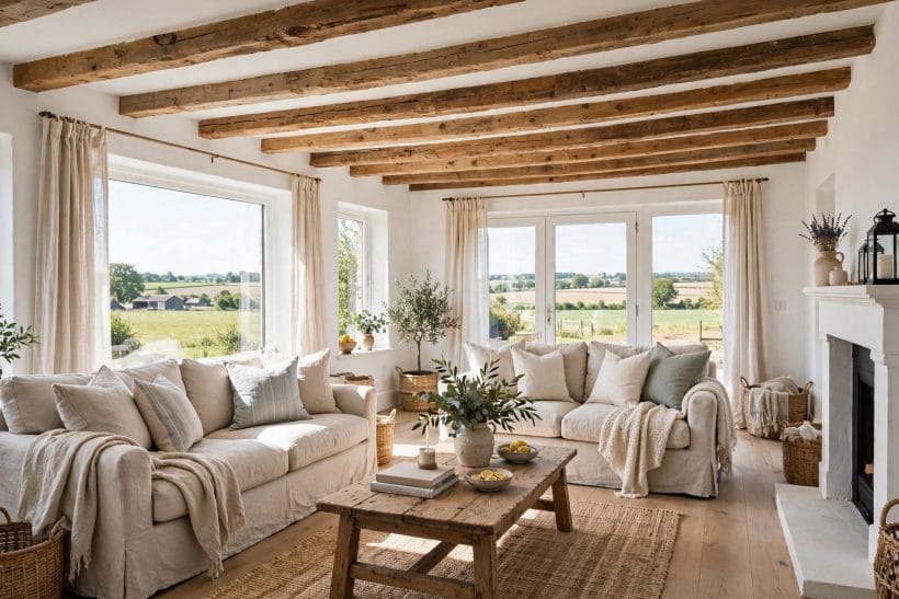
Paint is the ceiling design every room can afford: colour overhead changes a living room’s proportions, temperature and mood more cheaply than any other single decision.
28. A soft white with a warm undertone
The default done properly: a ceiling white warmed to match the walls’ family keeps light high and schemes calm. Judge it against the wall colour at midday — a blue-white ceiling over warm walls reads as a mistake, not a contrast.
29. The fifth wall: ceiling matched to the walls
Carrying the wall colour straight over the ceiling wraps a room in one tone and erases the hard horizon line. Small and north-facing rooms often gain most; the boundary vanishing makes the space feel larger and more deliberate.
30. A deep ceiling for evening rooms
Rooms used mainly after dark — media rooms, snug sitting rooms — take a deep ceiling beautifully: ink, forest, oxblood in matte. Lamplight pools below it, screens glow against it, and the ceiling’s weight becomes the room’s embrace.
31. A pale blue ceiling, the porch tradition
The softest colour trick in the book: a whisper of blue overhead reads as sky and air, lifting porches and garden rooms and any living room that opens to green. Keep it very pale — the effect is suggestion, not statement.
32. A colour-drench in one gentle hue
Walls, ceiling, woodwork and even the fireplace in a single soft colour is the modern route to a serene living room. Texture must do the decorating — linen, wool, timber, plaster — because contrast has been politely dismissed.
33. A contrasting ceiling band or border
Paint a border field around the ceiling’s edge in a deeper tone and the centre appears to rise. It is the painted cousin of the soffit frame, costs a tin of paint, and can be repainted in a weekend if the experiment fails.
34. Limewash and soft-mottled finishes
A brushed, cloudy finish overhead catches light unevenly and gives flat ceilings a plastered, old-world softness. It forgives imperfect surfaces better than flat paint and suits rooms with natural materials and unhurried schemes.
35. Test colour overhead before committing
Ceiling colour always reads darker and stronger than the same paint on a wall, because light reaches it differently. The habit urged in small living room ideas — test on a large board, in daylight and lamplight — matters twice as much when the board must be held over your head.
6. Plaster, Panelling and Surface Detail
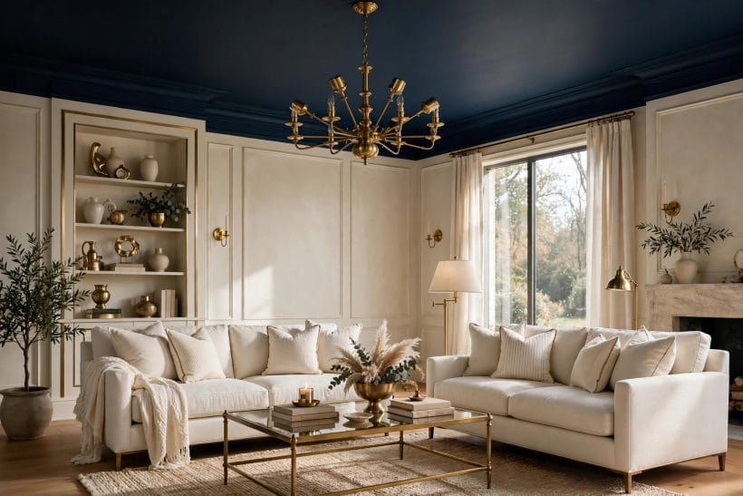
Between flat paint and full structure sits the surface family: mouldings, medallions, panelling and texture — detail at the ceiling’s skin, much of it achievable on an ordinary flat ceiling.
36. A ceiling rose centred on the light
The traditional medallion gives a pendant a birthplace and a plain ceiling a centre. Size it to the light fitting and the room, not to ambition.
37. Crown moulding that marries wall to ceiling
A well-proportioned cornice softens the room’s top edge and hides the imperfect junction every real wall has. Deeper profiles suit higher ceilings; a shallow, crisp profile suits ordinary heights.
38. Wall panelling carried over the ceiling
Continuing the wall’s panel moulding rhythm across the ceiling makes a room feel crafted as a single shell. Keep the ceiling’s panels larger and calmer than the walls’ or the room starts to feel like the inside of a box.
39. Tin-look and pressed ceiling tiles
Pressed tiles — in metal finishes or paintable board — give pattern, rhythm and a period note overhead. They flatter high ceilings and formal rooms, and paintable versions soften into any scheme.
40. A coffered-look ceiling in applied trim only
Applied trim grids on a flat ceiling borrow the coffer’s pattern at surface depth. Painted all one colour, shadow does the rest — the budget version of section two’s architecture, and a genuinely handsome one in modest rooms.
41. Textured plaster for a Mediterranean calm
A gently troweled, matte plaster ceiling scatters light softly and suits rooms of stone, linen and timber. Texture should whisper: heavy rustic texture overhead collects dust, darkens fast and dates a room to a single decade.
42. Exposed structure, honestly painted
In lofts and conversions, joists, boards and services painted out in one colour make an honest industrial ceiling. The discipline is tidiness: everything visible must be clean and aligned, or honesty reads as neglect.
43. A vaulted or cathedral ceiling, kept simple
Where the roof gives height, the best move is restraint: one material, generous light, furniture scaled to the volume. The drama is the space itself, a point the coffered specialists in coffered ceiling living room ideas make from the other direction.
7. Ceiling Lighting: Layered Light From Above
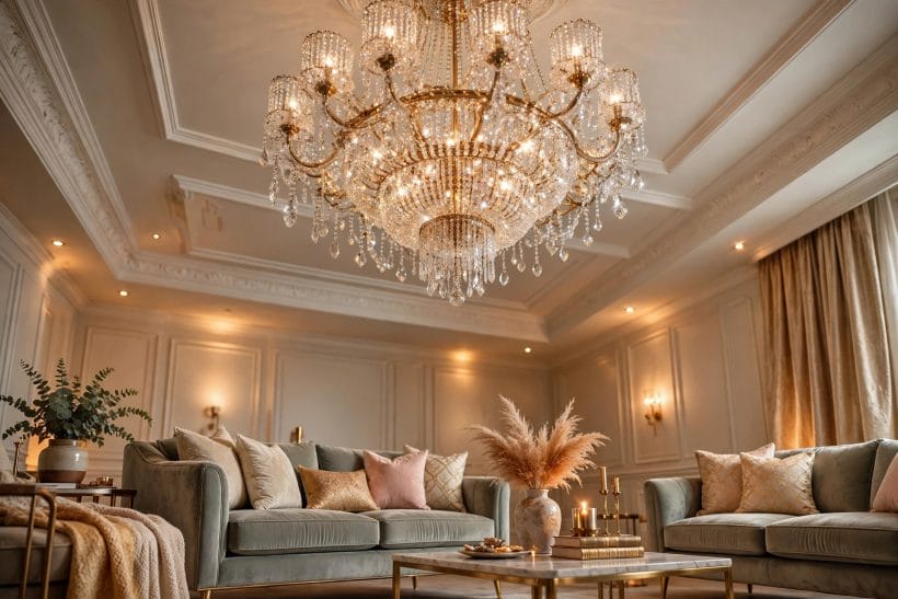
The subtitle promises layered lighting, and this is that section: a ceiling is the room’s lighting infrastructure, and the designs that age best plan light in layers — ambient, task and glow — from the start.
44. A central pendant as the room’s jewellery
One well-chosen pendant over the coffee table zone anchors the layout and gives the ceiling a focal point. Hang it for seated sightlines — low enough to feel present, high enough never to block conversation or the television.
45. Cove light as the ambient layer
Concealed cove light washing the ceiling is the softest ambient source a living room can have, and the natural partner of trays and soffits. On its own dimmer it becomes the evening setting: faces flattered, screens calm, edges gone.
46. Downlights placed by furniture, not by grid
Recessed lights earn their keep when they are placed for the sofas, chairs and art below — not marched in a ceiling grid that lights the floor’s empty middle. Fewer, aimed well, beat many aimed nowhere.
47. Fan-and-light combinations in warm climates
In rooms that need moving air, a quiet fan with an integrated light serves two layers at once. Choose the simplest silhouette the room can carry and size it to the space — the guidance in tiny house interior lighting ideas on layered, glare-free light applies at any scale.
48. Picture and wall-washing light from the ceiling
A row of discreet washers grazing the art wall gives a living room gallery calm after dark. It also stretches perceived width: a lit end wall pulls the room’s boundary outward in the evening.
49. Dimmers on every circuit, without exception
Layered light fails without control. Dimmers turn one ceiling into several rooms — bright for cleaning and games, low for films and talk — and they cost less than any other item in this whole post.
50. Skylights and roof lights in the ceiling plane
Where the roof allows, a roof light is the most generous ceiling design of all: daylight from above, stars at night, and a room whose centre is never gloomy. Blinds for summer glare and film-night darkness are part of the design, not an afterthought.
51. Low ceilings: flush, shallow and glare-free
In a low room the lighting rule is discipline — flush or semi-flush fittings, shallow coves, no hanging drops. Light thrown up and out from wall washers lifts the plane instead of measuring how close it is.
8. Layouts: Ceilings That Organise the Sofas
A ceiling design is also a layout tool. The profiles above earn their keep when they are drawn on the same plan as the furniture below.
52. A ceiling field centred over the main grouping
Whatever the treatment — tray, coffer, painted field — centre it on the sofa grouping, and the room’s plan clicks into place. Guests feel the order without naming it, because the ceiling has quietly told them where the room happens.
53. Two ceiling zones in an open-plan room
In a combined living space, change the ceiling — not just the rug — to mark living from dining or kitchen: coffers here, plain with pendants there. The zones read instantly, and each can carry its own light temperature and mood.
54. A ceiling axis from fireplace to garden
Many living rooms live along one axis: hearth at one end, garden at the other. Beams, a tray or a lighting run that follows that axis strengthens the room’s natural story and gives both focal points their due.
55. Media rooms: a calm, dark, acoustic-minded ceiling
Where the television rules, the ceiling should disappear — matte, deeper-toned, glare-free — and can carry discreet acoustic treatment in its finish. Every other section of this post is about presence; this one is about a well-mannered absence.
56. Conversation rooms: light low, ceiling warm
In a room arranged for talk — chairs in a circle, no screen — keep the ceiling warm-toned and the light low and local. The ceiling’s job is to lower the room’s voice, gathering faces into a pool of lamplight.
57. A double-height space, furniture scaled to match
In a tall room the ceiling design is mostly proportion: oversized pendants dropped into the volume, tall art, high shelving. Ordinary-height furniture under a soaring ceiling looks like a doll’s house unless a few tall pieces mediate the scale.
58. Ceilings over bay windows and alcoves
A bay or alcove deserves its own small ceiling decision — a shallow tray, a painted field, a tiny cove — marking it as the reading seat or the plant corner. These micro-ceilings are where a room’s personality quietly lives.
59. Rental-friendly ceiling design
Where nothing structural is permitted, design with paint fields, applied trim that removes cleanly, plug-in pendants on hooks, and light. A renter’s ceiling can still be a designed ceiling — it simply keeps its receipts.
9. Low Ceilings and Small Living Rooms
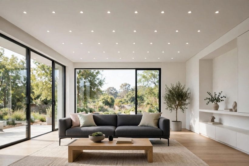
Not every living room offers height to spend. This section is the low room’s honest toolkit — shallow, pale, and calm in the centre.
60. Shallow profiles only, honestly chosen
Trays, coffers and beams all have shallow versions; in a low room use only those, and let one profile — not three — do the work. Depth you cannot afford reads as pressure, however beautiful the carpentry.
61. Pale, warm and matte overhead
The low ceiling’s colour rule: pale to bounce light, warm to avoid the chill of a lid, matte to hide the surface’s sins. A low ceiling in flat warm white is not a failure of imagination — it is often the best design in this section.
62. Cove and wall-wash light that lifts the plane
Light thrown upward and outward is the low room’s best friend: the ceiling’s edges glow brighter than its centre, and the eye reads height into the gradient. Fittings that hang measure the lowness; light that washes denies it.
63. A calm centre, detail at the edges
Keep the middle of a low ceiling bare and put what detail there is — cornice, border colour, a shallow frame — at its edges. The centre is what the eye measures; give it nothing to measure against.
64. Stripes and direction used sparingly
Boards, beams or a painted field that run the room’s length can stretch its feeling; run across, they shorten it. In a low room use direction for length only if the room also feels narrow — one optical problem at a time.
65. Curtains hung to the ceiling line
Though it is a wall decision, hanging curtains from just under the ceiling makes the whole overhead plane feel higher, and any ceiling treatment reads taller beside it. The ceiling and its neighbouring inches are designed together or not at all.
66. Avoid the pendant, embrace the flush light
A drop pendant in a low room is a head-height obstacle and a constant reminder. Flush and semi-flush fittings, chosen with the same care as pendants elsewhere, keep the plane clean and the room’s dignity intact.
67. One mirror trick: gloss at the edges only
A whisper of sheen in a border or cornice catches lamplight and hints at height without the full gloss ceiling’s unforgiving glare. In low rooms every suggestion should be a whisper — the space is too close for shouting.
10. Living With It: Care, Costs and Choosing
The last eight ideas are the practical ledger: choosing, what the work involves in general terms, and upkeep. Costs are stated as drivers only — every ceiling’s bill is written by its own house.
68. Start from height, light and layout — in that order
The choosing method for this whole post: measure the height you honestly have, note where daylight enters, draw the furniture layout, and only then shortlist profiles. A design chosen from a photograph of a taller room will disappoint in exact proportion to the difference.
69. Match the ceiling to the house’s own character
A cottage’s beams, a townhouse’s cornice, a new-build’s clean tray — ceilings that continue the house’s story age gracefully. Imported grandeur in a modest house reads as costume; the room below always tells on it.
70. Budget drivers, stated plainly
What a ceiling costs is driven by its type (paint is the least, structure the most), the ceiling’s size and height, scaffolding and access, electrical work for layered light, and the finish quality of plaster and carpentry. Get itemised local quotes; no honest figure can be given without seeing the room.
71. Sequence the work before the furniture
Ceiling work rains dust on everything beneath it, so it belongs before floors are finished and sofas installed — or behind serious protection and a planned exit for the furniture. Electrics for coves and downlights are first-fix work, decided with the profile, not after it.
72. Check structure and services before opening up
Joists, wiring, plumbing and — in older houses — finishes that need professional handling can all hide above a ceiling. Any design that opens, lowers or loads the ceiling should begin with proper checks and local rules, especially where beams or heavy fittings are planned.
73. Sound: the ceiling’s quiet second job
A living room ceiling also carries sound between floors. Added mass, resilient construction and soft finishes below all help, and a coffered or panelled build is a natural chance to improve matters — worth raising with your builder before the design is fixed.
74. Cleaning and repainting, planned for
Dust settles upward’s furniture too: beams, coffers and coves need an occasional long-handled dusting, and painted ceilings ask for a fresh coat when redecorating the walls. Matte finishes forgive the intervals best; plan access — a good ladder, a steady hand — as part of owning the design.
75. The one-change rule
If a full redesign is not possible, change one thing well: repaint the ceiling in a considered colour, or add dimmers and a cove, or centre one beautiful pendant. A living room ceiling improved honestly in one move beats a room of half-finished overhead ambitions.
Final Considerations
A living room ceiling is designed, not defaulted: choose the profile your height can honestly carry, echo a colour or material from the seating below, layer the light on dimmers, and centre the ceiling’s field over the life of the room.



0 Comments