

Every household owns two photographic archives: the one in the phone, numbering in the thousands and seen by nobody, and the one on the walls, which is usually an accident — a frame added here, a print propped there, until the display is less a choice than a sediment. The photographs deserve better, and better turns out to be mostly a matter of editing.
This article carries twenty ways to display family photographs tastefully, from the gallery wall to the single bedside print, and closes with the printing, framing and placing decisions that decide whether any of them work. The ways are honest ones: each assumes real rooms, real walls and a real archive of mixed ages and quality.
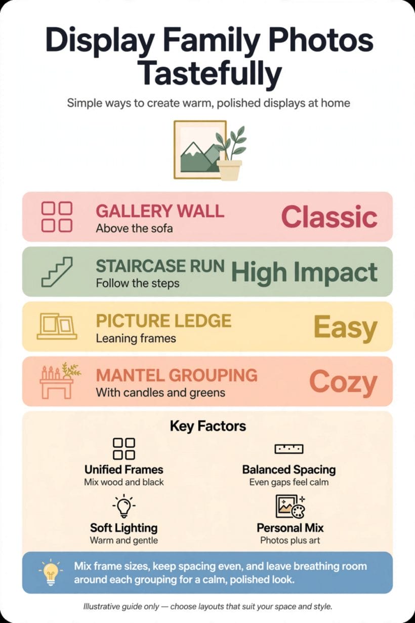
1. Displaying Family Photos at a Glance
The central entity is the display of family photographs in the home: the choosing, printing, framing and placing of the family’s own pictures, whose defining attributes are selection (fewer photographs, chosen hard), consistency (one frame family and one colour treatment per display), scale (prints sized honestly to their originals and their walls) and restraint (one display field per room, with breathing room around it). This article treats the subject evergreen and general, as arrangement and editing rather than as shopping. The wider home it decorates is gathered in this site’s home design ideas collection, and the rooms and surfaces the display lives on are linked where their lanes begin.
| Question | Short answer |
|---|---|
| What makes a photo display tasteful rather than cluttered? | Selection and consistency: fewer photographs, one frame family, one colour treatment, and empty wall left around every group. |
| How many photographs should a room hold? | One display field per room — a wall, a mantel or a shelf — at a scale the room’s eye level and light can carry calmly. |
| Should old and new photographs be mixed? | Yes, once they are reconciled: print the set together in one treatment — warm, soft or black and white — so the eras stop arguing. |
| What is the cheapest upgrade to an existing display? | Subtraction and mounts: remove a third of the prints, and give the rest generous mounts in matched frames. |
2. The Gallery Wall, Done Calmly: Ways 1–5
The gallery wall is where family photographs either become the room’s warmth or its noise, and the difference is never the photographs — it is the discipline around them. These first ways are the wall-scale arrangements, and they share one rule: the group is designed as a single composition first and filled with pictures second. The wider room they hang in is the ground of this site’s living room ideas survey; here the wall itself is the subject.
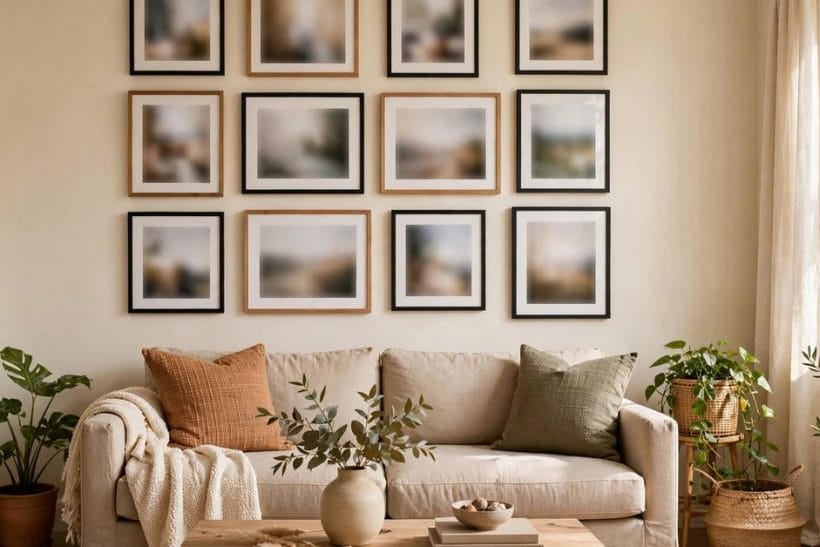
Way 1: Build a grid when the photos are many and various
A strict grid — same frames, same spacing, rows aligned — is the most forgiving way to hang a large mixed collection, because the order of the arrangement carries photographs that share nothing else. Birthdays, beaches and grandparents sit calmly side by side when the geometry is doing the organising, and the grid can grow by a row as the family does.
Way 2: Use picture ledges where the collection keeps changing
A shallow ledge shelf lets framed prints lean in an overlapping row that can be rearranged in a minute, with no new holes and no commitment.
Way 3: Give one photograph the whole wall
The boldest calm display is a single large print: one wedding, one landscape with the family small inside it, one portrait that earns the scale. Enlarged honestly from a good original and framed simply, it behaves like art rather than memorabilia, and it rests the eye in rooms where a busy wall would shout.
Way 4: Match the frames and let the mounts do the spacing
Uniform frames — one colour, one profile, generous mounts — turn a miscellaneous shoebox of prints into a collection. The mount is the secret: a wide pale border around each photograph gives every image the same breathing room, so a small print and a large one hang as equals. This is the cheapest form of taste in the whole article.
Way 5: Hang a salon wall only inside one palette
The mixed, floor-to-nearly-ceiling salon hang can be glorious, but it stays tasteful only under a strict colour discipline: frames in one or two finishes, photographs graded toward one register — warm, or black and white, or sun-faded — and one large piece anchoring the middle. Without the palette rule it is not a salon wall; it is storage on view.
3. Small Groups and Quiet Corners: Ways 6–10
Not every photograph wants a wall of its own. The smaller displays — a mantel, a shelf, a single print in the right place — carry the family’s presence through the house at conversational volume, and they are where most homes honestly live. The mantel group belongs to the room this site’s family room ideas survey covers; the stairwell line that follows is the staircase ideas field’s home ground.
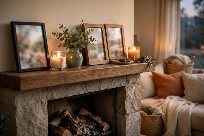
Way 6: Cluster three or five on the mantel, and stop
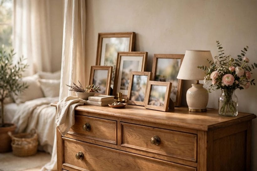
A mantel cluster works in odd numbers and at varied heights: a larger framed print at the back, smaller ones forward, one object — a clock, a vase, a candlestick — among them to break the row of rectangles. The discipline is the stopping. A mantel that holds every photograph the family owns holds none of them; rotate the cast rather than enlarging it.
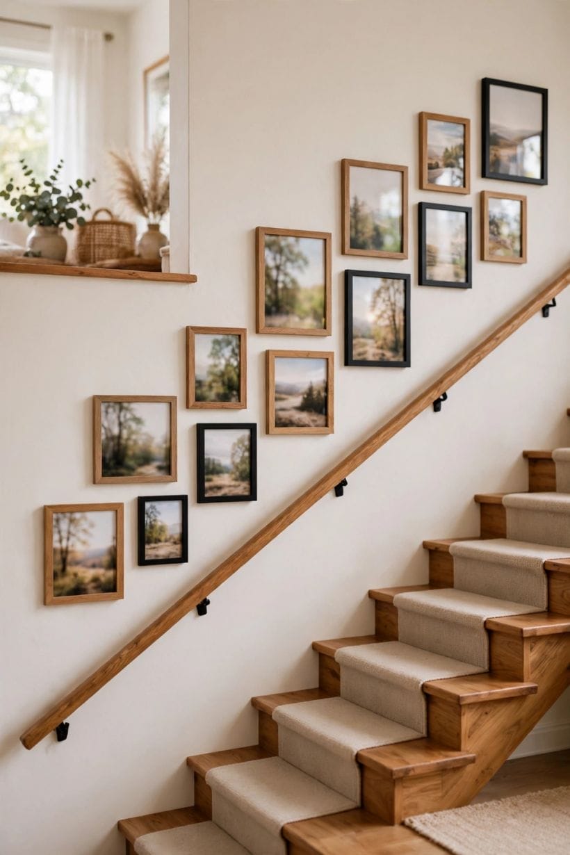
Way 7: Run a single line up the stairwell
The staircase is the house’s natural timeline, and a single file of frames climbing with the steps — same frames, hung to follow the slope — turns a passage into a story. Keep the line at one frame deep; a stairwell collage fights the handrail and the light. Photographs here are seen closely and daily, so choose ones that reward it.
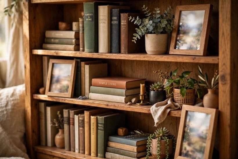
Way 8: Tuck prints among the books
A bookshelf vignette — one or two small framed photographs standing among the books, perhaps on a stack laid flat — is the quietest display in the house and often the most looked at. It asks nothing of the walls, it can change with the shelving, and it puts the family’s faces exactly where the household’s readers actually sit.
Way 9: Give the hallway a single file, evenly lit
A hallway run of frames in single file, one size, one frame, evenly spaced, converts a corridor into a gallery the house passes through a dozen times a day. Even spacing is the whole technique — measure it rather than eyeballing it — and pictures here should be the robust, cheerful kind rather than the precious kind.
Way 10: Place one framed print where one person will see it
The bedside table, the desk, the kitchen shelf by the kettle: a single small framed photograph in a place of daily ritual is seen more, and means more, than a wall of them in a room nobody sits in. Taste at this scale is simply choosing the one print that belongs to the person who will live beside it.
4. Beyond the Frame: Ways 11–15
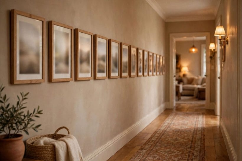
Frames are the grammar of photo display, not its whole language. Books, rotation, textiles and one carefully kept digital frame all display photographs without adding a single nail — and several of them suit the photographs that matter most and scan worst, the old, the small and the fragile. The composed shelf-and-surface end of this thinking is kin to this site’s arranging vignettes guide.
Way 11: Keep a real photo book on the coffee table
A bound book of the year’s photographs — printed, sequenced, captioned by hand if the household is wise — is display that guests actually experience, one page at a time, instead of glancing past a wall. It also rescues the camera roll’s thousands from oblivion: the discipline of choosing a book’s worth each year is editing, and editing is most of taste.
Way 12: Rotate one frame instead of adding ten
Choose one good frame in one good place and treat it as a changing exhibition: the season’s best photograph, swapped as the year turns. Rotation keeps display fresh, keeps walls uncluttered, and quietly raises the standard — a frame that must be earned is filled better than a wall that must be filled.
Way 13: Print one favourite large on canvas or cloth
A single photograph printed large on canvas or as a cloth hanging takes on the softness of a painting and suits the big soft subjects — the family on the beach, the dog in the fields — better than glossy paper does. Keep it to one per house area, unframed and unaccompanied; its informality is its charm and crowds dissolve it.
Way 14: Run one digital frame, curated hard
A digital frame earns its place only under strict curatorship: a short, edited set of the best photographs, brightness matched to the room, placed where a framed print would go and nowhere else. Set loose on a thousand unedited images it becomes a screen, and screens are what taste in this article is defined against. One frame, fifty photographs, no exceptions.
Way 15: Lay photographs under glass on a desk or dresser
The old desk-top display — prints arranged under a sheet of glass on a desk, dresser or hall table — shows a whole scattered archive at once, protected and changeable, and it suits the small, the faded and the oddly sized that framing would bully.
5. Editing and Restraint: Ways 16–20
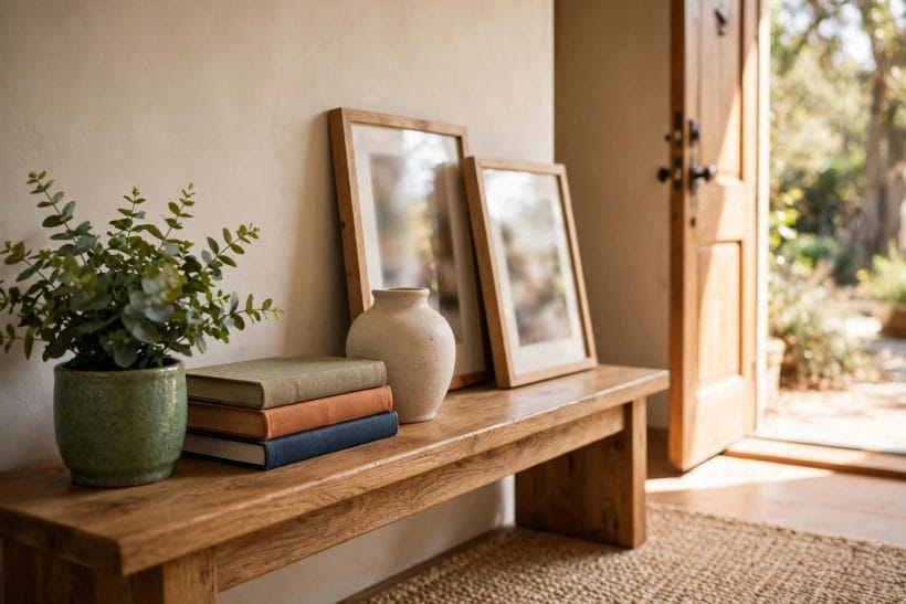
The last five ways are not arrangements but refusals — the editing decisions that separate a tasteful display from a shrine or a spill. They cost nothing, they apply to every way above them, and they are, if the truth is told, the part of the article that does the work.
Way 16: Print fewer photographs, and print them bigger
The single most reliable upgrade to any display is subtraction followed by scale: half as many photographs, each printed larger. Small prints in quantity read as clutter at any quality; the same images, fewer and bigger, read as chosen. When in doubt about any wall in this article, remove a third of what is on it and look again.
Way 17: Give the whole display one colour treatment
Photographs from forty years of cameras fight each other in colour. Grading the displayed set toward one treatment — all warm, all soft, or all black and white — reconciles them at a stroke, and black and white in particular forgives the mixed eras of a family archive.
Way 18: Leave breathing room around every group
Taste is largely negative space. A group of frames needs a margin of empty wall around it — from the ceiling, the corners, the furniture — or it reads as overflow rather than display. Hang the group, then step back and check that the wall still owns more of itself than the photographs do; that ratio is the whole secret.
Way 19: Keep to one display wall per room
A room with photographs on every wall has no display; it has wallpaper with faces. One wall, one mantel, one shelf per room — chosen as the room’s single field for the family — leaves the other walls to art, mirrors, colour and rest. The rooms of the house stay rooms, and the photographs keep their power to be noticed.
Way 20: Refresh the display with the seasons, and retire kindly
Displays age into invisibility. A light seasonal refresh — swapping a few prints, retiring the faded, promoting the new — keeps the household seeing its own photographs, and retiring a print to the album is not a demotion but the archive doing its work. The houses whose photographs feel alive are the ones where the display is edited like a garden, little and often.
6. Choosing and Printing: Paper, Finish and the Honest Print
Every way above stands or falls at the printer. Family photographs are usually printed too small, too glossy and too blue, and no frame ever made can argue with the print inside it for long.
Print from the best original, at an honest size
A photograph can only be enlarged as far as its original honestly allows; beyond that it softens into apology.
Matte over gloss, almost always
Glossy prints glare under room light and show every fingerprint; matte and lustre finishes sit quietly in a frame, flatter mixed collections, and suit the soft register that makes family photographs tasteful. Reserve gloss for the very contemporary print in the very contemporary room, and test one photograph in both finishes before committing a whole set.
Colour-manage the set, not the single print
Prints made at different times and places drift apart in colour. Where a set will hang together, have it printed together, in one batch, from files prepared the same way — the single-treatment discipline of the editing section is executed here, at the printer, or it is not executed at all.
7. Frames and Fixings: The Quiet Hardware
Frames are noticed when they are wrong and invisible when they are right, which is the definition of good hardware. The frame’s job is to present the photograph and then be forgotten, and the fixing’s job is to hold it level, safe and exactly where it was hung.
One frame family per display, depth over decoration
Within any single display, hold to one frame family — the same profile and finish, varied only in size. Depth of frame is the quiet luxury: a deeper frame with a proper mount reads as considered where a thin ornate one reads as anxious. Save the characterful, mismatched frames for the single-print displays, where one frame is allowed a personality.
Hang at eye level, and use two fixings on anything large
The centre of a display should sit at the eye level of the people who use the room — lower in rooms where everyone sits. Anything large or heavy wants two fixings so it cannot tilt, and fixings matched to the wall’s construction, fitted properly; a fallen frame damages the print, the wall and the household’s trust in the whole enterprise.
Glass, acrylic and the light in the room
Cover glazing honestly: ordinary glass is clear and cheap but reflective; anti-reflective options cost more and earn it in bright rooms; acrylic is light and safe where children and earthquakes are concerns but scratches more readily. In a sunlit room the glazing decision matters more than the frame decision — a photograph behind glare is a photograph not on display at all.
8. Rooms and Light: Where Photographs Sit Best
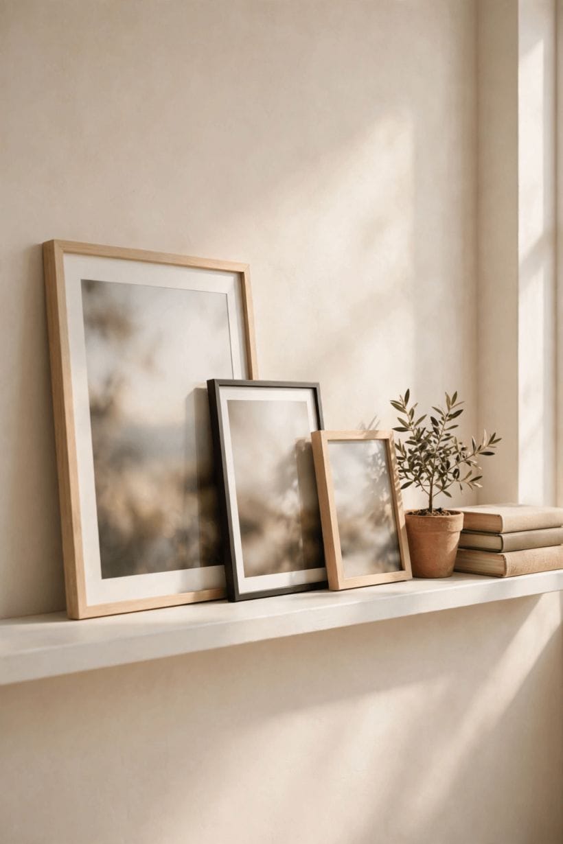
Photographs are light-sensitive objects in light-filled rooms, and placing them is a negotiation between being seen and being preserved. The rooms differ, and so does the light each offers.
Living rooms and halls: the public archive
The living room and hall are the family’s public rooms and carry the main display; the connecting routes between rooms — hall, landing, the entryway — are where a single-file run does its quiet work. Keep the largest groups where the household gathers longest, and let guests meet the family at conversational scale rather than all at once.
Bedrooms and studies: the private register
In bedrooms and studies the display turns private: fewer photographs, smaller, chosen for the sleeper and the worker rather than for show. This is where the single bedside print of the ways above lives, and where the oldest and most fragile originals should not — tenderness is not a conservation strategy.
Sunlight, kitchens and bathrooms: the honest warnings
Direct sunlight fades prints steadily, whatever the glazing; hang the replaceable copies in the bright rooms and the originals in the shade. Kitchens and bathrooms add steam and grease to the light’s damage — display there only what can be reprinted, or use the glass-top and book forms that keep photographs out of the air entirely.
9. Mistakes and False Notes
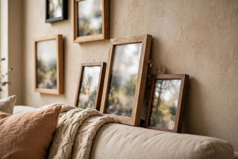
The mistakes in this field are consistent enough to list, and every one of them is a failure of editing rather than of budget — which is good news, since editing is free.
The shrine and the spill
The two failure modes face each other: the shrine, where one person’s photographs crowd out every other surface and subject until the room is a memorial rather than a living space; and the spill, where prints are taped, pinned and propped anywhere a gap appears. The twenty ways above are all, in the end, routes between these two ditches.
Frames outnumbering photographs worth framing
A common false note is investing in frames for photographs that were never chosen — the whole camera roll, framed by default. Frames should follow selection, not precede it: choose the photograph, live with the proof print on the shelf for a week, and frame only what still asks to be framed.
Crooked, crowded and lit like evidence
The finishing mistakes are physical: groups hung crooked and never straightened, spacing that tightens as the hanger tired, and downlights that rake across glass like interrogation lamps.
10. Costs and Pulling It Together
Nothing in this article requires a large budget, and its costs arrange themselves in a clear order. Printing is the smallest and most consequential spend — good prints, honestly sized, in one treatment — and it should take the first money. Mounts come next: the generous mount is the cheapest taste in the article and transforms ordinary prints. Frames follow, and the discipline of one family per display is also a saving, since matched frames are bought once and extended as the collection grows. Fixings, ledges and glazing are the tail of the spend, and the rotating and book forms reduce even that to nearly nothing.
Pull the twenty ways together and they reduce to a sentence: choose fewer photographs, print them properly, group them calmly, and leave the walls room to breathe. The family’s faces deserve better than the shoebox and better than the shrine — they deserve editing, which is the form attention takes when it grows up.
Final Considerations
A family’s photographs are its memory made visible, and like memory they work best edited — not diminished, but chosen, ordered and given room. The twenty ways in this article are twenty forms of the same respect: for the people in the pictures, for the rooms they hang in, and for the people who will live beside them daily.
Start with one wall or one shelf, apply the editing ways first and the arranging ways second, and the display will feel less like an accumulation and more like what it was always meant to be — the house telling its own story, quietly. The wider house around it stands in this site’s home design ideas collection; this article’s walls stand within it, hung level and loved.



0 Comments