

A ranch house wears its paint the way a face wears an expression: the whole house is one storey, long and low, so the exterior colour is visible all at once and there is nowhere for a wrong choice to hide. Getting ranch exterior paint right is less about following a trend and more about pairing — wall colour with trim, roof with porch, house with landscape — so the long horizontal lines read as calm and composed rather than flat and featureless.
This post stays with exterior paint pairing for ranch homes only. It names no paint codes as fact, because codes vary by maker and screen, and it makes no claim about any product’s performance. What follows is how to think about colour on a ranch: the wall, the trim, the roof, the porch and the planting, each in relation to the others.
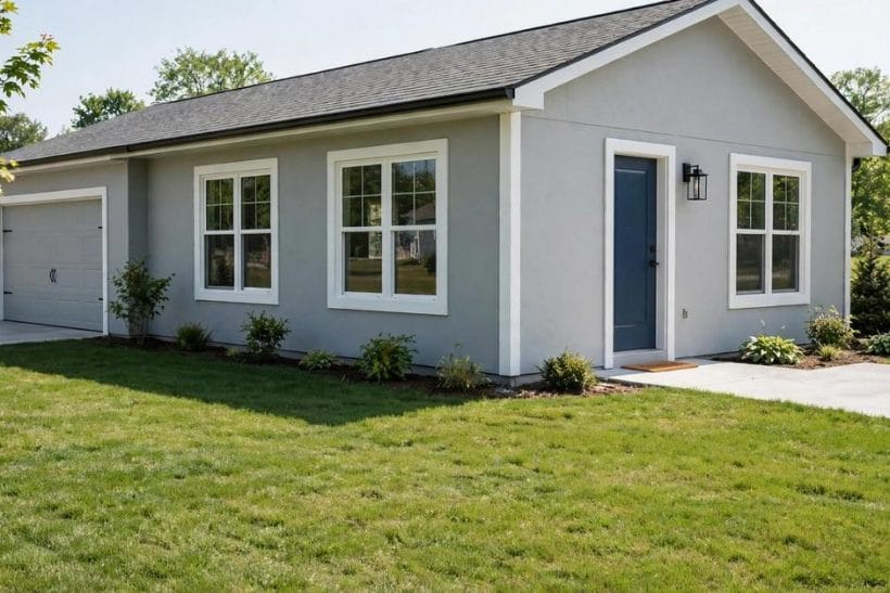
1. The Wall: The Long Horizontal Field
The wall is the largest painted surface on a ranch, and because the house is long, the wall colour dominates the first impression. Light colours make a ranch feel longer and more open; mid-tones give it weight and presence; dark colours can look handsome but also make a low house feel lower, especially under a dark roof. The wall colour should be chosen in daylight, on a large sample board held against the actual wall, because a colour that looks soft on a card can read very differently across thirty feet of siding.
Undertones matter more than names. A white with a warm undertone sits differently beside brick or stone than a white with a cool one, and a grey that leans blue will fight a brown roof while a grey that leans warm will settle beside it. Judge undertones against the fixed elements — roof, stone, brick, concrete — because those are the colours the paint must live with, not the other way around.
Ranch house layouts show why the wall matters so much: on a single-storey plan, the exterior is one continuous composition, and the wall colour is its ground.
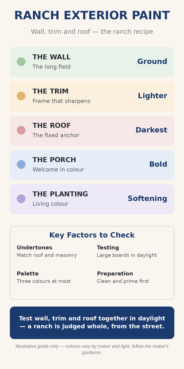
The infographic above summarises the five pairings that carry a ranch exterior: wall for the field, trim for the frame, roof for the anchor, porch for the welcome, and planting for the softening.
2. The Trim: The Frame That Sharpens the House
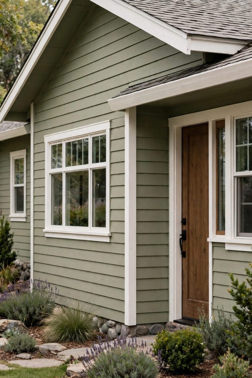
Trim is the ranch’s punctuation: fascia, window frames, door surrounds, porch columns and corner boards. Painted in a lighter tone than the wall, trim sharpens the house’s lines and makes windows and doors read clearly from the street. Painted in the same tone as the wall, it disappears, and the house can look unfinished or flat.
The classic move is a trim colour several steps lighter than the wall, in the same undertone family, so the contrast reads as intentional rather than accidental. White trim is the safest choice, but cream, pale grey and soft putty all work where pure white would glare. Whatever the trim colour, it should appear consistently — on every window, every door, every corner — because patchy trim reads as neglect faster than any wall colour reads as taste.
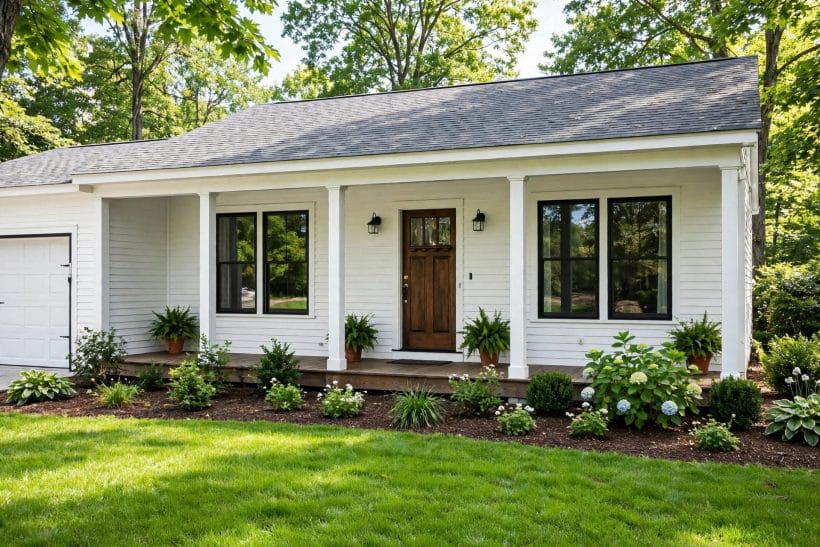
3. The Roof: The Anchor Colour
The roof is the one colour a homeowner rarely chooses freely, since roofs are replaced far less often than paint. Treat the roof as fixed and choose paint to suit it: warm brown roofs welcome warm wall colours, grey roofs welcome cool ones, and terracotta or tile roofs ask for warm whites and earth tones rather than stark contrasts.
A common mistake is painting walls to match the roof exactly, which flattens the house into a single block. Better to let the roof be the darkest element, the walls the middle tone, and the trim the lightest, so the house reads in three clear layers from top to bottom. That layering is what makes a long, low house feel composed rather than squat.
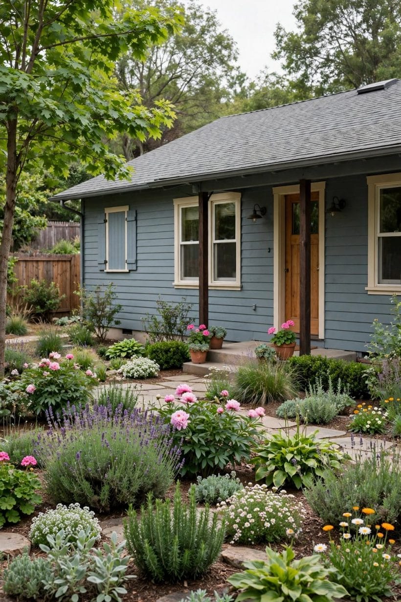
The roofline itself is a colour decision, not just the roof material. Fascia boards, gutters, soffits and bargeboards all carry paint, and their colour either ties the roof to the walls or cuts it away from them. Painting fascia the trim colour pulls the roofline into the house’s frame and makes the whole composition feel intentional, while painting it the wall colour lets the roof sit as a separate cap. Either choice works, but the choice should be deliberate, and it should be made at the same time as the wall and trim colours, not discovered afterwards when the painter asks.
4. The Porch: The Welcome in Colour
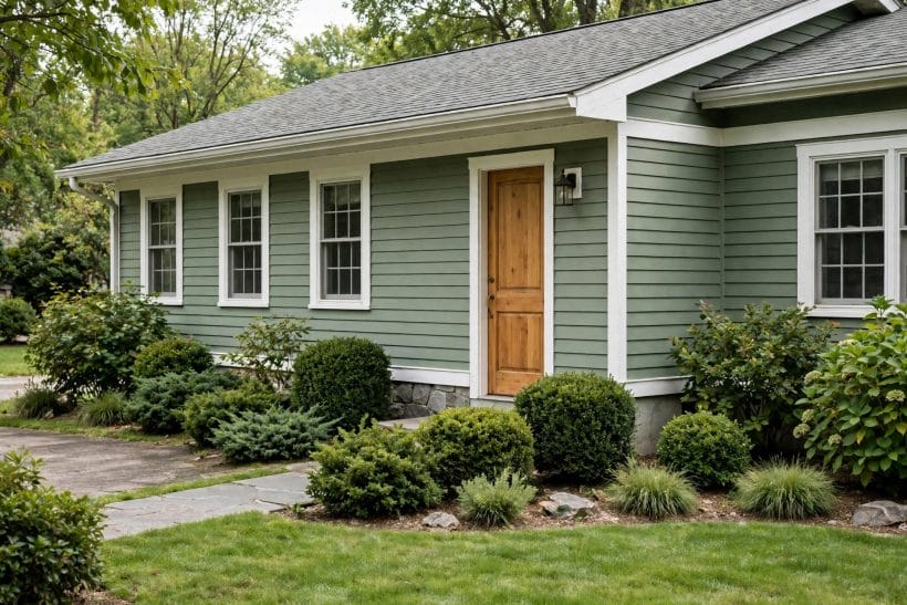
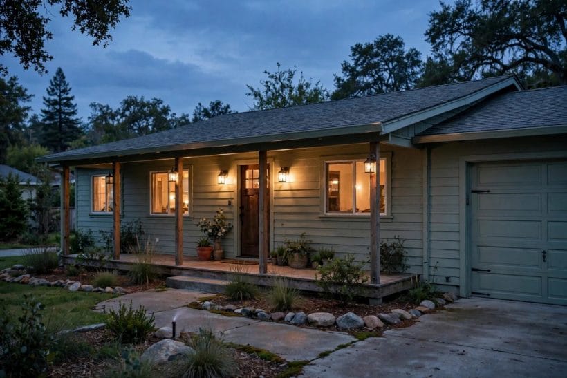
The porch is where a ranch can afford a bolder colour, because it is a small area and a natural focal point. A painted front door in a deep, warm tone — navy, forest, oxblood, teal — gives the long facade a centre, and it is the cheapest way to add character to a ranch exterior. The door colour should still relate to the house: pick it from the same undertone family as the walls, or from a colour already present in the planting or the roof.
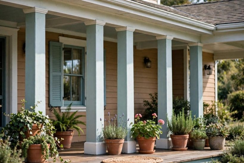
Porch floors, ceilings and columns deserve the same attention. A porch ceiling painted pale blue or soft white feels airy; porch columns in trim colour tie the porch to the rest of the house; a porch floor in a durable darker tone grounds the composition. Small areas, carefully painted, do more for a ranch than any large gesture.
Exterior entryway ideas show how the approach, the door and the surround work together, and on a ranch the porch is where that whole composition happens.
5. The Planting: Colour That Changes With the Seasons
Planting is the ranch exterior’s living paint, and it should be chosen with the wall colour in mind. Green foliage flatters almost every wall colour, but flowering shrubs and seasonal colour can clash with a wall that already carries a strong hue. A white or pale ranch welcomes bold flowers; a coloured ranch is better served by green structure and white blooms.
Planting also softens the ranch’s long lines. Shrubs at the corners break the horizontal run, climbers on a porch post add vertical interest, and a tree near the house gives shade that changes how the paint reads through the day. Paint and planting are one composition, and the best ranch exteriors are planned together, not one after the other.
6. The Pairings: Five Ranch Colour Schemes That Hold Together
Warm white walls with cream trim and a brown roof is the most forgiving ranch scheme, working with brick, stone and timber alike. Sage walls with white trim suit ranches with green surroundings, softening the house into its landscape rather than standing apart from it. Pale grey walls with white trim and a dark roof give a cooler, more contemporary ranch, provided the grey leans warm enough to sit beside any brown elements.
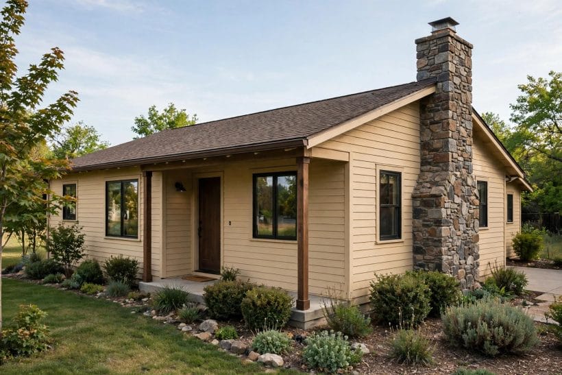
Beige walls with off-white trim suit ranches with stone or brick features, because the beige bridges the masonry and the paint. And a bolder wall — muted blue, soft green, warm terracotta — works when the trim stays quiet and the roof stays dark, letting one colour lead while the rest support. In every scheme, the rule is the same: one leading colour, the rest in support, and nothing competing for attention.
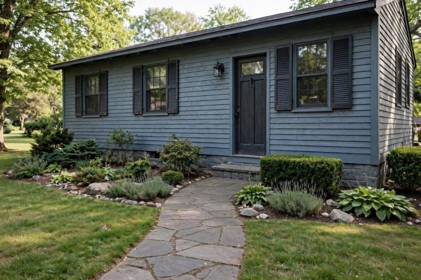
The neighbourhood test is the final check before committing to a ranch colour scheme. Walk the street and notice what the neighbouring houses wear: not to copy them, but to understand the street’s palette, its common roof colours, its brick and stone tones, and the range within which your house will sit comfortably. A ranch painted in violent contrast to its neighbours draws attention for the wrong reasons, while one painted in quiet sympathy with the street looks settled from the day the paint dries. Individuality on a ranch is better expressed in the door colour, the planting and the porch details than in a wall colour that fights the whole street.
7. The Light: Testing Colour Before Committing
Ranch exteriors are judged in full daylight, from the street, across a lawn — conditions no paint card reproduces. Always test with large sample boards, at least two feet square, held against the wall in morning and afternoon light, and viewed from the kerb as well as close up. A colour that looks perfect at arm’s length can look washed out or harsh from thirty feet away.
Test the full pairing, not just the wall: wall board beside trim board beside a roof sample, viewed together. Neighbouring houses matter too — a ranch should sit comfortably in its street, neither copying the neighbours exactly nor clashing with them. The best test is time: live with the boards for a few days, in sun and cloud, before ordering a single tin.
Painted staircase ideas make the same point indoors — colour must be judged in place, in real light, at real scale — and the lesson holds doubly outdoors, where the light never sits still.
8. The Mistakes: What Goes Wrong on Ranch Exteriors
The most common ranch paint mistake is too many colours. A wall, a trim, a door, a shutter and a porch floor in five unrelated hues chop a long house into stripes. Limit the palette to three colours — wall, trim, accent — and let the planting supply the rest. Another mistake is painting brick or stone that was never meant to be painted; masonry has its own colour and texture, and painting it is rarely reversible.
Ignoring the roof is the third mistake, and the most expensive to correct. A wall colour chosen without reference to the roof will fight it for the life of the paint job. And the quietest mistake is skimping on preparation: paint over chalking, peeling or dirty siding fails early whatever the colour, so cleaning and priming matter as much as the shade itself.
Fences and gates deserve the same colour thinking as the house, because they are part of the ranch’s street composition. A fence painted the trim colour extends the house’s frame into the garden and makes the plot feel larger, while a fence painted the wall colour recedes and lets planting lead. Gates, like front doors, can carry a bolder colour, and a gate painted to match the front door ties the whole approach together from pavement to porch. Whatever the choice, keep fences, gates and outbuildings within the same three-colour palette as the house, or the plot will read as several small decisions instead of one composed whole.
9. The Regions: Ranch Colour and Climate
Ranch colour has regional habits worth respecting. Desert ranches wear pale walls that reflect heat and sit easily against sand and stone. Wooded ranches wear greens and browns that settle into trees. Coastal ranches wear whites and pale blues that suit bright light and salt air. These are tendencies, not rules, but a ranch that echoes its region looks settled in a way a transplanted scheme rarely does.
Climate also affects how paint ages: strong sun fades dark colours faster, humidity challenges adhesion, and freeze-thaw cycles punish poor preparation. Choose finishes with the local climate in mind, follow the maker’s guidance, and expect to repaint on a cycle the climate dictates rather than a calendar.
10. The Refresh: Repainting Without Regret
A ranch repaint is an opportunity to correct, not just to renew. Before choosing, photograph the house in daylight, note what bothers you — too dark, too flat, trim lost, door invisible — and let those complaints set the brief. Often the fix is not a new wall colour at all but a lighter trim, a bolder door, or a porch ceiling painted to lift the entry.
Work in order: repair and prepare first, then prime, then paint wall, trim and accent in that sequence, checking each against the next in daylight. And keep a record of what was used — not codes claimed as universal fact, but the actual products on your own house — so future touch-ups match. A ranch exterior, repainted thoughtfully, can look new without looking new-build, which is exactly the character a ranch should keep.
Ranch style home ideas and interior design ideas both show how exterior and interior colour belong to one house story, and the ranch’s story is told first from the street.
Paint ages, and a ranch colour scheme should be chosen with its ageing in mind. Pale walls show dirt sooner but hide fading better, while deep colours hold their richness longer in shade but fade faster in strong sun. Trim in a slightly harder-wearing finish will keep its edge longer than flat wall paint, and a door colour that can be refreshed in an afternoon is the easiest part of the scheme to keep vivid. Choose colours you will still like when they are a little weathered, not only when they are freshly painted, and the house will look loved rather than merely new.
Final Considerations
Ranch exterior paint is an exercise in pairing: wall with trim, house with roof, building with landscape, all read at once across one long, low facade. Choose the wall for the field, the trim for the frame, the door for the welcome, and test everything in real light at real scale before committing. Done that way, a ranch repaint does not just refresh a house — it composes it, and the whole street can tell the difference. Tiny house designs apply the same wall-trim-roof discipline at a smaller scale, where a single wrong colour dominates the whole house.

0 Comments