
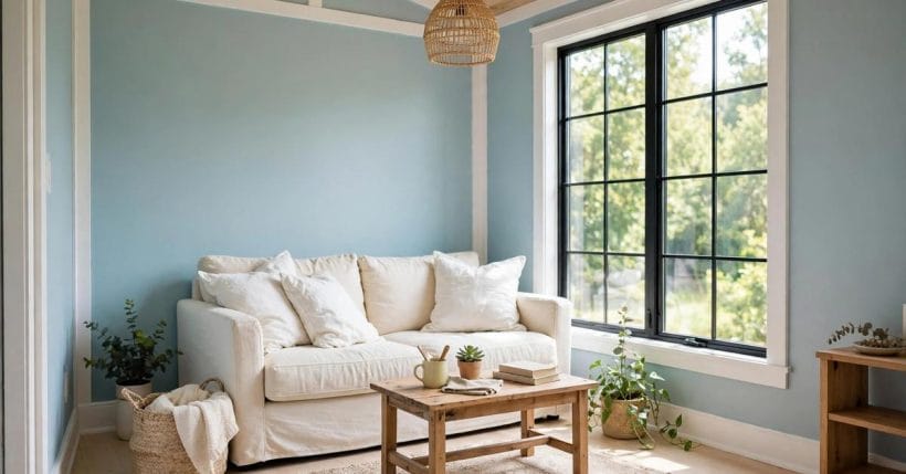
Some colours announce themselves the moment you walk into a room, and some quietly change the way the room feels without ever raising their voice. This shade belongs firmly in the second group. It sits between blue and green, light enough to keep a small room feeling open, coloured enough to give white walls a reason to exist, and gentle enough to live with every day. It takes its name from the pale, speckled shell of a robin’s egg, and that natural reference explains its appeal better than any colour chart could: it looks like something found outdoors on a spring morning, fresh and calm at the same time. This guide looks at robin egg blue as a whole-room idea, from the feeling it creates to the rooms it suits best, the colours it pairs with, and the sensible way to test it before committing a wall to it.
One caution belongs right at the start, because it shapes everything that follows. Shade names are not standardised. Two makers can use a similar-sounding name for noticeably different colours, and the same paint can look quite different in a north-facing room, a sunlit room, and a room lit only by lamps in the evening. Nothing in this guide quotes a maker’s code or a measured value, because any such figure would be a guess dressed up as a fact. Instead, the guidance here is descriptive: what the shade looks like in general terms, how it behaves in different lights, and what to look for when you test a sample in your own home. Any work involving wiring, plumbing, or high exterior walls belongs to qualified professionals, and this guide gives no instructions for those jobs.
1. What the Shade Actually Looks Like
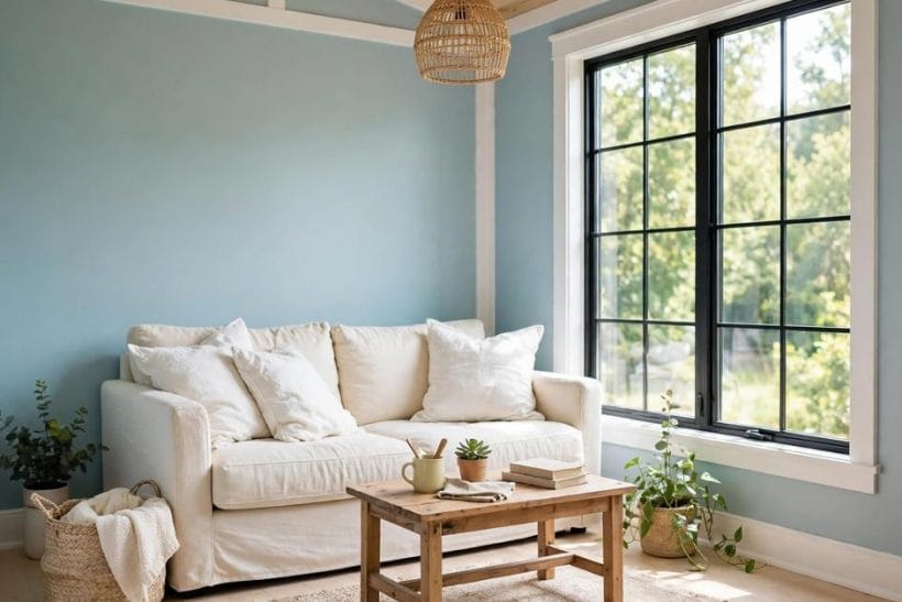
Picture a pale blue that has borrowed a little green, then been softened until it stops feeling cold. That is the heart of this colour. In bright daylight it reads as a clear, fresh blue-green, the kind of colour that makes white trim look crisp and pale wood look warm by contrast. In softer light it settles down and reads more like a muted green-blue, quieter and more restful. It never shouts, and that restraint is precisely why it works in small homes, where a loud colour can quickly feel like too much of a good thing.
The shade also has a natural, outdoors quality that many pale blues lack. Pure pale blue can feel a little icy in a cool room, while this blue-green carries a hint of leaf and sky at once, so it feels alive rather than chilly. That balance matters in a tiny house, where the living room, the sleeping area and the kitchen often share one open space and one continuous wall colour. A shade that feels both fresh and calm can hold that whole space together without dividing it into competing zones, and it can do so while still giving the room a distinct character of its own.
2. Why Small Rooms Love It
Small rooms reward colours that reflect light without washing out completely, and this shade does that job well. Because it is pale, it bounces daylight around a compact room instead of absorbing it, so a tiny living room or a narrow bedroom feels a little more open than it would under a deeper colour. Because it is coloured rather than plain white, it still gives the walls a presence of their own, so the room does not feel unfinished or temporary. That middle ground, lighter than a mid-tone but more interesting than white, is exactly where small-space colour works hardest.
There is also a practical advantage that only becomes obvious once you live with a colour for a while. A very pale room can show every shadow and every uneven patch of light, while a very dark room can make a small space feel enclosed by evening. This shade sits comfortably between those two extremes. By day it keeps the room bright, and by lamplight it deepens just enough to feel cosy without feeling closed in. For a room that has to work as a living space, a sleeping space and sometimes a workspace, that flexibility across the day is worth more than any single dramatic effect.
3. The Bedroom: A Calm Place to Wake Up
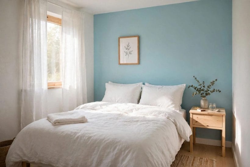
The bedroom is where this shade arguably earns its keep most convincingly. Sleep spaces benefit from colours that lower the visual temperature of a room without making it feel cold, and this blue-green does exactly that. Walls in this shade, paired with white bedding and pale wood, create a room that feels restful in the morning and unhurried in the evening. It is a colour that suits slow starts and quiet evenings equally, which is no small achievement for a single shade.
One wall is often enough in a small bedroom. A full room of any colour can feel like a commitment, and in a compact sleeping space a single painted wall behind the bed gives the room its character while leaving the other walls light and neutral. Bedding then does the rest of the work: white or cream linen keeps the room bright, while a textured throw in a soft natural tone adds warmth without competing with the wall. If you want more inspiration for sleeping spaces in blue tones, our guide to bedrooms with blue walls explores layouts, storage and restful styling in greater depth.
4. The Living Room: Fresh Without Feeling Cold
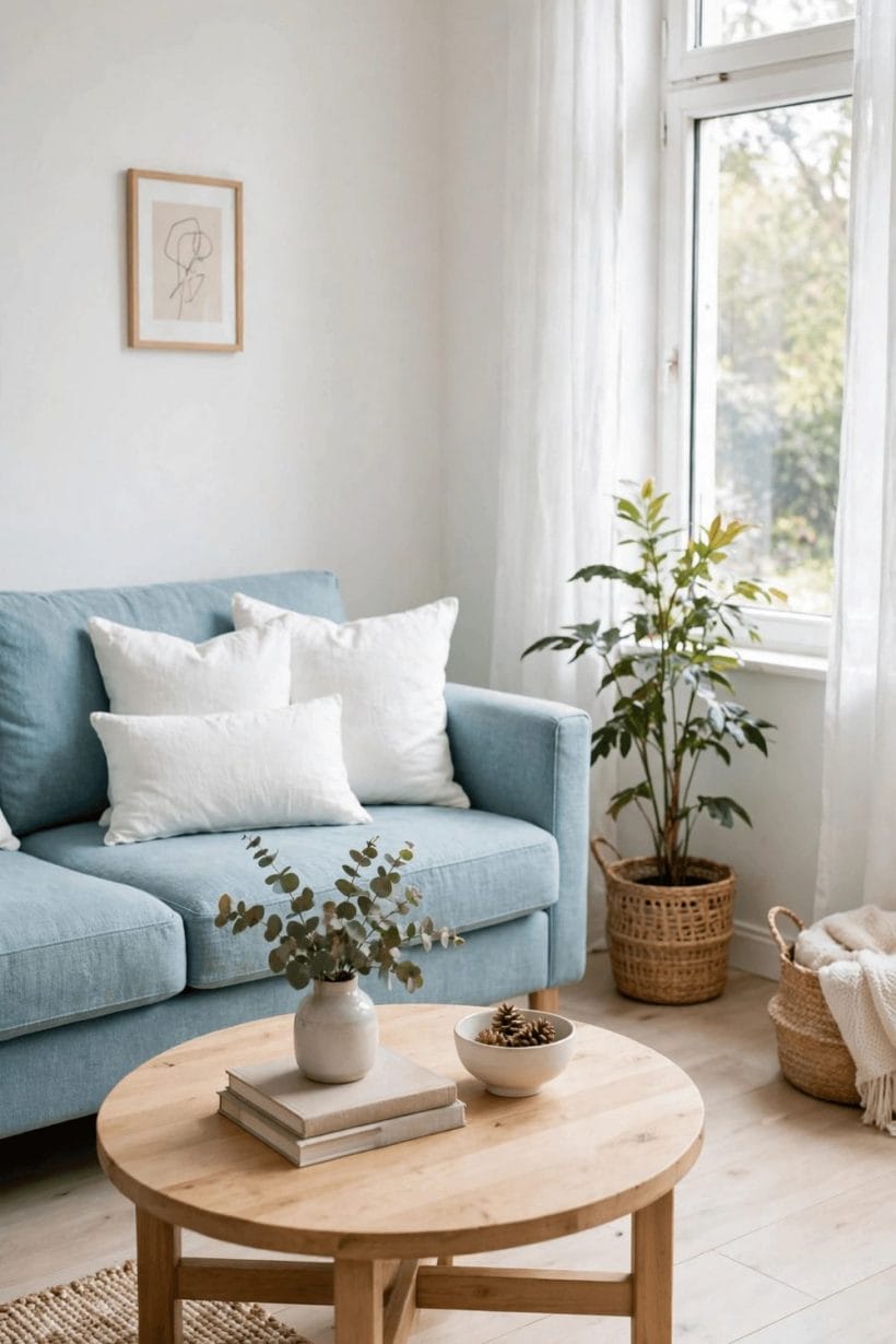
In a living room, this shade acts as a gentle backdrop rather than a star turn, and that is a compliment. Sofas, rugs, books and plants all sit comfortably against it, because it is coloured enough to frame them and quiet enough never to fight them. A cream or natural linen sofa looks especially good against it, the warm neutral softening the cool wall, while pale wood furniture picks up the green hint in the shade and ties the room together. The overall effect is a room that feels put together without feeling decorated to within an inch of its life.
Daylight changes the shade more than most people expect, so it pays to watch a sample wall through a full day before deciding. Morning light tends to bring out the blue, afternoon light warms it slightly, and lamplight in the evening draws out the green. None of these versions looks wrong, but they do look different, and the version you will live with most is the evening one, when lamps are on and the room is in use. For broader ideas on blue-toned gathering spaces, see our blue living room ideas, which cover sofas, colours and layered lighting.
5. The Kitchen: A Friendly Working Colour
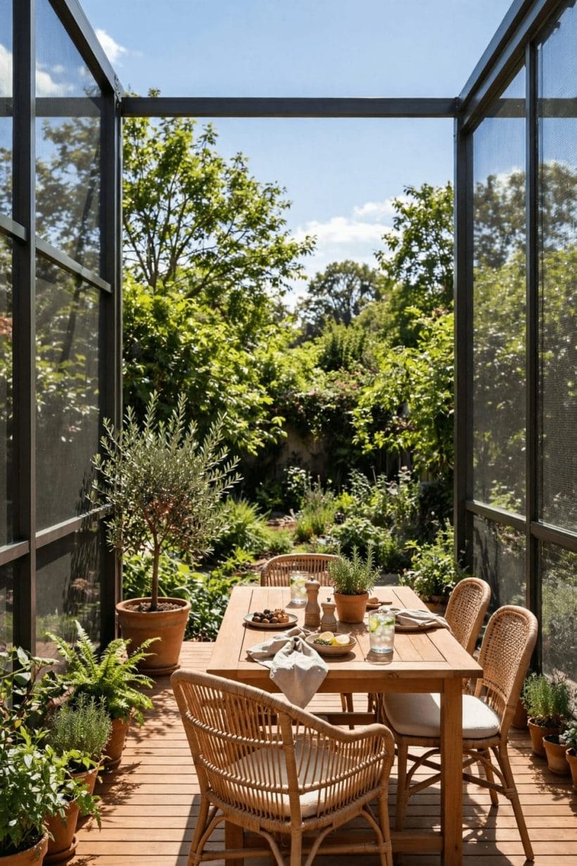
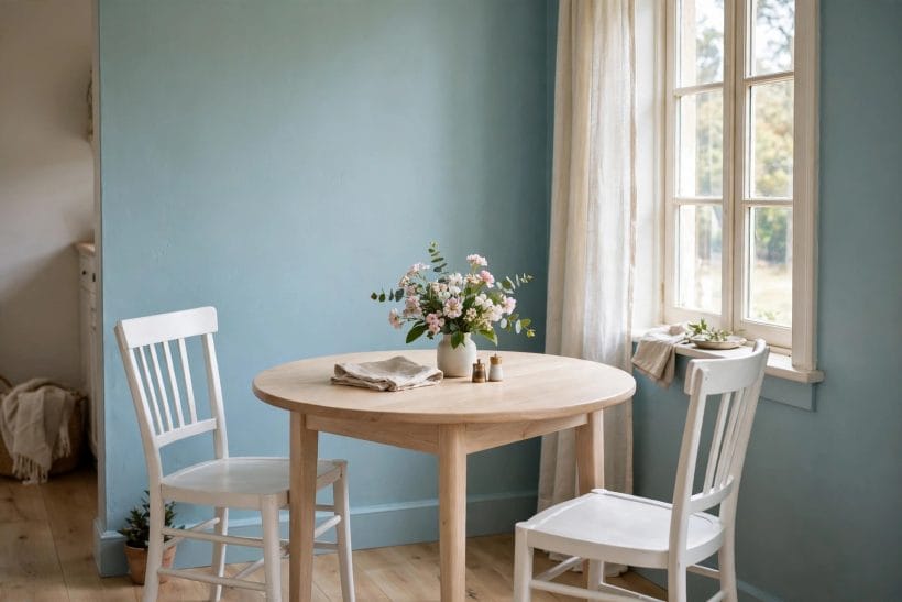
Kitchens are often painted white by default, on the reasonable grounds that white feels clean. This shade offers a friendlier alternative that still feels clean, especially on cabinets. Blue-green cabinets with white worktops and pale wood shelving give a compact kitchen a character that white alone cannot, while keeping the room bright enough for everyday cooking. White crockery on open shelving, a pale tiled splashback area, and natural wood details all sit naturally against it, so the kitchen feels designed rather than assembled.
There are two practical points worth keeping in mind. First, kitchen walls and cabinets take more wear than bedroom walls, with steam, splashes and daily handling all leaving their mark, so a finish that can be wiped clean matters more here than in a quiet room. Second, anything involving a cooker connection, a socket, or a water supply is professional work, and painting should never be used as an excuse to interfere with fittings. Keep the colour on the walls and the cabinets, and leave the services behind them to qualified tradespeople.
6. The Bathroom: A Natural Fit
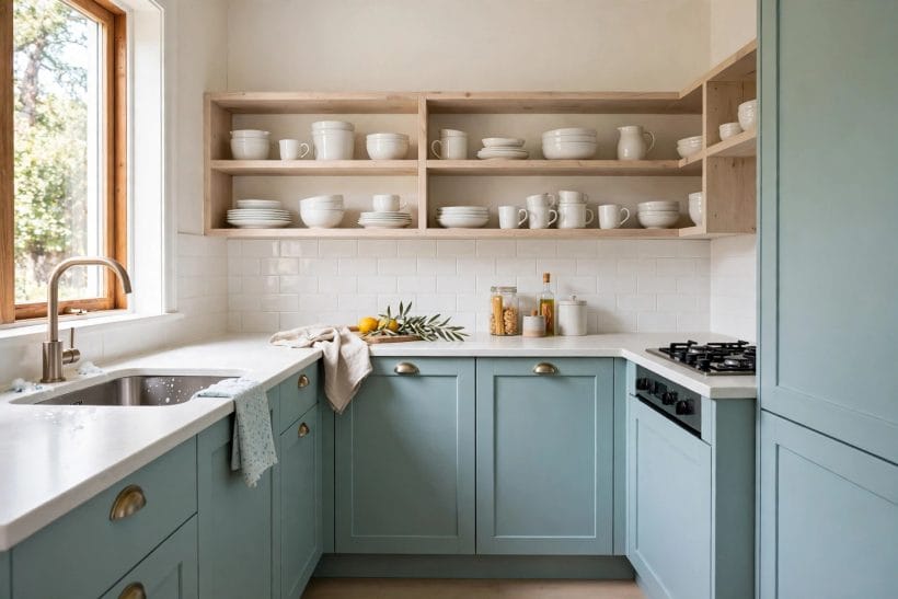
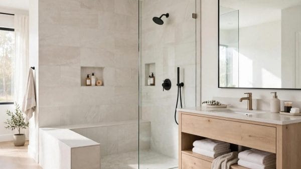
If any room was made for this shade, it is the bathroom. Water, sky and fresh air are the associations it carries, and all three suit a small washing space perfectly. Blue-green walls with a white basin, white towels and a simple wooden stool create a bathroom that feels fresh without feeling clinical, and the shade flatters both daylight from a small window and warm lamplight in the evening. It is also forgiving: in a room where steam and splashes are part of daily life, a soft mid-pale colour shows wear less starkly than brilliant white.
As with kitchens, the professional-only rule matters here more than anywhere else in the house. Plumbing, waterproofing and electrical work in a bathroom should always be left to qualified professionals, and no colour choice changes that. What the shade can do is make the finished room feel like a place you enjoy using, which is the real test of a bathroom colour. For more blue-toned washing spaces, our blue bathroom ideas cover layouts, vanities, tiles and space-saving fixtures.
7. Outside the House: A Cheerful Exterior
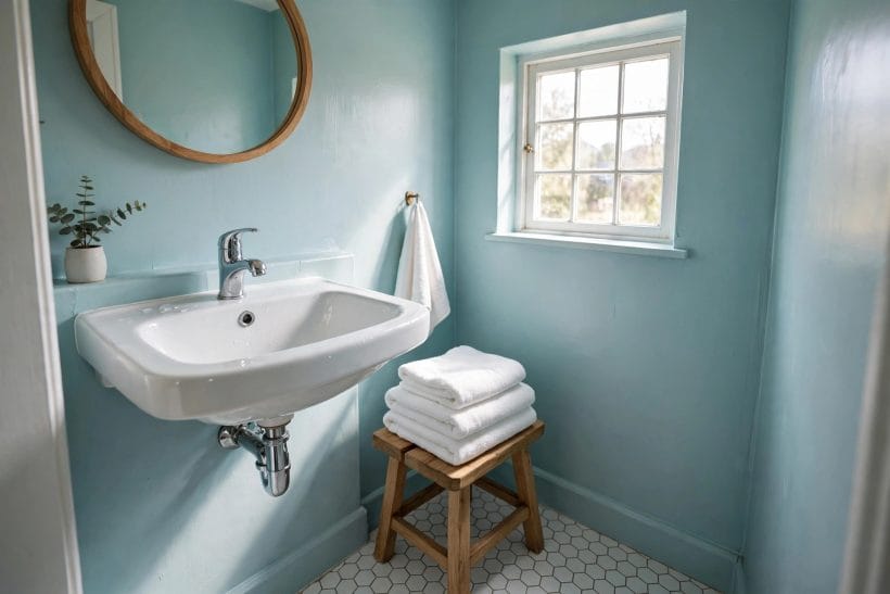
Used outside, the shade gives a small house a cheerful, welcoming face without turning it into a landmark. Blue-green siding with white window trim and a simple wooden porch reads as friendly and well-kept, and it sits comfortably among trees and planting, where its green hint helps it belong to the landscape rather than stand apart from it. For a tiny house, which is often seen whole from the road or the garden, that gentle presence is an advantage: the house looks cared for and distinctive, but never loud.
Exterior painting carries its own cautions. High walls, roofs and anything involving ladders at height should be left to professionals, and local rules or community guidelines may affect what colours are acceptable on an exterior. It is also worth remembering that exterior colours weather differently from interior ones, with sun and rain gradually softening any shade over time. A sample tested outdoors, viewed in both sun and shade, gives a far truer preview than any indoor swatch ever could.
8. Pairings That Work, and Pairings to Avoid
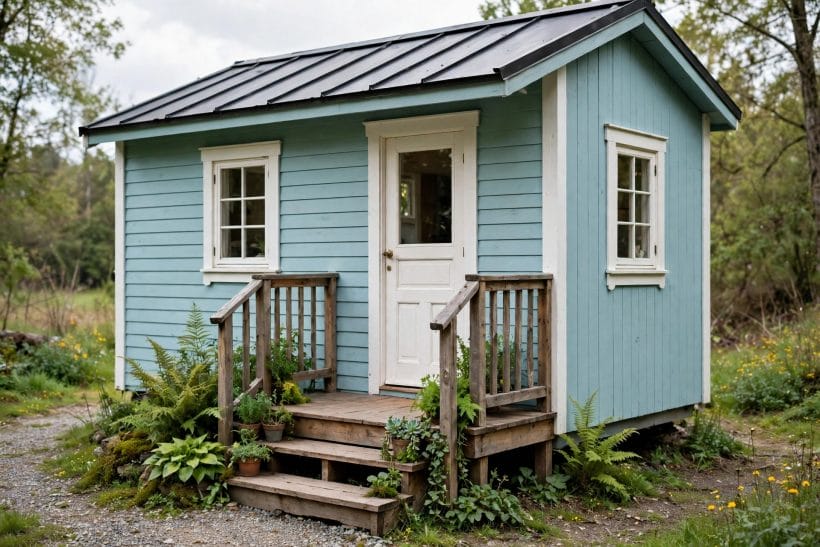
The most reliable partners for this shade are the quiet ones. White and cream trim keep it crisp, pale wood adds warmth, and natural linen, rattan and undyed cotton bring texture without adding competing colour. Soft grey can work as a secondary neutral, especially in bedding or upholstery, and a touch of warm brass or pale oak in fittings adds a gentle glow. The principle is simple: let the wall colour be the colour in the room, and let everything else support it in neutral or natural tones.
Pairings to handle with care are the loud ones. Strong reds, oranges and very dark colours can fight with a pale blue-green rather than complement it, and too many bright accents at once will undo the calm the shade creates. That does not mean a room must be monochrome: a single warm accent, such as a terracotta pot, a mustard cushion or a deep green plant, can be beautiful against it. The trick is restraint, one accent at a time, so the room keeps the peaceful feeling that made the shade appealing in the first place. For a related approach to single-wall colour, our accent wall ideas explore how one strong wall can carry a whole room.
9. A Quiet Corner: Reading Nooks and Small Spaces
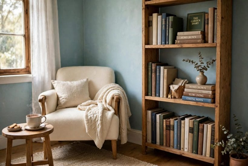
Not every use of colour has to cover a whole room. Some of the best uses of this shade are in the smallest spaces of all: a reading nook, a hallway corner, a home office alcove, or the wall behind a favourite chair. In a nook, the shade creates a sense of enclosure and calm, a visual signal that this corner is for slowing down. A cream armchair, a wooden bookshelf and a small side table are all the furniture such a corner needs, and the wall colour does the rest of the atmosphere work.
Small-space colour also rewards a lighter touch with accessories. Because the wall already supplies the room’s colour, accessories can stay simple: a plant, a framed print, a folded throw. Over-decorating a nook defeats its purpose, which is to be a calm retreat rather than a display. If you love the seaside feeling this shade can carry, our coastal bedroom ideas show how sea light, salt-air colour and rooms that breathe are put together.
10. Testing Before You Commit
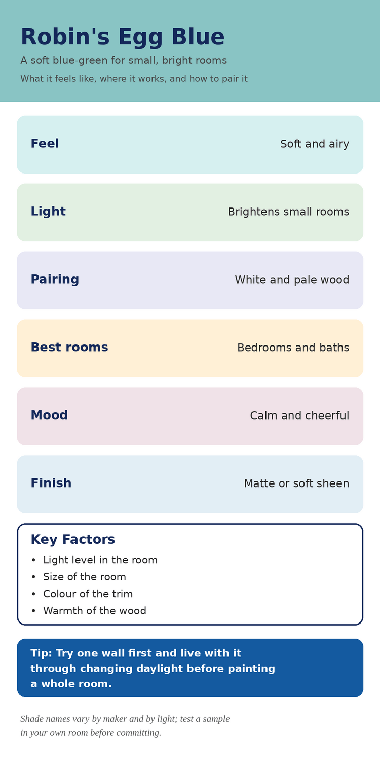
The single most useful step in this whole guide is also the simplest: test a sample in your own room before painting a whole wall. Paint a generous patch, or use a large sample board, and place it where the finished wall will be. Then live with it for a few days, watching it in morning light, afternoon light and lamplight, and against your actual furniture, flooring and trim. A shade that looks perfect in a shop or on a screen can behave quite differently next to your sofa and your wood floor, and only your own room can tell you the truth.
It also helps to compare the sample against the neutrals you already own. Hold white trim, cream linen and pale wood next to the sample and see whether they look fresh or washed out beside it. If the combination feels calm and coherent in all three lights, you have found your version of the shade, whatever any maker happens to call it. If it feels cold in the evening or too green by day, try a sample that leans slightly more blue or slightly more green until the balance feels right. Patience at this stage saves a repaint later, and it costs nothing but a little time. For a contrasting neutral approach, our beige paint ideas show how warm neutrals and honest undertones can glow in their own right.
Final Considerations
What makes this shade endure is not novelty but temperament. It is fresh without being cold, coloured without being loud, and calm without being dull, and those qualities suit the way small homes are actually lived in: one room doing several jobs, daylight changing through the day, and a need for spaces that feel restful rather than demanding. Used on one wall or a whole room, inside or out, it gives a small house a gentle identity that never tires the eye. That is a rare achievement for any single colour, and it explains why a hue named after a bird’s egg has stayed in favour far longer than most fashionable shades manage.
Start small, test honestly, and let the room itself have the final word. One painted wall, a few days of living with the sample, and a careful look at how it sits with your trim, your wood and your light will tell you more than any guide can. And if the shade earns its place, it will repay that patience every day, quietly making a small home feel brighter, calmer and a little more like a place found in nature. To see how such choices fit into compact living as a whole, explore our tiny house designs for layouts and ideas that put small spaces to good use. In the end, robin egg blue is less a bold statement than a gentle promise: a small room, made a little fresher, a little calmer, and a little more welcoming, every single day.


0 Comments