

Paint is the cheapest renovation a tiny house will ever get, and the most misunderstood. In a small interior, colour is never just colour — it is light management. Every wall sits close to a window, a lamp and your eye, so a shade behaves more dramatically than it would in a large room: whites glow or glare, greys warm up or turn to concrete, and a green that looked gentle on the shop chart can shout from four walls at once. Choosing tiny house interior paint colors well means deciding how the home handles daylight first, and how it photographs second.
This guide stays honest about what paint can and cannot do. No colour will add a square metre, dark shades are not forbidden, and there is no single fashionable answer — your windows, your orientation and your tolerance for repainting all outrank trends. What follows is a family-by-family tour: warm whites, pale greys, sage greens, ceilings kept lighter than walls, the single deliberate accent wall, and the testing routine that prevents expensive mistakes. Everything is described in colour families and light behaviour rather than specific branded shades, because your light — not a chart — will decide the result in your home.
Tiny House Interior Paint Colors at a Glance
The table below summarises the ten decisions in painting order: base colour first, ceiling and accent next, and the testing habits that protect all of them.
| Idea | Core Move | Why It Works in a Tiny House | Watch Out |
|---|---|---|---|
| 1. Warm whites | Soft, warm-leaning white walls | Maximum light, forgiving backdrop | Stark blue-whites turn chilly |
| 2. Pale greys | Warm greys with a soft undertone | Depth without darkness | Cool greys go concrete-grey |
| 3. Sage greens | Muted green-grey on key walls | Calm colour that suits timber | Saturated greens shrink rooms |
| 4. Lighter ceilings | Ceiling a step paler than walls | Lifts low ceilings visually | Same colour can feel flat |
| 5. One accent wall | A single deeper wall per zone | Focus and depth, kept controlled | Wrong wall shortens the room |
| 6. Testing routine | Big swatches, lived with for days | Prevents repaint regret | Costs a little patience |
| 7. One-colour envelope | Walls, trim and storage in one shade | Erases visual breaks | Can feel plain without texture |
| 8. Braver wet rooms | Deeper colour in kitchen and bath | Small zones carry bold shades | Steam and splash test finishes |
| 9. Contrast points | Doors, trim or cabinets a tone apart | Architecture reads clearly | Too many contrasts fragment |
| 10. Orientation first | Match undertone to your light | Colour behaves predictably | Ignoring it wastes every test |
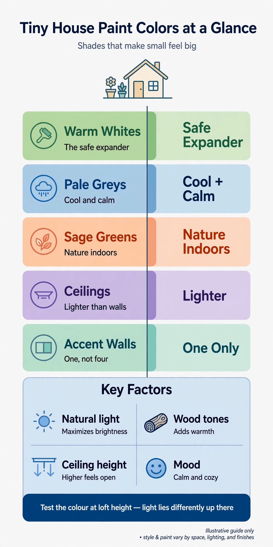
1. Warm Whites: The Reliable Space-Expander
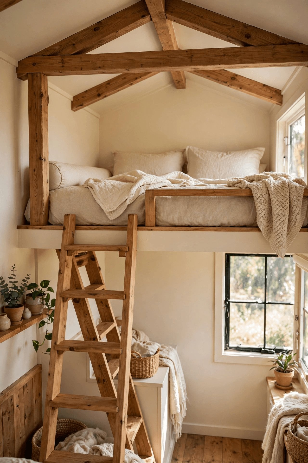
When in doubt, tiny houses reach for warm white — and the reasoning is physical, not fashionable. Pale walls return the most daylight to the room, soften shadows in corners, and give timber, textiles and skin tones a gentle backdrop that makes everything else look better. The critical word is warm: whites carrying a hint of cream, linen or soft beige stay kind under grey skies and evening lamps, while blue-leaning whites that look crisp in a bright shop can feel cold and faintly institutional in a small, shaded interior.
Finish matters almost as much as the shade. A soft sheen on walls — eggshell or satin rather than dead flat — bounces a little more light and wipes clean, which matters when every wall lives within reach of cooking and boots; keep flatter finishes for ceilings, where glare is unwelcome and hands never touch. If your structure gives you height, pairing warm white walls with volume multiplies the spaciousness — these tiny house plans with high ceilings show the same pale palette working over much taller walls, where it stops the height from feeling cold.
2. Pale Greys That Stay Soft, Never Cold
Pale grey is white’s moodier sibling: it gives a small room depth and shadow-play that pure white can flatten away, and it flatters black fixtures, pale timber and white textiles equally. The dividing line between restful grey and dreary grey is undertone. Warm greys — the family often called greige, leaning toward beige or a breath of green — stay soft in most lights. Cool blue-greys are the risky ones: in north-facing or tree-shaded homes they regularly dry down to the colour of wet cement, and the whole room takes on a chill that no cushion can fully fix.
Use grey where a room gets reliable daylight, and treat it as the room’s tonal anchor rather than a backdrop for everything. A pale warm grey in the living zone, flowing into warm white in the loft and kitchen, creates gentle zoning without a single hard colour border. Scandinavian-influenced schemes lean on exactly this family; these modern Scandinavian tiny house floor plans pair pale grey-white walls with light timber throughout. Test greys longer than any other family (idea six explains why), because grey is the colour most transformed by the light around it.
3. Sage Greens: Real Colour With a Calm Pulse
Sage is the tiny house’s friendliest true colour: a muted green softened with grey until it behaves almost like a neutral, while still reading unmistakably as colour. It flatters natural materials — pale timber, linen, stone, houseplants — sits peacefully beside warm whites and pale greys, and carries daylight gracefully instead of fighting it. Use it where a room wants identity: the living-end wall, the kitchen run’s backdrop, or the whole sleeping loft, where its calm, leafy character genuinely helps a resting space feel sheltered rather than boxed.
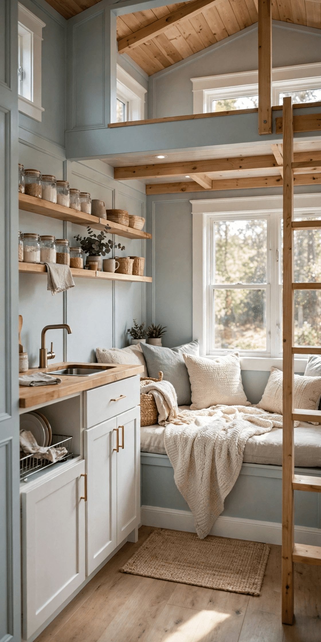
The rule is muting. Saturated, yellow-leaning greens close in fast at tiny-house distances, and a shade that sings on one garden-facing wall can overwhelm four. When in doubt, choose the greyer, paler member of the sage family and let cushions, throws and plants supply the fresher green notes that can be changed with the seasons. Sage also ages gracefully: unlike trend colours, it has been quietly used in country interiors for generations, and it tolerates the scuffs and touch-ups of small-space life without demanding a full repaint to stay respectable.
4. Ceilings Painted a Step Lighter Than the Walls
In a tiny house the ceiling is a wall you live under at unusually close range — especially beneath a loft — and treating it as part of the colour plan pays off daily. The classic move is the ceiling a step lighter than the walls: same colour family, visibly paler. The eye reads the lighter overhead surface as further away, low ceilings feel less oppressive, and the room gains a gentle gradient of light from floor to roof that mimics how brightness works outdoors. Pure bright white ceilings over warm walls can look like a lid, though; a softer white in the same family is usually the kinder choice.
Sloped ceilings and loft undersides deserve the same logic: carry the paler tone over every overhead plane, including the underside of the loft floor, and the structure seems to float rather than press. Where height comes from high glass, the ceiling’s job is mostly to stay quiet — these clerestory window tiny house layouts pour light across pale ceilings beautifully. The honest exception is the deliberate cocoon: a loft ceiling painted to match its walls can feel wonderfully cave-like for sleeping — but choose that knowingly, not by accident.
5. One Accent Wall, Chosen on Purpose
An accent wall is tiny-house colour at its most controlled: one wall goes deeper — a stronger sage, a clay tone, an inky blue-grey — while the rest stay pale, and the room gains focus, depth and a place for the eye to land. Placement decides whether it works. The classic choice is the wall you face on entering or the wall behind the main seating or the bed, because a deep end wall can make a long, thin room feel squarer and a pale room feel anchored. A deep wall on the long side of a narrow space, by contrast, can feel like it is slowly leaning toward you.
Keep the accent family-related to the room’s pale base — a deeper cousin of your sage or grey, rather than a stranger — and repeat a whisper of it in a cushion or a throw so the wall feels intentional. Painting the wall behind open shelving or a kitchen run is a smaller-commitment version with most of the effect. Rustic interiors have long used one strong wall this way; these rustic tiny stone cottage floor plans show deep, earthy tones set against stone and timber, where one strong surface carries the whole room’s character.
6. Testing Colour in Actual Loft Light
More tiny-house repaints are caused by skipped testing than by bad colour choices. Paint behaves like a chameleon: the same sage reads fresh at noon, grey at dusk and almost blue under a cheap bulb, and in a loft — close to the roof, lit by a skylight or a high window, warmed by rising heat — the light is unlike anywhere else in the house. So test where it matters. Paint generous swatches, at least a dinner-plate across and ideally on card you can move, on the wall itself, including up in the loft and on the wall opposite your main window.
Then live with them properly: a full day and night at minimum, checked at breakfast light, midday, golden hour and under your actual evening lamps, because that is the light you will live in most. Note which swatch stays itself and which one changes character rudely. Keep the surviving card — it becomes your reference for textiles and touch-ups — and photograph the winner in daylight for shopping trips. This routine costs a weekend of patience and saves the far larger cost of repainting a whole interior around a colour that only ever looked right in the shop.
7. The Envelope Trick: One Colour, Every Surface
The boldest spaciousness move is also the simplest: paint walls, trim, skirting, doors and built-in storage in one continuous colour, so the room becomes a single calm envelope with no visual interruptions. Every line where wall meets trim is a small border that tells the eye the room’s exact dimensions; erase the borders and the eye stops measuring. The trick works with warm whites and pale greys, and surprisingly well with mid-tone sage in a loft, where wrapping the colour over the sloped ceiling turns awkward geometry into a deliberate, tent-like cosiness.
Built-in storage is where the envelope earns its keep — painted the wall’s colour, cupboards, stair drawers and bench bases nearly vanish, and the room reads as architecture instead of furniture. These tiny house plans with hidden storage are full of units that disappear completely when finished this way. The trade-off is plainness: an envelope room depends on texture — timber, textiles, plants, metal — for its interest, and scuffs show along the continuous surfaces, so keep the leftover paint labelled and a small brush ready for five-minute touch-ups.
8. Small Wet Rooms Can Take Braver Colour
Kitchens and bathrooms break the pale rule safely, because they are the rooms you pass through rather than live in — and small, enclosed zones carry deeper colour with a confidence that surprises most people. A deep green or inky blue on a bathroom’s walls wraps the smallest room in the house like a jewel box, makes white sanitaryware glow, and turns a functional space into the home’s little moment of drama. In the kitchen, a stronger colour on the cabinet fronts or the splashback wall gives the working end of an open plan its own identity without darkening the living space beside it.
Practicality sets the limits here. Wet rooms punish the wrong finish: choose scrubbable paints made for steamy spaces, expect deeper colours to show water spots and soap film more honestly than pale ones, and ventilate like you mean it, because no paint outruns constant condensation. Keep the ceiling pale even in a brave bathroom, so the room keeps its sense of height, and test the deep shade under your bathroom’s artificial light — the mirror light is the one your face will judge it by every single morning.
9. Trim, Doors and Cabinet Fronts: Where Contrast Belongs
If the envelope trick removes contrast, this idea spends it deliberately — in the few places where a tone change sharpens the architecture instead of fragmenting it. An interior door painted a clear step deeper than its walls becomes a designed moment; window frames picked out in a soft contrast show off the view and the joinery; kitchen cabinet fronts in a muted colour under pale walls ground the whole room. The discipline is arithmetic: one contrast idea per room, in one colour, repeated at least twice so it reads as a decision.
Timber changes the calculation, because natural wood is already a contrast and a colour. In homes with strong timber elements — boarded walls, exposed structure — painted trim often looks best kept within the wall colour so the wood does the talking, as these compact cabin floor plans with traditional timber framing demonstrate with their paint-quiet, wood-loud interiors. Whichever direction you choose, paint a door or a frame first and live with it for a week; contrast is easy to add, tedious to remove, and in a tiny house there is nowhere to hide a mistake.
10. Reading Your Light: Orientation Changes Everything
The last idea governs all the others. Rooms drink light from their windows, and the direction that light travels changes its colour: light from the north arrives cool and bluish and will push every colour cooler, so warm-leaning shades are the safe correction; southern light arrives warm and golden, flattering cool greys and blues and sometimes making warm whites look yellow by evening. East-facing rooms get a bright, cool morning and a dim afternoon; west-facing rooms reverse the pattern, saving their drama — and their glare — for the evening you are actually home to see.
So begin every colour decision with orientation, and be honest about obstructions too — a neighbour’s wall, deep eaves or heavy tree cover can make a south room behave like a north one. Households should test together and agree in the light they will share, a small diplomacy these tiny house layouts for couples would surely approve of, since colour arguments in small homes have nowhere to cool off. Record what you learn on the back of your test cards: the next room, the next house and the next touch-up will all start from that knowledge instead of from a chart.
Final Considerations
Paint rewards tiny houses disproportionately: one careful colour decision touches every wall you own, and a repaint can re-found the whole home in a weekend for less than the cost of a single piece of furniture. The system in this guide is deliberately simple — a warm, light base chosen for your orientation, a ceiling kept a step lighter, colour spent in a few deliberate places (a sage wall, a brave little bathroom, a deeper door), and every shade tested in your real light, including up in the loft, before a full tin is opened.
Keep the honest limits in view. Paint will not fix a dark layout, a window problem or a storage shortage, and the palest, airiest scheme still collects the marks of real life in a home where everything is within reach. Choose washable finishes, keep labelled leftovers for touch-ups, and let the palette stay a family — three or four related tones across the whole house — rather than a different experiment per room. Small homes feel big when the light is managed, the colour is calm, and nothing on the walls is shouting. Paint is where all three of those are decided.


0 Comments