
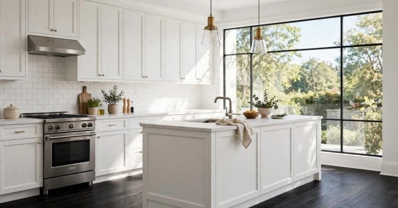
White cabinets over a dark floor is the boldest simple contrast a kitchen can make: brightness lifted to eye level, depth anchored underfoot. It photographs beautifully and lives honestly — the dark floor grounds the room and shows its dust, the white fronts bounce the light and show their splashes. These 36 ideas work the pairing from every side: layouts, floor tones, the cabinets themselves, counters, metals, light, small rooms, upkeep and the palettes that hold it together.
One rule runs under all of them: the contrast needs a mediator. A pale counter, a warm metal, a runner or a wall of daylight — something has to stand between the white and the near-black so the eye reads intention rather than a room cut in half. The sections below supply the mediators one theme at a time.
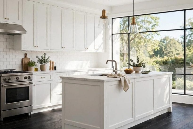
1. White Cabinets with Dark Floors at a Glance
Five things decide whether this pairing sings: the contrast itself, the light the room can borrow, the tone of the dark floor, the metals that mediate, and an honest plan for upkeep. The table below is the post in miniature.
| Element | What matters | In a word |
|---|---|---|
| The Contrast | White above, near-black below | Drama |
| The Light | Daylight decides the depth | Decisive |
| The Floor Tone | Walnut, slate or stained oak | Grounded |
| The Metals | One warm finish, repeated | Cohesion |
| The Upkeep | Dark floors show the dust | Honest |
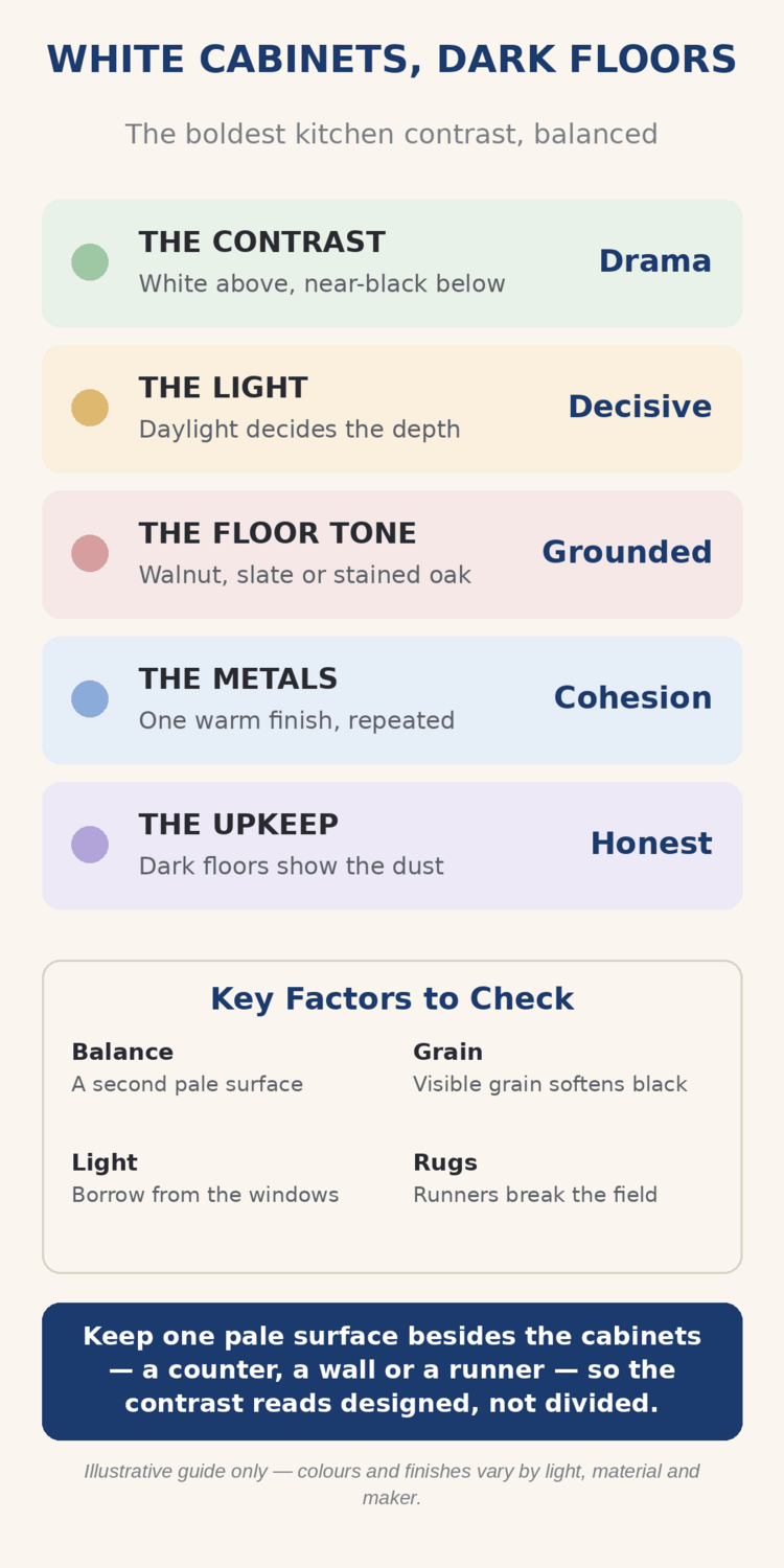
Four factors run under every idea: balance, because a second pale surface keeps the contrast designed rather than divided; grain, because visible grain in the floor softens the black; light, borrowed from windows wherever the plan allows; and rugs, because a runner breaks the dark field exactly where feet and eyes land most.
Keep one pale surface besides the cabinets — a counter, a wall or a runner — so the contrast reads designed, not divided. That single habit, repeated through the ideas below, is the difference between the kitchens that get saved to boards and the ones that get repainted within the year.
2. Layouts That Carry the Contrast
Start with the plan, because the pairing behaves differently in every layout — the worked examples in kitchen ideas show the same bones in softer colours. Four layouts carry the contrast best.
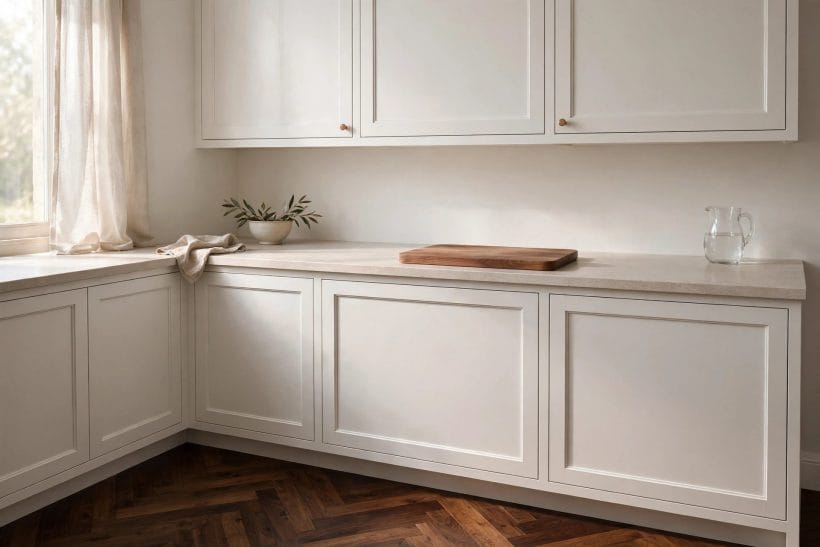
1. The Island as the Anchor’s Partner
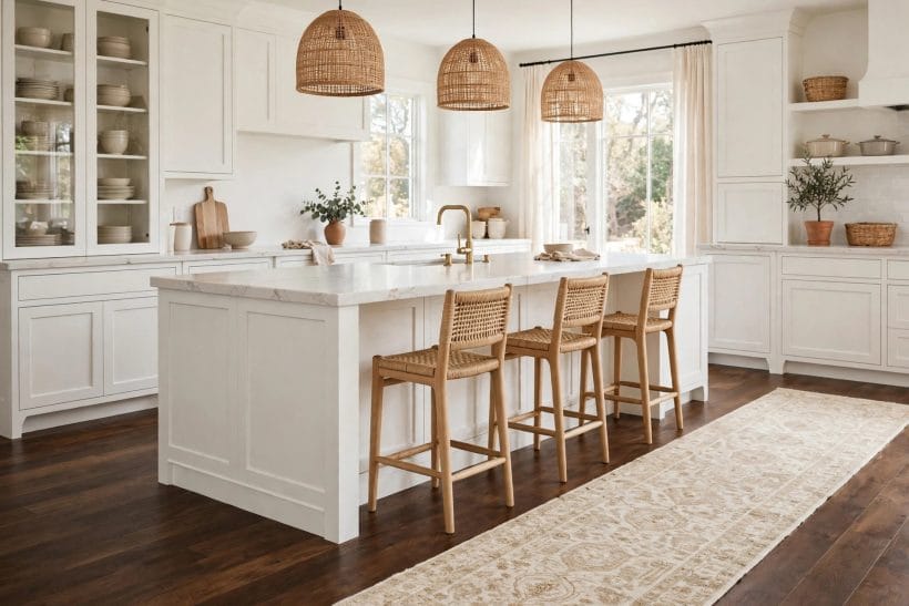
A white island on a dark floor is the pairing at its most confident: the island reads as a pale block floating on depth, and the floor’s darkness makes the room’s edges recede. Keep the island’s sides simple — shaker or slab — and let stools supply the texture.
2. Galley Runs in Black and White
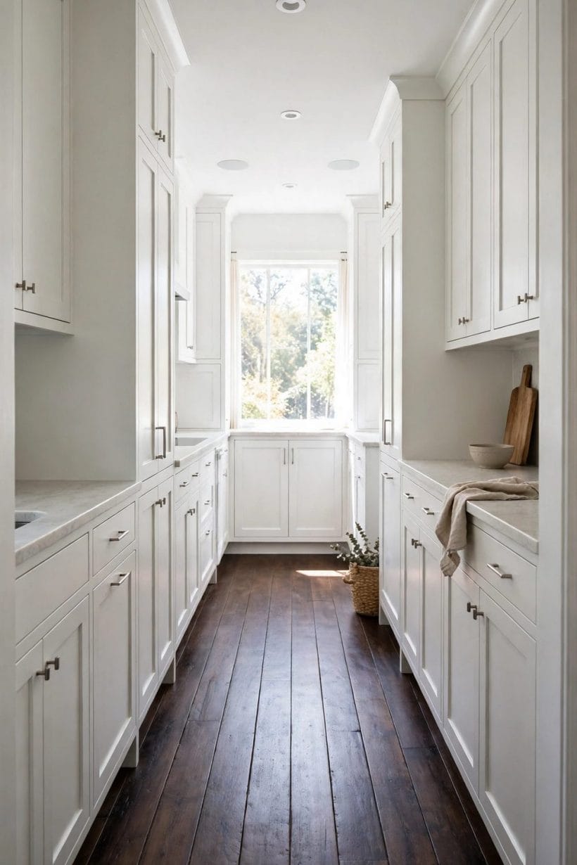
In a galley, the dark floor becomes a runway between two white walls of cabinetry, and the perspective does the styling. The look succeeds when the far end holds light — a window, a glazed door — so the runway leads somewhere bright.
3. L-Shaped Runs with a Pale Return
An L of white cabinets on a dark floor benefits from one pale return: a light wall, a tiled splashback carried high, or open shelving at the short end. The corner where the two runs meet is where the contrast gathers, so give it the room’s best light.
4. Open-Plan Kitchens Zoned by the Floor
In open plans, the dark floor can mark the kitchen’s territory inside a larger pale room, the white cabinets holding the zone’s brightness. The trick is a clean threshold — a straight floor edge the eye can follow — so the zoning reads deliberate.
Every layout above obeys one proportional rule: the bigger the floor area on show, the more mediators the room needs. A wide open-plan floor of near-black demands the pale island, the runner and the bright walls together, while a small galley can carry the same floor with the counter alone. Walk the plan at eye level, not on paper — the contrast is experienced standing up, and the layout that looks balanced in a drawing can feel bottom-heavy in the room.
3. How Dark the Floor Should Go
Tone is the pairing’s main dial, and the floor choices in tiny house flooring ideas frame the options. Four depths cover nearly every good version of this kitchen.
5. Near-Black Stained Oak
The most dramatic depth: stained oak taken almost to black, its grain still breathing under the finish. It suits bright rooms and confident owners — every crumb announces itself, and in exchange the white cabinets glow.
6. Espresso Brown for Warmth
A step back from black, espresso keeps the drama but warms it: brown undertones sit kindly with brass, wood worktops and cream textiles. In north-facing rooms, this is usually the wiser darkness.
7. Charcoal Slate and Stone Tiles
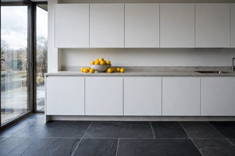
Stone and slate bring a cool, matte depth that timber cannot: large charcoal tiles under white cabinets read calm and architectural. The grout lines add a quiet grid — keep them toned close to the tile so the floor reads as one field.
8. Dark Walnut with Visible Grain
Walnut’s natural figure is the forgiving darkness: the grain breaks the surface, hiding the day’s dust better than any flat stain. It pairs with white cabinets in every era of kitchen, from shaker traditional to flat-front modern.
Before committing to a depth, live with samples: a floor board leant against the existing cabinets for a week tells you more than any showroom visit, because your room’s light — not the store’s — decides how dark the dark really is. Check the sample at breakfast and at lamp-light; espresso at noon can be near-black by evening, and the pairing has to please you at both hours.
4. The Cabinets Themselves
White is not one decision but four — style, surface, temperature and the top row. The same fronts carry a bathroom in white cabinets in a bathroom; here they work against the dark.
9. Shaker White, the Safe Classic
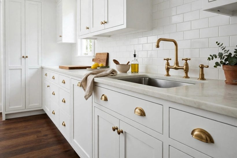
The shaker frame gives white a shadow line of its own, which keeps large runs from reading flat against the floor’s depth. It is the most forgiving front for this pairing and the one that ages slowest through fashion cycles.
10. Flat-Front White for a Quieter Contrast
Slab fronts remove the shadow play and let the floor do all the talking: the contrast becomes graphic, almost gallery-like. It asks for perfect alignment and good handles — there is nothing else to look at, so everything must be right.
11. Warm White over Cool White
Against dark warm floors, a warm white — creamy, slightly ivory — keeps the room cohesive where a blue-white can turn the cabinets icy. Against charcoal stone, the cool white earns its crispness back. Match the white’s temperature to the floor’s undertone.
12. Glass Uppers to Lighten the Top
Glazed upper doors break the white into reflection and depth, lightening the top half of the room so the dark floor stays the only heavy note. Keep the contents calm and pale; glass uppers above a dark floor reward tidy shelves.
5. Counters and Backsplashes: The Mediators
Between the white and the dark stands the counter — the pairing’s chief mediator. The reversed scheme in dark cabinets with dark floors shows the same diplomacy from the other side.
13. Pale Stone Counters as the Bridge
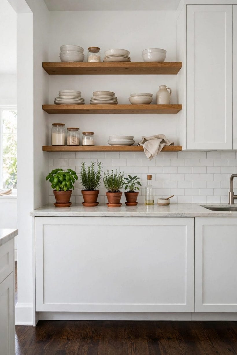
A pale stone or stone-look counter is the classic bridge: it echoes the cabinets’ brightness at worktop height and gives the eye a resting step before the floor’s depth. Soft veining adds movement without adding a third colour.
14. White Tile Backsplash, Grout as the Line
White tiles above a pale counter double the brightness where the work happens. The grout becomes the design: pale grout disappears into calm, while a mid-tone grout draws a fine grid that mediates between the white and the floor.
15. A Dark Counter for a Middle Note
Break the rule deliberately in large kitchens: a dark counter between white cabinets and a dark floor creates a layered gradient — white, depth, white, depth — that reads tailored rather than stark. It works best with pale walls holding the top.
16. Wood Worktops to Warm the Middle
A timber worktop is the warm mediator: paler than the floor, warmer than the cabinets, it shakes hands with both. It asks for oiling and honesty about water marks, and repays both with the room’s friendliest surface.
One more mediation decision hides in the splashback: how high it climbs. A counter-height splashback keeps the bright band thin and the contrast bold; a full-height tiled or panelled splashback widens the pale field and calms the whole wall. In small kitchens the taller splashback usually wins — it stretches the white upward to meet the cabinets and leaves the floor as the only dark note in the room.
6. Metals, Handles and Taps
Metal is the pairing’s jewellery — small in area, decisive in effect. Choose one finish and let it mediate everywhere.
17. Brass Warms the Contrast
Unlacquered or brushed brass is the classic mediator: warm enough to befriend a dark wood floor, bright enough to honour the white. Cup handles, a bridge tap and a rail of hooks in the same brass make the pairing feel furnished rather than merely painted.
18. Black Hardware Doubles Down
Black handles on white cabinets echo the floor and sharpen the graphic quality — the contrast gains punctuation. It is the boldest hardware choice and the least forgiving of clutter; keep counters clear and the look stays gallery-clean.
19. Chrome Keeps It Crisp
Chrome and polished nickel cool the pairing toward the clinical-bright end, partnering best with charcoal stone floors and flat-front cabinets. In warm timber-floored rooms, chrome can feel detached; test it against the floor before committing.
20. One Metal, Repeated Everywhere
Whatever the finish, repeat it without exception: handles, tap, hinges where visible, pendant stems, even the kettle. A single repeated metal is the cheapest cohesion a kitchen can buy, and mixed metals are the fastest way to make this strong pairing look accidental.
7. Walls and Light
The pairing eats light, so walls and windows are structural decisions here — the shades surveyed in tiny house interior paint colours supply the wall end of the bargain.
21. Pale Walls to Hold the Bounce
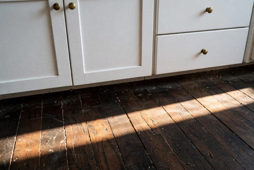
White cabinets against pale walls make the room’s top half one bright volume, leaving the floor as the single dark statement. Match the wall a half-step warmer or cooler than the cabinets so the fronts still read as the furniture.
22. Borrowed Light from Big Windows
The darker the floor, the more this pairing leans on daylight: wide windows, glazed doors and uncluttered sills are part of the design, not luck. If the room is dim, choose espresso over near-black and let the walls go paler still.
23. Under-Cabinet Light for the Working Line
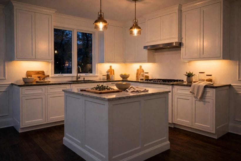
A lit worktop line stitches the white run together at night and keeps the contrast from collapsing into gloom after dark. Warm-toned light flatters both the cabinets and the floor better than blue-white strips.
24. Evening Layers: Pendants and Lamps
Pendants over the island repeat the brightness at ceiling height, balancing the floor’s pull downward. Add one low lamp or a lit shelf if the room allows; evening is when this pairing either glows or sulks, and layering decides which.
Gloss is light’s other lever: a satin or softly polished counter throws daylight back into the room, and a mirror or glass-fronted cabinet on the darkest wall can double a window. Use shine deliberately on the surfaces that face the light, and keep the floor itself matte — a glossy dark floor shows every footprint the matte one forgives.
8. Small Kitchens and Tiny Homes
Small rooms fear dark floors unnecessarily — the compact thinking in tiny kitchen ideas applies with the contrast turned up.
25. The Dark Floor as a Grounding Trick
In a small kitchen, a dark floor under white cabinets can read as a deliberate stage: the paleness above feels taller because the base is defined. Keep the floor’s field unbroken — door thresholds and mat edges aligned — so the smallness reads as neatness.
26. Keep the Uppers Shallow and Bright
Where ceiling height is limited, standard uppers crowd the contrast. Shallower wall cabinets, or uppers that stop short of the ceiling with a lit gap, keep air in the room’s top half and the pairing from turning top-heavy.
27. One Wall of Cabinets Only
The bravest small-kitchen version puts cabinets on one wall only — white, full height — and lets the dark floor run uninterrupted beneath everything else. The room reads as a bright wall standing on depth, and feels larger than its measure.
28. Runners and Mats to Break the Field
In small spaces the runner is not an accessory but a load-bearing idea: a pale flatweave along the run softens the contrast at foot level, catches the drips the dark floor would advertise, and washes when it must.
9. Upkeep, Honestly
This pairing’s only real cost is candour about cleaning. Four habits keep it looking like the photographs.
29. Dust Shows — Plan the Cleaning
A dark floor displays dust, flour and pet hair with total honesty. The owners who love this pairing longest are those who planned for it: a cordless vacuum living in a cabinet, a quick daily pass along the run, and no pretence that it will look showroom-clean between cooks.
30. Matte Finishes Hide More
Sheen is the enemy on a dark floor: gloss reflects every footprint and crumb at raking angles. Matte and satin finishes, in timber, stone or tile, forgive far more of real life while keeping the depth the pairing wants.
31. Grain and Pattern Forgive
A figured walnut, a mottled slate or a subtly patterned tile hides the day between cleans; a flat, uniform near-black hides nothing. When in doubt, choose the floor with something going on in it.
32. A Pale Runner by the Sink
The sink run is where water, dust and traffic meet. A pale washable runner there protects the floor’s finish, breaks the field at its busiest point and takes the visual blame so the rest of the floor can stay pristine in the eye.
The companion habit is at the door: most of what a dark floor displays arrived on shoes. A serious mat outside, a washable runner inside the entry line, and slippers or bare feet in the kitchen itself cut the visible dust more than any product applied to the boards. Owners of pale floors can skip this discipline; owners of dark ones make it invisible routine within a month.
10. Pairings and Palettes to Copy
Four complete palettes close the post — the wider colour logic lives in tiny house colour palette. Each names its cabinets, floor, metal and mediator.
33. White, Walnut and Brass
The warm classic: warm-white shaker cabinets, figured walnut floor, brushed brass throughout, a pale stone counter mediating. It suits traditional houses, north light and cooks who want the contrast to feel like furniture rather than architecture.
34. White, Slate and Chrome
The cool modern: flat-front cool-white cabinets, charcoal slate tiles, chrome repeated without exception, glass uppers lightening the top. It suits bright contemporary rooms and owners who keep counters religiously clear.
35. White, Espresso and Cream Textiles
The soft version: warm-white cabinets, espresso floor, and the mediation done by textiles — cream runner, linen blinds, pale seat pads. Metals can stay quiet nickel; the fabrics carry the warmth the floor’s brown begins.
36. The All-White Top Half Rule
The discipline behind all three: everything above the counter — cabinets, walls, splashback, shelves — stays in the white family, and everything below it goes dark or warm. Follow the rule and almost any floor tone, metal and layout in this post will compose itself.
Notice what the four palettes share: none of them adds a fourth strong colour. This pairing is a two-colour architecture with mediators, and its discipline is restraint — every new hue has to argue its way in against the white and the dark, and most should lose. That restraint is exactly why the look photographs so well and lives so calmly.
Final Considerations
White kitchens with dark floors ask for one decision made well — how dark, in what material — and then a handful of mediators to civilise the contrast: a pale counter, a repeated metal, a runner, enough daylight. Get those right and the pairing stops being a gamble and becomes what the photographs promise: the brightest possible top half of a kitchen, standing on depth.



0 Comments