

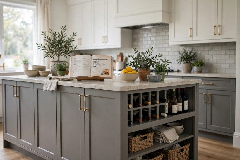
White cabinets keep a kitchen bright and uncluttered, but an all-white scheme can drift towards bland. A grey island gives the room its anchor: one calm, strong centre that makes the white around it look cleaner. The white kitchen grey island pairing suits period homes and new builds alike, and it is forgiving to live with.
This guide works through the layouts, shades, worktops and real cost drivers, plus the practical checks that decide whether the pairing sings or merely looks fine in a photograph.
1. At a Glance: The Two-Tone Decisions in Order
| Aspect | What to decide |
|---|---|
| Why it works | White supplies the light; grey supplies the grounding. The island becomes the room’s middle tone. |
| The island’s job | Preparation space, cooking, seating, storage, or all four. Decide first; size and services follow. |
| Choosing the grey | Test the real colour in your own light, morning and evening. Undertone matters more than depth. |
| The bridge | The worktop is where the two colours meet, so choose it to talk to both. |
| Cost drivers | Cabinet range, island size and services, worktop material, fitting and making good. |
| Living with it | White shows splashes; grey shows dust and flour. Both are honest, and both wipe clean. |
Work in a set order and the scheme almost designs itself. Start with the room and the island’s job, because those fix the layout. Then choose the grey, in your own kitchen, in your own light. Then pick the worktop that bridges the two colours, and let handles, floor and lighting follow. Reverse that order, choosing colours from a screen before the plan exists, and you will spend the project solving problems you created at the start.
Live with samples before you commit. A door sample of the white, a door sample of the grey, a worktop chip and a piece of the flooring should spend a few days together in the room, propped where they will actually sit. Look at them at breakfast, at noon and under evening light. Greys in particular are travellers: the shade that looked soft in a showroom can turn blue, green or purple at home, and the time to discover that is before the order, not after the fitting.
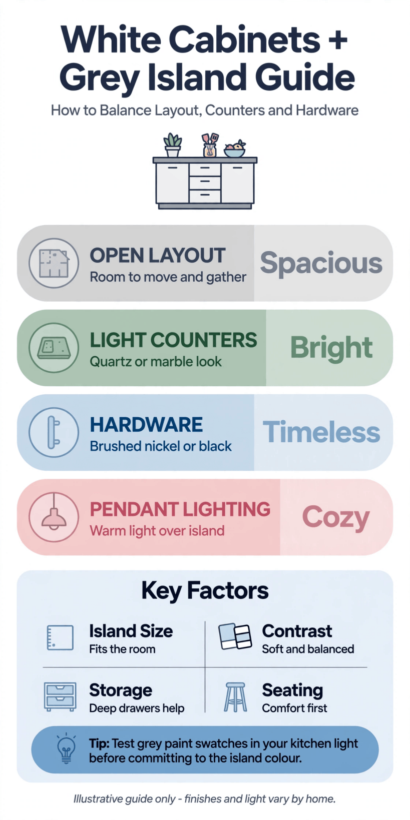
The two-tone decision at a glance: the island’s job first, the grey second, the bridge third.
2. Why the Pairing Works: Contrast, Light and Calm
The pairing works because each colour does a job the other cannot. White on the wall cabinets keeps the room’s edges bright and reflects light back into the space, which matters in kitchens that face away from the sun. Grey on the island grounds the centre of the room, where the activity is, and gives the eye a resting place. Between them there is contrast without drama: nothing shouts, yet the room has a clear structure, and the island reads as furniture rather than as more kitchen.
There is a practical side too. The island takes the knocks, the bags, the muddy paws and the flour. A mid-tone there hides the evidence of a working kitchen far better than white would, while the white cabinets, mostly above worktop height and out of the splash zone’s worst, stay looking fresh. In an open-plan room the island also becomes the boundary marker between kitchen and living space, the same zoning trick used in tiny house living room ideas, where one well-placed piece tells you which part of the room you are in.
Keep the rest of the palette quiet and the pairing stays calm. The scheme does not need a third strong colour competing; it needs texture, timber, plants and metal to warm it. If you later want colour, bring it in with stools, textiles and objects you can change in an afternoon.
3. Choosing the Grey: Shade, Undertone and Finish
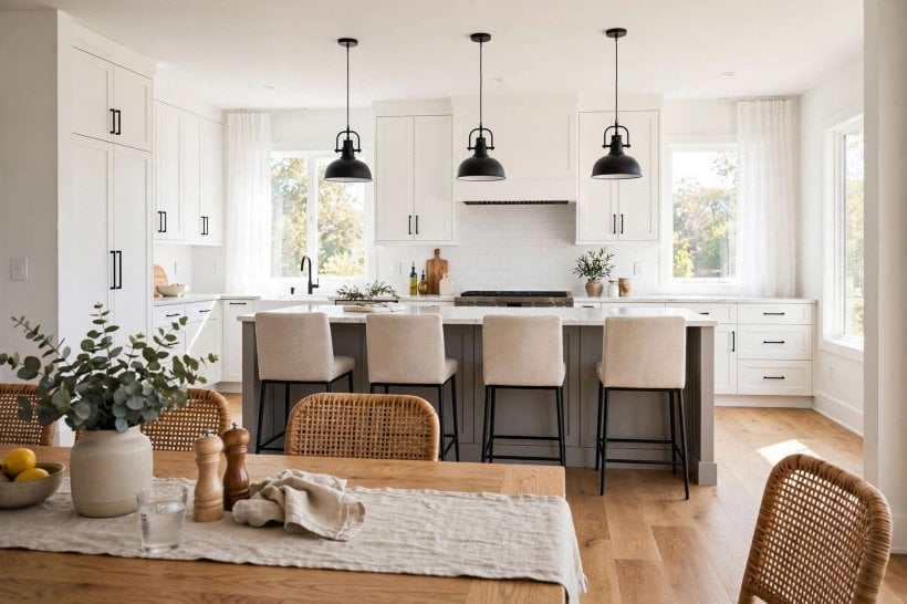
Grey is not one colour but a family, and choosing within it is the heart of this scheme. Pale greys read soft and architectural, close to the white but distinct, and they suit small or darker kitchens. Mid greys are the workhorses: clearly grey, calm against white, and the most forgiving of marks. Deep greys and charcoals are dramatic and handsome, especially with pale worktops, but they show dust, flour and fingerprints more readily, and they ask for good light. Choose by how the room behaves, not by the boldest photograph you have seen.
Undertone is where schemes succeed or quietly fail. Some greys lean blue and feel cool; some lean warm, towards greige, and feel softer beside timber and warm metals. Neither is wrong, but the undertone must agree with the worktop, the floor and the light the room actually gets. A north-facing room can make a blue-leaning grey feel cold, while a warm grey can turn muddy under yellow evening bulbs. This is why the sample test in section one is not a ritual; it is the decision.
Finish changes the colour too. Matt doors read softer and more modern; a satin finish reflects a little light and can be easier to wipe. Painted doors let you change the island’s colour years later, which is worth remembering if you like to refresh a room. The balanced approach in colourful tiny house interiors, where one confident element sits inside a calm scheme, is exactly the spirit here: the grey island is the confident element, and everything else supports it.
4. Layouts: Island Size, Shape and Position
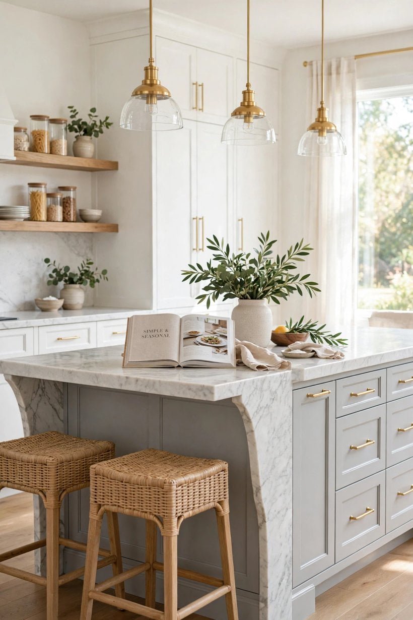
An island earns its place by working, so design from the job outwards. A preparation island wants unbroken worktop, the bin and the knives near the main run, and storage for boards and bowls. A cooking island wants the hob, safe landing space either side and thought about extraction. A seating island wants an overhang on the social side and stools that tuck away. Most islands blend jobs, but rank them: the first job gets the best position, and the others fit around it.
Size comes from the room, not from ambition. Tape the island’s footprint on the floor and live with it for a few days. Walk the routes with a laundry basket, open the fridge and the oven fully, and pull out an imaginary chair. Walkways around an island are commonly planned generously so two people can pass and doors can open, but the right clearance for your kitchen is the one your supplier designs to and your household tests on the taped floor, so confirm figures with them rather than copying numbers from elsewhere. If the tape test fails, a slimmer island, a peninsula against a wall, or a movable island can give you most of the benefit in the space you actually have.
Plan in stages, the way the methodical approach in how to build your own tiny house tackles a whole home: layout first, services second, finishes last. If a sink or hob is going on the island, water, waste and power need to reach it, and those decisions are cheap on paper and expensive in a finished floor.
5. Worktops and Splashbacks: The Bridge Between the Colours
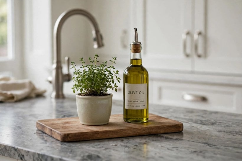
The worktop is where white meets grey, and it can lean either way. A pale worktop across both runs keeps the scheme light and lets the island’s colour carry the contrast. A grey worktop echoes the island and can look very tailored, especially if the perimeter top is pale. A veined or patterned surface containing both tones bridges them literally, and is the most forgiving of crumbs and marks. The island’s top may also differ from the perimeter’s: a timber or butcher-block style surface on the island warms the room and marks the island as furniture.
Splashbacks continue the conversation. An upstand in the worktop material is calm and easy to clean. Tiles let you pick a tone between the two colours, or a soft pattern, and they protect the wall behind the hob and sink where it matters. Behind an island there is usually no splashback at all, which is one more reason its back and ends need to be finished as carefully as its front.
Ask the supplier, not the internet, about the care of the exact material you choose: whether it needs sealing, how it takes heat, and what stains it shrugs off. Materials behave differently from one maker to the next, and the honest, hard-working approach that suits small, busy rooms like those in tiny house bathroom ideas applies here too: choose what copes with your cooking, not what photographs best.
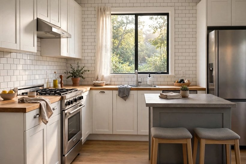
6. Handles, Taps and the Metals That Tie It Together
Hardware is the scheme’s jewellery, and it quietly decides whether the kitchen feels crisp, warm or classic. One metal family used consistently, across cabinet handles, the tap and visible appliance trims, makes two colours of cabinetry read as one design. Black hardware against white and grey is crisp and modern, and it echoes well if the lighting or stool frames share it. Warm brass or bronze softens the pairing and suits the warmer greys. Chrome and stainless steel are the classic, easy-living choice and sit happily with appliances.
Handle style matters as much as finish. Long bar handles read modern and give floury hands something generous to pull. Cup pulls and knobs lean traditional. Integrated or push-to-open fronts remove hardware from the island entirely, which can look very calm but shows fingerprints where hands land, something to weigh if the island is the household’s dumping ground. Whatever you choose, fit the same style at the same height rhythm on both colours of cabinet, so the eye reads one kitchen.
Do not forget the small metal decisions: hinges you will glimpse, the kettle and toaster that live out, even the fruit bowl. A scheme this simple is held together by consistency in the details, and undermined by five unrelated finishes competing at eye level.
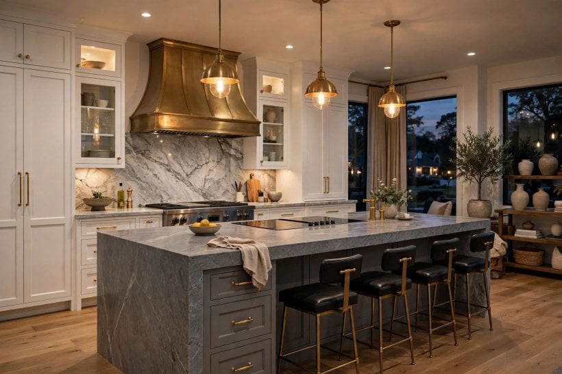
7. Floors, Walls and Everything Around the Cabinets
The floor is the scheme’s third big surface, and it has to agree with both colours. Timber, real or convincingly imitated, warms the whole pairing and is the choice that most often makes white and grey feel like a home rather than a showroom. Stone-look tiles echo the island’s grey family, but compare samples side by side on the floor: two greys that nearly match will fight, while a floor that is clearly lighter, darker or warmer than the island will sit happily beneath it. Patterned tiles can carry a period kitchen beautifully, with the island’s calm grey as their foil.
Walls can stay in the white family for maximum light, or take a soft tint that borrows from the island’s undertone at a much paler strength, which wraps the room without darkening it. Keep the strongest colour for the island and let walls support. Window dressings, seat pads and a rug in the dining area are the soft layer where pattern and warmth can live and be changed.
The natural-material warmth that runs through tiny barn house interiors, timber, woven textures, plants and honest surfaces, is the perfect counterweight to a scheme that could otherwise feel cool. A wooden board left out, a plant on the island, linen on the stools: small, warm, human things.
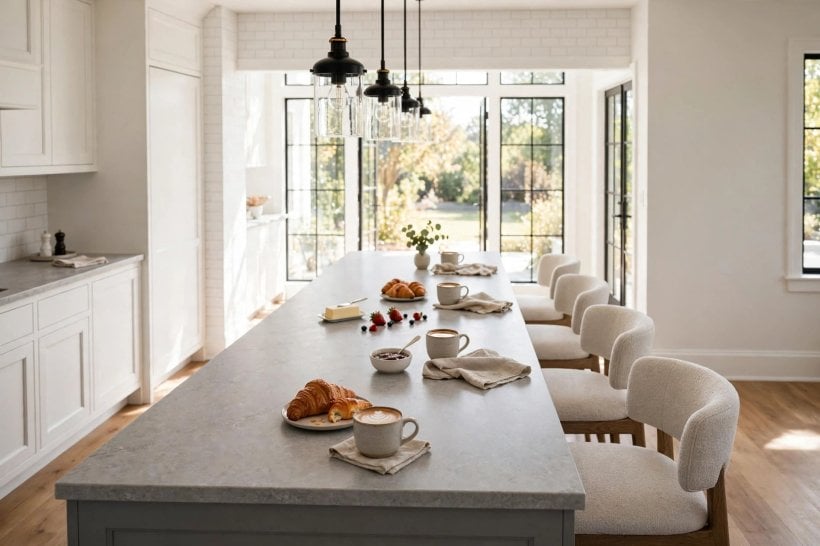
8. Lighting: Pendants Over the Island, Light for the Room
Lighting finishes the scheme and fixes its mood twice a day. Pendants over the island are the obvious feature: they mark the island as the room’s centre, give focused light for prep and seating, and their shades are a chance to repeat the scheme’s metals or introduce its one texture. Hang them so sightlines stay open and faces stay visible across the island, and agree the heights with your electrician before cables are finalised, because moving a pendant after the ceiling is closed is a nuisance out of proportion to its size.
Task light matters as much as the feature. Light beneath wall cabinets onto the perimeter worktop, sensible light over the hob and sink, and no corner left gloomy. Then think about evening: the kitchen that is bright and businesslike at noon should be able to soften at night, with dimmers or separate circuits so the island can glow while the working lights rest. Keep bulb colour consistent across fittings, or the grey will change its mind from one end of the room to the other.
The layered, restful approach to light in tiny house bedroom ideas, soft pools for people, brighter light only where tasks happen, translates directly to a kitchen that is also a place to sit. Light the people and the work, in that order, and the two colours will look after themselves.
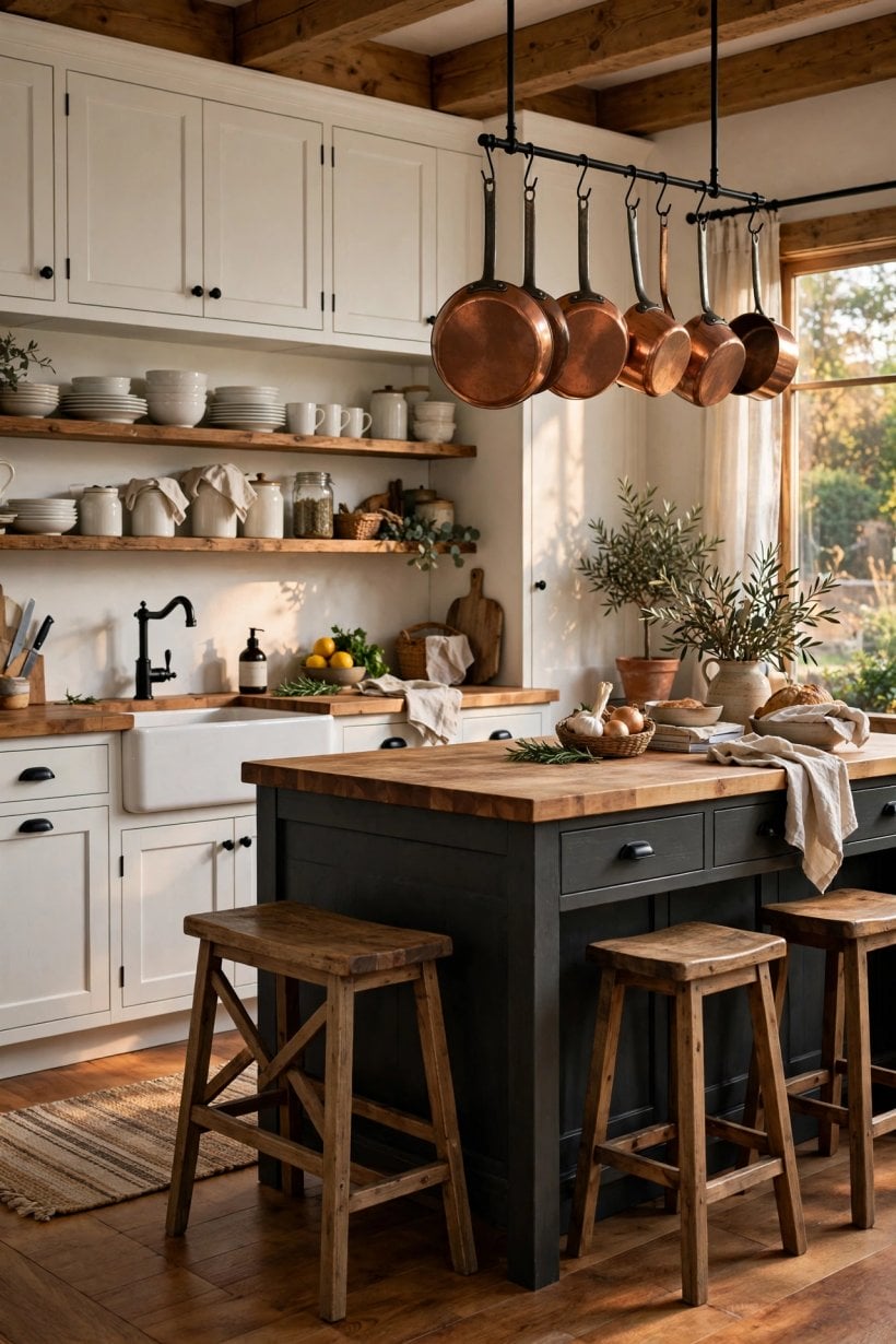
9. Seating, Storage and Living Around the Island
If the island seats people, treat the seating as a small design project of its own. Stools need the right height for the worktop overhang, a footrest for comfort, and seats that wipe clean, and they should tuck fully beneath the overhang so the walkway survives when nobody is sitting there. Put the seating on the island’s social side, away from the hob’s splash and the oven’s heat, so a person with a coffee is company, not an obstacle.
Storage has a geography too. Drawers for cutlery, pans and utensils belong on the cooking side, close to the main run. The social side can hold the things guests and breakfast need, or books, games and the household’s charging tangle, kept behind doors so the calm face of the island stays calm. Deep drawers usually earn their keep better than cupboards you have to kneel into; plan the insides around what you own, measured honestly, rather than around a catalogue.
Finally, let the island connect the kitchen to the rest of life. In rooms that open to the garden, the island often faces the doors, and the view out becomes part of the scheme, much as the planting in tiny house landscaping ideas is designed to be seen from inside. A plant, a bowl of fruit and somewhere to perch with a laptop: that is the difference between a kitchen that is admired and one that is lived in.
10. Costs, Ordering Checks and Fitting Without Surprises
The cost of this scheme is driven by the same things as any kitchen: the cabinet range and how it is made, the size of the island in cabinets and worktop, whether services move to the island, the worktop material and its edging and cut-outs, appliances, and the fitting, including making good floors and walls. Two colours do not automatically cost more than one; in some ranges the island is simply ordered in the second colour, in others a painted finish carries a premium. Ask, and get the answer in the quote, rather than assuming either way.
Ordering is where two-tone schemes earn their reputation for mix-ups, so check the paperwork like a proofreader. Both colour names and codes should appear against the right units; the island’s end panels and back must be specified in the island colour and finished properly, because unlike wall units, an island is seen from every side and an unfinished back will spoil the room daily. Confirm worktop templating happens after the units are fitted, and check delivery access for long worktop lengths, which can be the day’s biggest drama if a doorway disagrees.
During fitting, photograph pipes and cables before floors or boxing are closed over them, keep the colour codes, a spare handle and the care instructions in one file, and agree in advance who is responsible for connecting services and removing the old kitchen. None of this is glamorous, and all of it is what makes the finished room feel effortless.
Final Considerations
White for the light, grey for the grounding, and a worktop that shakes hands with both: the scheme endures because it is built on contrast and calm rather than on fashion. Decide the island’s job first, test the grey in your own light, specify the island’s hidden faces as carefully as its front, and the kitchen will look composed from every angle, including the cook’s. That is the whole secret, and it is a manageable one.

0 Comments