
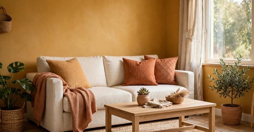
Ochre has a warmth that feels settled rather than loud. It sits somewhere between gold and brown, with a dusty, earthy depth that makes a room feel lived in from the first day. It recalls clay, autumn leaves, woven straw and sunlit plaster, and that natural association is part of its charm: it brings the outside in without shouting about it. Used with restraint, it can make a plain room feel richer, a pale room feel warmer, and a small room feel more welcoming.
Yellow ocher rewards a calm hand. A little of it goes a long way, and the rooms that wear it best are usually the ones where it has company: cream walls to breathe beside it, pale wood to soften it, green plants to freshen it, and brass or terracotta to echo its warmth. The sections below work through the colour itself, the light it needs, the walls and rooms where it shines, and the small decisions that keep it from tipping into heaviness. One idea runs through them all: test first, in your own light, and let the room tell you how much it wants.
1. What the Colour Looks Like
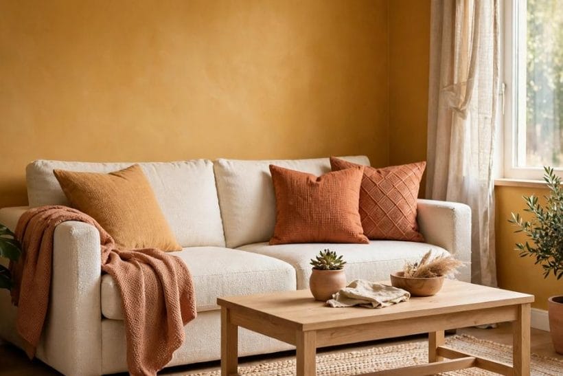
At its heart, yellow ocher is a golden earth colour, muted by a touch of brown so that it reads as warm rather than bright. In daylight it can look honeyed and open; under lamplight it deepens into something closer to caramel. That shift is not a flaw. It is what gives the colour its life, and it is why two rooms painted in the same shade can feel quite different from one another. The colour changes with the hour, the direction of the window, and the colours placed beside it.
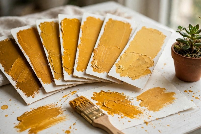
Descriptive shade names help here, because the family is broad. A pale version leans toward straw and sand, and suits rooms where only a whisper of warmth is wanted. A mid version, the classic golden ochre, carries the most character and works well as an accent wall or on cabinetry. A deeper version moves toward burnt honey and bronze, and is best kept to smaller areas, such as a door, a fireplace surround, or a single piece of furniture, where its richness can be enjoyed without closing the room in.
Finish matters as much as depth. A matte finish keeps the colour soft and chalky, and forgives uneven walls in older homes. A gentle eggshell finish gives a slight glow that suits kitchens and hallways, where walls are touched and cleaned more often. A high shine, by contrast, can make a strong colour feel harder and more reflective, so it is rarely the kindest choice for a large wall. When in doubt, choose the softer finish and let texture, through linen, wool, wood and plaster, do the interesting work.
2. Start With Light
Before painting anything, watch the room through a day. Morning light from the east is cool and clear, and it will keep an earthy gold feeling fresh. Midday light is at its most honest, showing the colour close to how it will look for much of the day. Afternoon light from the west is warmer and will deepen the colour, sometimes considerably. Evening lamplight warms it further still. A shade that looks perfect at noon can look much darker by supper, so a single glance is never enough.
The practical step is simple: paint a large test patch, at least as big as a cushion, on the wall you intend to paint, and live with it for a few days. Move a chair beside it, place a cushion against it, and look at it in daylight and lamplight, with curtains open and closed. If the patch still pleases you after that honest trial, it is a sound choice. If it starts to feel heavy or orange in the evening, step one shade paler and test again. Patience at this stage saves a repaint later.
Artificial light deserves the same attention. Warm bulbs will enrich a golden wall, while cool white bulbs can flatten it and pull out its greyer side. In a room where the colour is a feature, warm or neutral bulbs usually flatter it best. Layered lighting helps too: a ceiling light for general brightness, a lamp for reading, and perhaps a small light near a plant or picture, so that no single harsh source has to do all the work. For broader ideas on shaping a room around a colour, the tiny house colour palette shows how a single shade can anchor a whole small home.
3. One Wall, Done Well
The easiest way to use a strong earth colour is to give it one wall. An accent wall brings warmth and focus without asking the whole room to carry the weight. Choose the wall that the eye lands on naturally: behind a sofa, behind a bed, or the wall that frames a fireplace. The remaining walls, kept in cream, warm white or pale plaster, give the eye somewhere to rest and keep the room feeling open.
Trim makes a real difference on an accent wall. Crisp white or warm cream woodwork frames the colour cleanly and stops it from bleeding into the rest of the room. Skirting boards, door frames and window frames in a pale tone act like a mount around a picture, giving the strong colour a clear edge. In a small room, painting the trim the same pale tone as the other walls helps the accent wall read as a deliberate feature rather than a leftover patch.
What sits against the wall matters as much as the wall itself. A cream sofa, a pale wooden headboard, or a simple framed print will all stand out gently against a golden ground. Avoid crowding the wall with too many small objects, which can make a strong colour feel busy. One larger picture, a mirror, or a pair of shelves with breathing room between objects usually looks calmer. The goal is a wall that draws the eye once, and then lets it wander on around a peaceful room.
4. Pairings That Steady It
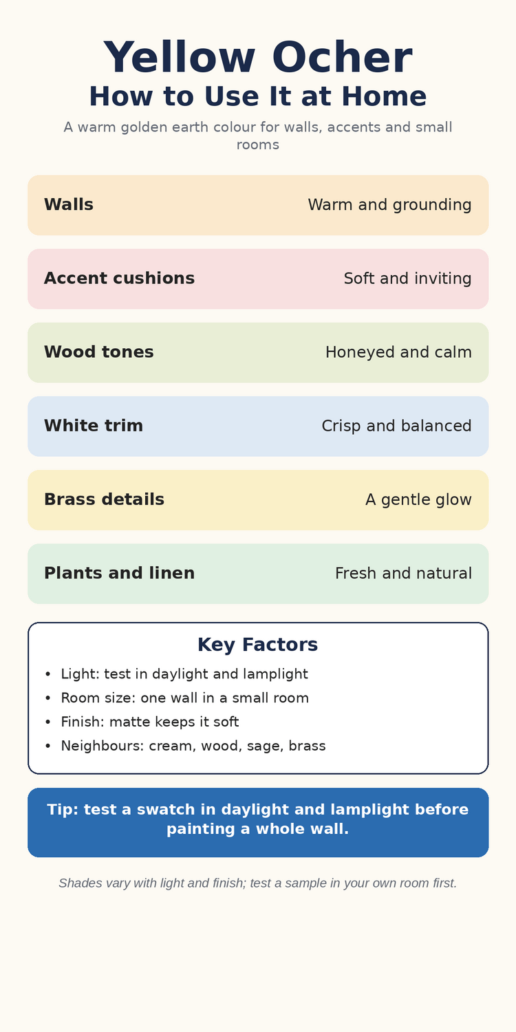
Every strong colour needs steady companions, and this one is happiest beside natural, quiet materials. Cream and warm white are its closest friends, lightening it without cooling it. Pale woods, from ash to light oak, echo its honeyed side and keep a room feeling handmade rather than decorated. Sage green, whether in plants or in a cushion, cools the warmth just enough to keep it fresh. Terracotta sits close beside it in the family and deepens the earthy feeling, while brass adds a small, warm gleam.
Some pairings deserve caution. Very bright white can make a golden wall look more orange by contrast, so a warm white usually sits better than a stark one. Black, used sparingly in a frame or a lamp, can ground the colour nicely, but large areas of black beside it can feel heavy in a small room. Cool greys can also fight with its warmth unless they lean warm themselves. When a pairing feels uneasy, the answer is often a bridge: a woven basket, a wooden bowl, or a linen throw in a tone that sits between the two colours and joins them gently.
Texture is the quiet partner in all of this. Linen curtains soften daylight as it falls on a golden wall. A wool throw adds weight to a chair in winter. A woven rug underfoot stops a strong wall colour from feeling flat. These textures do not compete with the colour; they give it something to play against, and they make a room feel touchable rather than merely looked at. A room dressed only in smooth, shiny surfaces can make a warm colour feel loud, while natural texture calms it at once.
5. Living Rooms
In a living room, the colour works best as a backdrop to comfort. A golden wall behind a cream sofa, as in the opening picture, makes seating feel like the centre of the room. Cushions in the same family, mixed with cream and a touch of rust, tie the wall to the furniture without matching everything exactly. A light wood coffee table and a woven rug keep the floor calm, while plants add the green note that stops warmth from becoming monotony.
If painting a wall feels like a large step, start with textiles. An ochre throw across a chair arm, a pair of cushions, or a woven blanket can introduce the colour for a season and be changed when the mood changes. Curtains are a middle step: they cover a large area, but they can be taken down, and their folds soften the colour beautifully in daylight. Art is another gentle entry point, since a print with golden tones can hint at the colour without committing a wall to it.
Lighting and layout complete the living room picture. Keep the seating facing the light where possible, so that faces are lit and the wall colour glows behind them rather than looming over them. A lamp beside a reading chair warms the corner in the evening. Leave some wall space bare, especially near a window, so that daylight has room to move. For more on arranging small living spaces around a strong accent, see the interior design ideas collection, which covers layouts that keep compact rooms feeling open.
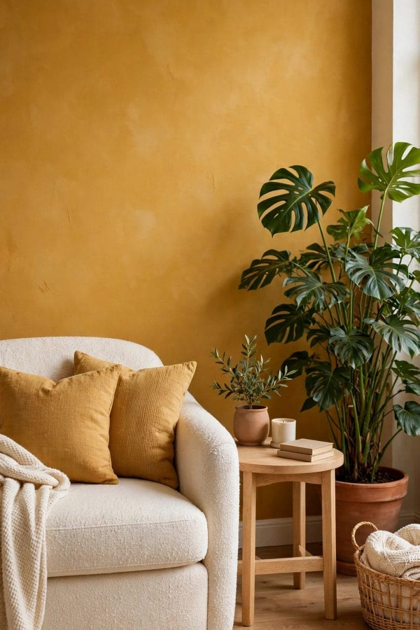
6. Bedrooms and Restful Corners
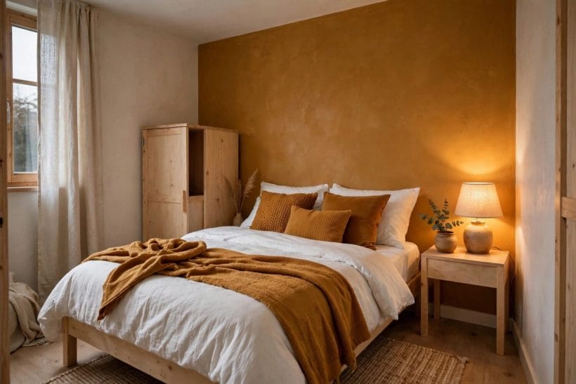
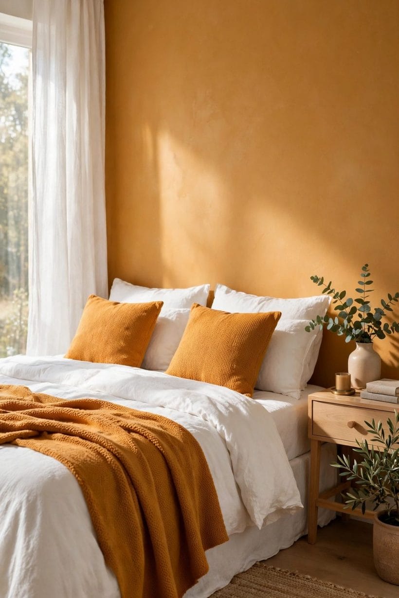
A bedroom asks for calm above all, and here the paler end of the family often wins. A soft straw or pale golden wall behind a bed gives warmth without stimulating the eye, and white bedding keeps the whole arrangement feeling clean and restful. An ochre throw, folded across the foot of the bed, adds just enough colour to make the room feel intentional. Cushions in mixed tones, cream, sand and one deeper gold, add depth without clutter.
In a restful corner, the same principles apply at a smaller scale. A single armchair, a small side table, a lamp and a plant can make a golden corner feel like a retreat. Keep the palette tight: two or three tones at most, with the golden colour as the warmest note. A book, a candle and a woven basket are enough dressing; the corner should invite sitting, not display. If the corner is by a window, sheer curtains will filter the light and let the colour glow softly through the day.
Bedrooms also benefit from thinking about the ceiling and floor. A white or very pale ceiling keeps the height of the room, even when a wall is warm and deep. A pale wooden floor, or a light rug over a darker floor, stops the room from feeling bottom-heavy. If the room is small, painting only the wall behind the bed, and keeping the other walls pale, preserves a sense of space while still giving the sleeper a warm view on waking. Ideas for warm, restful bedrooms can be found among the yellow bedroom ideas, where golden shades are shown in rooms of many sizes.
7. Kitchens and Bathrooms
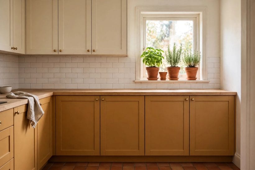
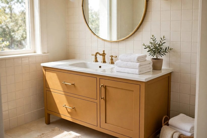
Kitchens take the colour well on cabinetry. Lower cabinets in a warm golden tone, paired with cream upper cabinets and a light wooden worktop, give a kitchen a handcrafted, cottage feeling without darkening the room. The cream above keeps the eye level bright, while the warmer tone below grounds the room. Brass handles, terracotta pots and green herbs on a sill complete the picture, and each of those details is easy to change if tastes shift.
In a bathroom, the colour is best used in small, washable doses. A painted vanity, a set of towels, or a tiled splash of warm gold can lift a pale bathroom without overwhelming it. Cream tiles and brass fixtures sit comfortably beside it, and white towels keep the room feeling clean. Because bathrooms are often small and steamy, choose finishes made for damp rooms, and keep the strongest colour away from areas that stay wet. A plant that enjoys humidity will add the green note and soften the hard surfaces.
Practical care matters in both rooms. Wipe painted cabinetry with a soft, damp cloth and dry it afterwards, rather than scrubbing. Keep wooden worktops oiled according to the maker’s guidance, and let painted surfaces cure fully before placing heavy objects against them. These small habits protect the finish and keep the colour looking even over time. For compact kitchen layouts that make the most of colour and storage together, the tiny kitchen ideas collection is a useful next read.
8. Small Rooms and Tiny Houses
Small rooms are where restraint pays most. In a tiny house, a single golden wall, a painted door, or a set of cushions can warm the whole space, because every surface is close to the eye. The temptation is to use the colour everywhere, but in a compact home that quickly feels enclosing. Better to choose one moment, the wall behind the sofa, the kitchen cabinets, or the bedroom nook, and let the rest of the home stay pale and calm around it.
Continuity helps a small home feel larger. If the golden tone appears in the living area, echo it lightly elsewhere, perhaps in a cushion in the bedroom or a towel in the bathroom, so the home feels connected rather than patched together. Keep the echoes small and the main statement in one place. Pale floors, mirrors placed to catch daylight, and furniture with visible legs all help a small room breathe, and they all flatter a warm wall colour rather than fighting it.
Storage deserves a thought too, since clutter is the enemy of a strong colour. Closed storage in pale tones keeps everyday objects out of sight and lets the golden accent be the thing the eye notices. Open shelves, if used, look best with breathing room and a limited palette, so that dishes and books do not compete with the wall behind them. A tidy small room makes even a deep colour feel generous. For layouts that balance colour, storage and light in compact homes, see the modern tiny house interior ideas collection.
9. Fabrics, Art and Everyday Objects
Not every use of the colour needs paint. Fabrics are the most forgiving way to try it: linen cushions, a wool throw, a woven rug, or curtains in a golden tone can transform a room in an afternoon and be stored away if they do not suit. Natural fibres suit the colour particularly well, because their slight unevenness echoes its earthy character. A flat, shiny fabric can make the same tone look harder, so texture is worth choosing with care.
Art and everyday objects offer the same gentle route. A landscape print with golden fields, a ceramic vase in a honeyed glaze, a wooden bowl, or a basket can each carry a note of the colour without dominating. Grouped together on a shelf or a table, three or four such objects in related tones make a small, deliberate composition. Spread thinly across a whole room, the same objects can look accidental, so grouping, with space around the group, usually reads better.
Seasonal change is another pleasure of using the colour through objects rather than paint. In colder months, deeper golds, wool and candlelight make a room feel sheltered. In warmer months, paler straw tones, linen and green plants keep the same family feeling light. Swapping a throw and a cushion is a small act, but it lets a room follow the year. More ideas for dressing compact rooms with colour and texture appear in the tiny house interior design ideas collection.
10. Doors, Exteriors and First Impressions
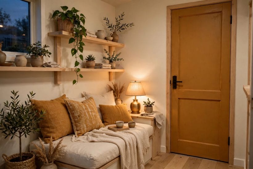
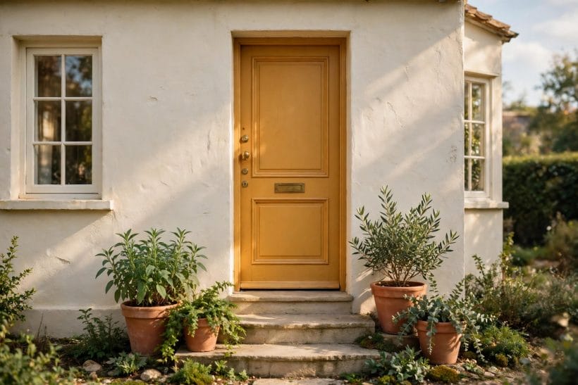
A front door is a wonderful place for this colour. It is a small area, it is seen in daylight, and it gives a house a warm welcome without committing the whole exterior. Cream or pale rendered walls, terracotta pots and green planting all sit happily beside a golden door, and the combination feels traditional without feeling old-fashioned. A door in this family suits brick, stone, render and timber alike, because its earthiness belongs with natural materials.
Outside, the same light rule applies, only more so. Sunlight is stronger outdoors, and a colour that looks soft indoors can look much brighter on a sunlit door. Test a painted board outdoors, propped where the door will be, and look at it in morning and afternoon sun before committing. The surrounding planting matters too: green leaves will cool the colour pleasantly, while autumn foliage will deepen it. Both are beautiful, but it is worth knowing which you will see most of the year.
Keep the exterior palette simple. One strong door colour, pale walls, and natural planting is usually enough. Shutters, window frames or a porch in a matching pale tone will tie the composition together, while too many competing colours at the front of a house can feel restless. A clean step, a working light by the door, and a pot or two of green planting will do more for a first impression than any amount of extra colour. For compact living spaces generally, the small living room ideas collection shows how a single warm note can anchor a room.
Final Considerations
The thread through all of this is simple: use the colour with intention, test it in real light, and give it calm company. Start small if you are unsure, with cushions or a door, and grow the commitment only when the room proves it wants more. Keep the palette tight, let natural materials do much of the work, and leave some pale space for the eye to rest. A room that follows those habits will feel warm without feeling heavy, and golden without feeling loud.
It is also worth accepting that the colour will change, and that this is part of its appeal. It will look different in summer and winter, in daylight and lamplight, beside cream and beside wood. Rather than chasing a single perfect appearance, choose a version that pleases you across those changes, and enjoy the way it moves through the day. A colour with that kind of life is a good companion in a home, especially a small one, where every shade is seen up close and lived with daily.




0 Comments