

Blue is the colour living rooms trust most: deep enough to hold a winter evening, pale enough to borrow the summer sky. Get the shade right and the room feels inevitable — as if it could never have been any other colour.
This post works through blue by shade and by job: navy walls and pale ones, teal accents and coastal stripes, the metals and woods that warm it, and the light tests that stop a beautiful blue turning cold — seventy-five ideas for the calmest colour in the house.
1. Blue Living Rooms at a Glance
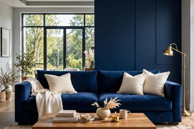
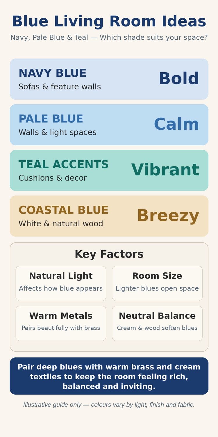
Blue in a living room is not one decision but a family of them. The feature image shows the boldest: navy velvet on the sofa and panelling, broken by cream, mustard and brass. At the other end of the family the galleries show powder-blue walls behind a white sofa, teal used as punctuation on grey, and a coastal room striped like a deckchair. All of them are blue living room ideas; they differ in shade, in proportion, and in what the blue is asked to do — wrap the room, anchor the seating, or simply season it. This post is the colour-lane survey of that family, and it sits inside the wider living room ideas pillar, linking sideways to its colour siblings rather than re-teaching the room itself.
The discipline that makes blue work is warmth management. Blue is a cool colour; rooms that succeed pair it with warm wood, brass, cream textiles and good lamplight, exactly as these images do. The lane’s neighbours make the same point from other directions — the beige living room ideas for warmth without colour, and the grey-and-orange survey for colour at full volume. Choose the blue, then choose its warm company, and test both in the room’s own light before committing a wall or a sofa to either.
| Question | Short answer |
|---|---|
| Which blue suits a living room? | Navy for drama and evening rooms, pale blue for light and space, teal for accent energy — matched to the room’s daylight and size |
| How is blue kept from feeling cold? | Warm company: wood, brass, cream and amber textiles, and layered lamplight rather than a single overhead source |
| Walls or furniture first? | Either can lead — a blue sofa on neutral walls is the reversible choice; blue walls are the committed one and want testing first |
| What must be checked before painting? | The shade in the room’s morning and evening light, on the wall it will cover — blue shifts more with light than any neutral |
2. Navy and Midnight Blues
1. The navy panelled wall
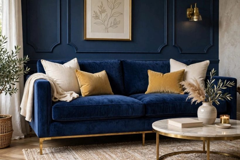
The first gallery image doubles down: navy panelling behind a navy sofa, and the room holds together because cream, mustard and marble interrupt it. Panelling gives dark blue the texture it needs — flat navy on flat plaster can deaden; mouldings keep it tailored.
2. Navy velvet, the anchor fabric
Velvet drinks in light, so a navy velvet sofa reads deeper and richer than the same colour in linen. It is the fastest route to the cocoon feeling dark blue promises, and it forgives the daily evidence of use better than pale fabrics do.
3. Mustard and ochre against navy
The complementary warmth: mustard cushions against navy are doing colour theory’s oldest trick, each making the other glow. Two cushions and a throw are enough; the pairing is potent and a little goes the whole room’s length.
4. Navy in an evening room
North-facing and lamplit rooms are navy naturals — the colour stops fighting the dimness and joins it. If the room is used mostly after dark, dark blue is not a brave choice but the honest one, and candles complete what paint begins.
5. The navy bookcase wall
Painting built-in shelves navy turns a storage wall into the room’s depth. Books supply the colour breaks, brass lamps the punctuation. It is the library version of the navy idea, and it suits rooms that hold more books than people most days.
6. Navy below the rail only
Half-commitment with full effect: navy on the lower wall or the panelling, pale above. The room keeps its light, the seating zone gains its cocoon, and the ceiling line stays high — a pattern older houses were literally built with rails to allow.
7. Midnight blue and black accents
A step deeper than navy, blue-black rewards restraint: one wall, or the cabinetry, with black metal and pale wood to keep the edges legible. It is the most architectural of the blues and the least forgiving of clutter.
8. Testing navy honestly
Dark blues dry darker and read bluer at night. Paint a large board, live with it through a full day and an evening, and judge it by lamplight — the light the room will actually be seen in — before the wall is committed.
3. Blue Sofas as the Anchor
9. The blue sofa on neutral walls
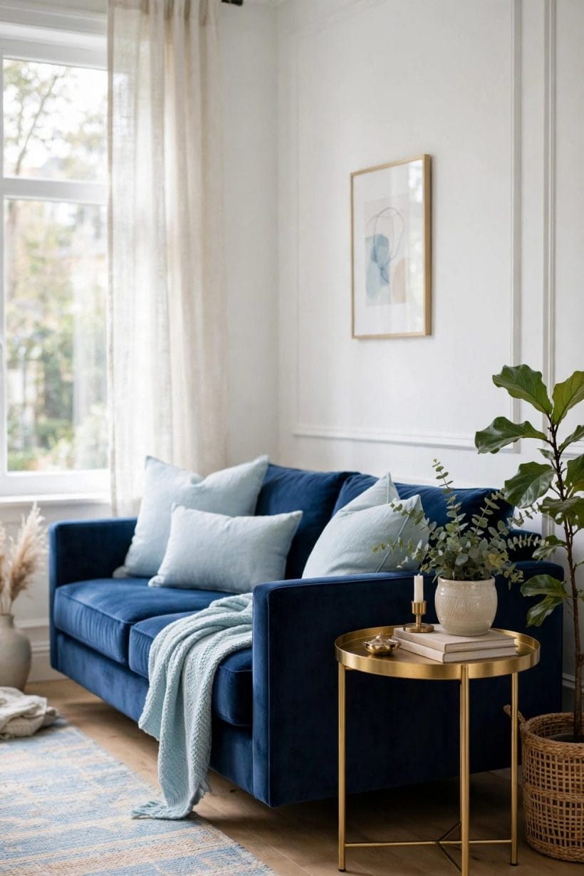
The reversible strategy: keep walls warm white or pale grey and let the sofa carry the colour. If taste changes, the sofa is one replacement; if the walls carried the blue, the change is a redecoration. Most first blue rooms should start here.
10. Choosing the sofa’s blue
Mid-blues bore quickly; the keepers sit at the ends — a true navy or a clear cornflower. Judge fabric swatches at home, in the room’s light, at the size of a cushion at least, because small swatches always read lighter than the finished sofa.
11. Two blues in one room
A navy sofa with paler blue armchairs, or the reverse, gives the family depth without introducing a second colour. Keep the two blues clearly different — near-misses look like mistakes, while honest contrasts look like design.
12. The blue chaise or daybed
A blue chaise by the window brings the colour to the room’s reading seat and leaves the main sofa neutral. It is the accent strategy at furniture scale, and it suits rooms whose blue commitment is real but partial.
13. Cushions that mediate
Between a blue sofa and a neutral room, cushions do the diplomacy: cream and natural linen to soften, one patterned blue-and-white to tie, one warm accent to season. The feature image’s arrangement is the template — mostly light, sparingly warm.
14. Blue leather, aged kindly
A blue leather sofa or pair of chairs brings a club-room note and improves with scuffs in a way fabrics do not. It pairs with wood and brass as naturally as velvet does, and suits rooms with dogs, children and realistic expectations.
15. The rug under a blue sofa
Dark seating wants a lighter floor beneath it: a cream, jute or pale patterned rug keeps the navy from pooling into gloom and defines the seating zone. The first gallery’s pale rug under the marble table is exactly this move.
16. When the family room goes blue
The same anchor logic runs the busier room in modern family room ideas — hard-wearing blues hide family life gracefully, which is half of blue’s popularity explained: it is the colour that forgives.
4. Pale and Powder Blues

17. Pale blue walls, white sofa
The second gallery image is the serene formula: powder-blue walls, a white linen sofa, pale oak, and sheers at the window. Nothing shouts; the room feels like morning. It is blue for people who say they do not like colour, and it converts many.
18. Pale blue for small rooms
Light blue recedes, so walls feel further away and small rooms breathe. Keep the ceiling white, the floor pale, and the blue’s undertone slightly grey — a sweet, sugary pale blue is the one that turns a small room childish.
19. The grey-blue safety zone
Blue-greys are the diplomatic shades, cool enough to be blue and grey enough to live with everything. They are also the easiest pale blues to keep, since their neutrality forgives clashing cushions and changing art.
20. Pale blue with natural textures
Rattan, jute, linen and pale wood are pale blue’s natural company, as the gallery shows. The combination is the Scandinavian-coastal overlap: restful, textural, and almost impossible to get wrong, which is why rental rooms reach for it.
21. A pale blue ceiling
The porch-blue tradition — a pale blue ceiling over white walls — lifts a room’s sense of sky. In a living room it works best where the ceiling is low or beamed, and it asks for nothing else blue in the room to succeed.
22. Pale blue cabinetry and shelves
Built-ins painted pale blue give the colour without wall commitment, and they make displayed objects look curated. In an alcove or on a bookcase wall the effect is gentle architecture — colour with a carpenter’s discipline.
23. Keeping pale blue warm enough
Pale blue’s failure mode is the chilly waiting room. The antidotes are in the gallery: warm wood, cream textiles, plants, and lamplight with warm bulbs. If the room still feels cold, the undertone is too blue — move one step greyer.
24. Pale blue and white pattern
A blue-and-white stripe or small print on one chair or the curtains keeps a pale scheme from flatness. Pattern at this scale is seasoning; the room stays serene, but the eye is given somewhere to travel.
5. Teal and Blue-Green Accents
25. Teal as punctuation
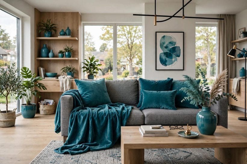
The third gallery image shows teal’s best job: cushions, a throw and ceramics against a grey sofa and oak shelves. The room is neutral; the teal is the sentence’s exclamation. Accents at this strength can be changed in an afternoon when fashion moves.
26. Teal velvet cushions
Velvet again, because teal in a flat fabric can look municipal while teal in velvet looks jewel-like. Two cushions and a throw are the standard dose; a whole teal sofa is a different, bolder post’s territory — though navy owners will recognise the logic.
27. Blue-green walls for the brave
Teal or petrol walls make unforgettable evening rooms, especially with brass and walnut. They also shrink-wrap a room’s light, so they belong in rooms used at night or blessed with serious windows. Test large, and judge at dusk.
28. The grey-and-blue balance
The established pairing dissected in grey and blue living room rests on the same truce this lane uses: grey carries the calm, blue carries the colour, and wood keeps both honest. Teal is simply that truce at higher saturation.
29. Teal with plants
Houseplants sit against teal like foliage against deep water — the greens rhyme rather than clash. A teal accent wall behind shelving and plants is one of the most photographed combinations in modern interiors, and unusually, it deserves the attention.
30. Peacock and jewel tones
At the saturated end, peacock blue-green pairs with amber, rust and brass for a room with evening glamour. It is a deliberate, dressed-up look; keep the shapes simple and let the colour do the dressing.
31. Aqua and sea-glass notes
Paler blue-greens — aqua, sea glass, mist — belong with the coastal family in section nine, but a single aqua glass or ceramic piece can cool a navy room pleasantly, like a window opened inside the scheme.
32. Mixing blue-greens without a clash
Teal, aqua and navy can share a room if their undertones agree and their proportions are ranked: one lead, one support, one whisper. The rule is hierarchy, not matching — rooms fail when three blues compete at equal volume.
6. Reading Corners and Bookcase Walls
33. The navy wingback
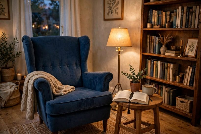
The fourth gallery’s wingback chair, in deep blue beside the bookcase, is the reading corner perfected: high back against draughts, a lamp at shoulder height, a small table for the book and the cup. Blue’s calm serves concentration like no other colour.
34. A blue corner in a neutral room
One chair, one lamp, one blue — a corner can carry the room’s whole colour story. It is the lowest-commitment blue there is, and landlords and the cautious should start with a corner before a wall.
35. Bookcase walls painted blue
Section two’s navy shelves return in daylight terms: any deep blue on a bookcase wall gives books a gallery. Pale spines glow against it, and the wall becomes the room’s intellectual furniture rather than its storage problem.
36. The reading light
A warm floor lamp with the bulb at book height, as in the gallery, is the corner’s second half. Blue rooms live or die by their lamplight; a reading corner is where that truth is tested nightly and must not be failed.
37. Blue and the library palette
Leather, wood, brass and deep blue are the traditional library chord. Even a single bookcase corner struck in that chord lends the whole living room a studious calm — the room feels read in, which is a compliment few palettes earn.
38. A window seat in blue
Cushions and a throw in the room’s blue on a window seat tie the corner strategy to the architecture. Daytime reading by real light is the luxury; the blue is simply its uniform.
39. Children’s reading corner
A small blue chair, a low shelf and a cushion pile make a child’s reading corner that matches the grown-up room. Blue’s calm is not wasted on the young, and the corner can be reclaimed by adults without redecorating when tastes grow.
40. The chess and games corner
Two blue chairs and a small table make a games corner with club-room manners. It anchors the room’s quiet end, balances the television’s end, and gives the living room a second purpose that needs no screen.
41. Blue upholstery, cleaned honestly
Deep blues hide the evidence of daily life; pale blues show it and wash well in removable covers. Choose the depth by the household’s reality — dogs, toddlers, red wine — and the corner will stay handsome instead of becoming a worry.
7. Pattern, Cushions and Layered Textiles
42. The cushion pile
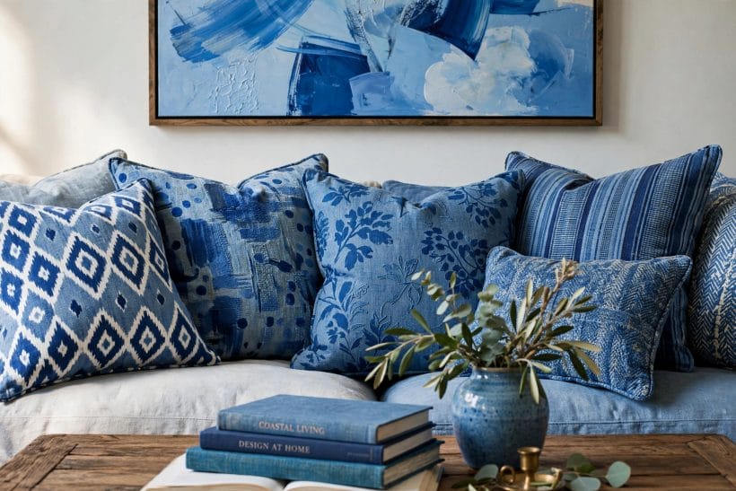
The fifth gallery image piles blue patterns on a pale sofa — ikat, floral, stripe, plain — and it works because every pattern shares the one palette. This is the safest experimentation in decorating: total commitment, fully reversible by teatime.
43. Blue-and-white, the eternal pattern
Blue on white — porcelain, toile, ticking, block print — is the oldest decorative partnership in the house. It freshens navy rooms, deepens pale ones, and connects a living room to kitchens and bedrooms dressed the same way.
44. One abstract painting
A single large blue abstract above the sofa, as in the gallery, sets the room’s palette like a key signature. Art-led schemes are easier than they look: pull the cushions from the painting and the painting from your taste, and the room agrees with itself.
45. Stripes for structure
A blue stripe — on a chair, a rug’s border, a cushion — gives a soft scheme its architecture. Stripes are pattern for people who fear pattern, and in blue and white they carry the coastal and the classic rooms equally.
46. Layering depths of blue
Plain textiles in three depths of blue — navy throw, mid-blue cushions, pale blanket — create the tonal richness plain colours alone cannot. It is the textile version of section five’s hierarchy rule, applied to fabric.
47. The warm interruption
Every blue textile scheme needs one warm note — the rust cushion, the amber throw, the leather pouffe. The yellow living room ideas in this lane show the opposite arrangement; here the warmth is the guest, and it must not be allowed to move in.
48. Seasonal textile swaps
Blue rooms change mood with their textiles: linen and stripes for summer, velvet and wool for winter. Two sets of cushion covers are the whole machinery — the cheapest redecoration in this entire post, and the one most likely to happen.
49. Pattern scale discipline
One large pattern, one small, the rest plain: the gallery obeys it, and so should the room. Pattern chaos is the one failure blue cannot charm its way out of, because the colour’s calm depends on visual quiet around it.
8. Blue With Wood, Brass and Warm Metals
50. Brass, blue’s oldest friend
Brass lamps, frames and table edges against blue is the pairing the feature image and the infographic both reach for. The metal’s warmth is exactly the temperature blue lacks, and aged brass — not mirror-polished — keeps the effect mellow.
51. Pale oak with pale blue
The Scandinavian register: light wood keeps pale blue airy and modern. The second gallery’s oak sideboard and table are the template — blue as a gentle wall colour, wood as the warmth, white as the breathing space.
52. Walnut with navy
Dark wood with dark blue is the tailored, evening register — mid-century in ancestry, club-room in effect. It needs the lamplight of section six and one pale element, a rug or a ceiling, to keep its edges.
53. Wood on the walls
A timber-clad wall section or bookcase front in natural wood warms a blue room structurally. The texture story continues in wood wall living room ideas, where the wood leads and colours like blue are the supporting act.
54. Black metal for definition
Thin black frames — on lamps, tables, picture frames — draw the lines in a blue room the way ink outlines a watercolour. Use sparingly; black is the scheme’s punctuation, and too much punctuation makes any sentence hard to read.
55. Marble and stone accents
The feature room’s marble coffee table cools and lightens the navy around it. Pale stone is blue’s daylight friend as brass is its evening one, and a single stone surface often does the balancing work of several accessories.
56. Rattan and cane
Woven textures bring the coastal warmth without the theme: a rattan basket, a cane-fronted cabinet, a woven shade. Against blue they read as sand against sea, which is the association doing the warming.
57. The fireplace in a blue room
A working fire is the ultimate warm accent, and blue rooms with fireplaces have their balance built in. Paint the chimney breast blue and the fire becomes the room’s jewel; keep it pale and the fire is a warm picture in a cool frame.
9. Coastal Blue and Natural Texture
58. The striped sunroom
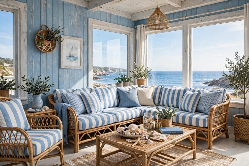
The sixth gallery image is coastal blue at full sail: blue-and-white stripes on rattan, weathered boards on the wall, the sea doing the rest. Stripes plus natural weave is the whole formula; everything else is garnish.
59. Coastal without the clichés
The look survives inland when the props are dropped and the palette kept: stripes, pale wood, linen, one piece of driftwood-toned furniture. Anchors and rope belong to restaurants; the colour scheme belongs to anyone.
60. Weathered and washed blues
Coastal blue is blue with the saturation weathered out of it — chalky, greyed, sun-faded. Paint finishes in matt and chalk effects help, and fabrics should look washed rather than new. Gloss and jewel tones belong to other sections.
61. Blue with white-painted wood
White-painted boards and furniture are coastal blue’s architecture, from the gallery’s wall cladding to a painted floor. The pairing is bright even in dull weather, which is the practical reason seaside rooms invented it.
62. Shells, rope and restraint
One bowl of shells on the table, as the gallery allows itself, is a souvenir; a room full is a theme park. The discipline matters more at the coast look than any other, because its props are cheap and its palette is strong.
63. A coastal corner inland
A striped chair, a pale rug and a sea-toned cushion or two give a city living room a coastal corner without redecorating. It is the accent strategy of section five wearing its summer clothes.
64. Blue-green sea tones
Where the sea is the reference, blue slides green — the aqua and sea-glass of section five. Coastal rooms can take more of the green shift than classic ones, because the reference excuses it, and plants complete the illusion.
65. Durable fabrics for the coast look
The look is relaxed; the fabrics should be too — washable cottons and linens that fade gracefully. A coastal room that cannot handle sandy feet and wet towels has missed its own point, however good it photographs.
66. Dusk in a coastal room
Evening is the test: pale coastal schemes can turn grey and cold after dark. Warm lamps, a lit candle or two, and textiles with some cream in them carry the room through to bedtime without betraying its daylight self.
10. Choosing, Testing and Costing Your Blue
67. Start from the light
North light cools blue further; south light warms it toward grey-green. The room’s orientation chooses the shortlist before taste does — bring swatches home and judge them at the times the room is actually used.
68. The big-board test
Paint boards, not patches: a board can move from wall to wall and hour to hour. Live with the finalists for days. Blue is the colour most lied about by small samples and shop lighting, and the board is the lie detector.
69. Undertone discipline
Blues lean green, violet or grey, and the lean decides their company. Put the swatch against the room’s wood and sofa fabric; the pairing that looks inevitable is the right undertone, whatever the colour’s name promised.
70. Where the colour budget goes
In this lane the money sits in the sofa, the paint and the textiles, in that order of permanence. This post states no figures — fabric and paint prices vary too widely — but the driver is clear: buy the sofa’s blue once, and let cushions carry experiments.
71. Painting order and samples
Test paint before the sofa is ordered if walls will carry blue, and order fabric against the dried paint, not the wet card. Sequence is the difference between a scheme and an argument, and it costs only patience.
72. The one-wall compromise
Where the household argues, one wall — usually the fireplace or sofa wall — takes the deep blue and the rest stay pale. It is not a failure of nerve; several rooms in this post’s galleries are exactly that arrangement, working beautifully.
73. Renters’ blue
For rooms that cannot be painted: the blue sofa, the blue rug, the blue art, the blue corner. Everything in sections three, six and seven is reversible within a day, which is most of blue’s power with none of its commitment.
74. The colour-cluster view
Blue sits in a family of colour lanes in this plan — with the warm metals of section eight and the accents of grey and orange ideas at the family’s loud end. Reading the lanes together keeps neighbouring rooms in one conversation instead of several arguments.
75. The calm test
Last, the only test that matters: sit in the finished room at the end of a day and notice whether your shoulders drop. Blue’s whole reputation is that moment. If the room gives it, every choice was right; if it does not, adjust the warmth before touching the blue.
Final Considerations
Blue succeeds in living rooms because it is a spectrum of moods wearing one name: navy’s cocoon, powder’s morning calm, teal’s spark, the coast’s washed ease. Choose the mood first and the shade second, manage the warmth deliberately, and test in the room’s own light — those three disciplines turn the colour from a gamble into the safest strong choice a living room can make.
And let the room stay a little unfinished. A blue living room absorbs new books, new art and new textiles more gracefully than any rival colour, so it improves with living in a way stricter schemes do not. That, finally, is why the colour never leaves: it is the one that grows old with the household, kindly.


0 Comments